Video
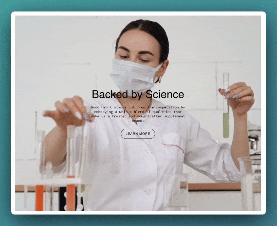
A powerful all-in-one video section for banners and building attention-grabbing promotions
Create video banners and promotional sections to enhance your brand, products, and services with this single-column section in Broadcast.
Flexible
The video section can loop MP4 or MOV format videos from your content library. Videos can also appear with a pop-up player, ideal for longer video content.
Broadcast always presents a clean branded experience for shoppers, including options to add separate poster images for desktop and mobile devices. These images will load first while your video is loading into the browser and then be replaced by the video content.
Adding videos to your store is perfect for creating attractive promotions. You can easily incorporate them into any page of your store.
YouTube and Vimeo
YouTube and Vimeo videos can only be displayed as Popup videos. The reason is, Shopify can't control the ads and linked videos that YouTube or Vimeo will display in the video. The result is a very unprofessional background section.
If you need to use a YouTube or Vimeo video, we have a couple of recommendations:
To use as a background video, download the YouTube or Vimeo video and convert it to an MP4 or MOV format, then you can simply add it to your Shopify library.
For a popup video, you can add the YouTube or Vimeo URL in the Popup section. Use a branded image or a still frame from the video to represent the video.
Section settings
Content
Video
video
Upload a local MP4 or MOV file to play as the main video.
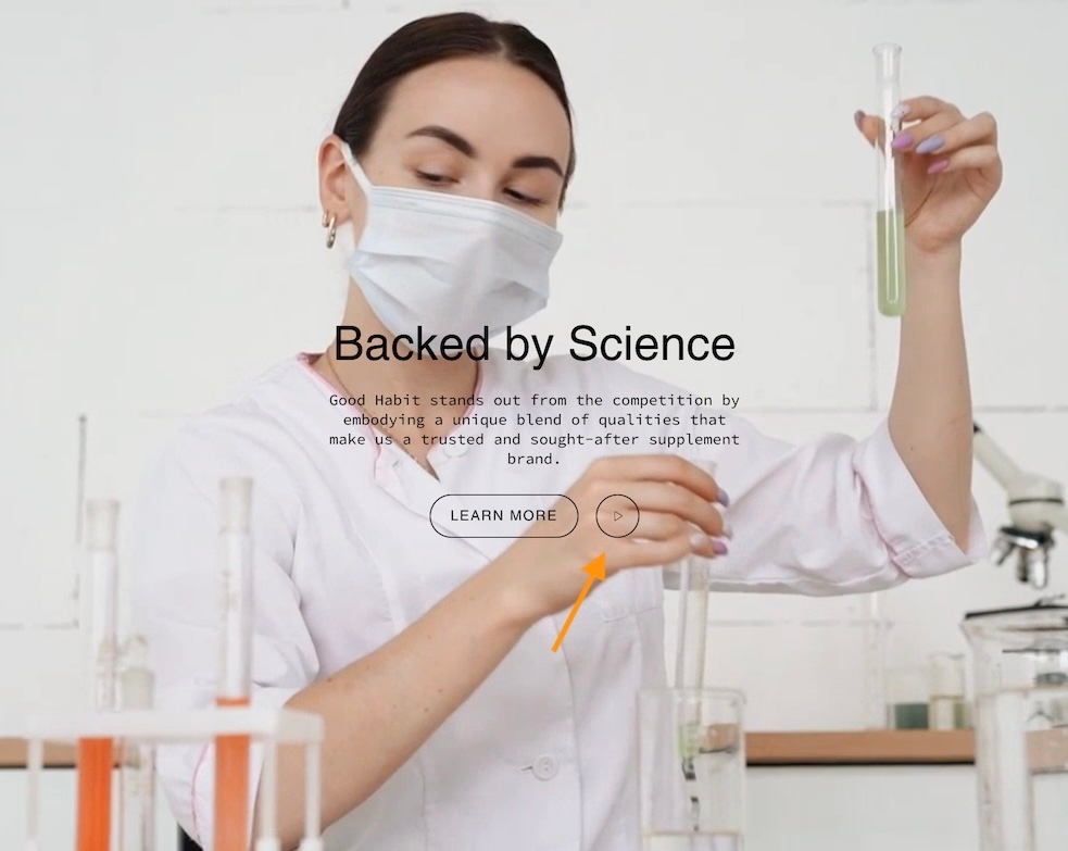
Popup
Enable popup
checkbox
Enables the video popup overlay functionality.
MP4/MOV
video
Upload a secondary video to be used in the popup.
Youtube/Vimeo link
video_url
Add a link to a YouTube or Vimeo video for popup. Accepts only these two sources.
Typography
Heading
text
Title text displayed over the video.
Heading size
select
Choose Mini, Extra small, Small, Medium, Large, or Extra large for the heading text.
Text
richtext
Rich text editor to input supporting content.
Text size
select
Sets paragraph text size. Applies only when content is set as a paragraph:Extra small, Small, Medium, Large, or Extra large.
Text alignment
select
Aligns text vertically and horizontally over the video.
Button
Text
text
Label for the CTA button. Leave blank to make entire image clickable.
Link
url
URL the button should link to.
Color
select
Choose button color: Black, White, Primary, or Secondary.
Size
select
Choose button size: Small, Medium, or Large.
Style
select
Choose button style: Solid, Outline, or Text.
Show arrow
checkbox
Display an arrow icon inside the button.
Desktop
Image
image_picker
Fallback image if video fails to load (Recommended: 3200x1200px).
Height
select
Defines height of section: Full screen height, 3/4 of screen, 750 px, etc.
Mobile
Image
image_picker
Fallback image for mobile (Recommended: 1200x1600px).
Height
select
Sets mobile height in screen ratio or fixed pixels.
Layout
Width
select
Set section to Full width or Full width padded.
Colors
Color scheme
color_scheme
Choose a predefined color scheme.
Show text background
checkbox
Adds a background behind the text for better legibility.
Text
color
Manually select text color.
Overlay opacity
range
Adjust overlay opacity from 0–100% for contrast.
Overlay behind text only
checkbox
Limits overlay background to text block only.
Padding
Top
range
Add top padding.
Bottom
range
Add bottom padding.
Advanced
Heading SEO tag
select
Define heading semantic tag: H1–H6 or Automatic.
When enabled, the popup play button uses the same style as the call-to-action button. Adding a popup video can help display longer video content:
Video Overview
How to use the video section. This video demonstrates how to use the settings and options, plus details about the cover image and video types for looping and YouTube videos:
Last updated