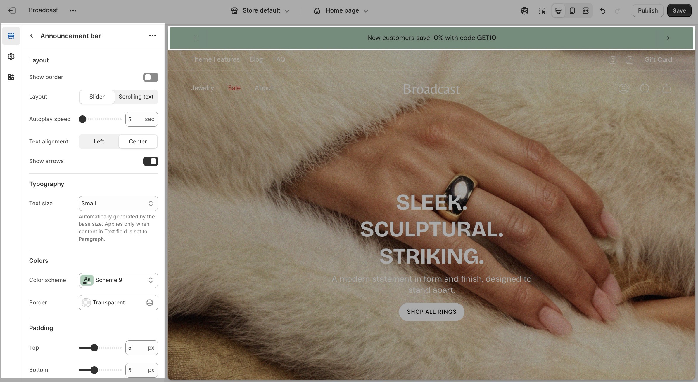
Broadcast Documentation
NewSupport
Latest version
Latest version
  • About Broadcast
    • Broadcast theme documentation
    • Feature requests
  • Updates
    • What's new in Broadcast
      • Release Notes
      • About v6.2 release
      • About v6.1 release
      • About v6.0 release
      • About v5.8 release
      • About v5.7 release
      • About v5.6 release
      • About v5.5 release
      • About v5.4 release
      • About v5.3 release
      • About v5.2 release
      • About v5.1 release
      • About v5.0 release
      • About v4.0 release
  • Sections
    • Broadcast sections
      • Demo store sections
      • Accordion
        • Text column
        • Image column
        • Icon column
        • Custom code
        • Contact form
      • Accordion group
        • Heading
        • Question
      • Before and After
        • Heading
        • Subheading
        • Text
        • Button
      • Blog posts
      • Collection list
        • Collection
      • Collection list hover
        • Collection
      • Countdown timer
        • Subheading
        • Heading
        • Text
        • Buttons
      • Contact form
        • Email
        • Message
        • Text line
        • Text area
        • Telephone
        • Heading
        • Spacer
        • Single checkbox
        • Select dropdown
        • Radio buttons
      • Custom code
      • Custom content
        • Image
        • Text
        • Newsletter
        • Testimonial
        • Product
        • Video
        • Collection
        • Before and after
      • Divider
      • Featured blog posts
        • Featured post
      • Featured collection
      • Featured product
      • Highlights
        • Highlight
      • Image banner
        • Heading
        • Text
        • Single button
        • Side by side buttons
        • Custom code
      • Image with product
        • Heading
        • Text
        • Single button
        • Side by side buttons
        • Custom code
      • Image with scrolling text
        • Scrolling text
        • Heading
        • Text
        • Button
      • Image with text
        • Heading
        • Subheading
        • Text
        • Button
        • Divider
        • Accordion
        • Image
        • Video
        • Product
        • Collection
        • Custom code
      • Image with text slider
        • Text slide
      • Map
      • Multicolumn
        • Image
        • Icon
        • Text
        • Menu
        • Product
      • Newsletter
        • Image
        • Text
        • Newsletter
      • Press logos
        • Logo with header
        • Logo with text
      • Products with image
        • Products
        • Image
      • Recently viewed products
      • Rich text
        • Heading
        • Subheading
        • Text
        • Button
        • Image
        • Divider
      • Rich text with columns
        • Heading
        • Text
        • Buttons
      • Scrolling text
        • Heading
        • Text
        • Free shipping message
        • Custom code
        • Image
        • Collection
        • Advanced text
      • Shop the look
        • Product
      • Sidebar
        • Header
        • Accordion
        • Text
      • Slideshow
      • Tab collections
        • Collection
      • Testimonials
        • Testimonial
      • Text columns with icons
        • Icon
      • Text columns with images
        • Image
      • Text promo
        • Button
        • Heading
        • Text
      • Text with products
        • Collection
        • Product
        • Image
      • Timeline
        • Timeline
      • Video
  • Theme settings
    • Theme settings
      • Colors
      • Typography
      • Buttons
      • Layout
      • Search
      • Social media
      • Product grid
      • Product form
      • Swatches
      • Favicon
      • Cart
      • Currency format
  • Header
    • Announcement bar
      • Announcement bar section
      • Text announcement
      • Free shipping message
      • Custom code
      • Countdown timer
      • Target settings
    • Header
      • Demo store header settings
      • Section settings
        • Transparent header
        • Quantity indicators
        • Social icons
        • Navigation images
      • Header blocks
        • Image
        • Toolbar
    • Mobile menu
      • Section settings
      • Blocks
        • Menu
        • Menu columns
        • Image
        • Icon
        • Text
        • Button
        • Review
        • Language and currency
        • Social media
        • Collection
        • Product
        • Divider
        • Search bar
  • Footer
    • Footer sections
      • Logo
      • Supporting menu
    • Footer settings
    • Footer blocks
      • Link list
      • Newsletter
      • Social
      • Text
      • Page
      • Divider
  • Products
    • Product pages
      • Settings and layout
      • Final Sale
      • Out-of-stock notification
      • Pre-order using metafields
      • Pre-order products using tags
      • Sale items
      • Size charts
      • Swatches (Updated)
      • Swatch collection styles
  • Product Theme Blocks
    • Title
    • Price
    • Variant picker
    • Buy buttons
    • Siblings
    • Description
    • Tabs
    • Accordion
    • Upsell
    • Inventory countdown
    • Sharing
    • Local pickup
    • Text
    • Custom code
    • Icon
    • Divider
    • Line item property
    • Feature
    • Complementary products
    • Popup
    • Badges
    • SKU
    • Fit guide
    • Countdown timer
  • Product recommendations section
    • Related products
    • Recently viewed products
  • Collections
    • Collection pages
      • Collection products
        • Featured image
      • Subcollections
      • Swatch collection styles
      • Product badges
      • Product badges with metafields
      • Product filtering
      • Quick add
      • Cutline second line
  • Pages
    • Page templates
      • Demo store about page
      • Page section
      • Creating page templates
      • About page templates
  • Blogs
    • Blogs
      • About blogs and articles
      • Featured blog posts
        • Featured post
    • Blog posts
      • Article page
        • Navigation
        • Related products
        • Recent articles
        • Default image
      • Product links in blog posts
  • Overlay
    • Cart drawer
      • Title
      • Cart message
      • Free shipping message
      • Products
      • Upsell products
      • Order note
      • Gift note
      • Shipping estimate
      • Icon
      • Product list
      • Custom code
      • Payment icons
      • Checkout buttons
    • Newsletter
      • Popup
      • Mini popup
    • Text promotion
    • Additional settings
  • Promotions
    • Upselling
      • Upselling with metafields
      • Upselling with tags
  • Siblings
    • Product siblings
      • About product siblings
      • How to setup siblings
      • Siblings metafields
      • Siblings color
      • Siblings collection
      • Siblings product setup
      • Siblings block
      • Customizations
  • FAQ
    • Frequently asked questions
      • How to update Broadcast
      • Default theme content
      • Share preview link
      • Hiding prices
      • How to use sections
      • Section blocks
      • How to remove Powered by Shopify
      • Improving the speed of your site
      • How to prevent your images from getting cropped
      • Check your theme version
      • CSS customizations
      • Missing Cart Drawer after Updating
  • License
    • Theme license
  • Support
    • Theme support policy
    • Contacting support
    • Hire a Shopify Expert
Powered by GitBook
On this page
  • Section settings
  • Learn more
Export as PDF
  1. Header
  2. Announcement bar

Announcement bar section

Announcement bar section settings and options

PreviousAnnouncement barNextText announcement

Last updated 17 days ago

The Announcement Bar is a flexible and customizable section designed to highlight key messages across your storefront, such as promotions, shipping offers, or limited-time campaigns. You can configure the layout, typography, and display logic, and add multiple content block types, including text, messages, countdowns, and custom code.

Section settings

Settings
Type
Description

Layout

Show border

checkbox

Displays a border around the announcement bar.

Layout

select

Determines how multiple messages are displayed: Slider rotates content, or Scrolling text scrolls continuously.

Slider

Autoplay speed

range

Interval in seconds between slide transitions.

Text alignment

select

Horizontal alignment of the text content: Left ot Center.

Show arrows

checkbox

Shows navigation arrows for manual control.

Scrolling text

Autoplay speed

range

Controls the speed of the marquee animation.

Space between messages

range

Sets spacing between scrolling announcements.

Typography

Text size

select

Controls the font size of paragraph text. Options include: Extra small, Small, Medium, Large, or Extra large. Applies only when content is in <p> tags.

Colors

Color scheme

color_scheme

Applies a theme-wide color palette.

Border

color

Custom color for the announcement bar’s border (if enabled).

Padding

Top / Bottom

range

Adds vertical padding above or below the announcement bar.

Learn more

Video overview of the different styles and settings to configure the Announcement bar in Broadcast:

Video: Main section settings and options