Colors
Color schemes and settings
The colors configuration defines the color system used across the theme, including sections, buttons, headers, and product highlights.
It provides flexibility through color schemes, background gradients, and transparency, ensuring brand consistency and visual harmony across all sections.

If you're updating from an earlier version of Broadcast, you can view your site's colors from the live theme. This will be helpful when you're building the newer version as a Draft.
The Shopify update tool cannot copy your original colors. However, you can view them from the live theme and create new color schemes with the latest version.
Color settings
Configure your brand colors in the color settings. These color elements are used in all the general sections, the header, and all other pages.

Tip: These are your primary brand colors used throughout the theme. Some sections or blocks have their own color settings for even greater control.
Here are some common color elements to demonstrate how the color settings work:
Color schemes
The color schemes group defines all the color values used throughout the theme. Each subsection provides customizable color inputs with default values and optional transparency.
Light background
The light background setting is used for background accents like the coupon message in the cart drawer. It's also used in the free shipping indicator with the bright accent color setting.

Additional
The additional color group defines supporting and utility colors that enhance the overall visual experience of the theme.
Accent
A highlight color that can be used to draw attention to important elements such as active states, badges, or promotional highlights. It reinforces brand personality and adds visual emphasis.

Header
The header color group controls the visual presentation of the site’s main navigation area, including the top bar, dropdown menus, and transparent header states.
It ensures that navigation elements are readable, accessible, and visually aligned with the overall brand design.
Background
This is the background color of the main navigation bar. It provides a neutral foundation for logos and navigation links. Typically white or a light neutral tone for modern designs.

Navigation
The text color for header navigation links. It must contrast strongly with the menu color to ensure readability and accessibility.

Dropdown background
The background color for dropdown (submenu) panels that appear beneath main navigation links.
Ensures clear separation from the main header and easy legibility.

Dropdown navigation
Text color for links inside dropdown menus. Matches or complements the main navigation link color for consistency.

Transparent navigation
The color applied to header links and icons when the header is transparent (for example, when placed over hero images or videos). Used to maintain contrast and readability in overlay designs.

Note: When using a transparent header, these colors are used when the dropdown is activated. The transparent header has a separate setting while inactive. That setting is in the next group.
Product
The product color group defines the visual styling for product-related elements, particularly those used in pricing, promotions, and sales indicators across the storefront.
Sale
A bold, attention-grabbing color can be used to highlight sale prices, promotional badges, or discount labels.

Tip: Use a color that will convey urgency and encourage engagement.
Contrast
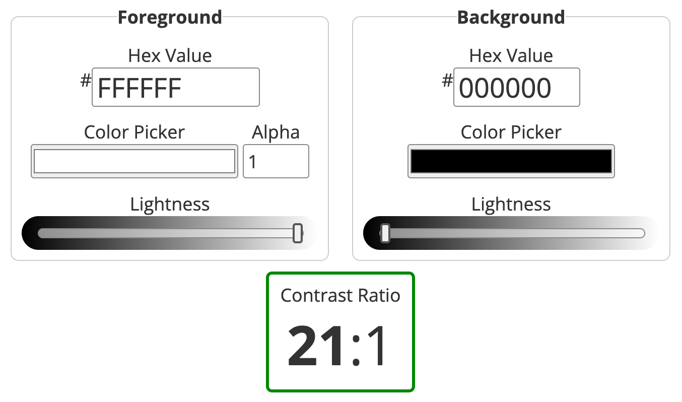
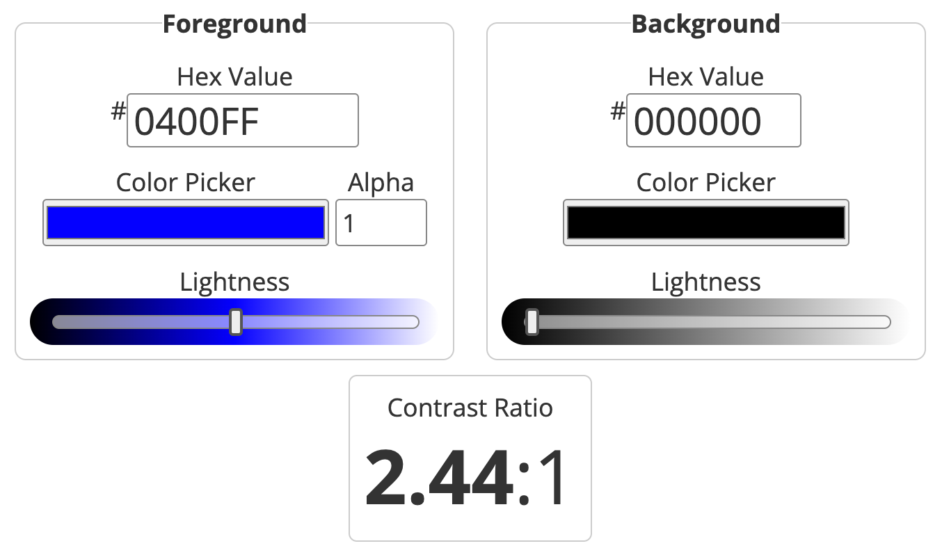
Try to use colors that are high in contrast. It will make your text easier to read. Here is a great contrast checker:
Example of a good score, 21:1 - White foreground on Black background:

Poor score, 2.44:1 - Blue foreground on Black background:

Last updated