The buttons configuration defines all typographic and stylistic properties for buttons throughout the theme. It ensures consistent button design across sections, maintaining cohesive typography, shape, and spacing.
This configuration allows control over:
Font, style, and font size
Letter spacing and uppercase
Different button sizes
Font
Broadcast allows you to choose any font from the Shopify font library for the buttons in your theme.
Changing the button font type
Style
Broadcast includes different button style options. In these settings, choose a style that will be applied to all buttons throughout your shop. Button shapes included are square, rounded, and pill.
The pill shape brings a modern design to buttons, with a large radius on each corner. Shorter buttons, like variant options, will appear circular.
Pill style
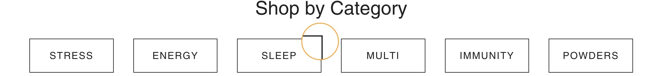
The square shape has 90-degree corners on all sides.
Square style
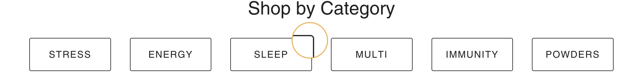
Similar to the square style, the rounded style has slightly rounded corners.
Rounded style
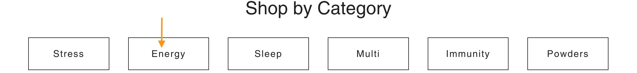
There is an option to force uppercase lettering inside the buttons. Uncheck the option to display lettering as it is entered in the button text fields, or check the option to make all letters uppercase.