> For the complete documentation index, see [llms.txt](https://broadcast.presidiocreative.com/llms.txt). Markdown versions of documentation pages are available by appending `.md` to page URLs; this page is available as [Markdown](https://broadcast.presidiocreative.com/updates/whats-new-in-broadcast/about-v5.1-release.md).
# About v5.1 release
Additional information on recent Broadcast updates
### Featured product section
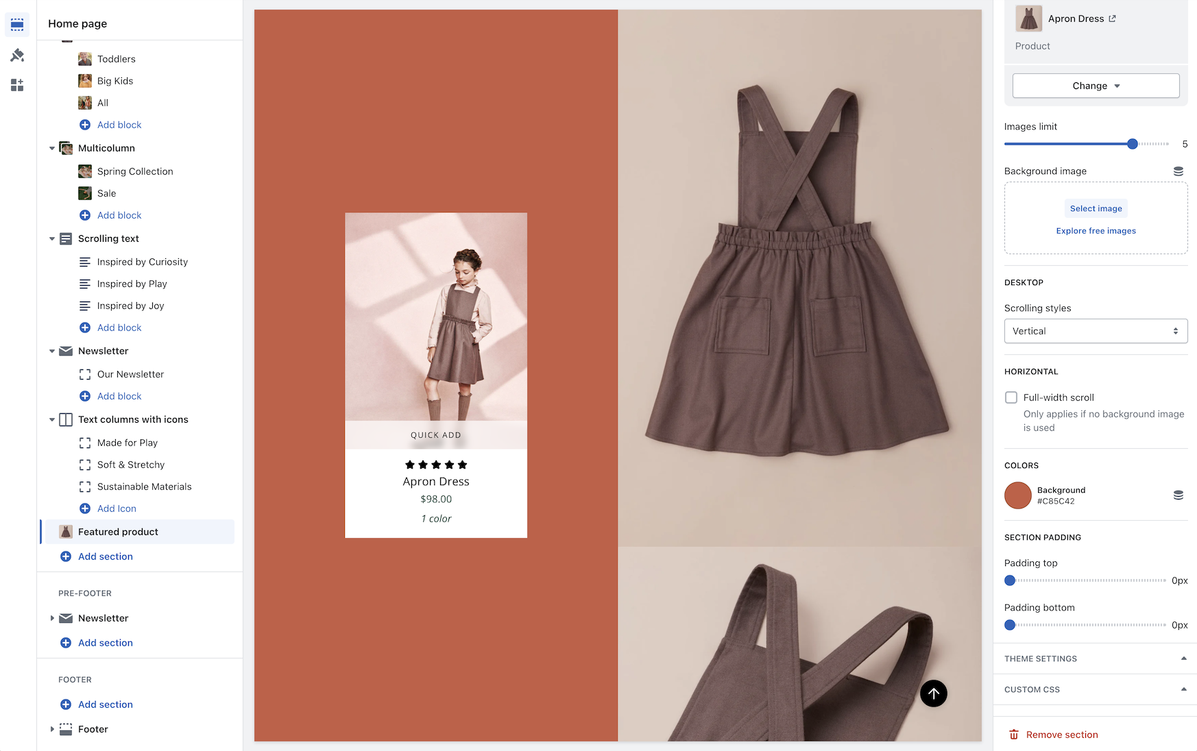
Fresh new design for the featured product section with new image scrolling options and additional section settings:
Discover the new vertical and horizontal image scrolling options with this quick video:
{% embed url="" %}
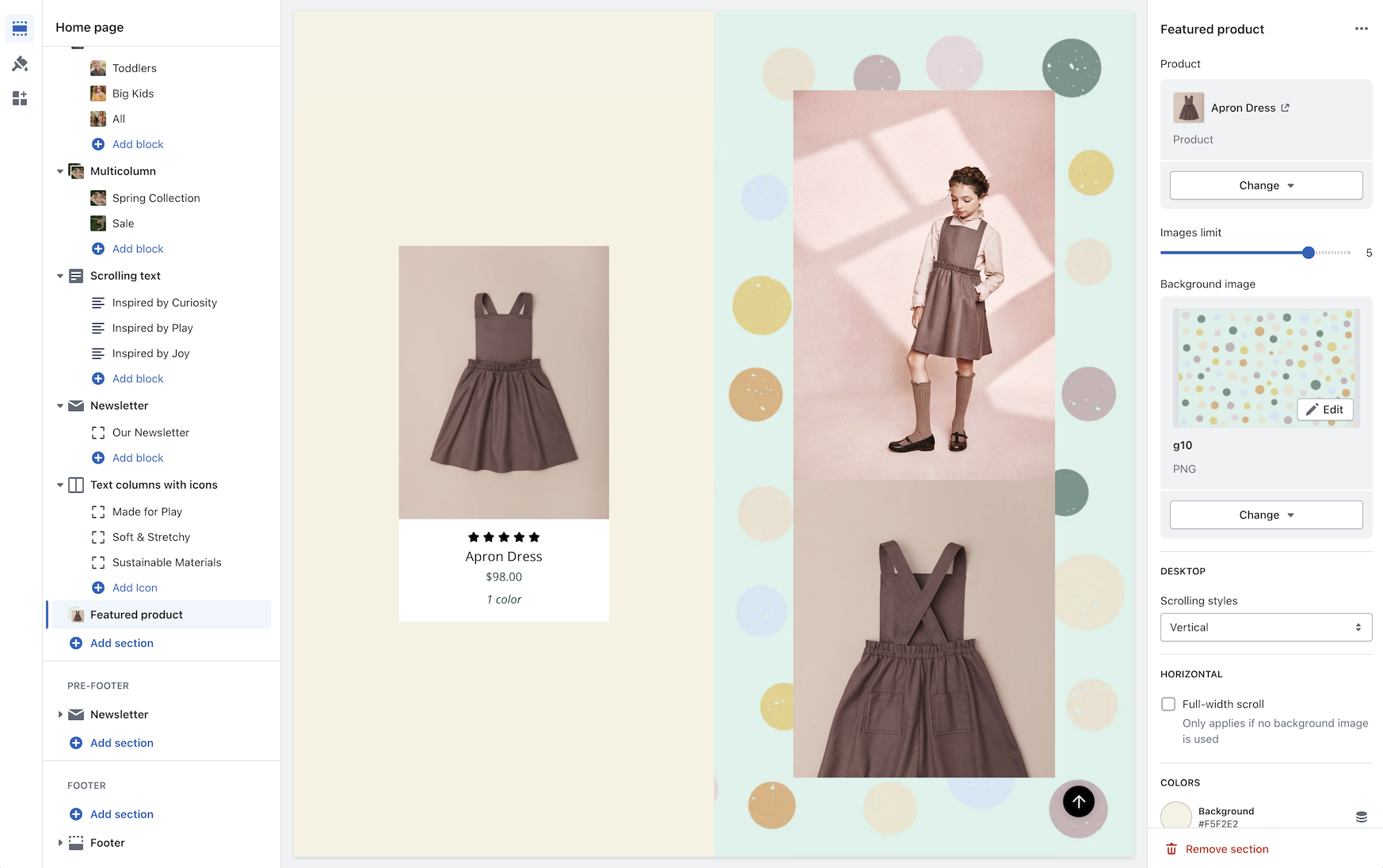
You have the option to add a background image to enhance the appearance of the section:
{% hint style="info" %}
Note: When a background image is used, the full-width horizontal scrolling effect is disabled. Vertical scrolling and regular horizontal scrolling are not affected.
{% endhint %}
### Image with text slider section
A new section added to Broadcast is a two-column image and text section with multiple text blocks. You can now add multiple text blocks that customers can slide through for additional information.
Watch this short video walk-through on the section and block settings:
{% embed url="" %}
On mobile devices, the images will rotate automatically and customers can swipe through the text blocks:
{% embed url="" %}
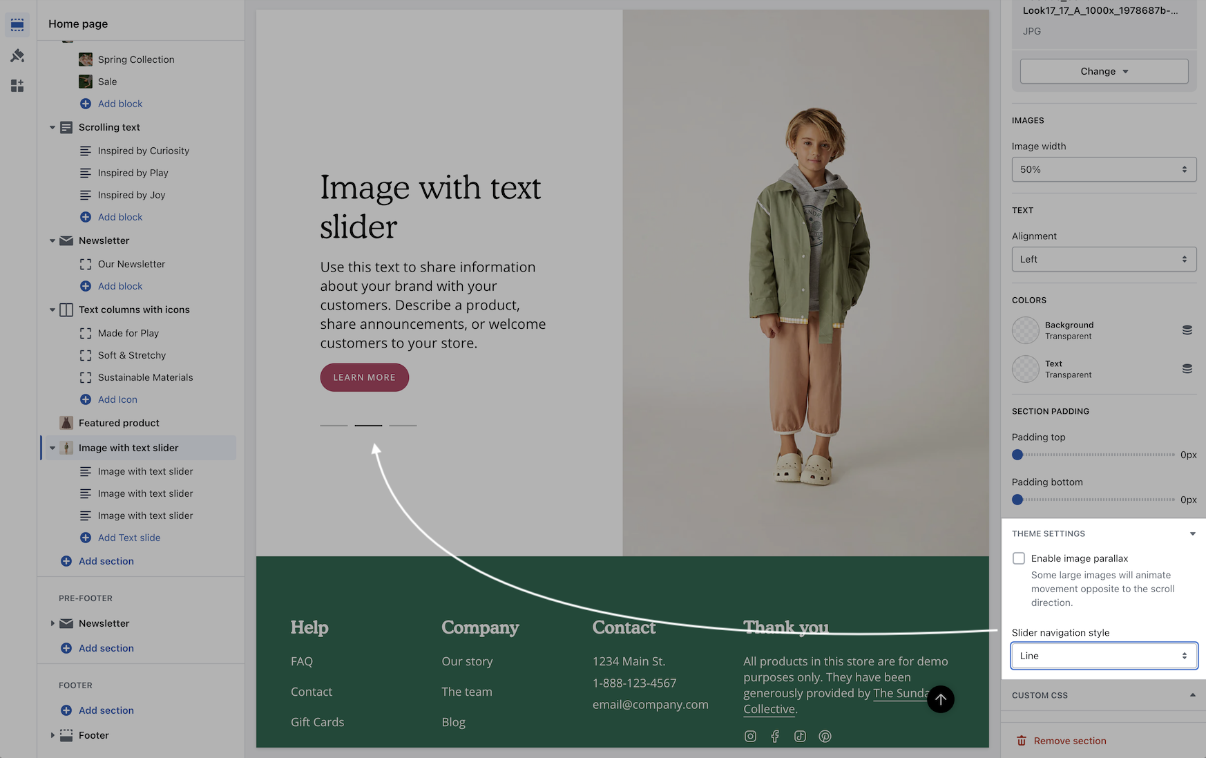
The slider navigation style can be adjusted under the Theme settings:
### Color swatches
Swatches are now easier to manage and control. All the settings for color swatches around are found under Theme Settings -> Swatches
Key changes
* Color codes are now managed under the Theme settings.
* Swatch Images are now used from the Shopify files.
* Siblings can now use a color swatch instead of a product image.
Video walk-through on all the changes:
{% embed url="" %}
### Tab collection section
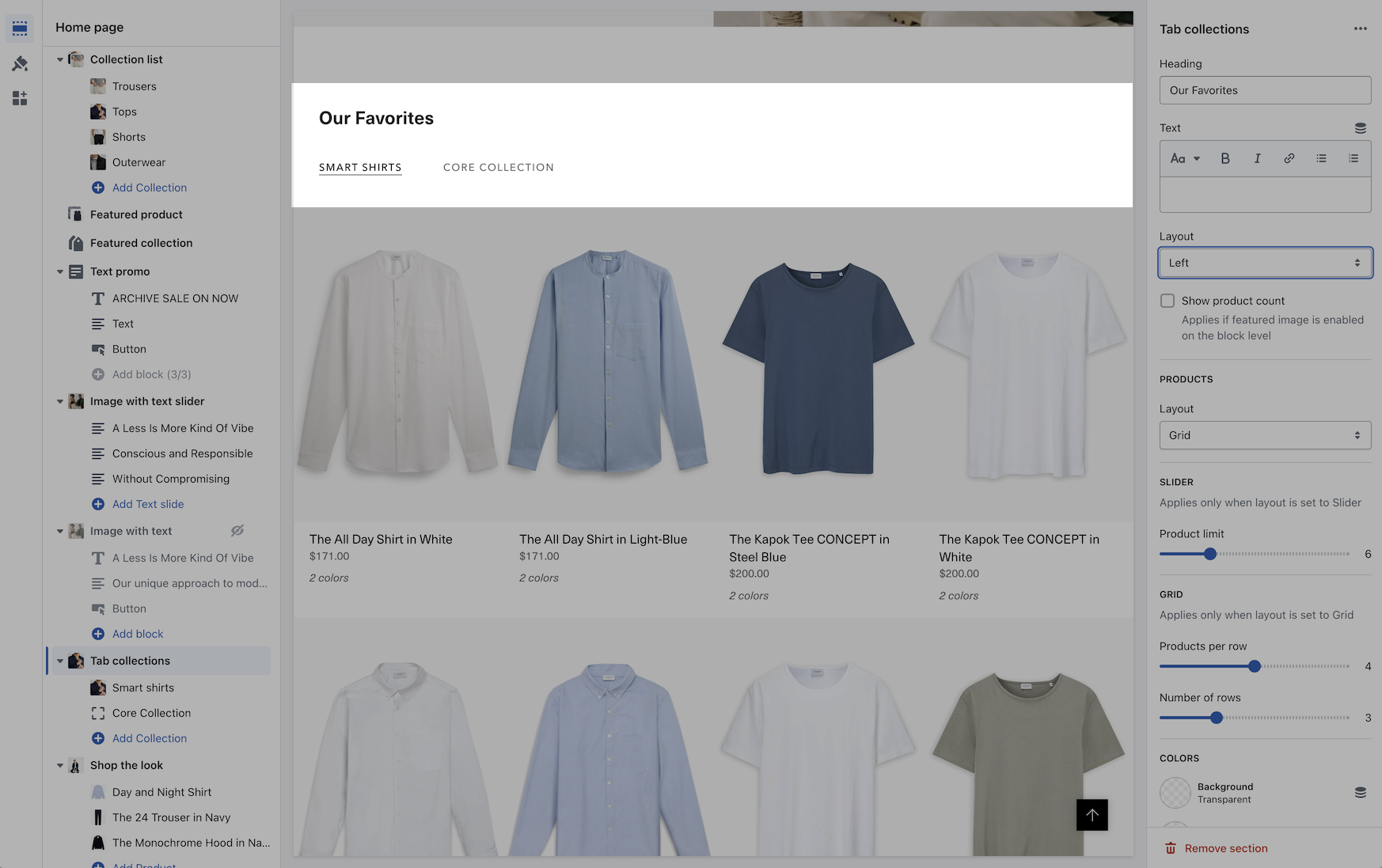
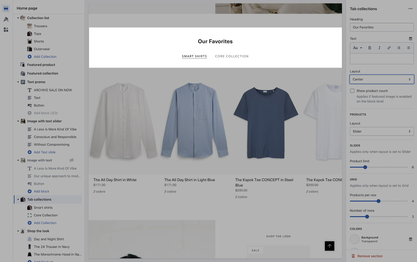
A new grid layout option for the desktop has been added for displaying the products within a tabbed collection. You can easily choose between the slider style or the new grid option:
{% embed url="" %}
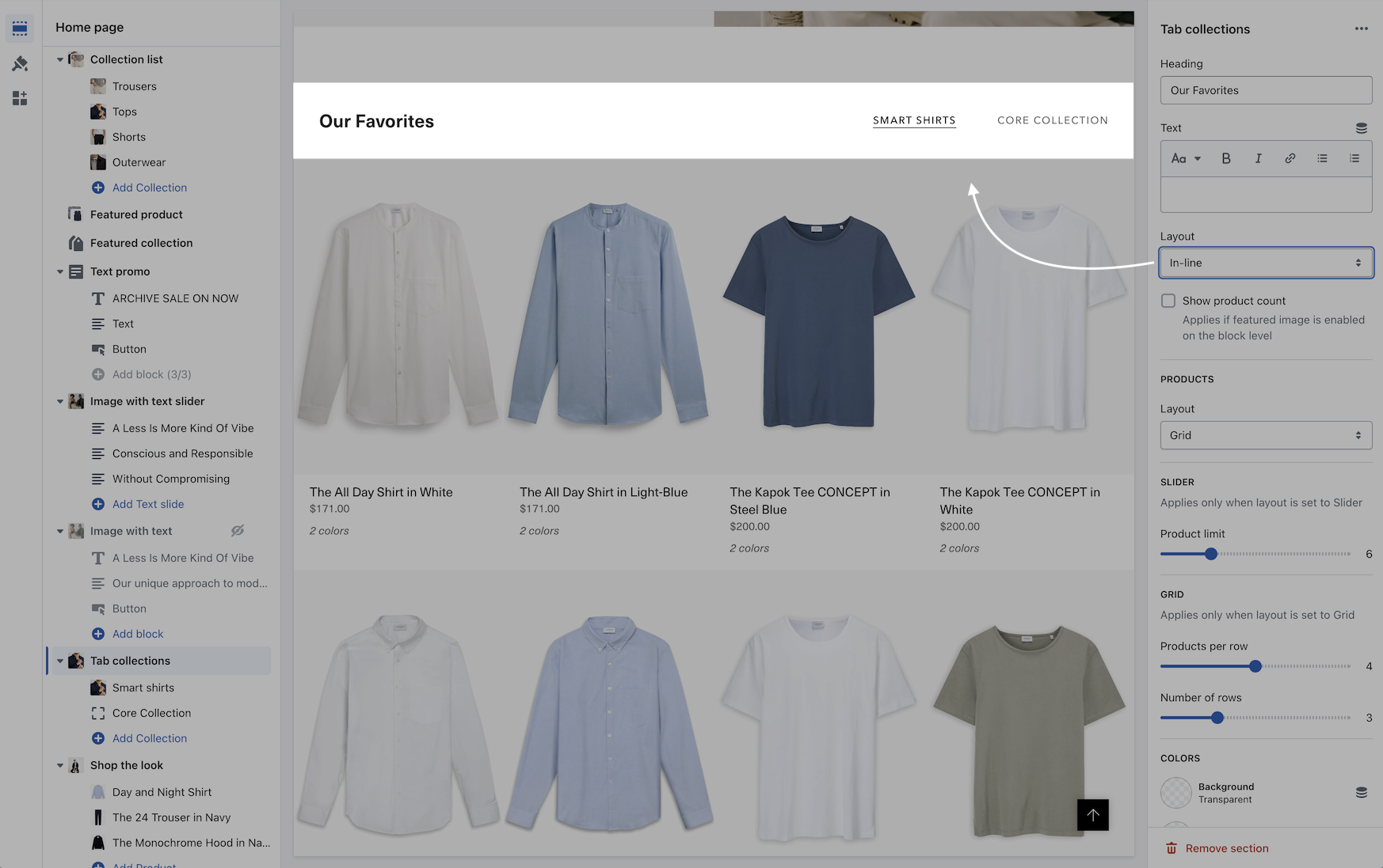
In addition to the product layout, you can position the tabs with different layout options:
In-line
Left aligned
Center aligned
### Scrolling text section
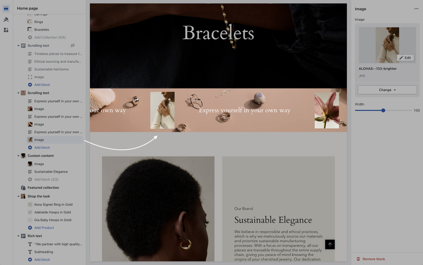
You can now add a background image to the scrolling text section and also image blocks in-line:
Video overview - Scrolling text updates:
{% embed url="" %}
### Header line
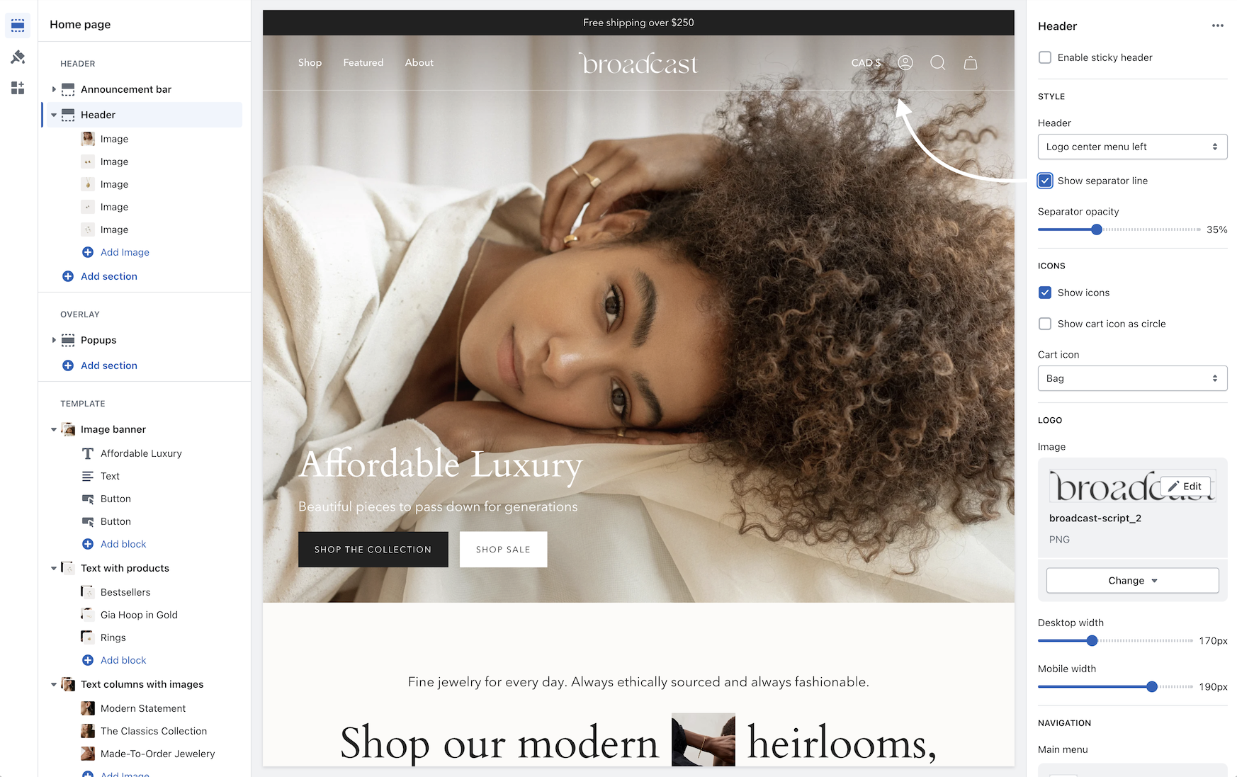
An option has been added to help build a separation between the header and content:
Use the separator opacity slider to adjust the transparency of the line.
### Header sizing
You can now adjust the padding in the header area to make larger or tighter headers:
{% embed url="" %}
### Cart
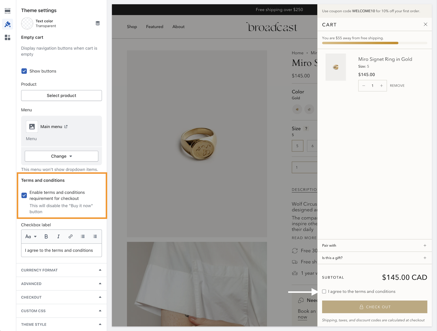
A terms and conditions checkbox option has been added:
Use the Theme settings -> Cart to toggle. When enabled, the customer must check the box in order to proceed with checkout.
---
# Agent Instructions
This documentation is published with GitBook. GitBook is the documentation platform designed so that both humans and AI agents can read, navigate, and reason over technical content effectively. Learn more at gitbook.com.
## Querying This Documentation
If you need additional information that is not directly available in this page, you can query the documentation by asking a question.
Perform an HTTP GET request on the following URL with the `ask` and `goal` query parameters:
```
GET https://broadcast.presidiocreative.com/updates/whats-new-in-broadcast/about-v5.1-release.md?ask=&goal=
```
`ask` is the immediate question: it should be specific, self-contained, and written in natural language.
`goal` is what the user is ultimately trying to achieve, the reason they need the answer. Sharing it helps GitBook give you a better, more relevant answer. A goal is most helpful when it describes the outcome the user wants rather than restating the question. For example, with `ask=how do I create an API token`, a goal like `automate deployments from our CI pipeline` lets GitBook tailor the answer to that use case.
The response will contain a direct answer to the question and relevant excerpts and sources from the documentation.
Use this mechanism when the answer is not explicitly present in the current page, you need clarification or additional context, or you want to retrieve related documentation sections.