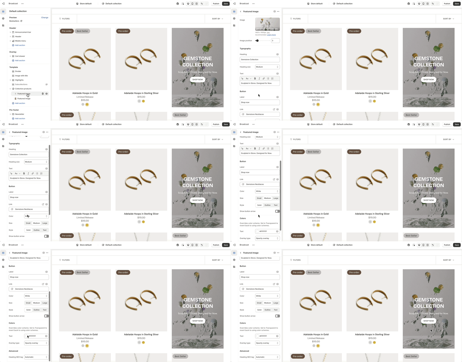
Expand Collection products to add and configure Featured image

Expand Collection products to add and configure Featured image
| Settings | Type | Description |
|---|---|---|
| Image | image_picker | Image shown (recommended 1400x1400px .jpg). |
| Image position | range | Placement order (1-24). |
| Typography | ||
| Heading | text | Heading displayed on the featured image. |
| Heading size | select | Font size options: Mini, Extra small, Small, Medium, Large, or Extra large. |
| Text | richtext | Descriptive text below the heading. |
| Button | ||
| Label | text | Button label text. |
| Link | url | URL the button will link to. |
| Color | select | Color style: Black, White, Primary, or Secondary. |
| Size | select | Size: Small, Medium, or Large. |
| Style | select | Style: Solid, Outline, or Text. |
| Show button arrow | checkbox | Shows an arrow next to the button label if enabled. |
| Colors | ||
| Text | color | Text color (overrides theme color scheme). |
| Overlay type | select | Adds an overlay: Disabled, Opacity, or Text underlay. |
| Advanced | ||
| Heading SEO tag | select | HTML heading tag for SEO: Automatic, or H1-H6. |