Buttons
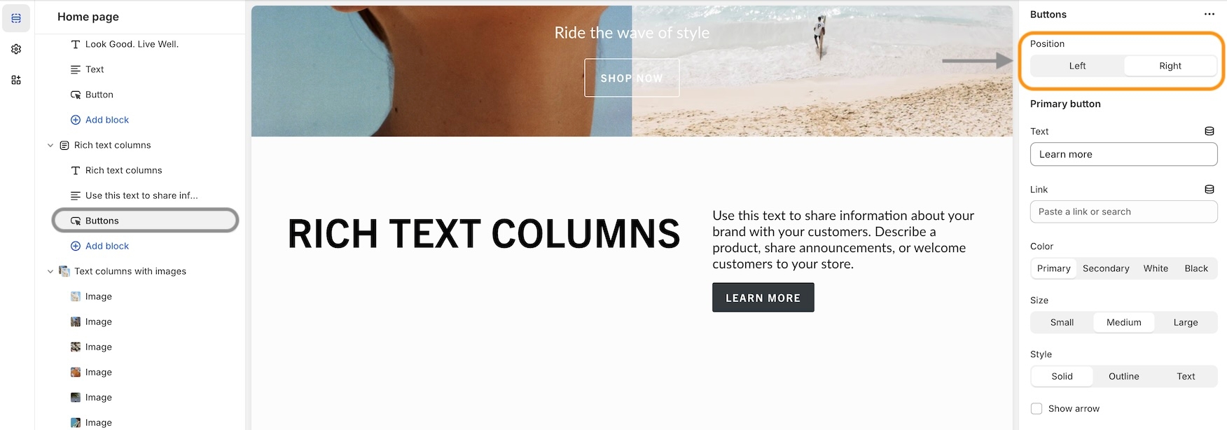
Build your content and then move it to the left or right columns. Each block has a position option for column placement:
Column
select
Places button(s) in Left or Right column.
Primary button
Text
text
Text for the primary button.
Link
url
Link for the primary button.
Color
select
Color of the button. Options: Black, White, Primary, or Secondary.
Size
select
Size of the button. Options: Small, Medium, or Large.
Style
select
Button style. Options: Solid, Outline, or Text.
Show arrow
checkbox
Displays arrow icon in the primary button.
Secondary button
Text
text
Text for the secondary button.
Link
url
Link for the secondary button.
Color
select
Color of the secondary button: Black, White, Primary, or Secondary.
Size
select
Size of the secondary button: Small, Medium, or Large.
Style
select
Style of the secondary button: Solid, Outline, or Text.
Show arrow
checkbox
Displays arrow icon on secondary button.
Padding
Bottom
range
Space below buttons block.
Last updated