Highlights
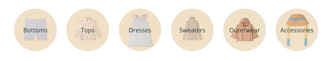
Display navigation-style links with shapes and colors
Highlight links in your store in colorful shapes and sizes to help your customers find your products and services. The Highlights section in Broadcast is fast and simple to set up.
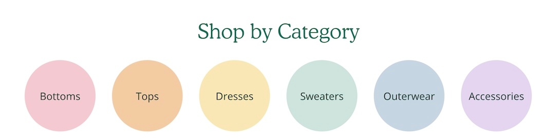
The section can be used to build a separation between your content. Use it on the homepage, product pages, blogs and other pages.
The shapes and color options help you build the right highlights for your brand. Links can be used as a secondary navigation for your pages.
Section settings
Content
Style
select
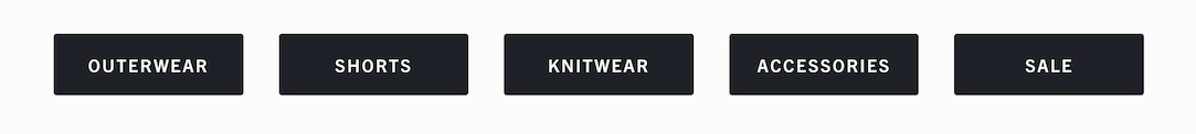
Choose highlight shape: Square, Rectangle, Circle, or Button.
Highlights per row
range
Sets number of highlights per row.
Typography
Heading
text
Section heading text.
Heading alignment
select
Align heading text to Left or Center.
Heading size
select
Choose heading size from Mini, Extra small, Small, Medium, Large or Extra large.
Highlight text size
select
Controls the font size for paragraph content in highlights: Extra small, Small, Medium, Large or Extra large.
Layout
Width
select
Choose section width: Full width padded, Normal, or Narrow.
Mobile
Layout
select
Choose layout: 1 highlight per row, 2 highlights per row, or Slider.
Colors
Color scheme
color_scheme
Apply a predefined color scheme.
Padding
Top
range
Top padding in pixels.
Bottom
range
Bottom padding in pixels.
Advanced
Heading SEO tag
select
Sets HTML heading level: H1–H6 or Automaticto improve your SEO structure.
Video Overview
This video demonstrates the section settings and block options for the Highlights section, including mobile layouts:
Last updated