Accordion
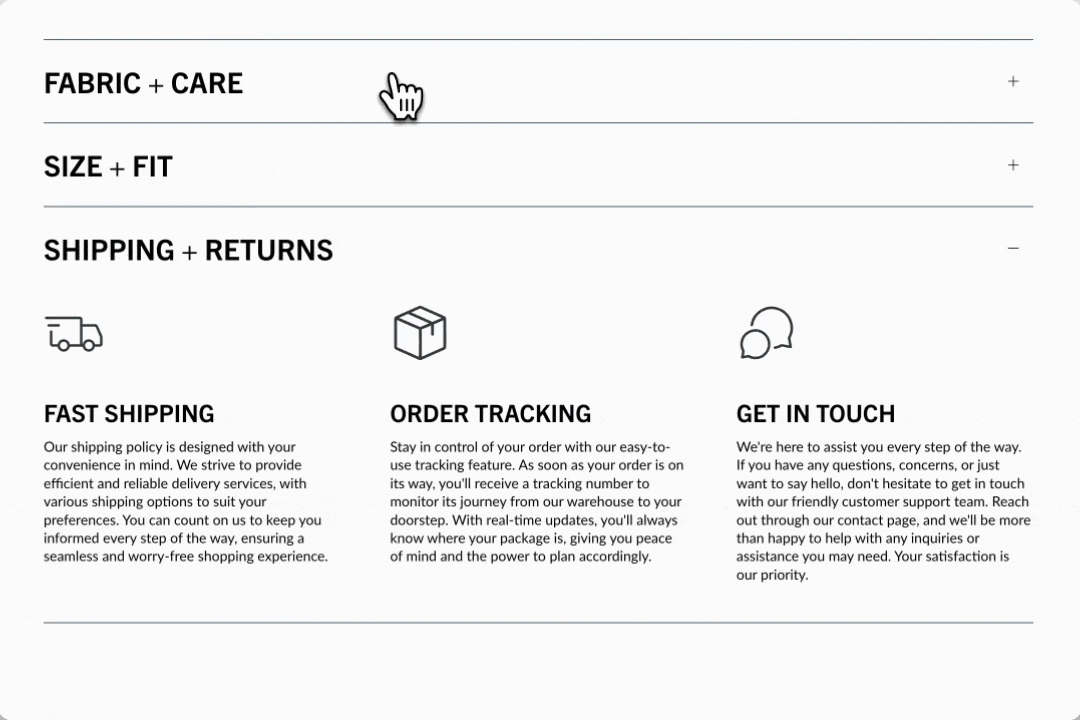
Enhanced accordion with image columns, icon columns, a contact form and more
This Broadcast section is packed with full-featured accordion blocks to help you design and build rich, interactive content. Display columns of rich content, such as images, icons with messaging, and text.
Section settings
Build rich accordions on the home page, a lookbook, product pages, or anywhere on your site. Choose from a rich set of content blocks to display eye-catching information. Stack multiple accordion sections together to incorporate multiple column sizes.
Open by default
checkbox
When enabled, the first accordion item is expanded by default.
Typography
Heading
text
Main heading for the section. Hidden if left blank.
Heading size
select
Controls the size of the section heading. Options: Mini, Extra small, Small, Medium, Large, or Extra large.
Icon
Show icon
checkbox
Toggle visibility of icons for each item.
Icon
select
Choose from a list of themed icons.
Alternative icon/image
image_picker
Upload a custom image.
Size
range
Set the size of the icon/image.
Layout
Width
select
Choose between Normal or Narrow container width.
Colors
Color scheme
color_scheme
Select a predefined color scheme.
Icon
color
Set a custom icon color.
Padding
Top
range
Add top padding.
Bottom
range
Add bottom padding.
Video Overview
This video demonstrates how to create image, icon and text accordions in Broadcast:
See also
For pages with longer question-and-answer style content, Broadcast has a unique Sidebar section that automatically generates navigation to groups of questions or content:
SidebarFor a simple text-based question-and-answer section that supports one or two columns, Broadcast includes the Accordion group section:
Accordion groupLast updated