Collection list
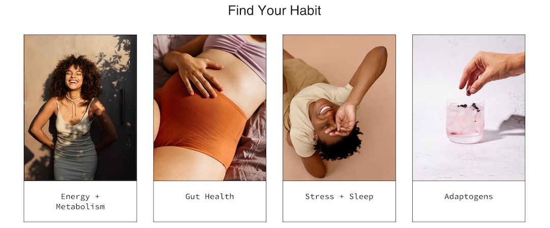
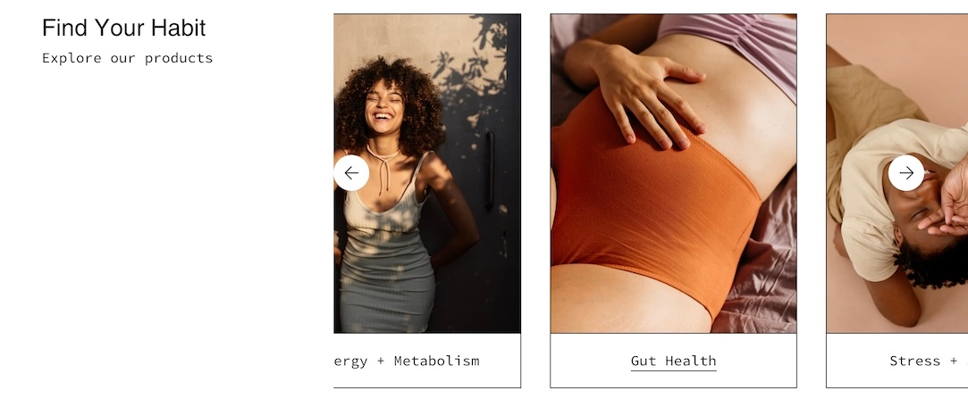
Display a selection of collections with images and links
Drive more sales by guiding customers to your featured collections. The Collection list section in Broadcast lets you create organized displays that simplify shoppers navigating and finding their desired products.
Choose from grid or slider layouts to showcase your best collections and enhance customer engagement.
Section settings
Typography
Heading
text
Title text for the section.
Heading size
select
Choose the font size of the heading: Mini, Extra small, Small, Medium, Large, orExtra large.
Text
richtext
Optional subheading or description text below the heading.
Text size
select
Size of the text: Extra small, Small, Medium, Large, orExtra large (only applies to Paragraph content in the Text field).
Button
Text
text
Button label text.
Link
url
URL the button links to.
Color
select
Choose the button color: Black, White, Primary, or Secondary.
Size
select
Button size: Small, Medium, or Large.
Style
select
Button style: Solid, Outline, or Text.
Show arrow
checkbox
Enable to display an arrow icon in the button.
Images
Image aspect ratio
range
Ratio of image width to height.
Layout
Width
select
Section width: Full width, Full width padded, or Normal.
Layout
select
Display layout: Grid or Slider.
Grid
Collections per row
range
Number of collections shown per row.
Mobile
Layout
select
Mobile layout: 1 collections per row, 2 collections per row, or slider.
Colors
Color scheme
color_scheme
Choose the visual color scheme for the section.
Padding
Top
range
Padding above the section.
Bottom
range
Padding below the section.
Advanced
Heading SEO tag
select
Choose an HTML heading tag: H1–H6 or Automatic, for SEO structure.
Video Overview
This short video demonstrates some of the settings and options for the Collection list section:
Last updated