Image banner
Display a single or split images hero-style banner
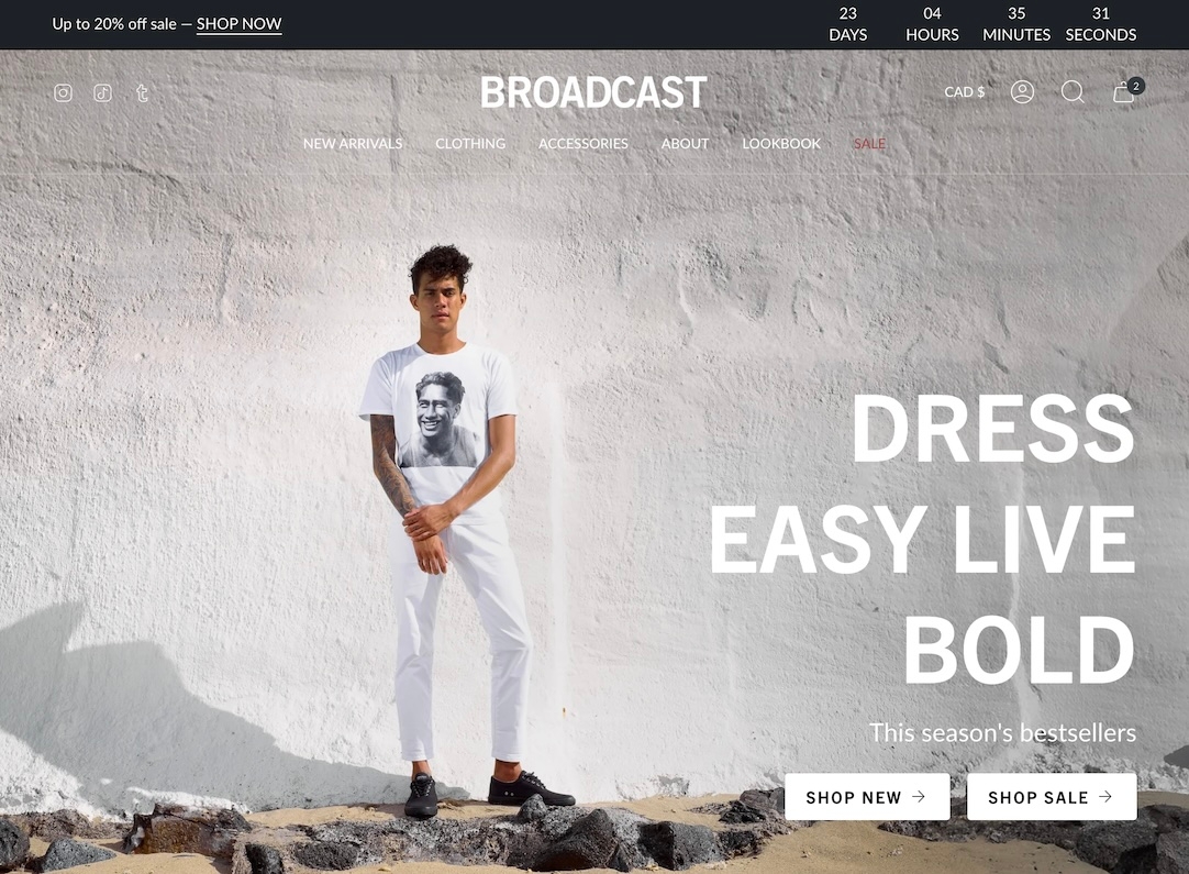
Restricts overlay to only the area behind the text. Requires Overlay opacity > 0.Broadcast's hero-style section lets you quickly build a powerful banner section with one or two split images.
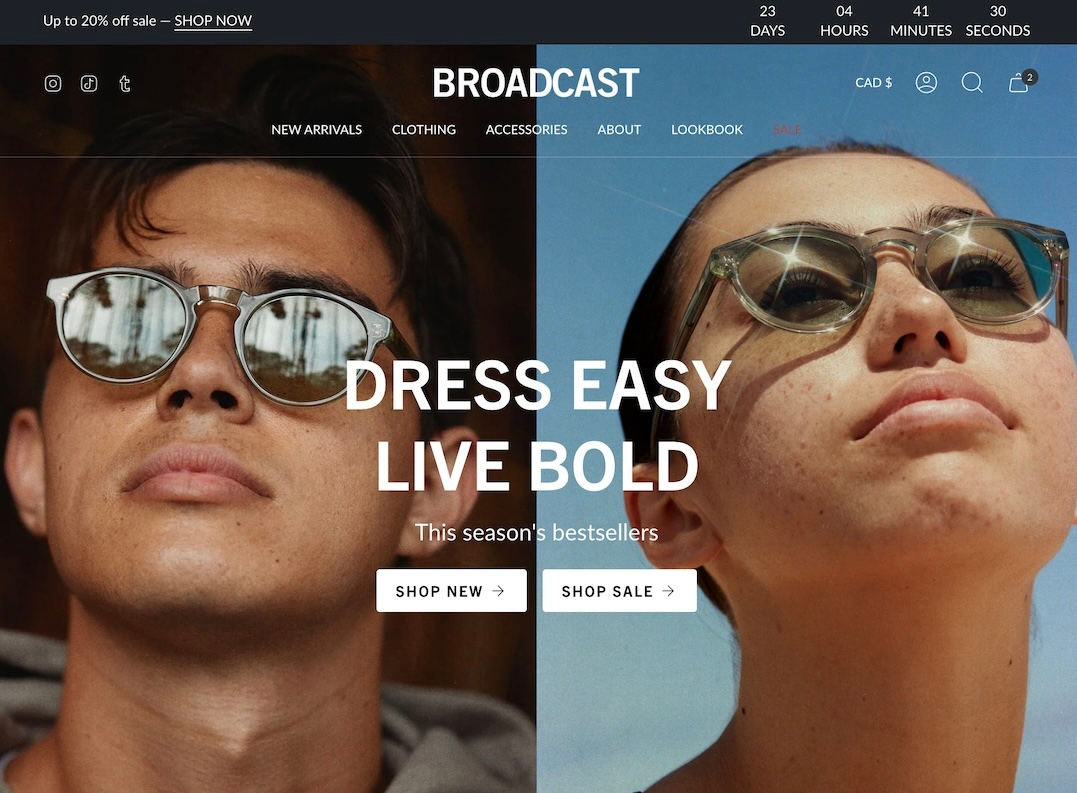
The heading, text, and buttons are blocks that can be placed in different positions to create the perfect branded banner and messaging.
Sectionn settings
Content
Primary image
image_picker
Main banner image. Recommended size: 3200×1200px JPG.
Secondary image
image_picker
Optional second image (displays 50% width). Same size as primary.
Image link
url
Optional link for the image.
Layout
Width
select
Width of the banner: Full width or Full width padded.
Desktop
Height
select
Controls banner height on desktop. Multiple screen height or fixed pixel options
Desktop alignment
select
Alignment of content within the banner for desktop.
Content width
range
Percentage of banner width that content will occupy.
Mobile
Image
image_picker
Optional mobile-specific image (1200×1600px recommended).
Height
select
Controls height on mobile. Options mimic desktop height settings.
Mobile alignment
select
Alignment of content for mobile.
Colors
Color scheme
color_scheme
Select color scheme to apply to this section.
Show text background
checkbox
Adds background behind text for legibility.
Overlay opacity
range
Controls dark overlay on image. Useful for contrast.
Overlay behind text only
checkbox
Restricts overlay to only the area behind the text. Requires Overlay opacity > 0.
Padding
Top
range
Top padding.
Bottom
range
Bottom padding.
Advanced
Show placeholder image
checkbox
Displays a placeholder if no image is selected. Disable for metafields.
Video Overview
This video demonstrates the section settings and block options for the Image banner section, including split-images and mobile options:
Advanced setting
This video discusses the advanced setting option when using the image banner page templates with metafields:
Last updated