Buttons
Settings to configure the default button styles and colors for call to action buttons
Choose the default style and colors for your call-to-action buttons. These button settings allow you to manage the style and appearance of the default buttons. Many sections and blocks will use the choices selected in these settings.
Font
Broadcast allows you to choose any font from the Shopify Font Library for the buttons in your theme. Use the font selector to select the font choice for your buttons.
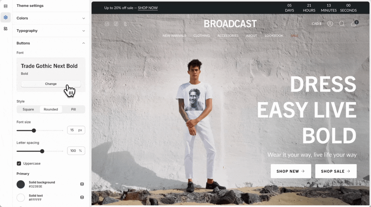
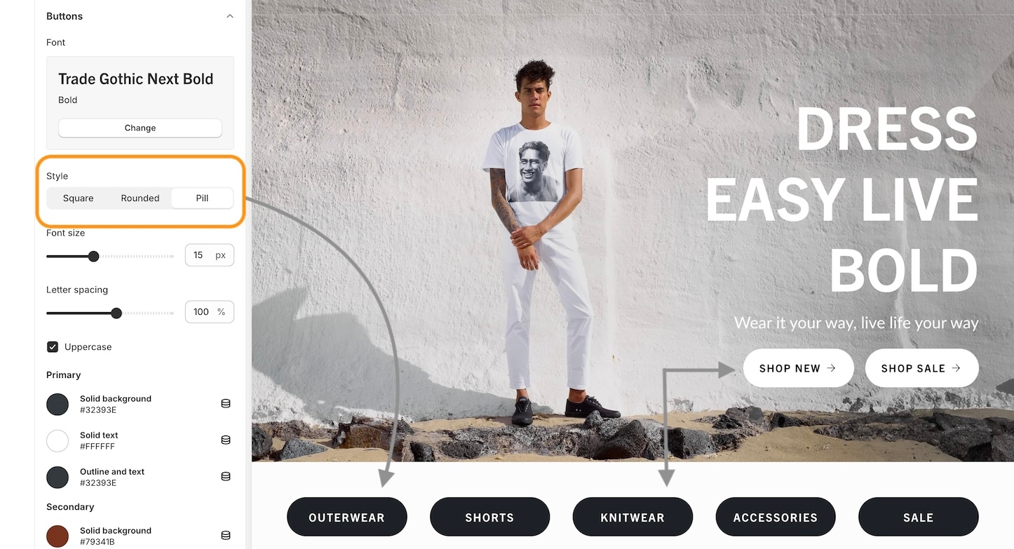
Style
Broadcast includes different button style options. In these settings, choose a style that will be applied to all buttons throughout your shop. Button shapes included are square, rounded, and pill.
The pill shape brings a modern design to buttons, with a large radius on each corner. Shorter buttons like variant options will appear circular.
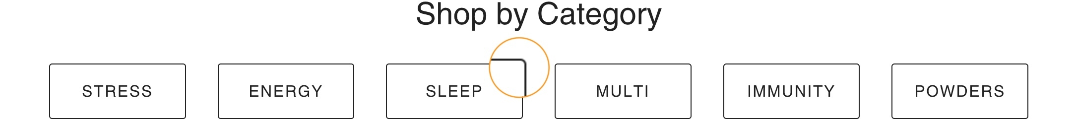
The square shape has 90-degree corners on all sides.

Similar to the square style, the rounded style has slightly rounded corners.
There is an option to force uppercase lettering inside the buttons. Uncheck the option to display lettering as it is entered in the button text fields, or check the option to make all letters uppercase.
Colors
Broadcast includes a range of color settings for the buttons used in the theme. Most sections will have button color options for style and color, including primary and secondary colors, pulled from the theme settings choices.
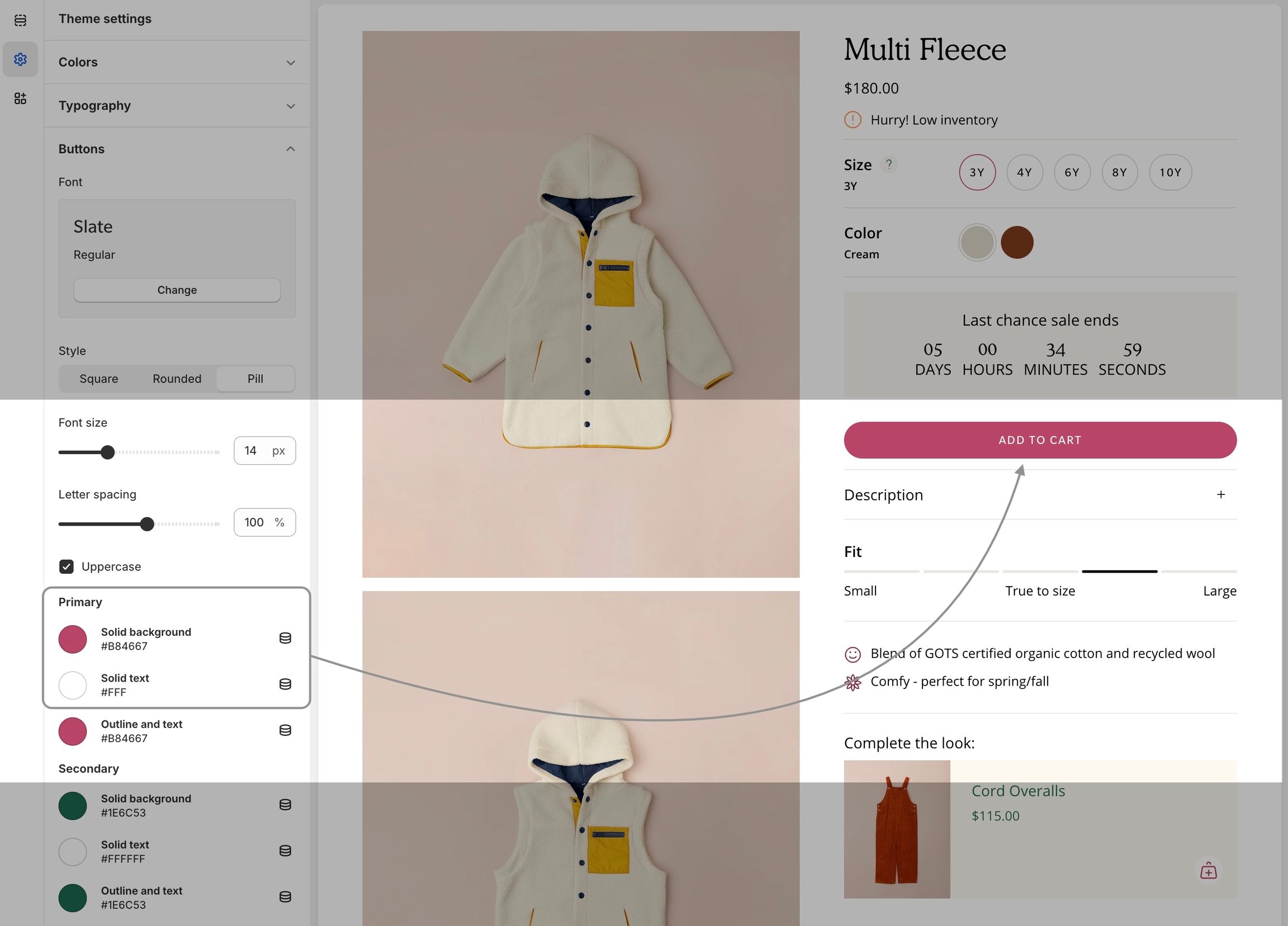
Product pages can display two buttons: an 'Add to Cart' button and a 'Buy it Now' button.
Add to Cart
The 'Add to Cart' button is the default call-to-action button. It's the only button shown unless you configure and set up to use Shopify's 'Dynamic checkout buttons.' When only the 'Add to Cart' button is shown, the primary solid colors are used from the theme settings.
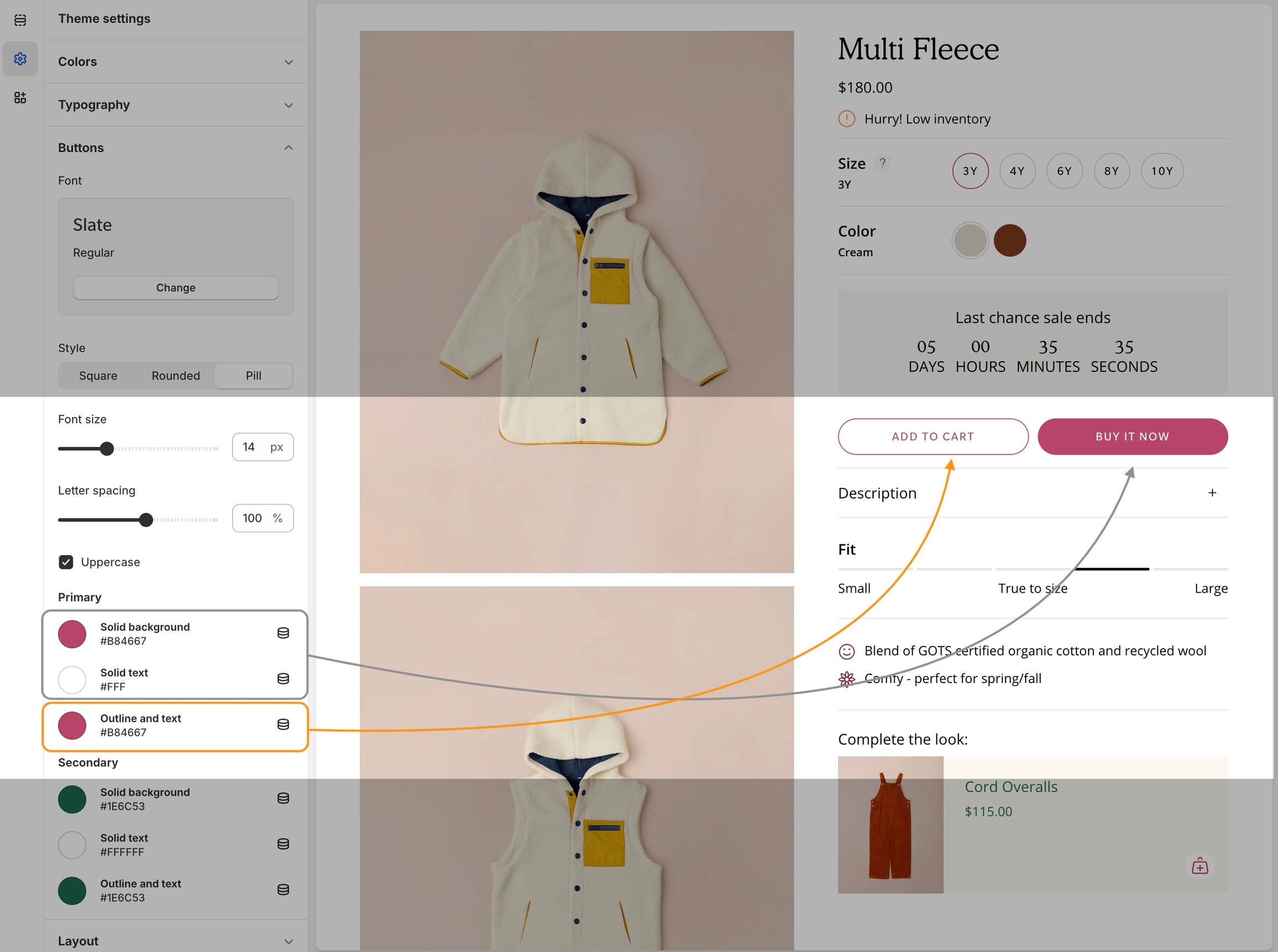
This is the default call-to-action button and uses the Primary solid color choices:
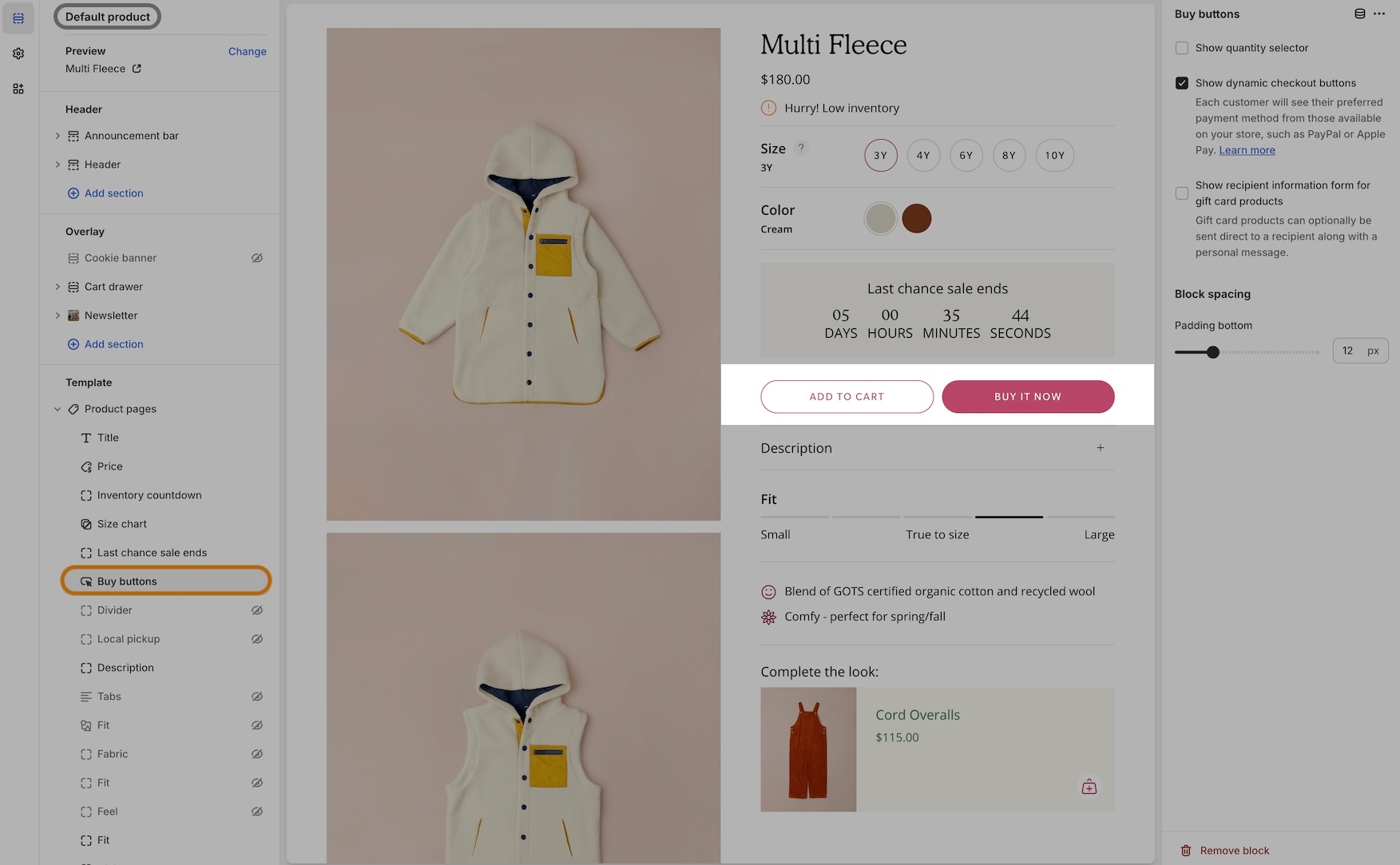
Buy it Now
The 'Buy it Now' button is activated when the 'Show dynamic checkout buttons' option is checked.
When both buttons, 'Add to Cart' and 'Buy it Now,' are used, the 'Buy it Now' button adopts the primary solid background and primary solid text colors.
Video Overview
This video demonstrates how to change colors for the 'Add to Cart' and 'Buy it Now' buttons on product pages in Broadcast:
The video also covers changing the 'Add to Cart' button text.
Secondary
The secondary color options are used for sections and blocks that can choose a button color. You can pre-select secondary button colors and use them throughout the theme.
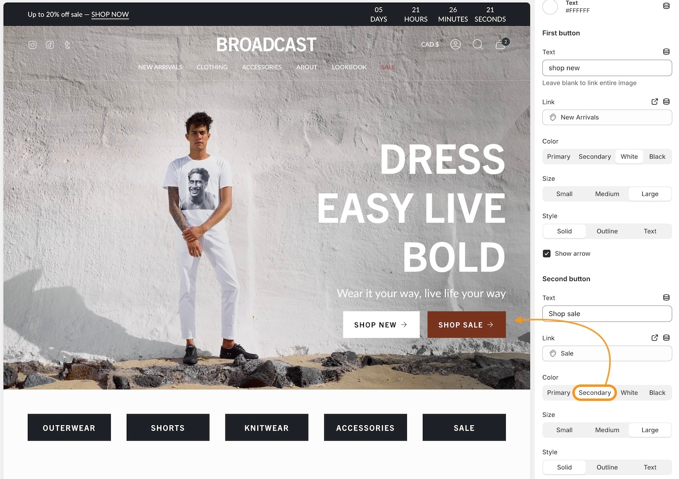
In the example below, two buttons are displayed for the slideshow slide. The second is using the color settings from the secondary color palette:
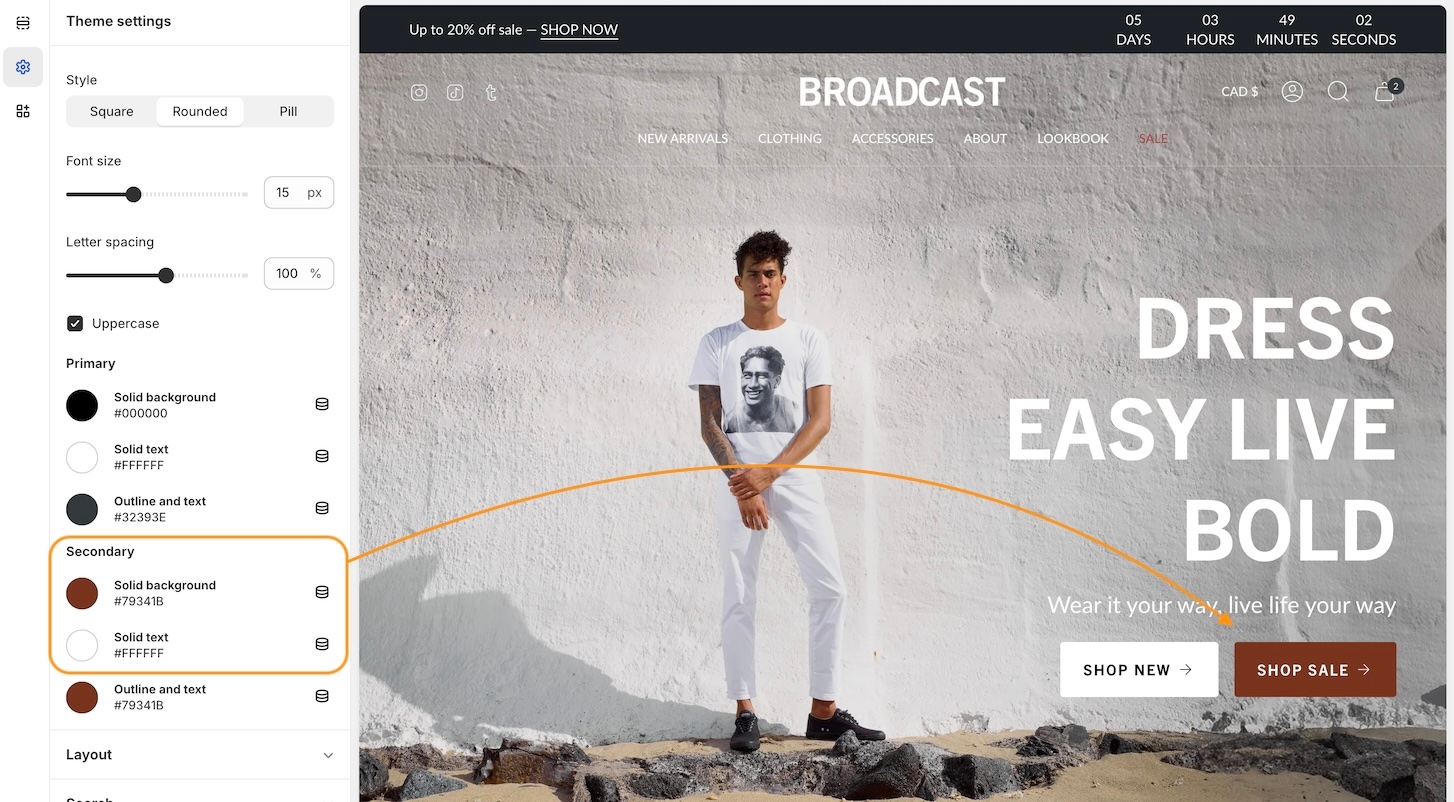
In the second button block settings, you can select different color options under Color. We've used the Secondary choice to quickly insert our brand colors from the theme settings.
The primary and secondary colors are pulled from the theme settings. The white and black options are also available as quick presets.