Broadcast v6.2 has been released - Learn more about
What's new
Broadcast Documentation
NewSupport
Broadcast v5
Broadcast v5
  • About Broadcast
    • Broadcast theme documentation
    • Feature requests
  • Updates
    • What's new in Broadcast
      • Release Notes
      • About v5.8 release
      • About v5.7 release
      • About v5.6 release
      • About v5.5 release
      • About v5.4 release
      • About v5.3 release
      • About v5.2 release
      • About v5.1 release
      • About v5.0 release
      • About v4.0 release
  • Sections
    • Broadcast sections
      • Demo store sections
      • Accordion
      • Accordion group
      • Before and After
      • Blog posts
      • Collection list
      • Collection list hover
      • Countdown
      • Contact form
      • Custom code
      • Custom content
      • Divider
      • Featured blog posts
      • Featured collection
      • Featured product
      • Highlights
      • Image banner
      • Image with text
      • Image with text slider
      • Map
      • Multicolumn
      • Newsletter
      • Press logos
      • Products with image
      • Rich text
      • Rich text with columns
      • Scrolling text
      • Shop the look
      • Sidebar
      • Slideshow
      • Tab collections
      • Testimonials
      • Text columns with icons
      • Text columns with images
      • Text promo
      • Text with products
      • Timeline
      • Video
  • Theme settings
    • Theme settings
      • Colors
      • Typography
      • Buttons
      • Layout
      • Search
      • Social media
      • Product Grid
      • Product Form
      • Cart
  • Header
    • Header
      • Demo store header settings
      • Header section
      • Navigation images
      • Quantity indicators
      • Transparent header
      • Header icons
      • Social icons
      • Sticky header
      • Target settings
    • Toolbar
      • Header toolbar
      • Video walkthrough
    • Announcement bar
      • Announcement bar settings
      • Free shipping message
      • Countdown timer
      • Text announcement
      • Custom code
      • Target settings
  • Footer
    • Footer settings
    • Footer blocks
      • Link list
      • Newsletter
      • Social
      • Text
      • Page
  • Products
    • Product pages
      • Accordion section
      • Custom form field
      • FAQ Accordions
      • Final Sale
      • Free products
      • Low inventory message
      • Out-of-stock notification
      • Pre-order using metafields
      • Pre-order products using tags
      • Product Theme Blocks
        • Title
        • Price
        • Variant picker
        • Buy buttons
        • Siblings
        • Description
        • Upsell
        • Inventory countdown
        • Sharing
        • Local pickup
        • Text
        • Custom code
        • Icon
        • Divider
        • Line item property
        • Feature
        • Complementary products
        • Popup
      • Related products
      • Sale items
      • Settings and layout
      • Siblings
      • Size charts
      • Swatches (Updated)
      • Swatch collection styles
      • Tabs and accordions
      • Tab content using metafields
      • Unique image banners
      • Upselling
      • Variant images
  • Collections
    • Collection pages
      • Collection page settings
      • Swatch collection styles
      • Product badges
      • Product badges with metafields
      • Product filtering
      • Quick add
      • Sub-collections
      • Cutline second line
      • Featured image
  • Overlay
    • Popups
      • Popups Theme Blocks
      • Large newsletter
      • Text promo
      • Small newsletter
      • Cookie consent
      • Coupon codes
      • Popup Behavior and Target
  • Promotions
    • Upselling
      • Upselling with metafields
      • Upselling with tags
  • Siblings
    • Product siblings
      • About product siblings
      • How to setup siblings
      • Siblings metafields
      • Siblings color
      • Siblings collection
      • Siblings product setup
      • Siblings block
      • Customizations
  • Pages
    • Page templates
      • Demo store about page
      • Creating page templates
      • Page section
      • About page templates
  • Blogs
    • Blogs and articles
      • About blogs and articles
      • Featured posts
      • Article page
      • Product links in blog posts
      • Article theme blocks
  • FAQ
    • Frequently asked questions
      • How to update Broadcast
      • Default theme content
      • Share preview link
      • Hiding prices
      • How to use sections
      • Section blocks
      • How to remove Powered by Shopify
      • Improving the speed of your site
      • How to prevent your images from getting cropped
      • Check your theme version
      • CSS customizations
  • License
    • Theme license
  • Support
    • Contacting support
    • Missing Cart Drawer after Updating
Powered by GitBook
On this page
  • General
  • Light background
  • Bright accent
  • Sale
  • Header bar
  • Background
  • Links
  • Header Navigation
  • Links
  • Dropdown background
  • Dropdown links
  • Transparent header text
  • Footer
  • Background
  • Borders
  • Text
  • Links
  • Contrast
Export as PDF
  1. Theme settings
  2. Theme settings

Colors

Settings to adjust the general, heading and footer colors using in the theme

PreviousTheme settingsNextTypography

Configure your brand colors in the color settings. These color elements are used in all the general sections, header, and footer.

Tip: These are your primary brand colors used throughout the theme. Some sections or blocks have their own color settings for even greater control.

Here are some common color elements to demonstrate how the color settings work:

General

Light background

The light background setting is used for background accents like the coupon message in the cart drawer. It's also used in the free shipping indicator with the bright accent color setting.

Bright accent

The bright accent is a highlight color for elements like the free shipping progress bar shown above in red and also the cart bubble indicator in the header:

Sale

The sale color is used for the prices on product grid listings like collections:

  • The sale badge uses a different setting, which can be found under the Product grid settings.

Header bar

Background

The background color adjusts the text inside the cart bubble indicator:

Links

The social, search, account, cart icons area is adjusted with this setting:
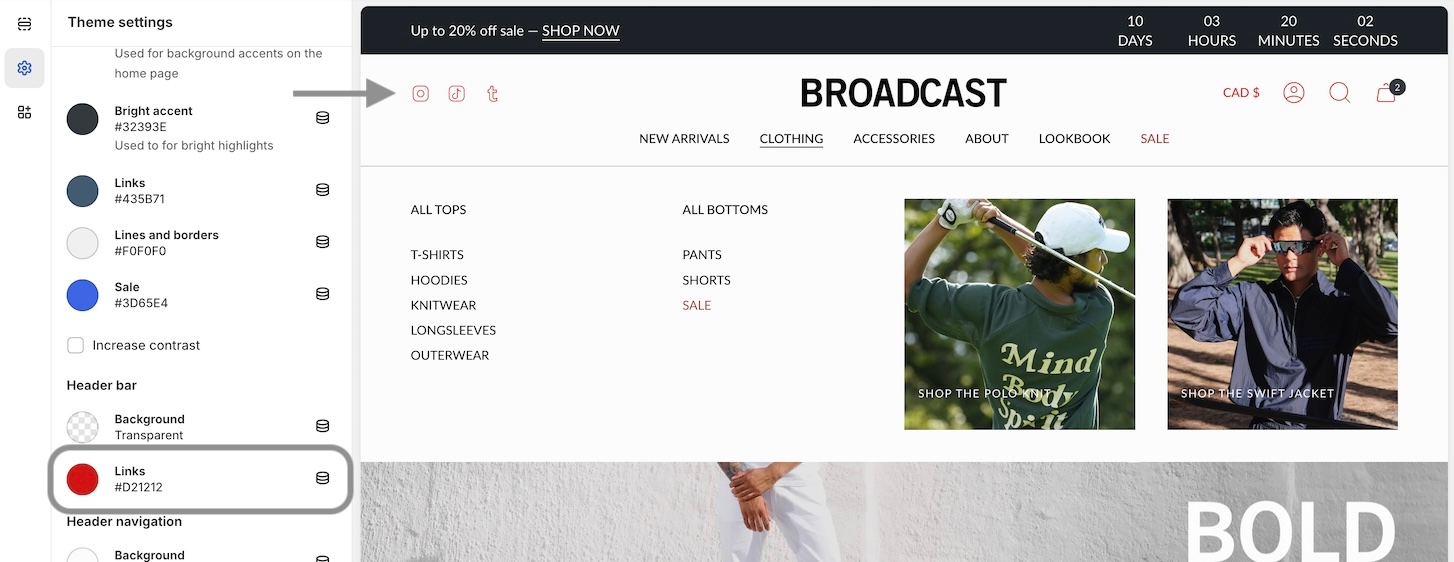
Note: When using a transparent header, these colors are used when the dropdown is activated. The transparent header has a separate setting while inactive. That setting is in the next group.

Header Navigation

Links

The links setting adjusts the main header navigation links:

Dropdown background

For dropdown menus, including the MegaNav, the background color can be adjusted:

Dropdown links

Inside the dropdowns, you can adjust the color of the links:

Transparent header text

When using a transparent header, the main colors in the header area include the social, search, account, and cart icons. Also, main navigation links:

Footer

Background

Adjust the main footer background color:

Borders

Border elements are used within the footer for the forms and buttons:

  • The grey horizontal and vertical lines are "Divider" blocks. These have their own color settings within the block.

Text

The default text for content in the footer:
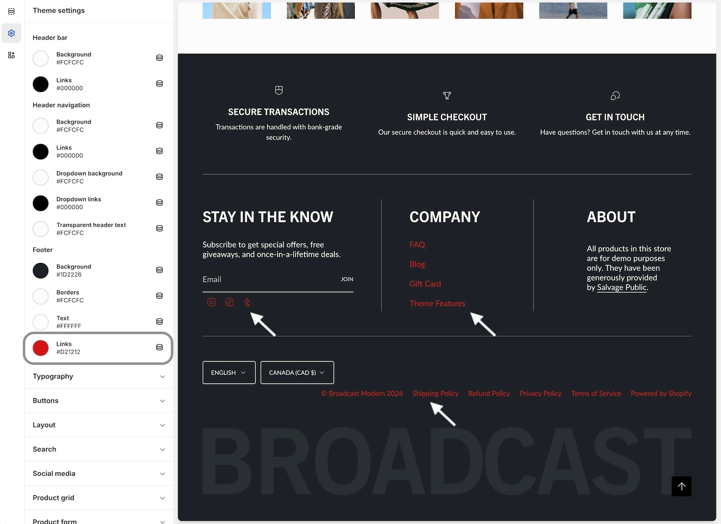
Links

All the links, including social icons and navigation links:

Contrast

Try to use colors that are high in contrast. It will make your text easier to read. Here is a great contrast checker:

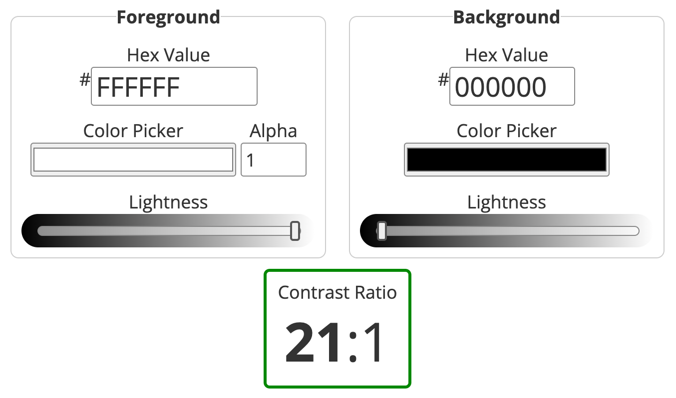
  • Example of a good score, 21:1 - White foreground on Black background:

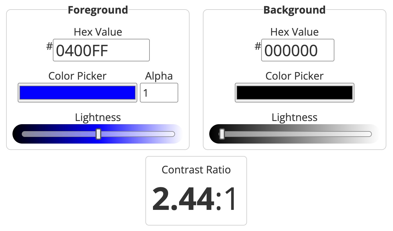
  • Poor score, 2.44:1 - Blue foreground on Black background:

WebAIM: Contrast Checker
Logo
Open the Colors accordion to find all the settings
Sale price
Red are borders, grey are divider blocks