
Loading...
Loading...
Loading...
Loading...
Loading...
Loading...
Loading...
Loading...
Loading...
Loading...
Loading...
Loading...
Loading...
Loading...
Loading...
Loading...
Loading...
Loading...
Loading...
Loading...
Loading...
Loading...
Loading...
Loading...
Loading...
Loading...
Loading...
Loading...
Loading...
Loading...
Loading...
Loading...
Loading...
Loading...
Loading...
Loading...
Loading...
Loading...
Loading...
Loading...
Loading...
Loading...
Loading...
Loading...
Loading...
Loading...
Loading...
Loading...
Loading...
Loading...
Loading...
Loading...
Loading...
Loading...
Loading...
Loading...
Loading...
Loading...
Loading...
Loading...
Loading...
Loading...
Loading...
Loading...
Loading...
Loading...
Loading...
Loading...
Loading...
Loading...
Loading...
Loading...
Loading...
Loading...
Loading...
Loading...
Loading...
Loading...
Loading...
Loading...
Loading...
Loading...
Loading...
Loading...
Loading...
Loading...
Loading...
Loading...
Loading...
Loading...
Loading...
Loading...
Loading...
Loading...
Loading...
Loading...
Loading...
New features and updates in Broadcast
Additional information on recent Broadcast updates
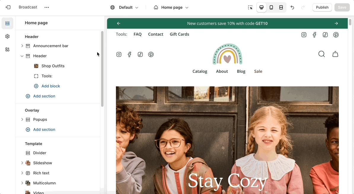
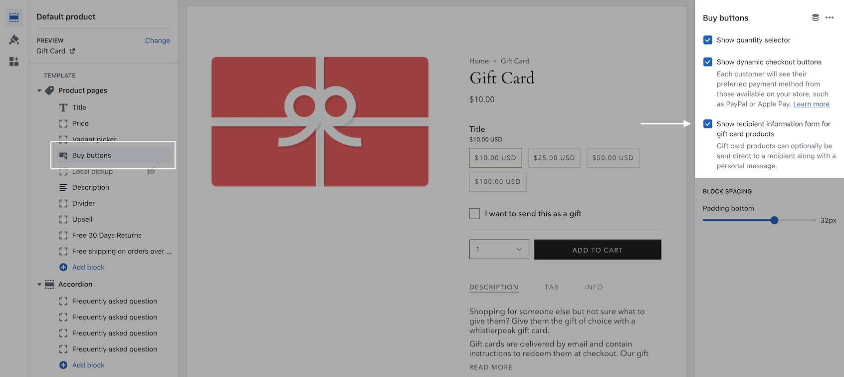
Our latest header block allows you to add more menu items, more icons, and more functionality to your main navigation.
This new option has dedicated controls to show a menu, country and region selectors, a currency picker, social media icons as well as dedicated color settings (for the background and text).
Note: When the hamburger menu is enabled, links from the navigation menu will be added to the side drawer.
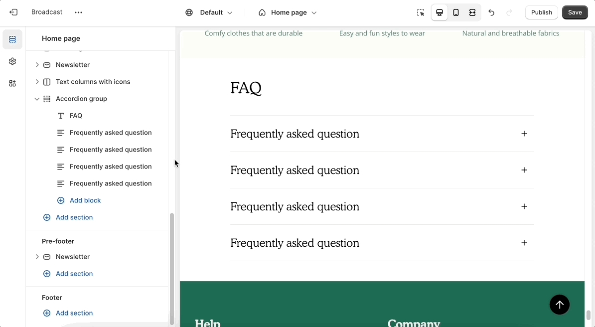
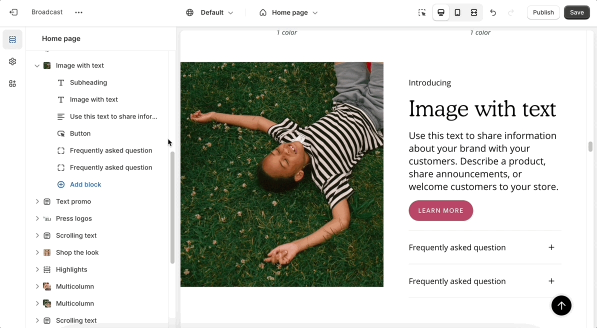
Accordions are making their way to more sections. Add expandable blocks to your Image with text section.
Show two columns of tabs with the new option in the accordion group section:
There are three new ways to display your image blocks in the multicolumn section. First, be sure to add an image block:
Select an image shape from the individual block settings. Try out the new blob and its hover animation!
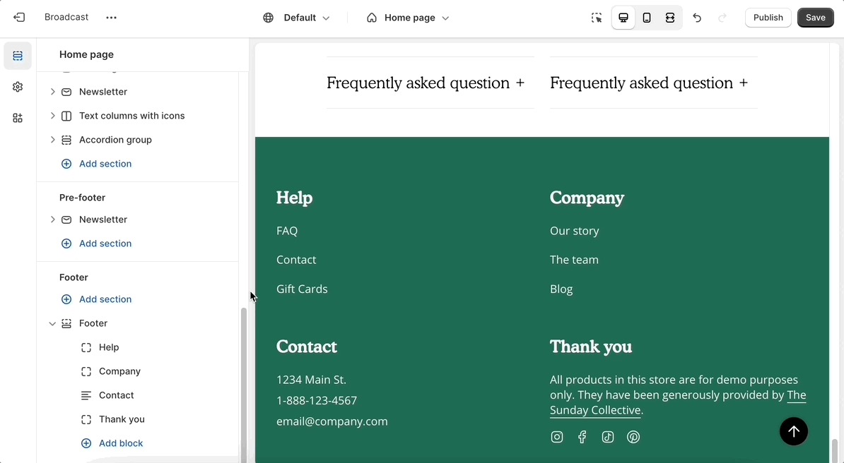
The divider section has made its way to the footer group. Use it to add a horizontal ruler and separate the content above the header.
There is also a divider block inside the footer section itself. Use the individual block settings to adjust the width and space everything perfectly around it:
Additional information on recent Broadcast updates
Additional information on recent Broadcast updates
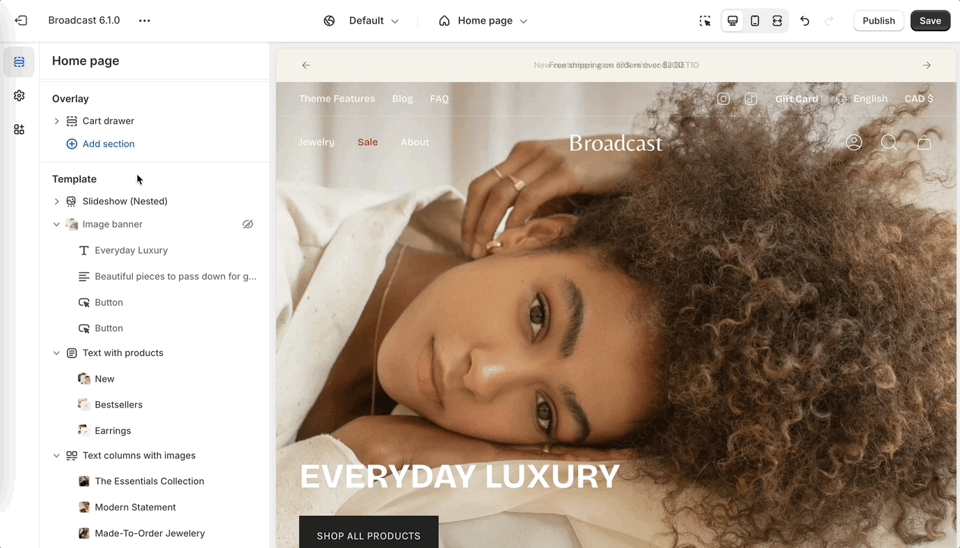
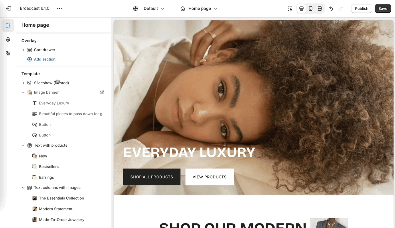
With Broadcast 6.1 we are making use of nested blocks on select sections. Nested blocks are a new feature in Shopify themes that allows us to break the blocks of any section into even more blocks. This will allow you to more easily re-order the contents of any section that uses nested blocks and create a unique layout.
Changing the order of the blocks is as simple as dragging and dropping them.
Also new with the slideshow section is the ability to change the width of your content box.
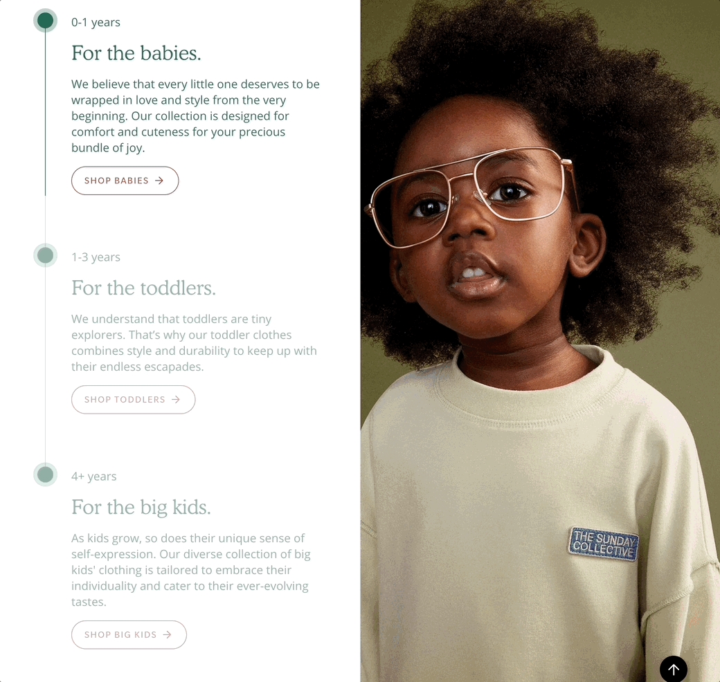
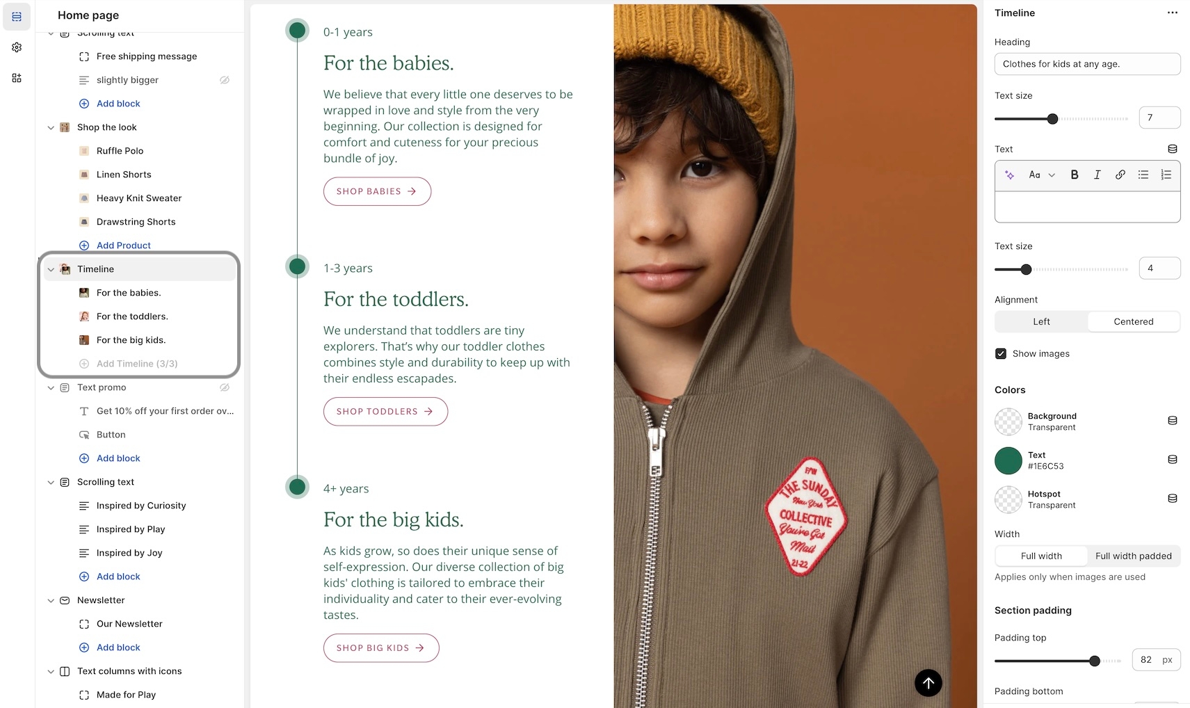
New to Broadcast is a unique Interactive section with beautiful animation to engage your customers:
Animated lines connect to timeline points as the customer scrolls down the page. Easy to build, add a timeline block for each entry. Use the section settings to customize the design:
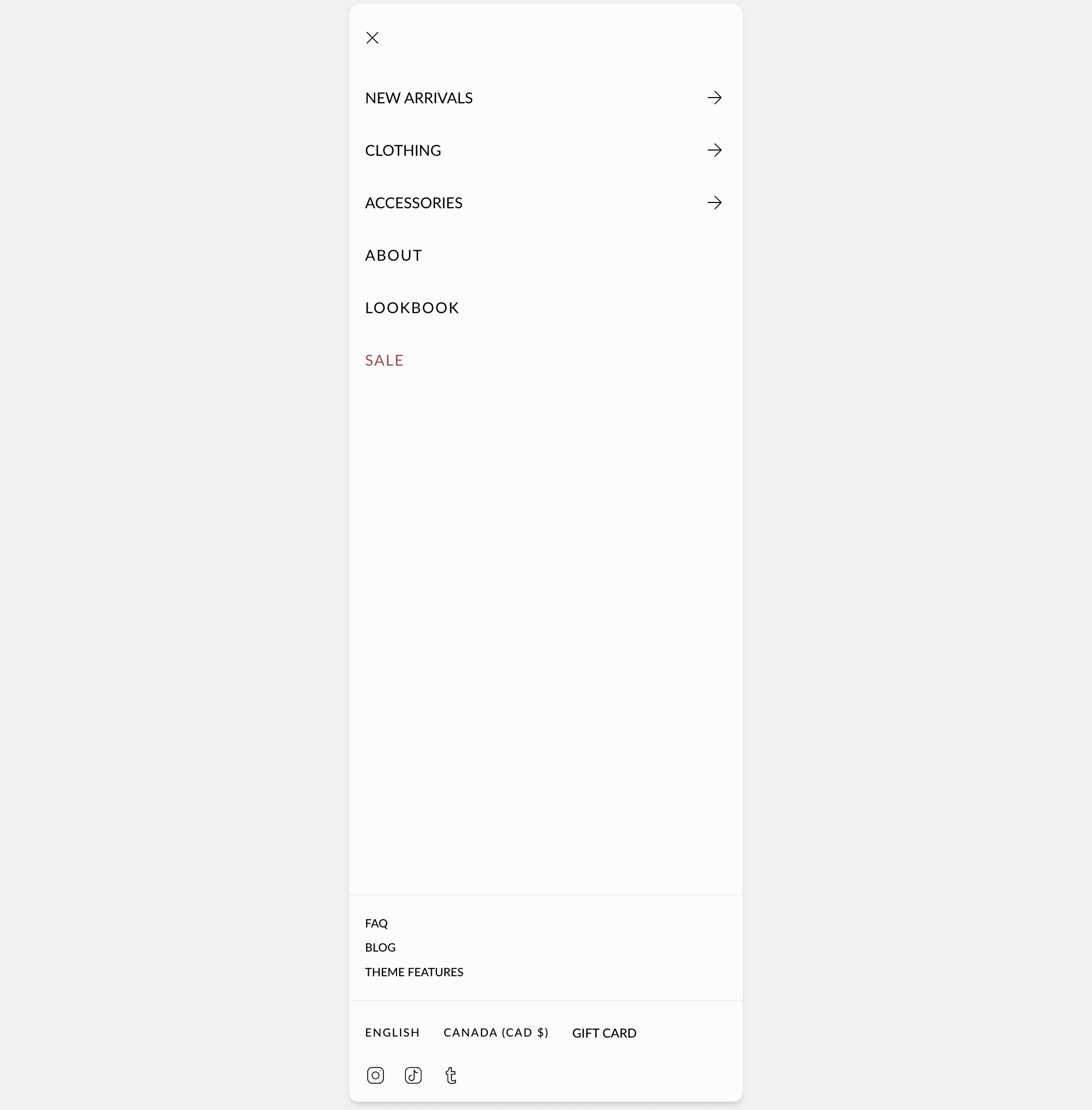
We've improved the header elements in the mobile navigation:
Content from the header is now placed in the lower section of mobile navigation.
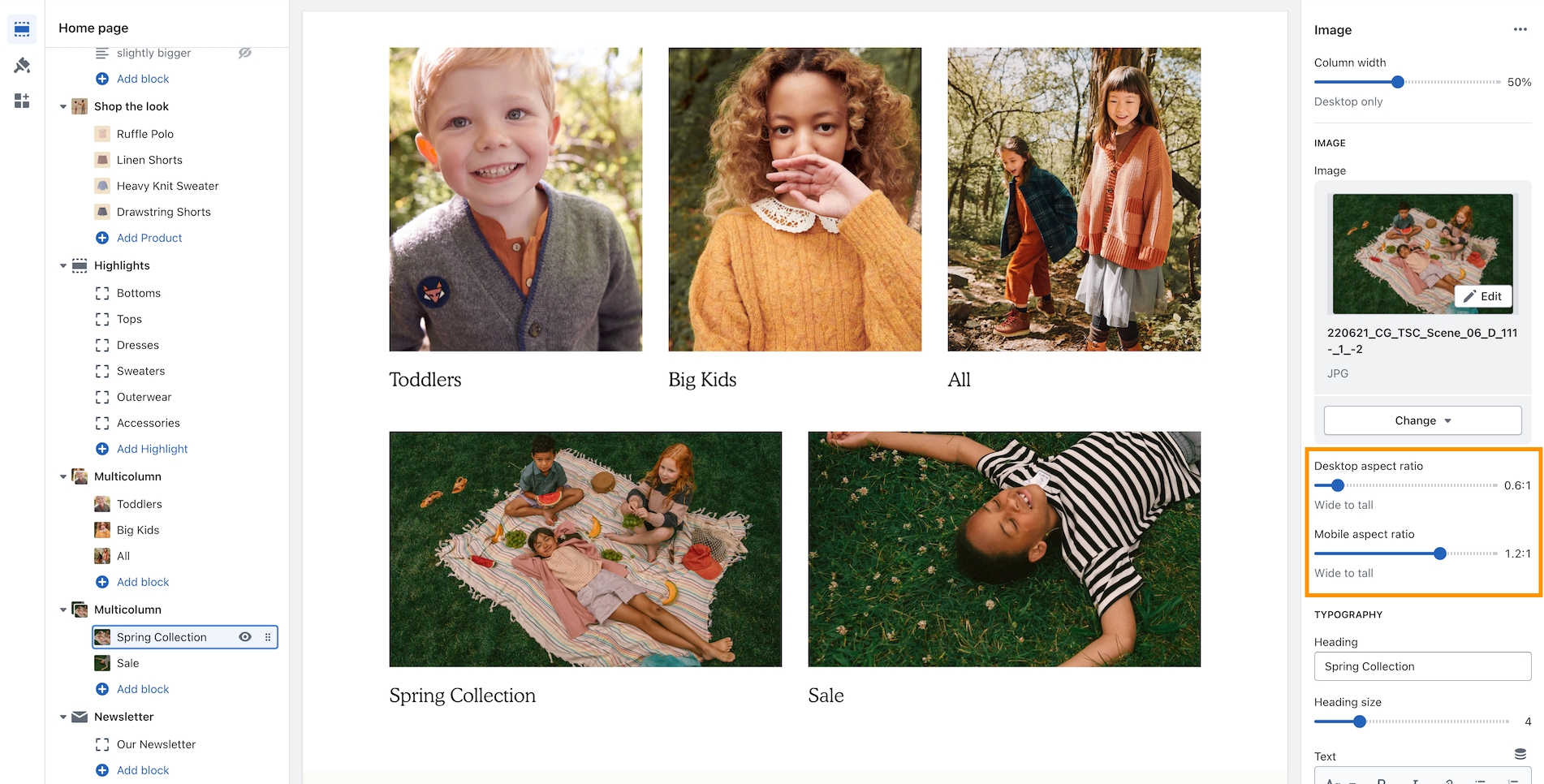
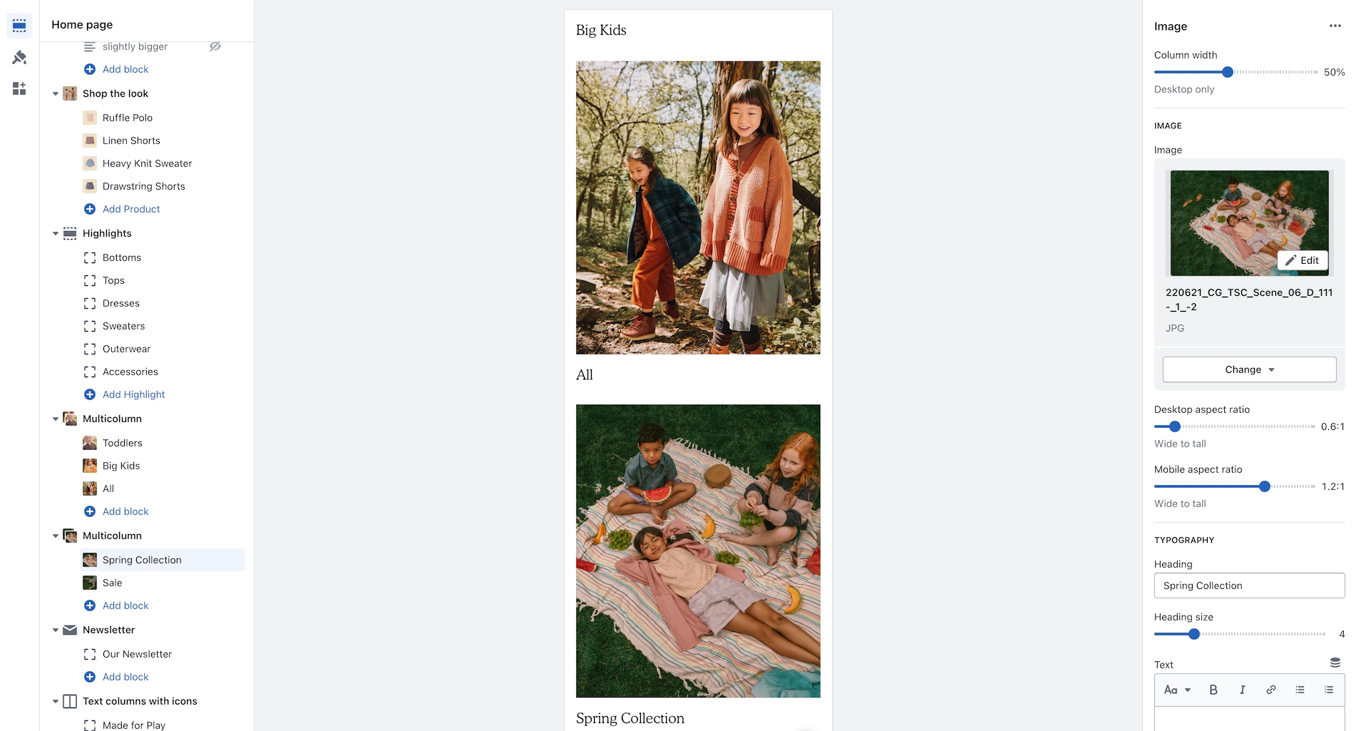
An image aspect ratio for mobile has been added in Broadcast 5.0. This will help provide more flexibility when designing complex layouts. In the example below, two Multicolumn sections are used to build a mosaic. The second has wider images. With the new settings, the mobile aspect ratio can be adjusted to make the images consistent with the section above:
Example of wider desktop images showing with 1:2:1 aspect ratio for mobile which matches the section image sizes of the previous section:
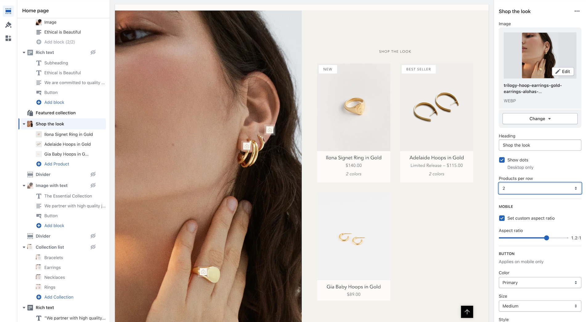
We've added the ability to show 2 product grid items per row. Ideal for showing more on desktop screens:
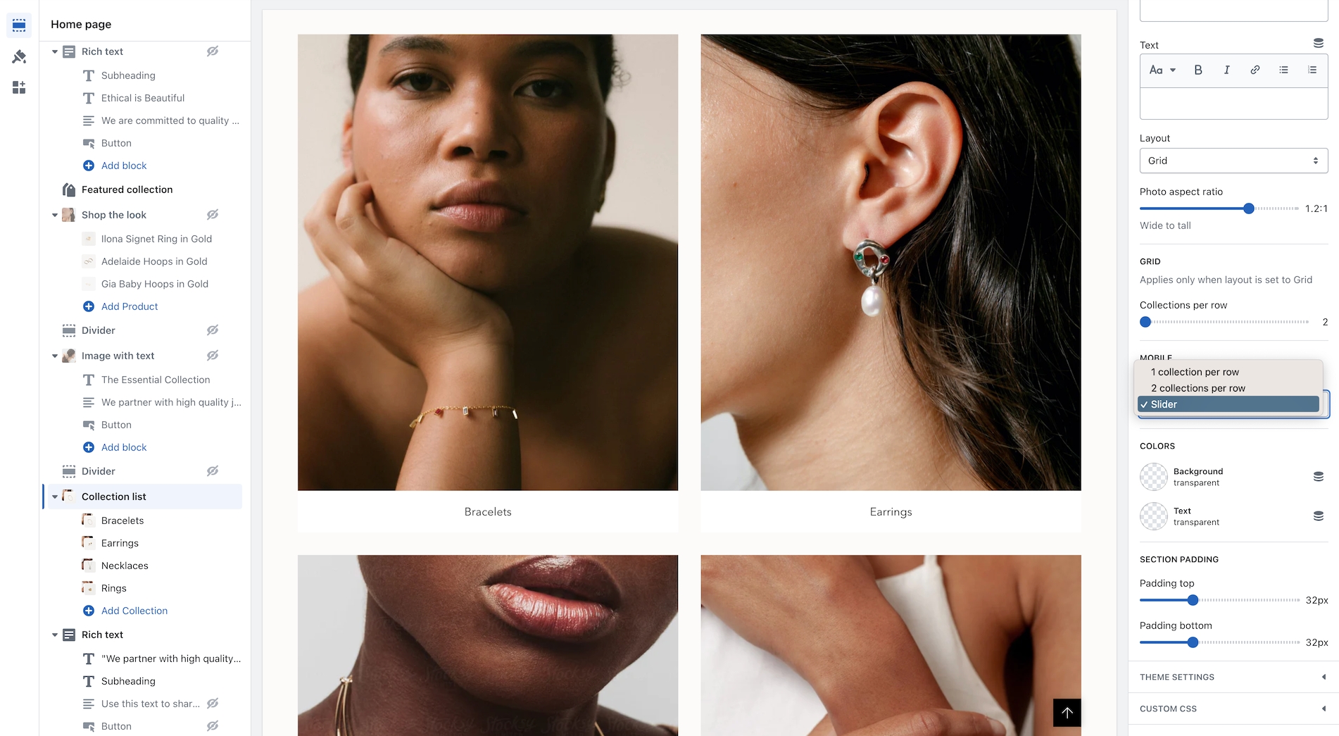
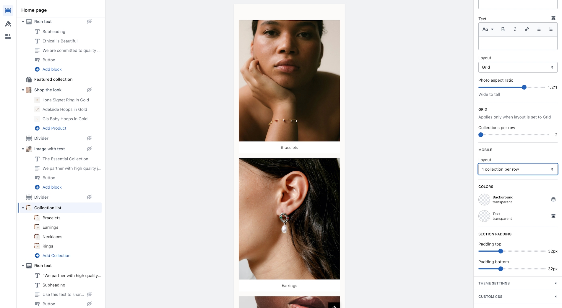
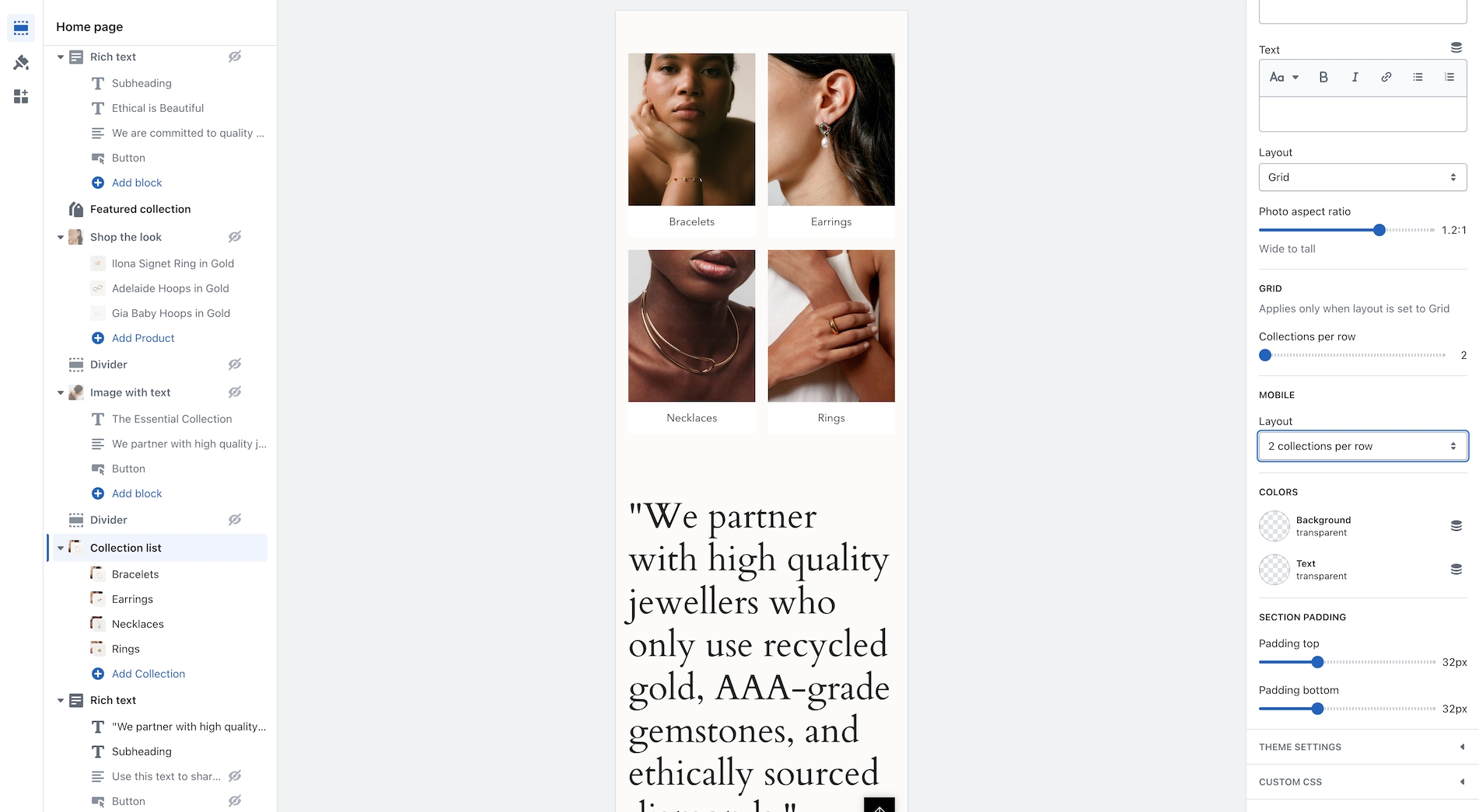
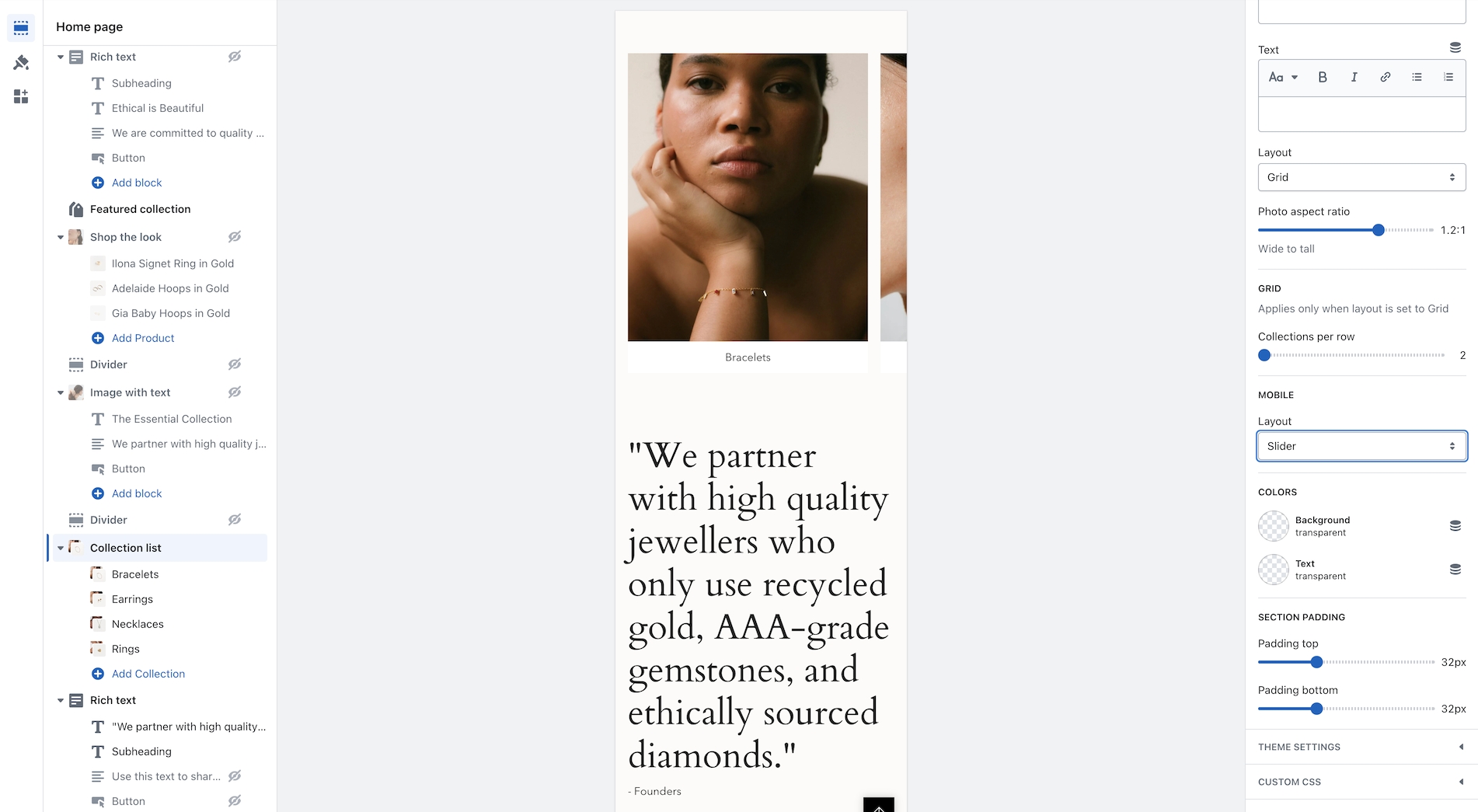
Broadcast now includes mobile layout styles for the Collection list section. You can choose to display 1 or 2 collections per row or the mobile slider:
Layout examples for mobile:
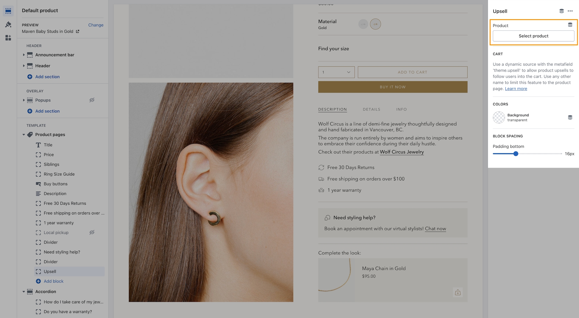
Now you can easily add one product right from the Theme Editor as your Upsell item which will instantly appear for all products using the same Product template.
This method is a simple way to use the upsell feature without the complexity of using metafields. It will add the chosen product to all products using the same template. If you use multiple product templates, you can customize which product is selected for each template.
The section includes settings for desktop and mobile images and heights. Choose from scrolling text, text, or button blocks to build the content. Buttons will be placed inline horizontally.
With Broadcast, you can now embed a product card right into an image banner-styled section:
Designed to be quick and easy to set up, this new section has incorporated the image and product settings into the section settings. Content blocks, including heading, text, button, and custom code, can be added to build the overlaying information on the left while the product card is shown on the right:
On mobile, the product card is placed below the image. The content can be positioned on top, in the middle, or at the bottom for the stacked view:
Broadcast can display the number of products that are in collections. The feature shows a numerical value next to the collection name in the dropdown navigation:
A theme-wide optional "Superscript" design option has been added, showing the number of products in a collection for multiple sections.
Broadcast makes adding product cards to your blog posts even more effortless. Choose products from a list and add them to the sidebar:
Customize the heading and select products from the product list:
Note: Since Shopify's templating system will reuse these choices on other articles, you can create a new blog post template and then assign that to different posts.
Another option for a unique selection of products is to use metafields for the product list:
Broadcast has a new interface to support touchscreen laptops and devices. When a touch screen is detected, the "second image on hover" feature becomes a slideshow in the product grid. Now, the customer can see additional product images without requiring a hover action. This works for mobile devices and larger touchscreens.
To adjust how many images appear in the slideshow, use the new setting in the Theme settings -> Product grid:
For larger touchscreen devices, the full "Quick Add" button is displayed below the product image. Mobile devices will use the icon-style button.
View the release notes for a complete listing of changes:
In our newer versions, we introduced a more modern quantity selector which uses a drop-down. After the phenomenal feedback from our merchants, we have now added an option to toggle between a more basic quantity picker and our theme's more modern look.
With this update, you can now change the position of the badges on your collection pages.
A small touch added to the icon drop-down selectors in our theme. The new "Check" icon.
Additional information on recent Broadcast updates
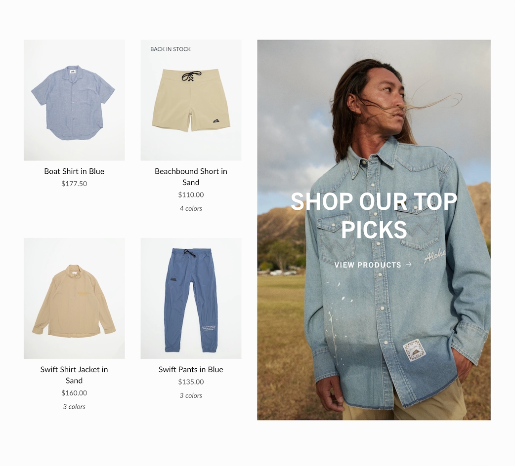
Display a branded image with a selection of products with this new two-column style section:
The mobile version displays the image first, followed by the products:
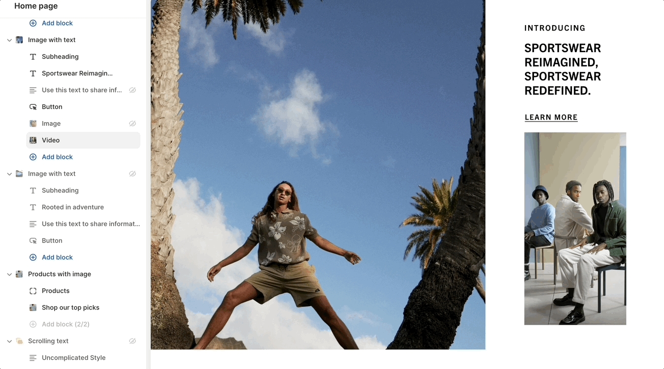
Add an image or video block into the text area of the Image with text section:
Insert an image or video into the text column:
The main image is configured in the section settings. The image block will add an image to the text area. Drag the image or video block to sort placement position in the text area.
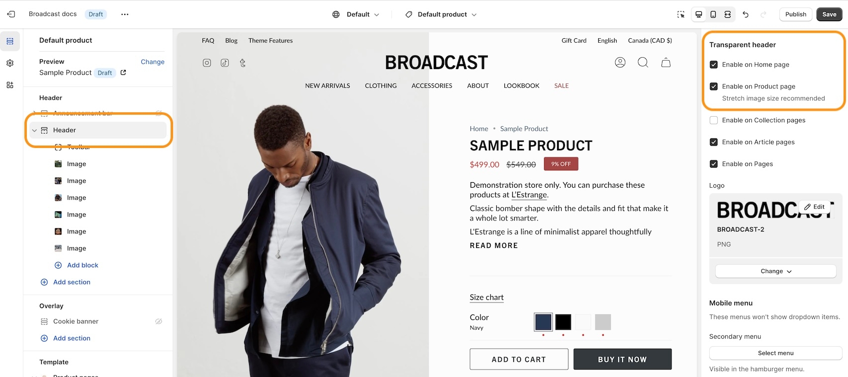
Create modern designs for product pages, now with transparent header support:
Find the settings in the Header section:
For best results, use the Stretched option for the Product page layout:
Now you can configure both the Body and Heading styles for Subheadings:
Adjust the font sizing, and letter spacing, plus an option to make subheadings in all uppercase.
These docs are here to guide you as your store evolves. We aim to keep things intuitive and require as little documentation as possible, but when complexity arises, we provide clear, experience-backed guidance.
Our team has spent over a decade building Shopify themes and working with startups and global brands alike. That insight is built into Broadcast and into these documents.
If it’s here, it’s likely worth your time, whether you're just getting started or optimizing a mature store. From the team at Presidio Creative, we hope you enjoy using Broadcast as much as we enjoyed creating it.
Explore our demonstration stores to see design elements and features included in Broadcast. These Broadcast presets are available in the Shopify Theme store:
✔️ Our Broadcast demonstration stores utilize only the features included with the theme, without using any third-party apps, except for Shopify's free apps, to show how we integrate with Shopify's tools.
Watch our video overview of the sections used in the Modern demo store:
Broadcast 8.0 is now out in the Shopify Theme Store. Download the latest version of Broadcast from the
All licensed customers can download the latest version for free to their store. Continue running your current version and publish only when you've set up the latest.
What's New Articles:
Changelog:
If you're new to Broadcast, you can easily download a free trial version from Shopify's Theme Store. With Broadcast, you can create a store that perfectly fits your brand, products, and services. You can use it as a draft theme for as long as you need without any time constraints. Only pay when you're ready to publish your store.
If you have questions or need additional assistance with using the theme, our support staff is here to help you by email. We offer free theme-related support by email to all our customers with no extra fees. You can also inquire about features or ask us questions about the theme before your purchase:
Broadcast has grown with Shopify over the years. We are currently on the sixth generation of the theme. To change the version, click the version toggle at the top of the page next to the logo.
Additional information on recent Broadcast updates
The new Broadcast 8.0 release introduces several new features to improve your merchandising and store settings. Here are some of the updates and changes you'll see in Broadcast by category.
We are excited to announce the addition of three new sections to our theme, designed to enhance your experience and provide more options to merchandise your store:
Additional information on recent Broadcast updates
We've made several thoughtful adjustments to the Quick Add button's functionality in version 6.2, focusing on visibility, customization, and control over the mobile experience.
Improved mobile visibility: To ensure your product images always take center stage, the Quick Add button on mobile devices will now consistently appear below the main product content on the Product Detail Page. This prevents the button from overlapping your visuals, leading to a cleaner presentation and easier interaction for your customers on smaller screens.


A dynamic new section designed to visually engage your shoppers and seamlessly guide them to your top product collections.
The collection image changes when you hover over the collection links with an animated transition. For desktop shoppers, clicking on the link will direct them to the collection page.
On mobile, tapping on the collection name changes the image. A call-to-action button is placed over the image:
This new section is all about creating a smoother, more visual path to purchase:
Elevated Browsing: The instant image change provides a richer, more interactive browsing experience that has been proven to capture attention more effectively than static links alone.
Clearer Path to Purchase: By visually connecting your collections to their best imagery, you make it immediately clear what a shopper will find when they click, reducing friction and encouraging exploration.
Feature Your Best: Use the prominent image placement to highlight your must-have products, best sellers, or seasonal collections.
We've introduced the Social video section—a powerful, dedicated space for you to showcase engaging, real-life product videos. Hover over the video to instantly play the video. The badge button lets you control the playback and display a social profile address:
This section is designed to integrate the powerful social proof of video directly into your shop, helping customers feel more confident in their purchase decisions:
Boost Shopper Confidence: By featuring authentic videos. Demonstrate to potential buyers how your products look and perform in real-life settings. This transparency helps build user confidence and trust in your brand, often leading to better conversion rates.
Broadcast uses Shopify-supported .MOV and .MP4 formats directly to this section. Note: Videos are uploaded to your Shopify store and are not streamed from external social platforms.
This section offers the best of both worlds. Upload high-quality, branded videos that are specifically designed to look and feel like popular social reels. By pairing your own professional content with the familiar video format and an optional social handle in the Badge text, you effectively leverage social trends while maintaining full control over your brand messaging.
Section settings
Customize the overall presentation using Broadcast's many section options, including:
Text size and alignment for any introductory text.
Layout settings, including full-width padding.
Video aspect ratio to match your video content style, suitable for both wide and tall videos.
Display style on desktop and mobile, letting you choose between a classic Grid or a swipeable Slider.
SEO heading tag setting for the optional section heading.
A visual way to show off the brand's personality. This new banner section lets you place a video over top of your main banner to add some animation without occupying the entire banner space:
A modern design element to showcase your brand. Use the section settings to completely customize the section layout and elements.
Add common blocks to include optional messaging or call-to-action buttons:
In this release (Version 8.0), Broadcast now fully supports Shopify's new API changes for handling products with a high number of variants (e.g., more than 250 variants or combined listings).
Historically, themes would attempt to load all product variants at once, which caused significant slowdowns, especially on product pages for merchants with a large inventory of options.
Broadcast 8.0 directly addresses those performance issues:
Faster Product Pages: By adopting Shopify’s new, optimized variant APIs, Broadcast no longer requires loading every single variant at once. This results in significantly faster load times for product pages that have many color, size, or material combinations.
This enhancement ensures that your store is prepared for Shopify’s increased variant limits, allowing you to confidently scale your inventory and product complexity without sacrificing site speed or the shopper experience.
Seamless Shopping: Your customers will enjoy a smoother browsing experience, especially with complex products, resulting in reduced customer frustration and higher conversion rates.
For Developers & Agencies: We have audited and updated all theme code that previously relied on loading a complete list of variants via the legacy product.variants Liquid object, ensuring full compatibility with the new, performant API structure.
We've added the Mini-button back as an option for mobile devices in Broadcast 8.0. Now, you can choose between a mini-button and a regular, full-sized button.
The "Mini-button" displays a smaller, shopping bag icon:
The "Button" option will display a full-sized button in the product card:
In the Broadcast 8.0 Theme Settings, you can toggle between the two choices under "Mobile style".
Theme settings → Product grid → Quick add
For additional examples and to try Broadcast for free, visit our demo stores and download the latest version of Broadcast:
Existing customers can update for free. To preserve your live published theme, use the Shopify Update tool. The update tool will download an additional theme to your theme library and only copy the settings from your live theme. This is the safest and easiest method of updating your theme.
Column sizes and text alignment can be adjusted in the section settings:
Mobile settings allow the stacked content to be left-aligned or centred.
Display blocks inside an accordion for the mobile footer:
In the footer blocks, you can use the new checkbox to enable the accordion feature for mobile devices:
The accordion option is available on the following footer block types:
Link list
Text
Page
Social
The newsletter and divider blocks do not contain the option.
We've added the ability to hide products from searches and collections. Simply add the hide tag to your product:
After adding the hide tag, the product won't appear on collections and search results:
You can still view the product page by using the product URL:
Items that are sold out can now display a badge on the product grid or collection listings. The price is now also shown with the product information:
In the Theme settings -> Product grid, you can toggle the badge option:
We've added additional size and spacing options to the blocks in the "Before and After" section:
We've improved the placement of the "Remove" items from the cart. The link is now below the quantity selector and left-aligned to match the other elements:
View the release notes for a complete listing of changes:
Enhanced color customization: You now have distinct color options for the Quick Add button on desktop. For mobile views, the button will automatically adopt a clear outline style, utilizing the Text color selected within your theme's color settings. This approach provides customization flexibility for desktop while maintaining a consistent and optimized look on mobile.
Mobile display control: Recognizing that every store has unique needs, we've introduced the ability to disable the Quick Add button specifically for mobile devices. Suppose you prefer a more streamlined product page experience for your mobile visitors. In that case, you can now easily hide the button on mobile viewports while keeping it active for desktop users via the theme settings.
How to configure:
Theme settings > Product grid, the Quick add section contains the settings:
Version 6.2 enhances the Cart Drawer with flexibility and refinement, focusing on providing you with greater control over typography and visual presentation.
Expanded typography controls: A key update is the addition of Text size settings across multiple elements within the Cart Drawer. You can now fine-tune the text size for:
Products block (item details)
Title
Cart message
Free shipping bar
Each of these settings pulls from your theme's established Body text size options, making it easier to maintain visual consistency throughout your store.
Cart Message Alignment: Alongside the new text size option, the Cart message now also includes Text alignment settings. You can choose between left and center alignment to best match your design preferences.
Simplified Free Shipping Bar Styling: We've streamlined the styling options for the Free Shipping Bar. The previous gradient background option has been replaced with a straightforward solid Color setting for easier customization. The Text size control mentioned above has also been added here.
We've introduced more intuitive and flexible ways to add and manage button layouts within the Image banner and Slideshow sections, moving away from workarounds and towards dedicated controls.
New: 'Side-by-Side Buttons' Block - We've added a new block specifically for creating horizontal double-button layouts. Previously, achieving this look required adding and configuring two separate 'Button' blocks. This dedicated block simplifies the setup and provides a single place to manage two buttons displayed side by side.
'Single button' Block - Now has a full-width option. With the introduction of the 'Side by Side buttons' block, we have enhanced the standard button block. The original Button block is now named Single Button and features a Full-width setting, making it easy to have a single button span the entire available width of its container:
Image banner & Slideshow: The new "Side by side buttons" block and changes to the "Single button" block are available in the "Image banner" and the two "Slideshow" sections.
You can now add MP4/MOV videos directly to your Slideshow section in Broadcast 6.2. We've added a video block to display looping videos from your Shopify content storage. This update brings more dynamic content capabilities to your storefront, offering a powerful new way to engage visitors right from the homepage.
Add a "Video" slide to your slideshow alongside "Image" slides. The Video slide has customization options to help the text and call-to-action buttons stand out.
The new video slide is available in the 'Slideshow (Nested)' section and not in the legacy version.
We've added global button size settings to the Theme settings in Broadcast 6.2:
You can now set the size for all Small, Medium, and Large buttons throughout your store with these global settings.
The Add to cart button on the Product detail page can now show the price inside the button:
This is a global setting that applies to all products.
How to configure:
Theme settings > Product form. The Add to cart toggle can be found there.
To enhance the visual organization and readability of multi-column text layouts, version 6.2 introduces a simple yet effective display option for handling rich text columns in sections.
Improved Separation: We noticed that, depending on screen size and content length, text in adjacent columns can sometimes appear too close together, which affects readability. To address this, we have included a vertical divider with width and line settings.
This option adds an optional, subtle vertical line between the columns, providing clear visual separation. This ensures your columns remain distinct and your content is neatly organized and easy to read.
Add more context and detail to your color options directly on the product page! Broadcast 6.2 introduces the ability to display unique text descriptions associated with specific product color variants using Shopify's metafield system. This helps customers understand the nuances, materials, or special features associated with each color choice.
This feature utilizes a standard Shopify variant metafield. When a customer selects a product variant on the storefront, the theme automatically checks if that specific variant has a text metafield defined with the exact namespace and key: theme.color_description. If this metafield exists and contains text, its content will be displayed dynamically on the product form, typically near the variant selectors, providing context for the chosen color.
Watch this video walk-through on how to create the required custom variant metafield:
Define the Metafield: In your Shopify Admin, go to Settings > Custom data > Variants. Add a new definition.
Set the Namespace to theme.
Set the Key to color_description.
Choose a Content type of Single-line text . Give it a clear name, such as "Color Description," and a description for your reference. Save the definition.
Add Content to Variants: Go to the specific products in your Shopify Admin. Edit the variants and locate the "Metafields" section at the bottom. Add your desired descriptive text into the "Theme Color Description" metafield for each relevant variant. Save the product.
This metafield is checked on a per-variant basis. If your product has multiple options (e.g., Color and Size), you must add the appropriate color description text to every combination that should display it. For example, if you have 'Red' in 'Small', 'Medium', and 'Large', you need to add the Red description text to the theme.color_description metafield for the Red-Small variant, the Red-Medium variant, AND the Red-Large variant.
Siblings: This color description feature integrates seamlessly and works correctly with the theme's Siblings display logic for variants.
Example Use Cases: You can use this field to specify things like "Vibrant, non-toxic dye," "Limited edition Spring color," "slightly metallic finish," or "Matches our Cerulean Blue bag collection."
This feature offers a great way to provide valuable, targeted information about color options right where customers are making their decisions.
We've refined the visual styling for variant selectors in Broadcast 6.2 to provide a more prominent hover state over variants to help make the selection process more intuitive for your customers:
This refreshed design dynamically uses your theme's existing Text color setting (configured under Theme Settings > Colors, Color scheme) to style the key indicators for these selected and hovered states. This helps maintain visual consistency with your overall brand typography settings.
For additional examples and to try Broadcast for free, visit our demo stores and download the latest version of Broadcast:
Existing customers can update for free. To preserve your live published theme, use the Shopify Update tool. The update tool will download an additional theme to your theme library and only copy the settings from your live theme. This is the safest and easiest method of updating your theme.
Additional information on recent Broadcast updates
Fresh new design for the featured product section with new image scrolling options and additional section settings:
Discover the new vertical and horizontal image scrolling options with this quick video:
You have the option to add a background image to enhance the appearance of the section:
A new section added to Broadcast is a two-column image and text section with multiple text blocks. You can now add multiple text blocks that customers can slide through for additional information.
Watch this short video walk-through on the section and block settings:
On mobile devices, the images will rotate automatically and customers can swipe through the text blocks:
The slider navigation style can be adjusted under the Theme settings:
Swatches are now easier to manage and control. All the settings for color swatches around are found under Theme Settings -> Swatches
Video walk-through on all the changes:
A new grid layout option for the desktop has been added for displaying the products within a tabbed collection. You can easily choose between the slider style or the new grid option:
In addition to the product layout, you can position the tabs with different layout options:
You can now add a background image to the scrolling text section and also image blocks in-line:
Video overview - Scrolling text updates:
An option has been added to help build a separation between the header and content:
You can now adjust the padding in the header area to make larger or tighter headers:
A terms and conditions checkbox option has been added:
Use the Theme settings -> Cart to toggle. When enabled, the customer must check the box in order to proceed with checkout.
Additional information on recent Broadcast updates
The new Broadcast 7.1 release introduces several new features to improve your merchandising and store settings. Here are some of the updates and changes you'll see in Broadcast by category.
New updates to the product default page (PDP). Here's what's new with product pages in Broadcast:
Display two buttons side by side with separate styles and links for multiple actions.
Shows a selected product with its image, title, price, and default quick add-to-cart functionality.
Display a scrolling text banner to highlight announcements or offers.
Adds a message textarea field with a label and required toggle.
Modern demo store sections and footer overview
Adds a single checkbox with customizable label and required option.
Add blocks to build out your list of collections.
Adds a single-line text input field with customizable label and required option.
Column width
range
Width of the product block on desktop.
Product
product
Select a product to feature.

Label
textarea
Label for message input field.
Required
checkbox
If checked, message is mandatory.

Label
text
Checkbox label, e.g., 'Subscribe to newsletter'.
Required
checkbox
Field must be checked before submission.

Label
text
Single-line input, e.g., for name.
Required
checkbox
Toggles whether the field is mandatory.


Link for the button.
Color
select
Color for the button: Black, White, Primary, or Secondary.
Size
select
Size of the button: Small, Medium, or Large.
Style
select
Style for the button: Solid, Outline, or Text.
Show arrow
checkbox
Show arrow on the button.
Padding
Bottom
range
Padding below the section.
Primary/Secondary buttons
Text
text
Label for the button.
Link

url
Override text color for this scrolling text block.
Text
richtext
Enter rich text to scroll.
Colors
Text

color
Optional custom label to display in place of the collection’s title.
Collection
collection
Select the collection to display.
Image
image_picker
Override the collection image. Recommended: 1400×1400px .jpg.
Text

text
Now with Broadcast, you can set pre-orders at the variant level. Previously, we supported product metafields that assigned a pre-order button to the entire product. You can now create a variant metafield and assign a pre-order button to any variant in your product catalog. Both options, the product as a whole and the new variant-level pre-orders, are available for you to choose from and customize pre-order products.
Learn all about pre-order variants in Broadcast and how to set up the variant metafield here:
Promote product bundles on product pages and the cart drawer with automatic discounts and precise product matching with metafields. Broadcast will display bundle promotions alongside the upsell block, giving you two promotional options.
Customers can add a bundled item right from the Cart drawer. A new block called 'Bundle products' has been added to the Overlay > Cart drawer to display bundle promotions.
When using a list of products in the cart drawer, the promotions will be displayed in a slider carousel.
Learn all about the 'Bundle and save' feature in Broadcast:
A new option has been added to the Accordion block in the product form. You can now choose to display the accordion details in a drawer:
Use the block settings to toggle between Colapsible and Drawer:
The Popup block in the product form will now display the content in a slide-out drawer, similar to the drawer option for the accordion block:
Previously, the Popup block was displayed as a modal. The new design helps improve the user experience.
A new block you can use to display the estimated delivery or shipping date to help customers know how quickly products are sent out or expected for delivery:
Use the Label and Slider to specify your shipping or expected delivery date. Broadcast will convert the days into a date value.
Use a metafield to customize each product.
Here's what's new with the Theme settings in Broadcast:
You'll now find all the badge settings in a new category in the Theme settings under Badges:
You can customize and configure all the badges included in Broadcast here, including badges for the PDP and Product Card.
Shopify has introduced a new opacity slider in the color picker. Broadcast now uses this slider to adjust transparency, including overlays:
An infinite scroll option has been added to Pagination in the Theme settings. Now, you can enable continuous scrolling or toggle it off for regular page-style pagination.
Here's what's new with the Cart and Cart drawer in Broadcast:
Shoppers can now add a discount code directly in the Cart before proceeding to checkout, greatly enhancing the user experience for adding more items and encouraging impulse purchases.
The discount amount is shown, and the subtotal is updated right in the cart. Add the new 'Discount code' block in the Overlay section under the Cart drawer:
Use the new 'Bundle products' block in the Overlay section under Cart drawer to display bundle promotions right in the cart. View additional information here:
We've added a grayscale option to the payment icons block in Broadcast. The payment icons block is found in the cart, cart drawer, and footer.
Here's what's new with theme sections and section blocks in Broadcast v7.1:
We've brought back the original clean Product section in Broadcast, now called 'Product'.
In addition to the 'Featured product', which has a modern design, the new classic 'Product' section can be used to build product promotions throughout your shop quickly:
To add the 'Product' section, choose it from the Products group:
You can now choose from two different section styles:
Featured product - Modern design section.
Product - The original simple section, ideal for quick promotions.
A new block type has been added to the Multicolumn and Collection list sections called 'Image with text overlay'.
Now you can overlay text and call-to-action buttons over an image in various positions:
Use the new 'Image with text overlay' block when you want to position content over your images, or use the 'Image' block to place text outside of the image.
The press logo slides will now auto-rotate for mobile devices:
Shopify now groups sections in the Theme Customizer. When you add a new section, you'll find the sections in Broadcast grouped in these new categories. Here's a breakdown on where to find our sections:
Custom section
Multi column
Image banner
Image with scrolling text
Slideshow (Legacy)
Slideshow (Nested)
Video
Collection list
Collection list hover
Featured collection
Tab collections
Contact form
Newsletter
Custom code
Divider
Featured product
Image with product
Product
Products with image
Recently viewed products
Shop the look
Text with products
Accordion
Accordion group
Before and after
Blog posts
Featured blog posts
Image with text
Image with text slider
Map
Press logos
Testimonials
Text columns with icons
Text columns with images
Countdown timer
Highlights
Rich text
Rich text columns
Scrolling text
Sidebar
Text promo
For additional examples and to try Broadcast for free, visit our demo stores and download the latest version of Broadcast:
Existing customers can update for free. To preserve your live published theme, use the Shopify Update tool. The update tool will download an additional theme to your theme library and only copy the settings from your live theme. This is the safest and easiest method of updating your theme.
For a full breakdown of how we've set up the header and toolbar on the Bold demo store:
Learn how we set up our About page on the Modern demo store:
Custom section
Build a unique layout for your pages
Multi column
Build custom multi-column promotions rapidly, using rich content blocks


Additional information on recent Broadcast updates
Badges can now be displayed on Broadcast Product pages. Broadcast can automatically display Sale badges or Custom badges that you create for individual products:
Custom and Sale badges can be styled in the 'Theme Settings' tab under 'Product grid'. These settings are applied to badges placed on both the Product card (also known as Collections or Product Card) and now the Product form when using the Badges block:
The Broadcast Cart now has blocks to customize the cart experience for your customers. Sort and arrange cart blocks, plus pin certain blocks to the bottom near the checkout button.
If you are updating from a previous version of Broadcast, please revisit the Theme Settings -> Cart to reconfigure your cart settings.
The new cart blocks are available under the Overlay section in the Theme Customizer.
The number of items in the cart is shown in the main Cart heading:
Easily display and link to products or collections with new blocks added to the Image with text section. These two new blocks can help you quickly build promotions on any page:
The collection block has options to choose a custom image and button text for the call to action:
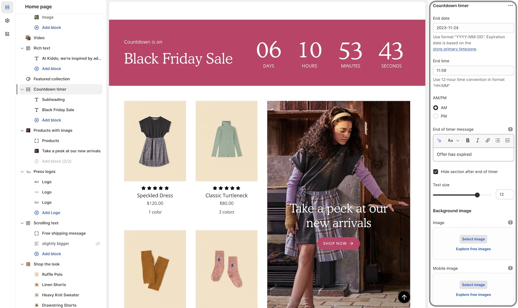
Add a sense of urgency right into the main announcement bar with the new countdown timer block:
Add the block from the Header -> Announcement bar:
Now, you can add multiple promotions to your collection pages. Additional Featured image blocks can be added to collections:
Position each Featured image block by using the Image position slider or enter the value manually:
We've redesigned the mobile timeline section to include a horizontal scroller and cleaner visual presentation:
For square, rounded, or pill-styled period moments, use the options under Theme Settings -> Buttons:
An open-by-default option has been added to keep certain accordion blocks open when the page is loaded:
A bottom padding slider has been added to the Rich text and Image with text sections to help you manage spacing between sections:
The Rich text section includes an image block option for adding a visual to the main text content:
We've added a background image option for mobile devices to enhance the display and scrolling effect:
The background image remains sticky as the Featured Product elements are scrolled through:
You can now have the text block styled to match the variant options when using the modern Product form layout. This places the heading to the left and the text in the next column that matches the style of the variants:
The Left option will show the heading and text in one column and two rows:
To enable this option, ensure the Modern form style is chosen under the Theme Settings -> Product form:
Additional information on recent Broadcast updates
Now, with Broadcast 6, you can build a custom mobile navigation directly from the Theme Customizer. The mobile menu uses blocks to manage content easily for mobile designs:
You can add products, collections, images, icons, text, dividers, buttons, reviews, and a search bar.
Social media links, currency, and language choosers are also included.
Compress your menu using Menu Columns, or combine it with the regular list format.
With a wide choice of mobile menu blocks, you can build the perfect mobile menu to help navigate and promote your products and services to mobile users.
Add the new "Mobile menu" from the Header group. Use the "Add section".
Choose a Shopify navigation menu as the main menu. This can be the same as your desktop menu or an entirely different version for mobile.
Add menu blocks. Choose from an extensive list of options to customize your mobile menu completely. Rotate different promotions within the menu to improve the customer experience.
Broadcast 6 now includes Shopify's Color Schemes for managing colors throughout your theme:
Color schemes help ensure the consistency of your brand colors across all sections and allow for easy changes. Customize the palettes in the Theme Settings under Colors, then apply a palette or scheme to existing sections.
Experiment with gradients and other colors to create visually interesting backgrounds and elements that will enhance your store's aesthetic appeal.
Broadcast now includes new typography styles and color schemes to help manage fonts, font properties, and font sizes throughout the theme.
Predefine your Headings font options for desktop and mobile with granular controls in the Theme Settings:
Then, choose the size style in your sections:
You can also configure fonts, font properties, and font sizes for:
Header navigation
Body text
Subheadings
If you're updating from a previous version of Broadcast, similar to colors, you can use your live theme as a reference when setting up your new draft theme typography.
We've added a Collection block to the Scrolling text section. Adding this block will display the name of a collection and the number of items in the collection when using the subscript setting in Broadcast:
For subscript, activate in the Theme Settings, under Layout:
We've included an SEO heading setting many sections and heading blocks. This Advanced option allows you to set the SEO tag value of a heading without affecting the style of the heading:
You can now choose the heading value for SEO without changing the design of the heading.
Displays a simple navigation menu without dropdowns, ideal for quick links within a section.
Column width
range
Width of the menu block on desktop.
Menu
link_list
Choose a menu (no dropdowns supported).
Heading size
Display a block of text content with adjustable size and color.
Text
textarea
Add descriptive paragraph or brand message.
Text size
select
Font size based on paragraph body scale: Extra small, Small, Medium, Large, or Extra large.
Colors
Display a heading with a customizable size and SEO tag for clear section titles.
Typography
Heading
text
The heading text.
Heading size
Display a heading with adjustable size and SEO tag for clear section titles.
Heading
text
Enter heading text.
Heading size
select
Font size for heading: Mini, Extra small, Small, Medium, Large, or Extra large.
Advanced
This block enables you to display two horizontally aligned call-to-action buttons, a primary and a secondary, ideal for highlighting dual actions (e.g., View collection and Shop sale).
Primary/Secondary buttons
Text
text
The Text block lets you add supporting or descriptive content below the heading. Ideal for short explanations, feature blurbs, or promotional subtext.
Text
richtext
Rich text content. Supports HTML.
Text size
select
Choose a style: Extra small, Small, Medium, Large, or Extra large.
Adds a multi-line textarea input with customizable label and required option.
Label
textarea
Multi-line input field for extended text.
Required
checkbox
If checked, field is required.
Adds a set of radio buttons with up to six customizable options and a required toggle.
Heading
text
Label for group of radio button options.
Required
checkbox
Ensures one option is selected.
Option one - six
Shows two images side by side with an interactive slider to illustrate transformations or comparisons effectively.
You can only choose two blocks to be shown at a time.
The Collection text overlay block allows you to feature a collection with custom imagery and layered text. This layout is perfect for creating visually engaging callouts or banners within a Collection List section.
Highlights a product collection, allowing visitors to browse grouped items directly from the section.
You can only choose two blocks to be shown at a time.
The Single button block creates a standalone CTA button. This is useful if you only need one action instead of two (unlike the Side by Side Buttons block).
Display a featured collection with an optional custom image and heading.
Adds a dropdown selector with up to six customizable options and a required toggle.
Adds a telephone input field with a label and required toggle.
Adds an email input field with a label and required toggle.
The Heading block allows you to add a prominent title or message over the image. It's perfect for hero messaging, campaign headlines, or strong product callouts.
Add a single button with customizable text, color, size, and style for call-to-action links.
Adds a heading to visually separate sections within the form.
Label
text
Input for phone number.
Required
checkbox
Indicates whether the phone number is required.

Label
text
Label for email input field.
Required
checkbox
If checked, email field must be filled.

Heading
text
Adds a heading label within the form layout.

Timeline


select
Font size of the heading: Mini, Extra small, Small, Medium, Large, or Extra large.

Text
color
Override text color.

select
Font size for heading:Mini, Extra small, Small, Medium, Large, or Extra large.
Advanced
Heading SEO tag
select
HTML tag for SEO: H1 - H6, or Automatic.
Padding
Buttom
range
Padding below the section.

Heading SEO tag
select
Define HTML heading tag: H1-H6 or Automatic.

Featured product
Bring a product gallery to your store pages.
Image with product
Combines a powerful visual with product highlights and call-to-action options, making it ideal for impactful storytelling and promotional campaigns.
Product
Displays a featured product with customizable layout, media, and design settings.
Products with image
Display a list of products with an image promotion.
Recently viewed products
Display a dynamic list of products the customer has recently viewed to boost engagement and encourage return visits.
Shop the look
Shoppers can find products from branded images.
Text with products
Highlight products, a collection or images alongside a brand message.


Label for the button.
Link
url
Link for the button.
Color
select
Button color: Black, White, Primary, or Secondary.
Size
select
Size of the button: Small, Medium, or Large.
Style
select
Button style: Solid, Outline, or Text.
Show arrow
checkbox
Show the arrow icon on the button.

Banner with video
Highlight your brand story with a bold banner featuring an autoplay or looped background video
Image banner
Display a single or split images hero-style banner
Image with scrolling text
Visual elements with moving text for a captivating display
Slideshow (Legacy)
Slideshow (Nested)
Video
A powerful all-in-one video section for banners and building attention-grabbing promotions


text
Radio button labels (up to 6). Blank labels are hidden.

Image 1
image_picker
Upload the Before image (recommended: 2000 x 1400px).
Image 2
image_picker
Upload the After image (recommended: 2000 x 1400px).

text
Text overlaid on the image.
Heading size
select
Adjust heading size: Mini, Extra small, Small, Medium, Large, or Extra large.
Text alignment
select
Choose overlay text position: Center, Bottom right, Left etc.
Colors
Show text background
checkbox
Adds a background behind the overlay text.
Background
color
Background color for text area. Supports transparency.
Text
color
Color of overlay text. Supports transparency.
Overlay type
select
Choose between: Disabled, Opacity overlay, or Text underlay.
Collection
collection
Select a collection to feature.
Image
image_picker
Custom image override for the collection. Recommended: 1400×1400px.

Heading
collection
Choose a Shopify collection to feature in this section.
Typography
Heading
text
Enter a title or heading for the collection section.
Colors
Background
color
Set the background color of the section.
Text
color
Set the color of the text content.

Collection
select
Button color style: Black, White, Primary, or Secondary.
Size
select
Size of the button: Small, Medium, or Large.
Style
select
Button style: Solid, Outline, or Text.
Show arrow
checkbox
Toggle to display an arrow icon.
Full-width
checkbox
Button stretches to container width.
Text
text
Button text label.
Link
url
Destination link.

Color
Optional heading to overlay on the image (overrides collection title if set).
Collection
collection
Select a Shopify collection to feature.
Image
image_picker
Upload or select a custom image for the collection. Recommended: 3200×1200px .jpg.
Heading

text
Labels for up to six selectable options.
Heading
text
Dropdown label shown to users.
Required
checkbox
If enabled, a choice must be made.
Option one - six

text
Heading SEO tag
select
HTML tag used for semantic structure: H1-H6 or Automatic.
Heading
text
The heading text. Supports plain text or dynamic sources.
Heading size
select
Size of the heading: Mini, Extra small, Small, Medium, Large, or Extra large.

Advanced
Button color: Black, White, Primary, or Secondary.
Size
select
Size of the button: Small, Medium, or Large.
Style
select
Button style: Solid, Outline, or Text.
Show arrow
checkbox
Toggles directional arrow in button.
Full-width
checkbox
Makes the button span the full width of its container.
Padding
Bottom
range
Padding below the section.
Text
text
Button label text.
Link
url
URL the button links to.
Color

select
Contact form
Give your customers a way to get in touch
Newsletter
Give your customers a way to stay in touch

Custom code
Add custom code to your theme or build a custom section
Divider
Display a horizontal line or separation between sections
Displays a standalone image to visually highlight products, promotions, or brand content within a section.
You can only choose two blocks to be shown at a time.
Shows a built-in or uploaded icon with customizable size, color, heading, and supporting text.
Column width
range
Sets block width on desktop.
Icon
Icon
Build one or two-column sections rapidly, using rich content blocks
The Custom section allows you to build flexible, reusable content areas anywhere on your store. You can combine different block types to create custom layouts for announcements, promotional areas, or storytelling elements.
The multicolumn section in Broadcast is another option to build a custom section with additional columns rapidly:
The video block settings offer tools to embed and display video content in place of static images. These settings mirror image settings but are tailored for motion content.
Video
Video
video
Upload an MP4 video to be played as the background or slide content.
Add custom code to your theme or build a custom section
Broadcast includes a custom code section to help you add Shopify App snippets, HTML or other Liquid code to create advanced customizations.
This video demonstrates adding custom HTML, Liquid code, and the Custom CSS feature:
Add a fully-customized contact form to your store
Broadcast includes a full-featured section for your customers to contact you. Easily add form blocks to build a simple or complex contact form and place it anywhere you like. The section can be added to most parts of your store.
This video demonstrates some of the settings and options, including contact form blocks:
Display a list of products with an image promotion
Build an engaging section showcasing products from a collection alongside a prominent image promotion. This modern design by Broadcast captures shoppers' attention while browsing your store pages.
Mobile placement can be reversed to show the image first or after the products.
The mobile layout can have one or two items per row or a slider for less vertical scrolling.
When using four products for your section, choose a tall image to span two rows of products. A wide-aspect ratio image will work best for two products.
This video demonstrates the section settings and block options for the Products with image section, including mobile layouts:
Display a horizontal line or separation between sections
Display a block of rich text content with adjustable text size.
Text
richtext
Rich text field.
Text size
select
Text size if using paragraph format. Affects only paragraph elements: Extra small, Small, Medium, Large, or Extra large.
Padding
Adds spacing with an optional horizontal line divider.
Show line
checkbox
Adds vertical space, optionally with a divider line.

The banner with video section lets you showcase a large hero banner that combines a background image and a video. It’s ideal for storytelling, product launches, or brand introductions, creating an immersive visual experience with text and buttons layered over the media.
Display a collection with a heading, optional featured image with overlay, description, and a customizable button.
Add a quick and simple newsletter sign-up form to any page
Broadcast provides various methods for adding a newsletter sign-up option to your shop, including the footer and blocks in various sections. This section allows you to promote your newsletter on any page easily.
The newsletter form collects the customer's email address and tags them in your customer base with "Accepts Marketing." When integrated with newsletter apps, you can target these customers with updates. New subscribers will be seen as new Customers in your Shopify admin tab.
The image block settings allow you to configure how an image appears within a slide. These settings ensure your visual content is optimized across devices and maintains consistency across slides.
The Product section is used to feature a single product with a flexible layout, media customization, and content blocks such as title, description, and app integrations. Ideal for product pages, landing pages, or marketing bundles.
Learn more about the section blocks:
Each block represents a featured collection, allowing you to customize its title, image, button, and background color for a visually engaging spotlight layout.
Limit: Up to 5 blocks per section.
Displays a specific product with its image, title, price, and a quick add-to-cart option if supported.
You can only choose two blocks to be shown at a time.
Collection
collection
Select the collection to display.
Image
image_picker
Optional image to represent the collection.
Typography
Heading
text
Title for the collection block.
Heading size
select
Font size for the collection heading: Mini, Extra small, Small, Medium, Large, or Extra large.
Button
Text
text
Text for the button (mobile only).
Link
url
Destination link for the button.
Color
select
Button color options: Primary, Secondary, White, or Black.
Size
select
Button size options: Small, Medium, or Large.
Style
select
Button style options: Solid, Outline, or Text.
Show arrow
checkbox
Option to display an arrow icon in the button.
Colors
Background color
color
Background color for the collection block.

Image
image_picker
Upload image (2000 x 1400px recommended).
Typography
Heading
text
Block heading.
Heading size
select
Sets heading font size: Mini, Extra small, Small, Medium, Large, or Extra large.
Text
richtext
Optional supporting text.
Text size
select
Sets body text size:Extra small, Small, Medium, Large, or Extra large.
Block alignment
select
Alignment of content: Top left, Bottom right, Absolute center, etc.
Colors
Show text background
checkbox
Displays background behind text for contrast.
Background
color
Background color override.
Text
color
Text color override.
Overlay type
select
Adds an overlay: Disabled, Opacity overlay, or Text underlay.
Button
Text
text
Button label. If empty, the image becomes the clickable area.
Link
url
Link URL for the button or image.
Color
select
Sets the button's color style: Primary, Secondary, Black, ot White.
Size
select
Choose Small, Medium, or Large size.
Style
select
Set Solid, Outline, or Text style.
Show arrow
checkbox
Displays an arrow icon inside the button.
Advanced
Heading SEO tag
select
Controls the semantic tag for the heading: H1- H6or Automatic.

select
Choose from predefined icons.
Alternative icon/image
image_picker
Optional image override for icon.
Size
range
Size of the icon.
Placement
select
Position of the icon: Top or Left.
Color
color
Set the icon color.
Typography
Heading
text
Title below the icon.
Heading size
select
Font size of the heading: Mini, Extra small, Small, Medium, Large, or Extra large.
Text
richtext
Descriptive text content.
Text size
select
Font size for the text: Extra small, Small, Medium, Large, or Extra large.
Advanced
Heading SEO tag
select
SEO tag for the heading: Automatic, or H1 - H6.

Image link
url
Optional link, clicking the video block can navigate to this URL.
Desktop
Text alignment
select
Positions the text overlay on desktop: Absolute center, Top center, Bottom left, etc.
Mobile
Text alignment
select
Positions the text overlay on mobile:Middle right, Bottom center, Top right, etc.
Colors
Show text background
checkbox
Adds a background behind text for better readability.
Background
color
Sets the background color of the text container.
Text
color
Defines the text color displayed over the video.
Overlay type
select
Adds an overlay: Disabled, Opacity, or Text underlay.

Bottom
range
Padding below the section.


Controls vertical height on desktop.
Mobile
Height
select
Controls vertical height on mobile devices.
Reverse block placement
checkbox
Switches the order of the blocks for layout flexibility.
Colors
Color scheme
color_scheme
Sets the overall color scheme from the theme.
Padding
Top
range
Adds spacing to the top of the section.
Bottom
range
Adds spacing to the bottom of the section.
Add borders
checkbox
Adds borders around the section.
Enable gutters
checkbox
Adds spacing (gutters) between blocks.
Layout
Width
select
Controls the section's horizontal width:Full width, Full width padded, or Normal.
Desktop
Height

select
Choose the Shopify collection to feature.
Featured image
Show image
checkbox
Enables or disables featured image.
Align with product images
checkbox
Aligns image position with products.
Image
image_picker
Upload custom image (recommended: 1400x1400px JPG).
Overlay type
select
Adds an overlay: Disabled, Opacity, or Text underlay.
Content
Text
richtext
Optional description or message.
Text
color
Color of the overlay or content text.
Button
Text
text
Button text (leave blank to make image clickable).
Link
url
Button or image destination URL.
Color
select
Button color style: Primary, Secondary, Black, or White.
Size
select
Button size: Small, Medium, or Large.
Style
select
Button style: Solid, Outline, or Text.
Show arrow
checkbox
Adds an arrow to the button.
Collection
Heading
text
Title of the collection tab.
Collection

collection
Text alignment
select
Controls the alignment of overlaid content on desktop: Absolute center, Top left, Bottom right, etc.
Mobile
Mobile image
image_picker
Upload or select an image optimized for mobile. Recommended size: 1200×1600px.
Text alignment
select
Controls the alignment of overlaid content on mobile: Middle right, Bottom center, Top right, etc.
Colors
Show text background
checkbox
Toggles a background behind text for better readability.
Background
color
Sets the background color for the content area.
Text
color
Sets the color of the text on the image.
Overlay type
select
Adds an overlay: Disabled, Opacity, or Text underlay.
Image
image_picker
Upload or select a main image for desktop. Recommended size: 3200×1200px.
Image link
url
Optional link URL the image will navigate to when clicked.

Desktop
product
Selects a featured product to display.
Typography
Subheading
text
Optional subtitle.
Colors
Background
color
Background color override.
Text
color
Text color override.

Product
Sets section width: Normal or Narrow.
Colors
Color scheme
color_scheme
Selects a color scheme from defined theme options.
Padding
Top
range
Top padding in pixels.
Bottom
range
Bottom padding in pixels.
Advanced
Heading SEO tag
select
Sets HTML heading level: H1-H6 or Automatic to improve your SEO structure.
Typography
Heading
text
Title of the form.
Heading size
select
Size of the form heading:Mini, Extra small, Small, Medium, Large, or Extra large.
Show hCAPTCHA terms
checkbox
Toggles the display of hCAPTCHA legal terms, recommended for spam protection.
Layout
Width
select
Select section-wide color scheme.
Padding
Top
range
Space above the section.
Bottom
range
Space below the section.
Layout
Width
select
Defines section width: Full width, Full width padded, or Normal.
Mobile
Reverse block placement
checkbox
Reverse order of blocks on mobile.
Colors
Color scheme


color_scheme
Add, arrange, and configure any of these cart blocks for a fully customized cart experience:
Title
Cart message
Free shipping message
Products
Upsell products
Order note
Gift note
Shipping estimate
Icon
Product list (easy upsell)
Custom code (use for apps)
Payment icons
Checkout buttons
Each block has a set of customizable options. Example of Icon block used to display shipping message:
Pin blocks to the bottom like the Payment icons:
Broadcast includes an easy-to-use fit guide block for Product pages. Help customers visually see how items fit. Each product can have a custom value for the line chart:
Video overview on how to use and set up the Fit guide block:
Video on how to customize the Fit Guide using custom values with metafields:
Display images for any variant type on your product form. Help your customers visually see what a variant looks like. In addition to swatches, Broadcast can display an image for each Size variant or any other type you choose.
Two styles are available in Broadcast 5.6, in-line and stacked:
Images are used from your Product setup:
The 'Size' variant is used by default. You can configure any variant to display images. The above example shows 'Type' to visually show the product style.
Now in Broadcast, you can add a call-to-action button right into the Header area:
Use the Header section settings to customize the button color, text and link:
Experiment with different Header styles, the call-to-action button positions differently based on the style of header and navigation you use:
Customize the swatch and siblings display style on the Product Grid. Now in Broadcast, you can choose from different swatch display styles. Examples include:
Clean text is displayed on the Product grid. Upon hover, the text is replaced with swatches or siblings. The slider feature keeps all swatch options aligned horizontally on a single line:
A clean text version that displays the number of swatches or siblings which are available:
Displays a sample of swatches or siblings on a single line and indicates how many additional options are available with text:
Displays the swatch or siblings slider on one line at all times:
Displays all possible swatches or sibling options that are available to choose from:
Use the global Theme Settings -> Swatches -> Collection style
Choose your collection style in the drop-down:
Display a 'Final sale' message with details of sale on sale items:
Configure the global settings under Theme settings -> Product form -> Final sale
We've added a countdown timer block to the Product form. You can now quickly add a countdown promotion right into the Product form:
Add the countdown timer block and customize it with a wide-range of options. Use dynamic data sources to apply individual settings for any product:
We've separated out the accordion, tabs and description into individual blocks. Now with greater customization and flexibility.
Example of Tabs block with options to show the description and read more button:
The Description block can be used to pull out the product description from an accordion or tab, and shown independently:
Let your customers know when a product or variant is back in stock. This new feature in Broadcast allows your customers to submit an email request with product and variant details for an item that is currently sold out:
Add and position the SKU block to display the value on your product pages. Adjust the padding with the block settings:
SKU values are taken from the product setup under variants:
Broadcast now includes a feature to hide the 'Image banner' placeholder image when using metafields. A new checkbox has been added to hide the placeholder for products that don't have a chosen metafield image.
Watch the video walkthrough on how this feature works:
This solves the problem of displaying an image banner section for specific products and excluding the banner from others with only one template.
An option has been added only to show in-stock items for upsell promotions on Product pages.
In the example below, the Waffle Legging is an upsell product. However, currently has no inventory:
By turning on the feature, that out-of-stock item will not be displayed as an upsell option:
We've added an easy-to-use setting in the Theme Settings -> Product Grid to add and customize when the 'New' badge appears on collection pages and the product grid:
You can now display recently viewed items in an empty cart. Broadcast includes a global theme setting under Theme settings -> Cart to toggle this feature:
Dress up the 'Rich text' section with an option to display a background image with overlay options to help display the text over the image:
Customize with a different image for mobile devices. If no mobile image is selected, the desktop image is used.
Image
Image
image_picker
Upload a high-resolution background image (recommended: 3200×1200px).
Image link
url
Add an optional link for the banner image.
Video
Video
video
Add a video to display alongside or within the banner.
Desktop width


Layout
Width
select
Controls the width of the section. Options: Full width, Full width padded, or Normal.
Desktop
Height
select
Sets section height on desktop. Multiple screen heights and fixed pixel options available.
Mobile
Height
A third-party app from the Shopify App Store will be required for automated emails and the creation of custom mailing lists. The newsletter sign-up forms in all Shopify Themes can only collect the customer's email address and name. Apps help you build newsletters, add mailing lists, and automate sending messages to customers who have signed up.
Shopify email marketing apps can be found here:
Or search with this query:


Width
select
Set content width: Full width padded or Normal.
Media
Enable zoom
checkbox
Enable image zoom on hover (desktop only).
Enable video looping
checkbox
Automatically loop product videos.
Desktop
Product gallery
select
Choose thumbnail layout: Bottom or Left. Applies to desktop.
Mobile
Product gallery
select
Display product media as Thumbnails or Slider.
Colors
Color scheme
color_scheme
Choose a theme color scheme.
Padding
Top
range
Add space above the section.
Bottom
range
Add space below the section.
Product
product
Select the product to display.


Layout
Custom code
liquid
Add custom Liquid code, app snippets, or embed tags. Advanced users only.
Layout
Width
select
Controls the content width. Options: Full width, Full width padded, Normal, or Narrow.
Colors
Color scheme
color_scheme
Apply a global color scheme to the section background.
Padding
Top
range
Padding above the section.
Bottom
range
Padding below the section.
Show line
checkbox
Toggle to display or hide the horizontal divider line.
Layout
Width
select
Controls the container width of the divider section: Full width, Full width padded, Normal, or Narrow.
Colors
Color scheme
color_scheme
Apply a predefined color scheme for background and text.
Padding
Top
range
Add space above the divider.
Bottom
range
Add space below the divider.


Additional information on recent Broadcast updates
We've introduced a new section in Broadcast to display inline images within a rich text block. You can add Products, Collections, or custom images inline to capture your audience's attention:
Images have a lively animation when the customer reaches the section. Learn more:
We've added arrows on hover to the announcement bar. When the layout setting is Slider, you now have the ability to show sliders in the same color as the message text:
A new section added to Broadcast with an engaging presentation of images presented in a dynamic format, featuring full-sized graphics and prominent text to promote collections within your store:
Learn more about the new section:
Enhance your customers' shopping experience by customizing the free shipping progress bar in the cart. Choose a creative gradient color scheme that will draw their attention and make their shopping journey even more enjoyable:
Find the setting under Theme settings -> Cart
We're excited to announce that we've expanded the range of options available for customizing the inventory countdown feature in Broadcast. With these new options, you have greater control over how the inventory countdown is displayed.
You can choose to always display the inventory, show it only when the inventory is low, or even hide the value altogether if desired. Our aim is to give you the flexibility to tailor the feature to your specific needs and preferences:
Learn more about the inventory countdown settings:
We've added even more professionally designed commerce icons to multiple sections:
Find the new icon options within sections that support the icon block:
We've added support for the transparent header option to Shopify Pages:
Ideal for page templates that use the banner or slideshow section at the top.
Quickly create an icon-based section using Text columns with icons:
For more advanced options including adding custom images, the Multicolumn section is available alongside Text columns with images.
Now you can quickly choose an MP4 video from your files library or upload directly with the newly improved Shopify interface:
A divider block has been added to the Rich Text section and Image with text:
The divider block can be used to build separation with or without a line:
There is also a section called Divider which can be used between sections. The block version adds similar functionality inside sections.
The new Scrolling text section replaces the Announcement bar section in Broadcast 4.0.
You'll still find an Announcement bar section in the Header group.
Scrolling text can be added to the main Sections group.
A new text size option has been added to the Scrolling text section:
When the second button option is used, both buttons will align side-by-side on desktop and stacked on mobile.
Use the feature on full-width sections like:
Slideshow (slide block)
Banner (button block)
Rich text (button block)
The tab collections section is one of Broadcast's most popular sections to feature multiple collections. Left alignment has been added in this release:
Using the Layout drop-down, you can now align the tabs and text content with the following options:
Left
Center
Inline
We've introduced an option to switch between the newer Modern design Product Form and the original Classic design.
In the Theme Settings under Product Form, you can choose between the two styles.
The variant labels and selections are displayed in line with the variant options:
The variant labels and selections are displayed above the variant options:
The Classic design is suitable for customers with a large number of variants. Since the labels are displayed above, there is more room below for the variant options.
Examples with Varients as boxes:
Both the Modern and Classic styles support the Quantity button next to the Add to Cart button. Use the Buy Button block settings to activate it:
When using the grid layout in the Collection list section, you can now choose how many collections per row to display:
The upsell block now includes a background color picker to help match your brand style:
The new pre-footer group provides your users with additional resources or options that can help them further engage with the website or accomplish their goals. Examples of content that may appear in a pre-footer include links to social media profiles, brand logos, and newsletter sign-ups.
We've included sections to help you add custom app code or some of our flexible sections for a quick pre-footer setup:
Each button will now have an option to 'Show arrow'. This option was previously in the global settings. Now you'll have the flexibility to show arrows on some buttons and hide for others:
We've added support for Shopify's Search and Discover app to help you customize search result recommendations:
We've separated these into two separate blocks. You can now easily sort them by preference and we've also included an option to show them in Tab format or Stacked.
Toggle tabbed and stacked with the 'Enable tabs' checkbox.
To customize related products, use the Shopify Search and Discovery app.
Adds customizable written content to convey messages, stories, or details anywhere on the page.
You can only choose two blocks to be shown at a time.
Typography
Displays an image with optional heading, text, overlay, alignment, button, and customizable colors.
You can only choose two blocks to be shown at a time.
Image
Displays an image with an optional heading, text, and button to visually highlight content.
Column width
range
Sets block width on desktop.
Image
Image
Shows a heading, subheading, and rich text with options for font size, alignment, buttons, social icons, and background colors.
You can only choose two blocks to be shown at a time.
Showcase customer reviews or quotes to build credibility and trust with your audience.
You can only choose two blocks to be shown at a time.
Testimonial
Add a button with customizable text, link, color, size, and style for a call-to-action.
Text
text
Button label.
Link
url
Destination URL when button is clicked.
Color
Adds a heading, rich text, and an optional button for general content or calls to action.
Column width
range
Sets block width on desktop.
Typography
Heading
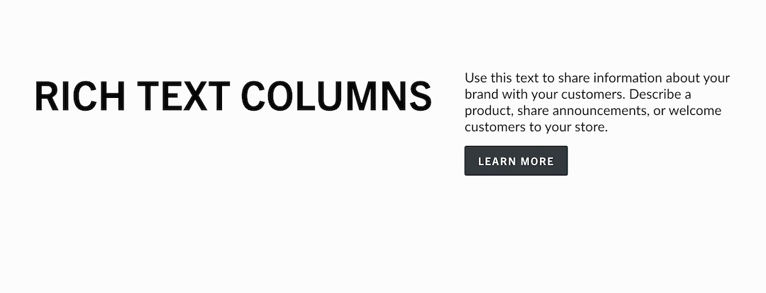
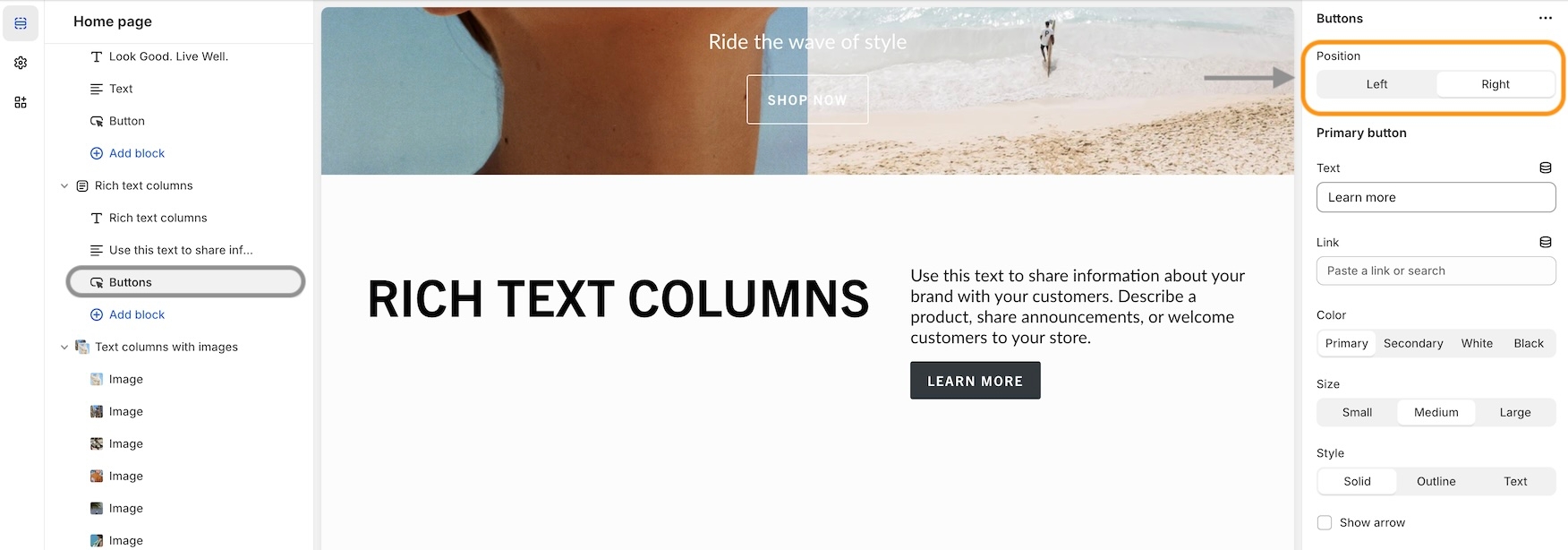
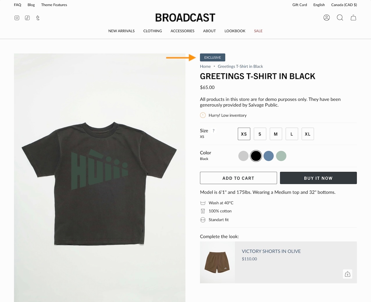
The Image and Video blocks can be combined under a unified structure because they share a common purpose and layout model:
Both blocks act as a background media container with nested content (like text, heading, button blocks) layered on top.
These content blocks are modular elements designed to build flexible, visually engaging slides or sections. Each block can be added, arranged, and styled independently to create rich storytelling experiences or drive user actions.
Display a selection of collections with images and links
Drive more sales by guiding customers to your featured collections. The Collection list section in Broadcast lets you create organized displays that simplify shoppers navigating and finding their desired products.
Choose from grid or slider layouts to showcase your best collections and enhance customer engagement.
This section is a highly flexible and customizable solution for displaying important messages alongside imagery. With extensive options, it fits a variety of design needs, from announcements to promotional banners.
Add and organize various section blocks within the layout, allowing you to customize the structure of your content by arranging different elements, such as the section heading and buttons, to create a visually engaging and well-structured page.
An animated collection list with full sized images and large text
Display a single or split images hero-style banner
Restricts overlay to only the area behind the text. Requires Overlay opacity > 0. SectionBroadcast's hero-style section lets you quickly build a powerful banner section with one or two split images.
The heading, text, and buttons are blocks that can be placed in different positions to create the perfect branded banner and messaging.
Display large background product images when promoting a product
Scroll through product images with Broadcast's captivating product section. Highlight the featured product while shoppers scroll through the page.
The section remains sticky while product images are displayed. Shoppers can purchase directly with the Quick Add feature or click through to view the full product page.
Build custom multi-column promotions rapidly, using rich content blocks
Broadcast's full-featured section to build rich, beautiful, custom layouts and promotions. The multi-column section is a perfect starting point for building creative promotions from one to many columns with rich blocks and animation.
Sample layouts and styles when using the multi-column section.
The nested Slideshow section creates a responsive carousel that supports nested content blocks within each slide. It enables users to combine visual media (images or videos) with structured content (e.g., headings, text, buttons) layered on top.
Designed to be flexible and immersive, it includes support for layout customization, color schemes, autoplay behavior, and responsive heights for both desktop and mobile.
Display products from multiple collections with tabbed navigation
Broadcast's tab collection enables you to showcase multiple collections in one section. It is the most comprehensive collection section with a wide range of features and options.
Each collection tab can display a promotion with a call to action.
Display products from multiple collections in one section. Include a promotional image with messaging and branding to draw customers to your products.
Display full-width image slides with headings, buttons, and custom layouts.
This legacy slideshow supports a wide range of layout, transition, and content options, including desktop/mobile optimization and overlay enhancements. Best suited for visual storytelling or promotional hero banners.
Provides a newsletter signup form with heading, subheading, description text, name field option, customizable button, and social icons.
You can only choose two blocks to be shown at a time.
Insert custom Liquid code or HTML for advanced layouts or embeds.
range
Adjusts how much space the video takes up on desktop.
Aspect ratio
range
Defines the video’s aspect ratio from wide to tall.
Layout
Width
select
Choose between Full width or Full width padded layout.
Desktop
Height
select
Set the banner’s desktop height: Full screen height, 3/4 of screen, 150px, and etc.
Desktop alignment
select
Control the position of text and buttons on the desktop: Top left, Absolute center, Bottom right, and etc.
Content width
range
Sets the width of the text and content area within the banner.
Mobile
Image
image_picker
Upload a separate image optimized for mobile (recommended: 1200×1600px).
Height
select
Set the banner height on mobile devices: Full screen height, 3/4 of screen, 150px, and etc.
Mobile alignment
select
Control text alignment and positioning for mobile: Top left, Absolute center, Bottom right, and etc.
Colors
Color scheme
color_scheme
Choose the section’s background and text color theme.
Padding
Top/Bottom
range
Adjust spacing above and below the section.
Advanced
Show placeholder image
checkbox
Displays a default placeholder image when no media is set.
Subheading
text
Secondary title above heading.
Heading
text
Main heading.
Heading size
select
Font size of the heading: Mini, Extra small, Small, Medium, Large, or Extra large
Text
richtext
Description or additional content.
Text size
select
Font size of body text: Extra small, Small, Medium, Large, or Extra large
Button
Text
text
Label for the optional button.
Link
url
Button destination.
Color
select
Choose from Primary, Secondary, White, or Black color style.
Size
select
Choose Small, Medium, or Largesize.
Style
select
Set Solid, Outline, or Text style.
Show arrow
checkbox
Adds arrow to the button.
Show social icons
checkbox
Enables social icons display (edit in Theme settings).
Columns
range
Sets the number of columns for text layout (desktop only).
Text alignment
select
Aligns the text to the Left or Centered.
Colors
Background
color
Custom background color.
Text
color
Custom text color.
Advanced
Heading SEO tag
select
SEO-focused heading tag: H1 - H6, or Automatic.

image_picker
Upload image (2000×1400px .jpg recommended).
Typography
Heading
text
Main headline text.
Heading size
select
Controls heading font size. Options: Mini, Extra small, Small, Medium, Large, or Extra large.
Text
richtext
Rich text content. Applies Text size only when set to Paragraph.
Text size
select
Sets body font size: Extra small, Small, Medium, Large, or Extra large.
Block alignment
select
Aligns the entire content block: Top Left, Bottom right, Absolute center, etc.
Colors
Show text background
checkbox
Displays a background color behind text.
Background
color
Override for background color.
Text
color
Override for text color.
Overlay type
select
Adds an overlay: Disabled, Opacity, or Text underlay.
Button
Text
text
Button label. Leave blank to make the entire image clickable.
Link
url
URL for the button or image.
Color
select
Button color style: Black, White, Primary, or Secondary.
Size
select
Button size: Small, Medium, or Large.
Style
select
Visual style: Solid, Outline, or Text.
Show arrow
checkbox
Adds an arrow icon to the button.
Advanced
Heading SEO tag
select
Sets HTML tag for heading: Automatic, or H1 - H6.

image_picker
Upload an image. Recommended size: 1400x1400px.
Image width
range
Adjust image width within the column.
Desktop aspect ratio
range
Image ratio from wide to tall.
Mobile aspect ratio
range
Same as above but for mobile.
Image shape
select
Display image as Normal, Circle, Rounded, Blob one, Blob two, or Blob three.
Typography
Heading
text
Title under image.
Heading size
select
Font size for the heading: Mini, Extra small, Small, Medium, Large, or Extra large.
Text
richtext
Rich text below the heading.
Text size
select
Font size of text content: Extra small, Small, Medium, Large, or Extra large.
Button
Text
text
Text for CTA button (leave blank to make image a link).
Link
url
Link for the button or image.
Color
select
Button color style: Primary, Secondary, Black, or White.
Style
select
Appearance of the button: Solid, Outline, or Text.
Show arrow
checkbox
Adds an arrow to the button if enabled.
Advanced
Heading SEO tag
select
SEO tag for the heading: Automatic, or H1 - H6.

Subheading
text
Smaller text above heading.
Heading
text
Main heading.
Heading size
select
Controls heading font size: Mini, Extra small, Small, Medium, Large, or Extra large.
Text
richtext
Text block content with default sample text.
Text size
select
Font size for text content:Extra small, Small, Medium, Large, or Extra large.
Columns
range
Number of text columns (1-3). Desktop only.
Text alignment
select
Left or Centered align the text.
Button
Text
text
Button label.
Link
url
Button URL.
Color
select
Button color style: Black, White, Primary, or Secondary.
Size
select
Button size: Small, Medium, or Large.
Style
select
Visual style: Solid, Outline, or Text.
Show arrow
checkbox
Adds arrow icon to button.
Social media icons
Show social icons
checkbox
Display social media icons. Editable in Theme Settings.
Colors
Background
color
Override for background color.
Text
color
Override for text color.
Advanced
Heading SEO tag
select
Sets HTML tag for heading: H1-H6 or Automatic.

Customer name
text
Name of the customer.
Subheading
text
Typically a username or secondary label.
Testimonial
textarea
Customer's review content.
Text size
select
Font size for the testimonial: Extra small, Small, Medium, Large, or Extra large
Bio image
image_picker
Optional customer image.
Review link
Link
url
Makes entire testimonial a clickable link.
Style
Show quotation mark
checkbox
Adds quote marks to the testimonial.
Text alignment
select
Aligns the testimonial: Left or Centered.
Colors
Background
color
Background color override.
Text
color
Text color override.

select
Choose from Black, White, Primary, or Secondary button color.
Size
select
Set Small, Medium, or Large size.
Style
select
Choose from Solid, Outline, or Text style.
Show arrow
checkbox
Adds directional arrow icon to button.

text
Main heading.
Heading size
select
Font size of the heading: Mini, Extra small, Small, Medium, Large, or Extra large.
Text
richtext
Paragraph text.
Text size
select
Font size for the paragraph: Extra small, Small, Medium, Large, or Extra large.
Button
Text
text
Optional CTA button text.
Link
url
Link for the button.
Color
select
Styling for button color: Primary, Secondary, Black, or White.
Style
select
Button appearance: Solid, Outline, or Text.
Show arrow
checkbox
Display an arrow icon in button.
Advanced
Heading SEO tag
select
SEO tag for the heading: Automatic, or H1 - H6.


Layout
select
Determines the placement of collections and image: Collections left, image right and reversed is Image left, collections right.
Width
select
Section width options: Full width, Full width padded, or Normal.
Desktop
Height
select
Height of the section on desktop: 150px, ⅓ of screen, Full screen height, end etc.
Mobile
Height
select
Height of the section on mobile: 150px, ⅓ of screen, Full screen height, end etc.
Reverse block placement
checkbox
Flips the placement of image and collections for variation.
Colors
Color scheme
color_scheme
Apply a color scheme to the section.
Padding
Top/Bottom
range
Adjust vertical spacing above and below the section.
Typography
Heading
text
Main title for the section.
Heading size
select
Adjusts the font size of the section heading: Mini, Extra small, Small, Medium, Large, or Extra large.
Text
richtext
Descriptive text to provide context or brand messaging.
Text size
select
Font size for paragraph text (applies only to paragraph content): Extra small, Small, Medium, Large, or Extra large.
Layout


checkbox
Displays left/right arrows when the user hovers over the slideshow.
Autoplay
Auto-rotate slides
checkbox
Enables automatic cycling of slides.
Change slides every
range
Interval between automatic slide changes.
Layout
Width
select
Sets section width: Full width or Full width with padding.
Desktop
Height
select
Controls slideshow height on desktop. Options include screen ratios and fixed pixel heights.
Mobile
Height
select
Controls slideshow height on mobile devices. Mirrors the desktop height options.
Colors
Color scheme
color_scheme
Applies a predefined color scheme to the content within the section.
Padding
Top
range
Adds spacing above the section.
Bottom
range
Adds spacing below the section.
Transition style
select
Determines the slide transition effect: Slide, Fade, Zoom out, or Wipe.


Show navigation arrows on hover
checkbox
Display arrow buttons when users hover over the slideshow.
Autoplay
Auto-rotate slides
checkbox
Enable automatic slide rotation (autoplay).
Change slides every
range
Time in seconds between automatic slide transitions.
Layout
Width
select
Choose between Full width or Full width padded layout.
Desktop
Height
select
Set slide height for desktop: Full screen, Fixed pixels, or Screen ratios.
Content width
range
Set how wide the text area should be relative to the slide.
Mobile
Height
select
Define slide height for mobile using screen ratios or fixed pixels.
Colors
Color scheme
color_scheme
Choose the theme’s color preset to apply to the slide section.
Padding
Top
range
Add spacing above the slideshow.
Bottom
range
Add spacing below the slideshow.
Transition style
select
Choose how slides change: Slide, Fade, Zoom out, or Wipe.


Show navigation arrows on hover
text
Smaller text above heading.
Heading
text
Primary headline.
Heading size
select
Controls heading font size: Mini, Extra small, Small, Medium, Large, or Extra large.
Text
richtext
Rich text content.
Text size
select
Sets font size for text content:Extra small, Small, Medium, Large, or Extra large.
Columns
range
Number of text columns. Desktop only.
Text alignment
select
Align Left or Centered.
Form
Show name field
checkbox
Displays an optional name input field.
Button text
text
Label for the submit button.
Show arrow
checkbox
Displays an arrow on the button.
Show reCAPTCHA terms
checkbox
Shows reCAPTCHA terms (recommended if spam protection is enabled).
Button
Color
select
Button color style. Options: Black, White, Primary, or Secondary.
Size
select
Button size: Options: Small, Medium, or Large.
Style
select
Button style: Solid, Outline, or Text.
Social media icons
Show social icons
checkbox
Toggle to show social media icons; editable in Theme Settings.
Colors
Background
color
Custom background color.
Text
color
Custom text color.
Advanced
Heading SEO tag
select
HTML heading tag for SEO: Options: Automatic, or H1-H6.

Subheading
Padding below the section.
Custom code
liquid
Add your own custom HTML/Liquid code. Renders directly in the section.
Padding
Bottom

range
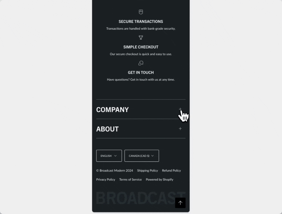
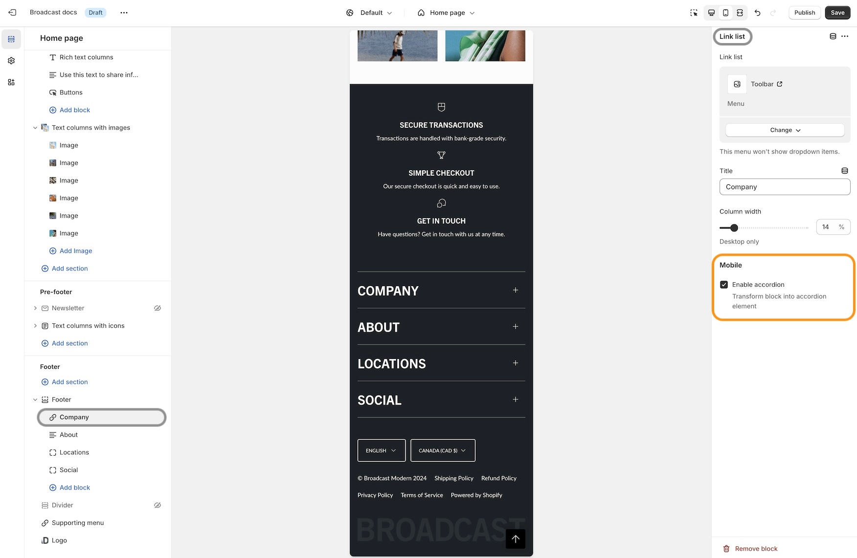
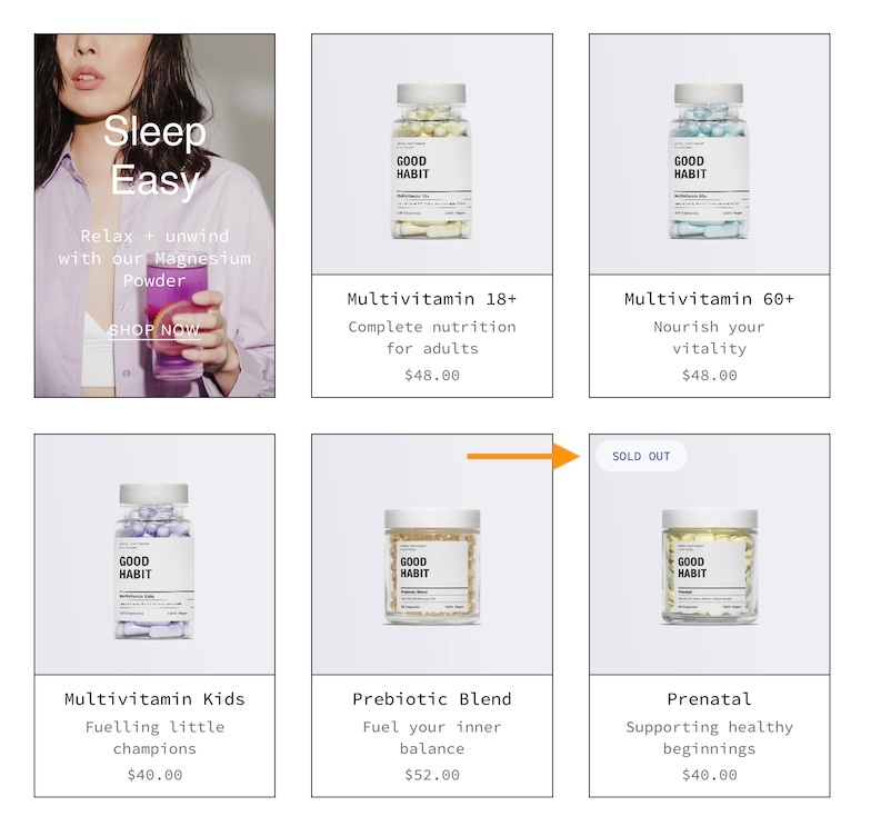
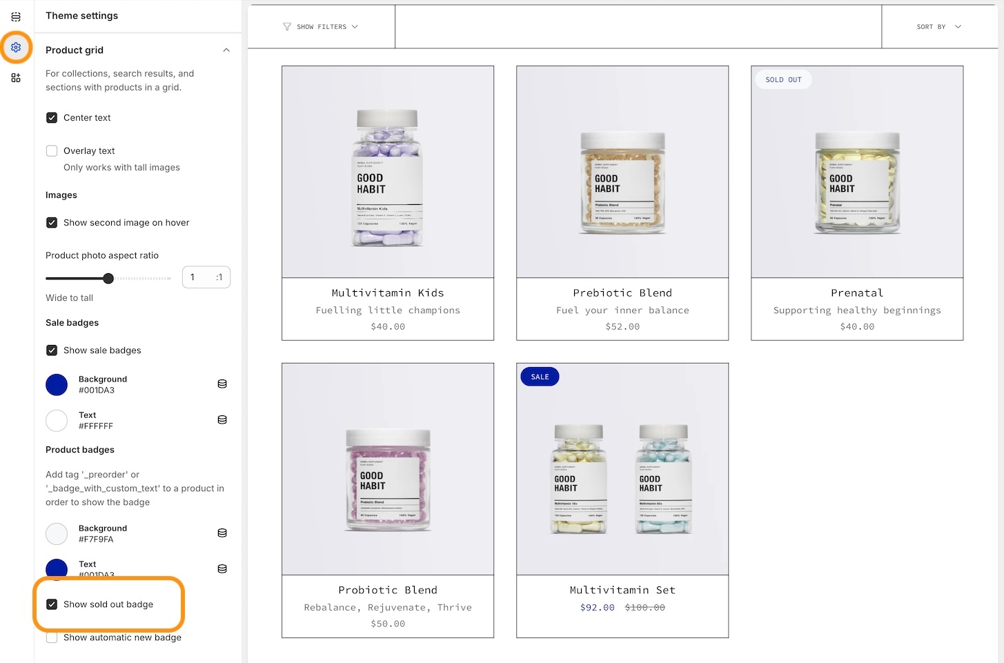
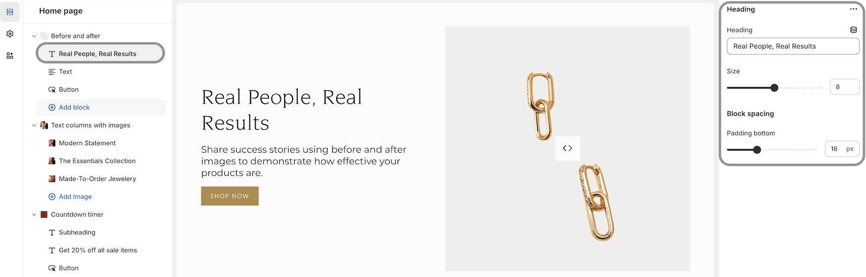
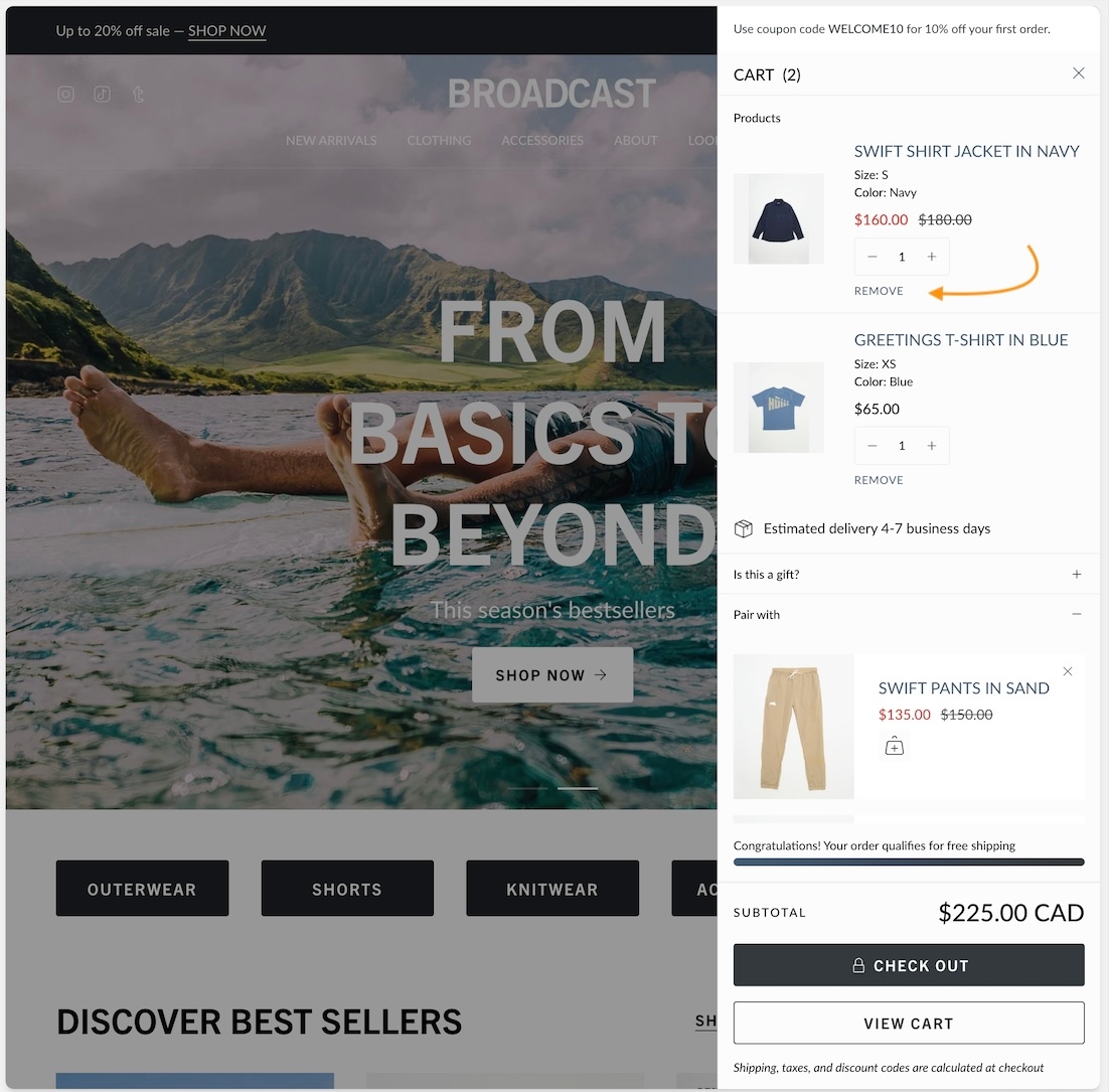
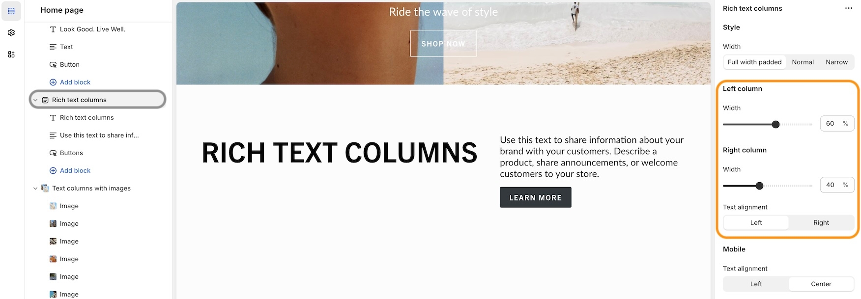
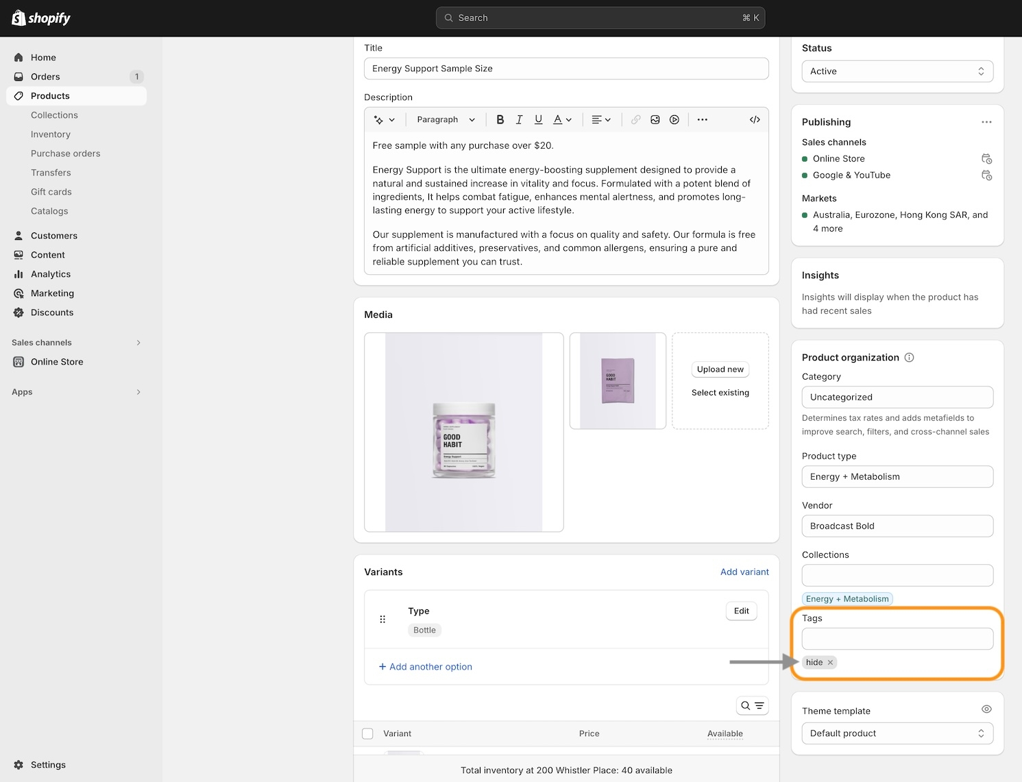
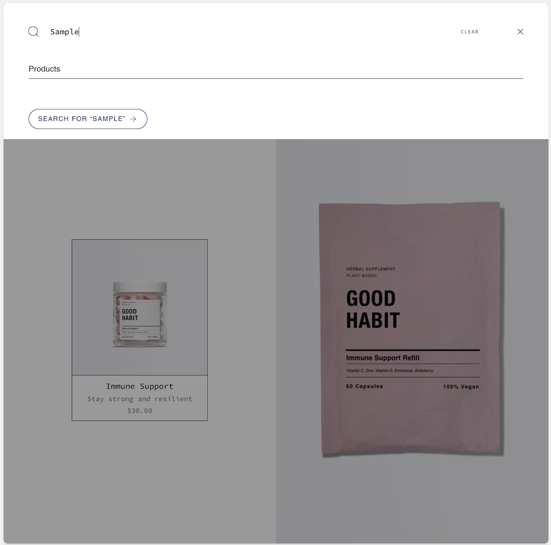
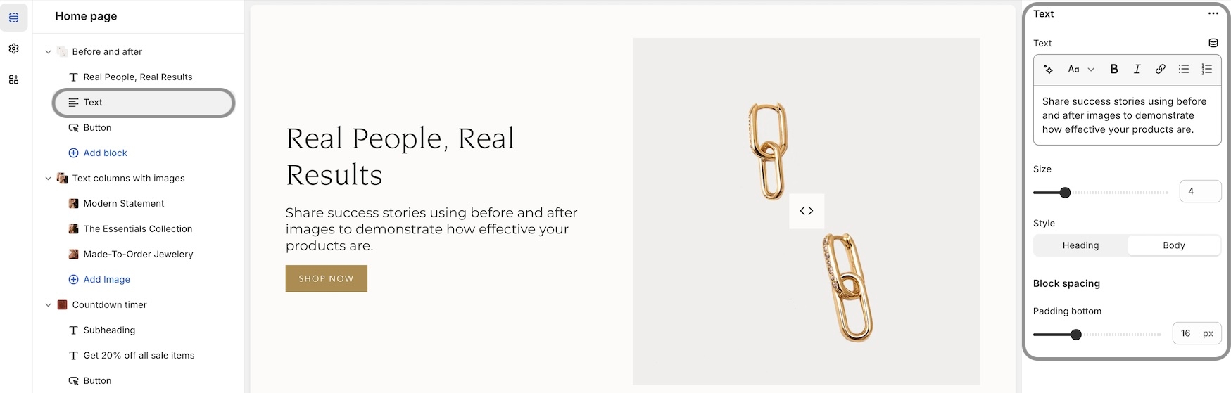
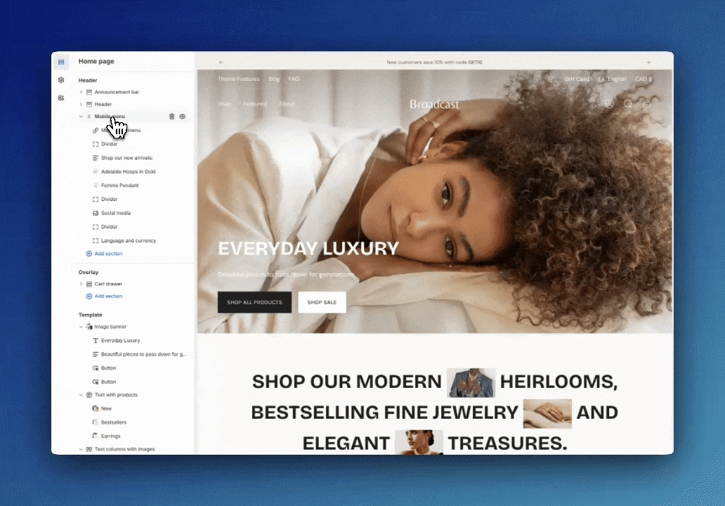
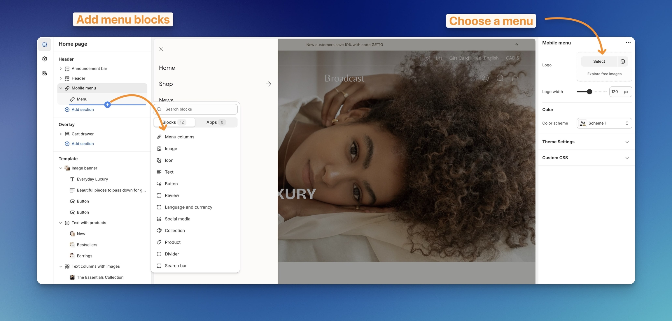
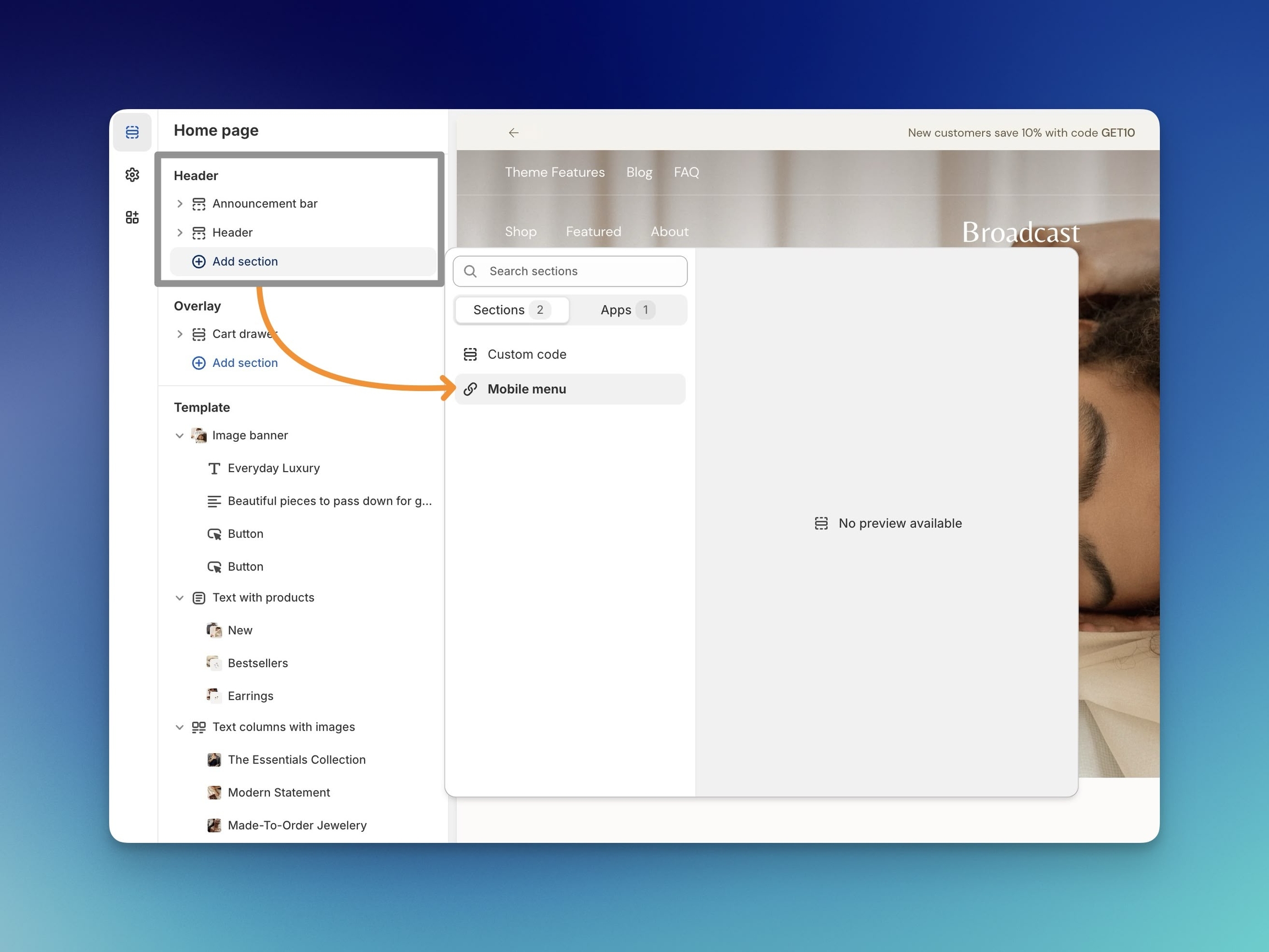
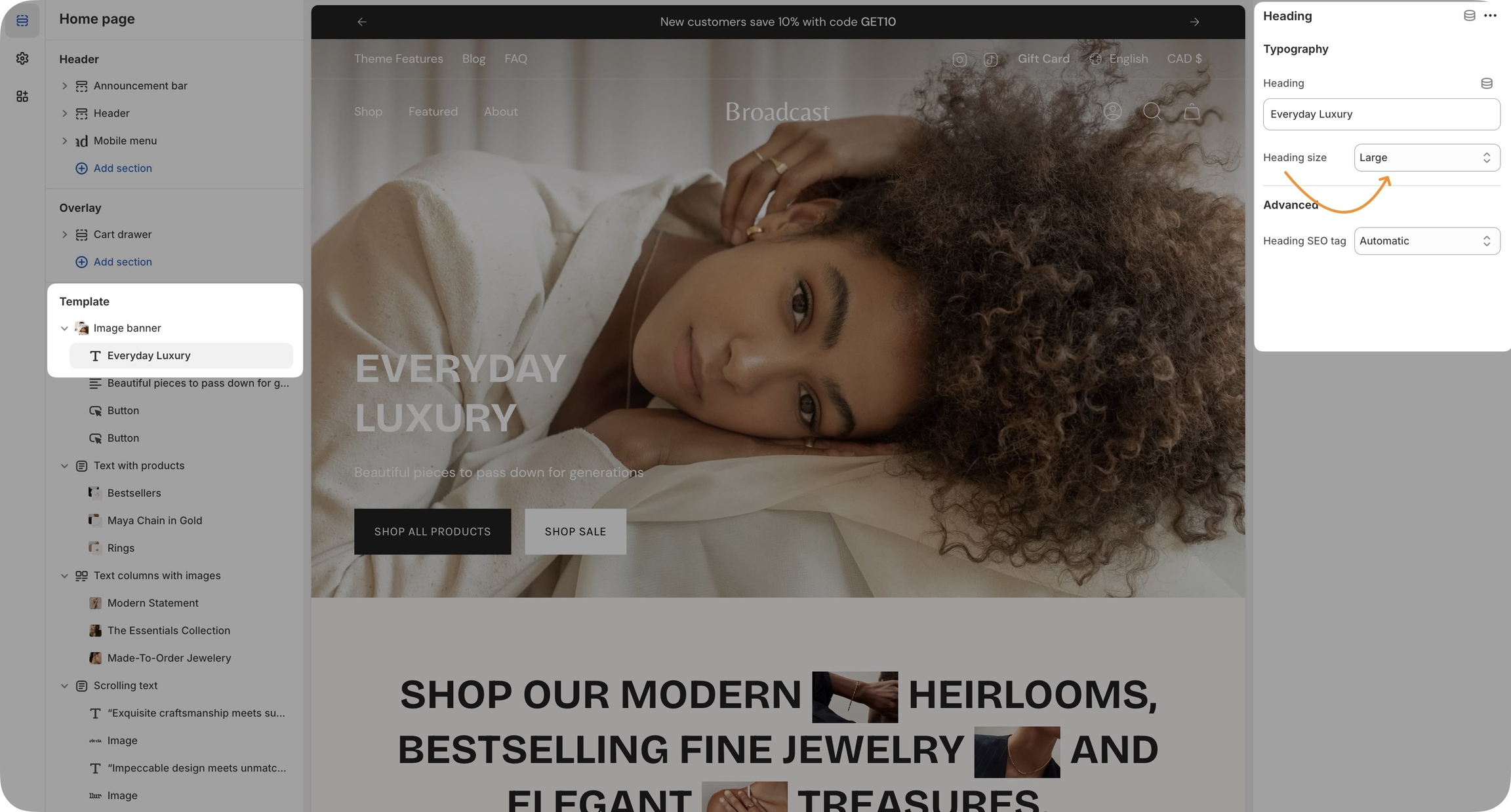
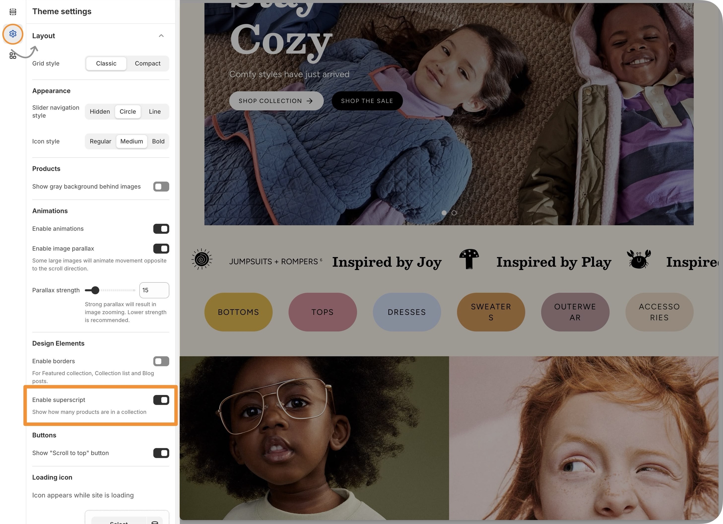
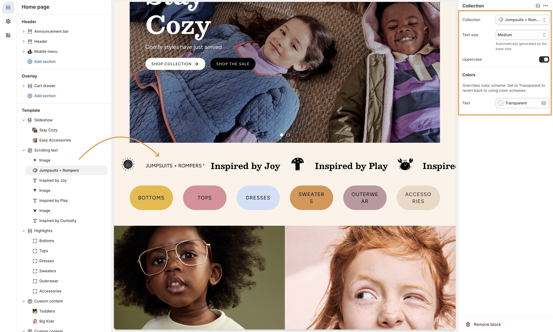
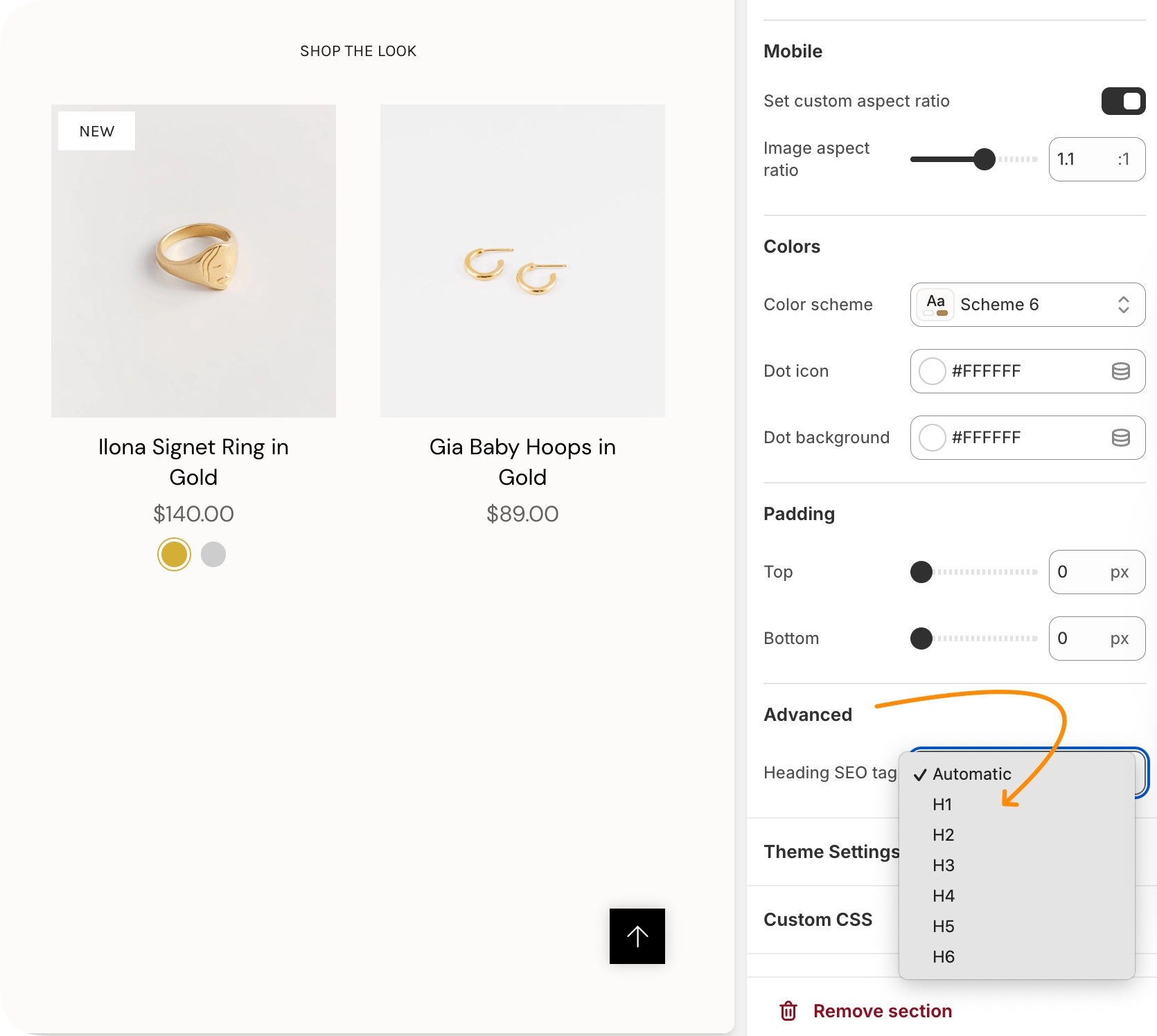
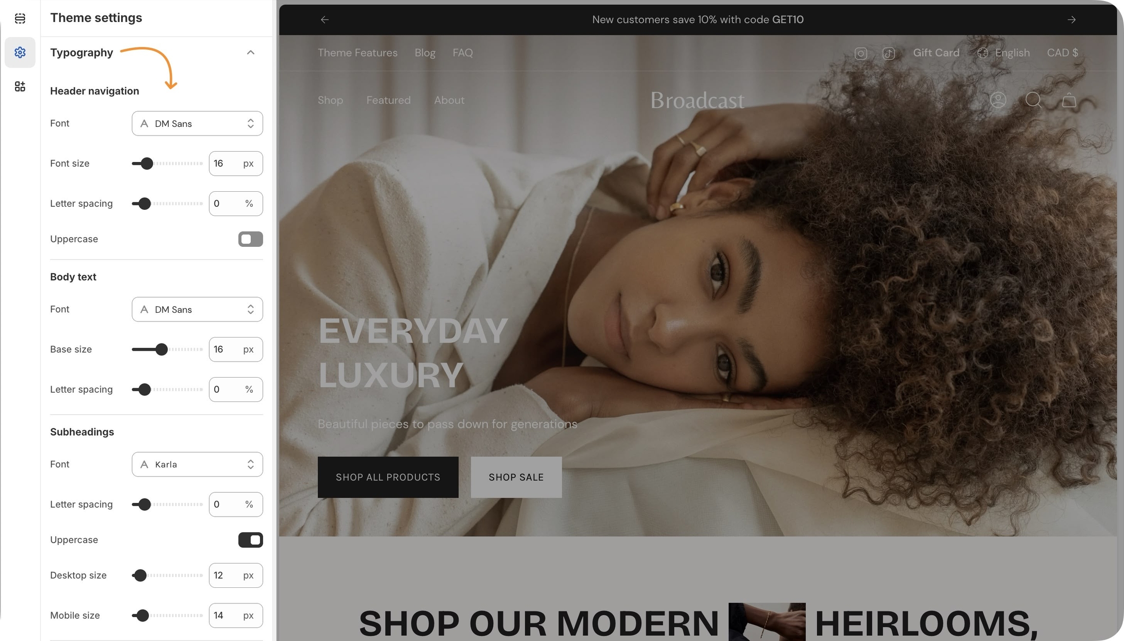
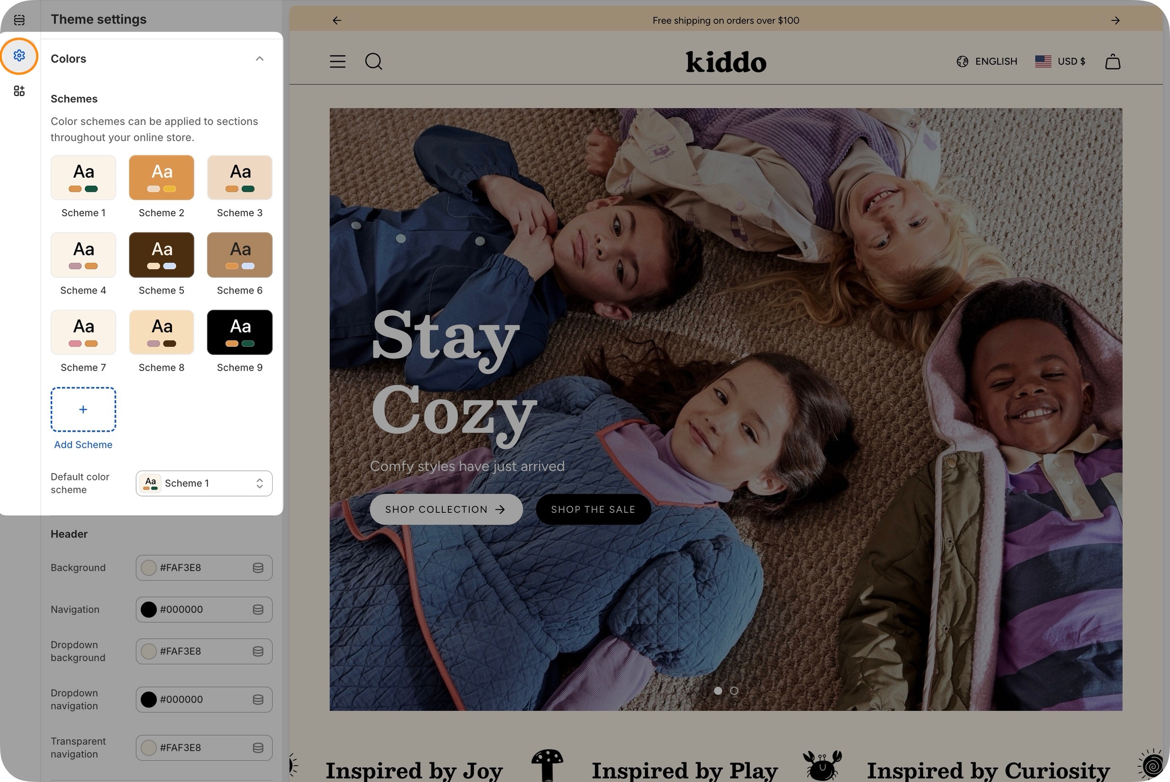
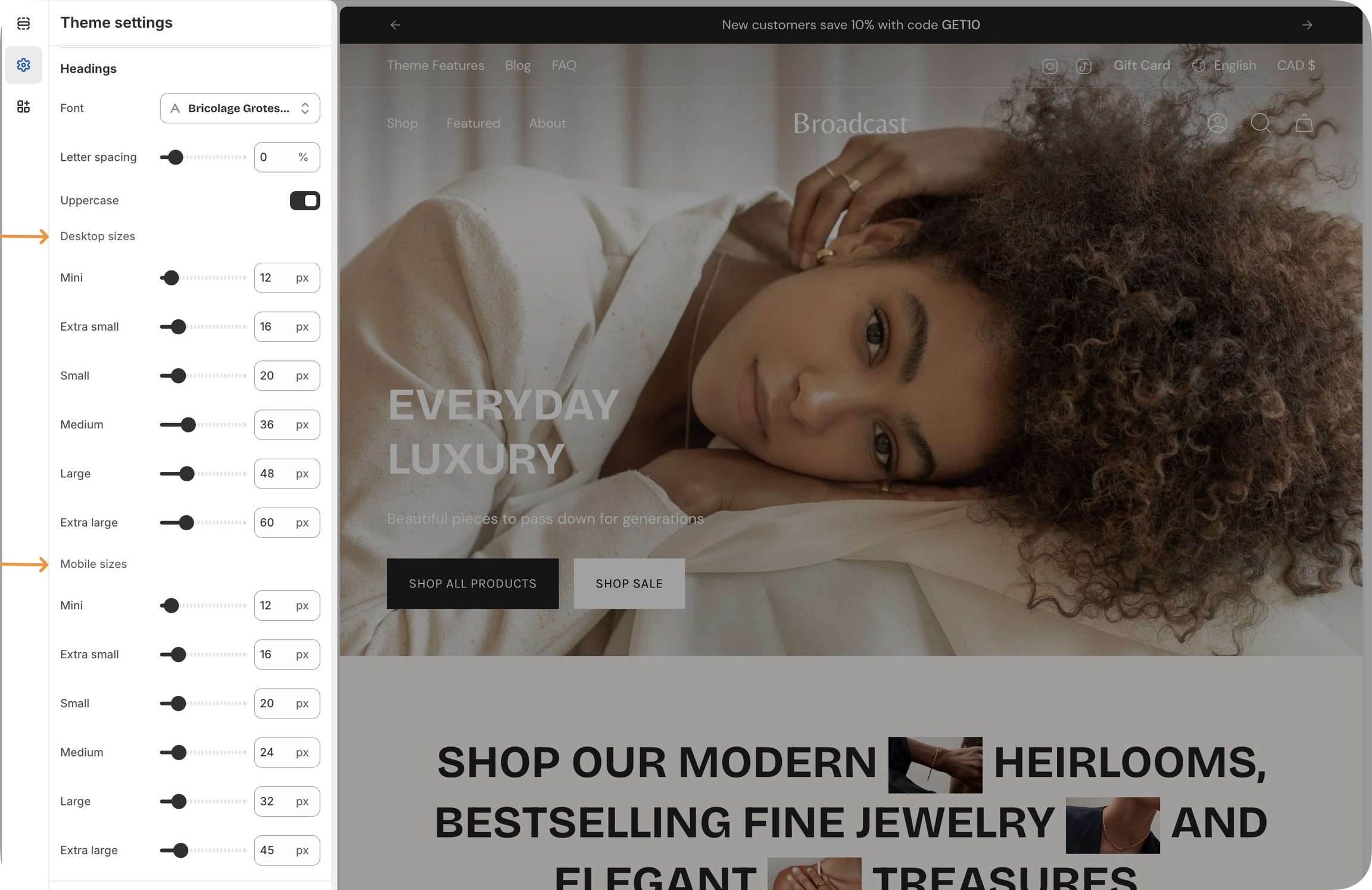
Displays a large headline or title within a slide or section.
Text
textarea
The heading content displayed over the image or video slide.
Heading size
select
Controls the visual size of the heading text. Options: Mini,Extra small, Small, Medium, Large, or Extra large.
Advanced
Heading SEO tag
select
Sets the semantic HTML tag H1-H6, or Automatic for SEO purposes.
Adds supporting or descriptive text beneath a heading.
Text
textarea
The body text shown over the image or video slide.
Text size
select
Controls the font size for product text. Adjusts based on base size setting: Extra small, Small, Medium, Large, or Extra large.
Padding
Bottom
range
Padding below the section.
Inserts a single call-to-action (CTA) button.
Text
text
The label that appears on the button.
Link
url
Destination URL the button will link to.
Color
select
Visual style of the button: Primary, Secondary, Black, or White.
Size
select
Button size options: Small, Medium, or Large.
Adds two CTAs side by side, usually Primary and Secondary actions.
Primary/Secondary buttons
Text
text
Label displayed on the primary/secondary buttons.
Link
url
URL the primary/secondary buttons links to.
Color
select
Button color: Primary, Secondary, Black, or White.

Typography
Heading
text
Title text for the section.
Heading size
select
Choose the font size of the heading: Mini, Extra small, Small, Medium, Large, orExtra large.
Text
richtext
Optional subheading or description text below the heading.
This short video demonstrates some of the settings and options for the Collection list section:


Content
Image
image_picker
Main desktop image (Recommended: 3200 x 1200px, JPG).
Image link
url
Optional URL to make the image clickable.
Space between messages
range
Controls the spacing between scrolling messages.
Autoplay speed
range
Adjusts the scrolling speed of the text.
Text typography


Typography
Heading size
select
Font size of the heading. Options from Mini, Extra small, Small, Medium, Large, orExtra large.
Desktop
Height
select
Controls the section height on desktop. Options include screen-based and fixed pixel heights.
Mobile
Height
This short video demonstrates some of the settings and options for the Collection list hover section:


Content
Primary image
image_picker
Main banner image. Recommended size: 3200×1200px JPG.
Secondary image
image_picker
Optional second image (displays 50% width). Same size as primary.
Image link
url
Optional link for the image.
Layout
Width
This video demonstrates the section settings and block options for the Image banner section, including split-images and mobile options:
This video discusses the advanced setting option when using the image banner page templates with metafields:


Content
Product
product
Select the product to be featured.
Show product card
checkbox
Optionally display the product card instead of the detailed view.
Layout
Layout
select
Determines order of product and image: Product left, image right or Image left ,product right.
Images limit
This video demonstrates the layout options and scrolling styles for desktop and mobile. Plus, all the section settings for the Featured product:


Text blocks with large heading sizes:
Menu block paired with an image block:
Two rows of text blocks with equal sizes:
Experiment with various column widths, blocks, and image shapes. The multi-column section can be used throughout your site with different designs.
Typography
Heading
text
Title for the section.
Heading size
select
Controls the font size of the heading: Mini, Extra small, Small, Medium, Large, or Extra large.
Text
richtext
Rich text area below the heading.
Image blocks have shape options and can have text and a call-to-action button after the image:
This video demonstrates different column layouts and also covers some of the section and block settings to achieve different styles:
For two-column sections with different block types, Broadcast also includes:
Show product count
checkbox
Displays product count if block-level featured image is enabled.
Typography
Heading
text
Section title.
Heading size
select
Font size for heading: Mini, Extra small, Small, Medium, Large, or Extra large.
This video demonstrates the tab layout options and reviews all the section and block options:
Broadcast includes a single-collection section with similar features for quickly displaying one collection:


select
Sets section height on mobile. Similar options to desktop.
Colors
Color scheme
color_scheme
Choose from predefined color schemes.
Padding
Top/Bottom
range
Sets top/bottom padding in pixels.
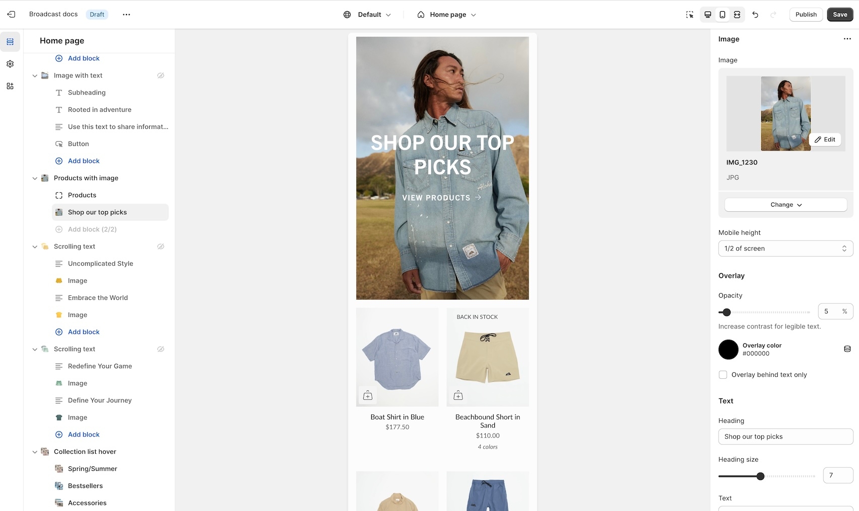
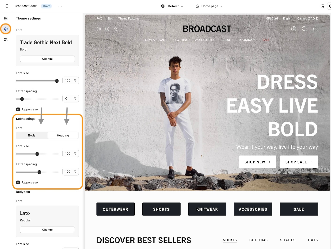
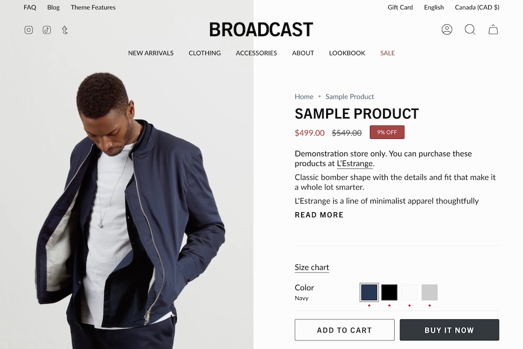
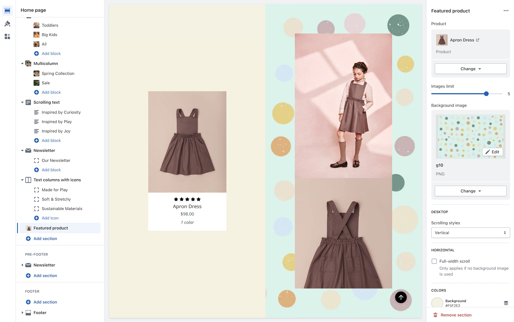
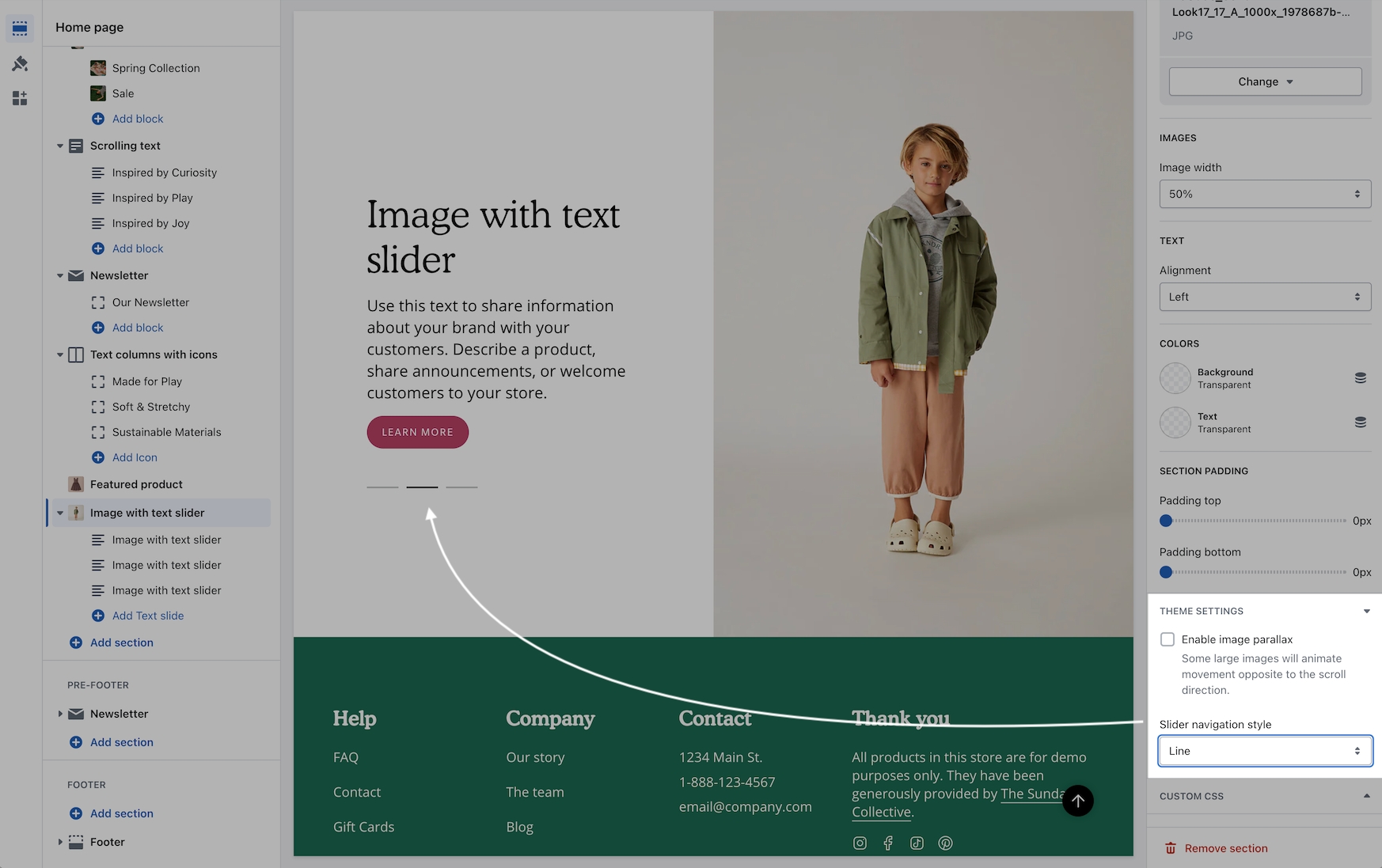
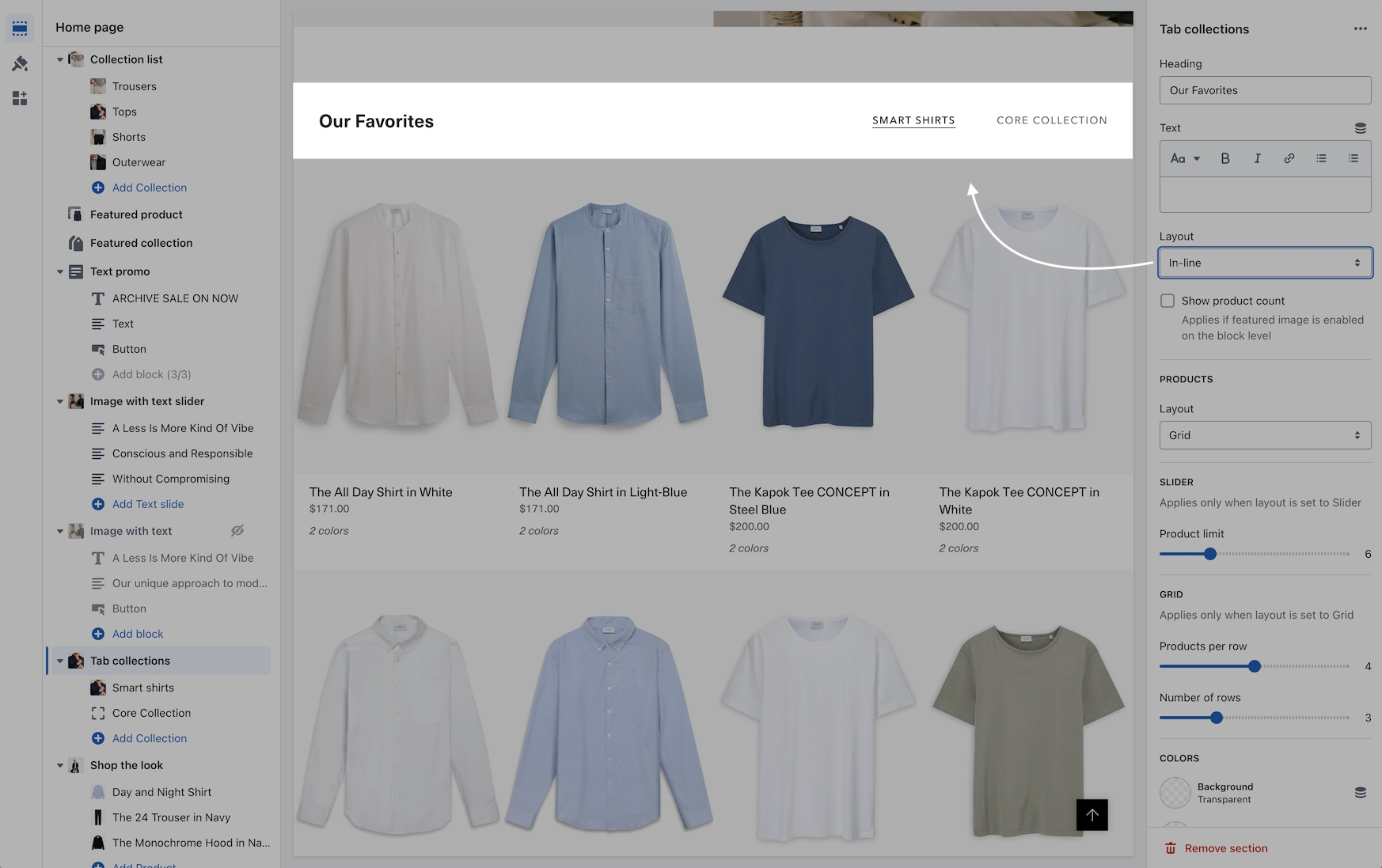
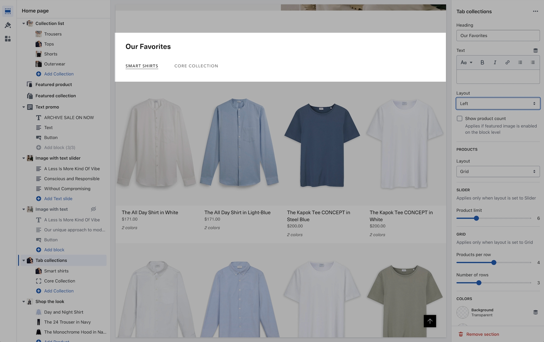
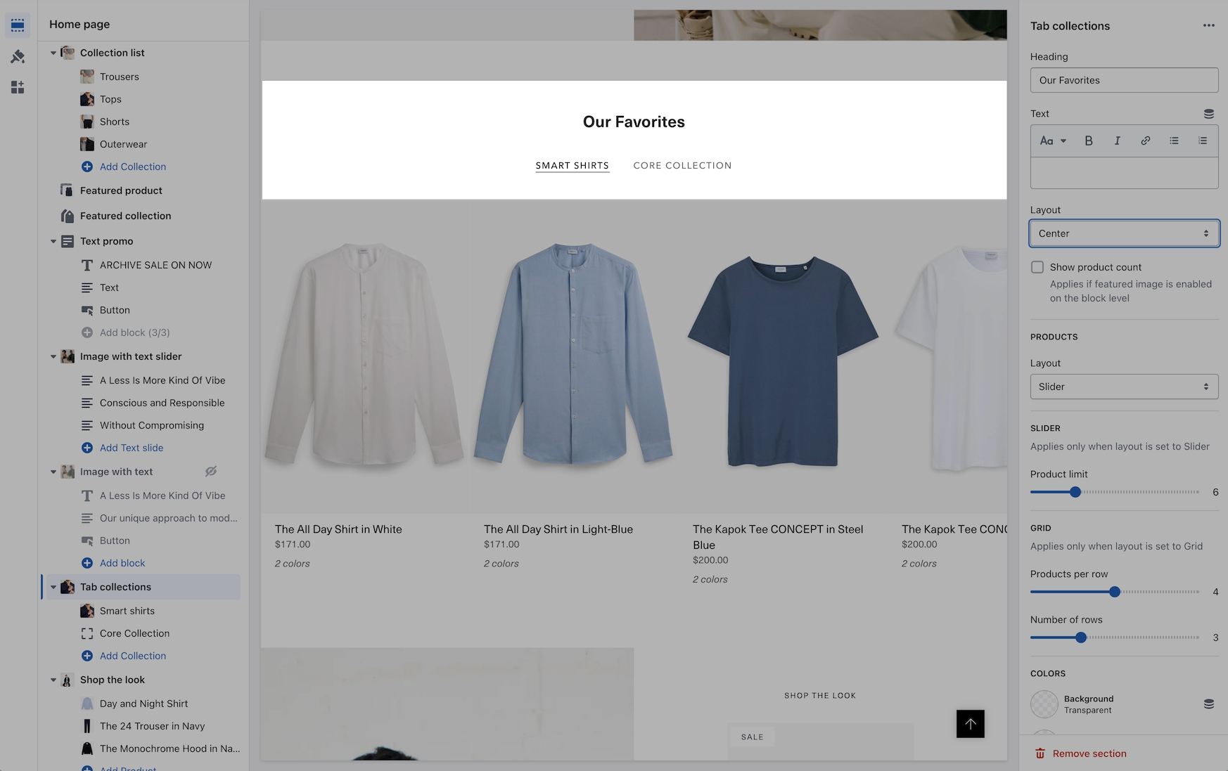
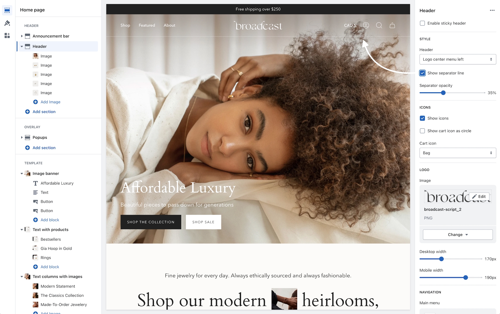
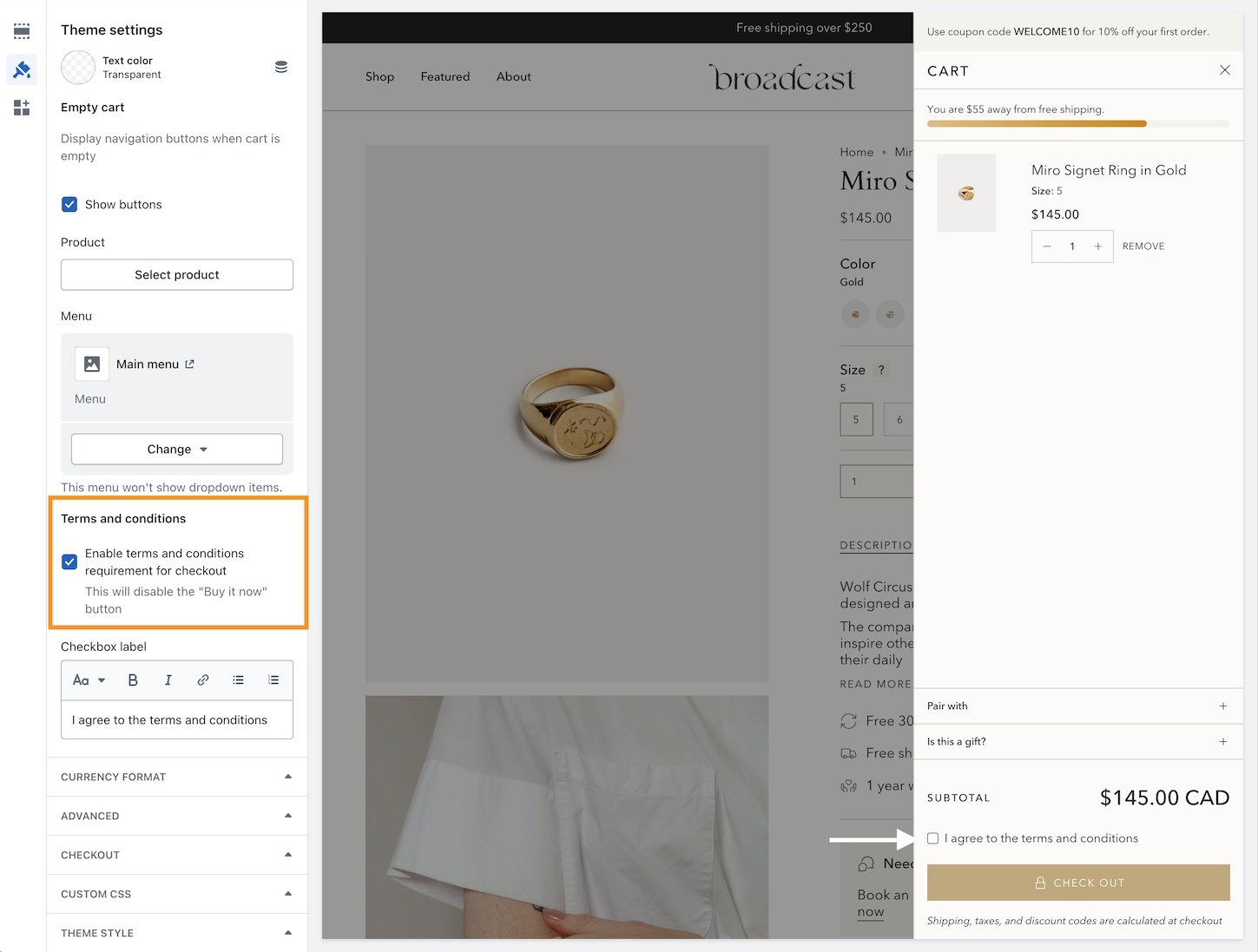
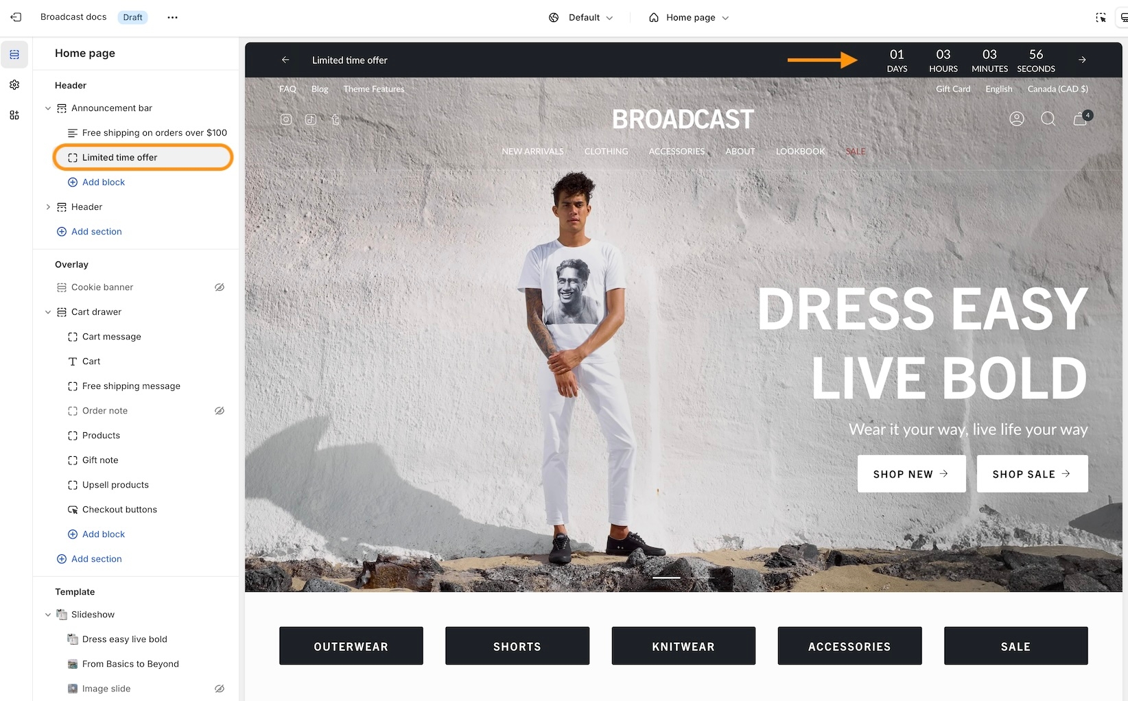
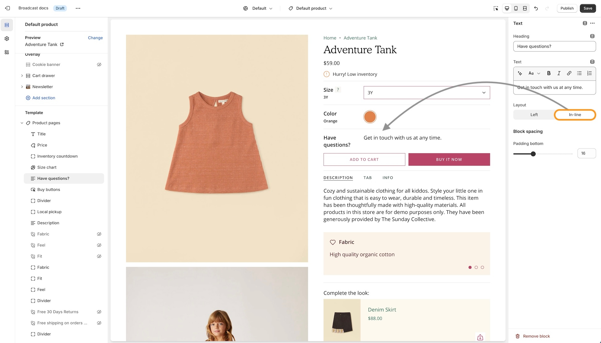
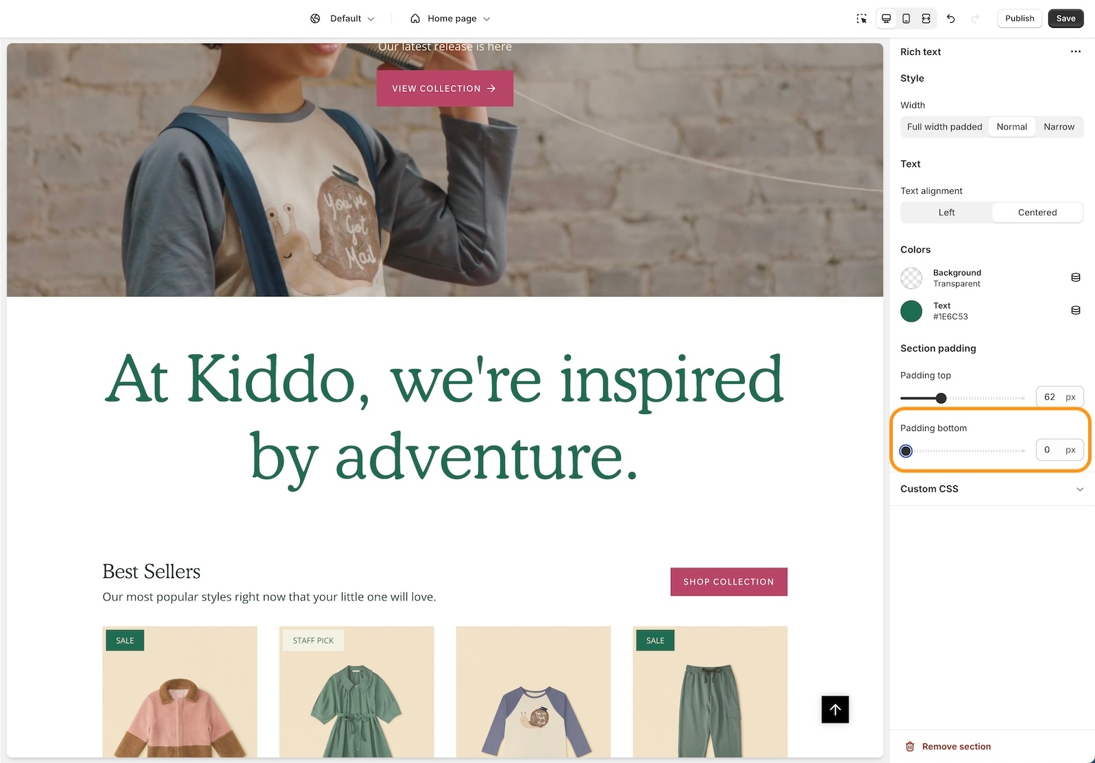
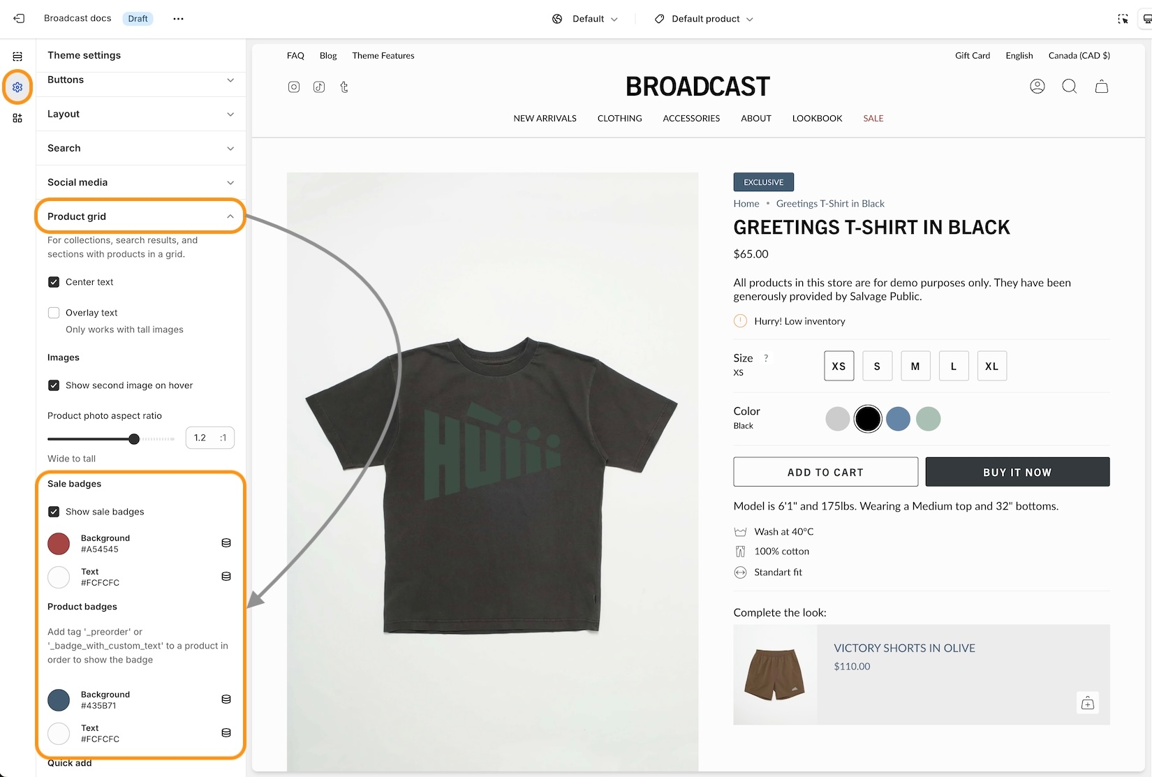
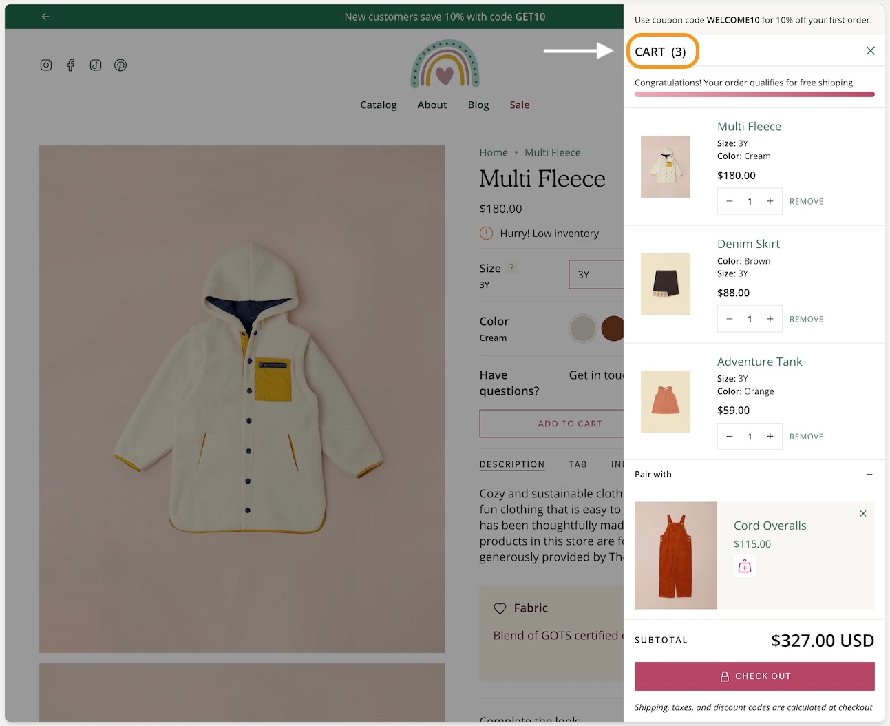
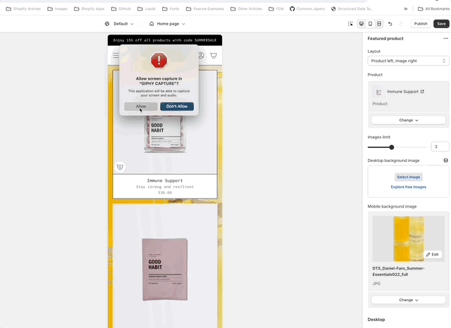
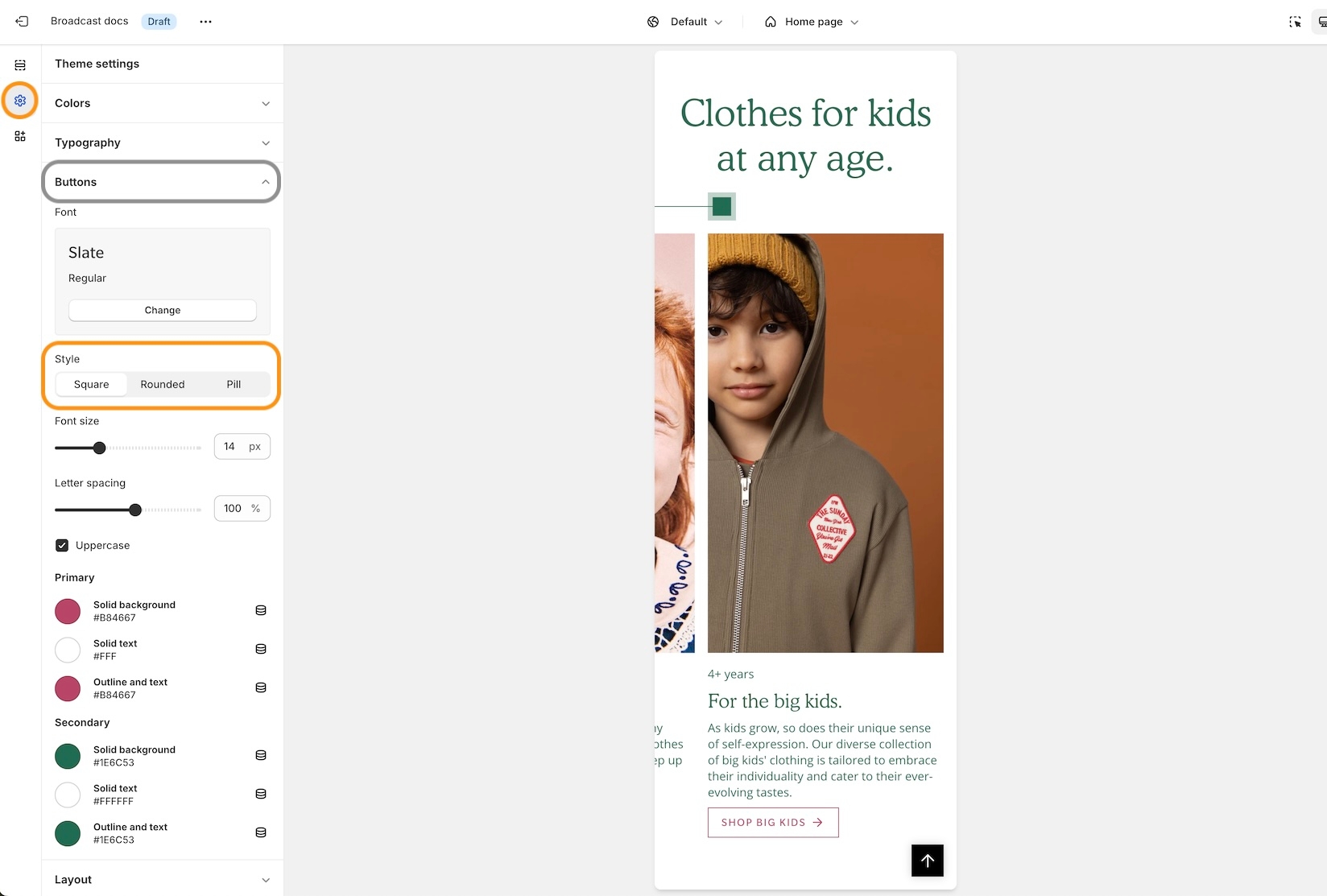
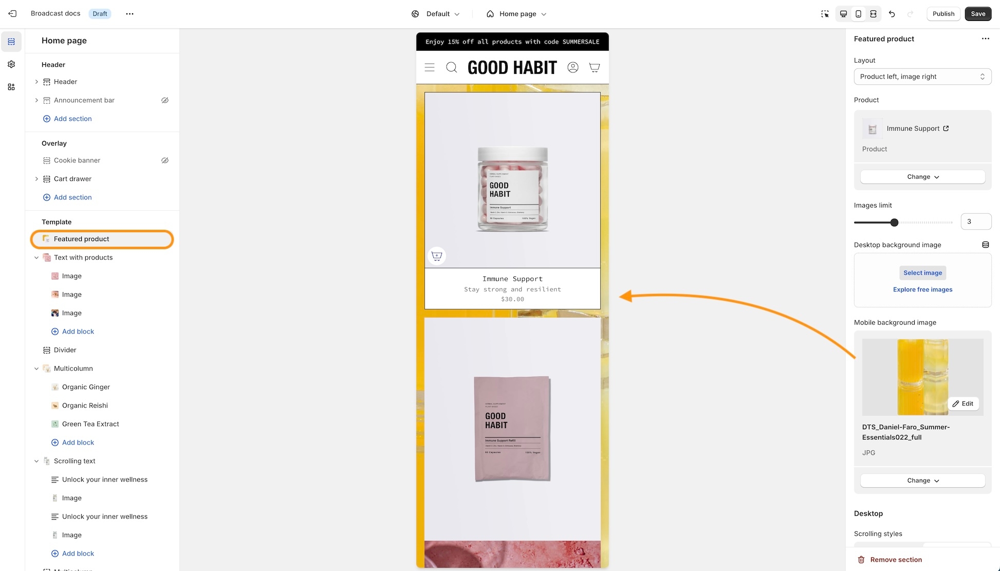
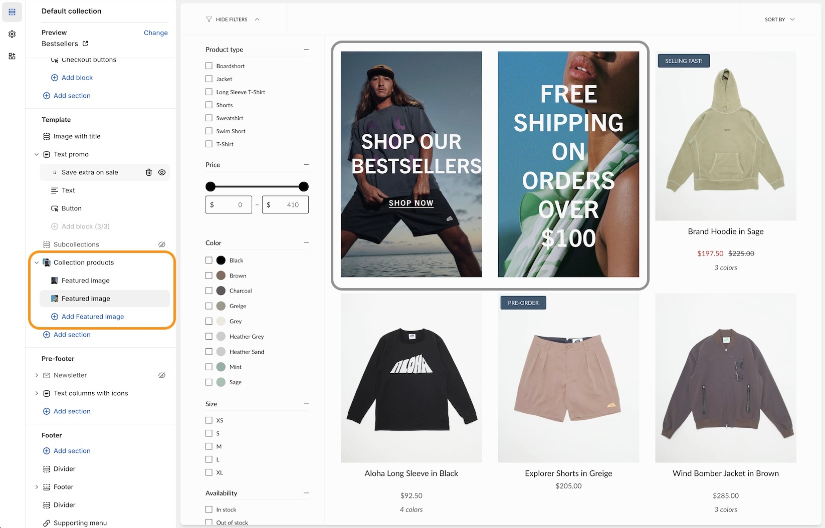
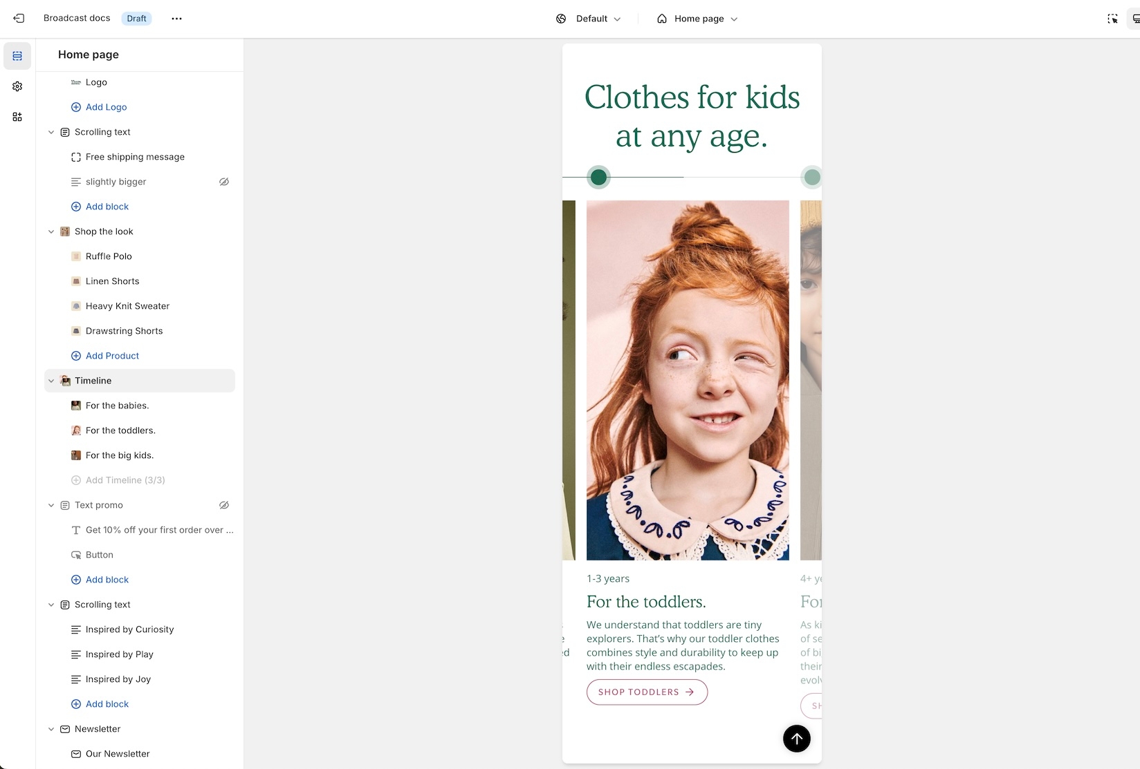
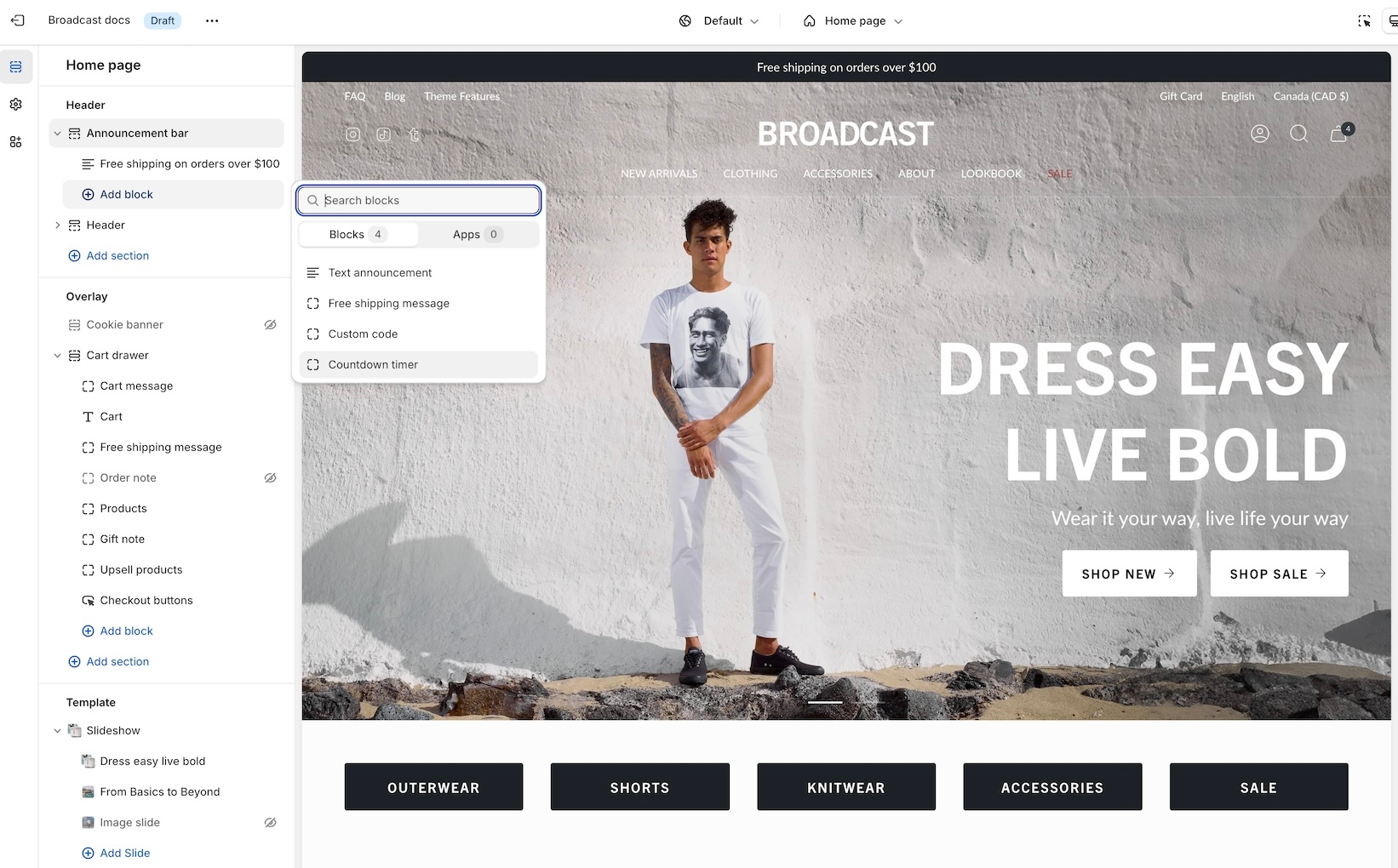
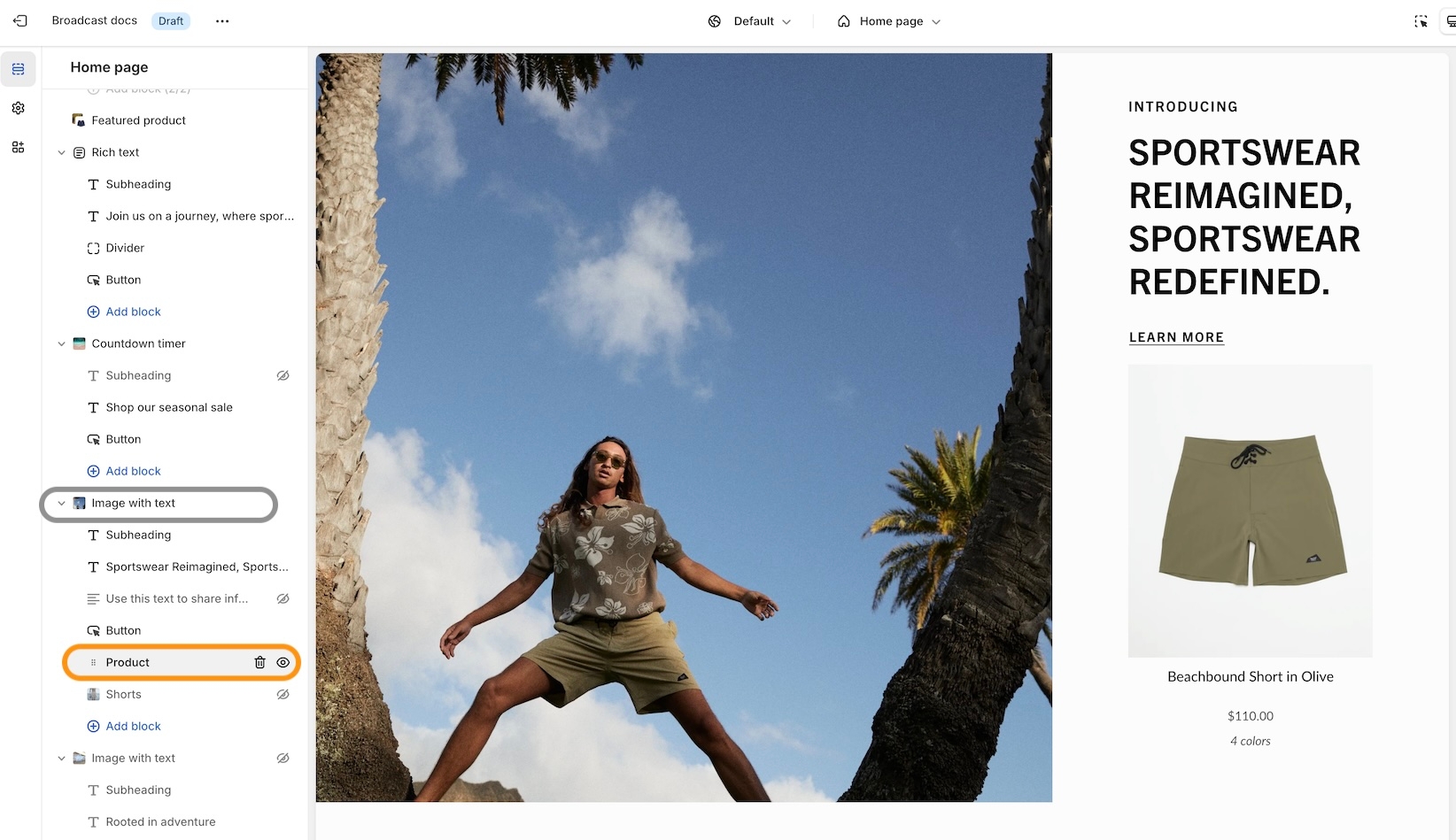
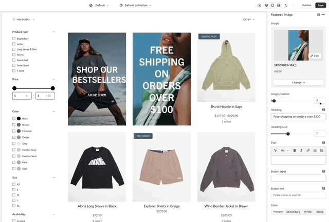
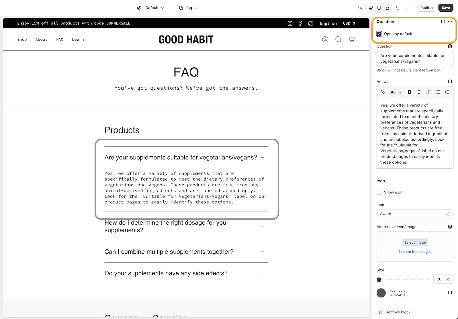
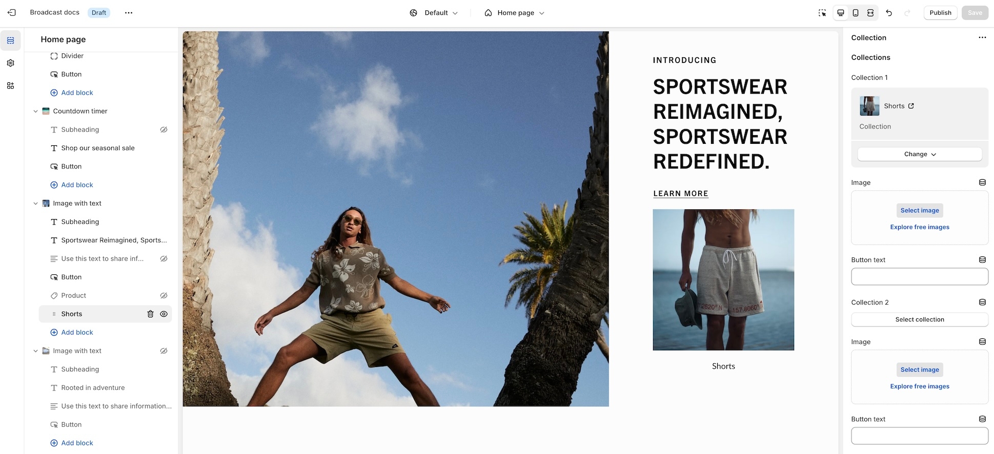
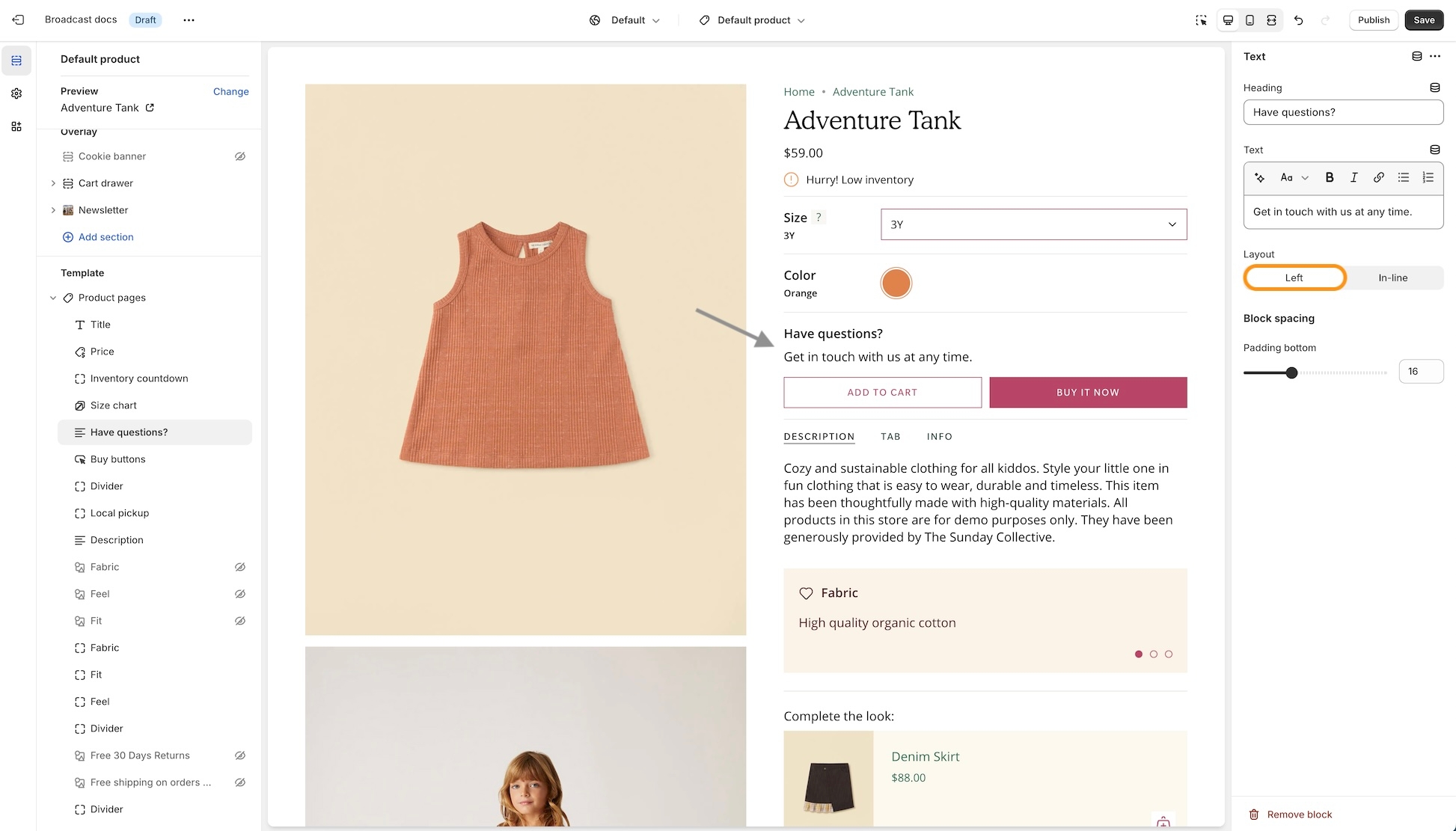
The Slide block represents an individual slide within a slideshow. It allows you to customize both the visual content and text overlays for each slide.
Content
Image
image_picker
Main image (recommended 3200x1200px .jpg)
Embeds a video file or external link to visually engage visitors with brand storytelling or demonstrations.
You can only choose two blocks to be shown at a time.
Display an image with a heading, text, and button overlaid for promotional or informational emphasis.
Column width
range
Width of the column desktop only.
Image
Image
You can select up to four products to feature in this promotion. The Quick Add feature quickly adds items to the cart. The call-to-action link over the image allows shoppers to view more items.
Product list
product_list
Choose up to 4 products to display.
Mobile

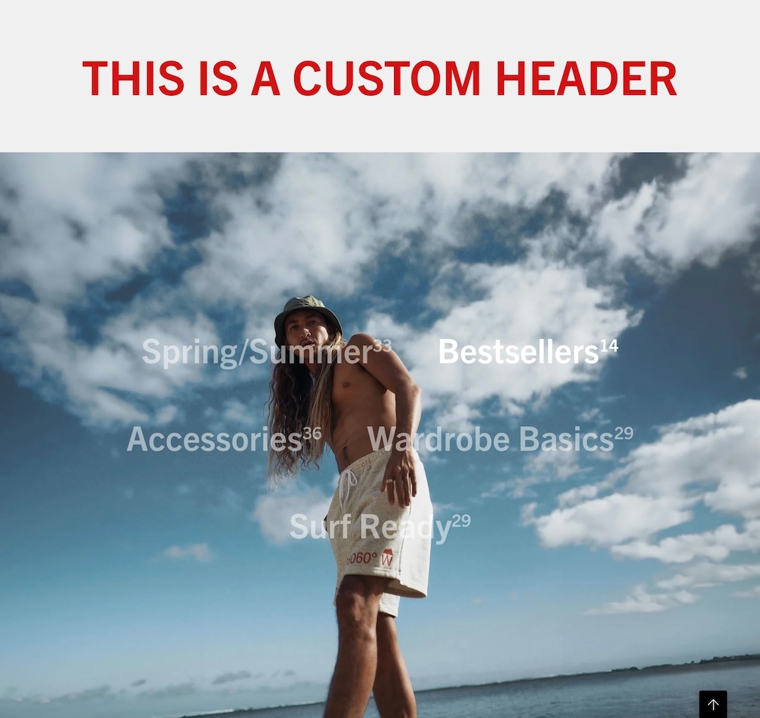
Display products from any of your collections in a grid or slider
The Featured Collection section displays selected products from a collection on your homepage or other eligible pages.
You can customize layout, typography, buttons, and colors to create a visually appealing and conversion-friendly showcase. It supports different grid formats for desktop and mobile, and offers control over heading style, padding, and SEO semantics.
The Image with product section combines a full-width or padded image banner with an overlay and integrated product display, making it ideal for promotional storytelling. It supports various responsive image heights, custom overlay options, a connected product card, and flexible call-to-action buttons.
This section is commonly used for hero images, promotional features, or highlighting a product in a lifestyle context. It supports up to 5 content blocks, including headings, text, buttons, and custom Liquid code.
Includes a signup form to collect customer emails for building your mailing list and driving engagement.
You can only choose two blocks to be shown at a time.
Text alignment
select
Vertical text position: Top, Center, or Bottom.
Scrolling text typography
Font
font_picker
Font style for scrolling text.
Text size
range
Font size for scrolling text.
Letter spacing
range
Controls spacing between letters.
Uppercase
checkbox
Transforms scrolling text to uppercase.
Position
select
Alignment for scrolling text: Top, Center, or Bottom.
Text direction
select
Marquee direction: Right-to-left or Left-to-right.
Desktop
Height
select
Choose height: image-based or fixed screen ratios.
Mobile
Image
image_picker
Alternative image for mobile (Recommended: 1200 x 1600px, JPG).
Height
select
Mobile height options similar to desktop.
Colors
Color scheme
color_scheme
Choose a color scheme from predefined options.
Overlay type
select
Adds an overlay: Disabled, Opacity, or Text underlay.
Padding
Top
range
Padding at the top.
Bottom
range
Padding at the bottom.
Advanced
Show placeholder image
checkbox
Show placeholder if metafield image is not used.

Padding
Bottom
Padding below the section.
Style
select
Button appearance: Solid (filled), Outline (border only), or Text (no border).
Show arrow
checkbox
If checked, a right-pointing arrow icon appears next to the text.
Full-width
checkbox
Makes the button span the full width of its container.
Padding
Bottom
range
Padding below the section.
Size
select
Button size: Small, Medium, or Large.
Style
select
Visual style: Solid, Outline, or Text.
Show arrow
checkbox
If checked, a right-arrow icon is shown on the buttons.
Padding
Bottom
range
Padding below the section.


Image link
url
Link for the main image
Typography
Heading
textarea
Heading text.
Heading size
select
Size of heading text: Mini,Extra small, Small, Medium, Large, or Extra large.
Text
textarea
Supporting description text.
Text size
select
Size of body text: Extra small, Small, Medium, Large, or Extra large.
Primary/Secondary buttons
Text
text
Label text for the primary button
Link
url
Link URL for the primary button
Color
select
Color scheme for primary button: Black, White, Primary, or Secondary.
Size
select
Size of primary button: Small, Medium, or Large.
Style
select
Style of primary button: Solid, Outline, or Text.
Show arrow
checkbox
Option to display an arrow icon on the primary button.
Desktop
Alignment
select
Alignment of content on desktop: Top left, Middle right, Bottom center, etc.
Mobile
Mobile image
image_picker
Mobile-optimized image (recommended 1200x1600px .jpg)
Alignment
select
Content alignment for mobile view: Top right, Middle left, Bottom center, etc.
Colors
Show text background
checkbox
Toggle to display a background behind text.
Background
color
Set the background color.
Text
color
Choose the text color.
Overlay type
select
Adds an overlay: Disabled, Opacity, or Text underlay.
Advanced
Heading SEO tag
select
SEO tag level for the heading: H1-H6 or Automatic.

Video
video
Upload the main video file to be displayed in the section.
Popup
Enable popup
checkbox
Toggles popup functionality for a secondary video.
MP4/MOV
video
Uploads a video file for use in the popup.
Youtube/Vimeo link
video_url
Add a YouTube or Vimeo video link for the popup.
Image
Image
image_picker
Upload a desktop image (recommended: 3200 x 1200px).
Mobile image
image_picker
Upload a mobile-specific image (recommended: 1200 x 1600px).
Typography
Heading
text
Set the heading text for the section.
Heading size
select
Choose heading font size Mini, Extra small, Small, Medium, Large, or Extra large.
Text
richtext
Add descriptive text below the heading.
Text size
select
Select the font size for the text: Extra small, Small, Medium, Large, or Extra large.
Block alignment
select
Align the content block within the section.
Button
Text
text
Specify the text for the button. Leave blank to make the entire image clickable.
Link
url
Enter a URL for the button to navigate to.
Color
select
Select the button color style: Black, White, Primary, or Secondary.
Size
select
Choose the button size: Small, Medium, or Large.
Style
select
Choose the button style: Solid, Outline, or Text.
Show arrow
checkbox
Enable an arrow icon within the button.
Colors
Show text background
checkbox
Adds a background behind the text for improved readability.
Background
color
Set the background color of the section.
Text
color
Set the text color.
Overlay type
select
Adds an overlay: Disabled, Opacity overlay, or Text underlay.
Advanced
Heading SEO tag
select
Specify the HTML tag for the heading: H1-H6 or Automatic.

image_picker
Upload image (1400 x 1400px .jpg recommended).
Image width
range
Width of the image.
Desktop aspect ratio
range
Image aspect ratio on desktop.
Mobile aspect ratio
range
Image aspect ratio on mobile.
Image shape
select
Shape style: Normal, Circle, Rounded, Blob one, Blob two, or Blob three.
Typography
Heading
text
Heading text overlay.
Heading size
select
Heading font size: Mini , Extra small, Small, Medium, Large, or Extra large.
Text
richtext
Descriptive text overlay.
Text size
select
Font size for text: Extra small, Small, Medium, Large, or Extra large.
Alignment
select
Position of overlay text and button within the image.
Button
Text
text
Button label text (leave blank to link entire image).
Link
url
URL for button or linked image.
Color
select
Button color style: Black, White, Primary, or Secondary.
Style
select
Button style: Solid, Outline, or Text.
Show arrow
checkbox
Display arrow icon in button.
Colors
Text
color
Color for overlay text.
Overlay type
select
Overlay style: Disabled, Opacity overlay, or Text underlay.
Advanced
Heading SEO tag
select
HTML tag for heading: Automatic or H1-H6.

Layout
select
Mobile layout: 1 item per row, 2 items per row, or Slider.

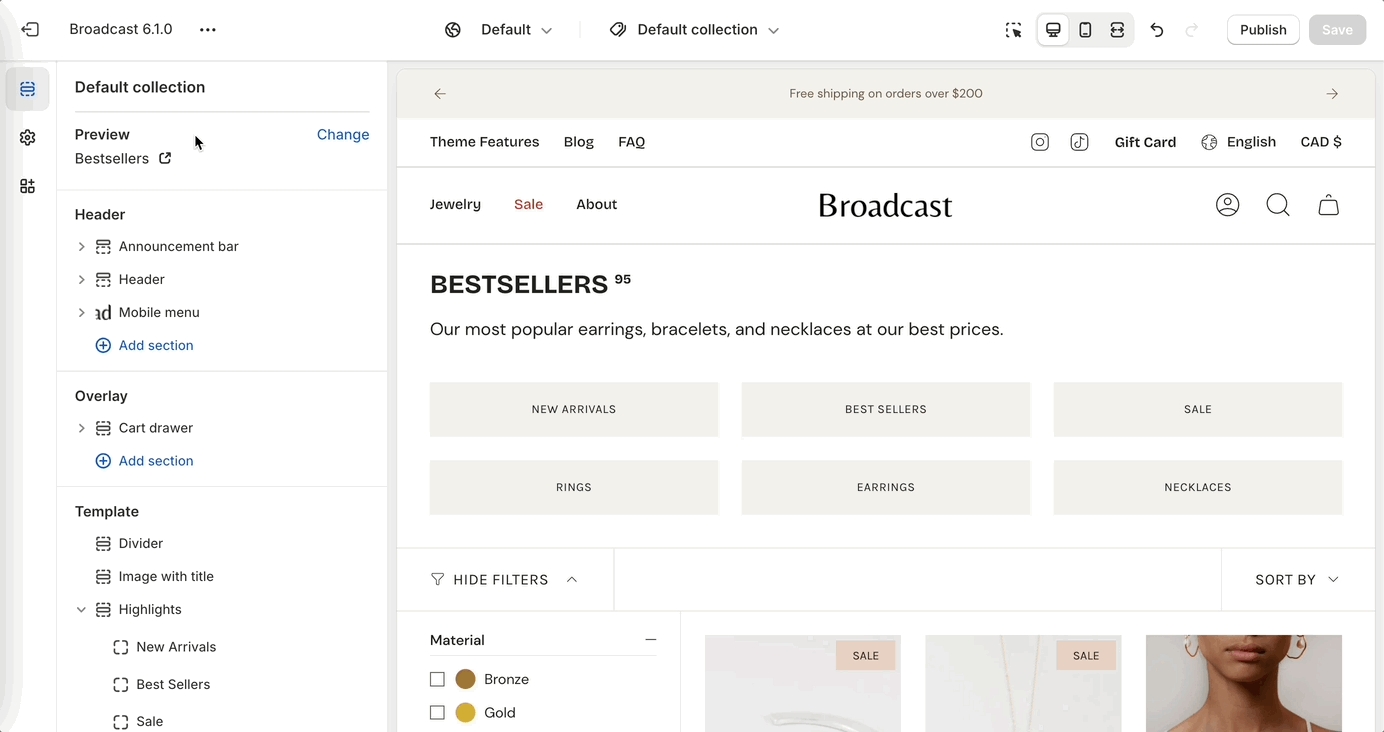
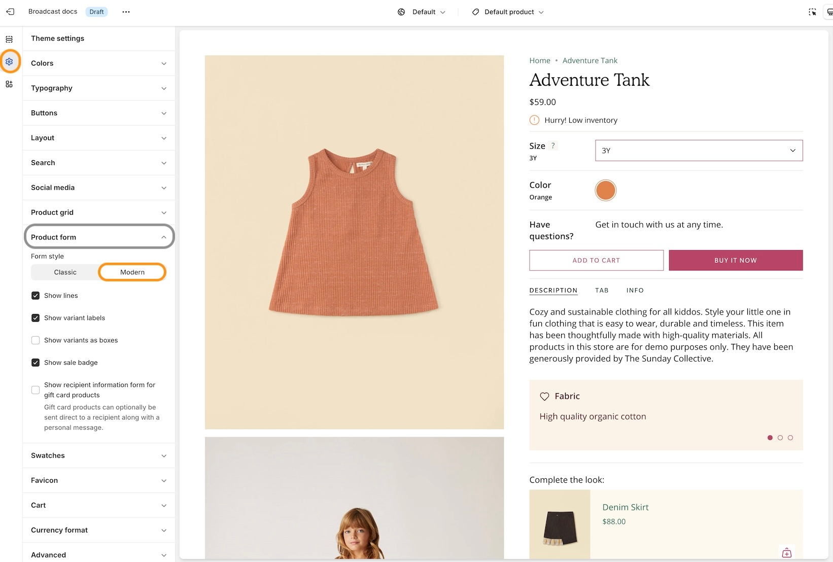
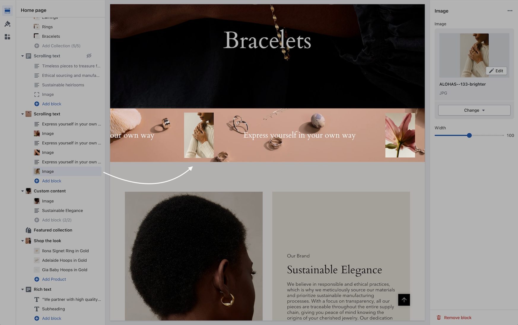
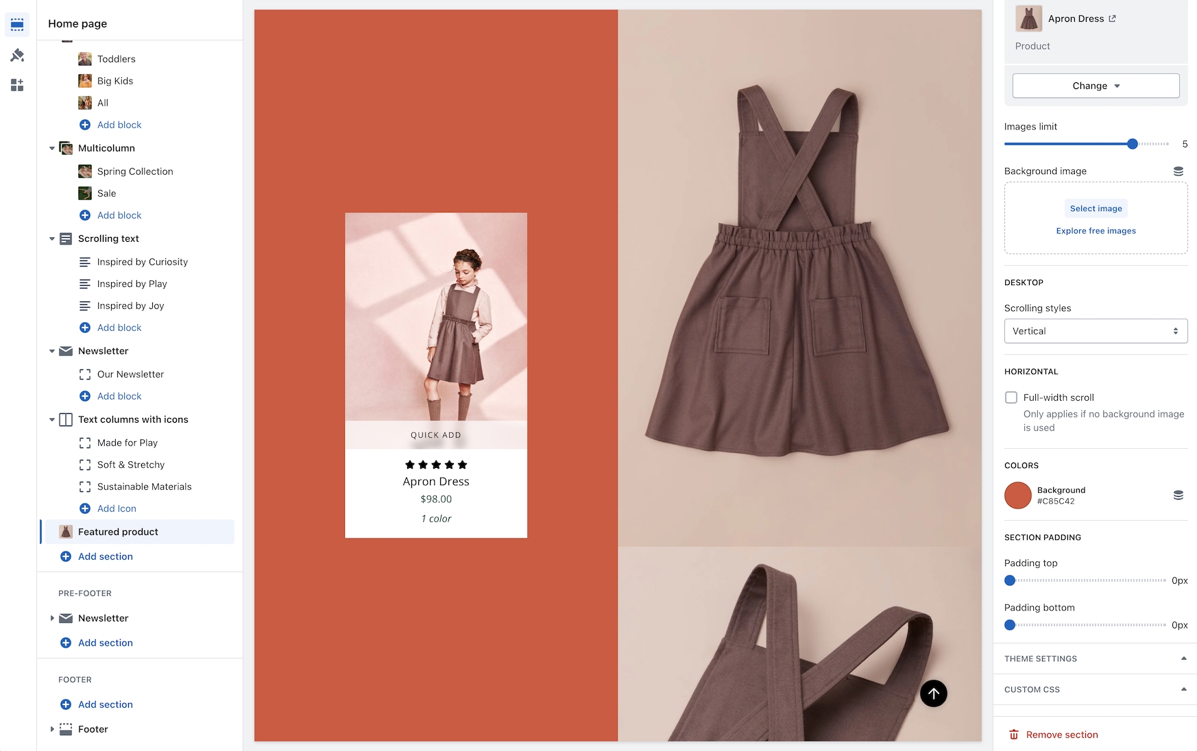
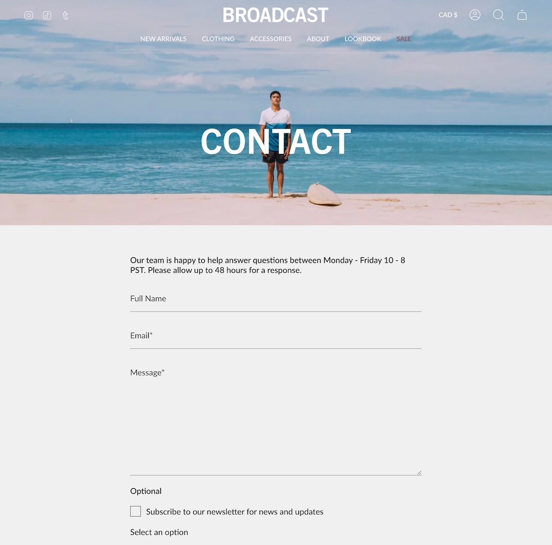
Subheading
text
Text displayed above the heading.
Heading
text
Main heading of the newsletter block.
Heading size
select
Font size of the heading: Mini, Extra small, Small, Medium, Large, or Extra large
Text
richtext
Supporting text below the heading.
Text size
select
Font size of the paragraph:Extra small, Small, Medium, Large, or Extra large
Columns
range
Number of text columns (desktop only).
Text alignment
select
Alignment of the text: Left or Centered.
Form
Show name field
checkbox
Includes a name field in the signup form.
Button text
text
Call-to-action button label.
Show arrow
checkbox
Adds an arrow icon to the button.
Show reCAPTCHA terms
checkbox
Shows reCAPTCHA terms for spam protection.
Button
Color
select
Choose color scheme: Primary, Secondary, Black or White,
Size
select
Size of the button: Small, Medium, or Large
Style
select
Style of the button: Solid, Outline, or Text
Social media icons
Show social icons
checkbox
Displays social icons below the form.
Colors
Background
color
Background color override.
Text
color
Text color override.
Advanced
Heading SEO tag
select
SEO heading tag: H1 - H6 or Automatic.

Typography
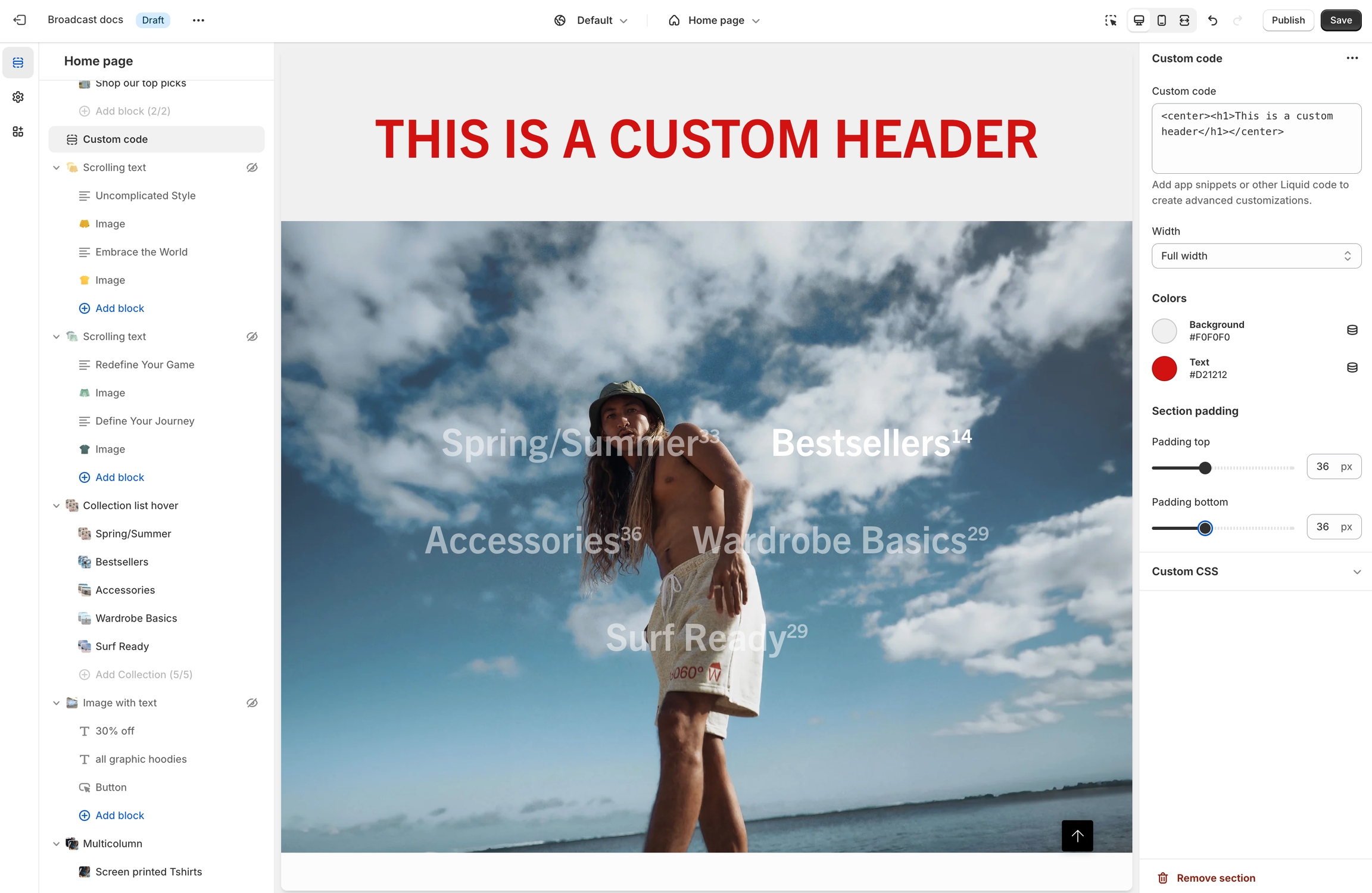
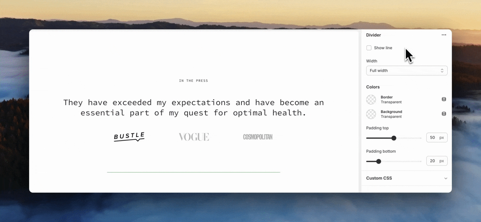
Collection
collection
Select the collection to be featured.
Typography
Heading
text
Main heading text.
Heading size
select
Choose heading size from Mini, Extra small, Small, Medium, Large or Extra large.
Text
richtext
Rich text field to display a short description.
Text size
select
Controls font size for the description. Applies to paragraphs only: Extra small, Small, Medium, Large or Extra large.
Text alignment
select
Aligns heading and description. Options: In-line, Center, or Left.
Button
Text
text
Text shown on the button.
Link
url
URL the button links to.
Color
select
Choose button color: Black, White, Primary, or Secondary.
Size
select
Choose size: Small, Medium, or Large.
Style
select
Choose style: Solid, Outline, or Text.
Show arrow
checkbox
Toggle to display an arrow icon next to the button.
Desktop
Product grid layout
select
Choose between a Grid or Slider layout for desktop.
Products per row
range
Number of products shown in each row (2-6, grid layout only).
Number of rows
range
Total rows of products displayed (1-8, grid layout only).
Width
select
Controls container width: Normal or Full width padded (grid only).
Mobile
Product grid layout
select
Layout options for mobile: 1 item per row, 2 items per row, or Slider.
Colors
Color scheme
color_scheme
Select a predefined color scheme.
Padding
Top
range
Controls spacing above the section.
Bottom
range
Controls spacing below the section.
Advanced
Heading SEO tag
select
Sets HTML heading level: H1-H6 or Automaticto improve your SEO structure.
This video demonstrates the layout options for desktop and mobile. Plus, all the section settings for the Featured collection:
Broadcast includes a tabbed section to display multiple collections within a section:
Content


Image
image_picker
Upload image. Recommended size: 3200x1200px JPG.
Image link
url
Optional link to wrap the image.
Product
Product
product
Choose a Shopify product to display.
Text
textarea
Descriptive text to accompany the product.
Text size
select
Controls font size for the description text: Extra small, Small, Medium, Large, or Extra large
Enable quick add
checkbox
Adds a button to allow quick add-to-cart.
Background
color
Background color for the product card.
Text
color
Text color for the product card.
Layout
Width
select
Controls section width: Full width or Full width padded.
Desktop
Height
select
Sets section height on desktop devices. Multiple fixed and screen-relative options.
Mobile
Image
image_picker
Upload mobile-specific image. Recommended: 1200x1600px JPG.
Height
select
Section height on mobile. Multiple options including screen-based and fixed pixel heights.
Text alignment
select
Vertical alignment of text on mobile: Top, Middle, or Bottom.
Colors
Color scheme
color_scheme
Choose from predefined color schemes.
Show text background
checkbox
Display a background behind the text content.
Overlay type
select
Adds an overlay: Disabled, Opacity, or Text underlay.
Padding
Top
range
Padding above content.
Bottom
range
Padding below content.
Advanced
Show placeholder image
checkbox
Show a default placeholder if no image is set. Disable when using metafields.
Content


Text size
select
Size of the text: Extra small, Small, Medium, Large, orExtra large (only applies to Paragraph content in the Text field).
Button
Text
text
Button label text.
Link
url
URL the button links to.
Color
select
Choose the button color: Black, White, Primary, or Secondary.
Size
select
Button size: Small, Medium, or Large.
Style
select
Button style: Solid, Outline, or Text.
Show arrow
checkbox
Enable to display an arrow icon in the button.
Images
Image aspect ratio
range
Ratio of image width to height.
Layout
Width
select
Section width: Full width, Full width padded, or Normal.
Layout
select
Display layout: Grid or Slider.
Grid
Collections per row
range
Number of collections shown per row.
Mobile
Layout
select
Mobile layout: 1 collections per row, 2 collections per row, or slider.
Colors
Color scheme
color_scheme
Choose the visual color scheme for the section.
Padding
Top
range
Padding above the section.
Bottom
range
Padding below the section.
Advanced
Heading SEO tag
select
Choose an HTML heading tag: H1-H6 or Automatic, for SEO structure.
select
Controls the section height on mobile. Options mirror desktop values with mobile variants.
Colors
Color scheme
color_scheme
Choose the visual color scheme for the section.
Overlay type
select
Adds an overlay: Disabled, Opacity, or Text underlay.
Padding
Top
range
Padding above the section..
Bottom
range
Padding below the section.
select
Width of the banner: Full width or Full width padded.
Desktop
Height
select
Controls banner height on desktop. Multiple screen height or fixed pixel options
Desktop alignment
select
Alignment of content within the banner for desktop.
Content width
range
Percentage of banner width that content will occupy.
Mobile
Image
image_picker
Optional mobile-specific image (1200×1600px recommended).
Height
select
Controls height on mobile. Options mimic desktop height settings.
Mobile alignment
select
Alignment of content for mobile.
Colors
Color scheme
color_scheme
Select color scheme to apply to this section.
Show text background
checkbox
Adds background behind text for legibility.
Overlay type
select
Adds an overlay: Disabled, Opacity, or Text underlay.
Padding
Top
range
Top padding.
Bottom
range
Bottom padding.
Advanced
Show placeholder image
checkbox
Displays a placeholder if no image is selected. Disable for metafields.
range
Sets how many product images to display.
Desktop
Background image
image_picker
Upload a background image for desktop. Recommended: 2000x1400px JPG.
Scrolling styles
select
Choose how product images scroll: Vertical or Horizontal.
Mobile
Background image
image_picker
Upload a mobile-specific background image. Recommended: 1200x1600px JPG.
Colors
Color scheme
color_scheme
Apply a color scheme to the section.
Heading
select
Alignment for the heading text: Left or Centered.
Text
select
Alignment for the description text: Left or Centered.
Layout
Width
select
Determines section width: Full width padded or Normal.
Columns
select
Vertical alignment of blocks: Top or Centered.
Mobile
Layout
select
Layout style on mobile: 1 item per row, 2 items per row, or Slider.
Colors
Color scheme
color_scheme
Choose a color scheme for background and text.
Padding
Top
range
Padding above the section.
Bottom
range
Padding below the section.
Advanced
Heading SEO tag
select
Controls HTML tag Automatic, or H1 - H6 for SEO purposes.
Text
richtext
Optional text content below heading.
Text size
select
Font size for the text field, applies only when formatted as a paragraph: Extra small, Small, Medium, Large, or Extra large.
Layout
select
Aligns heading/text layout: In-line, Center, or Left.
Desktop
Layout
select
Choose between Grid or Slider layout on desktop.
Mobile
Layout
select
Number of items per row or slider on mobile.
Slider
Product limit
range
Number of products shown in slider.
Grid
Products per row
range
Number of products per row.
Number of rows
range
Number of visible rows in grid.
Colors
Color scheme
color_scheme
Select a color scheme.
Padding
Top
range
Top spacing in pixels.
Bottom
range
Bottom spacing in pixels.
Advanced
Heading SEO tag
select
Controls the semantic HTML tag for heading: H1 - H6, or Automatic.

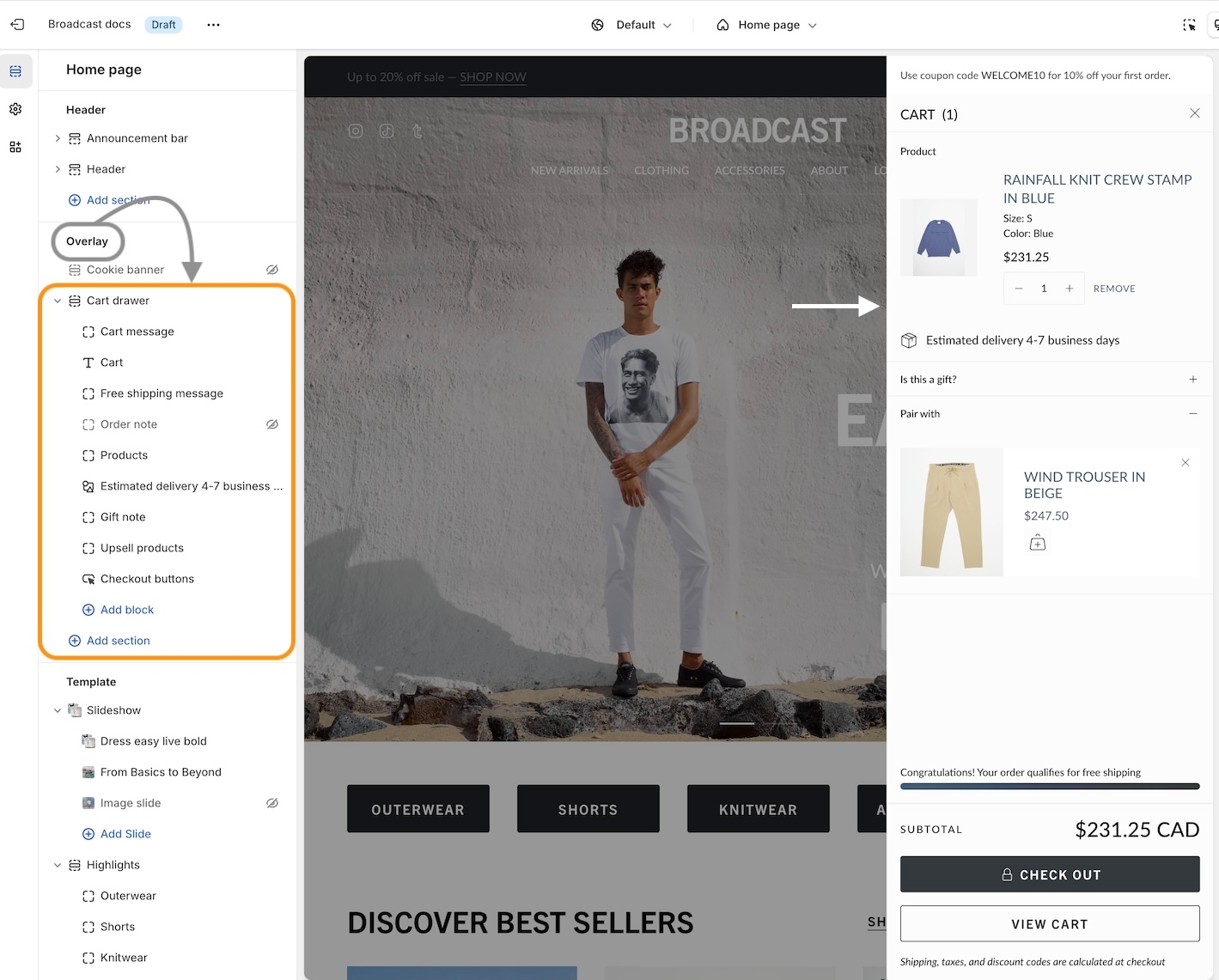
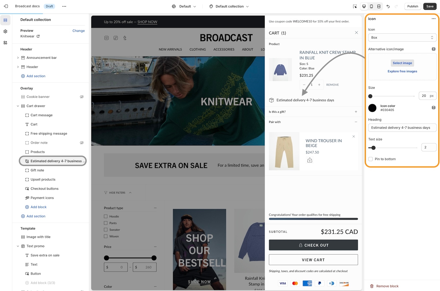
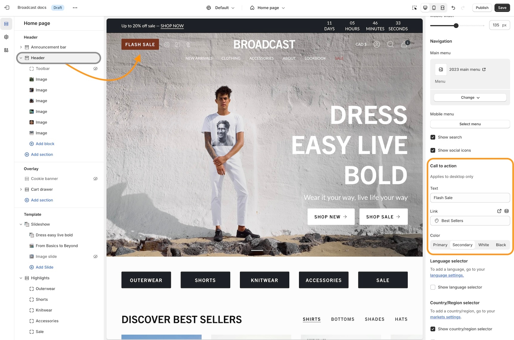
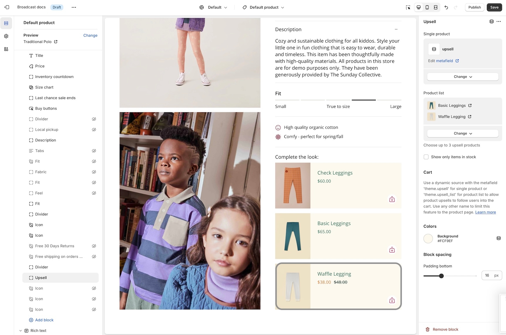
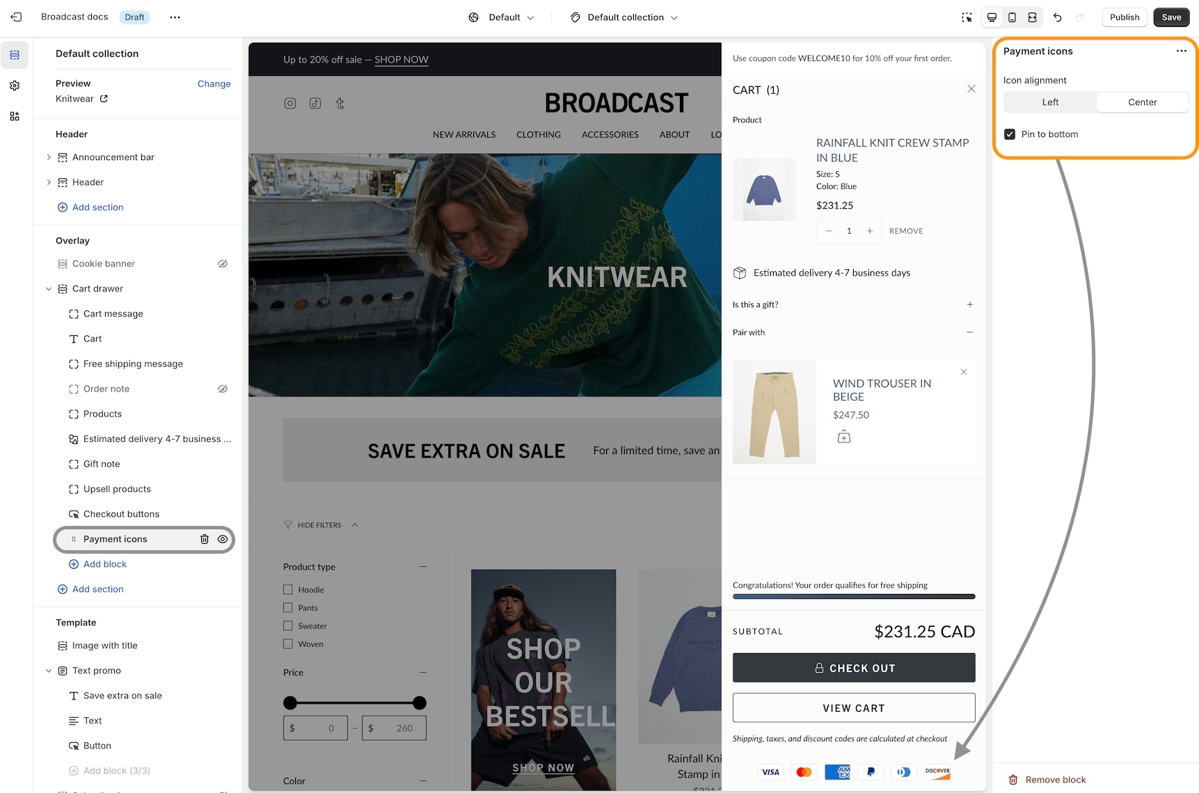
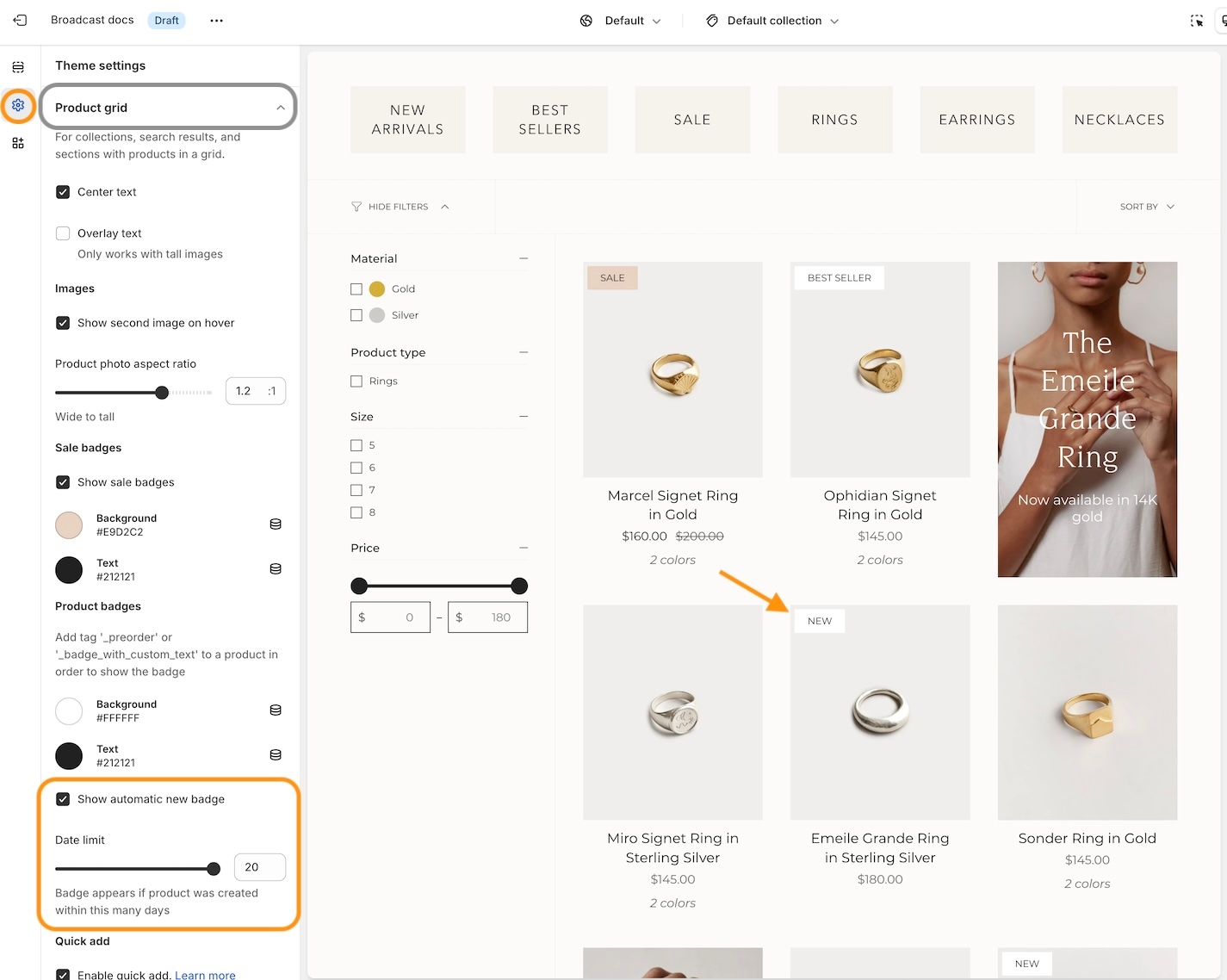
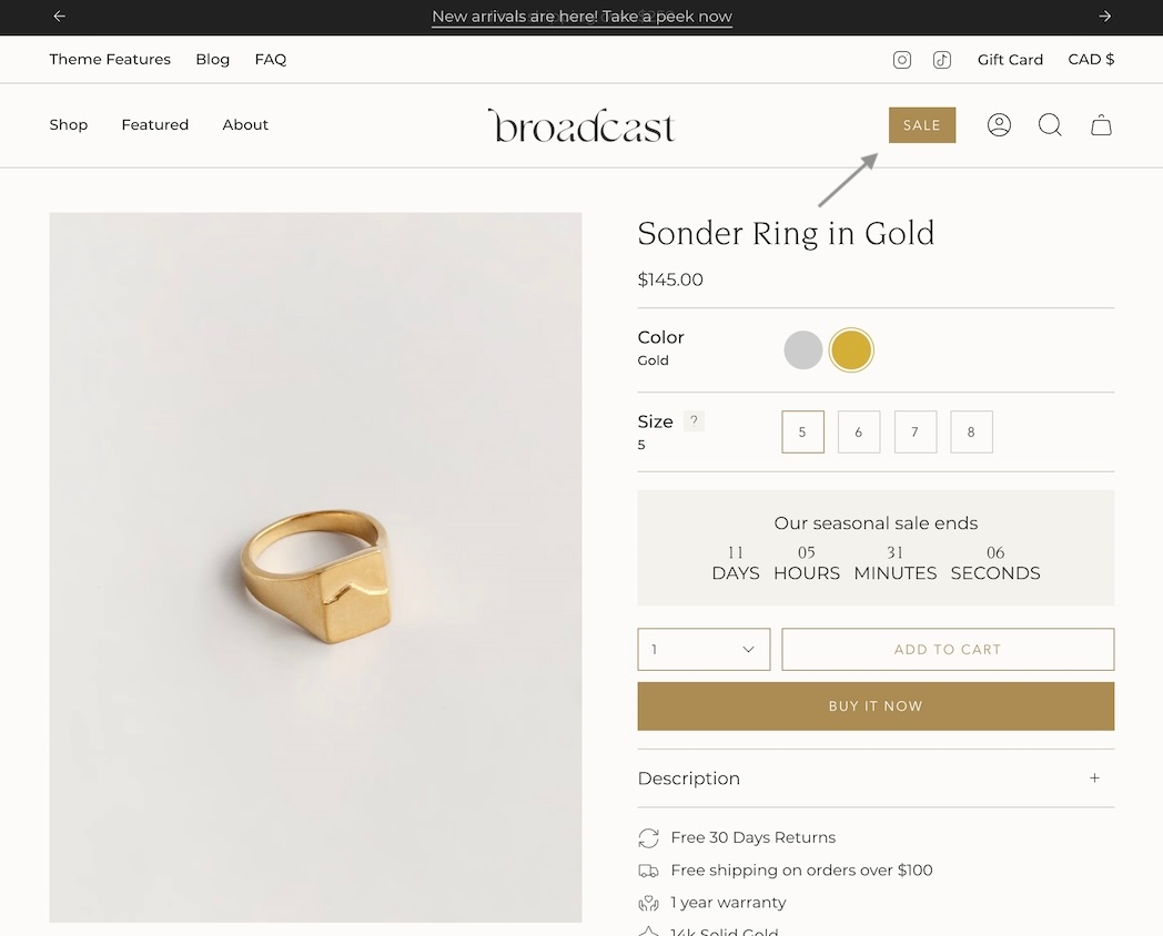
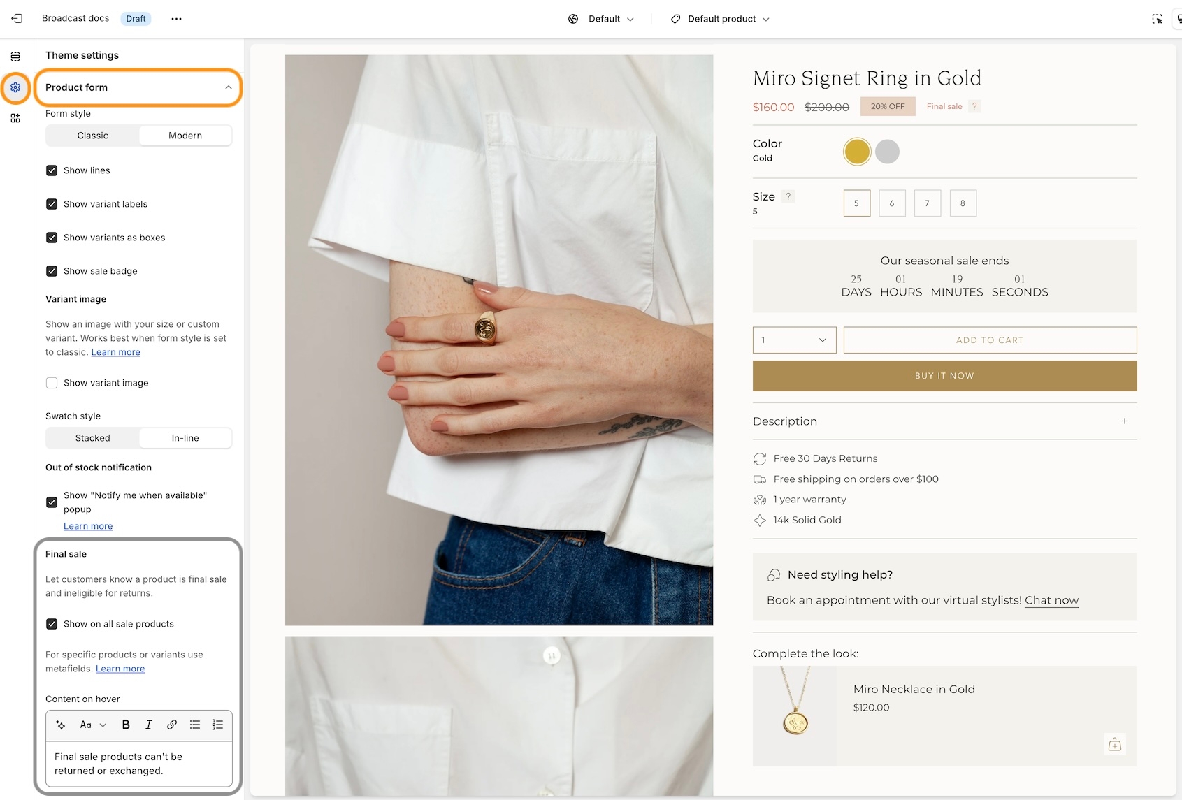
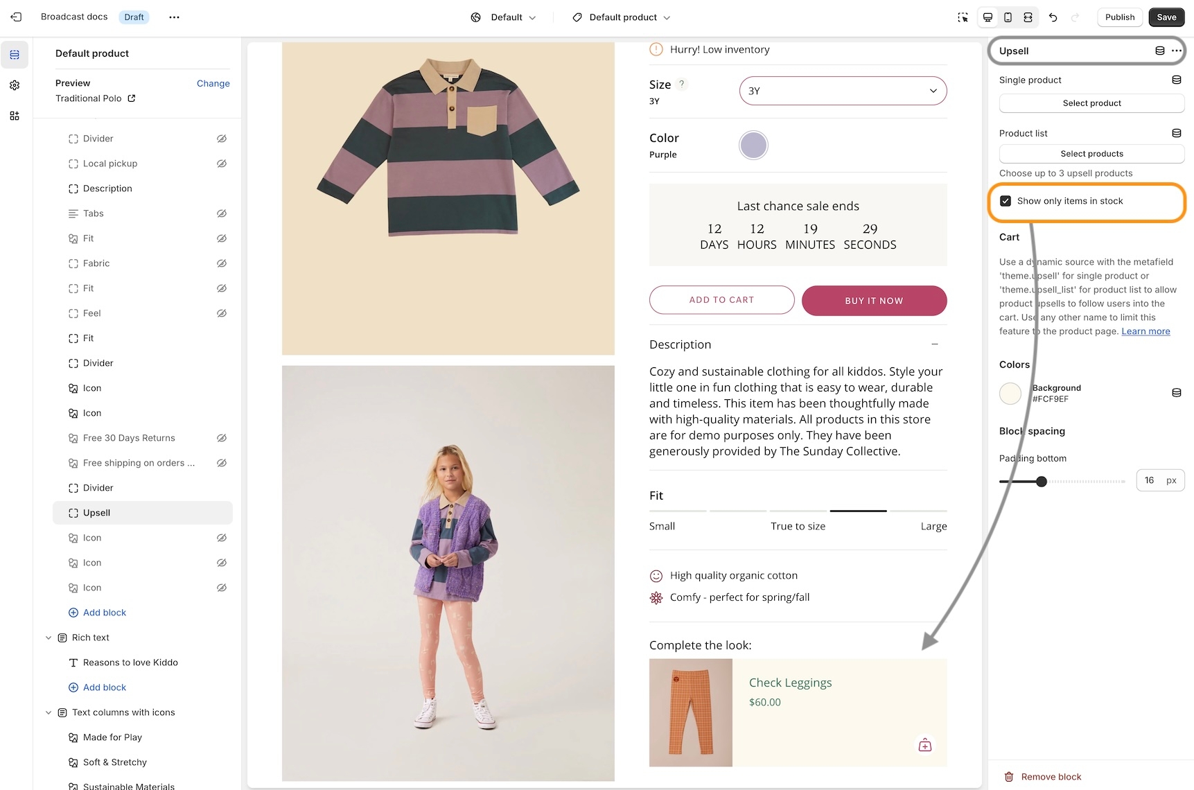
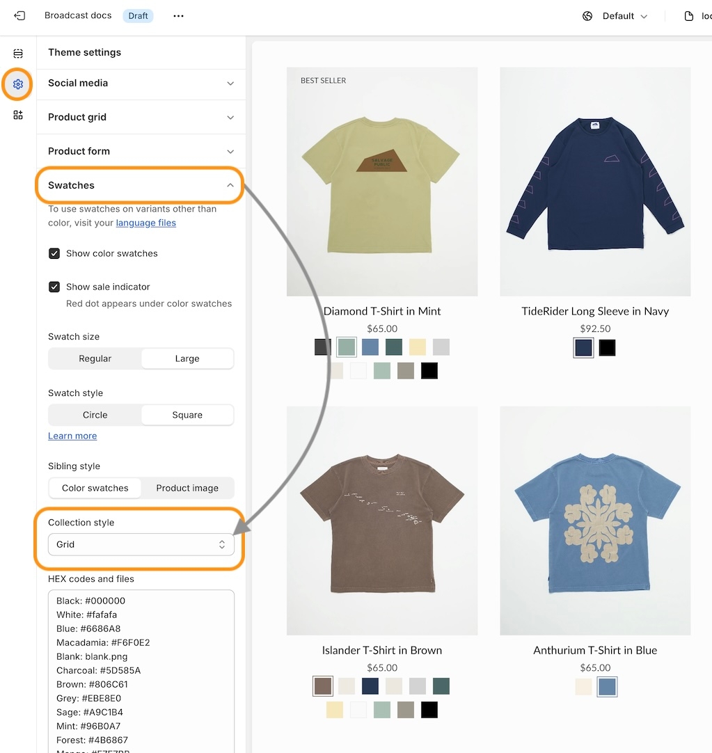
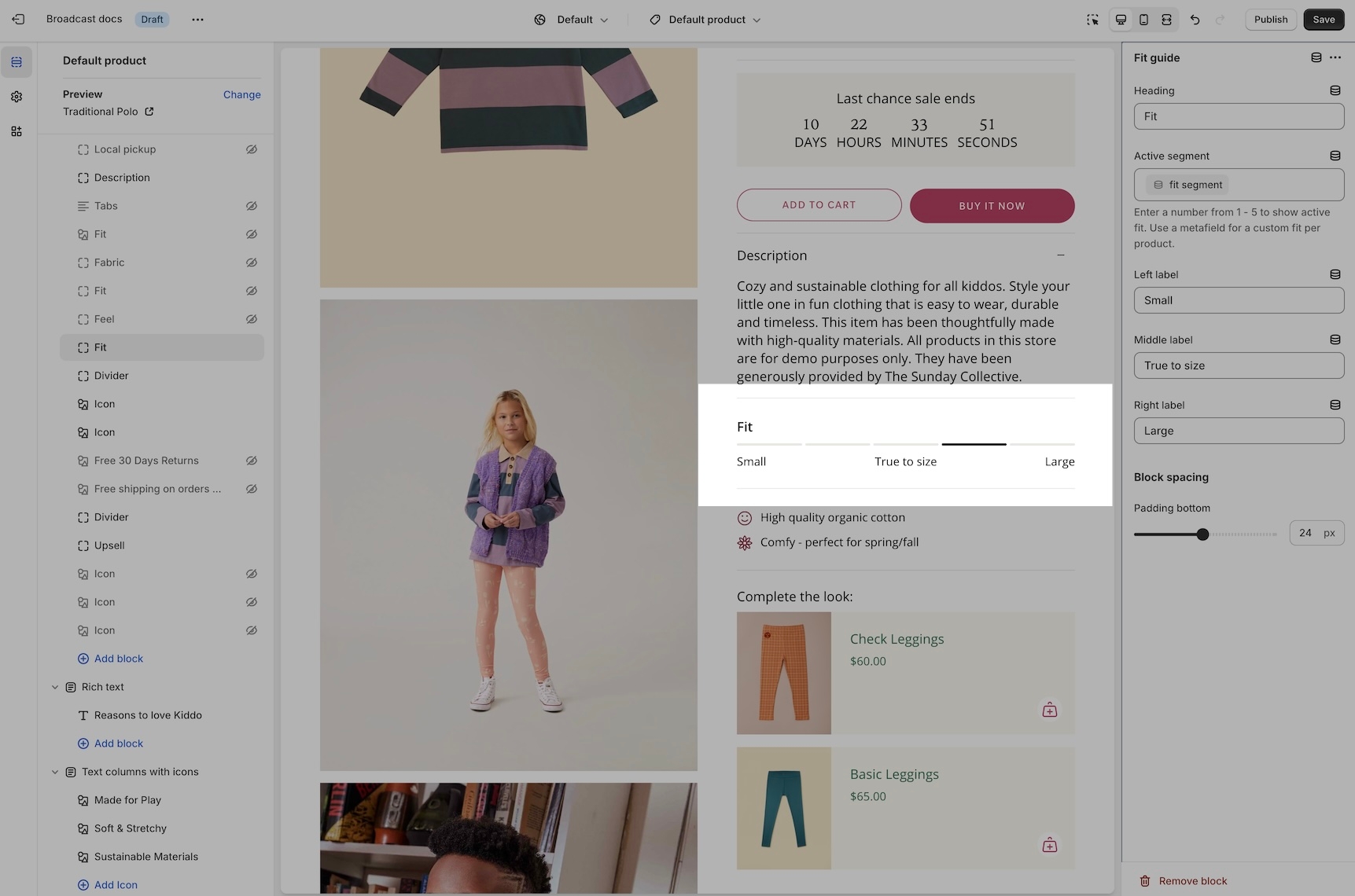
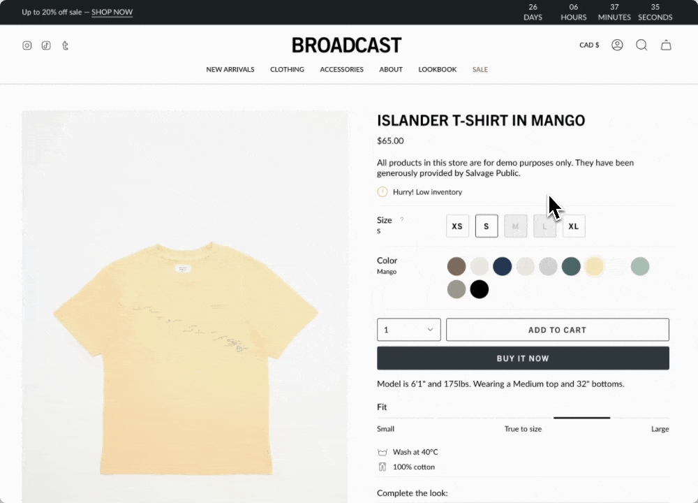
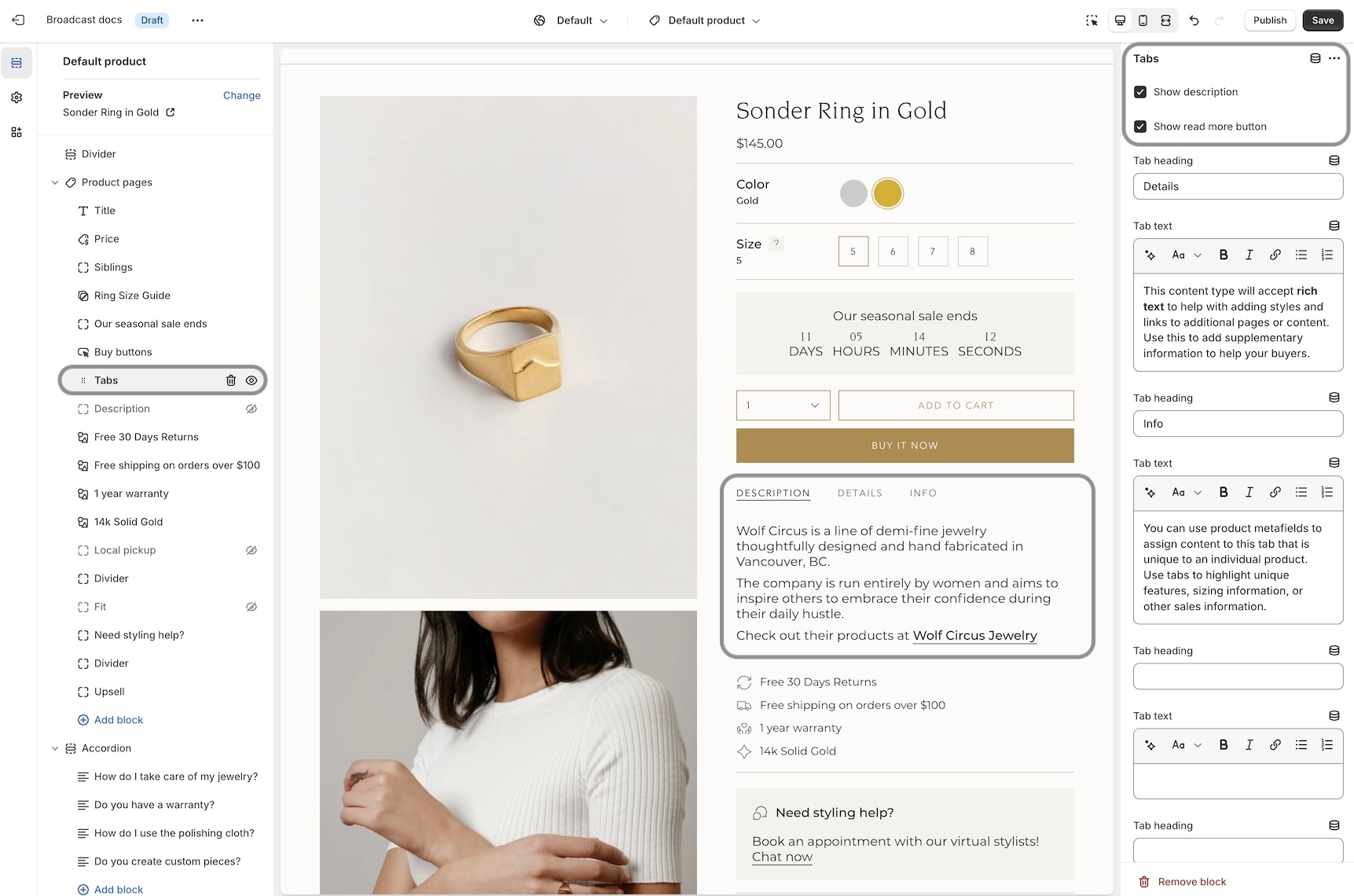
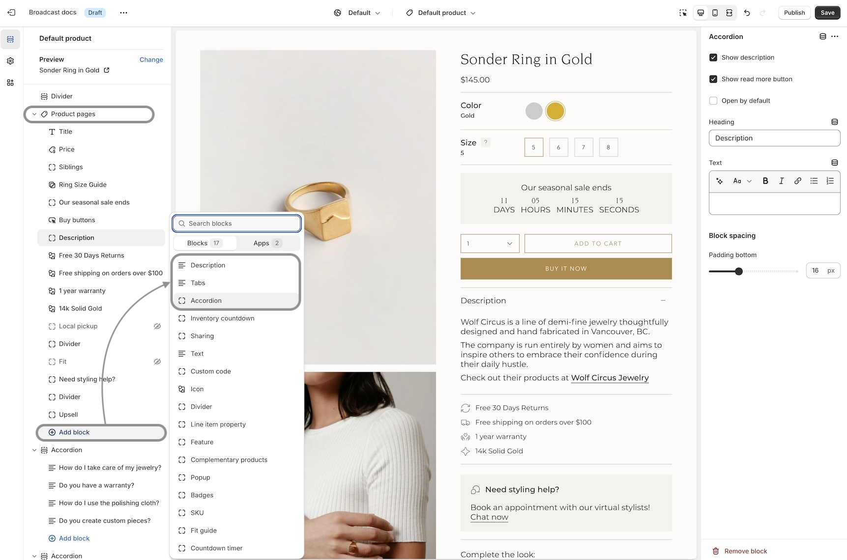
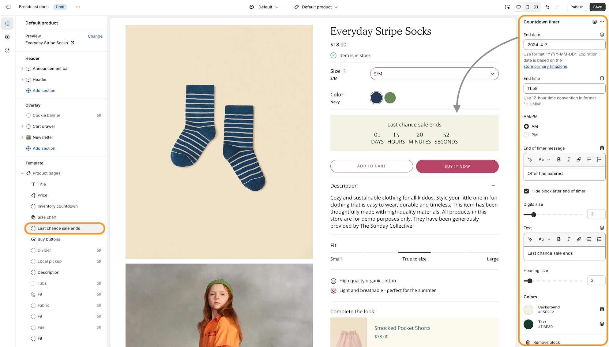
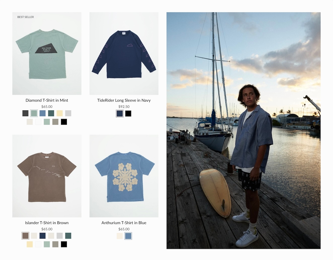
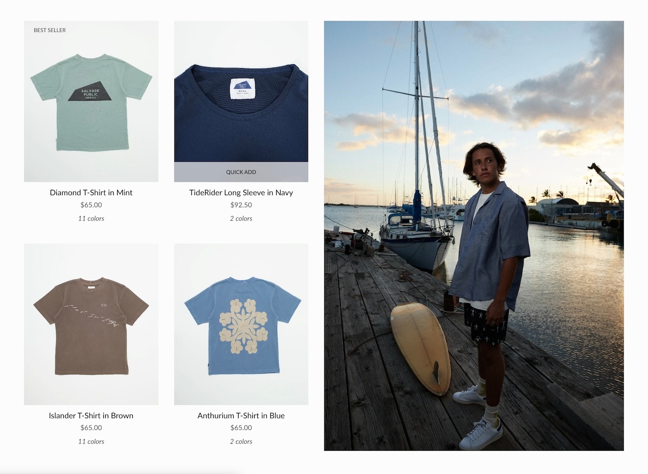
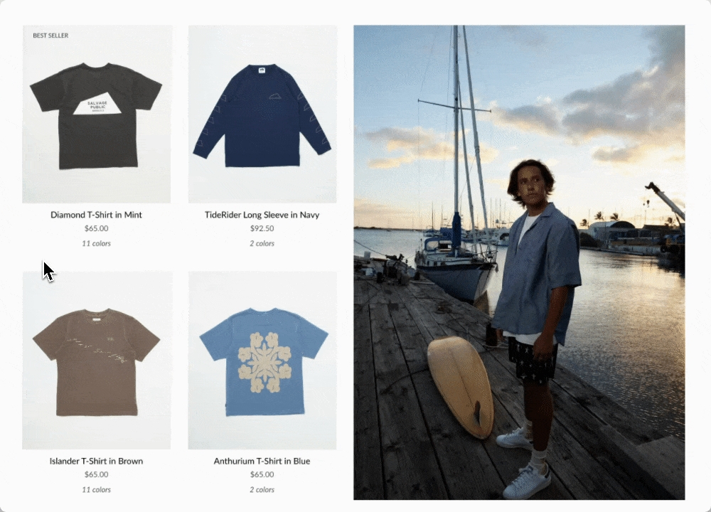
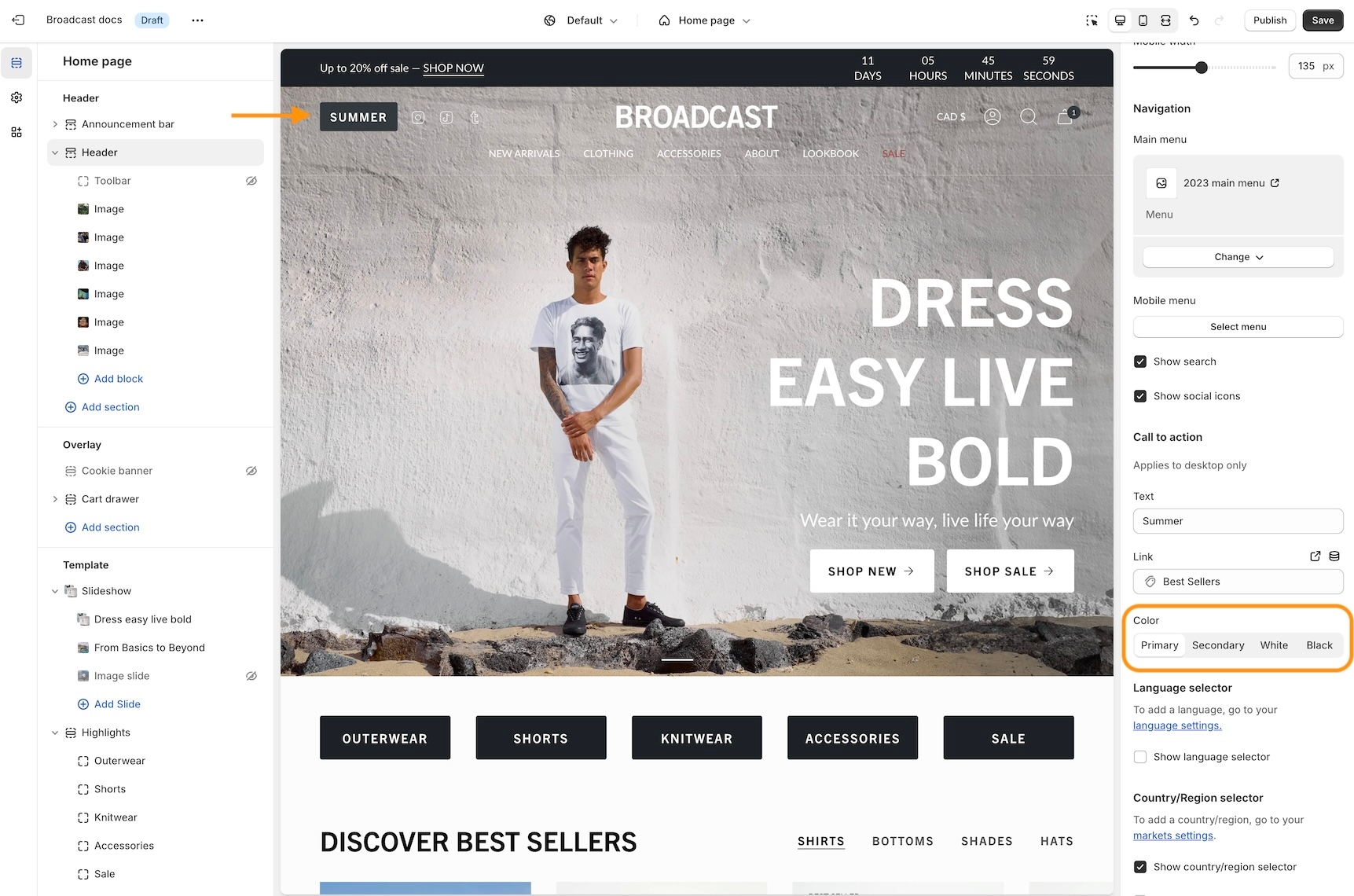
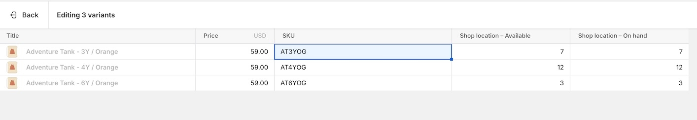
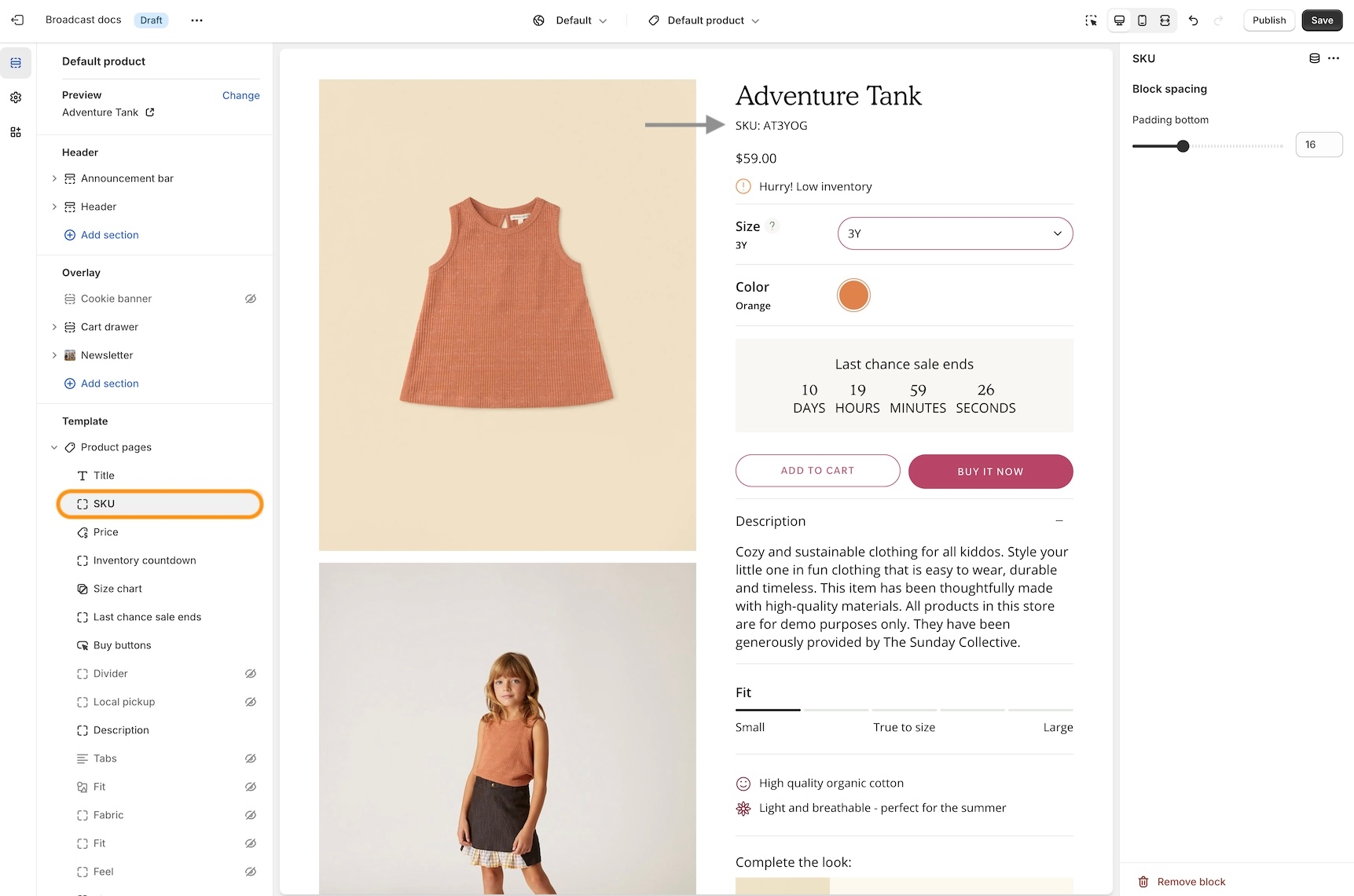
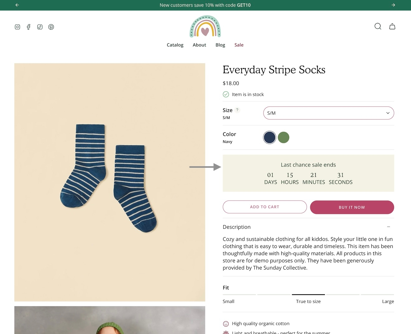
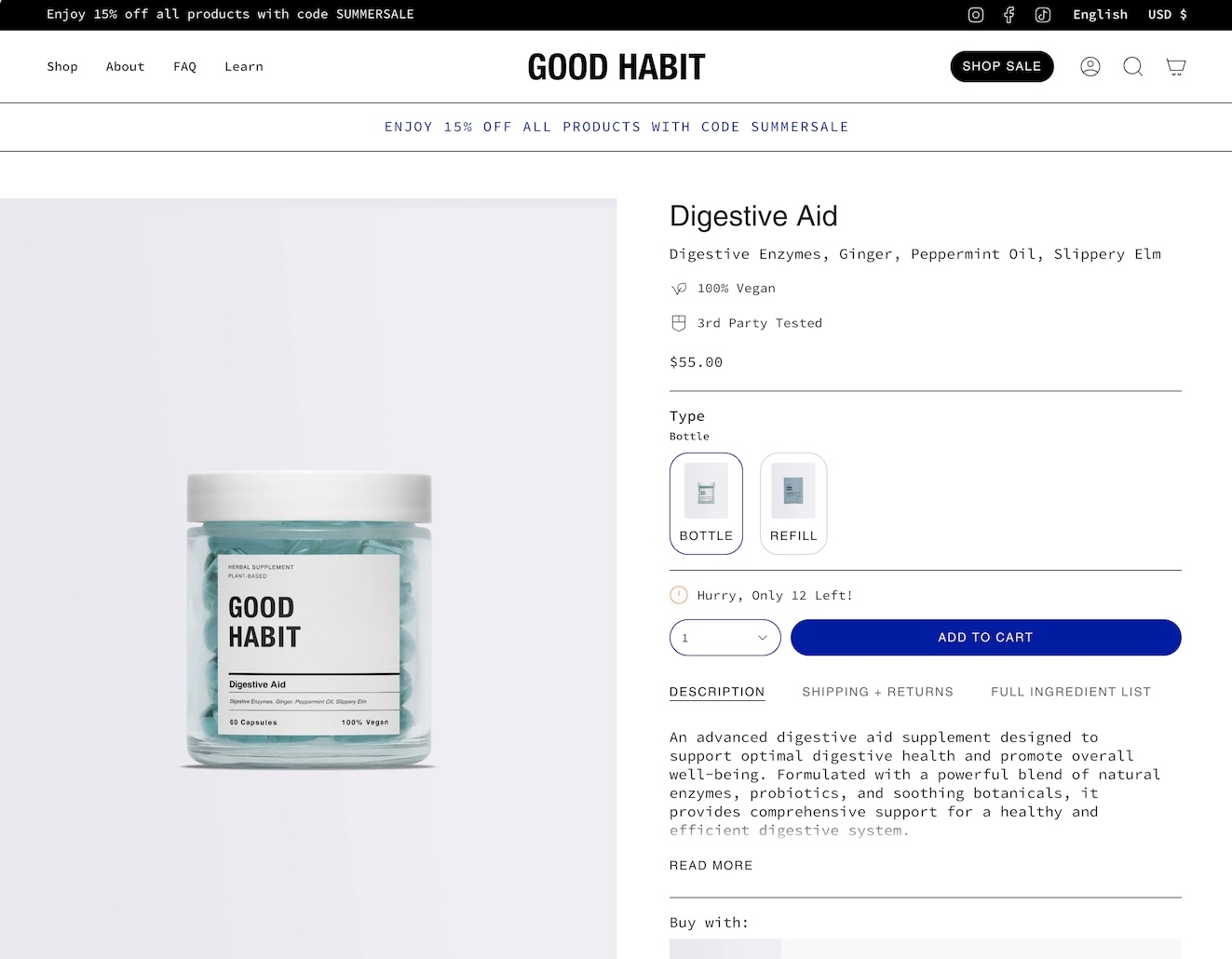
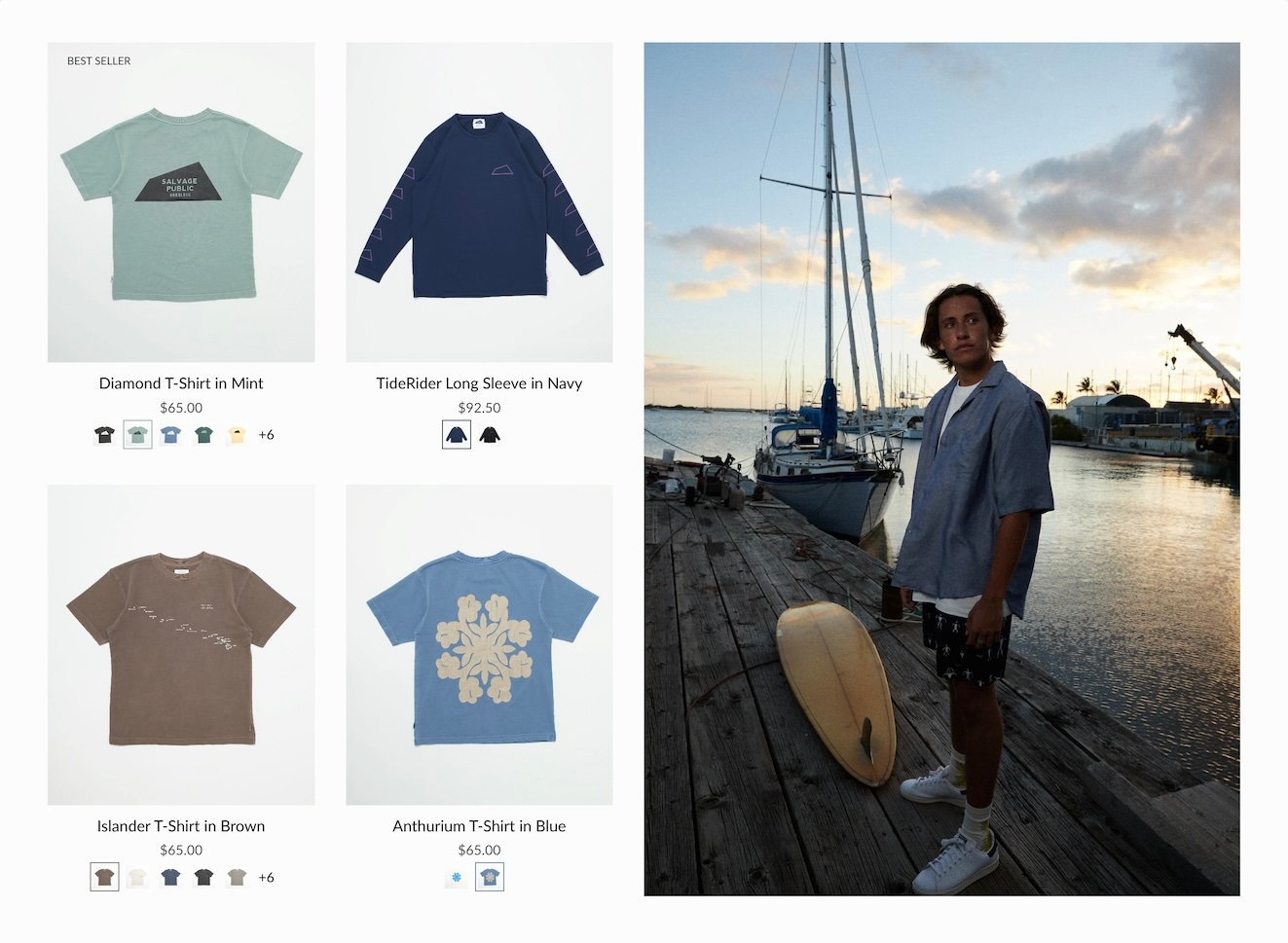
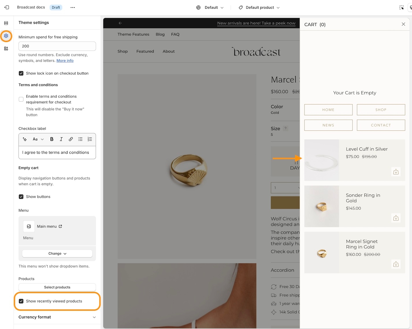
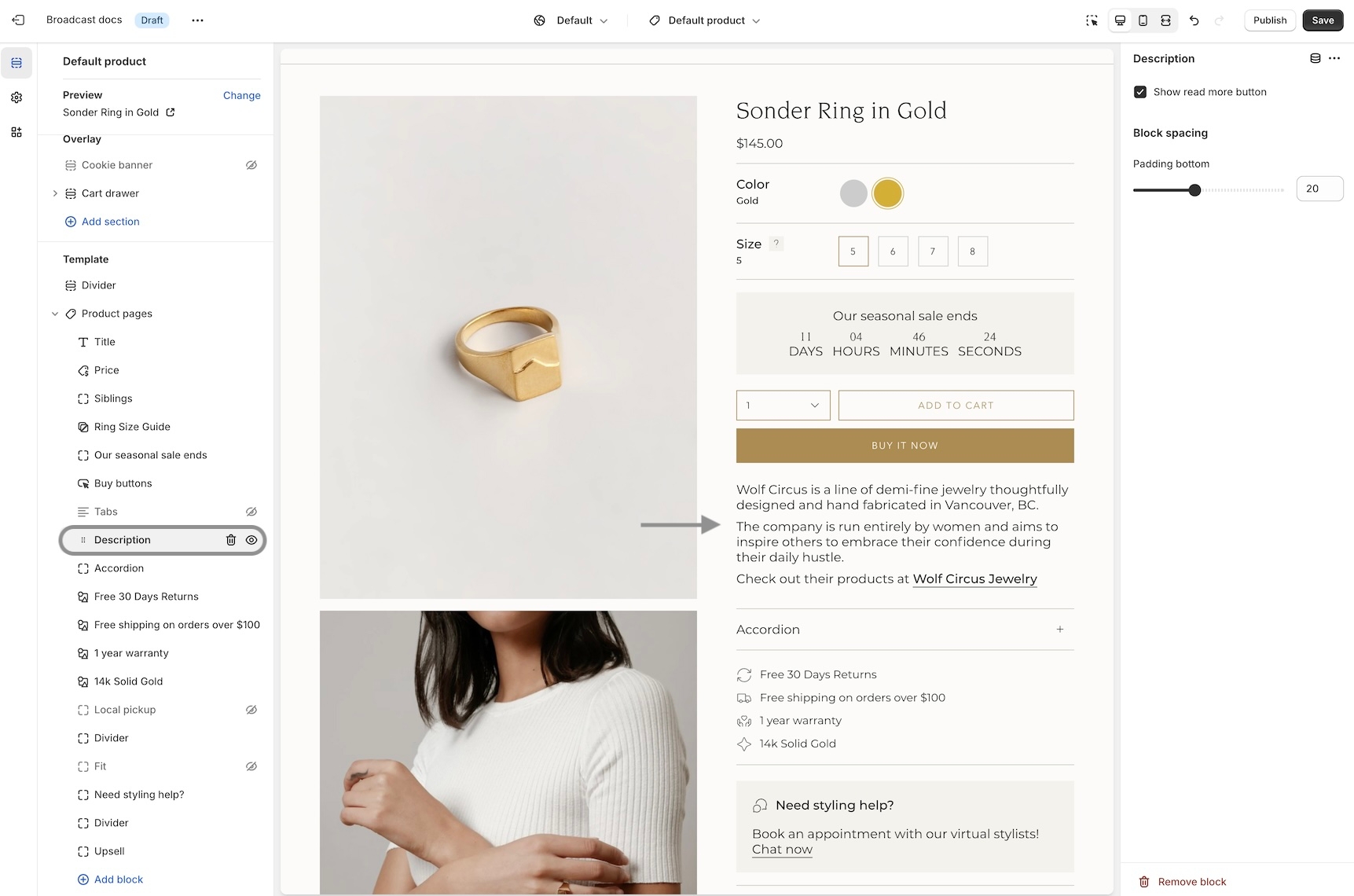
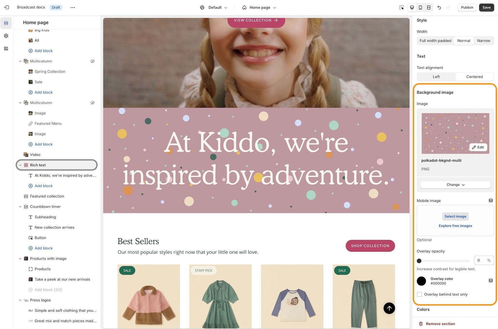
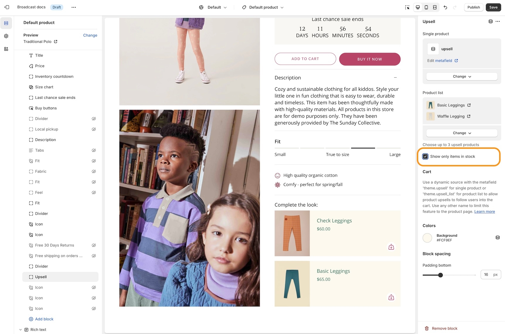
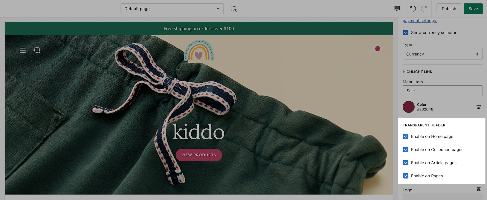
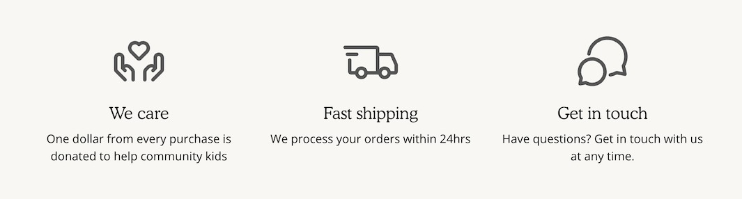

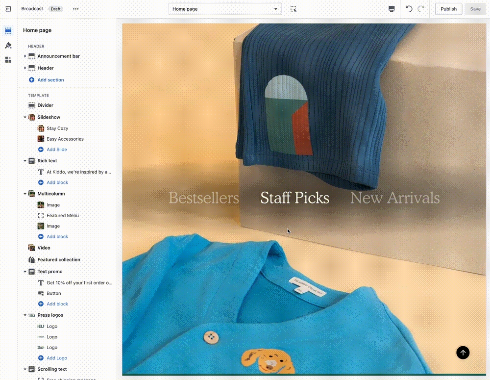
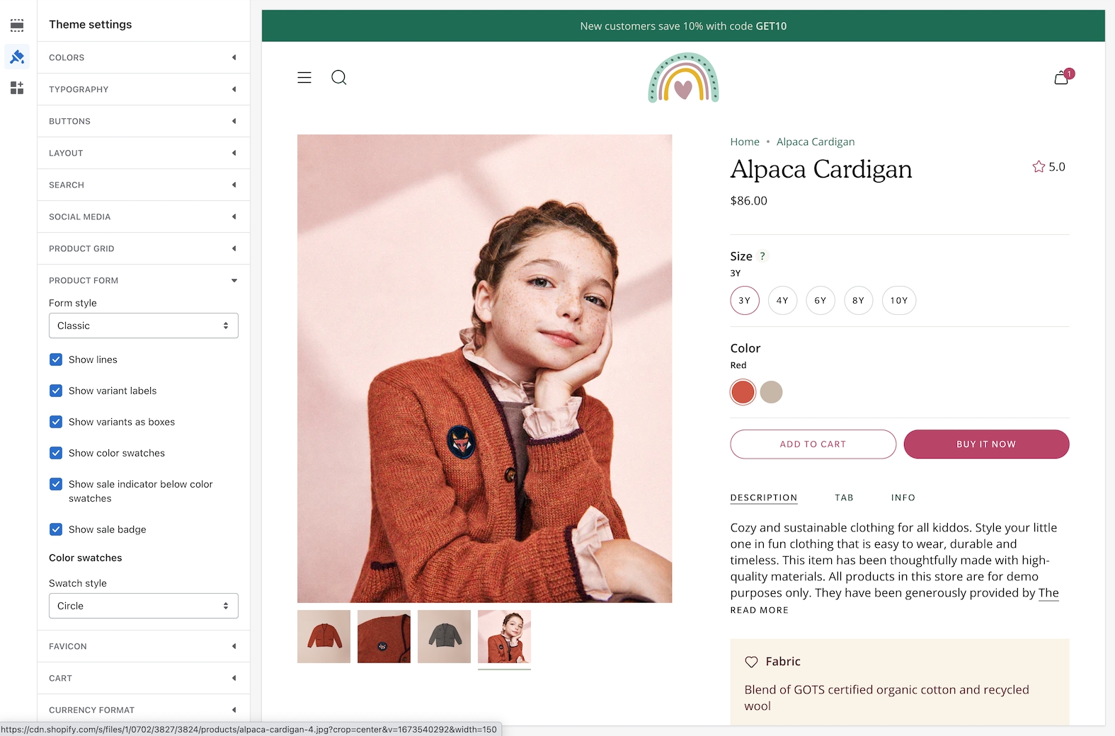
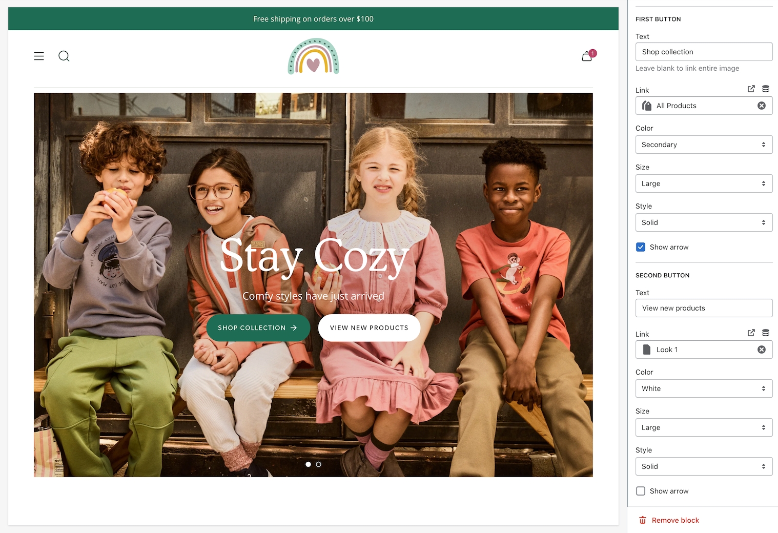
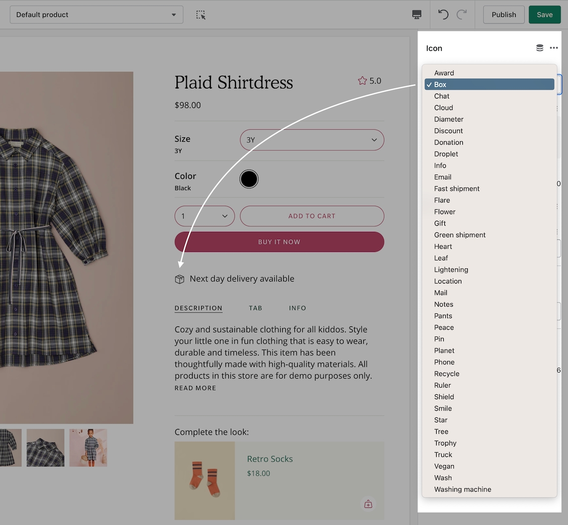
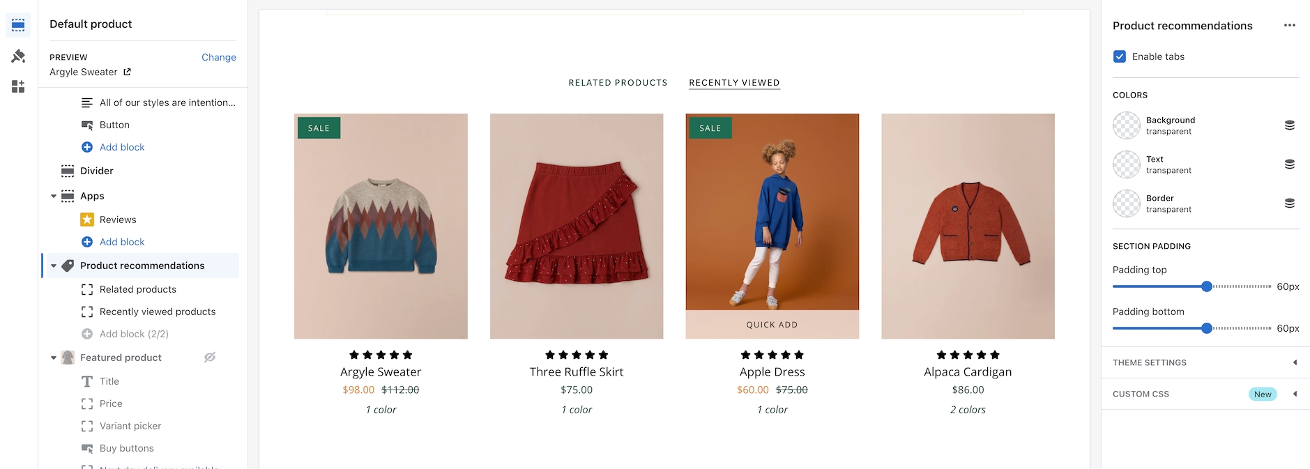
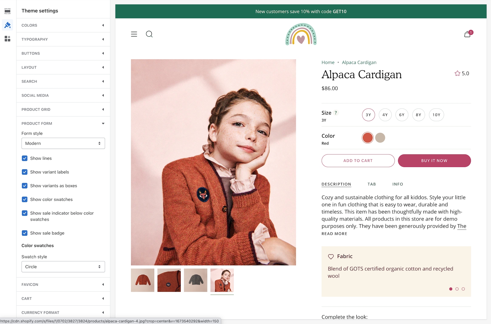
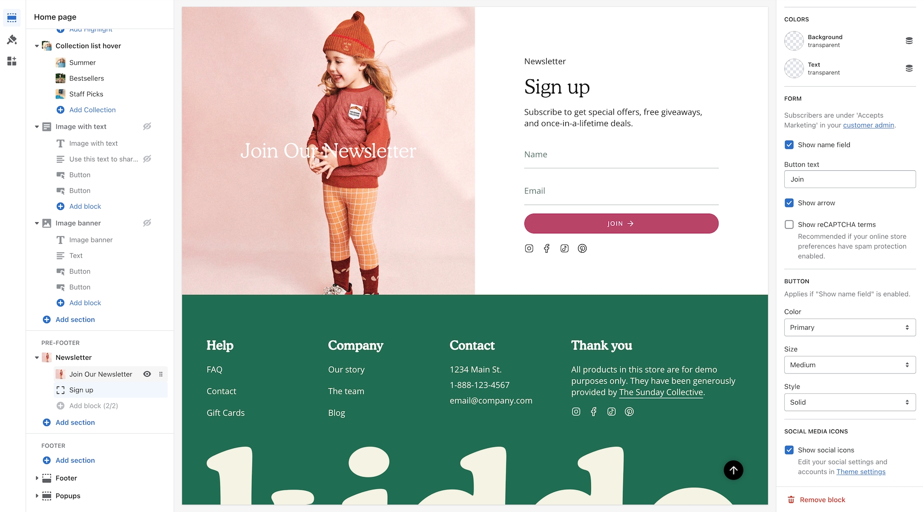
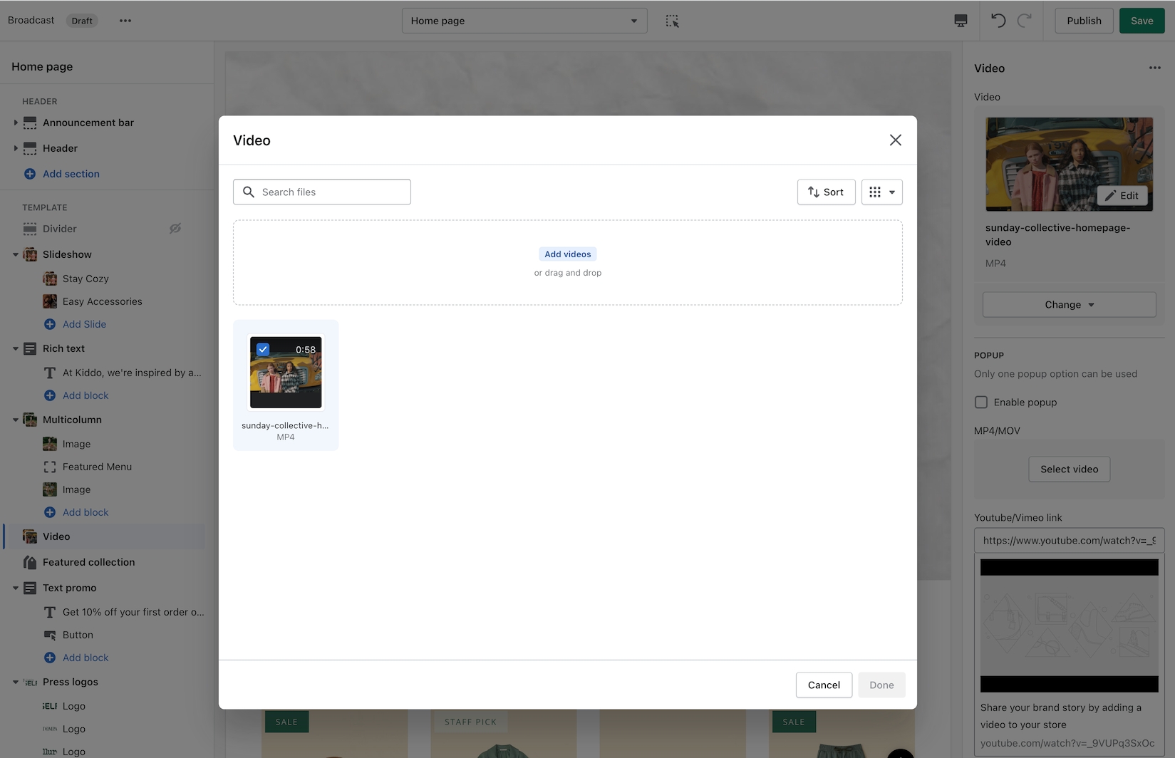
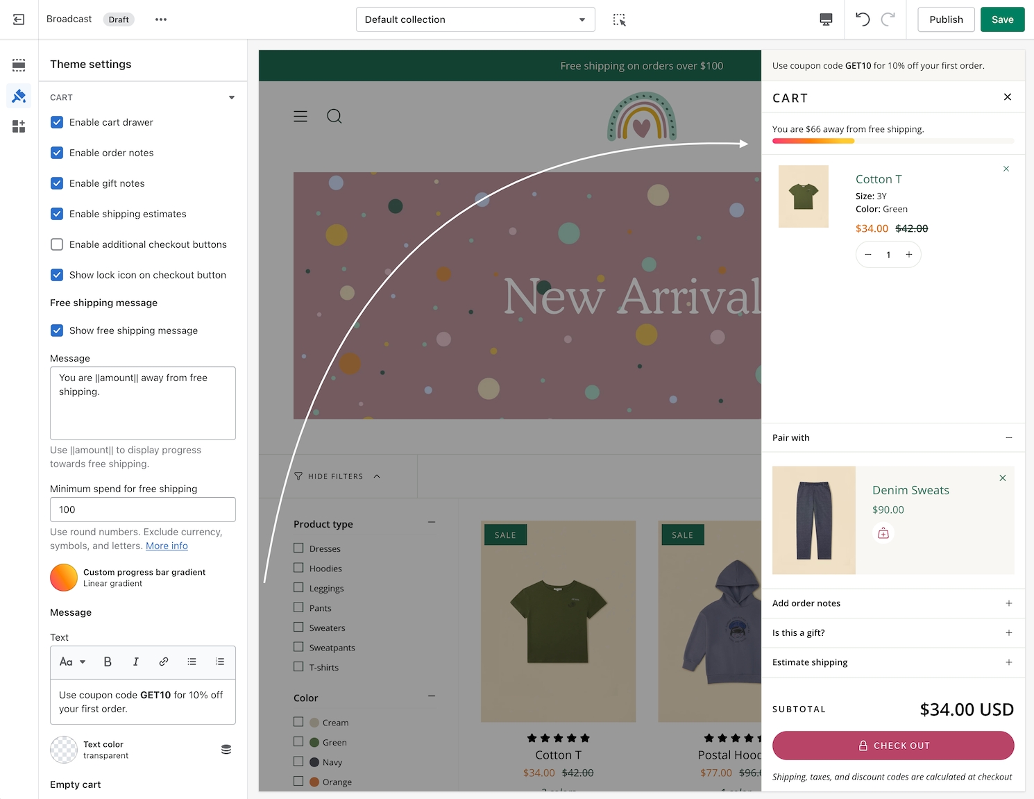
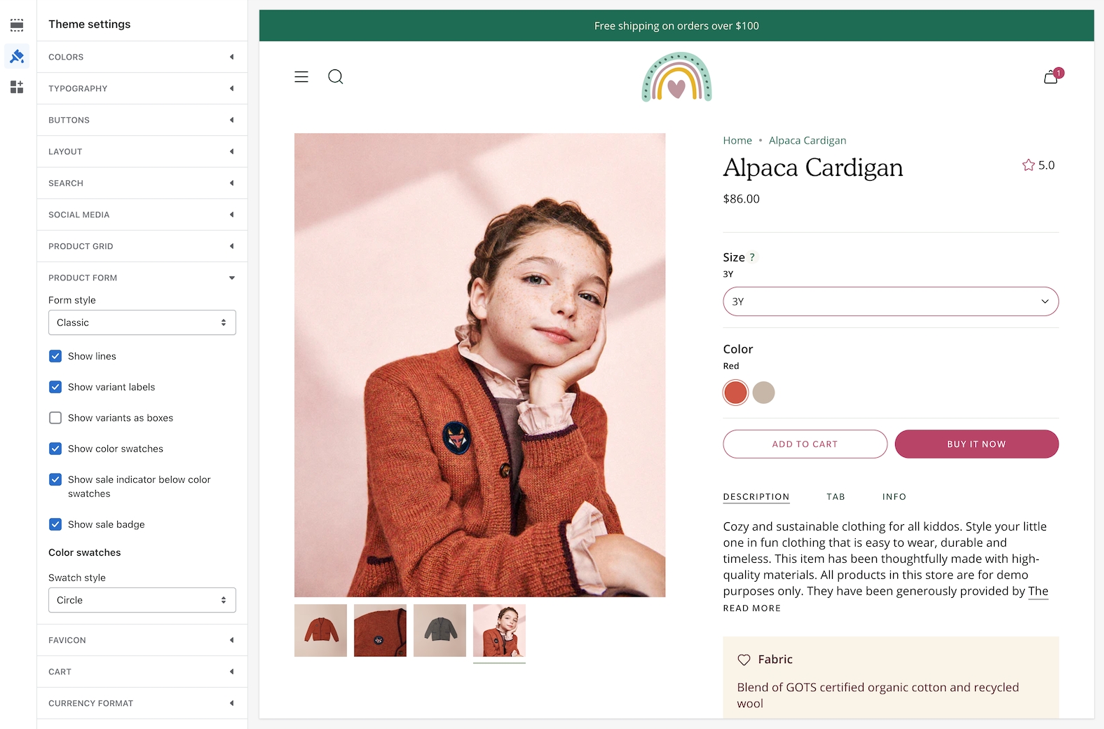
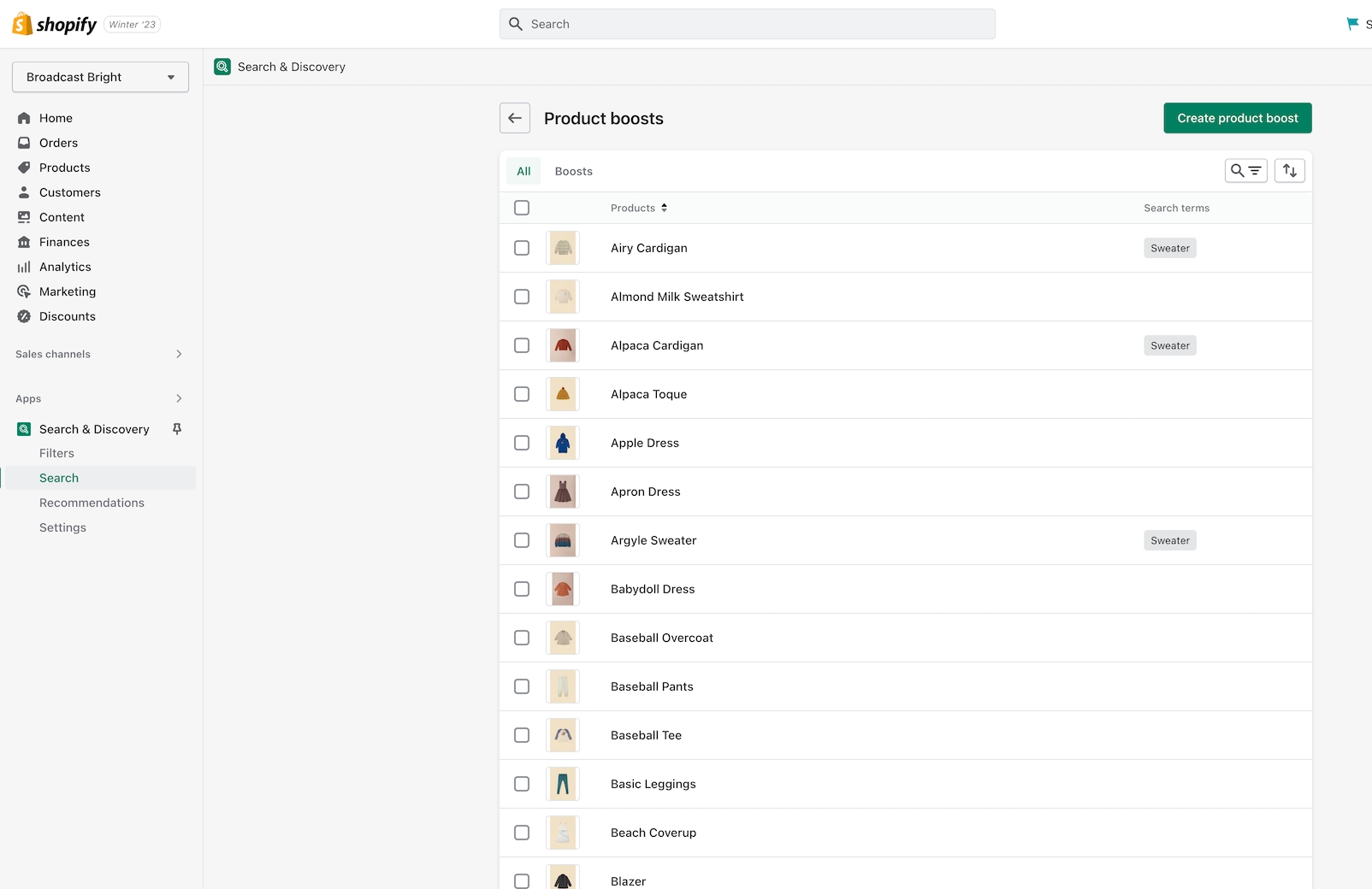
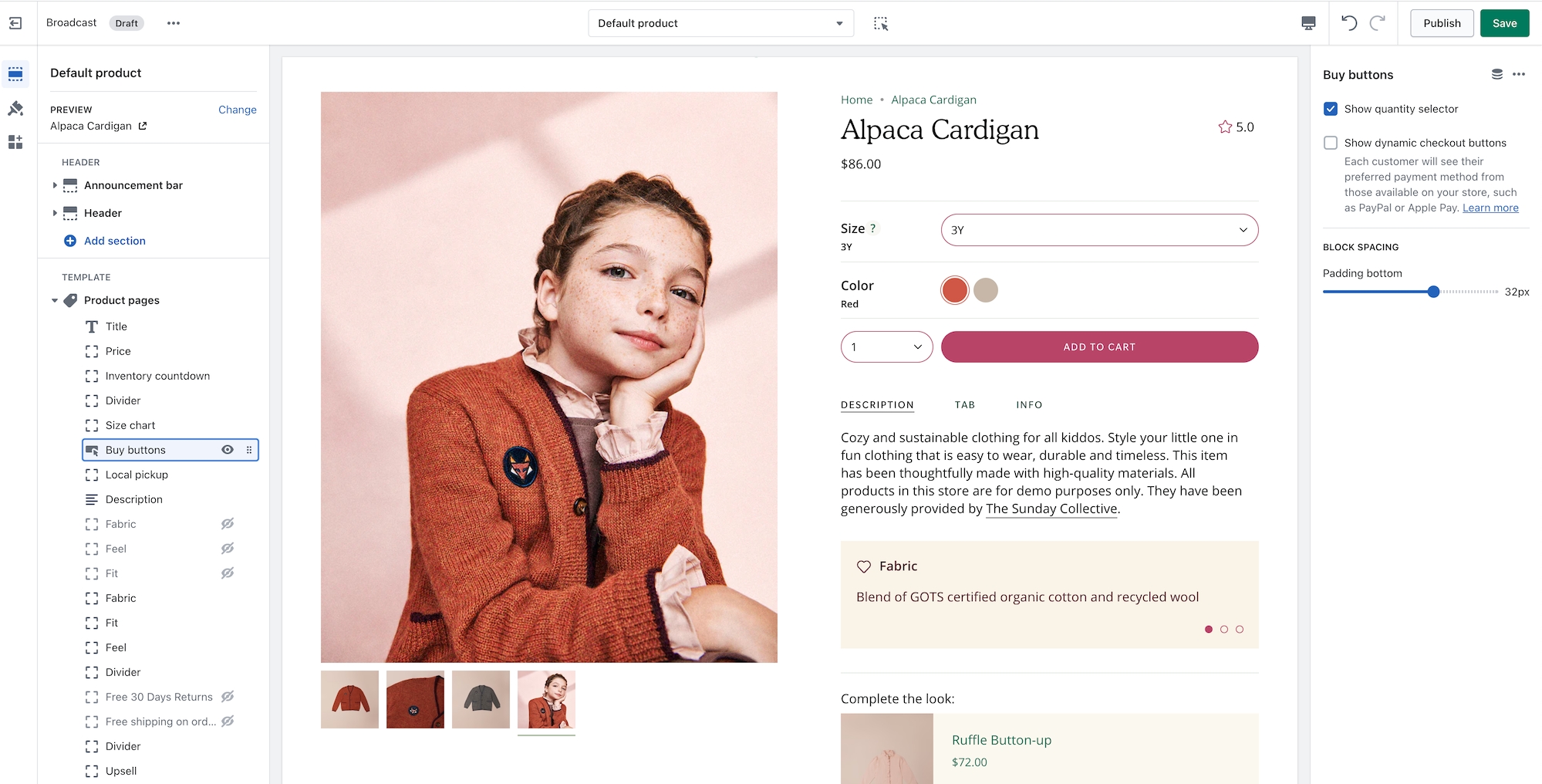
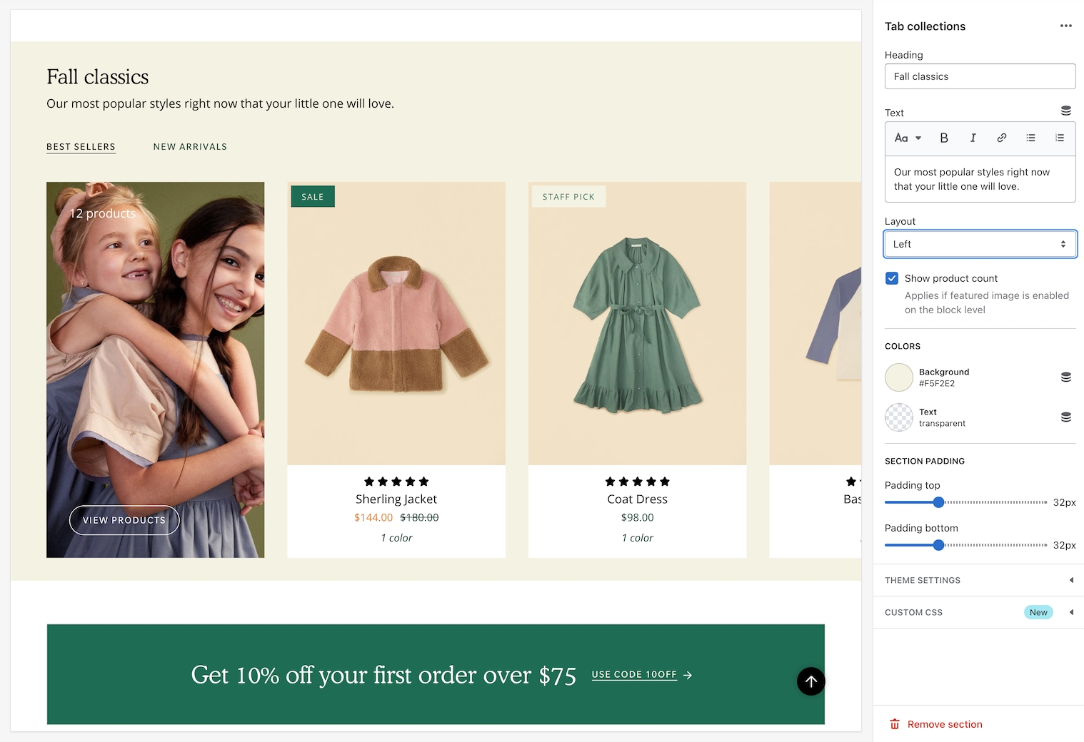
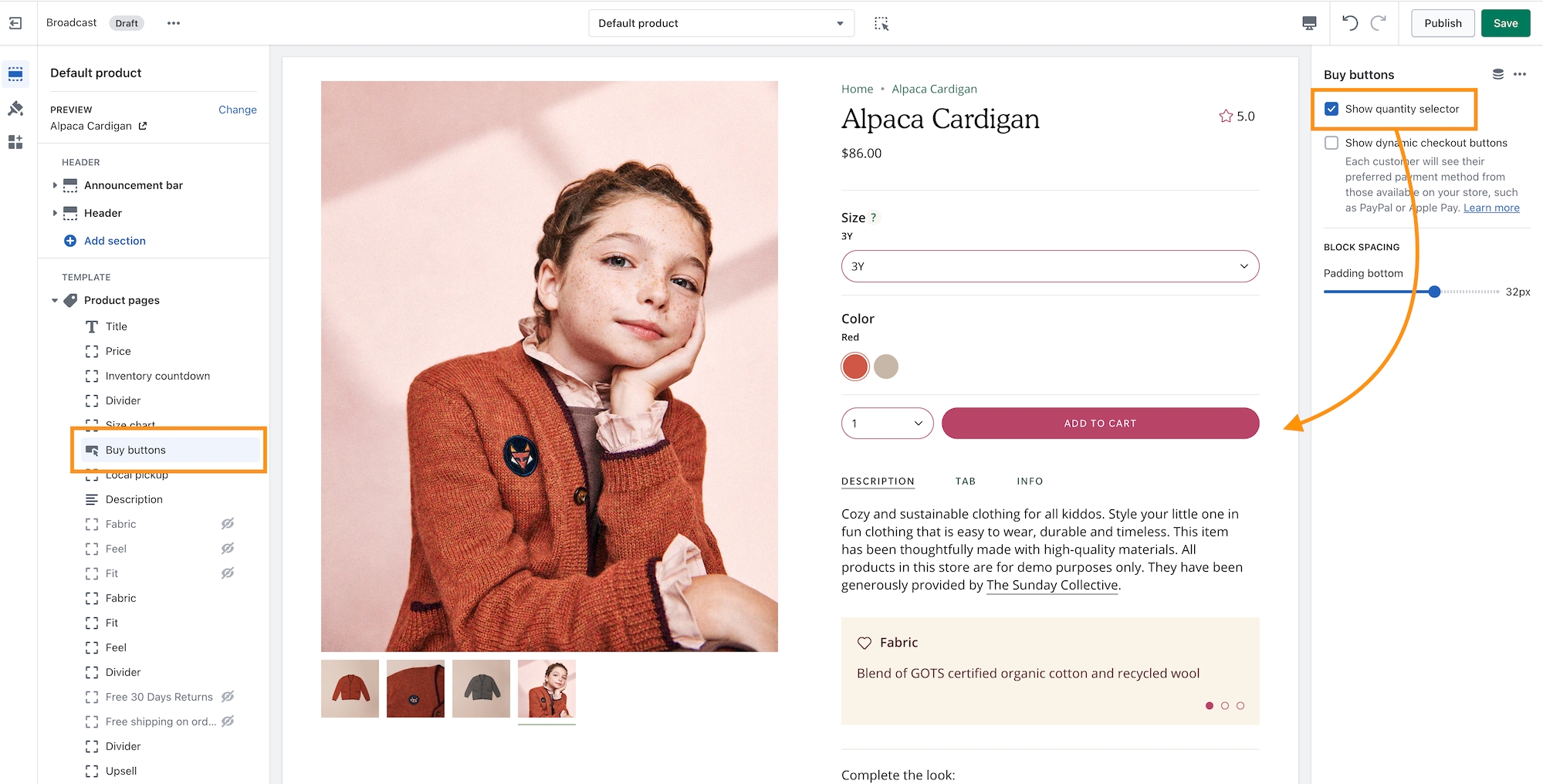
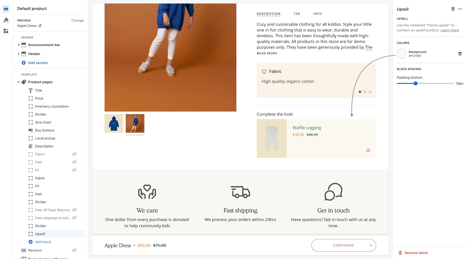
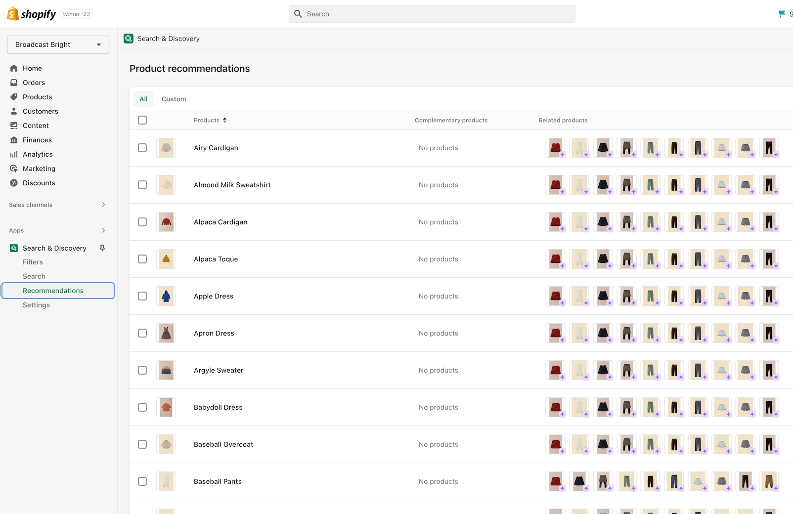
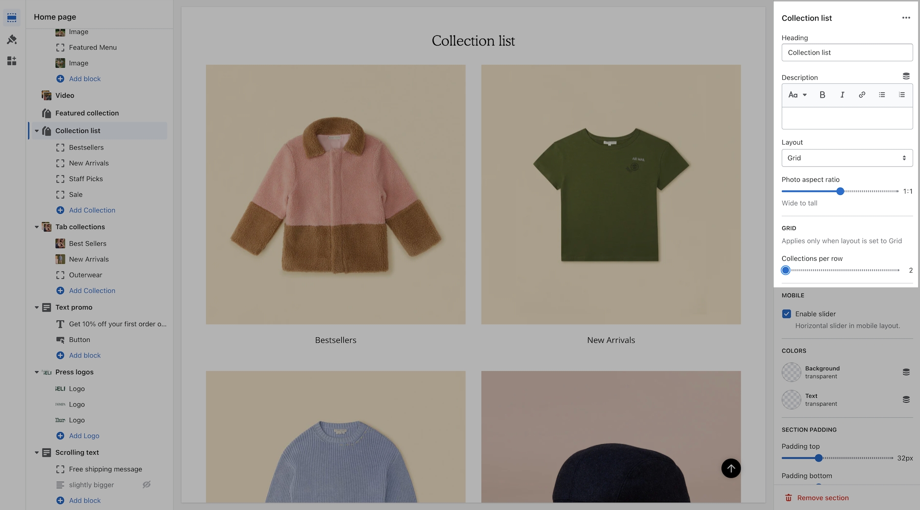
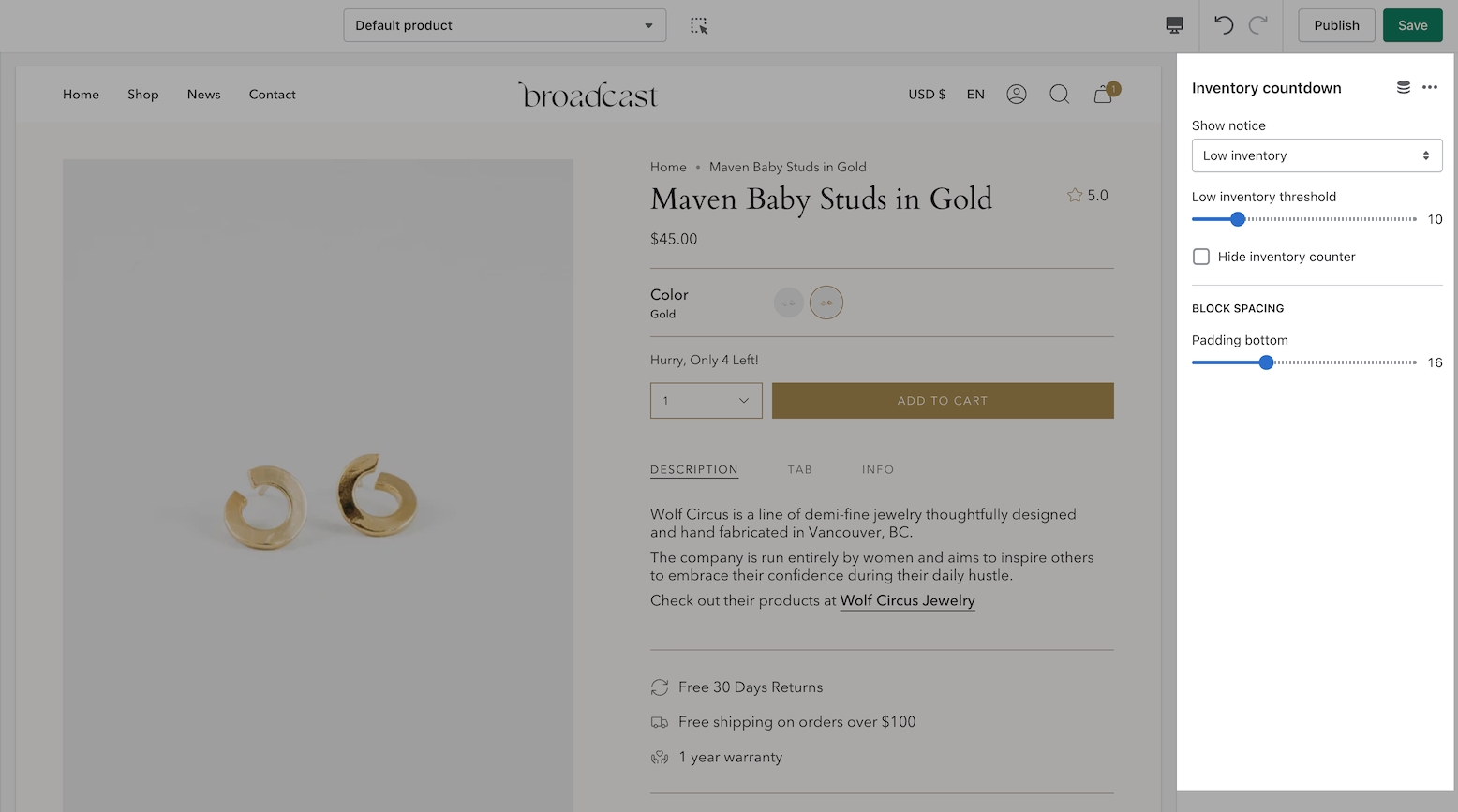
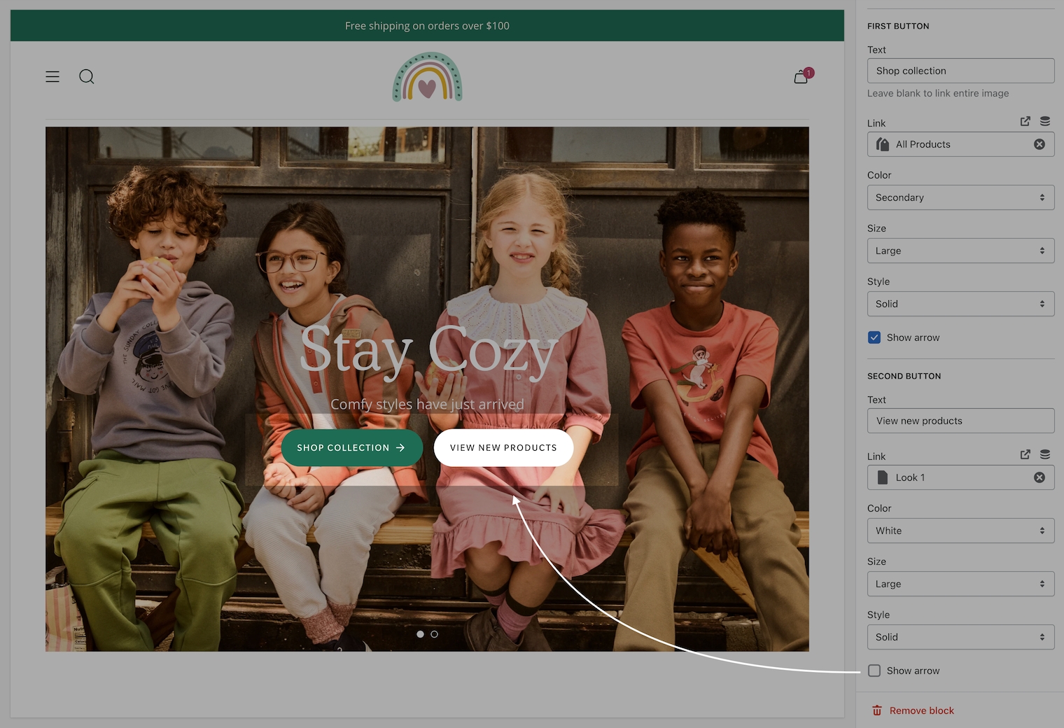
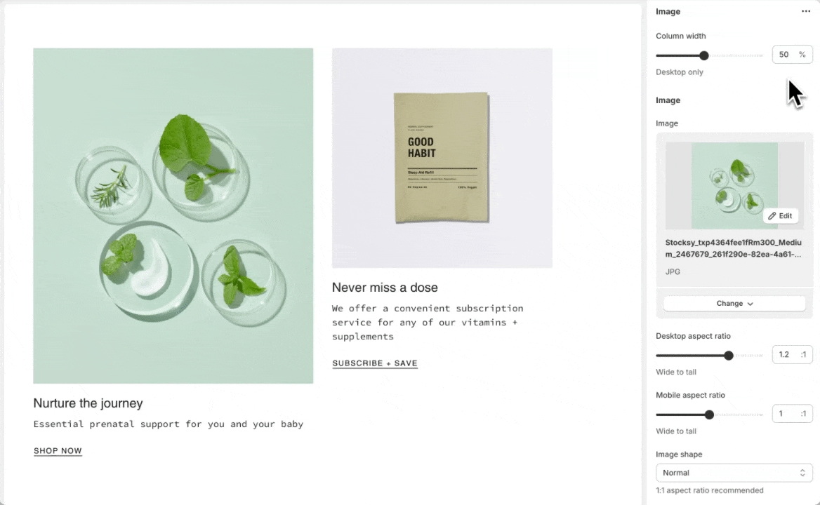
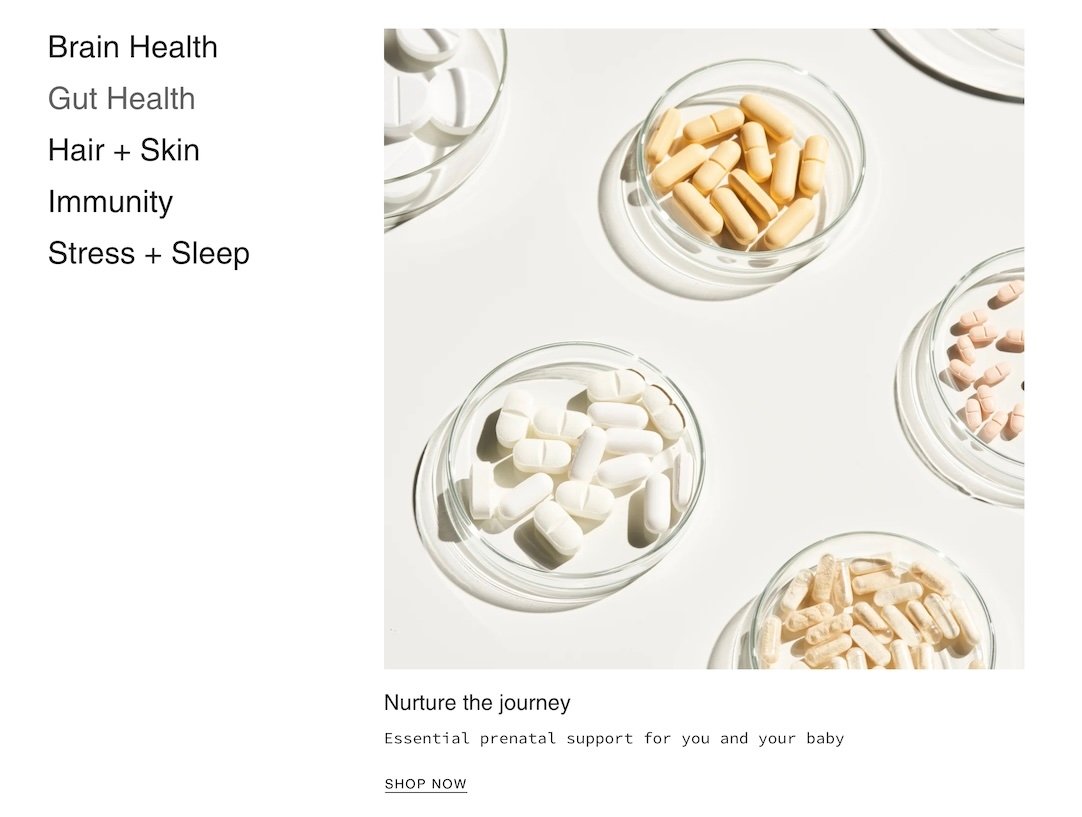
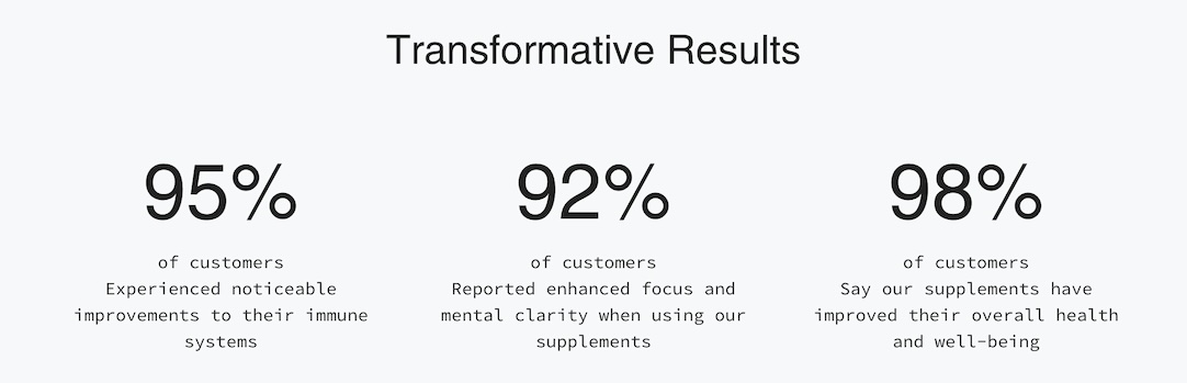
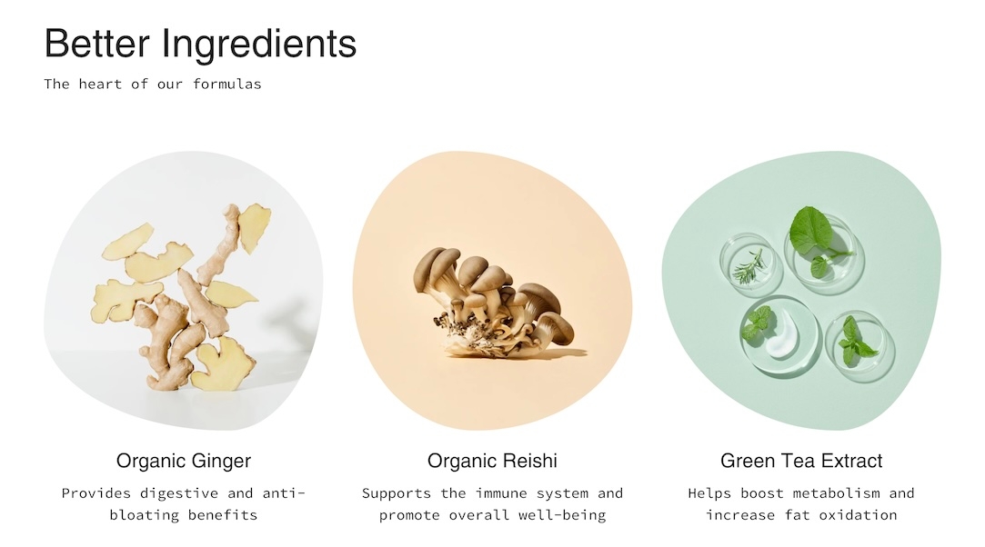
Broadcast theme updates
New section: Collection links: Spotlight
New section: Social video
New section: Banner with video (overlay)
Added support for high-variant products. Performance improvements for variants over 250.
Quickadd Button: Reintroduced the original button style, giving users a choice between two styles
Scrolling Text: Improved the animation when hovering over the text element
Resolved an issue where the Product Badge font size was not being applied correctly
The Main Broadcast preset was missing the Product template file.
Color Opacity Controls: Fine-tune the transparency of your theme's colors.
Collection Page Infinite Scroll: An optional pagination style for a seamless browsing experience.
Multicolumn: New "Image with Text Overlay" block.
Collection List: New "Collection with Text Overlay" block.
Product Pop-up Text: Now opens in a drawer for improved style consistency.
Mobile Header Menu: Mobile menu styles now utilize the dedicated "Mobile Menu" section design.
Out-of-Stock Notification: Resolved an issue where product titles were truncated in emails.
Press Logos: Fixed autorotation not working correctly on mobile devices.
Restructured theme files for theme store redesign.
Quick add button: Refined the visual style for both desktop and mobile interfaces.
Cart and Cart drawer: Expanded text size controls.
Slideshow buttons: Introduced a "Side-by-side" button style option
Slideshow video block: Enabled video integration within slideshow blocks
Button hover animation: Improved the button hover animation style for a more polished user experience.
Variant selection and hover: Refined variant selection and hover styles for enhanced visual feedback.
Header search: Removed the forced bold font style from the header search input.
Recently viewed: Corrected an issue where the "Recently Viewed" tab was displayed even when no products were present.
New section called "Slideshow (Nested)" introduces nested blocks for greater control over content layout. "Slideshow (Legacy)" remains to ensure a smooth upgrade process.
Quantity field styles within the product form and cart to choose between -/+ or a dropdown.
Upsell and complimentary products slider style.
Product grid badge alignment options.
Improved "Slideshow" full image linking.
"Text columns with image" was missing the image shape feature.
"Blog" pagination content was not updating.
There is a new section called "Mobile menu" (under the "Header") that utilizes blocks for flexible design options.
Scrolling text - A New "Collection" block
Shop the look - Header setting
New color palettes are here. Broadcast now uses Shopify's Color Palettes to manage color schemes.
New typography styles and settings! Another significant change in Broadcast is the management of typography settings.
Important: If upgrading from an earlier version of Broadcast, you will be required to reset your color and typography settings.
Removed the "Cookies" popup. Please use the built-in Shopify version instead.
New demo preset called "Groove"
Updated "Bright" demo preset colors and fonts to match new design
View the new
Updated style presets to match the Clean demo store upon initial installation, including colors and default sections.
Accordion - If enabled, the "read more" button was not appearing on iOS devices
Multicolumn - Product block that automatically pulls in product grid image and content
Option to have Collection "filter" accordions open by default
Input HTML into Slideshow header to bold, italicize, or include a CSS class for further design customization.
"More payment options" text was missing below the Dynamic Checkout Button (Paypal, Shop Pay, etc.)
The header "circle" cart icon option was showing an underline on hover
Predictive search was showing the secondary product image instead of the first one
Footer content would show as a broken accordion if there were no "Heading" entered
New section - Image with scrolling text
New section - Image with product
New design element: A theme-wide optional "Superscript" design that shows the number of products in a collection for multiple sections.
Image banner and Slideshow sections - Top and bottom padding settings added.
Improved the "Show secondary image on hover" setting to include tablet and mobile functionality. Added the ability to scroll through product images (max 5 for speed load)
Final sale text was not appearing in the quick add
A new section called “Rich text columns.”
Optional accordion style for the Footer blocks on mobile
Added a “hide” tag to products to prevent them from showing on search results, collection pages, recommended and recently viewed (use case: samples)
Sold out badge
Additional size and spacing options were added to the text and button blocks in the "Before and after" section. The image will be forced to full-width image size if no blocks are present.
Timeline dots are clickable on mobile.
Moved the “Remove” text in the cart to underneath quantity for an improved user experience
Editions ’24 taxonomy and filter updates
Cart text was missing the zero if no products were in the cart
Out-of-stock notification form will appear on the sticky cart for no variant products
Fixed an issue where the Out of stock notification form was always choosing the first available variant combination.
"Back in stock" notification feature for out-of-stock products
4 new styles for the collection color swatches
"Fit guide", "Countdown timer" and "SKU" block to the Product template
New blocks for the cart drawer: "Payment icons", "Icon", "Product list", and "Custom code"
Hide default banner images on the product page if you are using metafields for some products and not others
Option to hide sold-out upsell products
"Cart drawer - Note" not saving in certain circumstances
"Popup" was not closing if you clicked outside of the area
Product grid images appeared blurry for some merchants
Implemented blocks on the "Cart" template and "Cart drawer" section. Please note you may need to reconfigure these sections if you decide to upgrade.
Image with text - Introduced "Product" and "Collection" blocks
Announcement bar - New "Countdown timer" block
Rich text - Added an "Image" block
Added the option to show the product grid badges (sale, pre-order, custom) on the product page
Updated the design for the "Timeline" section on mobile screen sizes
Accordions - Option to show "open by default"
Image with text and Rich text - Customize spacing between blocks with the new "bottom spacing" setting
Removed "Reviews" from the product page as the Shopify app is no longer available
Toolbar - Fixed a mobile issue that was causing the "Gift card" link to get cut off
Fixed an issue where the cart notes were not being saved if you selected "View cart"
Added an optional icon setting to the Product page "Popup" block
Recommended products and Recently viewed products - New alignment and size settings
Products with image - New background color setting
Implement Shopify's new swatch collection filter
Countdown timer - Implemented new "height" setting to control desktop and mobile height separately.
Twitter - Updated icon to "X"
Product grid - Fixed a bug that was preventing the color swatch from showing on hover
Search - Closing icon was missing
Product page - The sticky cart bar was covering content on mobile
Collection - Additional white space appeared when filters were disabled
New section - Text with products
Image with text - Added "Image" and "Video" blocks
Product page - Introduced a transparent header using product images. We recommend using the "Stretch" image size with this one!
Implemented "Subheading" styles for greater control over typography
Quick view drawer - Fixed an issue where the focal point of the image was not centered
Collection "sort by" improved to work when filters are disabled
Removed "Upsell" product title when a product did not have an upsell associated with it
New section - Timeline
New section - Countdown timer
Added icon options to the accordions
New “Popup” block on the product page
Text columns with images/icons - New image per row setting
Updated design layout for the “Article” template
Fixed an issue with the toolbar content on mobile
Major release 🎉
Header - New block available: Toolbar; Additional currency styles
Image with text - New block: Accordion
Tabbed collections - New option: Mobile grid layout
Accordion group - New option: Show accordions in 2 columns
Custom content - Ensured the width options were consistent with the rest of the sections
Announcement bar - Arrows appear by default if enabled (instead of on hover)
Removed additional padding that was occurring on the product form for "Pre-order" products
Collection list - Linked the header to the collection
Search - The second product image was showing instead of the first one
Header - Fixed an issue with the mobile logo sizes not applying properly
Minor release
Fixed a liquid error coming from the preload_tag URL filter on swatches.css.liquid file
Major release 🎉
New section - Image with text slider
Gift card - Added a date picker
Header - Added a mobile logo width option
Header - Introduced the option to enable a bottom border
Improved color swatch implementation and introduced sibling color swatch options
Featured product - New design 🎉
Scrolling text - Added background image and image blocks
Featured collection - Introduced a width setting
Slideshow - Fixed a linking issue that was preventing the entire slide from linking out to another page
Fixed a quick add bug that was causing problems in Firefox
Major release 🎉
Gift card - Send directly to the recipient and include a message
Add a product to upsell in an empty cart
Multicolumn - New mobile aspect ratio setting
Shop the Look - New products per row (1 - 2) setting
Removed underline style when buttons set to "Text" with arrow enabled
Merged "Custom Liquid" and "Custom HTML" into one section called "Custom Code"
Updated "Upsell" functionality to work with one product and meta fields
Cart.js optimizations
Major release 🎉
This release introduces two new sections: collection list hover and text with products. We've also updated to include Shopify section groups and the new Shopify query suggestions for predictive search plus a few other improvements.
New section: Collection list hover
New section: Text with products
Implemented Shopify's new search functionality
Page templates can use the transparent header option
Improved the Inventory Counter on the product form
Added more icon options
Included the "Divider" block into more sections
Modified secondary button styles – Buttons will now appear side-by-side instead of below
Brought back the previous product form style as a design option
Improved video functionality and fixed button icon shift
Learn more about the update:
Major release 🎉
This release includes a significant update to the product form and shop the look section, improves button styles and functionality throughout the theme, and builds upon UX best practices.
Product form features have been separated into blocks.
Image with text – New secondary image style added.
Multi-column (previous "Text columns with images" and "Text columns with icons") – Added a "Menu" option with the ability to customize block widths
Focal points – This Shopify feature replaces our existing "position" setting.
Product form design.
Shop the look design and improvements to the mobile functionality of Shop the look.
Improved button functionality theme-wide.
Merge existing sections together for greater visibility*
*Note: You will need to reconfigure these sections when updating. Existing section settings will not migrate as they have been replaced by new sections. We recommend you manually add the new sections and configure them with the new options and controls.
General consistency improvements for arrows, buttons, and underline styles.
Major release 🎉
In this release, we've introduced a new icon set, mobile height settings for all sections, and general improvements throughout.
Mobile height setting for all sections to improve the mobile experience
New "Image with text" section
New "Features" block on the product page
New mobile slider style for product images on the product template
New icon set!
Connected the "Size chart" to the "Size" variant
Modified the "Image banner" section to utilize blocks – If you are currently using this section, you will need to rebuild it to accommodate this new functionality
Cart drawer and upsell product popup animations have been improved
Improved cart circle style for larger screen sizes
Optimized forms and newsletters for Google reCAPTCHA
Added color settings for the mega menu images to improve visibility
Minor release 🎉
New password page design
New predictive search results for blog, pages, and collections heading terms
Enhanced the responsive design for product pages
Introduced blocks for the "Rich text" section. This will require you to reconfigure your "Rich text" sections.
Improved sibling functionality on Quick Add
Major release 🎉
This release adds support for product siblings, updates the collection page filters, and improves accessibility across the theme.
- Link multiple products together as swatches.
Collection filters - New design and usability improvements
All new Quick Add design and functionality added with slide-out drawer
Introduced better cart animations
Accessibility improvements
Product search and close icon sizing
Major release 🎉
New section called Highlights to showcase collections and text content
New metafield option to customize the text below product images on collection pages
New circle option for the Cart icon
The upsell design, now allows customers to choose their variants 🎉 -
An all new Testimonials section with refreshed design
Improved linked variants for sold out products
Added support for multi-currencies in the free shipping message
Refined collection pagination when a Featured Product block was used
3.4.1 Release fixes a hamburger menu issue, where the closing "X" was missing
3.4.1 Added tooltips to the color swatches in the Upsell feature
Major release 🎉
Added granular padding options to each section. Now you manage easily manage the padding between various sections with top and bottom padding controls.
Improved sold-out variant styles. Swatches and variant boxes are now displayed as crossed out and drop-down variants will have sold out text next to them.
v3.3.0 was displaying a dark background on the header image blocks. This has been removed.
Minor release
Improved the functionality of the mobile main menu animations.
Improved the video section on mobile if the device is in low power mode.
FIXED
Empty translation string error.
Major release 🎉
Now you can include a short description on the product grid sections like collections, collection list, and featured collection.
Add icons and text under product form on product pages
Pulsing loading icon that will appear on the first load of your website, or all pages. Example usage: Display your brand logo on page loads.
Added a text option for header icon styles.
Ability to use metafields for pre-order and badges instead of tags. Tagging option is still available.
Option to choose % off instead of $ off for sale items.
Upsell will now skip a product if that product is already in your customer's cart.
Gift card translation issue.
Main Menu animation now works when using the back button.
Footer social media icons are opening pages in a new tab.
Footer opacity setting.
Major release 🎉
Fixed Issue with Cart Drawer clicking "X" not removing items
Product grid text elements like product title and price now use Body font for sizing
Improved sold out badge text visibility on the product grid
New header icon set and options
Fixed Collection filter bug
Major release 🎉
New Supports Shopify Online Store 2.0 (OS2) platform
New Support for Shopify’s Collection Filtering - Add collection filters in your Navigation admin
New Includes support for sections everywhere - Place sections on all page types including Products, Collections, Blogs, Pages, Cart and more
Updates to home page collection sections to ensure consistency
Fixed product page over scroll
Fixed minor cart upsell issue
Improved FAQ template design
New newsletter popup with targeting functionality, including a cookie popup.
New "Pair with" functionality to upsell in the cart. This automatically integrates with our product page upsell feature.
New "Collection Carousel" section.
Fixed issue with line item properties.
Fixed issue with iOS scroll lock which can prevent scrolling the cart body when there are many items in the cart.
Fixed password page login error.
New upsell feature on the product page
New quick add functionality, replaces Quickview
New about page template
New
Fixed issue with product variant images
Removed jQuery dependency
Improved speed and load times
Added a cart drawer setting
Updated design for mobile menu
Fix secondary currency price formatting on cart popup and recently viewed products
Fix issue on recently viewed products where no-image product causes JS error
Fixes issue were app injected URL params were wiped by variant state changes
Add unit_price in cart popup
Fix bugs introduced by architectural changes in 1.7.0:
Fix index-blog not showing tags
Fix margin-top for blank/captcha template
Convert snippets to use render which improves overall performance.
Added support for Unit pricing (currently supported for Shopify shops in Germany and France).
Convert to social image setting in shop admin. Now uses Shopify's admin setting for the social image.
Improved the speed with Quickview on collection pages and all product grid listings.
Improved mobile layout for newsletter pop-up when using an image. Resolves blurry image issues and small input space when button text is long.
Corrects PayPal dynamic payment button not displaying after quantity change on the cart page.
Fixes shipping calculator currency money format on the cart page.
Yotpo ratings will now appear correctly on collection pages after an endless scroll load.
URL fragments can now be used with variant history on the product page
Better variant focus states for tab-thru
Fixes issue with swatches on collection page after endless scroll occurs
Adds a simpler way to manage pre-order products
Added support for checkout in multiple currencies when using Shopify Payments
Added currency switcher to the footer settings -
New group filtering mode added - This allows you to build custom groups to filter by. Tag your products with custom prefixes and underscore to build custom groups
Fixes an issue with the YouTube Background videos
Adds a custom HTML section to make Instagram app integration
Product Media - Shopify now supports Video and 3D model files on product pages. This release supports Shopify's new product media formats. .
Removes Instagram section
Add new bold preset
Adds a split here section
Corrects an issue with endless scroll. Most noticeable when loading the third page of products on collection pages.
Added the ability to turn off endless scroll in Layout settings under Theme settings.
Adds support for automatic discounts and buy-one-get-one discounts
Adds support for the new product recommendations
Adds live search (using the old API for now, we built this right before the new API came out)
Improved add to cart popup cart notifications
New translations: Portuguese and Spanish
Tweaks price and title mobile sizing
Switch open graph tags to JSON-LD remove messy itemprop markup
Improved screen reader performance
Initial release 🎉
The Broadcast release log keeps track of the date and contents of each Broadcast release. Use this document to keep track of new versions and features. We always recommend staying up to date with the most recent version.
A powerful all-in-one video section for banners and building attention-grabbing promotions
The Video section lets you showcase a fullscreen or banner-style video with optional heading, text, button, and color overlays.
It supports autoplay background video or a popup playback mode, ensuring flexible storytelling and branding.
YouTube and Vimeo videos can only be displayed as Popup videos. The reason is, Shopify can't control the ads and linked videos that YouTube or Vimeo will display in the video. The result is a very unprofessional background section.
If you need to use a YouTube or Vimeo video, we have a couple of recommendations:
To use as a background video, download the YouTube or Vimeo video and convert it to an MP4 or MOV format, then you can simply add it to your Shopify library.
For a popup video, you can add the YouTube or Vimeo URL in the Popup section. Use a branded image or a still frame from the video to represent the video.
When enabled, the popup play button uses the same style as the call-to-action button. Adding a popup video can help display longer video content:
How to use the video section. This video demonstrates how to use the settings and options, plus details about the cover image and video types for looping and YouTube videos:
Slideshow & Banner Image: Bottom padding options between blocks for greater control over text spacing.
Variant-Level Pre-Order Styles: Apply distinct pre-order styles to individual product variants.
Product Template Accordion Style: Choose an optional "drawer" style for your accordion blocks.
Product Template Estimated Delivery Date: A new block to easily display estimated delivery dates.
New Standard Product Section: A dedicated section to showcase product images and forms with direct add-to-cart functionality.
Product Recommendations: Customize the number of products displayed per row in your recommendations.
Cart and Cart Drawer Discount Code: A new block allowing customers to enter their discount codes before checkout.
Button size controls: Added size adjustment options for all button elements: small, medium, large.
Add to cart button: Implemented an option to display the product price directly on the ATC button.
Rich text columns: Introduced a divider block for enhanced layout control.
Product form: Added the ability to assign descriptions to color variants for improved product clarity.
Control over the width of your content on the "Slideshow" and "Banner" sections.
New "Check" icon.
Prevent drastic size adjustments by the browser if the chosen font size is too small
Blog articles - A product list option was added to link multiple products easily.
Final sale shoutout on the product page to call out products that cannot be returned or exchanged
Connect images to your product variant boxes
Show "Recently viewed" products in your empty cart
Automatically add a "New" badge based on when a product was created. Disappears after a set number of days
Important: Separated "Accordion", "Tabs" and "Description" styles on the product page into individual blocks for greater control. If upgrading, your description will automatically convert to the "Tabs" style
Collection - Added the ability to add more than one "Featured image" block
Added the number of items in the cart beside the cart header for a better user experience
Introduced a "Swatch size" setting allowing for greater visibility for patterned swatches (new sizes: regular and large)
Scrolling text - Added an option to choose the font family: heading or body
Ability to choose up to 3 upsell products (instead of just one)
Multicolumn - New option: Image styles (set your images into circles)
Footer group - New block & section: Divider
Introduced more size chart styles
Cart - Added a "Terms and conditions" checkbox
Collection list - New mobile style options
The Split images section and Image Banner sections have been merged together as Image banner
The Text columns with images section and Text columns with icons section have both been merged into a new section called: Multi-column.
The Collection carousel section and Featured collection sections have both been merged into a new section called: Featured collection
Customize the width of each Footer block for unique layouts
The free shipping design has been updated and appears in empty carts to market free shipping minimums
New an option to include an arrow on buttons and text links
New text alignment setting for the Tab Collections section
Ability to increase or decrease the padding between the product images on the collection
Ability to add a Linklist menu to an Empty cart
Italian language translations
Before and after section to showcase customer results.
Sidebar section with sticky navigation. Recommended for FAQ and About pages.
Product page images can now appear 2 per row with the new grid setting.
Header design option for logo center and text left.
Video section now has the option for mobile-only image and height.
Minor padding and margin adjustments.
Improved language support in Cart when items are changed
Fixed issue with video playback on mobile when there is no sound
Fixed issue with flashing slideshow transitions
Improved support for iOS 15 - slideshow and size chart scrolling
Improved support for Reviews app with Recently Viewed and Product Recommendation sections
Improved small newsletter visibility on scroll
New Added support for $0 products in Language Editor (Edit languages)
New Added Liquid code block to Product form
New Added show after 3 seconds option and position options to Small newsletter
Fixed issue with transparent header upon page refresh
New native video player. Deprecated Plry.
Improved support for no image products
Improved a11y support for navigation dropdowns
App block supported added to Accordion section
Improved collection filter selection support
New Added hotspot links to products in Shop the look section
New Recently viewed section
New size chart functionality for product pages with the ability to have custom popups per product.
New "Back to top" scroll feature.
New "Custom icon" setting for the "Text row with icons" section.
New "FAQ" page template.
New mobile image option on the "Slideshow" and "Image with text overlay" sections.
New custom label functionality allows you to add any text such as "coming soon" to a product on the collection template.
Updates to product page images, with a new size setting and a new thumbnail position. Thumbnails can now be placed on the left side of the main product image on the desktop!
Updates to announcement bar with dynamic free shipping message.
Improved animations and transitions.
Improved main menu and mega menu design.
New “Featured collection” slider option
New cookie popup option
Updates to sticky cart functionality
Updates to color swatches on collection grid when quick add is disabled
Updates to accessibility
Added Shop Pay
Added new menu design settings
Switched to predictive search API for faster search
Added support for subscriptions / setting plans on cart and order pages
Fix issue where header height calculation was incorrect when the search is disabled
Fix auto height on RTE images for legacy mobile devices
Fix product title size for recently viewed
Fix forgot password page
Lighthouse performance updates. Major overall theme speed performance.
New setting to show/hide reCAPTCHA terms
Minor improvements to mobile display and navigation including newsletter popup and updates with cart icon.
Fixes issue where leading or trailing non-breaking space could prevent megamenu from matching a name
Fix small screen grid for related products
Removes currency estimator from header
Adds support for Store Languages
Adds a tag filtering sidebar popout
Moves tag and sort pop downs on the collection page
Show variants as boxes added to Product Grid settings (displays variants in box format similar to swatches instead of dropdowns)
Adds an image and text column section
Adds an icon with text section
Adds a logos section
Improved homepage blog layout
Improved layout for collections list page
Transparent header setting
Meganav images
Sticky header setting
Add support for javascript currency switcher
Featured post section for the blog
Background video sound setting added for browsers that support audio autoplay
Update schema with contact url
Bug fix: Hide default variant title in cart
Bug fix: Fix quickview showing incorrect product on homepage with multiple collections
Bug fix: Fix footer social link colors
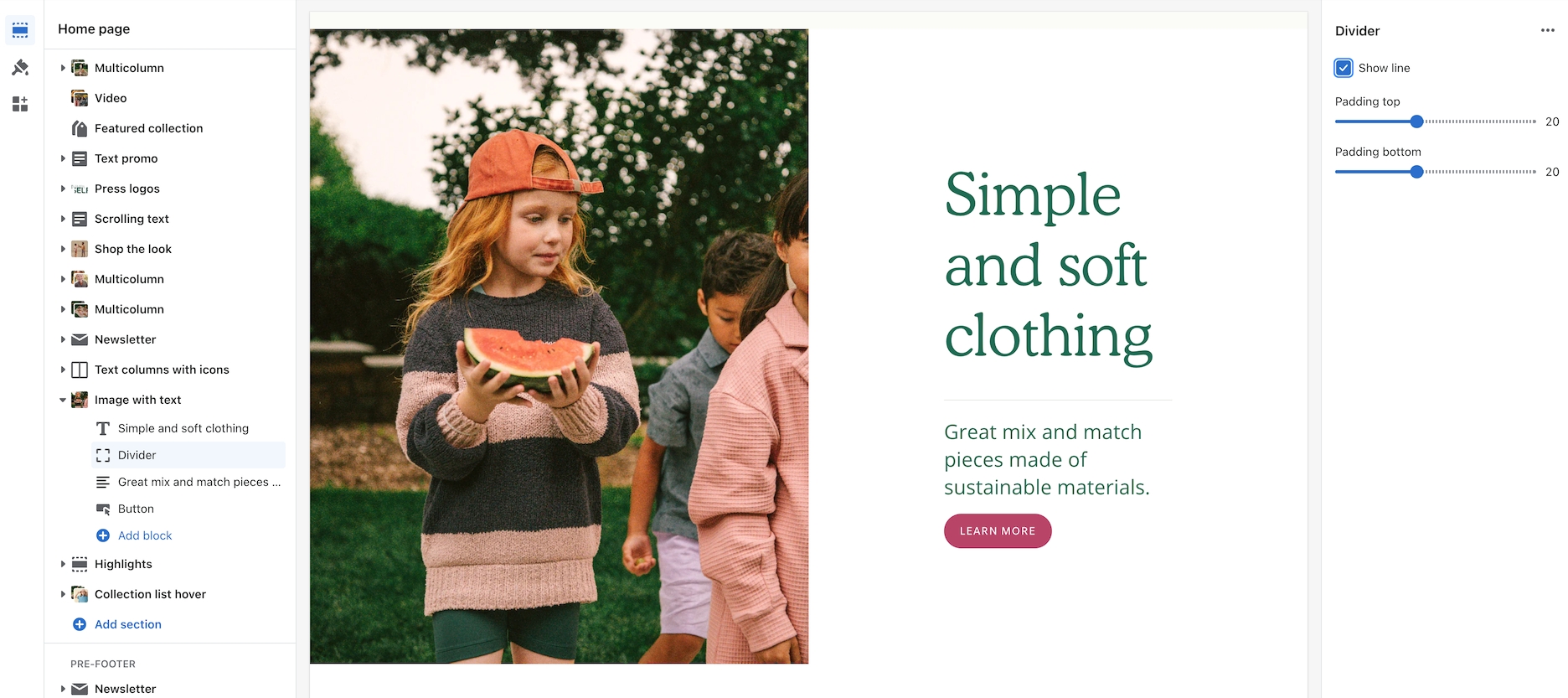
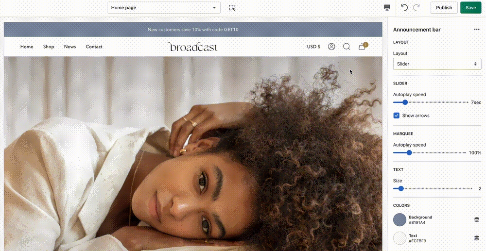
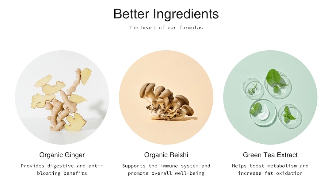
MP4/MOV
video
Upload a secondary video to be used in the popup.
Youtube/Vimeo link
video_url
Add a link to a YouTube or Vimeo video for popup. Accepts only these two sources.
Typography
Heading
text
Title text displayed over the video.
Heading size
select
Choose Mini, Extra small, Small, Medium, Large, or Extra large for the heading text.
Text
richtext
Rich text editor to input supporting content.
Text size
select
Sets paragraph text size. Applies only when content is set as a paragraph:Extra small, Small, Medium, Large, or Extra large.
Text alignment
select
Aligns text vertically and horizontally over the video.
Button
Text
text
Label for the CTA button. Leave blank to make entire image clickable.
Link
url
URL the button should link to.
Color
select
Choose button color: Black, White, Primary, or Secondary.
Size
select
Choose button size: Small, Medium, or Large.
Style
select
Choose button style: Solid, Outline, or Text.
Show arrow
checkbox
Display an arrow icon inside the button.
Desktop
Image
image_picker
Fallback image if video fails to load (Recommended: 3200x1200px).
Height
select
Defines height of section: Full screen height, 3/4 of screen, 750 px, etc.
Mobile
Image
image_picker
Fallback image for mobile (Recommended: 1200x1600px).
Height
select
Sets mobile height in screen ratio or fixed pixels.
Layout
Width
select
Set section to Full width or Full width padded.
Colors
Color scheme
color_scheme
Choose a predefined color scheme.
Show text background
checkbox
Adds a background behind the text for better legibility.
Text
color
Manually select text color.
Overlay
select
Adds an overlay: Disabled, Opacity, or Text underlay.
Padding
Top
range
Add top padding.
Bottom
range
Add bottom padding.
Advanced
Heading SEO tag
select
Define heading semantic tag: H1-H6 or Automatic.
Content
Video
video
Upload a local MP4 or MOV file to play as the main video.
Popup
Enable popup
checkbox
Enables the video popup overlay functionality.


