Broadcast is likely the most feature-rich theme ever built for Shopify. We hope you didn’t notice. It is built to be easy to set up and run for the first time and has rich features you can tap into as your needs become more complex.
These docs are built to guide you along that journey. We hope to develop themes that rarely need documentation, but e-commerce is complex, and some things require explanation. In some cases, these docs are opinionated. The authors of Broadcast have been working in e-commerce for over a decade, building Shopify themes, launching startups, and building large complex sites for international brands. We have opinions about best practices that are based on this experience. We have baked that ethos into Broadcast.
We aim to help you avoid pitfalls and build a site that is maintainable for the long term. In general, we don't document the apparent things. If you see documentation here, it’s probably worth reading — even if you're an expert. From all of us at Invisible, we hope you love it as much as we do.
Demonstration stores
Explore sections in Broadcast
Watch our video overview of the sections used in the Modern demo store:
Discover our latest release
Update: Broadcast 6 is now out in the Shopify Theme Store. Download the latest version of Broadcast from the
All licensed customers can download the latest version for free to their store. Continue running your current version and publish only when you've set up the latest.
Try Broadcast for Free
If you're new to Broadcast, you can easily download a free trial version from Shopify's Theme Store. With Broadcast, you can create a store that perfectly fits your brand, products, and services. You can use it as a draft theme for as long as you need without any time constraints. Only pay when you're ready to publish your store.
Support
If you have questions or need additional assistance with using the theme, our support staff is here to help you by email. We offer free theme-related support by email to all our customers with no extra fees. You can also inquire about features or ask us questions about the theme before your purchase:
Earlier versions of Broadcast
Broadcast has grown with Shopify over the years. We are currently on our fifth generation of the theme. Choose the version toggle at the top of the page next to the logo.
About v5.4 release
Additional information on recent Broadcast updates
Products with image - New section
Display a branded image with a selection of products with this new two-column style section:
The mobile version displays the image first, followed by the products:
Image with text section now supports media in the text block
Add an image or video block into the text area of the Image with text section:
Insert an image or video into the text column:
The main image is configured in the section settings. The image block will add an image to the text area. Drag the image or video block to sort placement position in the text area.
Transparent header support for product pages
Create modern designs for product pages, now with transparent header support:
Find the settings in the Header section:
For best results, use the Stretched option for the Product page layout:
Subheading settings - New options
Now you can configure both the Body and Heading styles for Subheadings:
Adjust the font sizing, and letter spacing, plus an option to make subheadings in all uppercase.
About v5.3 release
Additional information on recent Broadcast updates
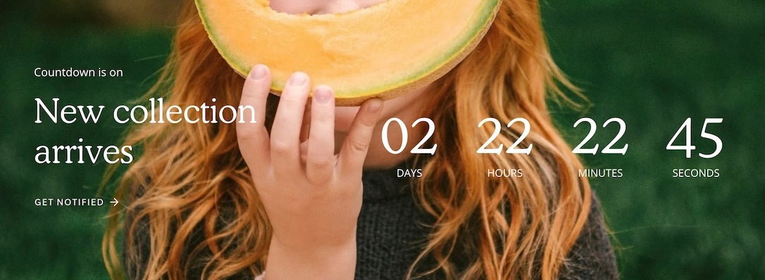
Countdown timer - New section
Add promotion-style countdown timers to your shop:
Design unique styles with backgrounds for desktop and mobile devices:
Customize with various section settings. Add blocks for text content:
Timeline - New section
New to Broadcast is a unique Interactive section with beautiful animation to engage your customers:
Animated lines connect to timeline points as the customer scrolls down the page. Easy to build, add a timeline block for each entry. Use the section settings to customize the design:
Improved mobile layout for header
We've improved the header elements in the mobile navigation:
Content from the header is now placed in the lower section of mobile navigation.
About v5.2 release
Additional information on recent Broadcast updates
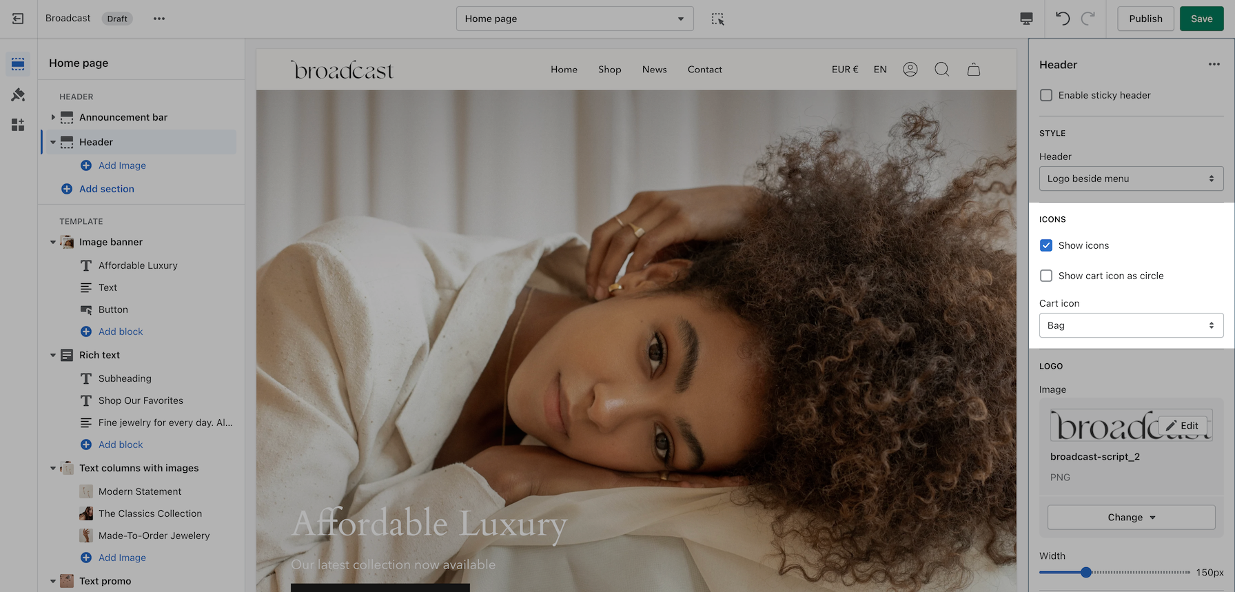
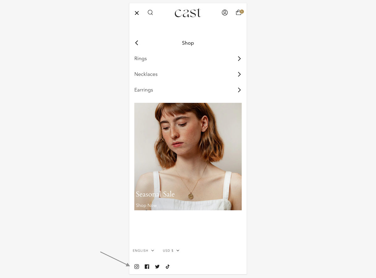
Header section: Toolbar block
Our latest header block allows you to add more menu items, more icons, and more functionality to your main navigation.
This new option has dedicated controls to show a menu, country and region selectors, a currency picker, social media icons as well as dedicated color settings (for the background and text).
Note: When the hamburger menu is enabled, links from the navigation menu will be added to the side drawer.
Image with text: Accordion block
Accordions are making their way to more sections. Add expandable blocks to your Image with text section.
Accordion group: new option
Show two columns of tabs with the new option in the accordion group section:
Multicolumn: new option
There are three new ways to display your image blocks in the multicolumn section. First, be sure to add an image block:
Select an image shape from the individual block settings. Try out the new blob and its hover animation!
Footer group: new block & section:
The divider section has made its way to the footer group. Use it to add a horizontal ruler and separate the content above the header.
There is also a divider block inside the footer section itself. Use the individual block settings to adjust the width and space everything perfectly around it:
About v5.8 release
Additional information on recent Broadcast updates
Image with scrolling text section
We've added a new section to expand the scrolling text feature by integrating a modern scrolling text element within an image banner-style section:
Flexible
The section includes settings for desktop and mobile images and heights. Choose from scrolling text, text, or button blocks to build the content. Buttons will be placed inline horizontally.
Images are selected in the section settings, content is added using the rich blocks
Image with product section
With Broadcast, you can now embed a product card right into an image banner-styled section:
Designed to be quick and easy to set up, this new section has incorporated the image and product settings into the section settings. Content blocks, including heading, text, button, and custom code, can be added to build the overlaying information on the left while the product card is shown on the right:
On mobile, the product card is placed below the image. The content can be positioned on top, in the middle, or at the bottom for the stacked view:
Superscript indicators
Broadcast can display the number of products that are in collections. The feature shows a numerical value next to the collection name in the dropdown navigation:
A theme-wide optional "Superscript" design option has been added, showing the number of products in a collection for multiple sections.
Learn more:
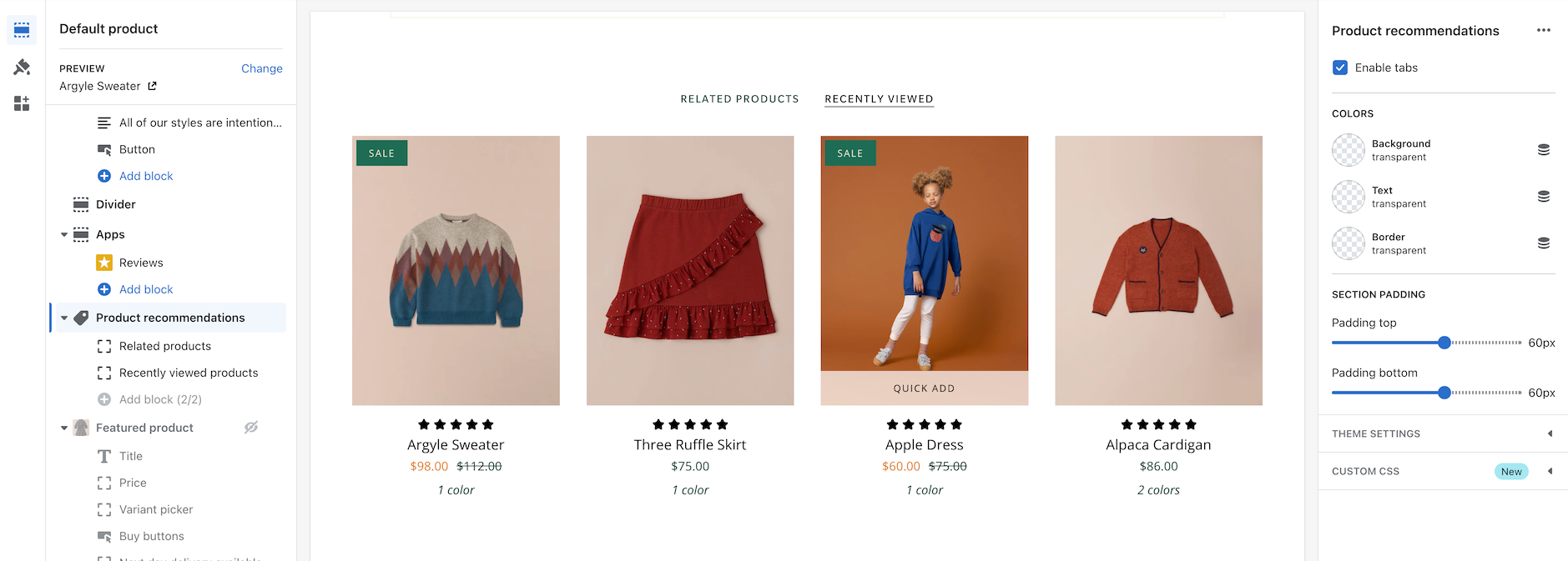
Blog posts with product cards
Broadcast makes adding product cards to your blog posts even more effortless. Choose products from a list and add them to the sidebar:
Customize the heading and select products from the product list:
Note: Since Shopify's templating system will reuse these choices on other articles, you can create a new blog post template and then assign that to different posts.
Another option for a unique selection of products is to use metafields for the product list:
Use the dynamic source option for unique products on each blog post
Second image on hover and Quick Add improvements
Broadcast has a new interface to support touchscreen laptops and devices. When a touch screen is detected, the "second image on hover" feature becomes a slideshow in the product grid. Now, the customer can see additional product images without requiring a hover action. This works for mobile devices and larger touchscreens.
To adjust how many images appear in the slideshow, use the new setting in the Theme settings -> Product grid:
Quick Add
For larger touchscreen devices, the full "Quick Add" button is displayed below the product image. Mobile devices will use the icon-style button.
Release Notes
View the release notes for a complete listing of changes:
Additional information on recent Broadcast updates
Rich text columns section
We've added a new section to quickly build text-based content and organize the elements into left and right columns.
Two-column rich text section with different column widths
Each block has a position option for column placement:
Column sizes and text alignment can be adjusted in the section settings:
Mobile settings allow the stacked content to be left-aligned or centred.
Mobile footer accordion options
Display blocks inside an accordion for the mobile footer:
In the footer blocks, you can use the new checkbox to enable the accordion feature for mobile devices:
The accordion option is available on the following footer block types:
Link list
Text
Page
Social
The newsletter and divider blocks do not contain the option.
Hide tag for products
We've added the ability to hide products from searches and collections. Simply add the hide tag to your product:
After adding the hide tag, the product won't appear on collections and search results:
You can still view the product page by using the product URL:
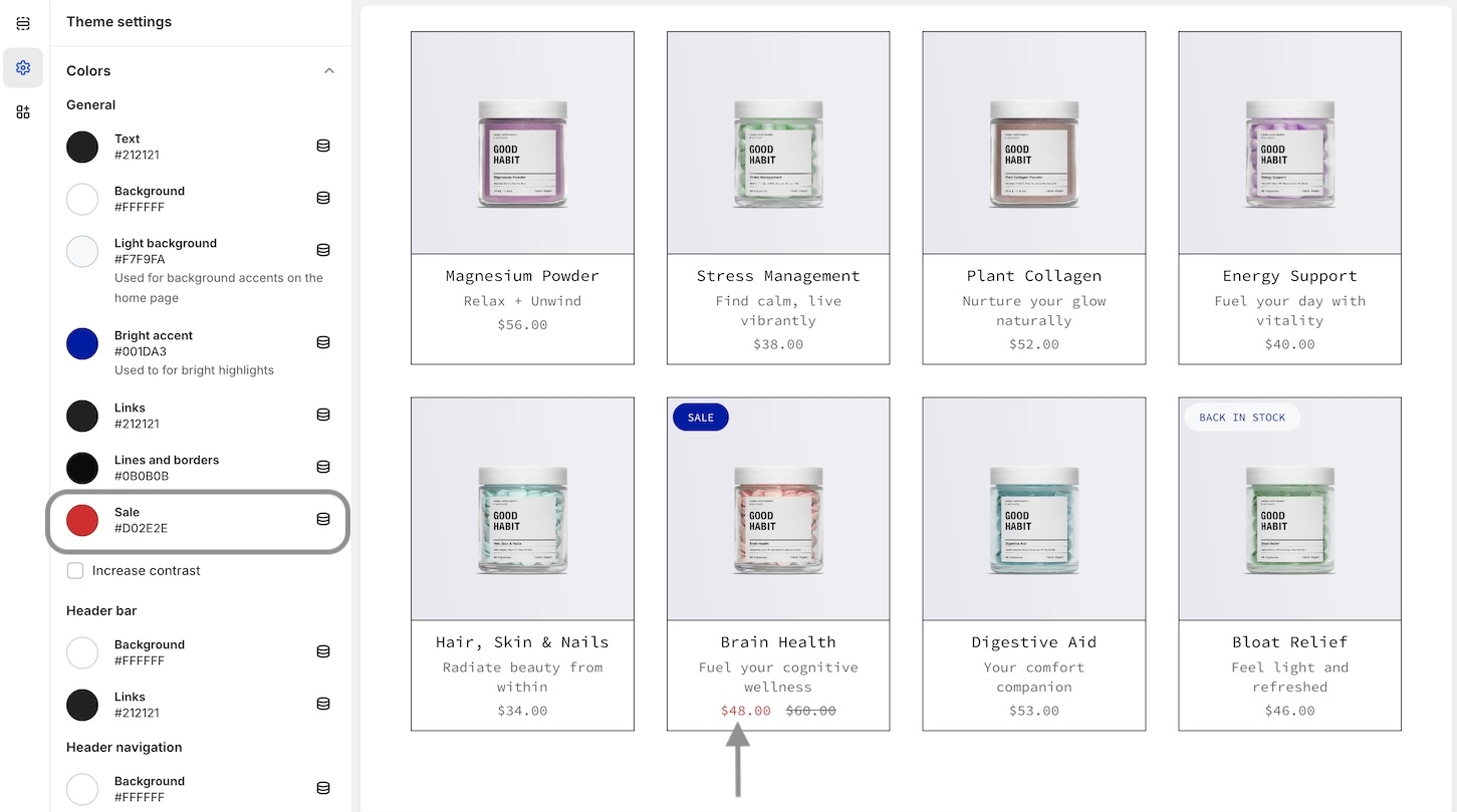
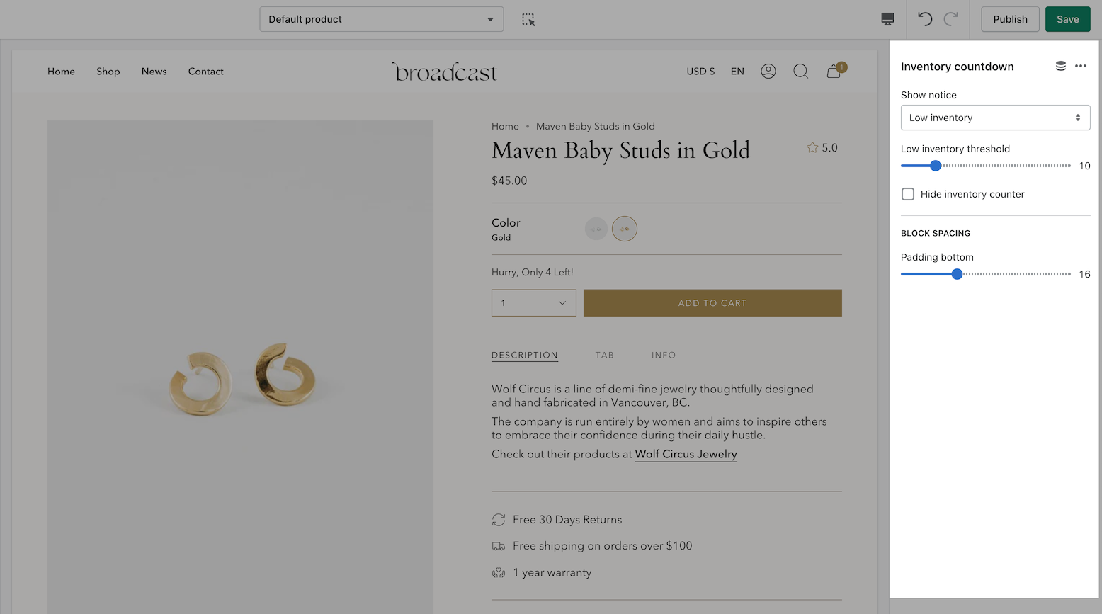
Sold out badge
Items that are sold out can now display a badge on the product grid or collection listings. The price is now also shown with the product information:
In the Theme settings -> Product grid, you can toggle the badge option:
Before and after block updates
We've added additional size and spacing options to the blocks in the "Before and After" section:
Remove link repositioned in the cart
We've improved the placement of the "Remove" items from the cart. The link is now below the quantity selector and left-aligned to match the other elements:
Release notes
View the release notes for a complete listing of changes:
Map
Display an interactive or static location map
With the map section in Broadcast, you can display an interactive map for your customers.
Broadcast supports the Google Maps API to display a store's location easily. Alternatively, you can use any static image to display a location.
Example map styles
When using your Google Maps API key, Broadcast will automatically generate an interactive map with the address you provide. Broadcast also includes multiple map styles. Here are some examples:
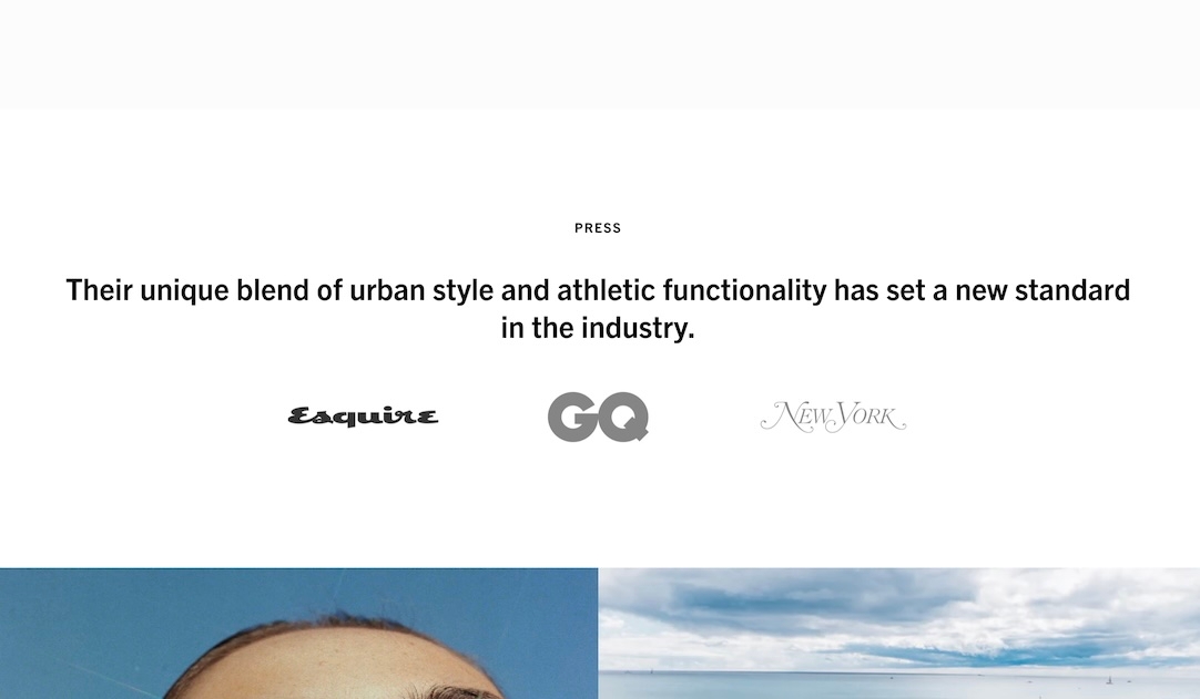
Press logos
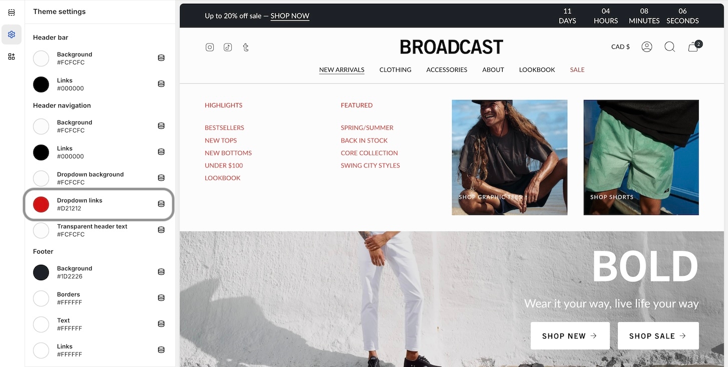
Display quotes and brand logos
Use the interactive press logos section in Broadcast to draw attention to customer feedback on your products and services, creating an engaging presentation of quotes.
Flexible
Add as many brand logos and optional quotes as needed. The section builds a slider when additional logos are displayed beyond the viewport.
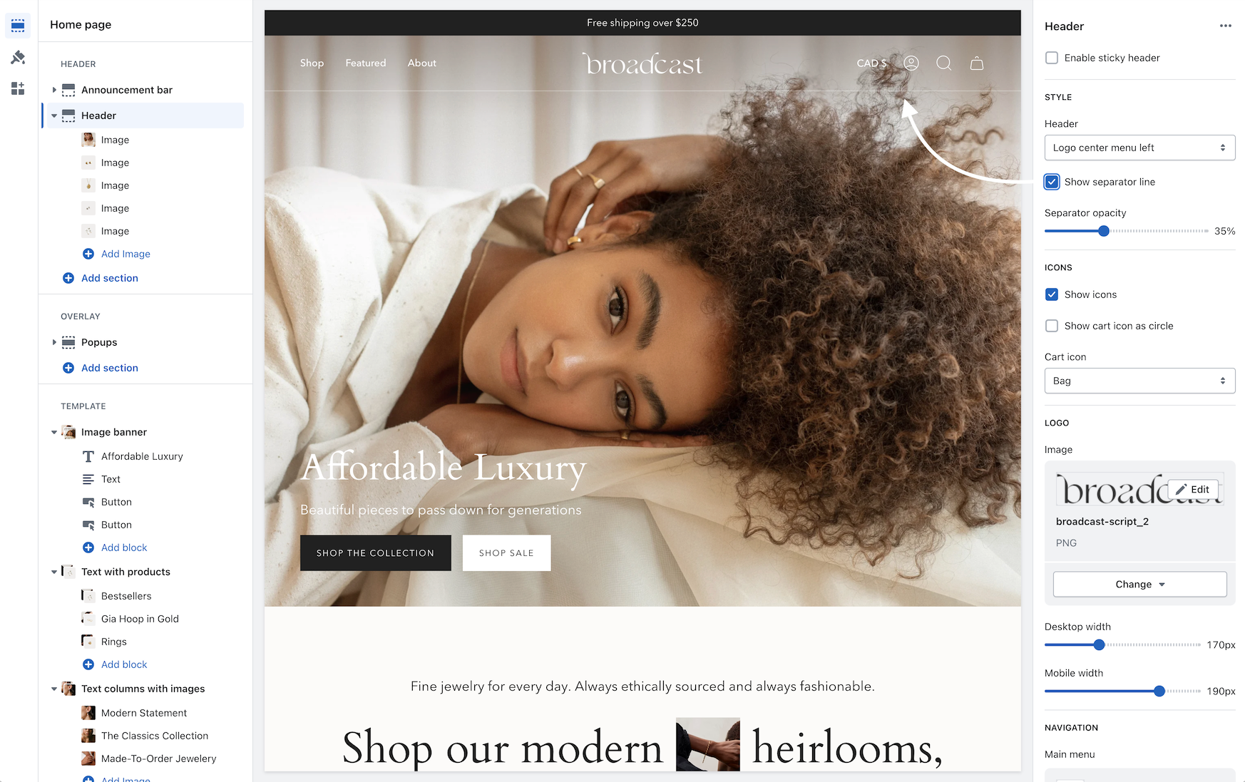
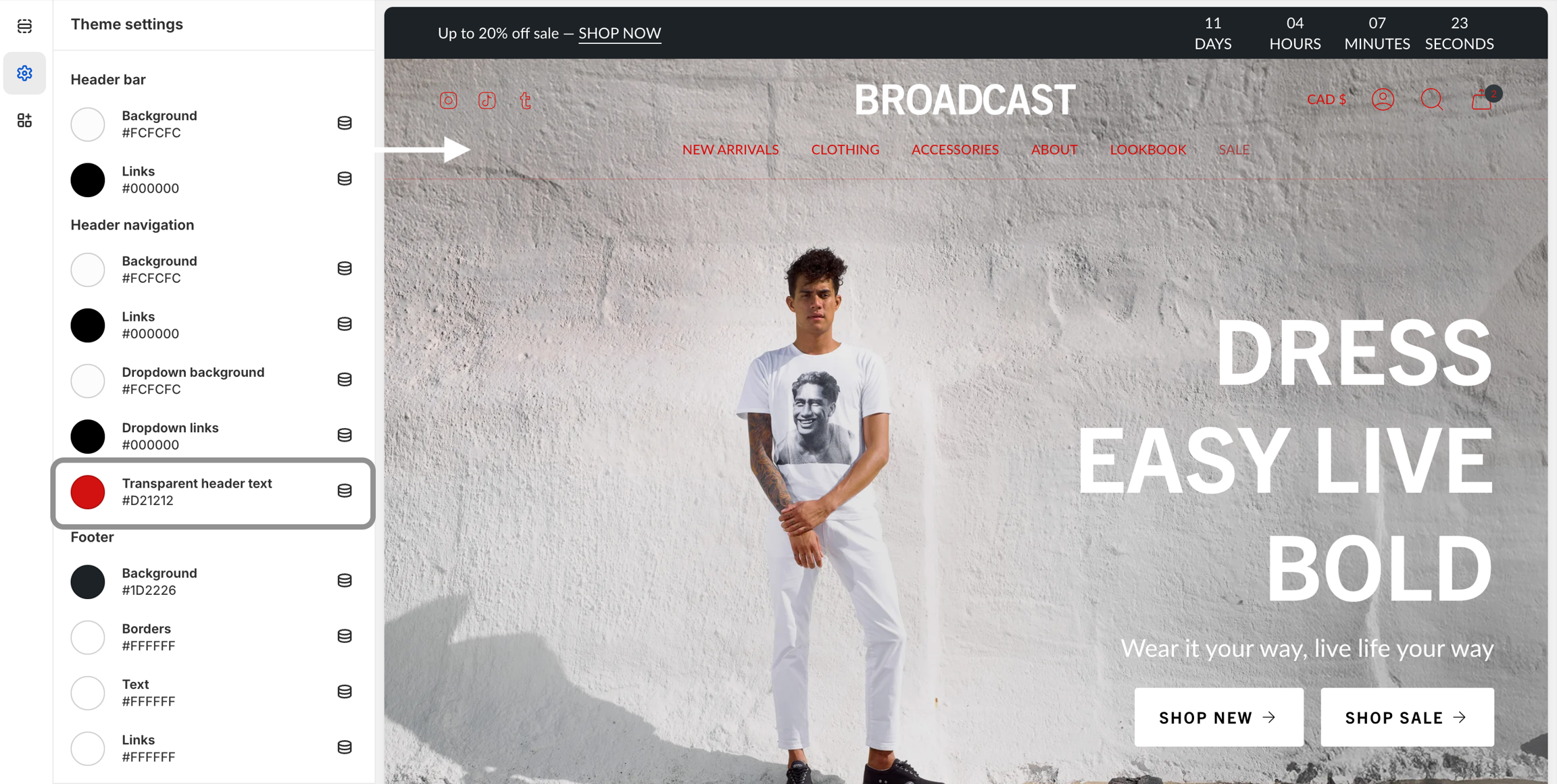
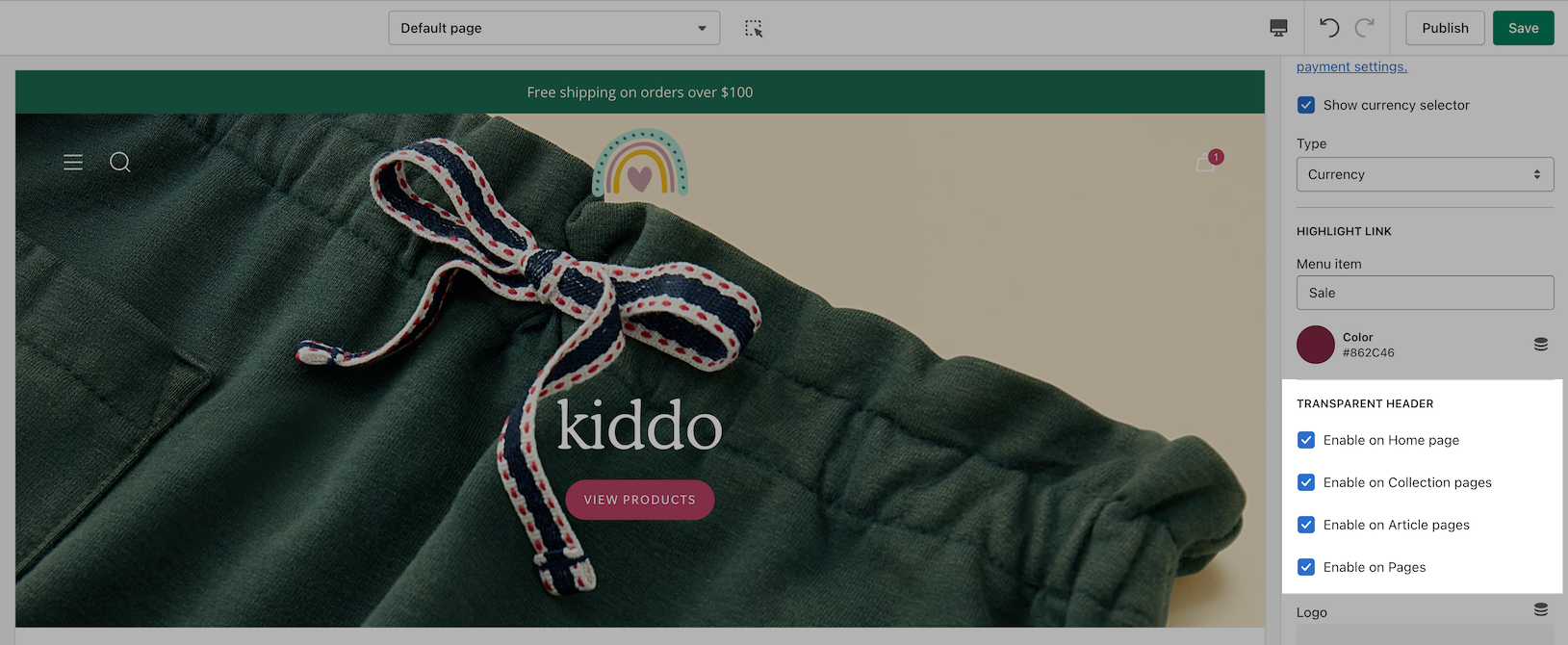
Transparent header
Change the opacity to blend the header with the background image
Broadcast can display a transparent header on almost all pages:
When using a transparent header, you may include a second logo to provide contrast with your main homepage asset.
If a sticky header is also used, a darker logo will provide the needed contrast upon scroll.
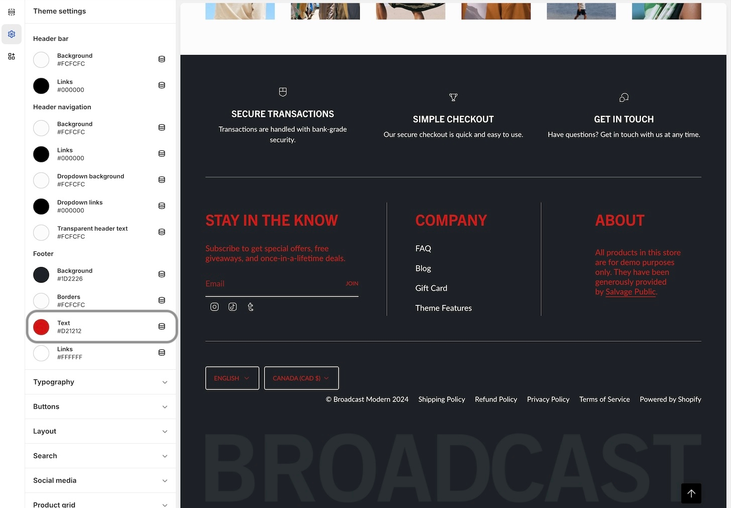
Footer blocks
Customize columns within the footer area using rich and interactive theme blocks
Broadcast footer theme blocks help you customize content columns within the footer:
Types of theme blocks
Broadcast includes the following theme blocks for the Footer:
Search
With Broadcast you can easily add search suggestions:
In this tab, you can add a navigation menu and select products.
Video walkthrough
Example settings for the toolbar and image blocks on the Bold demo store
Watch a video excerpt from our Bold demo store example. This video covers the toolbar settings and image blocks used on our demo store:
Header
Product pages
Toolbar
Announcement bar
Minimal style
Light style
The default style displays the standard Google Maps colors:
Default style
Flexible
This section can use the Google Map API for rich interactive maps or add any image from your store library to display a location. You can choose from different map styles and zoom levels when using the Map API key.
Customize
Choose the heights of the desktop and mobile sections. When using the Map API key, the map is not cropped. Use the zoom control to get the best view of your location. For static images, choose a height that works best for the image.
Select from different map styles, including regular, minimal, light and dark.
Add a heading and address to the text area. The directions button will open Google Maps to the address you've provided.
You can use longitude and latitude values to find the perfect position for greater accuracy.
Video Overview
This video demonstrates how to set up a Google Maps API key and also configure the section settings for the Map section:
Register a key
Shopify's article will help you get started with the links to the Google Dashboard:
Interactive map using Google's Map API
Customize
You can use the press logos section with or without quotes. The heading slider toggle can be used to hide quotes and display only the logos:
Adjust the inactive logo opacity to bring attention to the selected logo and quote.
Logos can be linked to any page if quotes aren't used:
Replace the heading slider quotes with links
Heading slider with quotes
Logos
An Alternate logooption is available to help provide better contrast when transparency is used. This is an optional but helpful feature.
If a Sticky header is enabled, the first primary logo is used while scrolling. This overrides the Alternate logo choice during scroll.
Main logo is used while scrolling with sticky header
Link list (menu)
Newsletter (form)
Social (icons with links)
Text (rich text)
Page (Shopify page)
Columns are created by adding theme blocks, one per column
URL is found at the bottom of the product setup under the SEO listing
The price replaces the original sold out text at the bottom, when badge is used
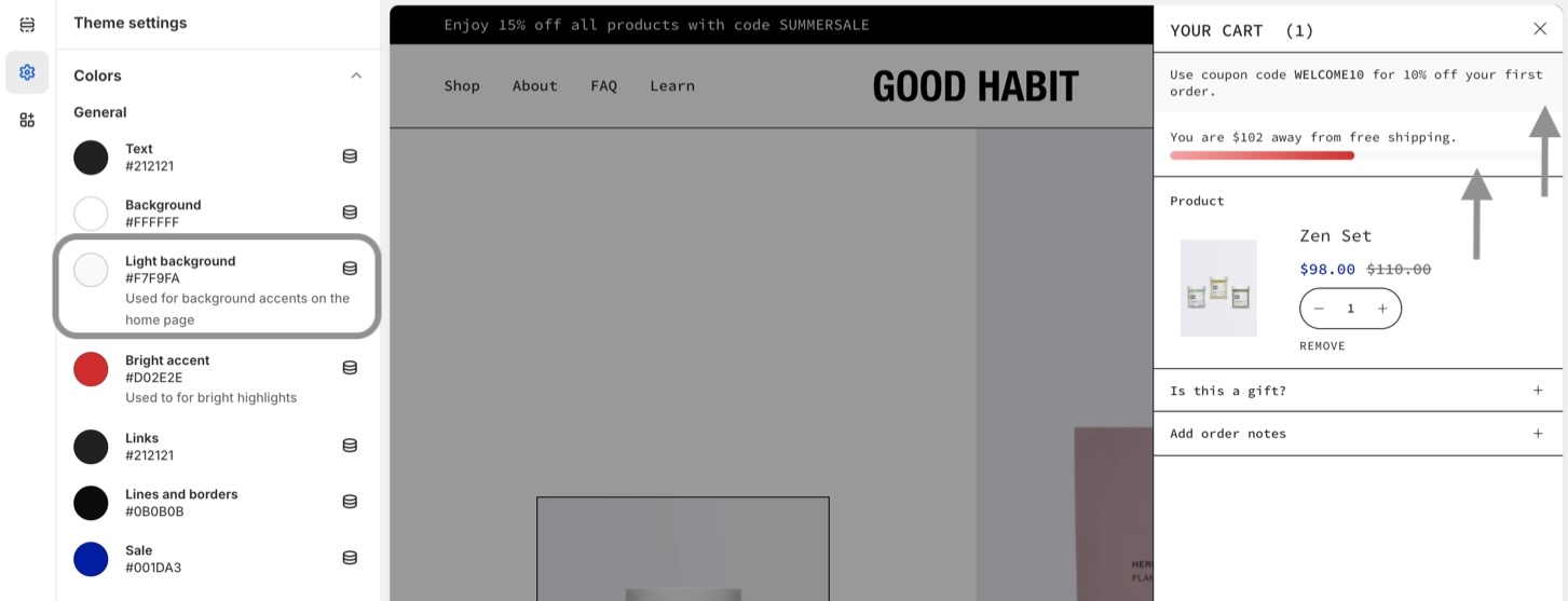
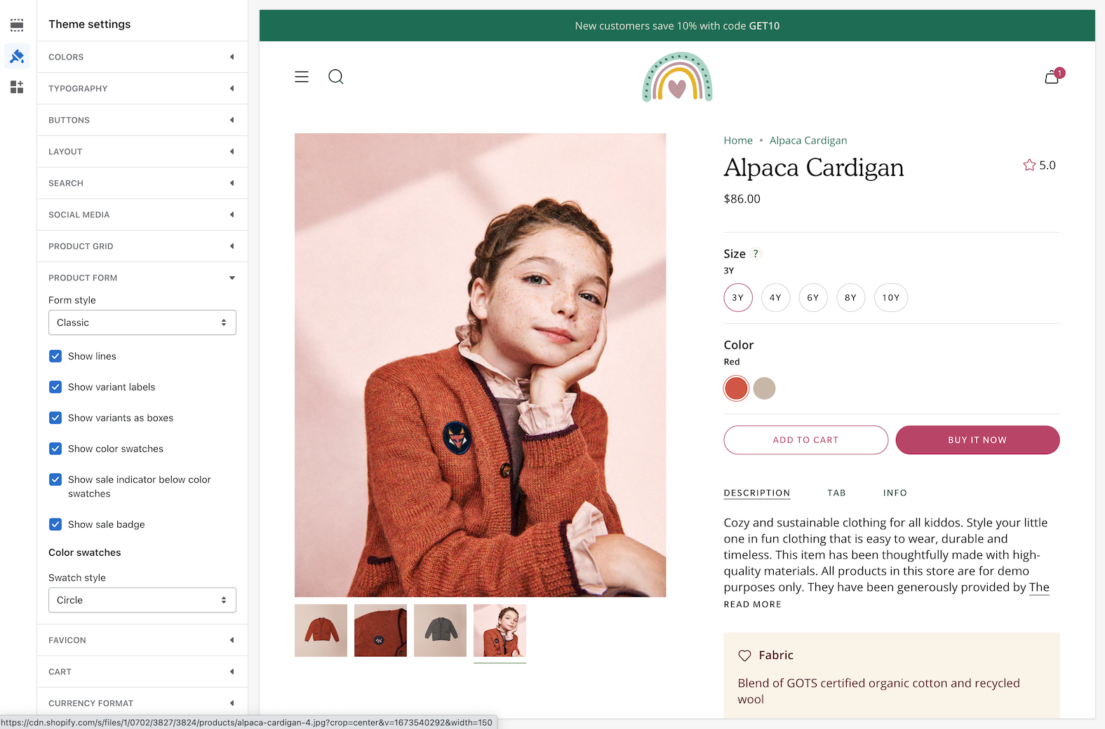
Theme Settings
Heading block - Size and Block spacing options
Text block - Size, style and spacing options
Remove link is now left-aligned with the rest of the cart elements
Image with text
Display two columns of rich content types with a wide range of options
This is one of Broadcast's most flexible sections, packed with different content block types and options. Quickly build beautiful promotions with versatility.
Image with text using the Collection block on the right
Build unique sections by adding multiple block types to the same column.
Video block added below Collection block
Flexible
Build creative promotions for the product template or any page. Versatile enough to start any promotion concept with layers of options and settings for desktop and mobile devices.
Customize
The image column can have one or two images within the column. The size of the column can be increased.
The text area can include multiple block types stacked together. The divider block can help add separation or lines.
The placement of content can be swapped from left to right. Use the alignment option to place text to the left or center.
Video Overview
This video demonstrates how to build and customize the Image with text section, including block variations and mobile options:
Advanced setting
Learn more about the Advanced setting to show the placeholder image. The Image banner section contains a video on the concepts and how they are applied. You can use this feature in the same way for the Image with text section:
See also
The multicolumn section in Broadcast is another option to build a custom section with additional columns rapidly:
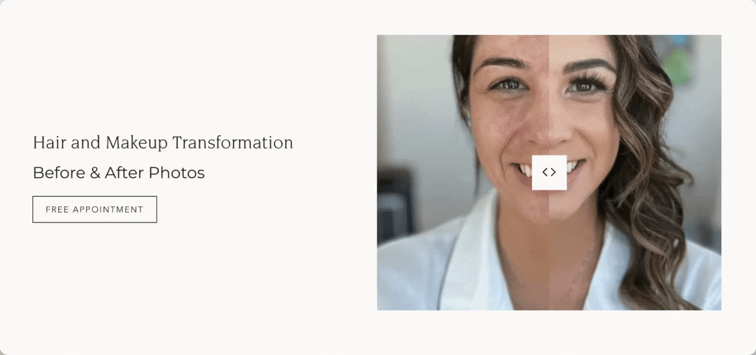
Before and After
Showcase results with Broadcast's 'Before and After' section
Display any two images with our interactive slider to present the before state and after state. A powerful sales tool to showcase your services.
Before and after interactive slider
Flexible
When you add text and button content, use it as a two-column section. Optionally, display it as a full-width single column without blocks.
Customize
In the section settings, add two similar sized images for best results.
Adjust the image aspect ratio for taller or wider images.
Use a Rich Text section above for a large single-column heading, or add the heading, text and button blocks to build a two-column version.
Video Overview
Discover how to customize and set up the 'Before and After' section in this video walkthrough:
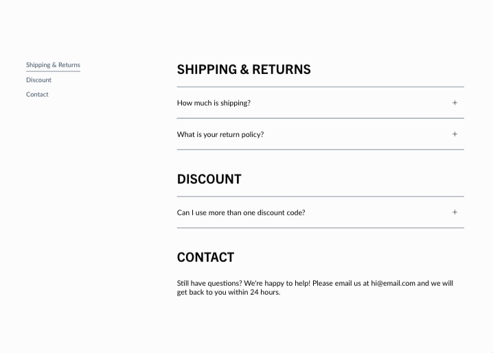
Sidebar
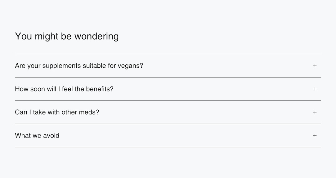
FAQ style content with sidebar navigation
Display accordion and text-based content in a section. Featuring autogenerated navigation that allows customers to navigate easily through your content blocks.
The sidebar's navigation is displayed on desktop devices and remains sticky for quick access to content areas.
Flexible
Use heading categories to organize the content and instantly build the sidebar. Add anywhere to present a question-and-answer style section with a navigation sidebar. This is ideal for FAQs, contacts, about pages, and more.
Customize
Use the Heading block to build the sidebar and group content into categories or sections.
The Accordion block helps you add question-and-answer style content.
The Text block is displayed without an accordion.
Video Overview
This video demonstrates the section settings and how to build the sidebar and content using the Sidebar section in Broadcast:
See also
For a rich accordion section that utilizes images, icons, a newsletter and more, Broadcast includes the Accordion section:
For a simple text-based question-and-answer section that supports one or two columns, Broadcast includes the Accordion group section:
Multicolumn
Build custom multi-column promotions rapidly, using rich content blocks
Broadcast's full-featured section to build rich, beautiful, custom layouts and promotions. The multicolumn section is a perfect starting point for building creative promotions from one to many columns with rich blocks and animation.
Column width, shape and animation examples
Examples
Sample layouts and styles when using the multicolumn section.
Text blocks with large heading sizes:
Menu block paired with an image block:
Two rows of text blocks with equal sizes:
Flexible
Experiment with various column widths, blocks and image shapes. The multicolumn section can be used throughout your site with different designs.
Customize
The section settings help you add an optional heading and configure the content's alignment, section colors, and padding.
You can choose from different content blocks, such as images, icons, text, and menus. Each block added creates a new column within the section.
Each block includes a column width option. Adjust the sizes to build rows of content. Four blocks sized at 50% will build two rows, and three blocks sized at 33% will build one row.
Video Overview
This video demonstrates different column layouts and also covers some of the section and block settings to achieve different styles:
See also
For two-column sections with different block types, Broadcast also includes:
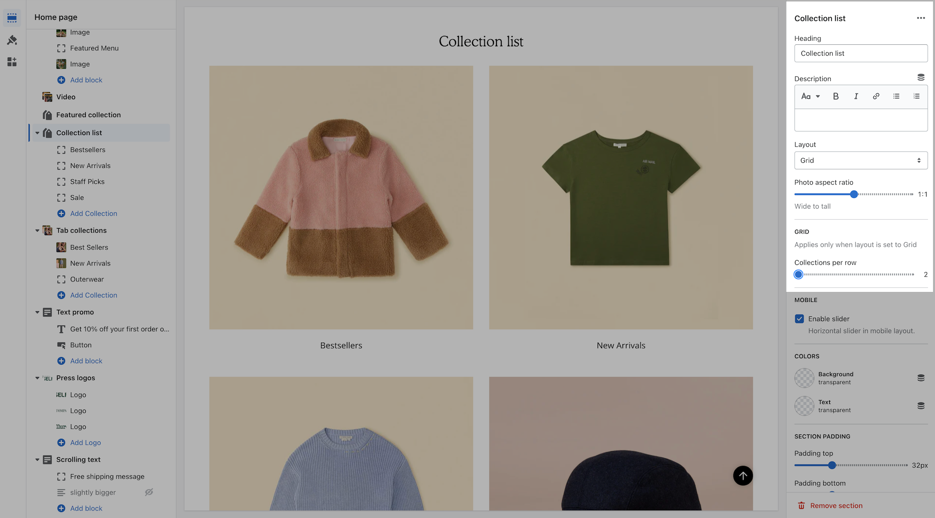
Collection list
Display a selection of collections with images and links
Drive more sales by guiding customers to your featured collections. The Collection list section in Broadcast lets you create organized displays that simplify shoppers navigating and finding their desired products.
Choose from grid or slider layouts to showcase your best collections and enhance customer engagement.
Grid layout
Slider version with heading and text on the left side
Flexible
Choose which collections to display and override the image or heading. Show in a gird or slider format.
Customize
Add blocks to build out your list of collections.
Configure the section settings for the right design, layout and messaging.
Video Overview
This short video demonstrates some of the settings and options for the Collection list section:
Accordion group
Grouped set of accordions for easy questions and answers
A quicker and simpler section to build FAQ-style questions and answers for your store. The Accordion group section can be used to add information about your products, services and even helpful tips. These are text-based accordions grouped into one section.
Accordion group section with two columns of questions
Flexible
Quick and simple section for building classic FAQ-style content. Create single or two-column sections with content blocks.
Customize
Use a Heading block to separate groups of questions.
Use the Question block to create questions and answers within a group.
Video Overview
This video demonstrates the section settings and content blocks in the accordion group section:
See also
For pages with longer question-and-answer style content, Broadcast has a unique Sidebar section that automatically generates navigation to groups of questions or content:
For a rich accordion section that utilizes images, icons, a newsletter and more, Broadcast includes the Accordion section:
Testimonials
Display quotes and client testimonials to boost sales and confidence
Broadcast includes a rich testimonials section where you can showcase reviews from clients and business partners. As the number of quotes increases, the section becomes an interactive slider.
Flexible
Compact to add on any page to build trust and confidence with your brand. Two image options are available to showcase a product and profile information.
Customize
Use the section settings to customize the layout and optional quotation marks. The featured image can be hidden to display only the quotes and optional profile photos.
Use the image aspect ratio to adjust for the type of featured images you use.
Text can be aligned centred or left.
Video Overview
This video demonstrates the layout and quote options for the testimonial section:
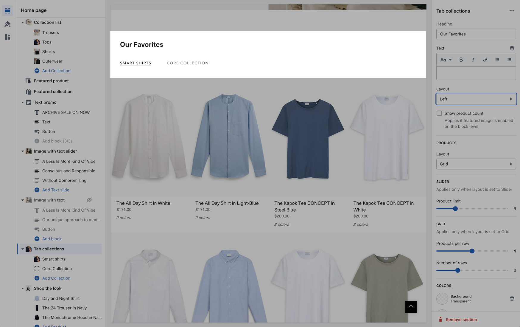
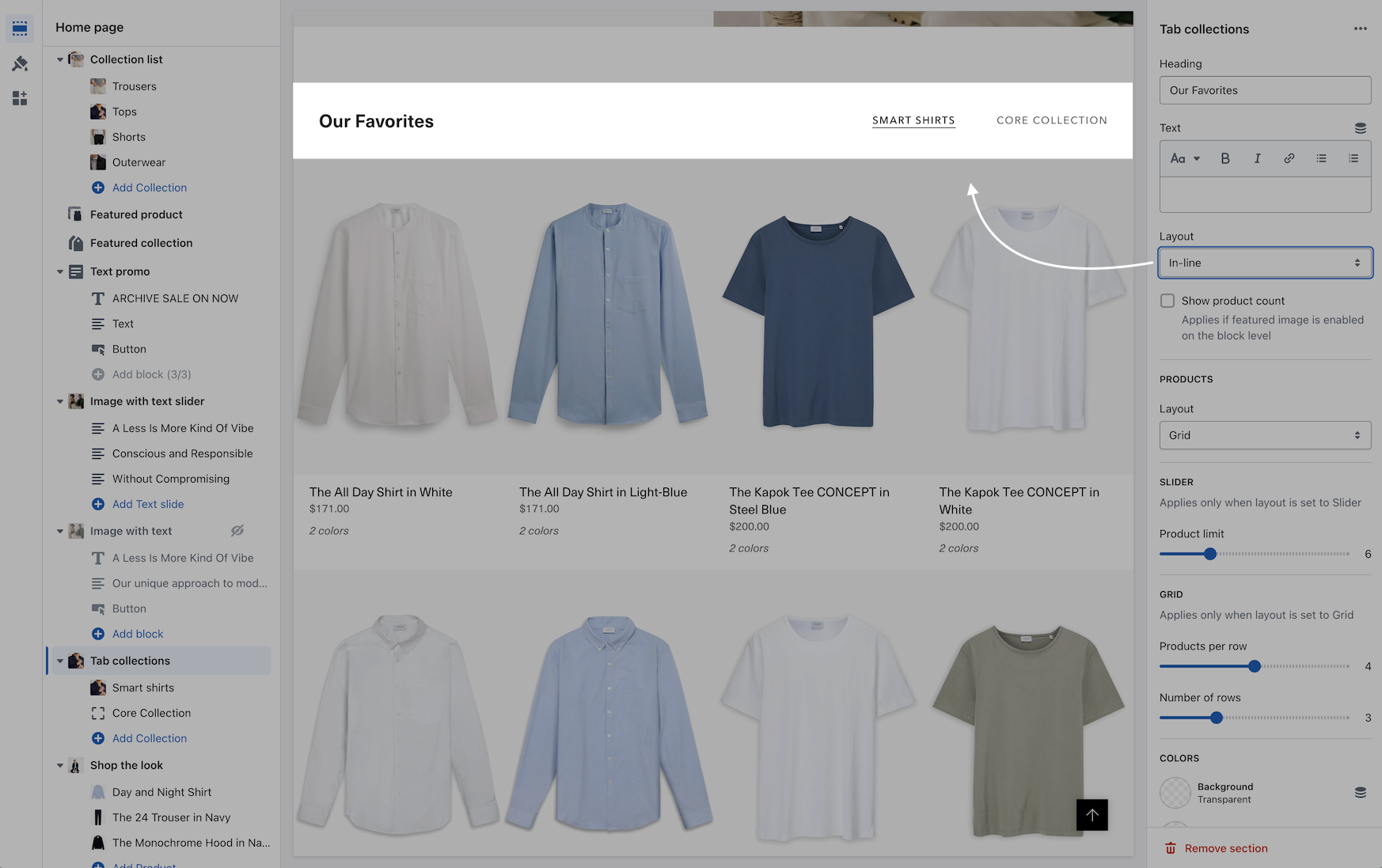
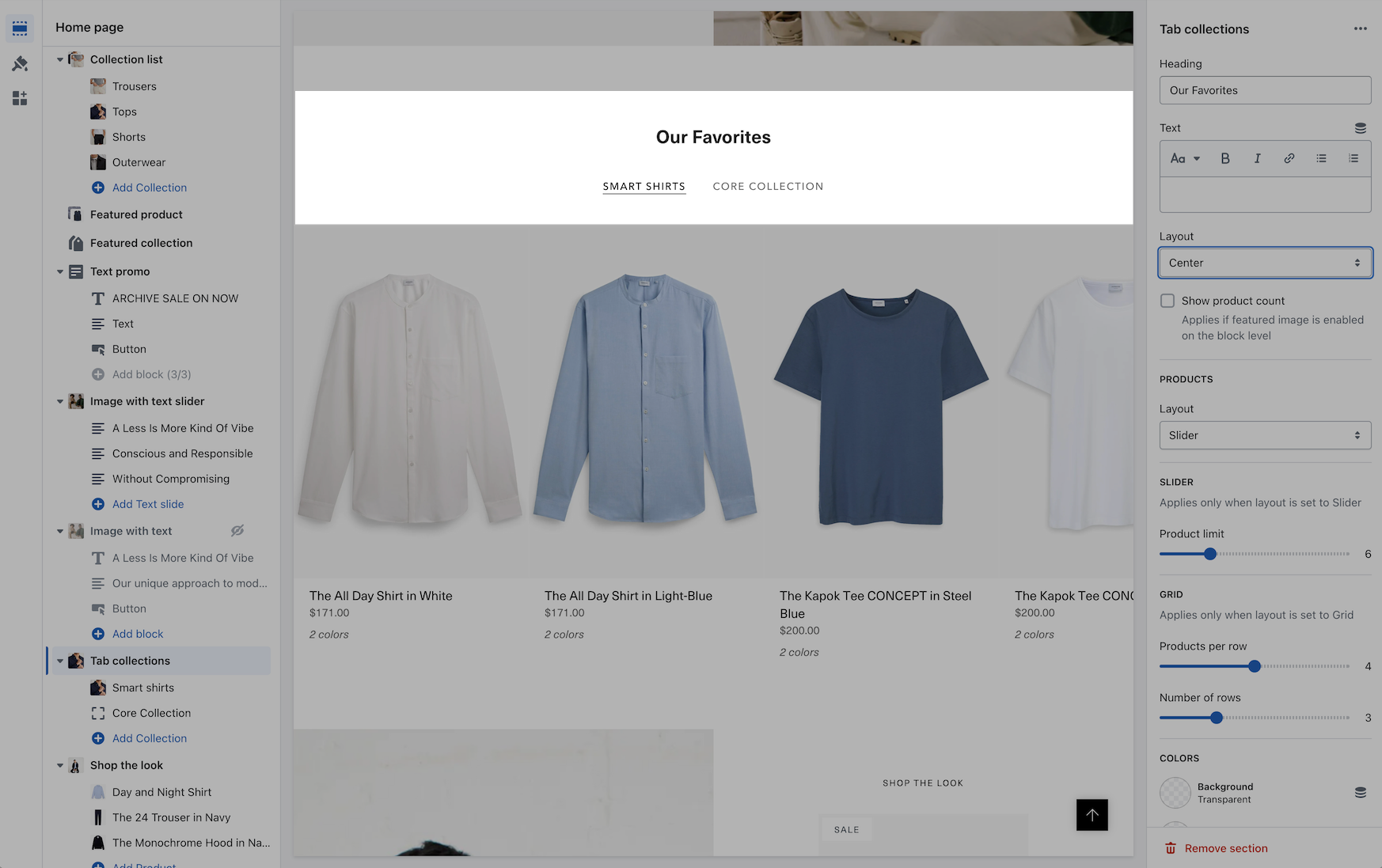
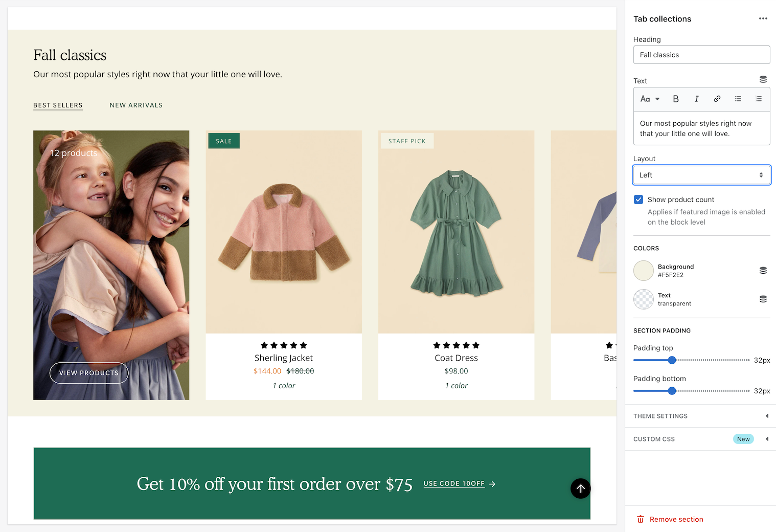
Tab collections
Display products from multiple collections with tabbed navigation
Broadcast's tab collection enables you to showcase multiple collections in one section. It is the most comprehensive collection section with a wide range of features and options.
Shoppers can use the Quick Add feature and also cycle through different collections
Each collection tab can display a promotion with a call to action.
Grid layout with promotional image
Flexible
Display products from multiple collections in one section. Include a promotional image with messaging and branding to draw customers to your products.
Customize
Add collection blocks to build each tab.
Use the heading feature in each block to label the tab name.
The featured image can be aligned to fit the size of your product images or image size.
Video Overview
This video demonstrates the tab layout options and reviews all the section and block options:
See also
Broadcast includes a single-collection section with similar features for quickly displaying one collection:
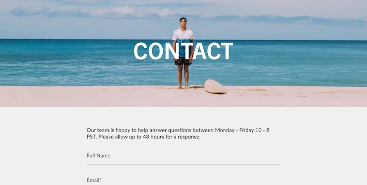
Contact form
Add a fully-customized contact form to your store
Broadcast includes a full-featured section for your customers to contact you. Easily add form blocks to build a simple or complex contact form and place it anywhere you like. The section can be added to most parts of your store.
Contact form section - Add to pages, the homepage or other areas
Flexible
Add any common form field type to your contact form. Broadcast includes the heading block to separate the fields.
Customize
After adding the section, you can modify:
Heading
Display captcha terms
Adjust the width of the form
Colors for the background and text
Next, build the perfect form using Broadcast's rich blocks:
Video Overview
This video demonstrates some of the settings and options, including contact form blocks:
Custom code
Add custom code to your theme or build a custom section
Broadcast includes a custom code section to help you add Shopify App snippets, HTML or other Liquid code to create advanced customizations.
Example of a custom H1 heading
Flexible
Add to different areas of your store for custom content without editing the theme code.
Customize
Add the Custom code section where you need the functionality. In the section settings, you can add your HTML, Liquid or App snipped into the Custom code area:
The section settings also include the ability to modify:
Colors for the background and text.
Section padding, above and below.
Custom CSS for this section.
Video Overview
This video demonstrates adding custom HTML, Liquid code, and the Custom CSS feature:
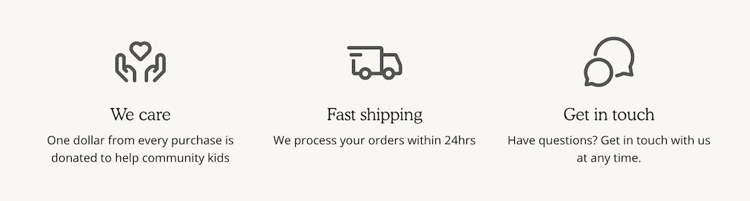
Text columns with icons
Display messages with professionally designed icons
Broadcast includes a wide range of commerce shopping icons that can create promotions and key product or brand messages without images.
Examples of different sections made from Text columns with icons
Flexible
Choose from a large list of commerce shopping icons built right into Broadcast. Each icon block creates a new column. Mobile devices can view one or two columns per row or flick through a slider version.
Customize
Use the section settings to configure the section heading, layout, alignment, colors and padding:
Add an optional heading and adjust the size.
Choose a grid or slider layout for desktop browsers. Broadcast includes how many items per row to display when using the grid layout style.
Use the alignment options to adjust the heading, icons, columns and section width.
Each of the icon blocks has settings to customize the column:
Choose from a pre-built icon from our commerce shopping collection or add your own image.
Adjust the color and height of the icon or image.
Add a heading and supporting text. Adjust the sizes for the heading and text.
Video Overview
This video demonstrates the layout options for desktop and mobile devices and covers how to configure the icons:
Slideshow
Hero-style banner images with multiple slides
Broadcast's multiple-slide hero banner section offers your store a wide range of options to customize and create a rich slideshow asset. Promote your key messages with this powerful branding tool.
Shown with a transparent header
Flexible
Use with one or more slides. Broadcast includes multiple slide transitions, height options for mobile and desktop, autoplay controls and more.
Customize
Each slide has an option for a desktop or mobile image. We recommend a wide, 16:9 ratio image for desktop devices and tall 18:9 or 19:9 aspect ratio images for mobile. Image cropping occurs from side to side and top to bottom. Keep the subject matter in the middle of your image for best results. Experiment with completely different images when choosing desktop and mobile images.
The overlay feature can help add contrast between the image and text messaging. Experiment with different colors, opacity, and the option to display only the overlay behind the text.
Each slide has text position options for both desktop and mobile. Move your messaging around to find the perfect spot over the branded image.
Video Overview
This video demonstrates the slideshow section settings and how to configure the slide blocks:
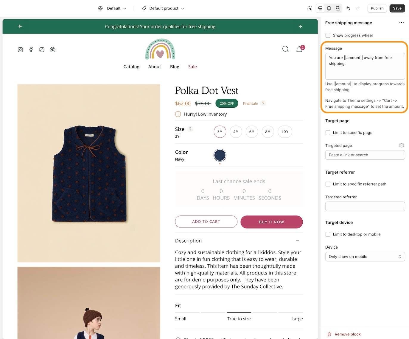
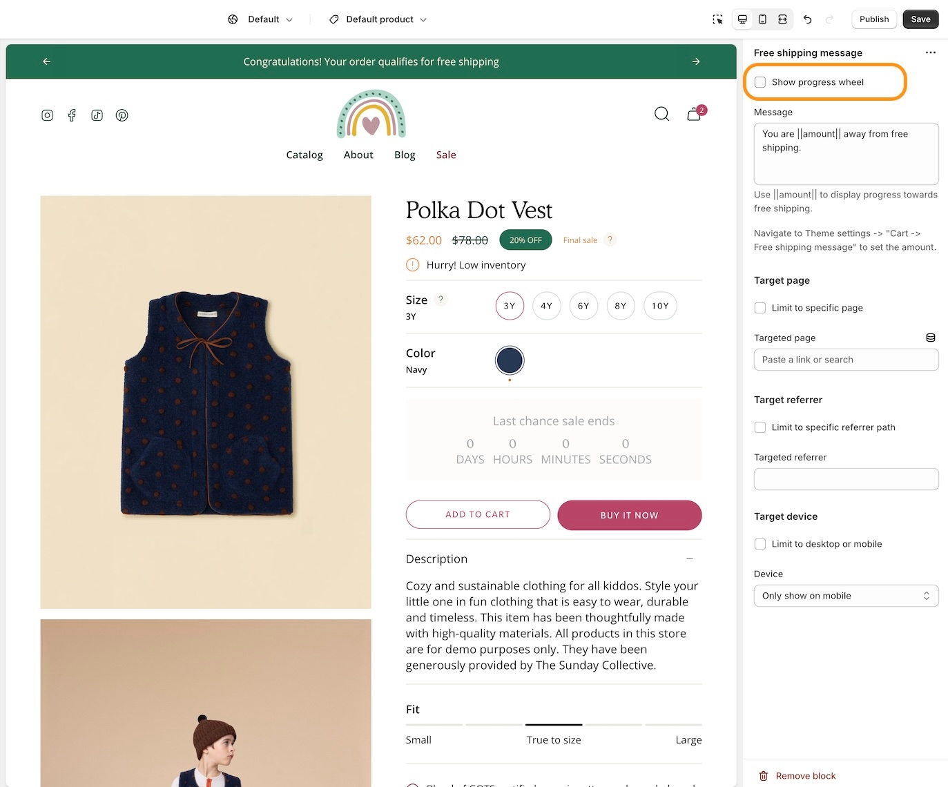
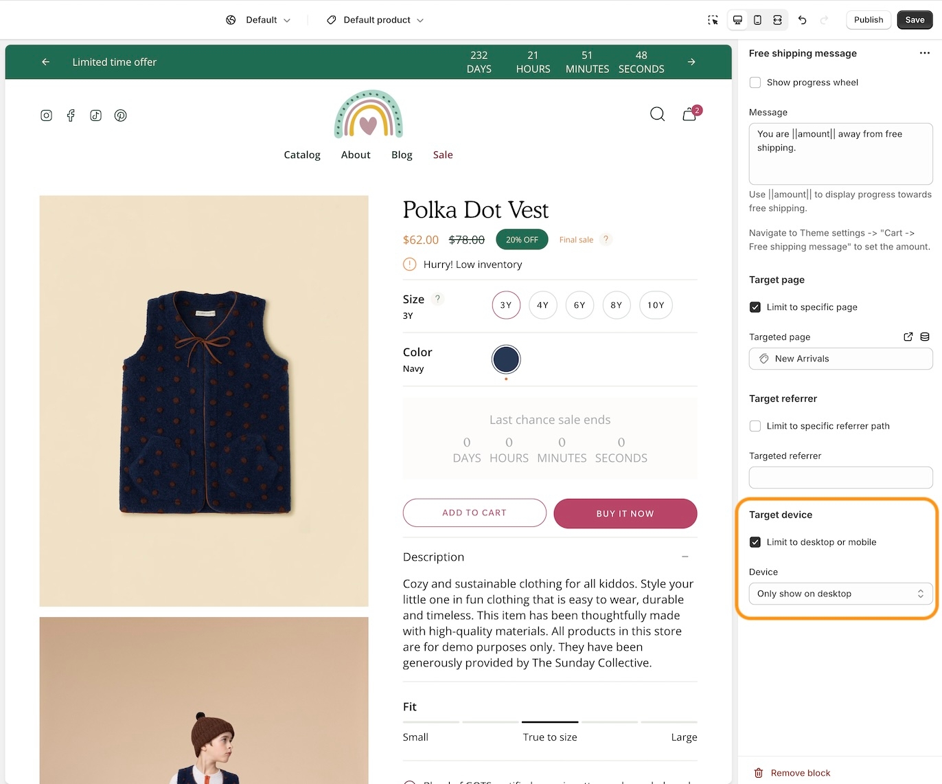
Target settings
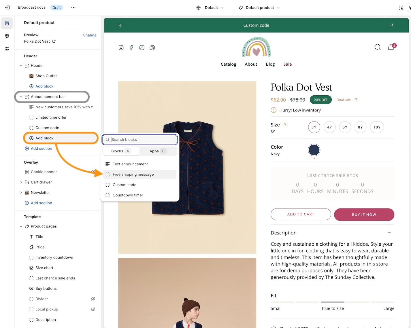
Flexible announcement message bar with targeting options
Add single or multiple text announcement bars with links to promote your offers:
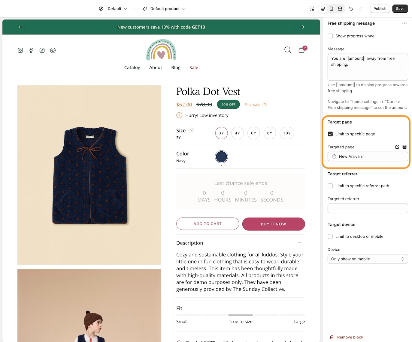
Target Page
Display a free shipping message to your customers only when the customer is browsing a certain page, product, collection, or blog post on your site.
Target your message based on where customers are browsing your site:
Create a different announcement bar with custom messages for various pages of your site.
Target Referrer
Target a specific audience by using Target Referrer. Your announcement bar will only appear when the customer arrives at your site from a certain path or location.
Enable when running a promotion on another site.
Use to provide a custom message related to the source promotion.
Target Device
Target only certain devices or create a custom announcement bar message for mobile devices and another for desktop browsers.
Enable custom announcement messages for mobile and desktop.
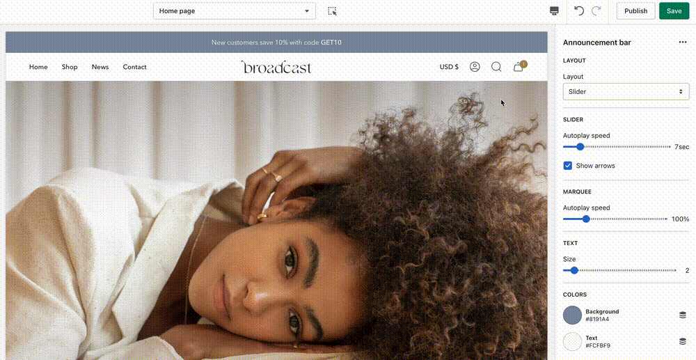
Announcement bar settings
Announcement bar section settings and options
Broadcast includes several options to customize the announcement bar in the header area fully. You can choose from different styles like a slider or scrolling announcement bar and add rich blocks to enhance the promotional information for your customers:
Settings for the Announcement bar section - Manage how it appears and functions
Layout options
The layout settings include an option to toggle a border and choose the style of the announcement bar to display.
Border
Toggle the border option to help separate the announcement bar and the rest of the header content. This can be helpful when using a similar background for both the announcement bar and the header:
Slider or Scrolling text
Choose between two message display styles:
The Slider option fades the current message out and fades in a new message when multiple message blocks are added. The "Autoplay speed" setting determines when messages rotate. Arrows can be displayed so customers can navigate through multiple messages.
The Scrolling text option auto-scrolls messages across the browser or device width, similar to a marquee effect. Use the "Autoplay speed" setting to adjust the scrolling speed. The "Space between the message" option increases or decreases the message gap.
Colors
Choose background and text colors for your announcement bar. Use a blank value for transparency.
Section padding
Customize the top and bottom padding of the announcement bar.
Learn more
Video overview of the different styles and settings to configure the Announcement bar in Broadcast:
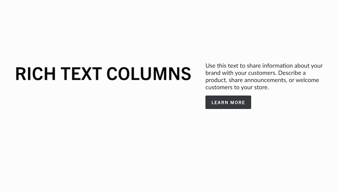
Rich text
Add headings or text anywhere
Broadcast's rich text section is the simplest method for adding text or headings above or between sections. It allows you to add large or short messages with headings, subheadings, and text styles.
Rich text section with Subheading, Heading and Button blocks
Flexible
Introduce sections with rich text. Place the section above another to build a seamless look:
Extended text can be spanned over columns with the columns block:
The text block can be used to build heading tags for SEO, like an H1:
Customize
Add a background image to help the section pop out. Both desktop and mobile options are available.
The text alignment option can centre text. The overlay and color options can be used to fine-tune the content.
Use the columns block to break content up into columns instantly. Choose how many columns to display.
Video Overview
This video demonstrates the section settings and block options for the Rich text section:
Accordion
Enhanced accordion with image columns, icon columns, a contact form and more
This Broadcast section is packed with full-featured accordion blocks to help you design and build rich, interactive content. Display columns of rich content, such as images, icons with messaging, and text.
Multiple accordion sections used with different column sizes
Flexible
Build rich accordions on the home page, a lookbook, product pages, or anywhere on your site. Choose from a rich set of content blocks to display eye-catching information. Stack multiple accordion sections together to incorporate multiple column sizes.
Customize
The section settings help you style the accordion's layout. The open-by-default toggle lets you keep the accordion open by default or closed.
Add blocks to build each column within the accordion. Similar block types work well together or mix them for a creative design.
The block settings help you configure each column within the accordion section.
We've included a wide range of blocks to build the right accordion quickly:
Text column - Commonly used for standard FAQ-style accordions.
Image column - Add images to your accordion for a more appealing branded experience.
Icon column - Choose from a rich set of modern icons by Broadcast or add your own.
Video Overview
This video demonstrates how to create image, icon and text accordions in Broadcast:
See also
For pages with longer question-and-answer style content, Broadcast has a unique Sidebar section that automatically generates navigation to groups of questions or content:
For a simple text-based question-and-answer section that supports one or two columns, Broadcast includes the Accordion group section:
Newsletter
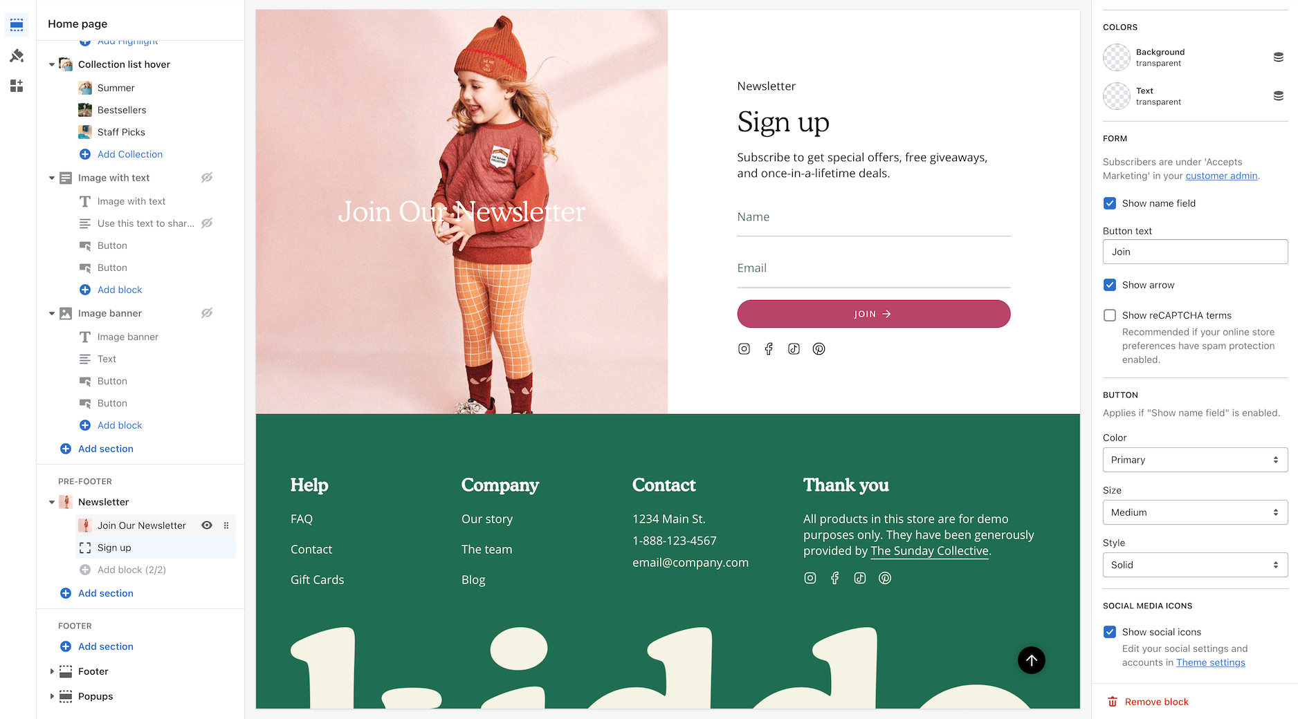
Displays a newsletter sign-up form:
Customize form description. Display optional name field.
Link list
Displays a Shopify menu:
Menus are created in the Shopify Admin under 'Navigation'
TIP - Create a custom menu designed for the footer with links to help customers find additional pages or content within your site.
Demo store sections
Modern demo store sections and footer overview
Video Overview
This video walkthrough showcases the sections and settings used on our Modern demo store. We cover the main sections used on the homepage and the footer configuration:
At the end of the video, we display how the sections appear on mobile devices.
More examples
For a full breakdown of how we've set up the header and toolbar on the Bold demo store:
Learn how we set up our Aboutpage on the Modern demo store:
Complete list of sections
Browse through the main index page of sections:
Page
Displays a Shopify Page created in your Shopify Admin, Pages:
Settings
Select a page created for your store or click on 'Create a page' to create a new page:
Edit or create a page in the Shopify page editor:
Quantity indicators
Display how many products are within a collection
Broadcast can display the number of products that are in collections. The feature shows a numerical value next to the collection name in the dropdown navigation:
How to
In the Theme settings -> Layout, use the checkbox to "Enable superscript".
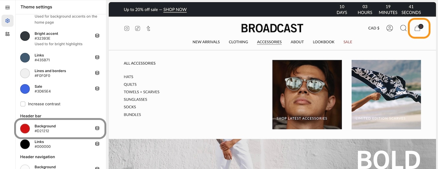
Sticky header
Broadcast provides a sticky header option to keep the navigation always visible on scroll
Transparent header with sticky scrolling
As scrolling begins, solid header background is animated in
Transparent header default scrolling
Sticky scrolling, no transparent header
Default scrolling, no transparent header
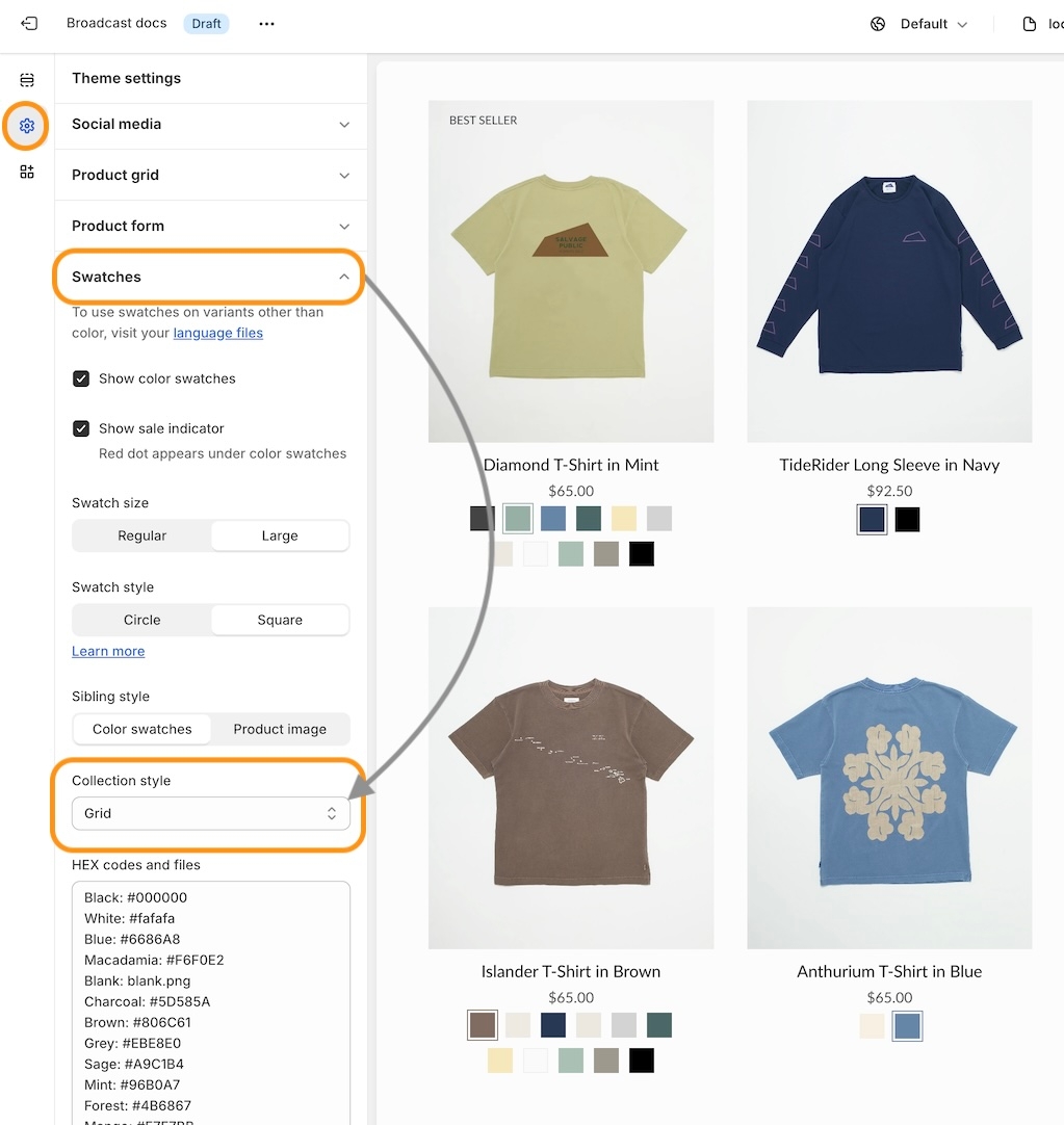
Product Grid
Our product grid is the base of our collection pages and the base for a lot of our sections.
In this tab, you can:
Set the aspect ratio for your grid images
Show the second image on hover (for non-touch devices only)
Enable different badges
Enable quick add
Enable sibling swatches
Enable cutline
Enable reviews - star rating
Text
Display rich text content in the column:
Configure heading and text.
Theme settings
Global settings for your theme
The theme settings help you configure theme-wide options and settings in Broadcast. These are considered global settings as they affect how your theme looks and functions on all pages.
You'll find some of the most important settings here: colors, typography, buttons, social media accounts, layouts and more. The theme settings can be found in the Theme Customizer by clicking on the settings icon on the left icon bar:
Tip: Most theme-wide settings are found here. When designing your store, you'll find many important options in the theme settings. Explore each accordion to find all the global settings and options found in Broadcast.
About v5.5 release
Additional information on recent Broadcast updates
Badges block for Product pages
Badges can now be displayed on Broadcast Product pages. Broadcast can automatically display Sale badges or Custom badges that you create for individual products:
About v5.0 release
Additional information on recent Broadcast updates
Gift card - Send directly to the recipient with a message
Customers can now send a gift card directly to the recipient's email and include a personal message.
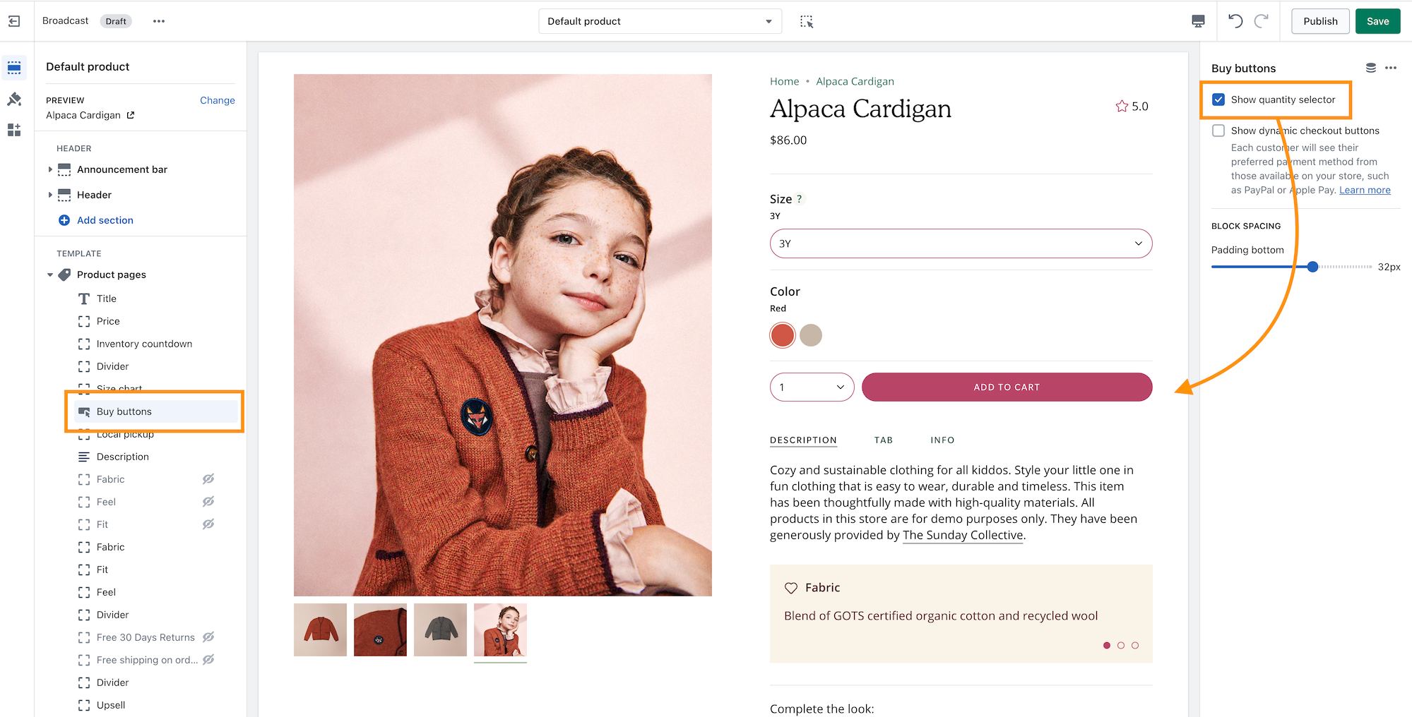
In the Theme Editor, use the checkbox option on the Buy buttons block to enable.
Featured blog posts
Handpick blog post articles to display in a slider carousel
Broadcast includes a rich slider section to promote one or more of your blog post articles:
Mobile users can swipe through a scrolling version of the articles:
Flexible
Typography
Setting up the primary heading and body fonts for your site
Broadcast uses two primary fonts: Heading and Body. You can choose these font values from a large library of professional fonts provided for free from Shopify by Google. After choosing these two font types, you can customize different elements throughout the theme with these default choices.
Heading
Begin by choosing a Heading font that will be used for various types of headings throughout the site:
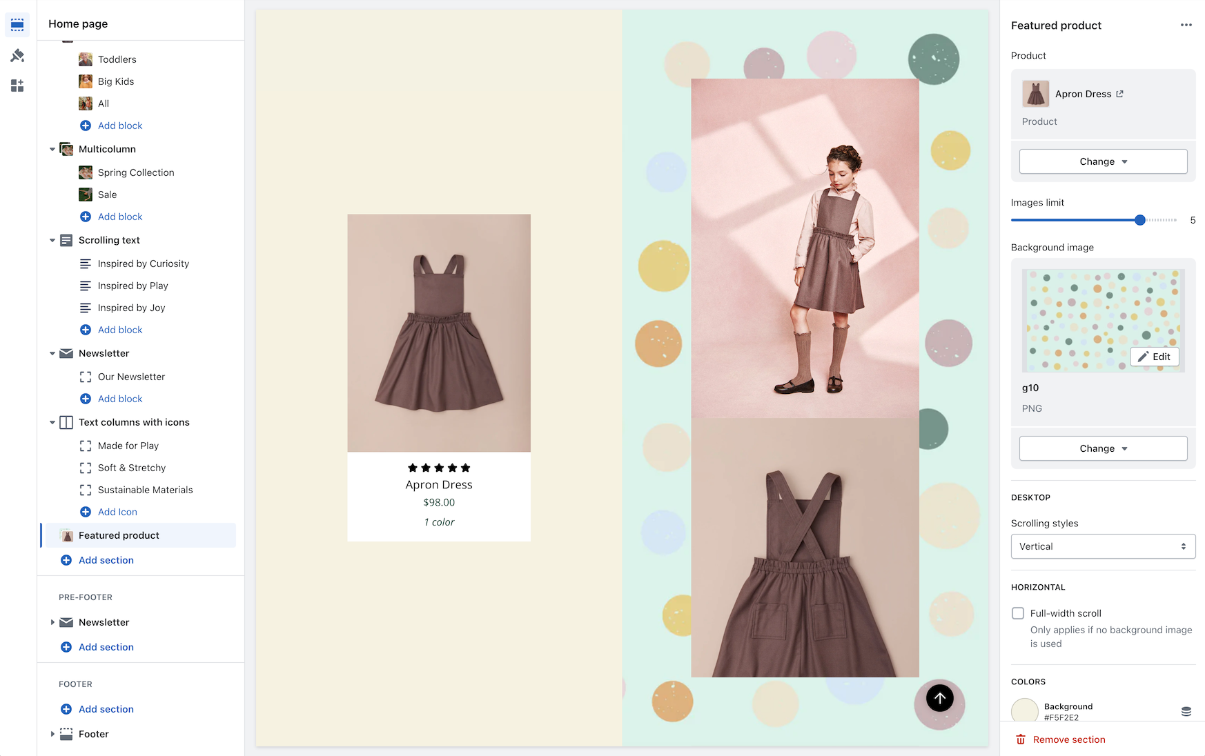
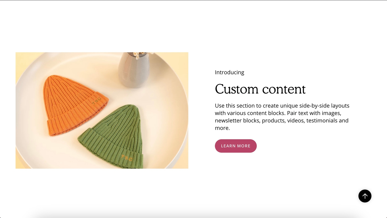
Custom content
Build one or two-column sections rapidly, using rich content blocks
Broadcast includes flexible options for creating feature-rich sections from detailed content blocks. The Custom content section is ideal for building single or two-column layouts.
Flexible
Save time by choosing full-featured content block types to build the right section for your page.
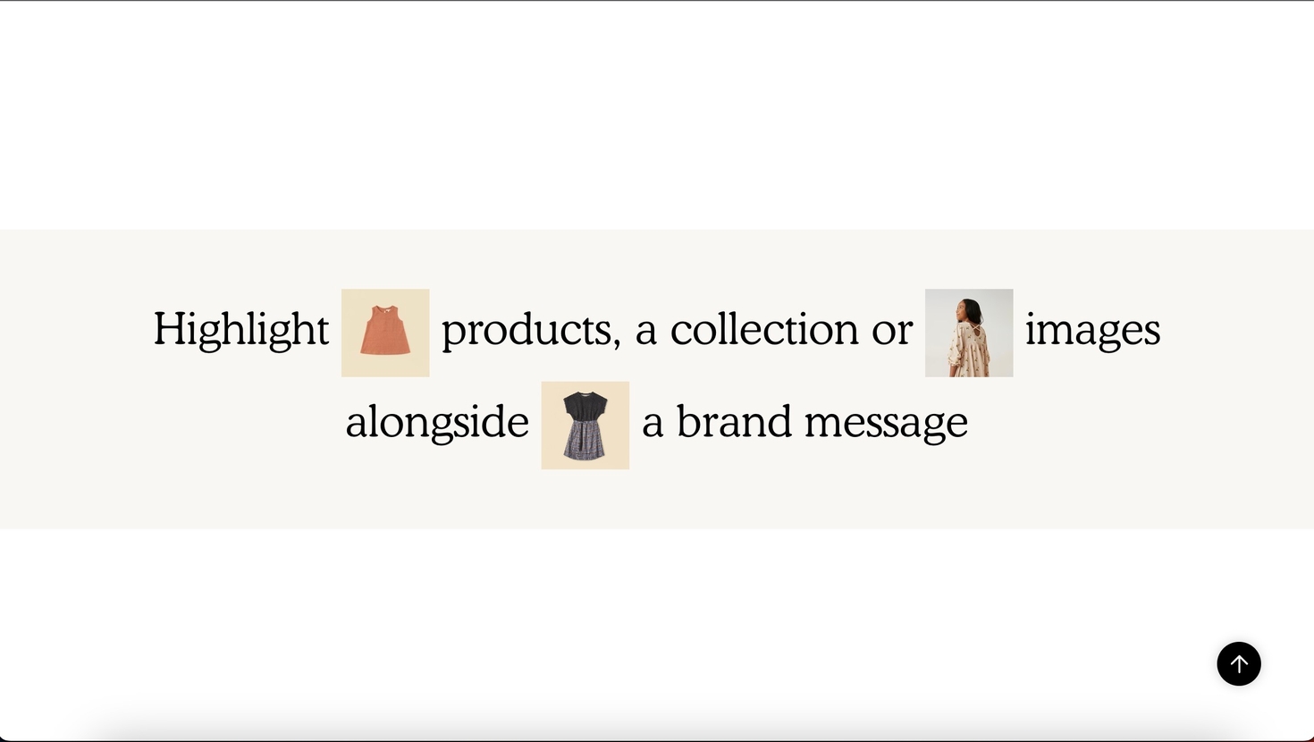
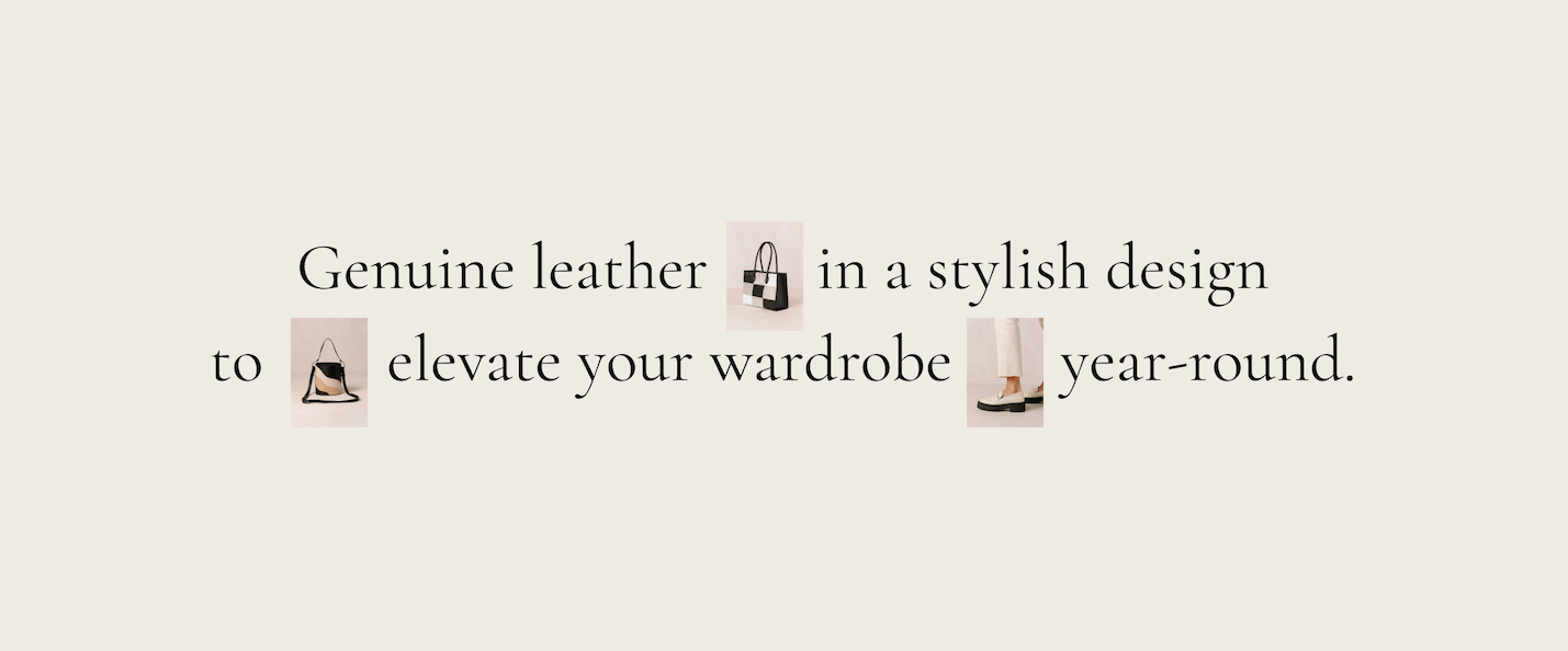
Text with products
Highlight products, a collection or images alongside a brand message
This Broadcast section helps you create unique, modern designs using inline product images directly linking to your products and collections. Easily build modern promotions with creative designs that link directly to your products and services.
Flexible
Quickly build text-based key messages throughout your shop and visually attract shoppers with branded images, products and collections. Separate text, alignment and image aspect ratio settings for mobile and desktop help you create the perfect look for all devices.
Text promo
Display bold and eye-catching text promotions in any location
Promote your offers and discounts easily with this easy-to-use text promotion builder, which can be added to your site.
These are static promotions without any scrolling. Sometimes, simple is best.
Flexible
Add throughout your store to alert customers of offers and services. Broadcast includes three content-block types to help you quickly build the right message with a call to action.
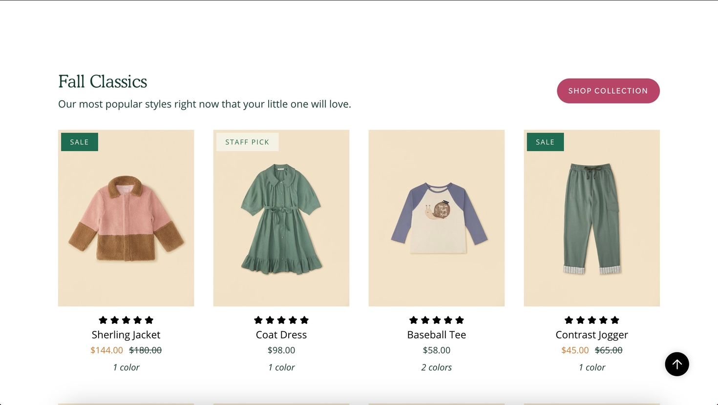
Featured collection
Display products from any of your collections in a grid or slider
Broadcast's featured collection is the fastest way to promote products from a collection. Add the section and customize the layout features to display your products quickly with a wide range of options.
Shoppers can purchase directly with the Quick Add feature or click through to view the full product page.
Flexible
Timeline
Display an interactive timeline of events and progress
Broadcast includes a unique interactive timeline section to showcase events, milestones, goals or even age-based shopping options.
With modern animation effects, this section enhances the online shopping experience for customers who scroll down the page or click on the timeline hotspots.
Flexible
The timeline section can be used with or without images for simple text-based content or rich sliding images.
Custom form field
Add an input form field for to collection additional information on the product form
Broadcast includes the "Line item property" block, which helps you collect additional information from your customer and attach that to the product.
This can be helpful when you need the customer's input and attach it to the order:
The information will be included in the order, and the customer will see it in the cart:
Products with image
Display a list of products with an image promotion
Build an engaging section showcasing products from a collection alongside a prominent image promotion. This modern design by Broadcast captures shoppers' attention while browsing your store pages.
Flexible
You can select up to four products to feature in this promotion. The Quick Add feature quickly adds items to the cart. The call-to-action link over the image allows shoppers to view more items.
Newsletter
Add a quick and simple newsletter sign-up form to any page
Broadcast provides various methods for adding a newsletter sign-up option to your shop, including the footer and blocks in various sections. This section allows you to promote your newsletter on any page easily.
The newsletter form collects the customer's email address and tags them in your customer base with "Accepts Marketing." When integrated with newsletter apps, you can target these customers with updates. New subscribers will be seen as new Customers in your Shopify admin tab.
Flexible
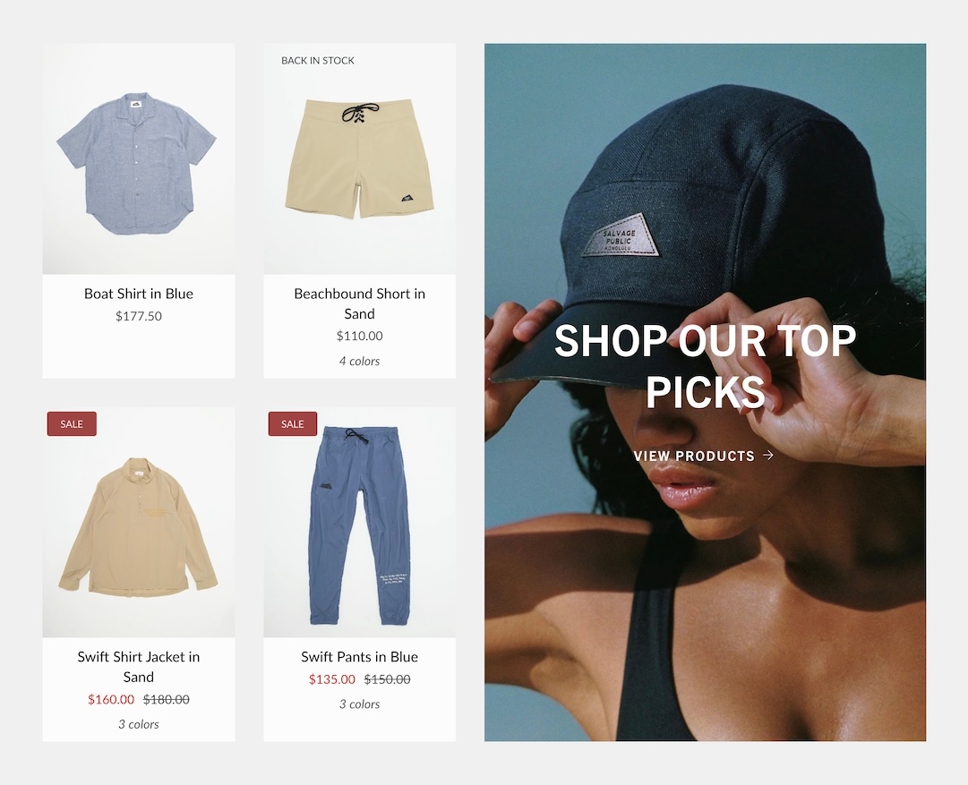
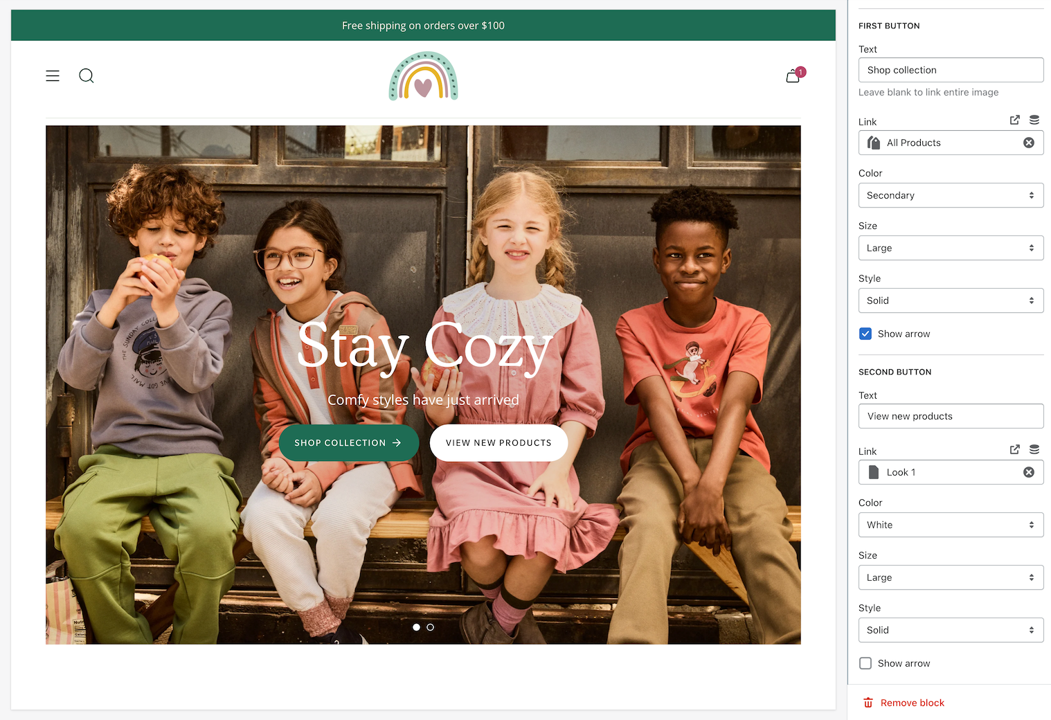
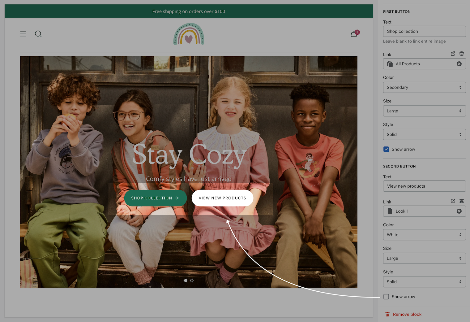
Image banner
Display a single or split images hero-style banner
Broadcast's hero-style section lets you quickly build a powerful banner section with one or two split images.
The heading, text, and buttons are blocks that can be placed in different positions to create the perfect branded banner and messaging.
Flexible
Text announcement
Flexible announcement message bar with targeting options
Add single or multiple text announcement bars with links to promote your offers:
Advanced configuration
Broadcast includes target options to help you create and manage multiple announcement promotions and assign them to certain pages on your site. You can even build shorter messages for mobile devices while displaying a longer message for desktop browsers.
Blog posts
Display recent articles from your blog
Broadcast includes a rich Blog posts section to display the most recent posts on your site quickly:
Flexible
Choose how many posts to display per row and how many rows.
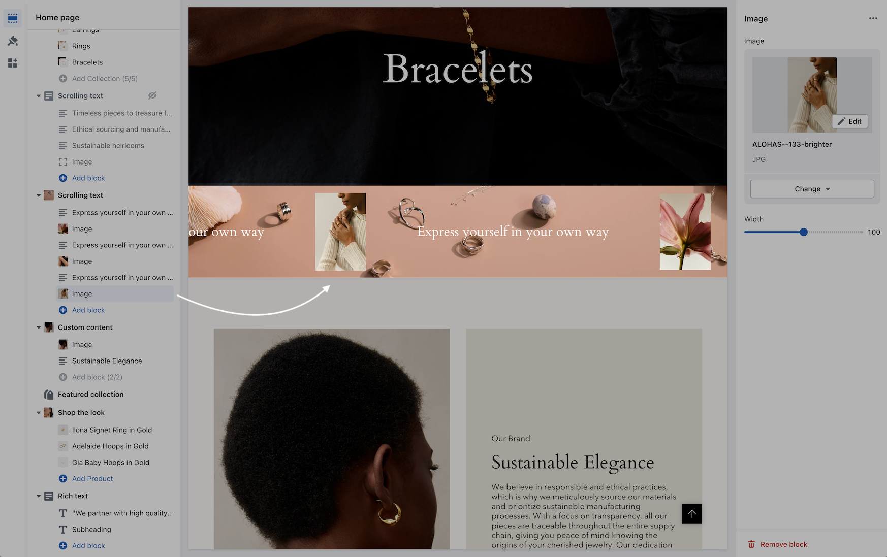
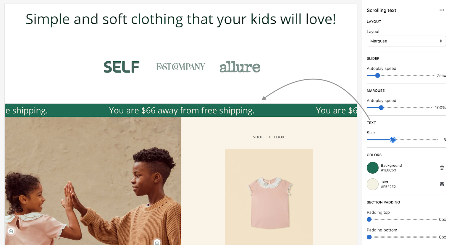
Scrolling text
Display rich marquee style or slider text promotions
With Broadcast, you can build rich scrolling text promotions with various font sizes, images, colors, scrolling directions and even a softer slider style. Add an eye-catching message to any spot on your pages.
Broadcast includes custom content blocks for dynamic free shipping information, custom code to build your own content and integrate with apps, plus an image block.
Flexible
Demo store header settings
Bold demo store settings for the header
Video Overview
Explore the settings we've used on our Bold demo store. This video overview includes all the settings we've used to build the Header in the demo store:
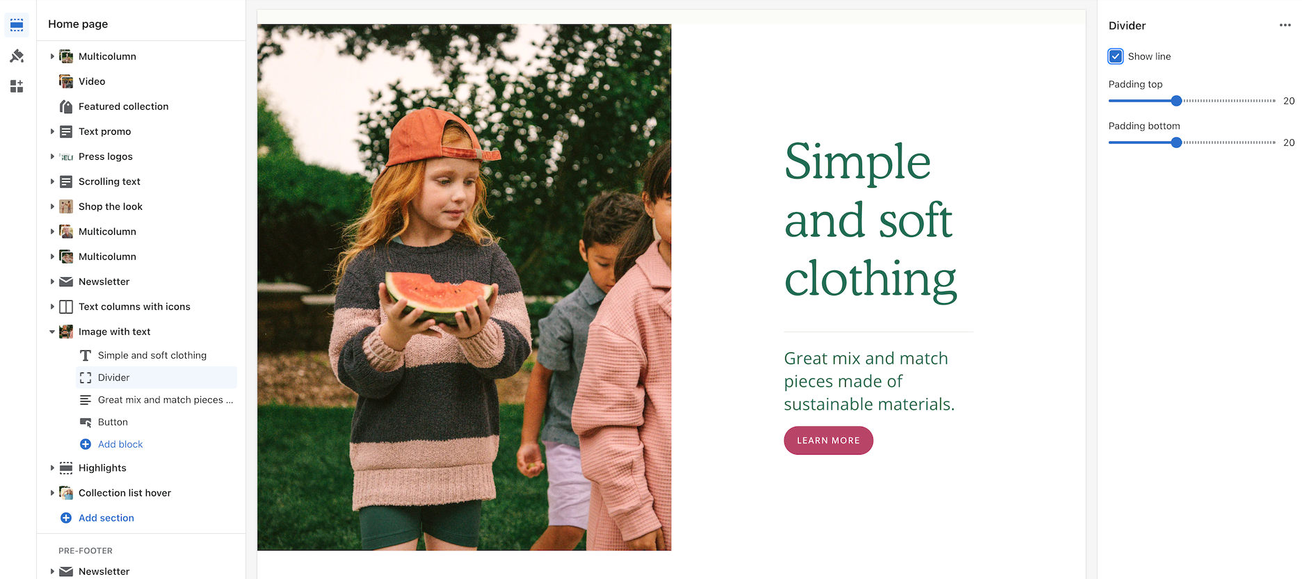
Divider
Display a horizontal line or separation between sections
Create custom dividers to style your pages with Broadcast's divider section.
Flexible
Dividers can be added above and below sections to build the correct type of separation. Broadcast includes options to build creative divider designs.
Accordion section
Add rich accordions with many style options
The accordion section in Broadcast includes a robust selection of blocks to visually improve content displayed on product detail pages, blogs, pages, and more.
Content blocks include:
Text column
Image column
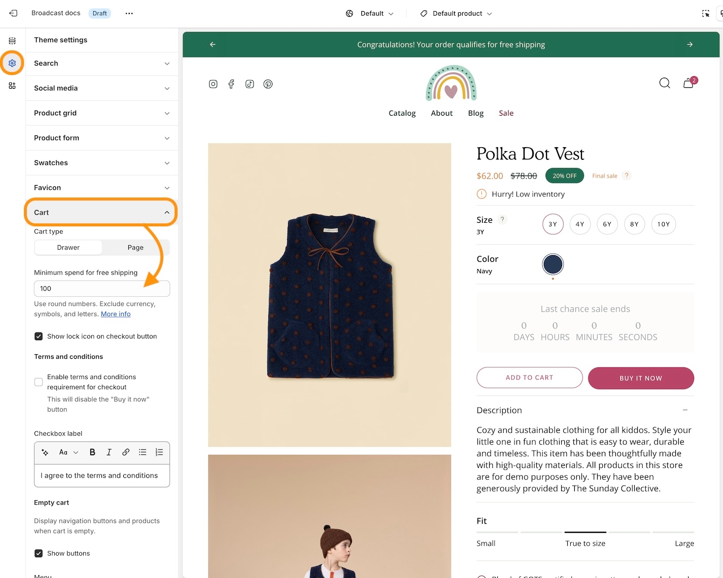
Cart
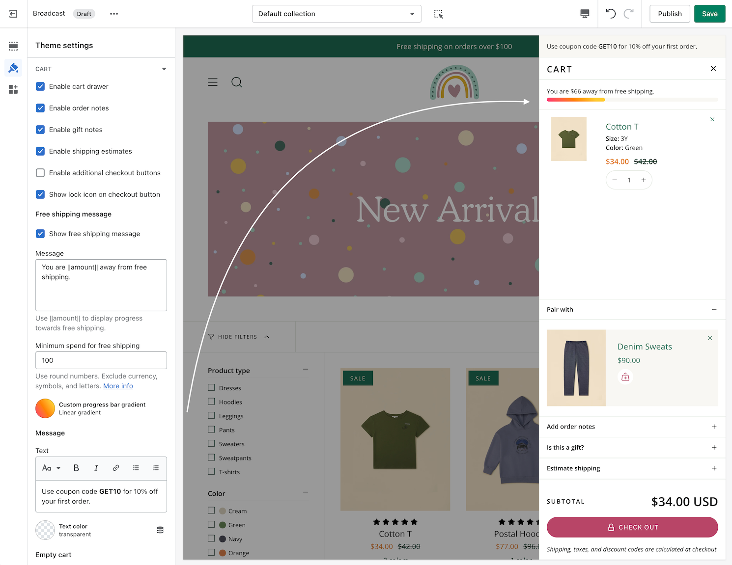
Cart drawer
Broadcast allows your customers to add items to the cart without the need to refresh the page.
This is done by using asynchronous JavaScript and XML (AJAX) to get the information we need to populate the cart.
This feature can be disabled if you need to integrate an application into the cart page.
Collection list hover
An animated collection list with full sized images and large text
Transform your store's collection promotion with a visually captivating presentation of high-resolution graphics and prominent text.
Our dynamic format will keep your customers engaged as they browse through the full-sized images to discover collections within your store.
Flexible
Choose which collections to display and override the image or heading. You can even show how many products are in the collection.
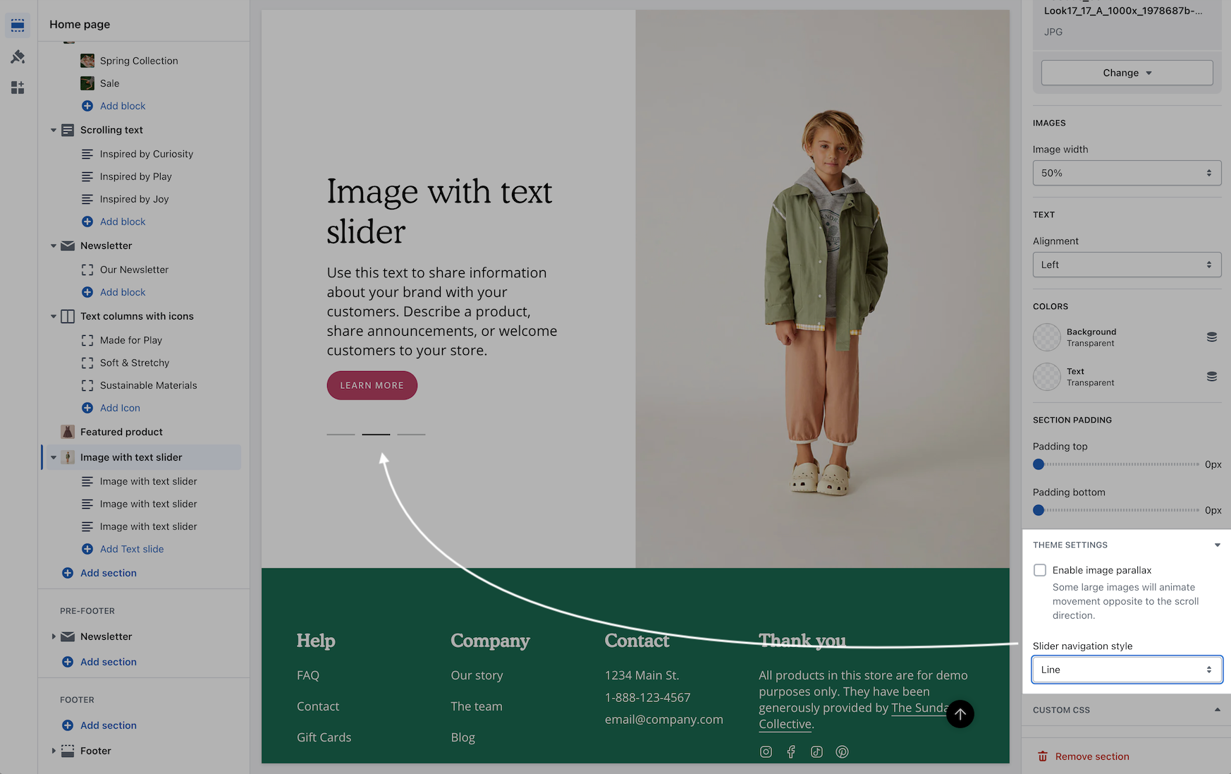
Image with text slider
Display sliding text cards or entire promotions on rotation
With Broadcast's Image with text slider section, you can build text slide cards with one image or an entire promotion that scrolls through your promotions.
Flexible
This section can rotate through multiple text messages while displaying a single image. Optionally, the entire section can rotate through multiple image and text promotions.
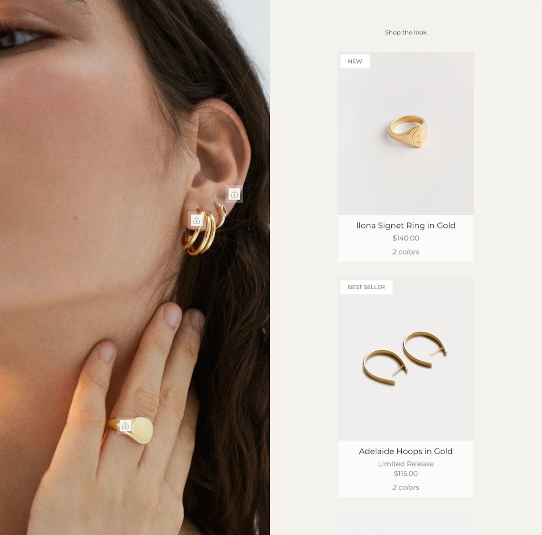
Shop the look
Shoppers can find products from branded images
Broadcast's interactive image and product section helps shoppers find the products from your brand images.
Flexible
Use it as a static image to promote products. Or display the product dots, which link to the products, making it easier to find the right one. Perfect for any page, including Lookbooks.
The product dots can be easily positioned over the branded image and link to the product in the section.
Product Form
The product form is home to variants, a quantity picker, and an 'Add to cart' button on all product pages.
Use the options in this tab to create the layout you like the most.
Social media
Add links to your social media pages and enable social sharing buttons.
Mobile positioning can be reversed to show text content first or following the image.
Choose from various content blocks, such as Heading, Subheading, Text, Button, Divider, Accordion, Image, Video, Product, Collection, and Custom code.
Each content block can be customized with various options.
Three columns with images, using the circle shape effect
Three columns of text
Two columns using the navigation and image blocks. Column widths set to 33% and 66%
Four blocks sized at 50% each creates two rows
Blob shapes include animation effects on hover. Heading and content text can be aligned differently.
Each of the testimonial blocks has options for the customer name and subheading. Both are styled differently.
A featured image, either a product or a customer image, can be displayed. Optionally, you can add a profile image displayed after the quote in a small circular style.
A link can be added, and the entire block will become a clickable link.
You can choose the layout from grid to slider in the section settings.
Choose how many items to show for the slider and the grid layout styles.
Mobile layout options include a slider, 1-column or 2-column.
Custom and Sale badges can be styled in the 'Theme Settings' tab under 'Product grid'. These settings are applied to badges placed on both the Product card (also known as Collections or Product Card) and now the Product form when using the Badges block:
Cart blocks
The Broadcast Cart now has blocks to customize the cart experience for your customers. Sort and arrange cart blocks, plus pin certain blocks to the bottom near the checkout button.
Cart drawer blocks video:
If you are updating from a previous version of Broadcast, please revisit the Theme Settings -> Cart to reconfigure your cart settings.
The new cart blocks are available under the Overlay section in the Theme Customizer.
Number of items in the cart
The number of items in the cart is shown in the main Cart heading:
Image with text section - Product and Collection blocks
Easily display and link to products or collections with new blocks added to the Image with text section. These two new blocks can help you quickly build promotions on any page:
Product block in Image with text section
The collection block has options to choose a custom image and button text for the call to action:
Countdown timer for the Announcement bar
Add a sense of urgency right into the main announcement bar with the new countdown timer block:
Add the block from the Header -> Announcement bar:
Collection promotions - Multiple featured image blocks
Now, you can add multiple promotions to your collection pages. Additional Featured image blocks can be added to collections:
Add upto three promotions on Collection pages
How to position
Position each Featured image block by using the Image position slider or enter the value manually:
Mobile timeline design
We've redesigned the mobile timeline section to include a horizontal scroller and cleaner visual presentation:
Settings
For square, rounded, or pill-styled period moments, use the options under Theme Settings -> Buttons:
Design is configured from Buttons Style
Accordion and Accordion groups
An open-by-default option has been added to keep certain accordion blocks open when the page is loaded:
Rich text section and Image with text section
A bottom padding slider has been added to the Rich text and Image with text sections to help you manage spacing between sections:
The Rich text section includes an image block option for adding a visual to the main text content:
Featured product section - Background mobile image
We've added a background image option for mobile devices to enhance the display and scrolling effect:
The background image remains sticky as the Featured Product elements are scrolled through:
Product form - Inline option for the text block
You can now have the text block styled to match the variant options when using the modern Product form layout. This places the heading to the left and the text in the next column that matches the style of the variants:
The Left option will show the heading and text in one column and two rows:
Settings
To enable this option, ensure the Modern form style is chosen under the Theme Settings -> Product form:
The customer will then have the option to send it as a gift:
Multicolumn - New mobile aspect ratio setting
An image aspect ratio for mobile has been added in Broadcast 5.0. This will help provide more flexibility when designing complex layouts. In the example below, two Multicolumn sections are used to build a mosaic. The second has wider images. With the new settings, the mobile aspect ratio can be adjusted to make the images consistent with the section above:
Example of wider desktop images showing with 1:2:1 aspect ratio for mobile which matches the section image sizes of the previous section:
Shop the look - Option for 2 per row
We've added the ability to show 2 product grid items per row. Ideal for showing more on desktop screens:
Collection list - New mobile layout styles
Broadcast now includes mobile layout styles for the Collection list section. You can choose to display 1 or 2 collections per row or the mobile slider:
Layout examples for mobile:
1 collection per row
2 collections per row
Slider
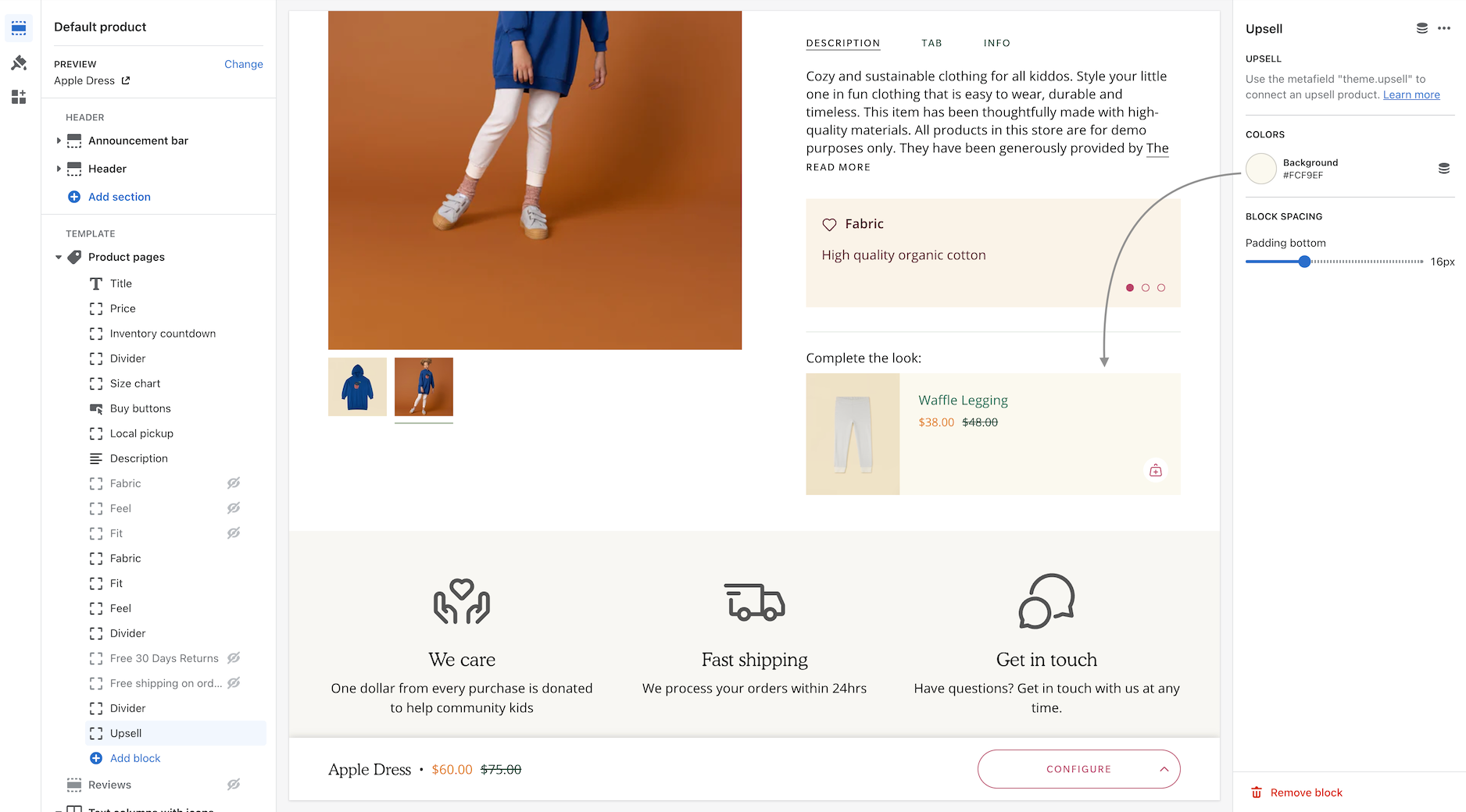
Upsell functionality updated to work with one product and metafields
Now you can easily add one product right from the Theme Editor as your Upsell item which will instantly appear for all products using the same Product template.
This method is a simple way to use the upsell feature without the complexity of using metafields. It will add the chosen product to all products using the same template. If you use multiple product templates, you can customize which product is selected for each template.
If you use the Select product option, that upsell product will appear for all products instantly. Think of this as a global upsell product.
If you combine it with a metafield, the metafield will override the selected global option. Therefore, the fallback is the global choice and the override is the metafield.
Choose which articles to feature in the section. Arrange in the order for the carousel.
Pick the articles you want to feature
Customize
Use one block to feature a single article or multiple blocks to build the slider.
Override the article image to match your branding.
Choose heights for desktop and mobile.
Options to display or hide the article author and the post date.
Video Overview
This video demonstrates the section settings and block options for the Featured blog posts section:
See also
The Blogs posts section uses multiple columns and rows to display your latest articles:
Adjust the default Font size to set the size of the heading font. Many sections and blocks allow you to override this setting with their own font size option.
Adjust the default Letter spacing. This is the spacing between each of the letters. This setting helps you configure a wide or narrow style heading.
You can use the checkbox option for Uppercase to set the default heading style to always be in uppercase. This will convert lowercase heading entries into uppercase.
Body text
Let's look at the body text font next. Choose a font for your primary body text, which will be used for descriptions, blog posts, product information, and more.
Subheadings and Navigation
Now that you've chosen both a Heading font and a Body text font, we can pick which font to use as our default choice for subheadings and navigation.
We've chosen the Heading font for our default Subheadings font.
We've chosen the Body font as our default option for the Navigation links and text.
Navigation font size
The Font size setting under Navigation will target both the top menu links and the dropdown menu links:
Font size settings adjusts all navigation links
Sections and Blocks
Many sections in Broadcast will have different block types, like a Heading block, a Subheading block, and a Text block. These blocks will use the font choices you've made in the Theme settings above.
Countdown section
In the above Countdown section example, the Subheading block is used above the Heading block.
Custom fonts
The Shopify font library contains a large variety of free fonts provided by Google that you can use for your store. These professionally designed fonts are widely used in most E-Commerce stores.
We recommend using a font from the Shopify Font Library, as it's integrated into the theme and provided by Shopify.
If your store requires custom fonts that are unavailable in the library, you can add them manually to the theme by using some CSS and modifying the theme code. Please remember that these fonts will not appear in the Shopify Font Library.
We strongly recommend using a Shopify Expert to implement this code change to your theme for best results. Our support staff cannot assist you or make this change for you.
The font choices in the Shopify Font Library cannot be modified. It's managed by Shopify, and you cannot add or remove fonts into this library directly. Custom fonts can only be added using CSS and editing the Theme code.
Our support staff cannot assist you or make this change for you.
To help those who are familiar with making code changes and have already done this with a previous theme, we have a video with some advanced steps:
Choosing fonts from the Shopify Font Library
Customize
Use one block for a single-column section. For example, an image or video block can create a hero banner. Create a heading with text with the text block.
Build a two-column section using two blocks. For example, combine text and a call to action column with a collection, product, image, or video block.
Video Overview
This video demonstrates the section settings and block options in the Custom content section:
See also
The multicolumn section in Broadcast is another option to build a custom section with additional columns rapidly:
Use the section settings to add your message and configure the layout for the section.
Enter your primary message into the Heading and adjust the size and alignment for desktop and mobile:
The optional subheading is placed above the main heading text.
Adjust the colors and padding for the section.
Add blocks to insert images into any position of your text. Start by adding a block type:
Image - Includes a custom link option.
Product - Links directly to a product. A custom image can be displayed.
Collection - Links to a collection of products. A custom image option is available.
Each block contains settings to help you design the right look and style. The image override allows you to use any image in your library. Both desktop and mobile image aspect ratio sliders will adjust how tall or wide the image appears:
Collection block example
Image position
Use this slider to place the image in the correct spot within your text message. Each position number is relative to the words in your message:
Choose the image position based on the word count of your heading
Image sizing
You can adjust each block image to fit proportionally with the Image aspect ratio slider. The Width slider helps you size each image individually:
Aspect ratio per image
Width size per image
Animation settings
Images will be animated in this section to give a lively look when the customer reaches the section. To disable the animations, use the toggle found under the Layout section of Theme Settings:
Images link directly to products and collections
Customize
The section settings have a range of options to customize the width, colors and padding. You can use an optional background image for a creative design.
Background image used
Each of the content blocks will be aligned horizontally. The content will wrap to multiple lines to fit the width of the display area.
Use the heading, text and button blocks to build the promotion content.
Video Overview
This video demonstrates the section settings and design options for the Text promo section:
Text promo used to separate sections
Easily feature a collection of products with this section. Choose from grid or slider layout options to optimize the space on your page.
Customize
Add a heading and text to introduce your products. Use the text layout options to position the introduction heading and text.
The text option has a dropdown to adjust the text style and tags to support SEO.
Include and customize the call-to-action button with various button colors and styles.
Choose a grid or slider layout. You can choose how many rows and items per row to display with the grid layout. Fewer products per row will increase the size of the product images.
Mobile options allow you to choose between slider and grid styles. The mobile grid can be customized to show one or two columns per row.
Video Overview
This video demonstrates the layout options for desktop and mobile. Plus, all the section settings for the Featured collection:
See also
Broadcast includes a tabbed section to display multiple collections within a section:
Grid layout with row and column options
Scroll through products with the Slider layout option
Mobile users experience a horizontal sliding version that's easy to swipe through.
Swipe through timeline periods on mobile
Customize
Use the section settings to configure the presentation of the section:
Add an optional heading, which can also be sized and aligned.
Toggle using images
With the color options, you can change the hotspot color, text, and section background.
Adjust the mobile height setting to match the best size for your images.
Section padding options help match the desired layout for your page.
Each timeline block has options to configure the period information:
Add an image for the timeline period.
The subheading is placed above the main heading text.
Add your heading and choose a size.
Use the text for your main description content.
The optional call-to-action button can link to any page. Use the button style and color options to complete each period in the timeline.
Video Overview
This video demonstrates the configuration options for both desktop and mobile views of the timeline section and how to configure the timeline periods:
Timeline used to shop by age group
Styles
The block can be used for different types of input:
Text
Checkbox
Dropdown select options
Checkbox example
Dropdown example
Video Overview
Here's a short video to learn how to add the block and general usage:
Customize
Mobile placement can be reversed to show the image first or after the products.
The mobile layout can have one or two items per row or a slider for less vertical scrolling.
When using four products for your section, choose a tall image to span two rows of products. A wide-aspect ratio image will work best for two products.
Use a wide image for single row sections or a tall image for two rows
Video Overview
This video demonstrates the section settings and block options for the Products with image section, including mobile layouts:
Choose any products to build the product list. The Quick Add feature appears while hovering a product.
Add the newsletter section to product pages, blog posts, or any page in your store. The image block lets you brand the promotion and increase awareness of your newsletter.
Customize
Use the image and sign-up blocks to build your promotion.
Adjust the section height for both desktop and mobile devices.
Width, padding, colors and section padding are available to complete the layout and style.
Text can be overlaid on an image and positioned in various locations:
Sending Newsletters
A third-party app from the Shopify App Store will be required for automated emails and the creation of custom mailing lists. The newsletter sign-up forms in all Shopify Themes can only collect the customer's email address and name. Apps help you build newsletters, add mailing lists, and automate sending messages to customers who have signed up.
Shopify email marketing apps can be found here:
Or search with this query:
Designed with tools to build engaging and visually appealing banners to promote your brand, products and services for desktop and mobile shoppers. Ideal for single or double-image promotions overlayed with messaging and call-to-action.
Customize
Mobile and desktop options for the banner image and section height help you design a banner for all devices.
For the desktop, choose a second image to build creative split-image designs.
Block types can be added multiple times. For example, you can use two button blocks and arrange them next to each other or in different orders.
Messaging is overlayed on top of the image to improve SEO. Use the size option for the heading and text blocks for the perfect-sized message.
The entire image can be a link. This can be the same or different from the button links.
For H1 headings, use the custom code block (covered in the video below).
Video Overview
This video demonstrates the section settings and block options for the Image banner section, including split-images and mobile options:
Advanced setting
This video discusses the advanced setting option when using the image banner page templates with metafields:
Two images split with multiple buttons
Single image with multiple buttons
Use the Target options in the message block to fully customize the message experience for your customers:
The Target page feature allows you to build announcement bar messages that are only displayed on certain site pages. For example, you can use this to display customized messages for certain collections, products, blog posts, or other pages.
With the Target Referrer feature, you can display custom messages when a customer views your shop from an external marketing campaign.
The Target device feature displays custom announcement bar messages for mobile devices, such as shorter messages and custom longer messages for desktop users.
The scrolling text section offers a variety of creative options. Broadcast allows you to target specific desktop or mobile devices with custom messages.
Combine multiple scrolling text sections to build eye-catching promotions.
Add images and color to make your message pop-out
Customize
The section settings allow you to customize the section's function and layout. The block settings control the content and target options.
Section settings
Choose between scrolling text like a marquee or a slider version similar to a slideshow.
The slider version has an autoplay setting and text alignment.
The scrolling text has speed control, direction, and spacing between content blocks.
You can choose the size of your text, adjust the background settings, and set the section padding. A border can also be displayed above and below the section.
Block settings
The text announcement block is the primary text content you can display and target on desktop or mobile devices.
Use the image block to display any image from your library.
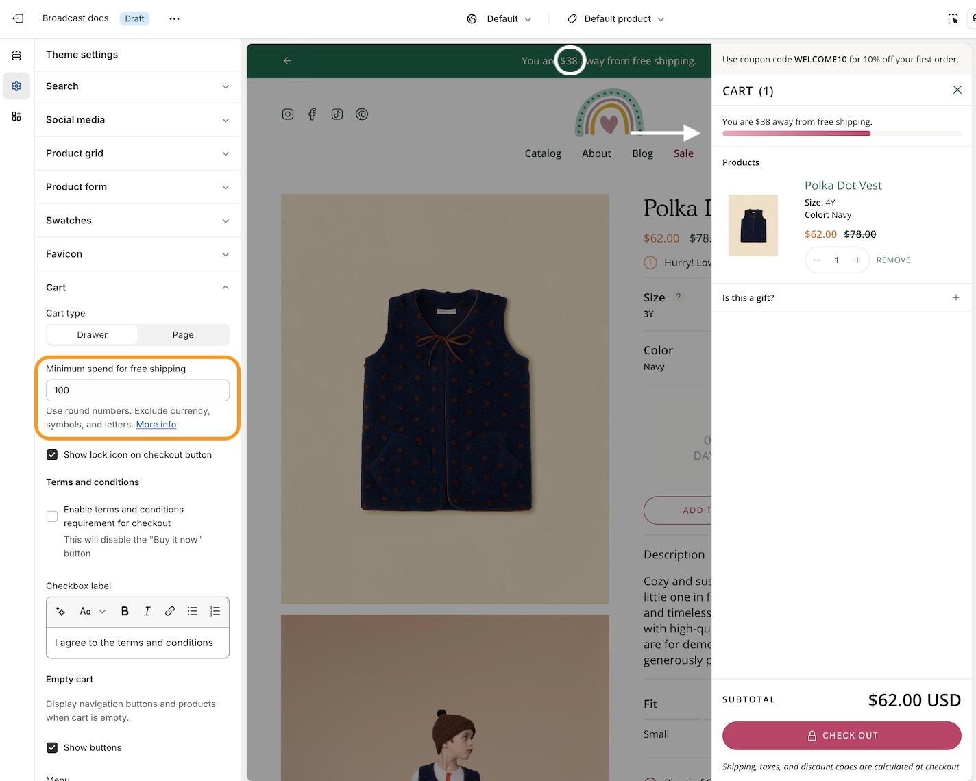
The free shipping block has a dynamic value based on the cart total, which informs the customer how much more they need to spend to qualify for free shipping.
The custom code block lets you add HTML or Liquid code to build your content or integrate content with other Shopify Apps.
Video Overview
This video demonstrates the section settings and block options for the Scrolling text section, including various styles and examples:
Scrolling text with product image displayed
Topics covered:
Header section settings
Toolbar block options and settings
Navigation image block options and settings
How we built the mega-menu navigation
View the Bold demo store:
More examples
For a full breakdown of how we've set up the sections and footer on the Modern demo store:
Learn how we set up our Aboutpage on the Modern demo store:
Dividers can be used as spaces or lines. The show line checkbox displays or hides the line.
Choose from different sizes, including width and padding.
Add color to the lines or spaces with the color options.
Video Overview
This video demonstrates different styles and designs that can be created with the divider section:
Dividers added above and below the press section
Icon column
Custom HTML
Contact form
Video Overview
Full details about each block type for accordions:
Adding images to accordions
Images in accordions are added by using the Image columnblock. Here's a quick 1-minute video demonstrating how to add images:
Other settings
In this tab you will also find the options to toggle:
Order notes
Gift notes
Shipping estimates
Additional checkout buttons
Customize
Add collection blocks for each hover slide.
Choose the collection and optionally override the default collection image and heading.
Adjust the section settings for the image height, heading size, padding and more.
Add custom images to each collection
Video Overview
This short video demonstrates some of the settings and options for the Collection list hover section:
Collection list hover
Customize
In the section settings, choose one or two images and add multiple text slider blocks to create rotating messages with a sticky image.
Each block can have an override image. When using the overriding image, the entire promotion will rotate.
Adjust the layout style, desktop height, mobile height, and image column width in the section settings for optimal design.
Section padding and width options are also available in the section settings.
Add your messaging and optional call-to-action within each text slider block.
Video Overview
This video demonstrates the section settings and block options for the Image with text slider section, including both types of rotating messages:
Advanced setting
Learn more about the Advanced setting to show the placeholder image. The Image banner section contains a video on the concepts and how they are applied. You can use this feature in the same way for the Image with text slider section:
Natural scrolling, header background does not change
Sticky with solid header background
Countdown timer
Bring attention to timed promotions on your store
Broadcast includes a fully-featured countdown timer block for the announcement bar. Add the block to help highlight your flash sales and improve conversions.
Countdown timer block settings
After adding the countdown timer block, you can configure your flash sale's end date and time. Use the 12-hour format and then choose the AM/PM option:
Hide block after end of timer
This option will entirely hide the countdown timer block when the flash sale time has reached.
Note:
In the Theme Customizer, the block will appear "dimmed" when the Hide block after the end of the timer option is selected and the sale time has ended.
This only appears in the Theme Customizer and not in your customers.
The entire block will be hidden in the announcement bar. Customers will only see other announcement bar messages or none if this is the only block.
Example of Theme Customizer "dimmed" version to indicate this block is not shown. However, you can still customize the time and details:
End of timer message
The End of timer message will replace the countdown clock with your message at the end of the sale:
Text
Add a message about your flash sale in the text area. This message is displayed on the left side of the main countdown timer:
Countdown
Display a countdown timer to promote flash sales and events
Broadcast's Countdown section gives you the tools to create attention-grabbing promotions. With customizable countdown styles, showcase flash sales, limited-time offers, or pre-order launches and keep customers engaged and eager to buy.
Easily build promotions that you can place throughout your store:
Background image example
Solid background example
Add next to collections and other supporing sections
Flexible
Design custom countdown promotions with background images and solid or gradient colors. Use the expiry features to hide the promotion or display a custom message during the countdown.
Customize
Choose an end date and time for your event.
Pick a size for the countdown timer and choose from split or centred styles.
Display a custom message or hide the entire section after the event.
Video Overview
This video demonstrates some of the settings and options, including gradients:
Navigation images
How to add images into your navigation
Broadcast can bring your navigation to life with images. Promote your product lines and sales events by easily adding image promotions to any of your top-level menu items:
Image promotions added to drop-down menus
You can even build an entire dropdown with images alone:
Example of ABOUT menu dropdown built entirely with image links
Video
How to build an all-image dropdown in Broadcast:
Video
How to use image blocks to add images to existing top-level menu items:
Adding images to menu items
Begin by adding an image block to the Header section:
Next, map the image to a menu position. If you'd like your image to appear on the first menu item, choose "Item 1". In our example, the image block is mapped to "Item 1", which would be the "NEW ARRIVALS" menu:
You can add multiple images to the same menu item. Each one will occupy a column. In this example, we have two images mapped to "Item 2":
Image settings
Finetune your image with individual block settings to perfect each individual image and call-to-action link:
Image scaling ratio - Adjust for wide to tall images.
Wide image checkbox - Use to adjust for smaller to larger images.
Overlay opacity - Darken the image to help highlight text.
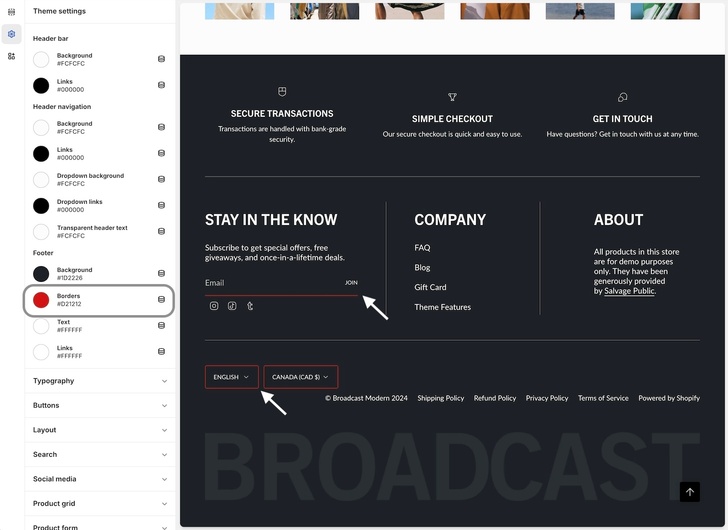
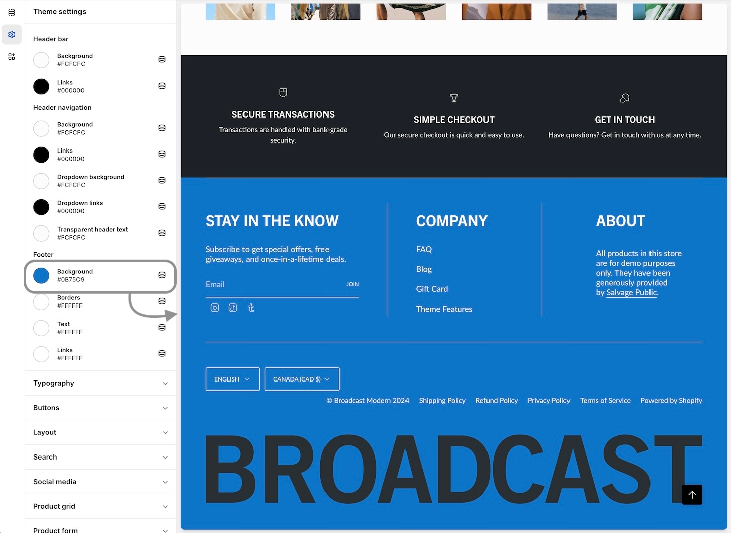
Footer settings
Customize the primary footer area above and below the footer columns
Click on Footer to view the main footer settings:
Setting Components
Logo
Background Image
Blocks
Logo
Add your brand logo to the top area of the footer:
Background Image
Add a background image to the entire footer area:
Payment icons are automatically generated from your Shopify admin settings, payments, and payment providers.
Video
A powerful all-in-one video section for banners and building attention-grabbing promotions
Create video banners and promotional sections to enhance your brand, products, and services with this single-column section in Broadcast.
Homepage banner example with transparent header
Flexible
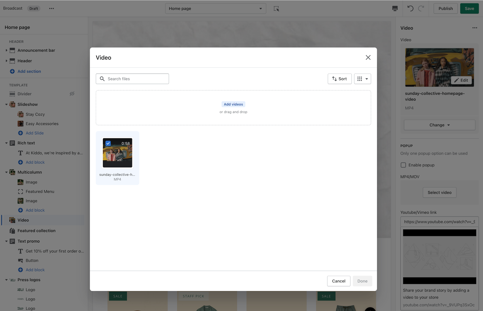
The video section can loop MP4 or MOV format videos from your content library. Videos can also appear with a pop-up player, ideal for longer video content.
Broadcast always presents a clean branded experience for shoppers, including options to add separate poster images for desktop and mobile devices. These images will load first while your video is loading into the browser and then be replaced by the video content.
Adding videos to your store is perfect for creating attractive promotions. You can easily incorporate them into any page of your store.
YouTube and Vimeo
YouTube and Vimeo videos can only be displayed as Popup videos. The reason is, Shopify can't control the ads and linked videos that YouTube or Vimeo will display in the video. The result is a very unprofessional background section.
If you need to use a YouTube or Vimeo video, we have a couple of recommendations:
To use as a background video, download the YouTube or Vimeo video and convert it to an MP4 or MOV format, then you can simply add it to your Shopify library.
For a popup video, you can add the YouTube or Vimeo URL in the Popup section. Use a branded image or a still frame from the video to represent the video.
Customize
Use the section settings to configure all the options for the video section.
To loop an MP4 or MOV video, select a supported video from your content library into the video option.
To use the optional popup feature, check the toggle option and select a video from your content library or a YouTube/Vimeo link address. In the section settings, lower down, find and adjust the button style and colors to modify the play icon.
Add a branded image or still frame image for desktop and mobile options in the image section. These images will be used while your video is loading into the browser. The mobile version is optional but recommended with a taller portrait-style image. For desktop, we recommend a
When enabled, the popup play button uses the same style as the call-to-action button. Adding a popup video can help display longer video content:
To display a circle-shaped play button, use the Theme settings -> Buttons and choose the "Pill" style. The square version is a regular rectangular shape, and the rounded version has rounded corners.
Video Overview
How to use the video section. This video demonstrates how to use the settings and options, plus details about the cover image and video types for looping and YouTube videos:
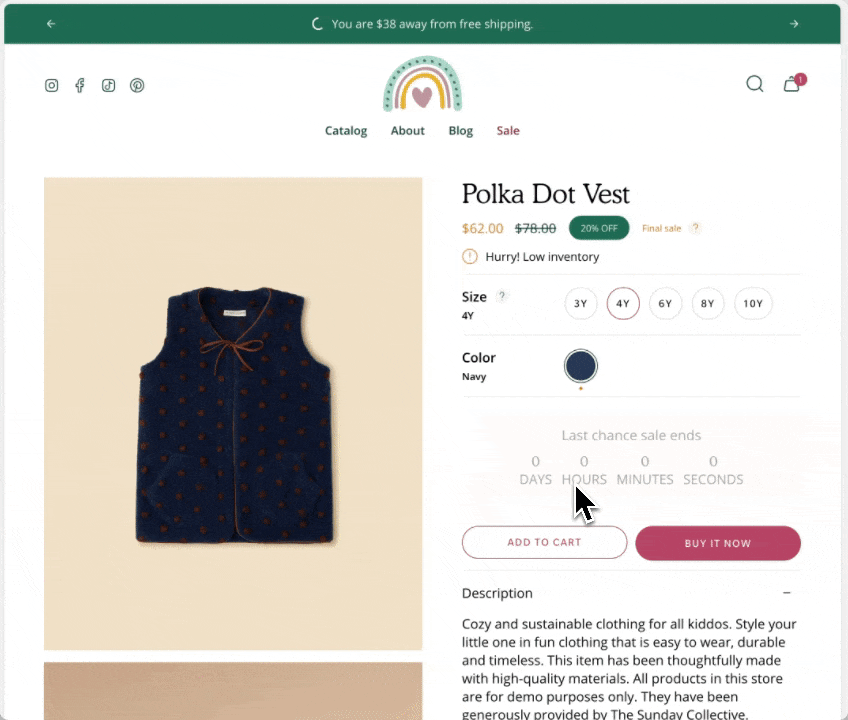
Final Sale
Display a final sale message with details on all sale items or select products
Introduced in Broadcast v5.6
Broadcast includes a Final sale message feature, which allows shoppers to easily identify products on final sale and view details about the sale.
The message can be triggered to appear on all sale items or individual products only.
All sale items
Use the Theme settings -> Product form -> Final sale to toggle the feature for all sale items and also configure the details displayed on hover:
When this toggle is checked, all sale items will display the 'Final sale' message and details on hover.
Individual products
Broadcast uses a custom metafield which can be added to individual products. Each product in your store can be individually toggled to display the final sale message.
The custom metafield is only required if you want to choose which products to display the final sale message and details individually.
No metafield is required if you plan to display the final sale message on all your sale items.
How to video
This short video demonstrates creating a required custom metafield to display the final sale message on only individual items:
Notes from video
Define a Product metafield
The namespace and key must be: theme.final_sale
Required custom metafield
Customize language
The theme will default the main message to 'Final sale'. You can change the text by modifying the default theme content.
In the Theme Customizer, click on the ellipsis icon on top and choose 'Edit default theme content':
In the editor, type in 'final sale' in the search box to find the correct entry to modify:
To manually find the text snippet, use the Products tab and under the Product section, find Final sale
FAQ Accordions
Accordion group section included in default product template
Broadcast includes an accordion section with the default product template to help you provide frequently asked questions.
A place to promote your services and brand strengths. Include product reviews for the current product.
Broadcast includes easy to use blocks to quickly add content
Theme blocks
Broadcast includes flexible content block types to help you quickly build rich accordions:
Text column
Image column
Content block types can be mixed and combined in each accordion section
Example of adding a new icon column
Changing the heading
Hiding an entire accordion section
Displaying product reviews
When reviews are enabled, they will appear in the accordion. Broadcast has built-in support for the Shopify Reviews app (required).
Toggle under Reviews:
After the deprecation of 'Product Reviews' please reach out to your respective app developer to confirm the best integration process with your version of Broadcast.
Custom content inside accordions
Using metafields, we can add custom unique content to accordion blocks for individual products.
Video tutorial - How to add custom content using metafields
Custom code
Use Custom code block to build custom announcement messages with HTML
Broadcast includes a custom code block to help you build customized messages with HTML and inline styles.
Build custom announcement messages and use targeting options to customize your promotions completely:
Example of custom code used in the above image:
<p>Custom code using <span style="color: orange; font-weight:900;" >HTML</span>. Build your own custom message block</p>
Target options
Broadcast includes target options to help you display custom messages on certain site pages. Use the Target page feature to customize which announcement bar messages are displayed on various pages of your site.
With the Target Referrer feature, you can display custom messages when a customer views your shop from an external marketing campaign.
The Target device feature displays custom announcement bar messages for mobile devices, such as shorter messages and custom longer messages for desktop users.
Learn more about the target options in Broadcast:
Highlights
Display navigation-style links with shapes and colors
Highlight links in your store in colorful shapes and sizes to help your customers find your products and services. The Highlights section in Broadcast is fast and simple to set up.
The section can be used to build a separation between your content. Use it on the homepage, product pages, blogs and other pages.
Flexible
The shapes and color options help you build the right highlights for your brand. Links can be used as a secondary navigation for your pages.
Customize
Add as many highlight blocks as required to build your navigation.
Choose from the multiple shape options, including square, rectangle, circular and button.
Adjust how many highlights per row. Multiple rows are generated based on the number of highlight blocks added. The size of each highlight is based on the number per row.
Video Overview
This video demonstrates the section settings and block options for the Highlights section, including mobile layouts:
Social
Displays social media icons with links to your social networks:
Configure heading and leading text.
Social icons
Icons automatically appear if a social network address has a URL address configured under Theme settings, Social Media:
Display a custom brand logo or animation during page loads.
Broadcast can display a pulsing custom icon or image during page loads. This branding feature is very easy to implement and is ideal for shops with media-rich pages.
View this short video to demonstrate the effect and how to easily set it up:
Social icons
Header options for displaying social media icons
Mobile drawer menu
When using this header style, the social media icons are displayed at the bottom:
Rich text with columns
Display text content in two columns with easy position controls
Broadcast includes a quick, easy-to-use section for building text content into a customized two-column layout. We include columns that can be sized differently and blocks easily positioned to either column.
Flexible
Content can be moved easily from one column to the other. Mobile devices view stacked content with centred or left alignment.
Featured product
Display large background product images when promoting a product
Scroll through product images with Broadcast's captivating product section. Highlight the featured product while shoppers scroll through the page.
The section remains sticky while product images are displayed. Shoppers can purchase directly with the Quick Add feature or click through to view the full product page.
Flexible
Header toolbar
A compact supplementary space to include valuable links and information
Broadcast includes a rich toolbar block to help you store important links and information without cluttering your main navigation area.
Store all the quick links in this secondary space while keeping your leading brand and navigation area clean and easy for shoppers to use.
Text
Display a custom message on the left side of the toolbar. This can be used as an alternative to the Announcement bar, keeping the header area compact.
Video overview of the Sidebar section
Desktop and mobile background image, text size and alignment.
Add text and button blocks for event messaging.
Section settings
Overlay color - Add an overlay tint to match your brand or enhance the look of the image.
Heading - Add heading text over the image.
Text - Smaller text displayed over the image.
Link - The promotional call-to-action link.
Color - Adjust the heading and text color.
NEW ARRIVALS is menu Item 1, CLOTHING is menu item 2
16:9
aspect ratio image, and for mobile, an
18:9
or
19:9
aspect ratio image.
Under Layout, use the desktop and mobile height options to find the right size for the video and poster image. Desktop and mobile controls are available.
For a banner-style image, choose the full-width option or add padding when using it to promote a page that incorporates padding on the sides.
The overlay settings help to bring contrast into the image when using text.
Add any optional text content with the heading and text settings. You can adjust the size for each of them.
Configure a call-to-action button or use the button settings to customize the popup play button style.
Promotion example adding animation to a page
Popup play button is configured using the button settings
Ensure the namespace and key are correct
The type is True or False
Configure any of your products using the new True or False toggle
In the Theme Customizer, turn off the global toggle to show the Final Sale message on all sale items. By turning this off, only individual products from the metafield settings will display the custom message.
Icon column
Custom code
Contact form
Customize icon and brand color
Click on top-level of accordion to change heading
Use the eye icon to toggle a section or block
Optionally, add and style a heading.
Each block can be customized with different colors, links and label text.
Background images can be used behind the text in place of the colors.
Tip: Build an animation sequence by using two custom images during page loads
Other options
In the Layout tab, you will also find the option to:
Change the grid style
Change the slider navigation style
Change the icon thickness
Enable parallax
Show outlines
Mobile devices
Most mobile devices will automatically switch to a Mobile drawer style for navigation.
For mobile devices, the social media icons are displayed at the bottom of the drawer regardless of the Header style used.
Hiding social icons
There is an option to turn off social icons for both desktop and mobile:
Setting up social links
Use the Theme Settings -> Social Media tab to add and remove links to your social networks.
When a link is added, Broadcast will automatically generate a social icon for that network in the header.
Mobile Drawer
Customize
Build your content and then move them to the left or right columns. Each block has a position option for column placement:
Block settings
Column sizes and text alignment can be adjusted in the section settings:
Section settings
Mobile settings allow the stacked content to be left-aligned or centred.
Video Overview
This video demonstrates the section settings and block options for the Rich text with columns section, including left and right placement of content:
Leading section is Rich text with columns. 40% and 60% sized columns
Broadcast offers both horizontal and vertical scrolling styles for this section. Choose how many product images to display.
Customize
Choose the product layout position, left or right of the images.
Broadcast pulls the product images directly from the product setup. In the section settings, you can limit the number of images displayed when scrolling with the range slider.
Desktop and mobile background image options are available. When used, the product images are reduced in size, and scrolling occurs within the background image.
Choose the scrolling direction, horizontal or vertical.
Optionally, add a background color behind the product.
Video Overview
This video demonstrates the layout options and scrolling styles for desktop and mobile. Plus, all the section settings for the Featured product:
Menu
An optional secondary navigation can be added to the left side. Store quick links here in addition to your main navigation. It is ideal for featuring new collections or sales events.
Border
Add a border to show the separation between the toolbar and the main header area. Helpful when using a similar background color as the header. Use the opacity slider to soften or increase intensity of the border.
Social media icons
Store your social media links in the toolbar. Broadcast will automatically create the icons from the Social media links you've set up in the Theme Settings.
Add your links under Theme settings -> Social media:
Broadcast will only display icons from the links you configure in these settings.
Gift Card
Display a quick link to your Gift Card in the toolbar:
Setup your gift card product in the main Shopify Admin.
Language and Country selectors
Use the toolbar to let your shoppers quickly change the language and/or currencies:
Configure the language options in your Shopify Admin under Language settings.
Configure and set up the Country/Region in the Shopify Admin under Markets settings
Colors
Choose which background color and text color to use for your toolbar.
Section padding
Use the range sliders to adjust the top and bottom padding and increase or decrease the size of the toolbar with padding.
Only appears in Theme Customizer, not to your merchants
Hide block is not checked
Use the opacity slider to help increase contrast with light background images
Text columns with images
Display multiple columns with text and image content equipped with custom shapes
Quickly build columns with text and images for any promotion in Broadcast. This section helps you build grid-style promotions or strips of photos. Broadcast will automatically align the columns to look perfect. Add creative shape designs with animation for a captivation section.
Animated shapes on hover
Flexible
Design clean-looking photo galleries or include headings, text and buttons to build rich promotions.
Each image can link to a product or any page
Add shapes to each of the image blocks.
Customize
Use the section settings to configure the section heading, layout, alignment, colors and padding:
Use the section settings to add an optional header. Adjust the heading size.
The desktop layout can be a slider or grid.
Adjust the number of items per row. Smaller values will display bigger images. When you increase the number of items per row, the images will resize smaller to fit the row.
With the image block settings, you can fine-tune the content:
Add an image and adjust the desktop and mobile aspect ratio sizes individually for the best display size. The image is optional for text-based columns.
Choose a shape to transform your image instantly. The blob-style shapes are animated on hover.
Add optional heading and text or call-to-action buttons.
Video Overview
This video demonstrates the section settings and how to add shapes to the images, plus more:
Each image shape is adjusted individually at the block level.
Video walkthrough of Google Map API Key and Map section setuup
Settings to configure the default button styles and colors for call to action buttons
Choose the default style and colors for your call-to-action buttons. These button settings allow you to manage the style and appearance of the default buttons. Many sections and blocks will use the choices selected in these settings.
Font
Broadcast allows you to choose any font from the Shopify Font Library for the buttons in your theme. Use the font selector to select the font choice for your buttons.
About v5.1 release
Additional information on recent Broadcast updates
Featured product section
Fresh new design for the featured product section with new image scrolling options and additional section settings:
Discover the new vertical and horizontal image scrolling options with this quick video:
Header section
Broadcast includes multiple header styles to easily customize the look of your main header
Logo above menu
Place the brand logo in the middle and navigation below.
The design allows for longer navigation. Stores with many menu items can place the navigation below the brand logo and position items like language selector, currency picker, account, search, and cart icons on the top right:
Colors
Settings to adjust the general, heading and footer colors using in the theme
Configure your brand colors in the color settings. These color elements are used in all the general sections, header, and footer.
Tip: These are your primary brand colors used throughout the theme. Some sections or blocks have their own color settings for even greater control.
Here are some common color elements to demonstrate how the color settings work:
Video walkthough of Sections and Footer from our demo store
Video walkthrough for the Contact form section
Video: How to use the Before and After section
Video walkthrough of the accordion group section
Video walkthrough of the collection list section
Video walkthrough of the Image with text section
Video walkthrough of the multicolumn section
Video overview of Text columns with icons section in Broadcast
Video walkthrough for the Custom code section
Video overview of the testimonials section
Video walkthrough of the features in the Tab collections section
Use the alignment options for the heading and text. Set the default colors and adjust the padding.
The entire image can become a link if you omit the button text but include a link.
Style
Broadcast includes different button style options. In these settings, choose a style that will be applied to all buttons throughout your shop. Button shapes included are square, rounded, and pill.
The pill shape brings a modern design to buttons, with a large radius on each corner. Shorter buttons like variant options will appear circular.
Pill style
The square shape has 90-degree corners on all sides.
Square style
Similar to the square style, the rounded style has slightly rounded corners.
Rounded style
There is an option to force uppercase lettering inside the buttons. Uncheck the option to display lettering as it is entered in the button text fields, or check the option to make all letters uppercase.
Uppercase toggle unchecked
Colors
Broadcast includes a range of color settings for the buttons used in the theme. Most sections will have button color options for style and color, including primary and secondary colors, pulled from the theme settings choices.
Product pages can display two buttons: an 'Add to Cart' button and a 'Buy it Now' button.
Add to Cart
The 'Add to Cart' button is the default call-to-action button. It's the only button shown unless you configure and set up to use Shopify's 'Dynamic checkout buttons.' When only the 'Add to Cart' button is shown, the primary solid colors are used from the theme settings.
When only displaying the Add to Cart button, the primary solid colors are used:
Primary Solid background color
Primary Solit text color
This is the default call-to-action button and uses the Primary solid color choices:
Add to Cart button on Product page
Buy it Now
The 'Buy it Now' button is activated when the 'Show dynamic checkout buttons' option is checked.
Add to Cart and Buy it Now buttons together on Product pages
When both buttons, 'Add to Cart' and 'Buy it Now,' are used, the 'Buy it Now' button adopts the primary solid background and primary solid text colors.
Both buttons are displayed next when the 'Dynamic checkout buttons' option is checked.
The Buy it Now button inherits the Primary solid colors:
Primary Solid background color
Primary Solid text color
The Add to Cart inherits the Primary outline and text colors:
Primary Outline and text color
Primary solid colors are used for the Buy it Now button while Add to Cart uses the Outline and text colors
Video Overview
This video demonstrates how to change colors for the 'Add to Cart' and 'Buy it Now' buttons on product pages in Broadcast:
The video also covers changing the 'Add to Cart' button text.
Secondary
The secondary color options are used for sections and blocks that can choose a button color. You can pre-select secondary button colors and use them throughout the theme.
In the example below, two buttons are displayed for the slideshow slide. The second is using the color settings from the secondary color palette:
Second button is using the Secondary button colors from the theme settings
In the second button block settings, you can select different color options under Color. We've used the Secondary choice to quickly insert our brand colors from the theme settings.
Block color settings for the slide
The primary and secondary colors are pulled from the theme settings. The white and black options are also available as quick presets.
Changing the button font type
You have the option to add a background image to enhance the appearance of the section:
Note: When a background image is used, the full-width horizontal scrolling effect is disabled. Vertical scrolling and regular horizontal scrolling are not affected.
Image with text slider section
A new section added to Broadcast is a two-column image and text section with multiple text blocks. You can now add multiple text blocks that customers can slide through for additional information.
Watch this short video walk-through on the section and block settings:
On mobile devices, the images will rotate automatically and customers can swipe through the text blocks:
The slider navigation style can be adjusted under the Theme settings:
Color swatches
Swatches are now easier to manage and control. All the settings for color swatches around are found under Theme Settings -> Swatches
Key changes
Color codes are now managed under the Theme settings.
Swatch Images are now used from the Shopify files.
Siblings can now use a color swatch instead of a product image.
Video walk-through on all the changes:
Tab collection section
A new grid layout option for the desktop has been added for displaying the products within a tabbed collection. You can easily choose between the slider style or the new grid option:
In addition to the product layout, you can position the tabs with different layout options:
In-line
Left aligned
Center aligned
Scrolling text section
You can now add a background image to the scrolling text section and also image blocks in-line:
Videooverview - Scrolling text updates:
Header line
An option has been added to help build a separation between the header and content:
Use the separator opacity slider to adjust the transparency of the line.
Header sizing
You can now adjust the padding in the header area to make larger or tighter headers:
Cart
A terms and conditions checkbox option has been added:
Use the Theme settings -> Cart to toggle. When enabled, the customer must check the box in order to proceed with checkout.
Logo beside menu
This style places the brand logo to the left with the navigation in the center. The design is a more compressed header area. Ideal for smaller/shorter navigation menus:
Cart icon style: Cart
Mobile drawer menu
This minimal style adopts the mobile design pattern used on all mobile devices.
This style is the cleanest option, hiding the navigation into a mobile-style drawer and keeping consistency between mobile and desktop:
Cart icon shown as circle with number of items in cart
When the menu text or icon is clicked, the slide-out mobile drawer is displayed on both desktop and mobile:
The search icon is placed next to the mobile-style hamburger icon for balance. Account and cart icons are on the far right.
Logo center, menu left
This common design presents the brand logo centered with navigation menu items on the left. Ideal for compact headers with a shorter top-level menu structure:
Cart icon style: Bag shown with items in cart indicator
Text-based items
Broadcast can replace icons with text for text-forward designs:
Toggle off the Show icons option
Currency selector
Broadcast supports Shopify's Localization feature. A currency selector can be placed in the header:
Localization is configured in your main Shopify Admin settings.
Language selector
Broadcast also supports Shopify's Language selector and can be placed in the header:
Language drop-down
Languages are configured in your main Shopify Admin settings.
Predictive search
Broadcast includes a powerful redesigned search tool for finding products and resources within your site. Predictive search can be engaged right from the header. Addition menu options can be added to customize the shopping experience:
Customize the search to help customers find common items
Configure and customize the search features under Theme Settings:
Localization, language, and search toggles
Each of these features can be individually toggled on or off to show in the main header area:
Transparent header
When using a transparent header, you can experiment with different icon styles to help the icons stand out with your background image.
A large icon size sometimes helps to bring attention to the icons:
Icon style: Modern
Find the transparent header options lower in the Header section settings:
Icon style: Bold
Cart icon style: Bag
General
Light background
The light background setting is used for background accents like the coupon message in the cart drawer. It's also used in the free shipping indicator with the bright accent color setting.
Bright accent
The bright accent is a highlight color for elements like the free shipping progress bar shown above in red and also the cart bubble indicator in the header:
Sale
The sale color is used for the prices on product grid listings like collections:
Sale price
The sale badge uses a different setting, which can be found under the Product grid settings.
Header bar
Background
The background color adjusts the text inside the cart bubble indicator:
Links
The social, search, account, cart icons area is adjusted with this setting:
Note: When using a transparent header, these colors are used when the dropdown is activated. The transparent header has a separate setting while inactive. That setting is in the next group.
Header Navigation
Links
The links setting adjusts the main header navigation links:
Dropdown background
For dropdown menus, including the MegaNav, the background color can be adjusted:
Dropdown links
Inside the dropdowns, you can adjust the color of the links:
Transparent header text
When using a transparent header, the main colors in the header area include the social, search, account, and cart icons. Also, main navigation links:
Footer
Background
Adjust the main footer background color:
Borders
Border elements are used within the footer for the forms and buttons:
Red are borders, grey are divider blocks
The grey horizontal and vertical lines are "Divider" blocks. These have their own color settings within the block.
Text
The default text for content in the footer:
Links
All the links, including social icons and navigation links:
Contrast
Try to use colors that are high in contrast. It will make your text easier to read. Here is a great contrast checker:
Example of a good score, 21:1 - White foreground on Black background:
Poor score, 2.44:1 - Blue foreground on Black background:
Open the Colors accordion to find all the settings
Video: Main section settings and options
About v5.6 release
Additional information on recent Broadcast updates
Cart drawer blocks
Broadcast 5.6 introduces Cart drawer blocks. Customize the cart drawer with a series of blocks to supercharge the cart experience :
Customize the entire cart experience with Broadcast 5.6
Cart blocks in Broadcast
Add, arrange, and configure any of these cart blocks for a fully customized cart experience:
Individual settings
Each block has a set of customizable options. Example of Icon block used to display shipping message:
Pin to bottom
Pin blocks to the bottom like the Payment icons:
Fit Guide for products
Broadcast includes an easy-to-use fit guide block for Product pages. Help customers visually see how items fit. Each product can have a custom value for the line chart:
Video overview on how to use and set up the Fit guide block:
Video on how to customize the Fit Guide using custom values with metafields:
Variant images
Display images for any variant type on your product form. Help your customers visually see what a variant looks like. In addition to swatches, Broadcast can display an image for each Size variant or any other type you choose.
Two styles are available in Broadcast 5.6, in-line and stacked:
In-line style
Stacked style
Images are used from your Product setup:
The 'Size' variant is used by default. You can configure any variant to display images. The above example shows 'Type' to visually show the product style.
Learn more:
Header call-to-action button
Now in Broadcast, you can add a call-to-action button right into the Header area:
Use the Header section settings to customize the button color, text and link:
Experiment with different Header styles, the call-to-action button positions differently based on the style of header and navigation you use:
Swatch collection styles
Customize the swatch and siblings display style on the Product Grid. Now in Broadcast, you can choose from different swatch display styles. Examples include:
Slider on hover
Clean text is displayed on the Product grid. Upon hover, the text is replaced with swatches or siblings. The slider feature keeps all swatch options aligned horizontally on a single line:
Text only
A clean text version that displays the number of swatches or siblings which are available:
Swatches with text
Displays a sample of swatches or siblings on a single line and indicates how many additional options are available with text:
Slider
Displays the swatch or siblings slider on one line at all times:
Grid
Displays all possible swatches or sibling options that are available to choose from:
How to configure
Use the global Theme Settings -> Swatches -> Collection style
Choose your collection style in the drop-down:
Final sale message
Display a 'Final sale' message with details of sale on sale items:
Configure the global settings under Theme settings -> Product form -> Final sale
Learn more:
Countdown timer block
We've added a countdown timer block to the Product form. You can now quickly add a countdown promotion right into the Product form:
Add the countdown timer block and customize it with a wide-range of options. Use dynamic data sources to apply individual settings for any product:
The same information will appear on all your product pages when adding blocks to the Default product template.
To display custom information for individual products, Shopify provides two methods to customize your content:
Create multiple product templates and assign only certain products to different templates
Accordions, Tabs and Description blocks for Product pages
We've separated out the accordion, tabs and description into individual blocks. Now with greater customization and flexibility.
Example of Tabs block with options to show the description and read more button:
The Description block can be used to pull out the product description from an accordion or tab, and shown independently:
Out-of-stock notification
Let your customers know when a product or variant is back in stock. This new feature in Broadcast allows your customers to submit an email request with product and variant details for an item that is currently sold out:
Learn more:
SKU block for product pages
Add and position the SKU block to display the value on your product pages. Adjust the padding with the block settings:
SKU values are taken from the product setup under variants:
Image banner placeholder on Product pages
Broadcast now includes a feature to hide the 'Image banner' placeholder image when using metafields. A new checkbox has been added to hide the placeholder for products that don't have a chosen metafield image.
Watch the video walkthrough on how this feature works:
This solves the problem of displaying an image banner section for specific products and excluding the banner from others with only one template.
Show only upsell items that are available in stock
An option has been added only to show in-stock items for upsell promotions on Product pages.
In the example below, the Waffle Legging is an upsell product. However, currently has no inventory:
By turning on the feature, that out-of-stock item will not be displayed as an upsell option:
Setting for New badge
We've added an easy-to-use setting in the Theme Settings -> Product Grid to add and customize when the 'New' badge appears on collection pages and the product grid:
Recently viewed items in empty cart
You can now display recently viewed items in an empty cart. Broadcast includes a global theme setting under Theme settings -> Cart to toggle this feature:
Background image for the Rich text section
Dress up the 'Rich text' section with an option to display a background image with overlay options to help display the text over the image:
Customize with a different image for mobile devices. If no mobile image is selected, the desktop image is used.
Free shipping message
Dynamic message to encourage increased items per transaction
Broadcast includes a dynamic Free shipping message block where you can display an animated progress wheel and currency value to inform your customers how close they are to qualifying for free shipping:
The wheel fills up, and the value changes as items are added to the cart.
Use to encourage add-on sales and increased quantities.
Add the "Free shipping message" block to your announcement bar and customize the options and settings:
How to setup
Use the Show progress wheel toggle to display or hide the animated circle effect:
You can modify the message in the Message area. The || amount || portion is the dynamic value you set in your Theme Settings -> Cart. Keep this custom shortcode and modify any text around it.
Example of a message modification:
To adjust the free shipping value, navigate to Theme settings and then choose Cart:
The cart drawer and announcement bar use the same setting value:
Optionally, you can customize the free shipping message information further using the Target page, Target referrer, and Target device settings.
For example, you limit the free shipping announcement bar message to appear only on certain pages:
You can also use a shorter message for mobile devices and a longer version for desktop browsers:
Header icons
Professionally designed and crafted for modern header styles
Broadcast includes a clean set of modern icons for the header. Multiple cart options are available to match your brand style.
Bag icon
Cart icon
Cart circle
How to setup
In the theme editor under Header, choose Show icons and select a cart icon style:
To override the cart icon style with a circle option, use the checkbox for Show cart icon as a circle:
Video overview of the slideshow section
Video walkthrough of the accordion section
Video walkthrough of the rich text section
Broadcast sections
List and details of sections included in Broadcast. Learn more about our theme sections.
Theme sections
Click to view details of individual sections included with Broadcast:
Video overview of the timeline section in Broadcast
Video walkthrough of the Image with text slider section with rotation types
Video walkthrough for the Featured blog posts section
Video walkthough
Shop the look section video overview
Video walkthrough for the Featured collection section
Video walkthrough of the products with image section
For advanced and experienced developers
Video walkthrough for the Custom content section
Video walkthrough of the scrolling text section
Toolbar and Image block settings
Use dynamic data sources with product metafields to customize for individual products.
Video walkthrough of the rich text with columns section
About v4.0 release
Additional information on recent Broadcast updates
Text with products
We've introduced a new section in Broadcast to display inline images within a rich text block. You can add Products, Collections, or custom images inline to capture your audience's attention:
Images have a lively animation when the customer reaches the section. Learn more:
Video walkthrough for the Featured product section
Spend ||amount|| more for free shipping.
Announcement bar slider arrows
We've added arrows on hover to the announcement bar. When the layout setting is Slider, you now have the ability to show sliders in the same color as the message text:
Collection list hover
A new section added to Broadcast with an engaging presentation of images presented in a dynamic format, featuring full-sized graphics and prominent text to promote collections within your store:
Learn more about the new section:
Cart drawer - Gradient settings for free shipping bar
Enhance your customers' shopping experience by customizing the free shipping progress bar in the cart. Choose a creative gradient color scheme that will draw their attention and make their shopping journey even more enjoyable:
Find the setting under Theme settings -> Cart
Inventory countdown - Improved customization and options
We're excited to announce that we've expanded the range of options available for customizing the inventory countdown feature in Broadcast. With these new options, you have greater control over how the inventory countdown is displayed.
You can choose to always display the inventory, show it only when the inventory is low, or even hide the value altogether if desired. Our aim is to give you the flexibility to tailor the feature to your specific needs and preferences:
Learn more about the inventory countdown settings:
Additional icon options
We've added even more professionally designed commerce icons to multiple sections:
Find the new icon options within sections that support the icon block:
Transparent Header on pages now available
We've added support for the transparent header option to Shopify Pages:
Ideal for page templates that use the banner or slideshow section at the top.
Text columns with icons section returns
Quickly create an icon-based section using Text columns with icons:
For more advanced options including adding custom images, the Multicolumn section is available alongside Text columns with images.
Easily add videos with new the new video picker
Now you can quickly choose an MP4 video from your files library or upload directly with the newly improved Shopify interface:
Divider block added to text sections
A divider block has been added to the Rich Text section and Image with text:
The divider block can be used to build separation with or without a line:
There is also a section called Divider which can be used between sections. The block version adds similar functionality inside sections.
The Announcement bar section is now the Scrolling text section
The new Scrolling text section replaces the Announcement bar section in Broadcast 4.0.
You'll still find an Announcement bar section in the Header group.
Scrolling text can be added to the main Sections group.
A new text size option has been added to the Scrolling text section:
Smart second button alignment
When the second button option is used, both buttons will align side-by-side on desktop and stacked on mobile.
Use the feature on full-width sections like:
Slideshow (slide block)
Banner (button block)
Rich text (button block)
Tab collections section now includes a left alignment option
The tab collections section is one of Broadcast's most popular sections to feature multiple collections. Left alignment has been added in this release:
Using the Layout drop-down, you can now align the tabs and text content with the following options:
Left
Center
Inline
Product form style setting
We've introduced an option to switch between the newer Modern design Product Form and the original Classic design.
In the Theme Settings under Product Form, you can choose between the two styles.
Modern:
The variant labels and selections are displayed in line with the variant options:
Classic:
The variant labels and selections are displayed above the variant options:
The Classic design is suitable for customers with a large number of variants. Since the labels are displayed above, there is more room below for the variant options.
Examples with Varients as boxes:
Quantity selector next to Add to Cart button
Both the Modern and Classic styles support the Quantity button next to the Add to Cart button. Use the Buy Button block settings to activate it:
Collection list section
When using the grid layout in the Collection list section, you can now choose how many collections per row to display:
Upsell promotions
The upsell block now includes a background color picker to help match your brand style:
Pre-footer
The new pre-footer group provides your users with additional resources or options that can help them further engage with the website or accomplish their goals. Examples of content that may appear in a pre-footer include links to social media profiles, brand logos, and newsletter sign-ups.
We've included sections to help you add custom app code or some of our flexible sections for a quick pre-footer setup:
Show arrow has been added to individual sections
Each button will now have an option to 'Show arrow'. This option was previously in the global settings. Now you'll have the flexibility to show arrows on some buttons and hide for others:
Search improvements
We've added support for Shopify's Search and Discover app to help you customize search result recommendations:
Related products and Recently viewed products
We've separated these into two separate blocks. You can now easily sort them by preference and we've also included an option to show them in Tab format or Stacked.
Toggle tabbed and stacked with the 'Enable tabs' checkbox.
To customize related products, use the Shopify Search and Discovery app.
Updated "Bright" demo preset colors and fonts to match new design
Demo Store
View the new
v5.8.2 - October 2, 2024
Fixes and other improvements
Updated style presets to match the Clean demo store upon initial installation, including colors and default sections.
Accordion - If enabled, the "read more" button was not appearing on iOS devices
v5.8.1 - September 3, 2024
Added
Multicolumn - Product block that automatically pulls in product grid image and content
Option to have Collection "filter" accordions open by default
Input HTML into Slideshow header to bold, italicize, or include a CSS class for further design customization
Fixes and other improvements
"More payment options" text was missing below the Dynamic Checkout Button (Paypal, Shop Pay, etc.)
The header "circle" cart icon option was showing an underline on hover
Predictive search was showing the secondary product image instead of the first one
v5.8 - July 11, 2024
Added
New section - Image with scrolling text
New section - Image with product
New design element: A theme-wide optional "Superscript" design that shows the number of products in a collection for multiple sections.
Changed
Improved the "Show secondary image on hover" setting to include tablet and mobile functionality. Added the ability to scroll through product images (max 5 for speed load)
Fixes and other improvements
Final sale text was not appearing in the quick add
v5.7 - June 4, 2024
Added
A new section called “Rich text columns.”
Optional accordion style for the Footer blocks on mobile
Added a “hide” tag to products to prevent them from showing on search results, collection pages, recommended and recently viewed (use case: samples)
Changed
Additional size and spacing options were added to the text and button blocks in the "Before and after" section. The image will be forced to full-width image size if no blocks are present.
Timeline dots are clickable on mobile.
Moved the “Remove” text in the cart to underneath quantity for an improved user experience
Fixes and other improvements
Editions ’24 taxonomy and filter updates
Cart text was missing the zero if no products were in the cart
Out-of-stock notification form will appear on the sticky cart for no variant products
v5.6.1 - April 19, 2024
Fixes and other improvements
Fixed an issue where the Out of stock notification form was always choosing the first available variant combination.
If you upgraded to 5.6.0 and have already configured your new theme, please contact our customer support. We will manually add the fix for the notify form. Or update your theme to 5.6.1, which has corrected the issue.
v5.6 - April 15, 2024
Added
"Back in stock" notification feature for out-of-stock products
4 new styles for the collection color swatches
"Fit guide", "Countdown timer" and "SKU" block to the Product template
Changed
Hide default banner images on the product page if you are using metafields for some products and not others
Option to hide sold-out upsell products
Fixes and other improvements
"Cart drawer - Note" not saving in certain circumstances
"Popup" was not closing if you clicked outside of the area
Product grid images appeared blurry for some merchants
v5.5 - February 5, 2024
Added
Implemented blocks on the "Cart" template and "Cart drawer" section. Please note you may need to reconfigure these sections if you decide to upgrade.
Image with text - Introduced "Product" and "Collection" blocks
Announcement bar - New "Countdown timer" block
Changed
Added the option to show the product grid badges (sale, pre-order, custom) on the product page
Updated the design for the "Timeline" section on mobile screen sizes
Accordions - Option to show "open by default"
Fixes and other improvements
Removed "Reviews" from the product page as the Shopify app is no longer available
Toolbar - Fixed a mobile issue that was causing the "Gift card" link to get cut off
Fixed an issue where the cart notes were not being saved if you selected "View cart"
v5.4.1 - December 14, 2023
Added
Added an optional icon setting to the Product page "Popup" block
Recommended products and Recently viewed products - New alignment and size settings
Products with image - New background color setting
Changed
Countdown timer - Implemented new "height" setting to control desktop and mobile height separately.
Twitter - Updated icon to "X"
Fixes and other improvements
Product grid - Fixed a bug that was preventing the color swatch from showing on hover
Search - Closing icon was missing
Product page - The sticky cart bar was covering content on mobile
v5.4 - November 15, 2023
Added
New section - Text with products
Image with text - Added "Image" and "Video" blocks
Product page - Introduced a transparent header using product images. We recommend using the "Stretch" image size with this one!
Fixes and other improvements
Quick view drawer - Fixed an issue where the focal point of the image was not centered
Collection "sort by" improved to work when filters are disabled
Removed "Upsell" product title when a product did not have an upsell associated with it
v5.3 - October 20, 2023
Added
New section - Timeline
New section - Countdown timer
Added icon options to the accordions
Changed
Text columns with images/icons - New image per row setting
Updated design layout for the “Article” template
Fixes and other improvements
Fixed an issue with the toolbar content on mobile
v5.2 - September 18, 2023
Major release 🎉
Added
Header - New block available: Toolbar; Additional currency styles
Image with text - New block: Accordion
Tabbed collections - New option: Mobile grid layout
Changed
Custom content - Ensured the width options were consistent with the rest of the sections
Announcement bar - Arrows appear by default if enabled (instead of on hover)
Fixes and other improvements
Removed additional padding that was occurring on the product form for "Pre-order" products
Collection list - Linked the header to the collection
Search - The second product image was showing instead of the first one
v5.13 - July 19, 2023
Minor release
Fixes and other improvements
Fixed a liquid error coming from the preload_tag URL filter on swatches.css.liquid file
v5.1 - June 28, 2023
Major release 🎉
ADDED
New section - Image with text slider
Gift card - Added a date picker
Header - Added a mobile logo width option
CHANGED
Improved color swatch implementation and introduced sibling color swatch options
Featured product - New design 🎉
Scrolling text - Added background image and image blocks
FIXES AND IMPROVEMENTS
Slideshow - Fixed a linking issue that was preventing the entire slide from linking out to another page
Fixed a quick add bug that was causing problems in Firefox
v5.0 - May 1, 2023
Major release 🎉
NEW
Gift card - Send directly to the recipient and include a message
Add a product to upsell in an empty cart
Multicolumn - New mobile aspect ratio setting
CHANGED
Removed underline style when buttons set to "Text" with arrow enabled
Merged "Custom Liquid" and "Custom HTML" into one section called "Custom Code"
Updated "Upsell" functionality to work with one product and meta fields
FIXES AND IMPROVEMENTS
Cart.js optimizations
Learn more about the update:
v4.0 - March 15, 2023
Major release 🎉
This release introduces two new sections: collection list hover and text with products. We've also updated to include Shopify section groups and the new Shopify query suggestions for predictive search plus a few other improvements.
NEW
New section: Collection list hover
New section: Text with products
Implemented Shopify's new search functionality
CHANGED
Improved the Inventory Counter on the product form
Added more icon options
Included the "Divider" block into more sections
FIXES AND IMPROVEMENTS
Brought back the previous product form style as a design option
Improved video functionality and fixed button icon shift
Learn more about the update:
v3.8 - January 24, 2023
Major release 🎉
This release includes a significant update to the product form and shop the look section, improves button styles and functionality throughout the theme, and builds upon UX best practices.
NEW
Product form features have been separated into blocks.
Image with text – New secondary image style added.
Multi-column (previous "Text columns with images" and "Text columns with icons") – Added a "Menu" option with the ability to customize block widths
CHANGED
Product form design.
Shop the look design and improvements to the mobile functionality of Shop the look.
Improved button functionality theme-wide.
*Note: You will need to reconfigure these sections when updating. Existing section settings will not migrate as they have been replaced by new sections. We recommend you manually add the new sections and configure them with the new options and controls.
FIXES AND IMPROVEMENTS
General consistency improvements for arrows, buttons, and underline styles.
v3.7 - November 9, 2022
Major release 🎉
In this release, we've introduced a new icon set, mobile height settings for all sections, and general improvements throughout.
NEW
Mobile height setting for all sections to improve the mobile experience
New "Image with text" section
New "Features" block on the product page
CHANGED
New icon set!
Connected the "Size chart" to the "Size" variant
Modified the "Image banner" section to utilize blocks – If you are currently using this section, you will need to rebuild it to accommodate this new functionality
FIXES AND IMPROVEMENTS
Improved cart circle style for larger screen sizes
Optimized forms and newsletters for Google reCAPTCHA
Added color settings for the mega menu images to improve visibility
v3.6 - October 19, 2022
Minor release 🎉
NEW
New password page design
New predictive search results for blog, pages, and collections heading terms
UPDATED
Enhanced the responsive design for product pages
Introduced blocks for the "Rich text" section. This will require you to reconfigure your "Rich text" sections.
FIXES AND IMPROVEMENTS
Improved sibling functionality on Quick Add
v3.5 - October 6, 2022
Major release 🎉
This release adds support for product siblings, updates the collection page filters, and improves accessibility across the theme.
NEW
-Link multiple products together as swatches.
Collection filters - New design and usability improvements
UPDATED
All new Quick Add design and functionality added with slide-out drawer
Introduced better cart animations
FIXES AND IMPROVEMENTS
Accessibility improvements
Product search and close icon sizing
v3.4.1 - September 15, 2022
Major release 🎉
NEW
New section called Highlights to showcase collections and text content
New metafield option to customize the text below product images on collection pages
New circle option for the Cart icon
UPDATED
The upsell design, now allows customers to choose their variants 🎉 -
An all new Testimonials section with refreshed design
Improved linked variants for sold out products
FIXED
Refined collection pagination when a Featured Product block was used
3.4.1 Release fixes a hamburger menu issue, where the closing "X" was missing
3.4.1 Added tooltips to the color swatches in the Upsell feature
v3.3.1 - June 9, 2022
Major release 🎉
NEW
Added granular padding options to each section. Now you manage easily manage the padding between various sections with top and bottom padding controls.
UPDATED
Improved sold-out variant styles. Swatches and variant boxes are now displayed as crossed out and drop-down variants will have sold out text next to them.
FIXED
v3.3.0 was displaying a dark background on the header image blocks. This has been removed.
v3.2.1 - April 21, 2022
Minor release
UPDATED
Improved the functionality of the mobile main menu animations.
Improved the video section on mobile if the device is in low power mode.
FIXED
Empty translation string error.
v3.2.0 - March 21, 2022
Major release 🎉
NEW
Now you can include a short description on the product grid sections like collections, collection list, and featured collection.
Add icons and text under product form on product pages
Pulsing loading icon that will appear on the first load of your website, or all pages. Example usage: Display your brand logo on page loads.
UPDATED
Added a text option for header icon styles.
Ability to use metafields for pre-order and badges instead of tags. Tagging option is still available.
Option to choose % off instead of $ off for sale items.
FIXED
Gift card translation issue.
Main Menu animation now works when using the back button.
Footer social media icons are opening pages in a new tab.
v3.1.0 - October 27, 2021
Major release 🎉
Fixed Issue with Cart Drawer clicking "X" not removing items
Product grid text elements like product title and price now use Body font for sizing
Improved sold out badge text visibility on the product grid
v3.0.1 - September 24, 2021
Fixed Collection filter bug
v3.0.0 - August 11, 2021
Major release 🎉
New Supports Shopify Online Store 2.0 (OS2) platform
New Support for Shopify’s Collection Filtering - Add collection filters in your Navigation admin
New Includes support for sections everywhere - Place sections on all page types including Products, Collections, Blogs, Pages, Cart and more
v2.1.1 - July 19, 2021
Updates to home page collection sections to ensure consistency
Fixed product page over scroll
Fixed minor cart upsell issue
v2.1.0 - July 8, 2021
New newsletter popup with targeting functionality, including a cookie popup.
New "Pair with" functionality to upsell in the cart. This automatically integrates with our product page upsell feature.
New "Collection Carousel" section.
v2.0.3 - June 8, 2021
Fixed issue with line item properties.
v2.0.2 - May 18, 2021
Fixed issue with iOS scroll lock which can prevent scrolling the cart body when there are many items in the cart.
v2.0.1 - May 11, 2021
Fixed password page login error.
v2.0.0 - May 11, 2021
New upsell feature on the product page
New quick add functionality, replaces Quickview
New about page template
v1.8.1 - April 14, 2021
Fixed issue with product variant images
v1.8.0 - Feb 23, 2021
Removed jQuery dependency
Improved speed and load times
Added a cart drawer setting
v1.7.2 - October 5, 2020
Fix secondary currency price formatting on cart popup and recently viewed products
Fix issue on recently viewed products where no-image product causes JS error
Fixes issue were app injected URL params were wiped by variant state changes
v1.7.1 - September 16, 2020
Add unit_price in cart popup
Fix bugs introduced by architectural changes in 1.7.0:
Fix index-blog not showing tags
v1.7.0 - September 8, 2020
Convert snippets to use render which improves overall performance.
Added support for Unit pricing (currently supported for Shopify shops in Germany and France).
Convert to social image setting in shop admin. Now uses Shopify's admin setting for the social image.
v1.6.3 - June 26, 2020
Improved mobile layout for newsletter pop-up when using an image. Resolves blurry image issues and small input space when button text is long.
Corrects PayPal dynamic payment button not displaying after quantity change on the cart page.
Fixes shipping calculator currency money format on the cart page.
v1.6.2 - June 4, 2020
URL fragments can now be used with variant history on the product page
Better variant focus states for tab-thru
Fixes issue with swatches on collection page after endless scroll occurs
v1.6.0 & 1.6.1 - March 26, 2020
Added support for checkout in multiple currencies when using Shopify Payments
Added currency switcher to the footer settings -
New group filtering mode added - This allows you to build custom groups to filter by. Tag your products with custom prefixes and underscore to build custom groups
v1.5.2 - March 17, 2020
Fixes an issue with the YouTube Background videos
v1.5.1 - Feb 25, 2020
Adds a custom HTML section to make Instagram app integration
v1.5.0 - Feb 20, 2020
Product Media - Shopify now supports Video and 3D model files on product pages. This release supports Shopify's new product media formats. .
Removes Instagram section
v1.3.0 - Jan 10, 2020
Add new bold preset
Adds a split here section
v1.2.3 - July 17, 2019
Corrects an issue with endless scroll. Most noticeable when loading the third page of products on collection pages.
Added the ability to turn off endless scroll in Layout settings under Theme settings.
v1.2.0 - June 10 2019
Adds support for automatic discounts and buy-one-get-one discounts
Adds support for the new product recommendations
Adds live search (using the old API for now, we built this right before the new API came out)
v1.1.0 - April 24 2019
New translations: Portuguese and Spanish
Tweaks price and title mobile sizing
Switch open graph tags to JSON-LD remove messy itemprop markup
v1.0.0 - March 6 2019
Initial release 🎉
The Broadcast release log keeps track of the date and contents of each Broadcast release. Use this document to keep track of new versions and features. We always recommend staying up to date with the most recent version.
Footer content would show as a broken accordion if there were no "Heading" entered
Prevent drastic size adjustments by the browser if the chosen font size is too small
Image banner and Slideshow sections - Top and bottom padding settings added.
Blog articles - A product list option was added to link multiple products easily.
Sold out badge
New blocks for the cart drawer: "Payment icons", "Icon", "Product list", and "Custom code"
Final sale shoutout on the product page to call out products that cannot be returned or exchanged
Connect images to your product variant boxes
Show "Recently viewed" products in your empty cart
Automatically add a "New" badge based on when a product was created. Disappears after a set number of days
Important: Separated "Accordion", "Tabs" and "Description" styles on the product page into individual blocks for greater control. If upgrading, your description will automatically convert to the "Tabs" style
Rich text - Added an "Image" block
Collection - Added the ability to add more than one "Featured image" block
Image with text and Rich text - Customize spacing between blocks with the new "bottom spacing" setting
Added the number of items in the cart beside the cart header for a better user experience
Implement Shopify's new swatch collection filter
Introduced a "Swatch size" setting allowing for greater visibility for patterned swatches (new sizes: regular and large)
Collection - Additional white space appeared when filters were disabled
Implemented "Subheading" styles for greater control over typography
Scrolling text - Added an option to choose the font family: heading or body
New “Popup” block on the product page
Ability to choose up to 3 upsell products (instead of just one)
Accordion group - New option: Show accordions in 2 columns
Multicolumn - New option: Image styles (set your images into circles)
Footer group - New block & section: Divider
Introduced more size chart styles
Header - Fixed an issue with the mobile logo sizes not applying properly
Header - Introduced the option to enable a bottom border
Cart - Added a "Terms and conditions" checkbox
Featured collection - Introduced a width setting
Shop the Look - New products per row (1 - 2) setting
Collection list - New mobile style options
Page templates can use the transparent header option
Modified secondary button styles – Buttons will now appear side-by-side instead of below
Merge existing sections together for greater visibility*
The Split images section and Image Banner sections have been merged together as Image banner
The Text columns with images section and Text columns with icons section have both been merged into a new section called: Multi-column.
The Collection carousel section and Featured collection sections have both been merged into a new section called: Featured collection
New mobile slider style for product images on the product template
Customize the width of each Footer block for unique layouts
Cart drawer and upsell product popup animations have been improved
The free shipping design has been updated and appears in empty carts to market free shipping minimums
New Newsletter section in the Footer which appears above the main Footer content
New an option to include an arrow on buttons and text links
New text alignment setting for the Tab Collections section
Ability to increase or decrease the padding between the product images on the collection
Ability to add a Linklist menu to an Empty cart
Italian language translations
Added support for multi-currencies in the free shipping message
Inventory message. Low stock notification on the product form.
Before and after section to showcase customer results.
Sidebar section with sticky navigation. Recommended for FAQ and About pages.
Product page images can now appear 2 per row with the new grid setting.
Header design option for logo center and text left.
Upsell will now skip a product if that product is already in your customer's cart.
Video section now has the option for mobile-only image and height.
Footer opacity setting.
Minor padding and margin adjustments.
New header icon set and options
Improved language support in Cart when items are changed
Fixed issue with video playback on mobile when there is no sound
Fixed issue with flashing slideshow transitions
Improved support for iOS 15 - slideshow and size chart scrolling
Improved support for Reviews app with Recently Viewed and Product Recommendation sections
Improved small newsletter visibility on scroll
New Added support for $0 products in Language Editor (Edit languages)
New Added Liquid code block to Product form
New Added show after 3 seconds option and position options to Small newsletter
Fixed issue with transparent header upon page refresh
New native video player. Deprecated Plry.
Improved support for no image products
Improved a11y support for navigation dropdowns
App block supported added to Accordion section
Improved collection filter selection support
New Added hotspot links to products in Shop the look section
New Pickup options for product template
New Recently viewed section
Improved FAQ template design
New "Tab Collections" section.
New size chart functionality for product pages with the ability to have custom popups per product.
New "Back to top" scroll feature.
New "Custom icon" setting for the "Text row with icons" section.
New "FAQ" page template.
New mobile image option on the "Slideshow" and "Image with text overlay" sections.
New custom label functionality allows you to add any text such as "coming soon" to a product on the collection template.
Updates to product page images, with a new size setting and a new thumbnail position. Thumbnails can now be placed on the left side of the main product image on the desktop!
Updates to announcement bar with dynamic free shipping message.
Improved animations and transitions.
Improved main menu and mega menu design.
New accordion sections to the product template
New “Featured collection” slider option
New cookie popup option
Updates to sticky cart functionality
Updates to color swatches on collection grid when quick add is disabled
Updates to accessibility
Added Shop Pay
Updated design for mobile menu
Added new menu design settings
Switched to predictive search API for faster search
Added support for subscriptions / setting plans on cart and order pages
Fix margin-top for blank/captcha template
Fix issue where header height calculation was incorrect when the search is disabled
Fix auto height on RTE images for legacy mobile devices
Fix product title size for recently viewed
Fix forgot password page
Improved the speed with Quickview on collection pages and all product grid listings.
Lighthouse performance updates. Major overall theme speed performance.
New setting to show/hide reCAPTCHA terms
Minor improvements to mobile display and navigation including newsletter popup and updates with cart icon.
Yotpo ratings will now appear correctly on collection pages after an endless scroll load.
Adds a simpler way to manage pre-order products
Fixes issue where leading or trailing non-breaking space could prevent megamenu from matching a name
Fix small screen grid for related products
Adds Shopify Pay multi-currency select to footer
Removes currency estimator from header
Adds support for
Adds a tag filtering sidebar popout
Moves tag and sort pop downs on the collection page
Show variants as boxes added to Product Grid settings (displays variants in box format similar to swatches instead of dropdowns)
Improved add to cart popup cart notifications
Adds an image and text column section
Adds an icon with text section
Adds a logos section
Improved screen reader performance
Improved homepage blog layout
Improved layout for collections list page
Transparent header setting
Meganav images
Sticky header setting
Add support for javascript currency switcher
Featured post section for the blog
Background video sound setting added for browsers that support audio autoplay
Update schema with contact url
Bug fix: Hide default variant title in cart
Bug fix: Fix quickview showing incorrect product on homepage with multiple collections
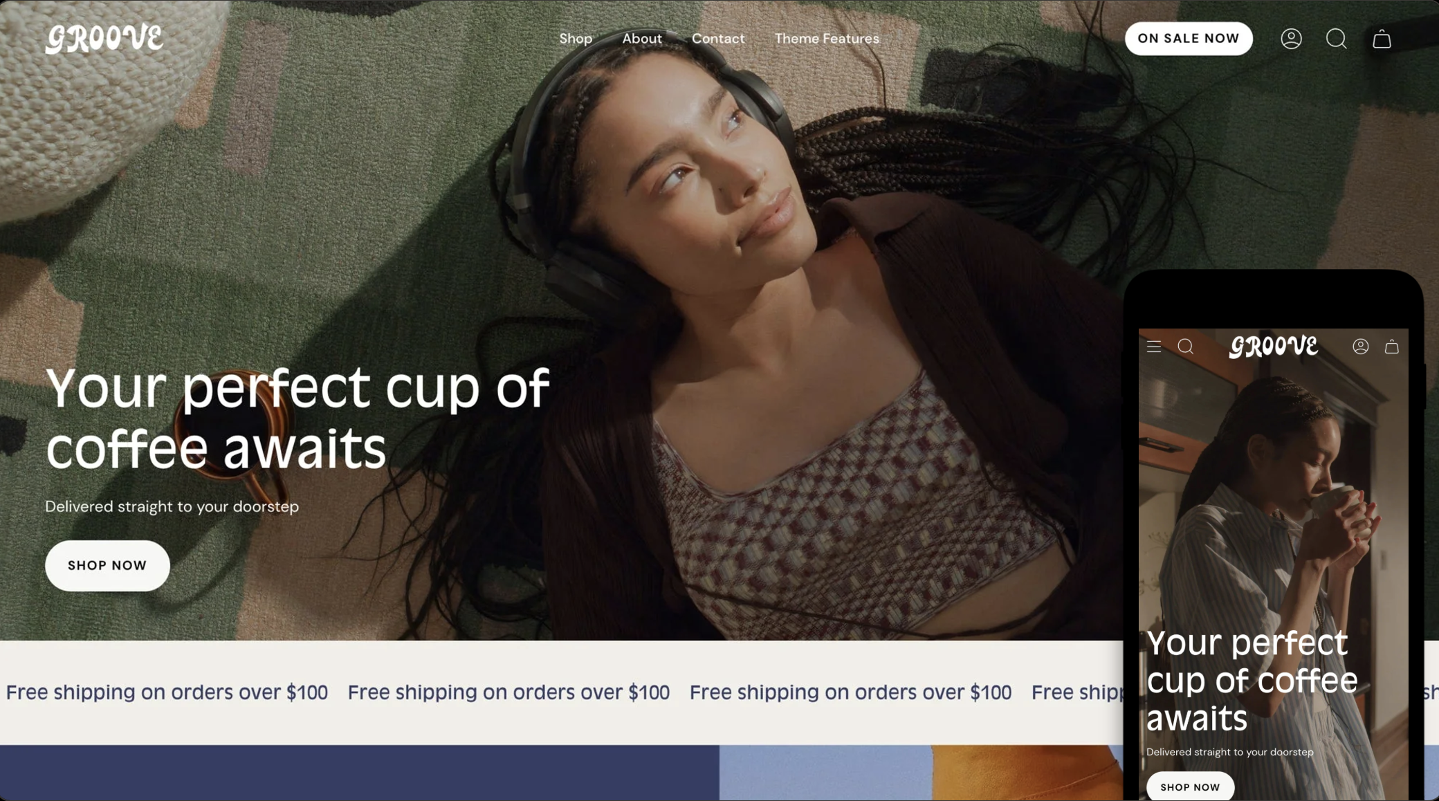
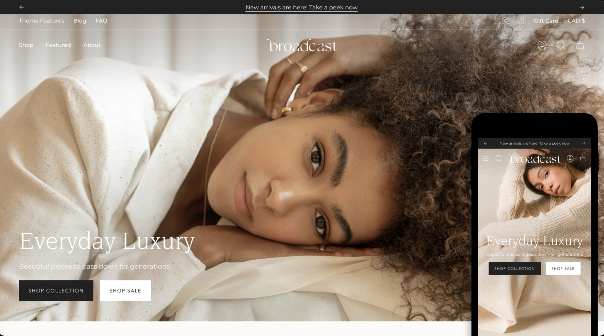
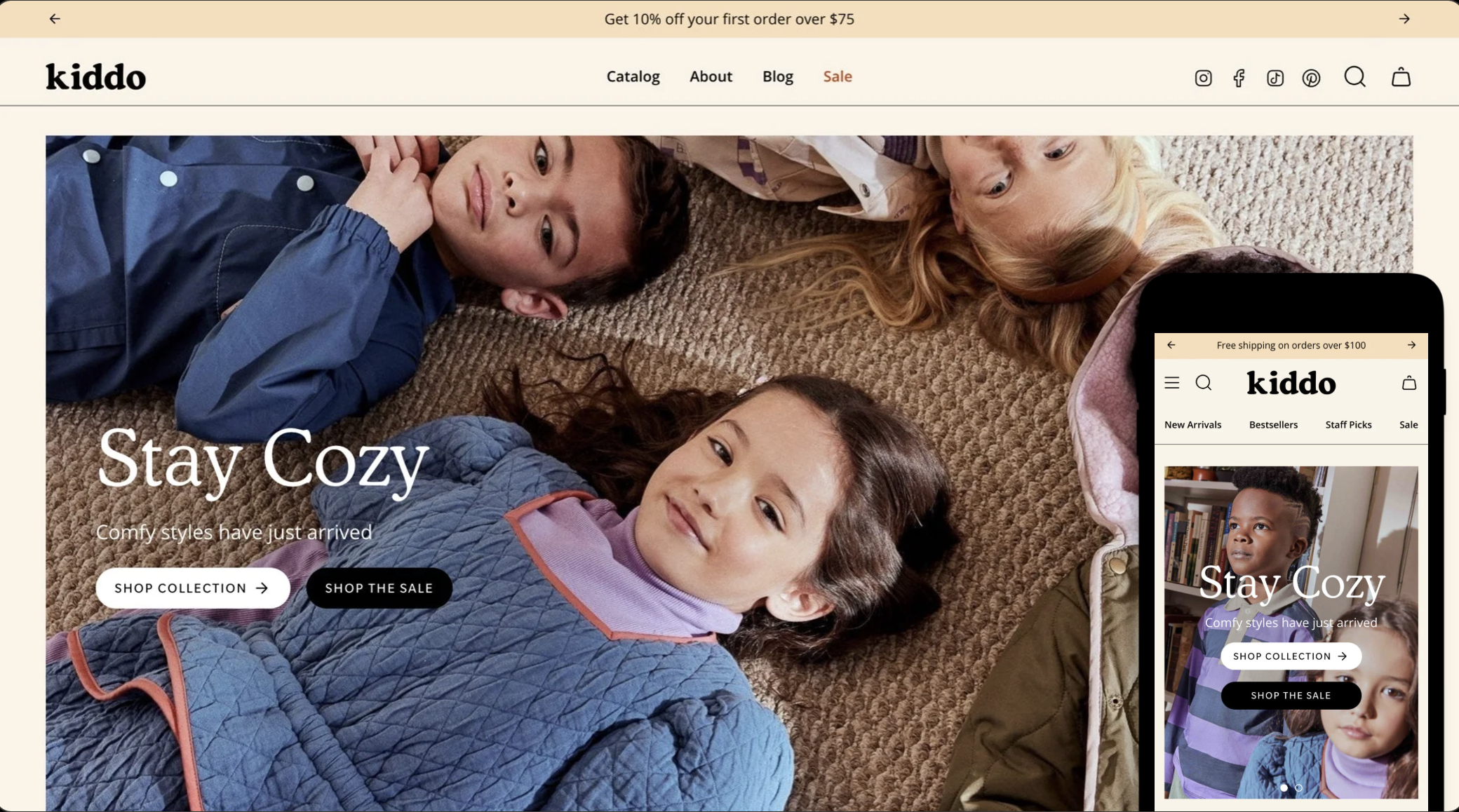
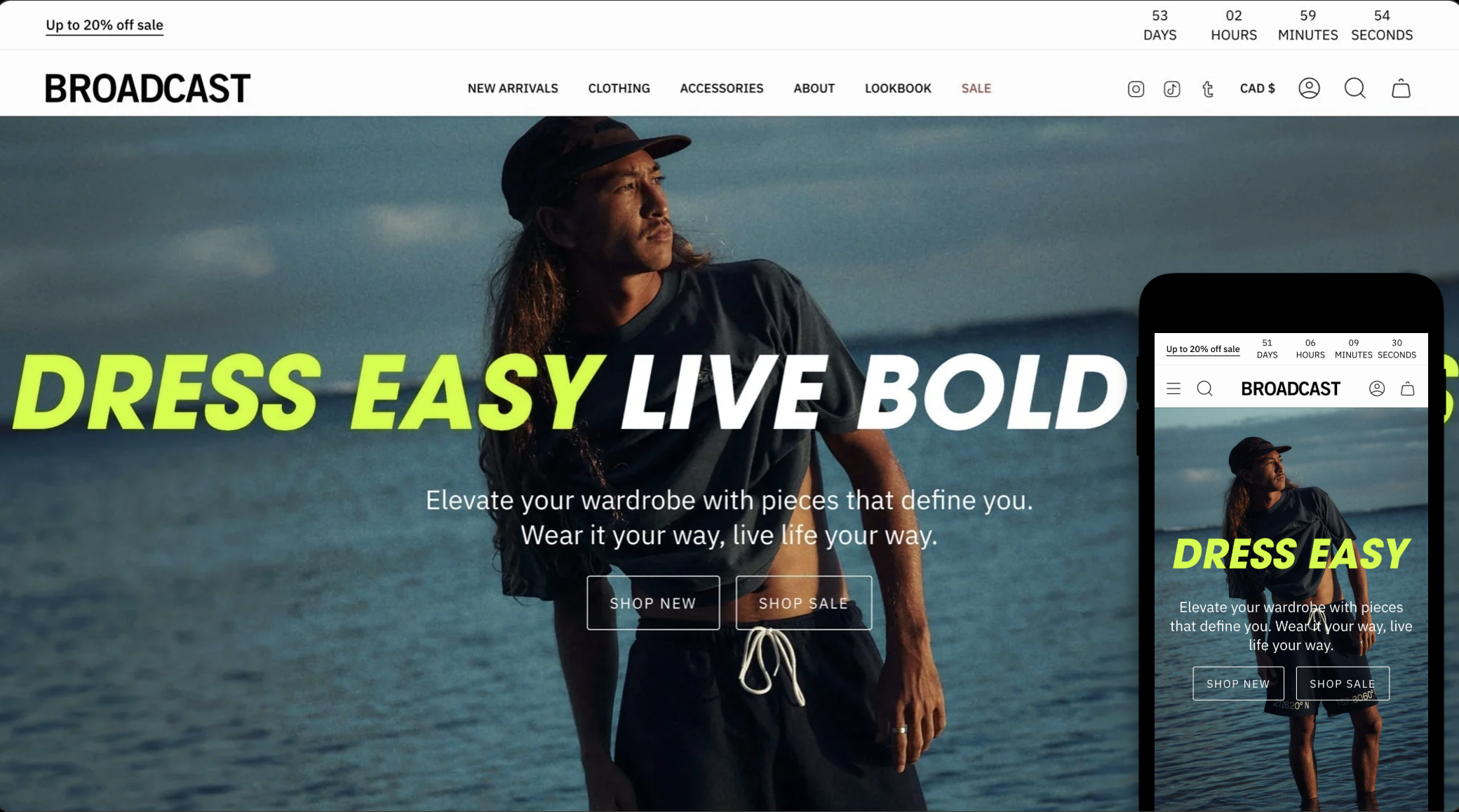
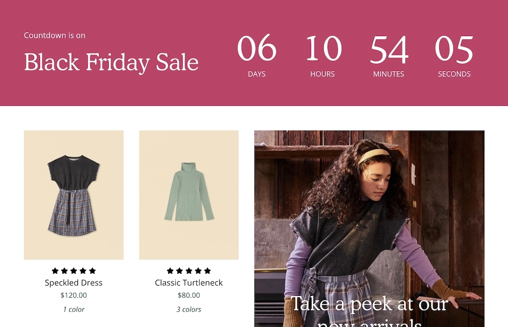
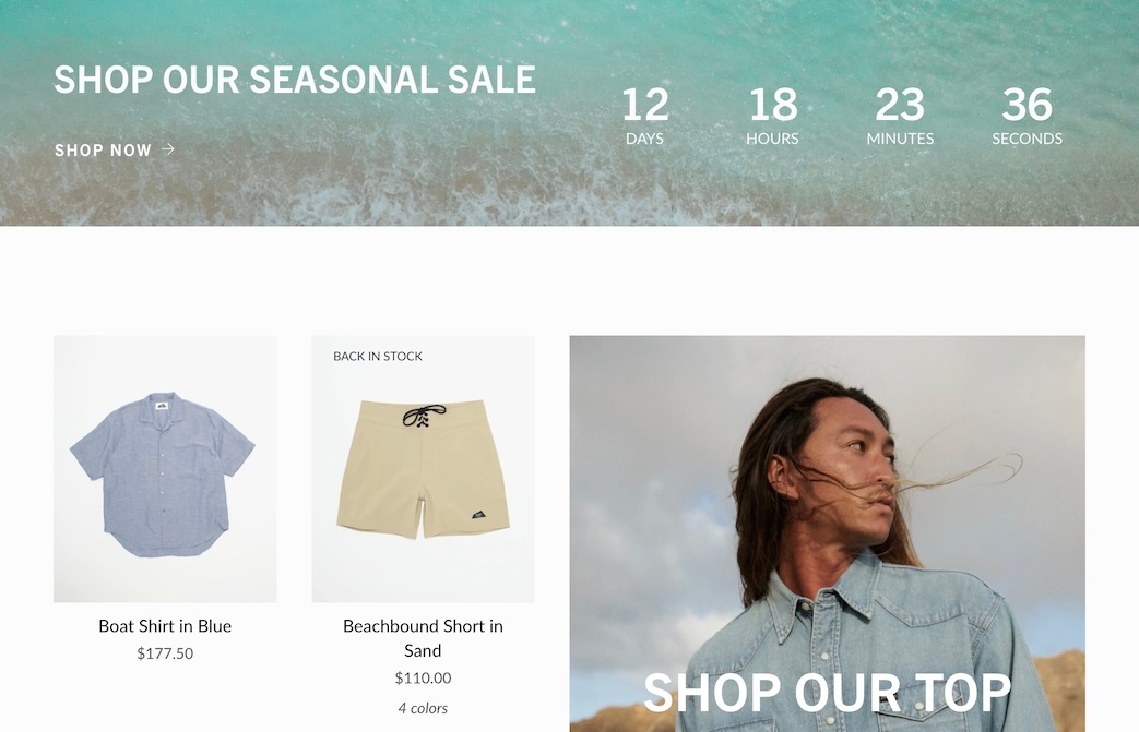
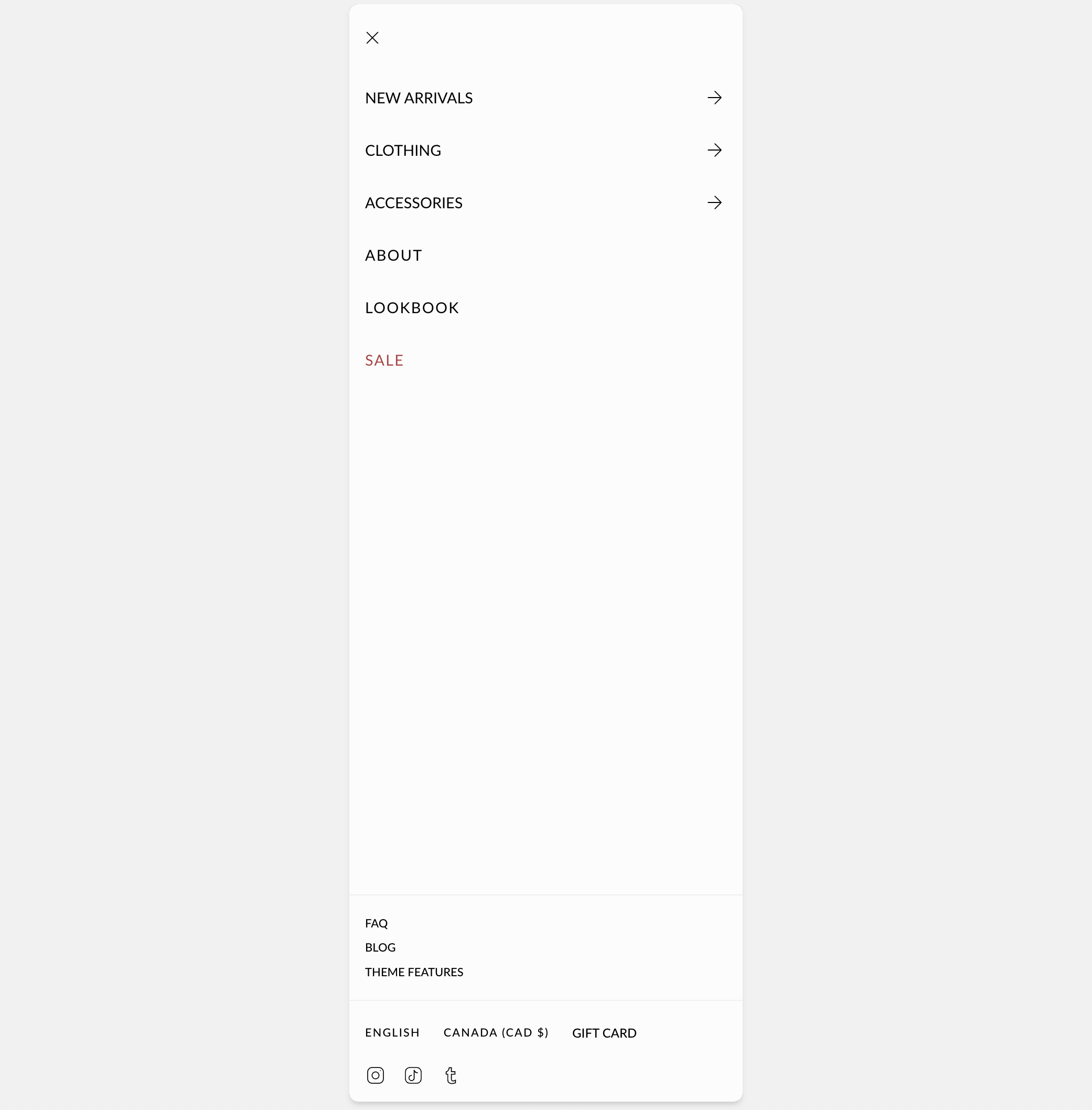
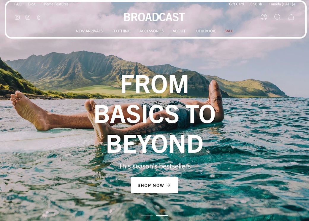
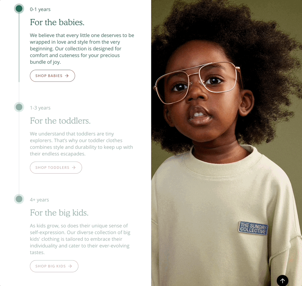
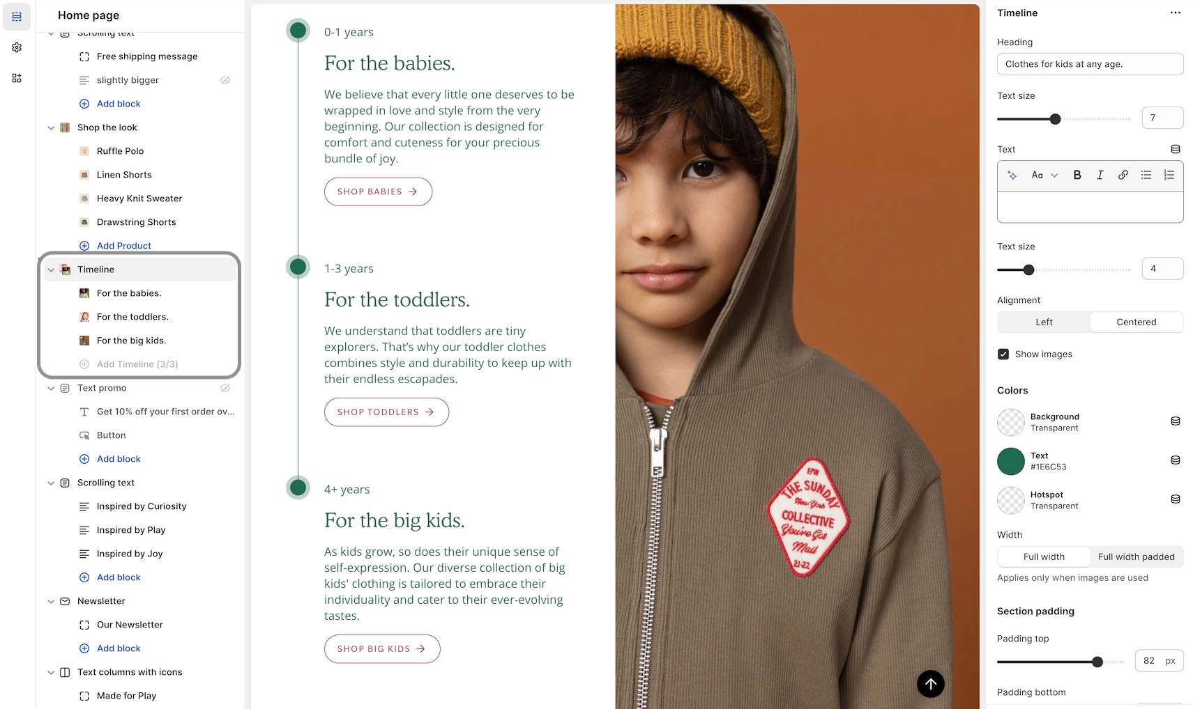

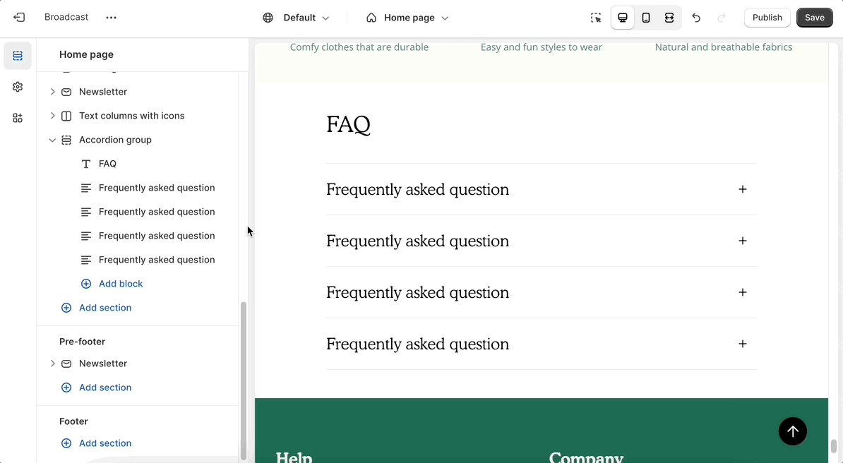


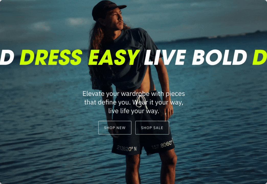
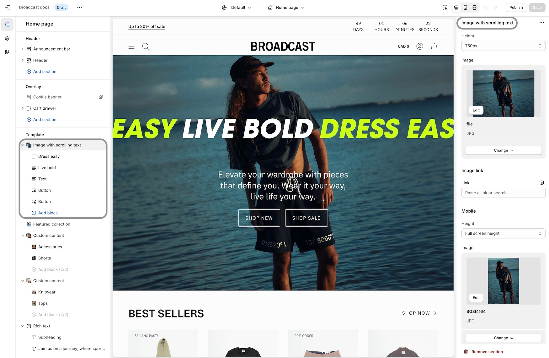

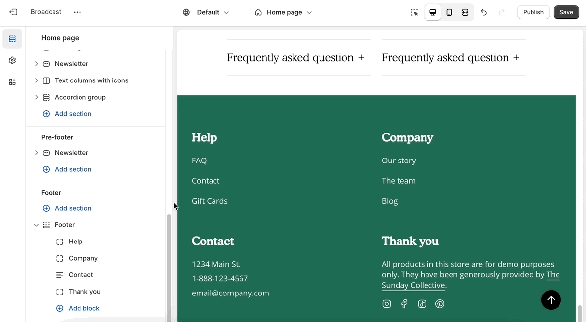
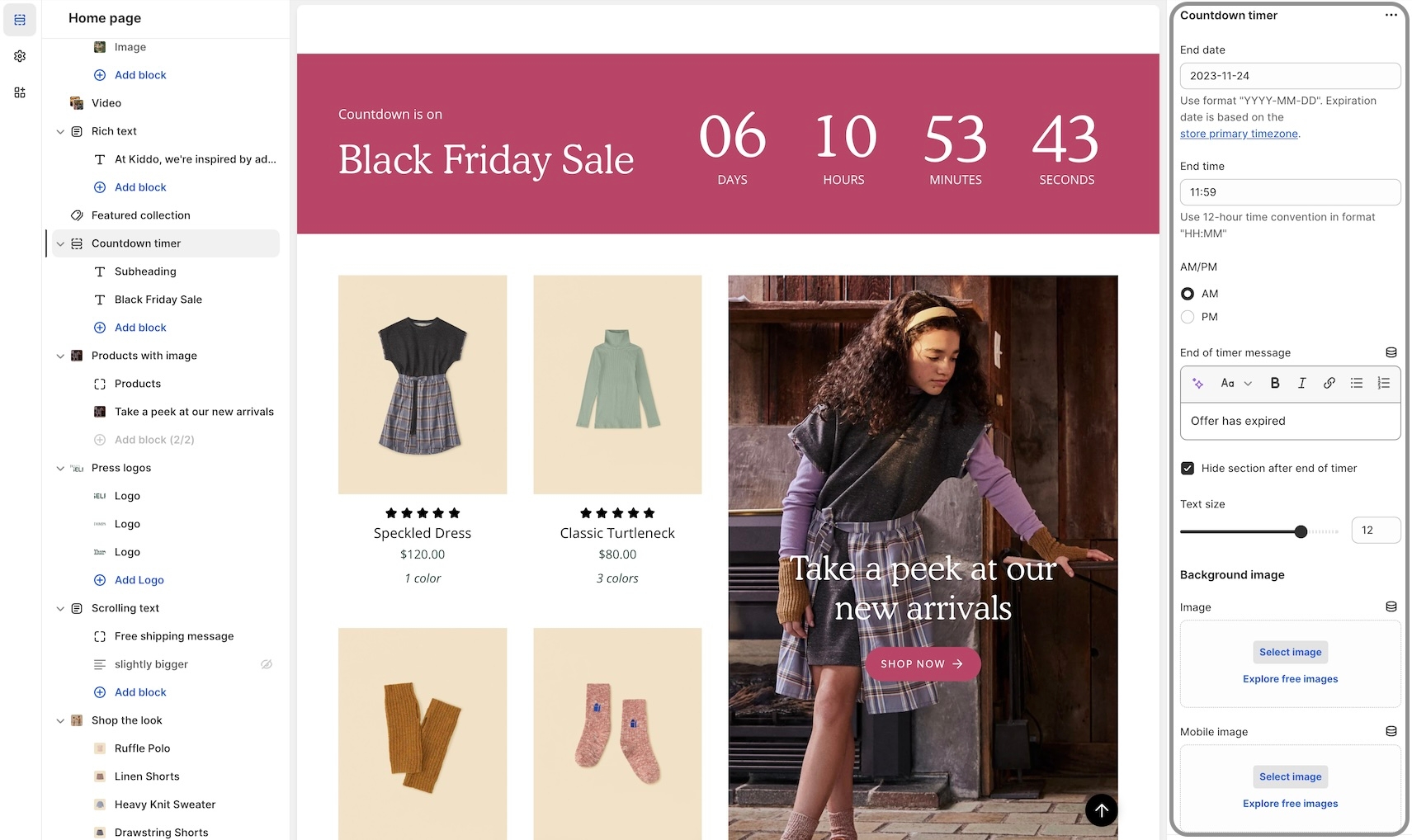
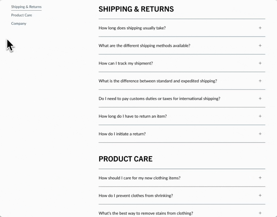
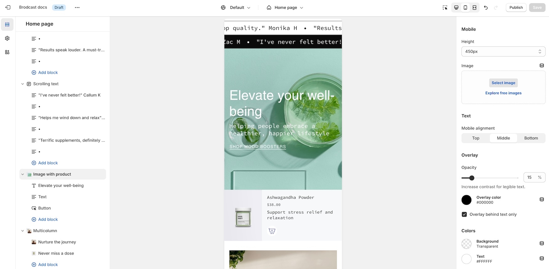
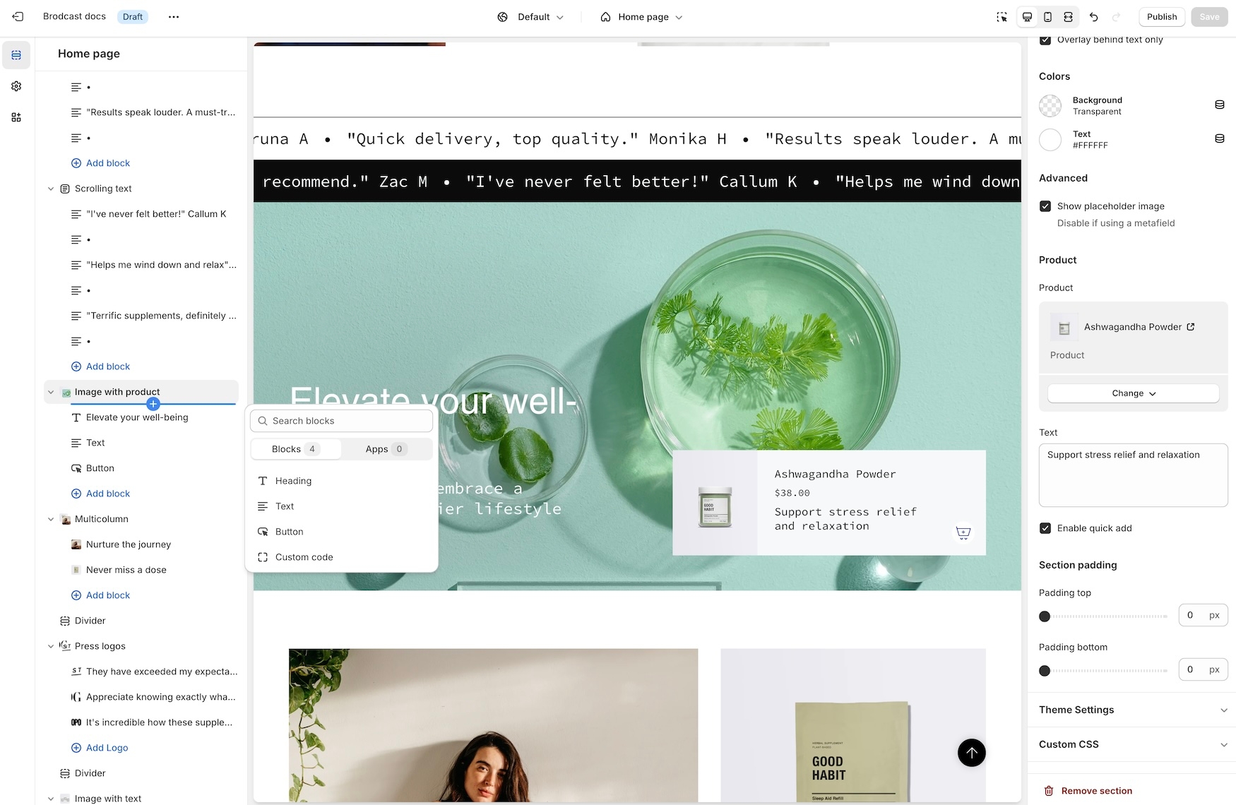
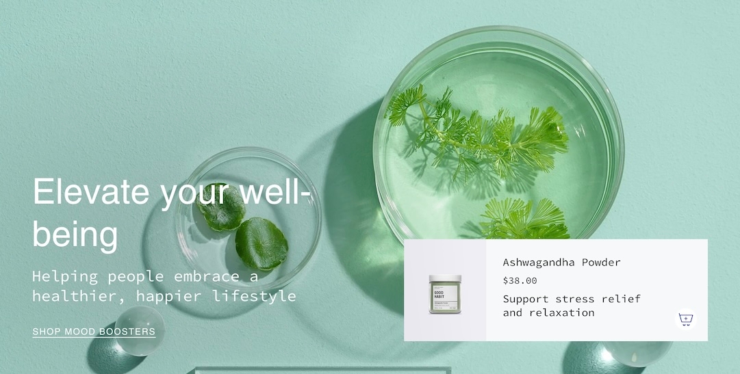
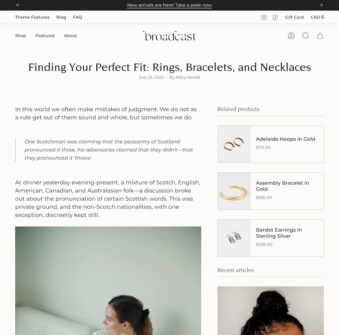
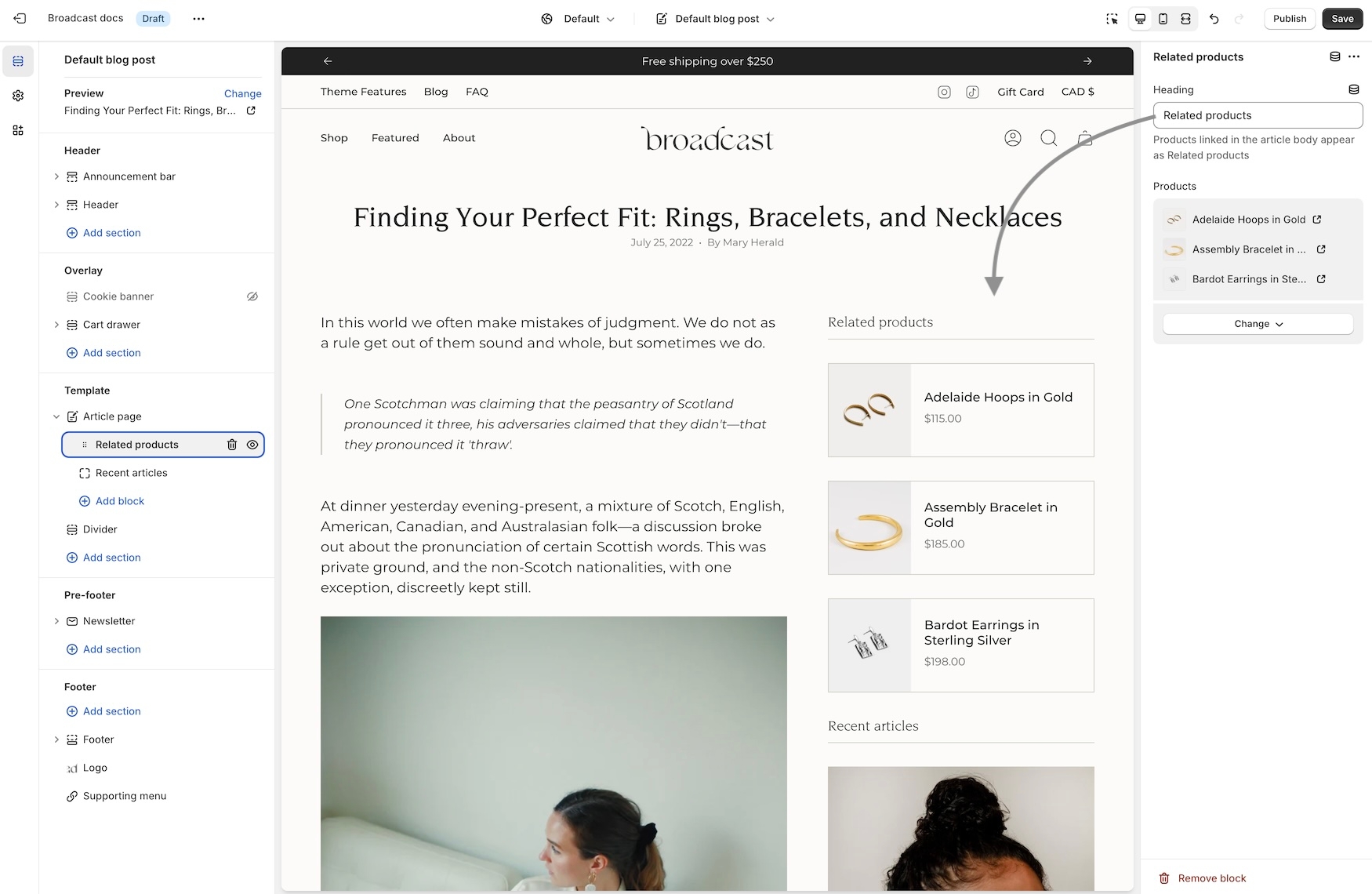
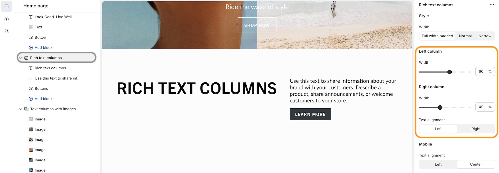
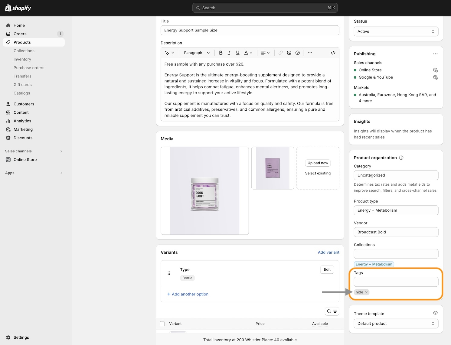
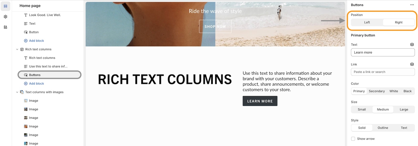
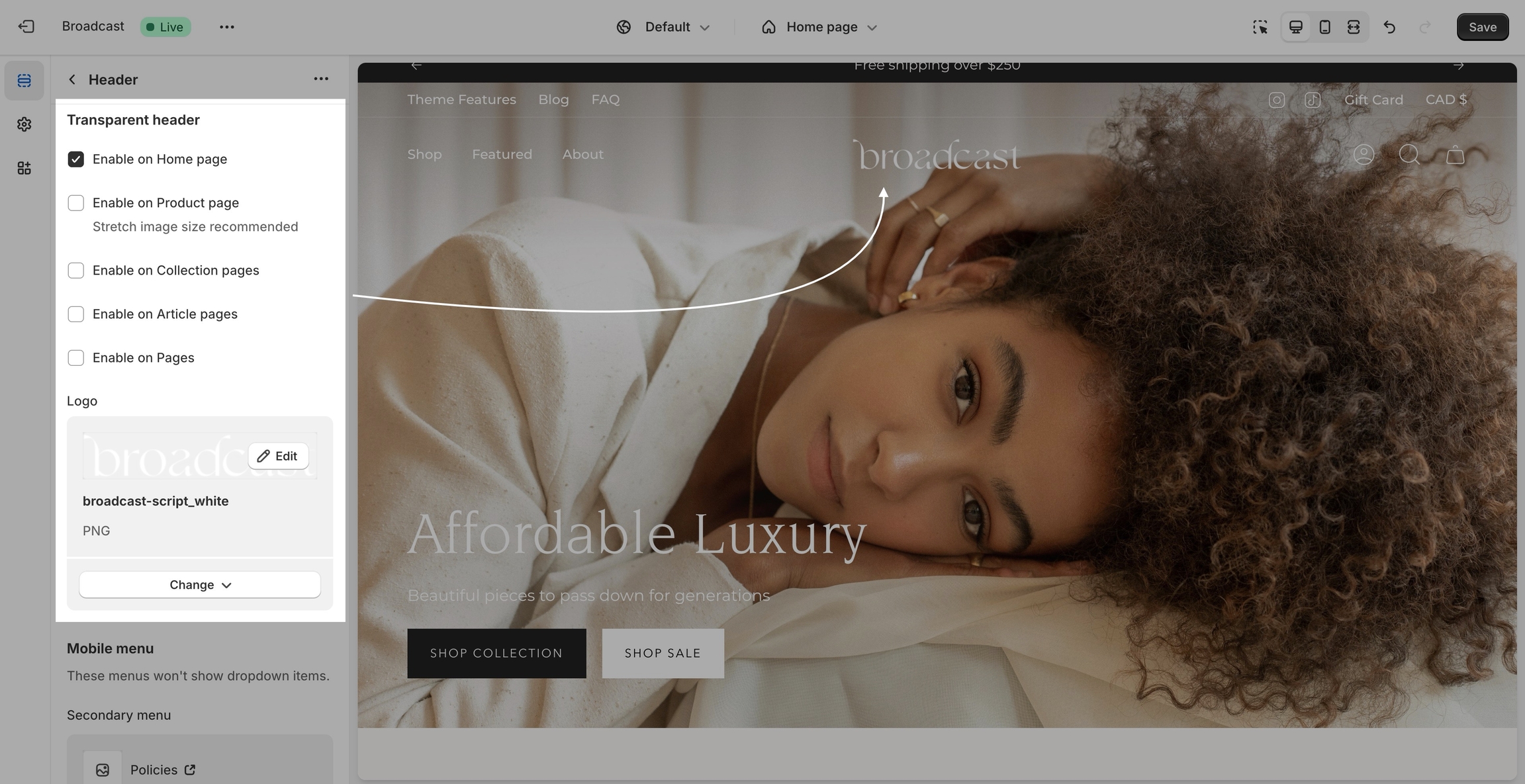
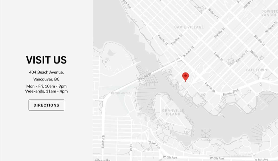


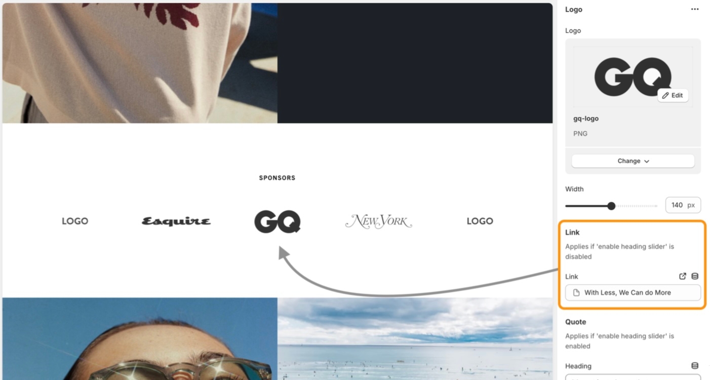
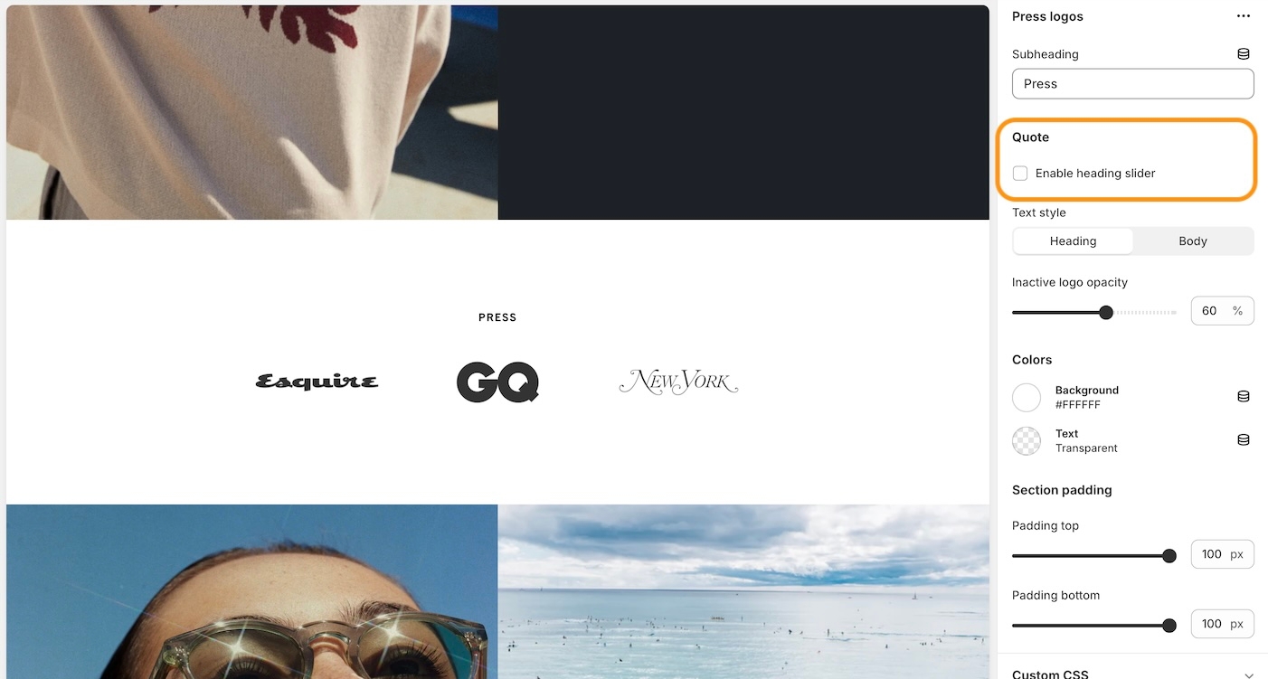
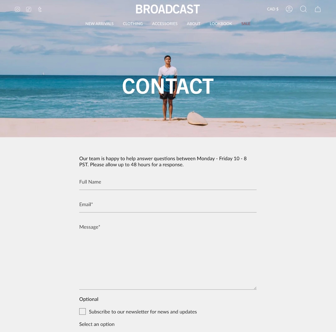
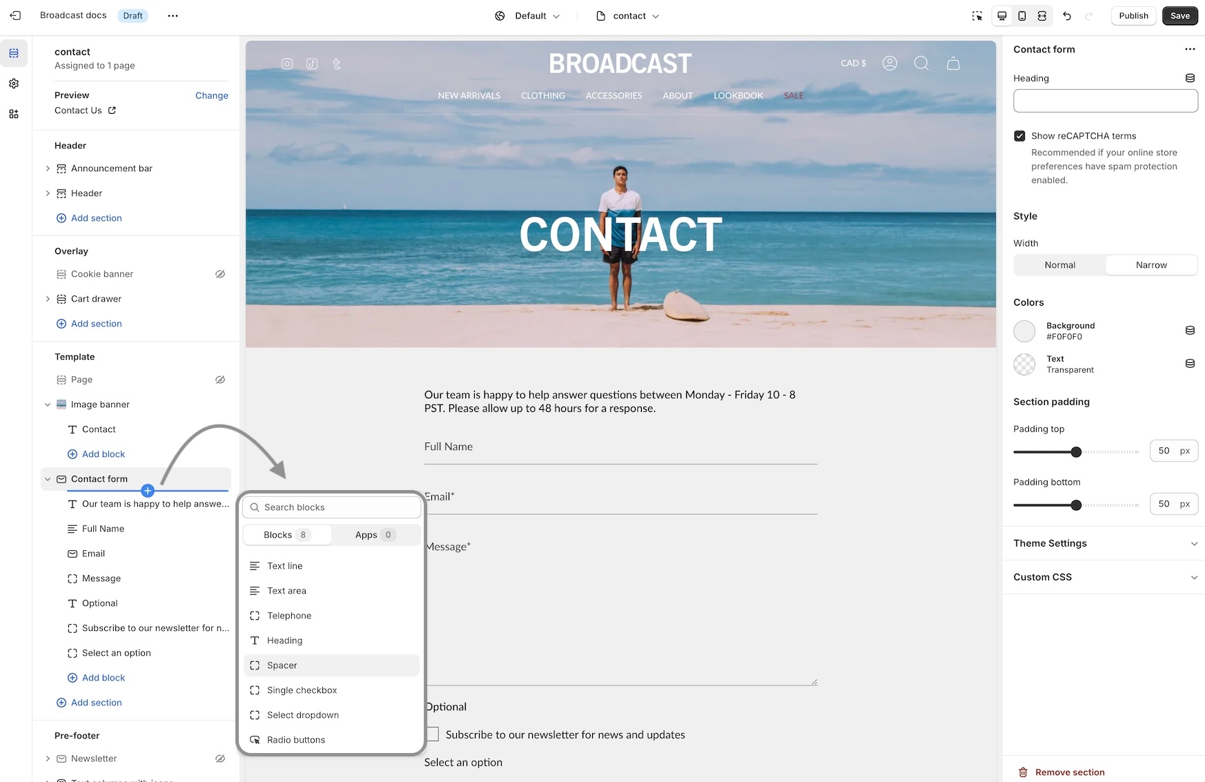
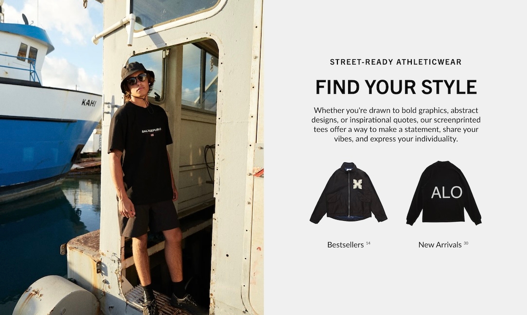
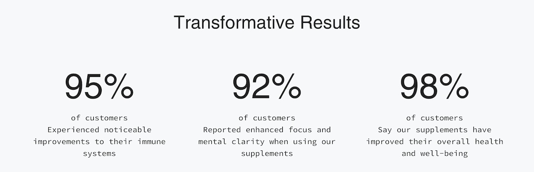

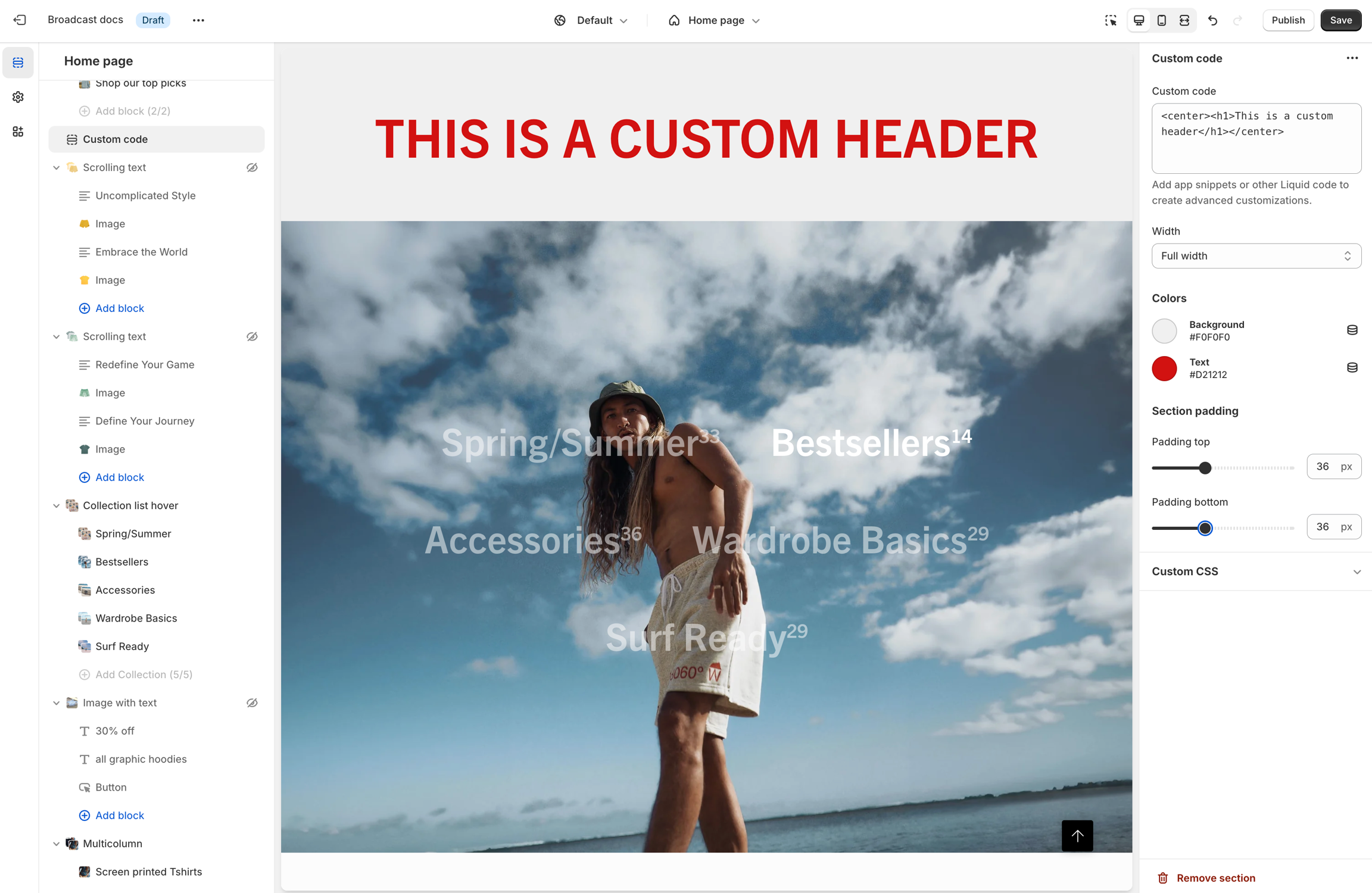

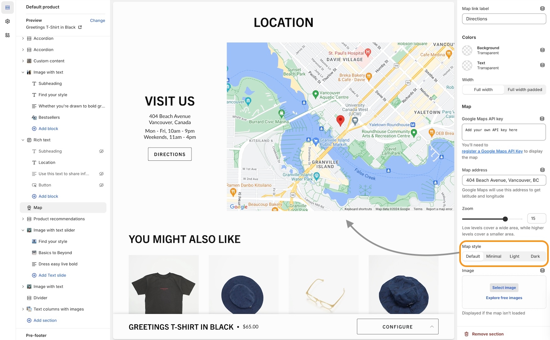
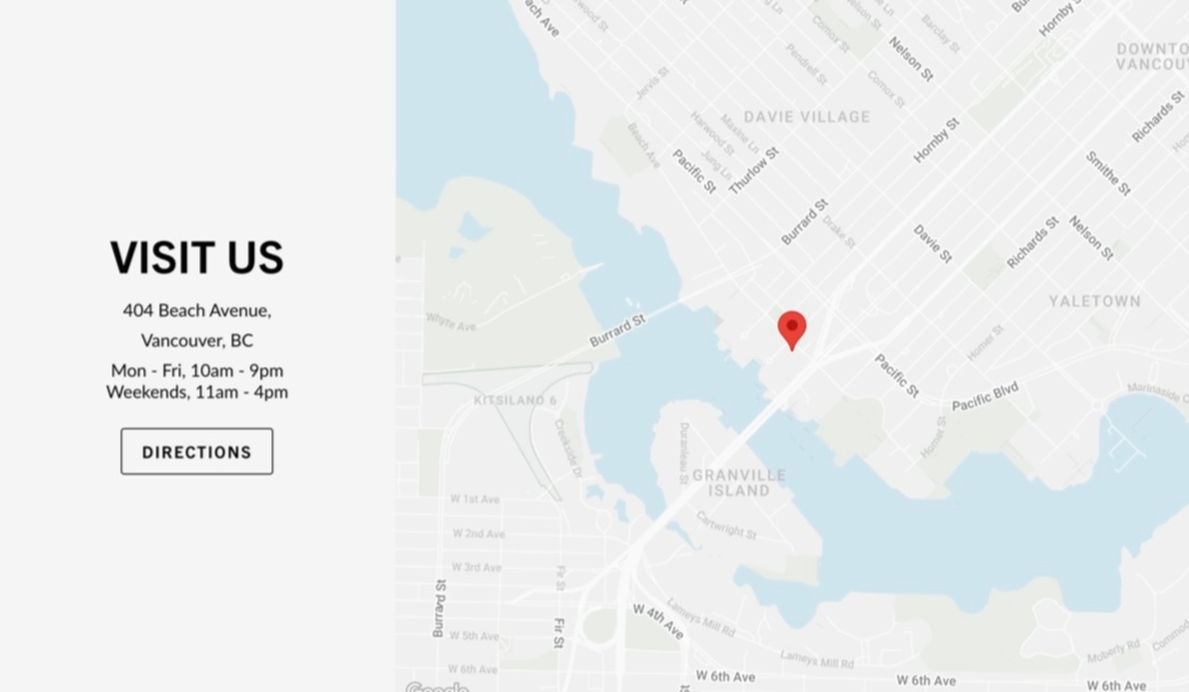

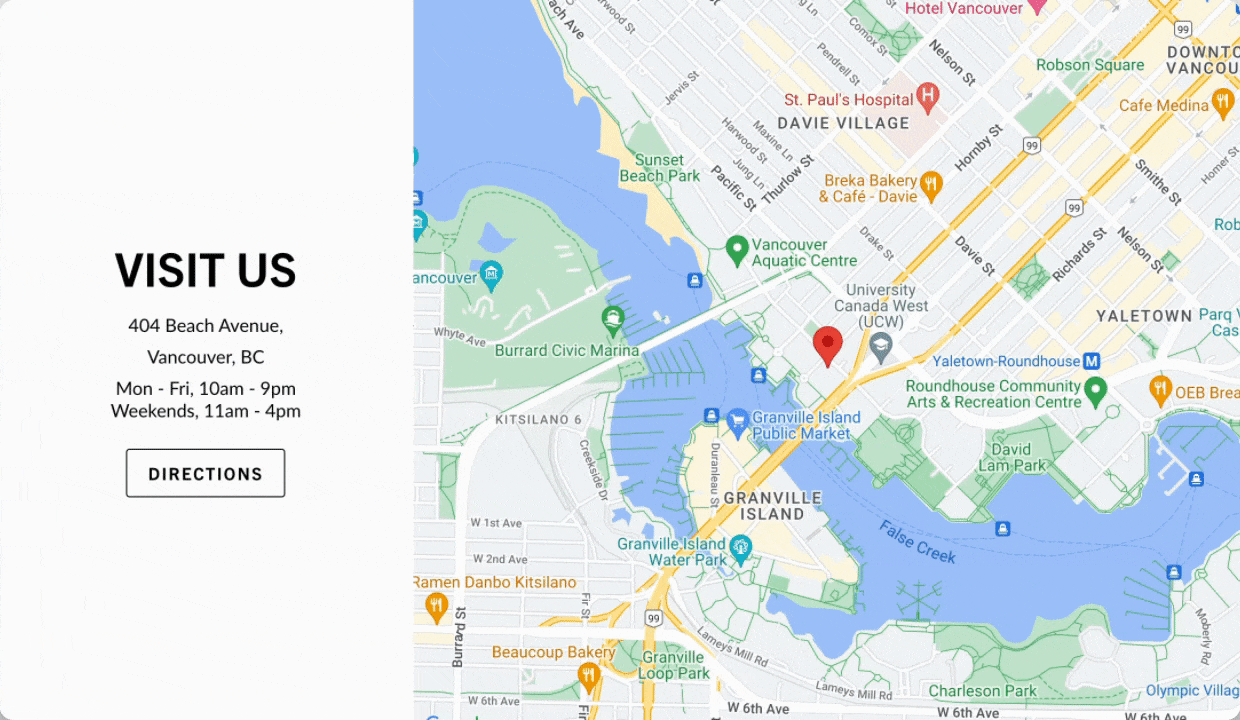
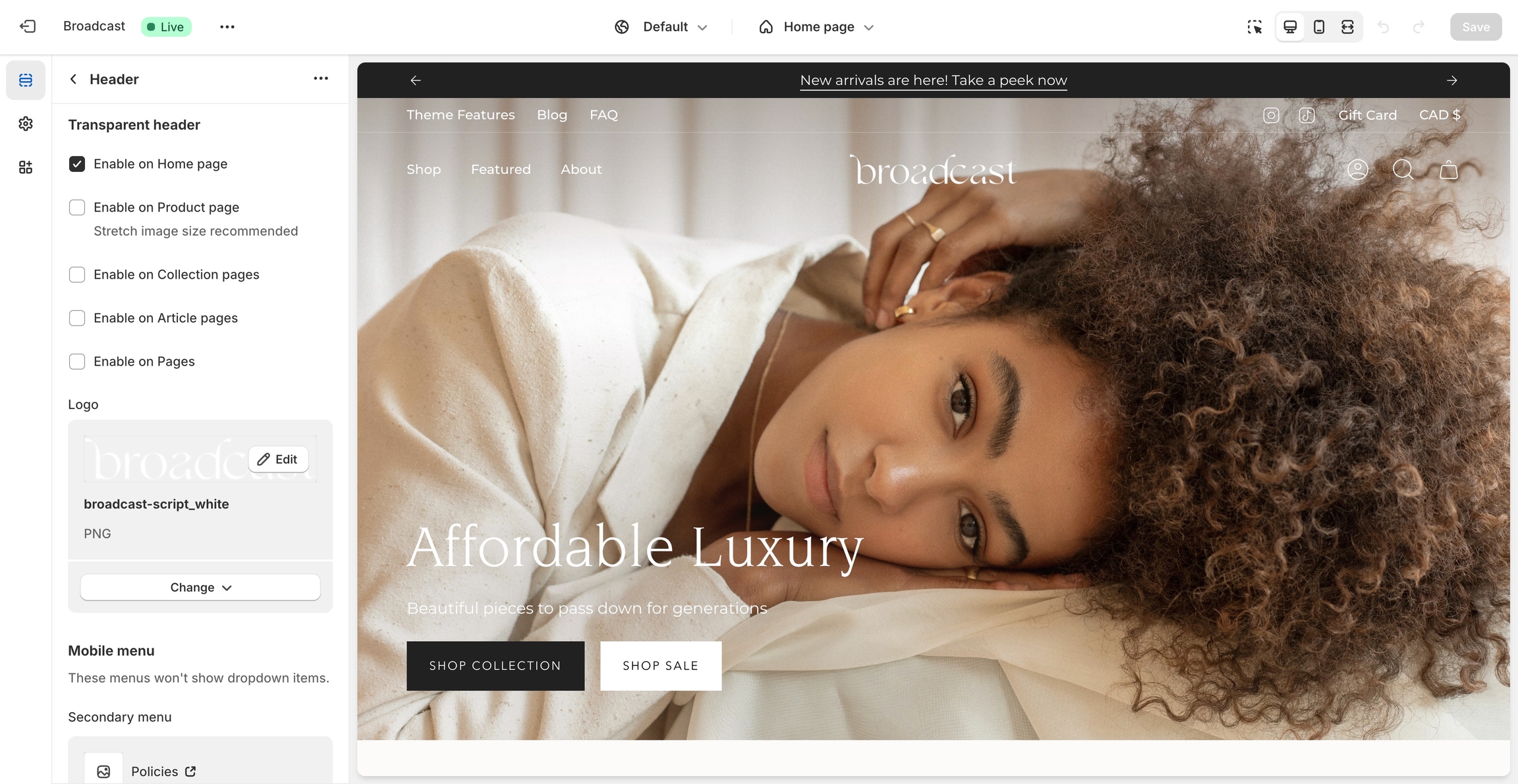
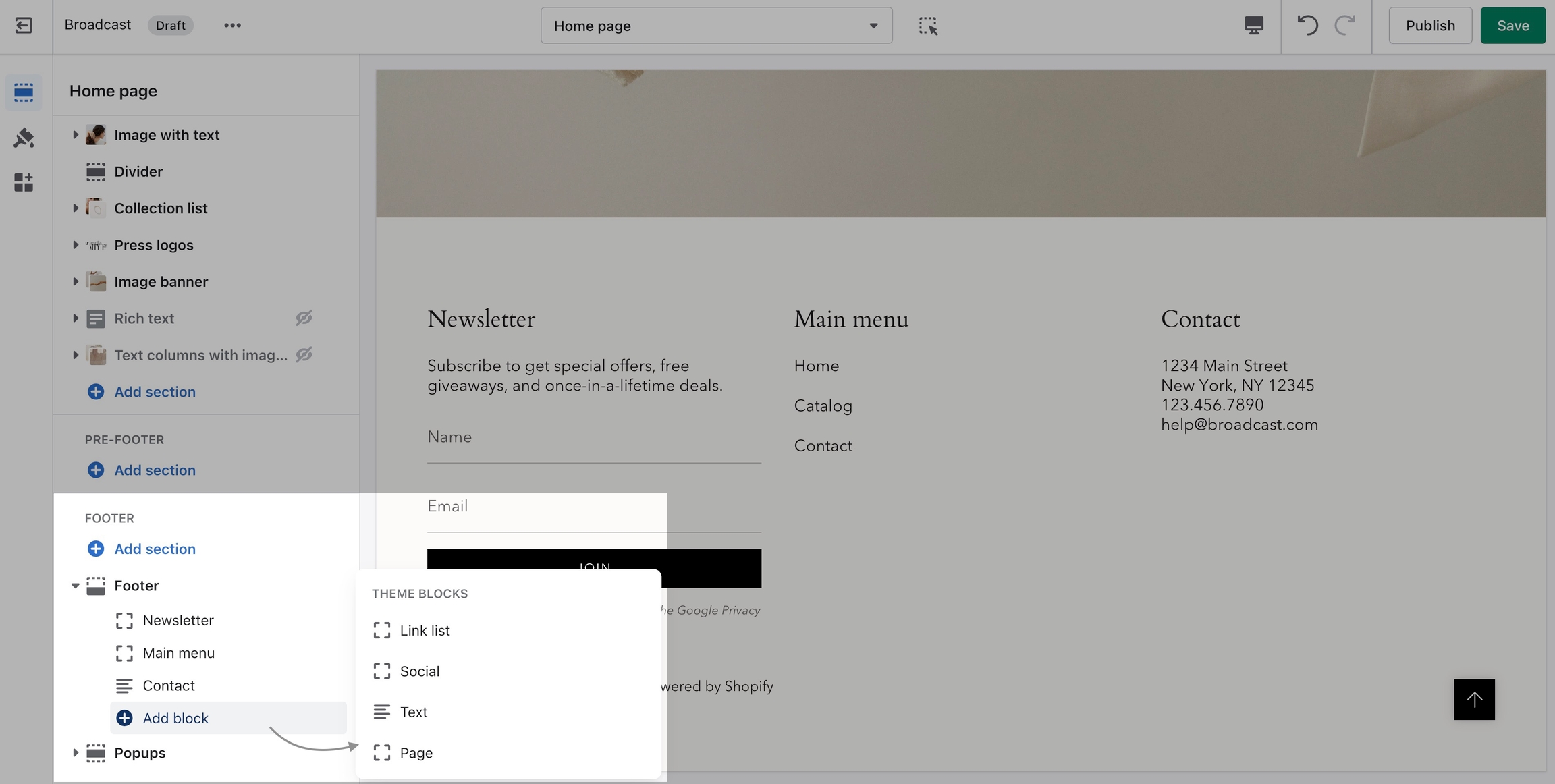


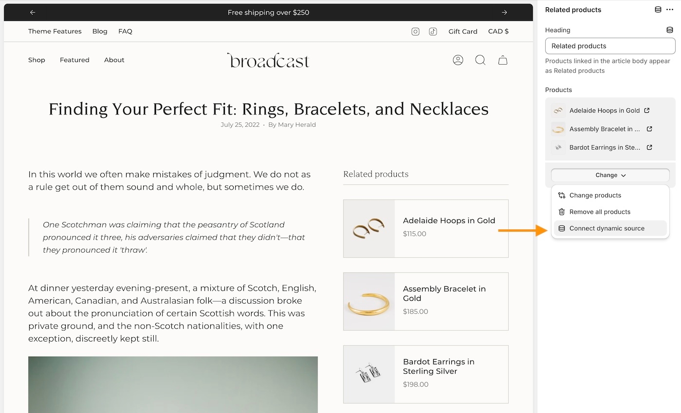
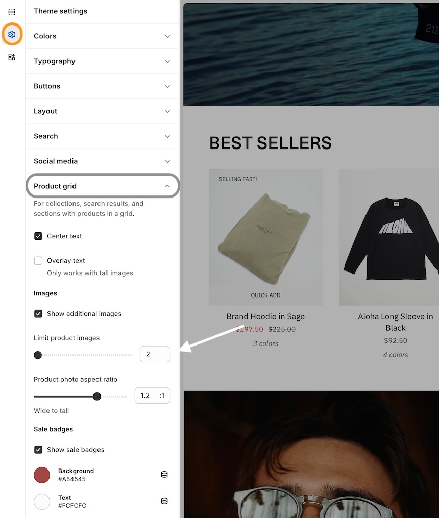
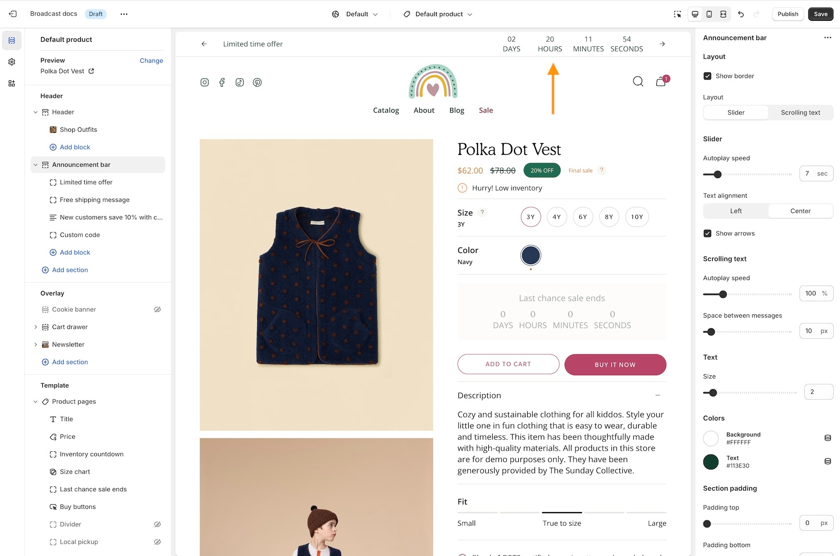
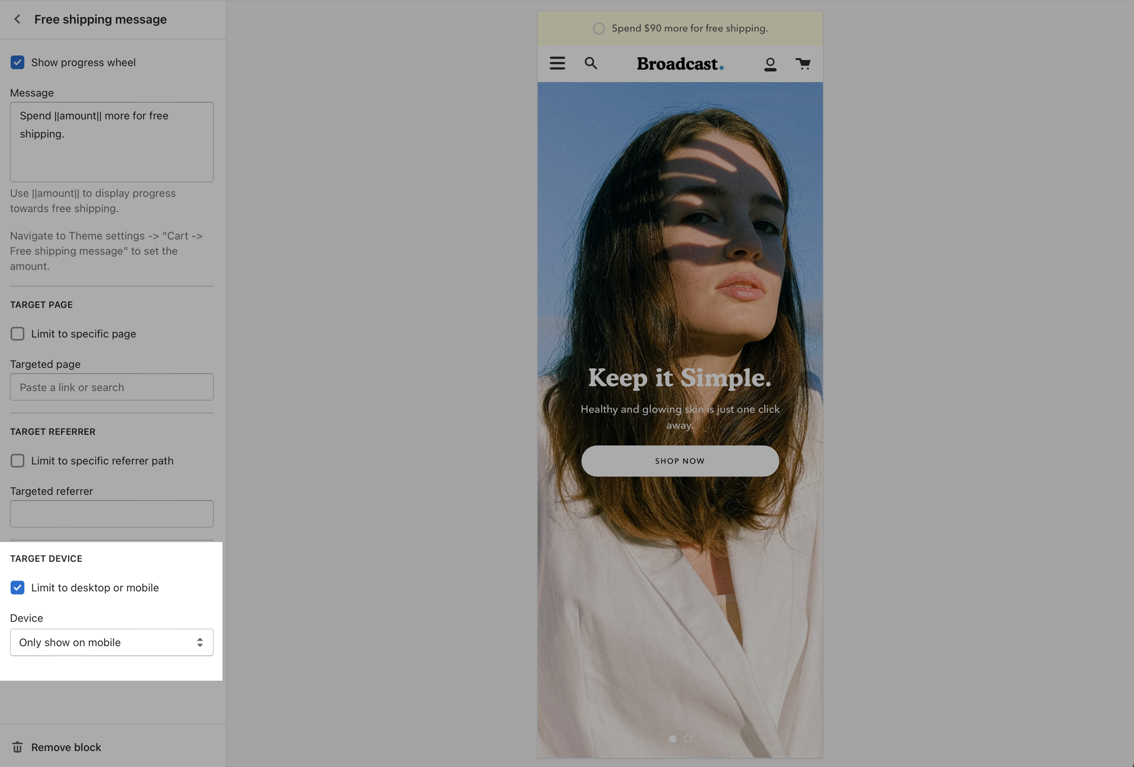
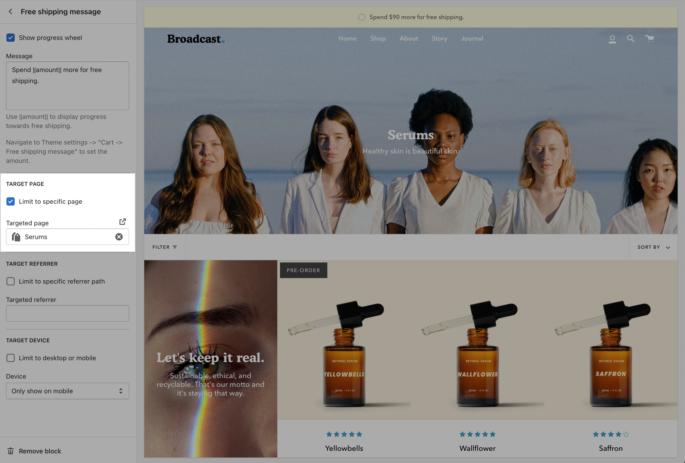
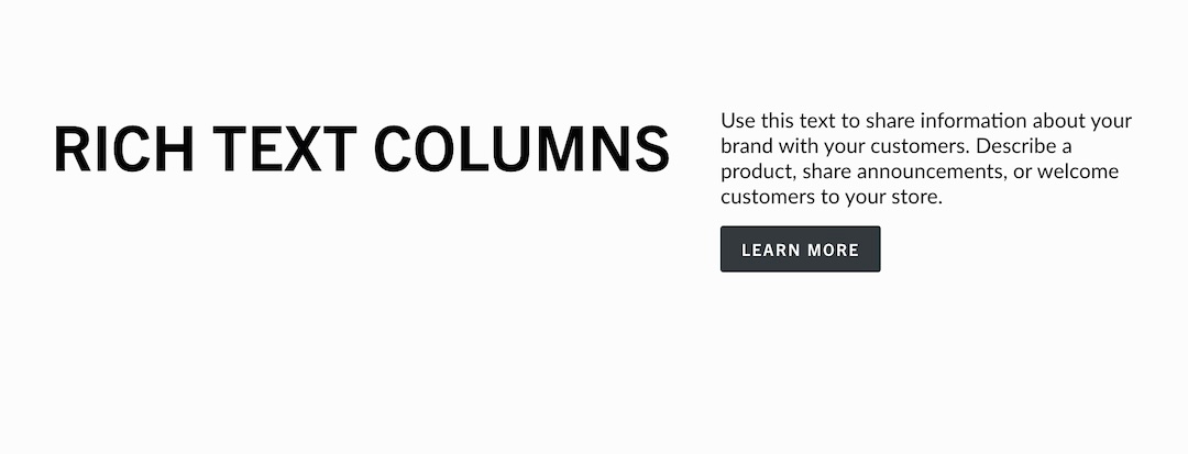
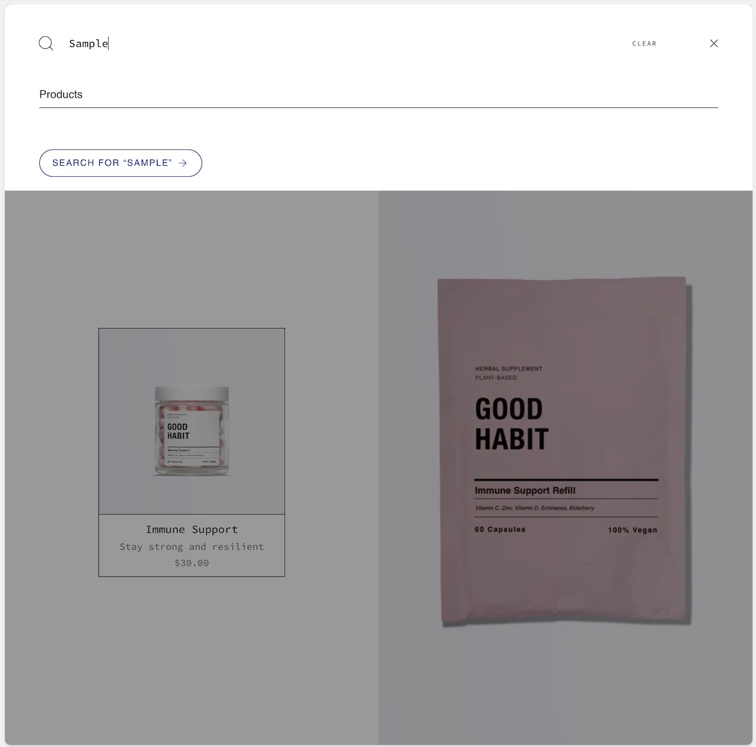
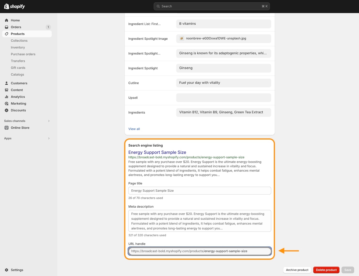
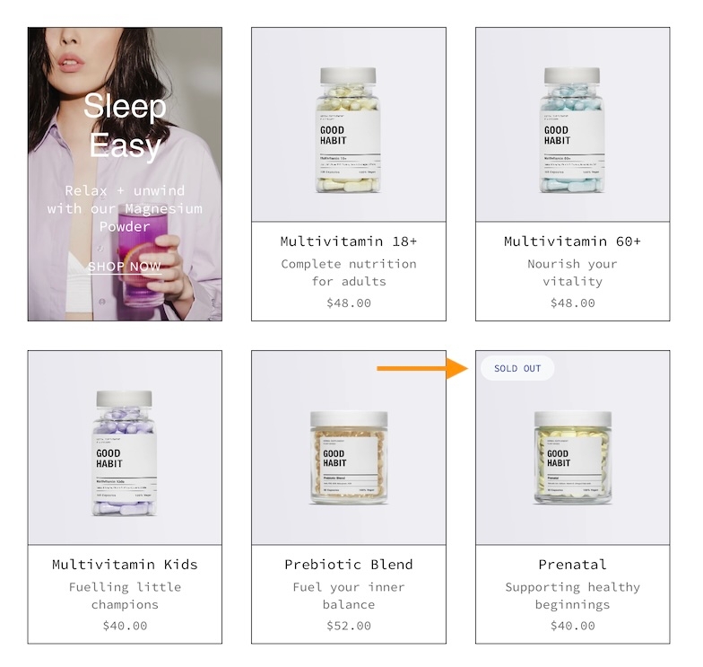
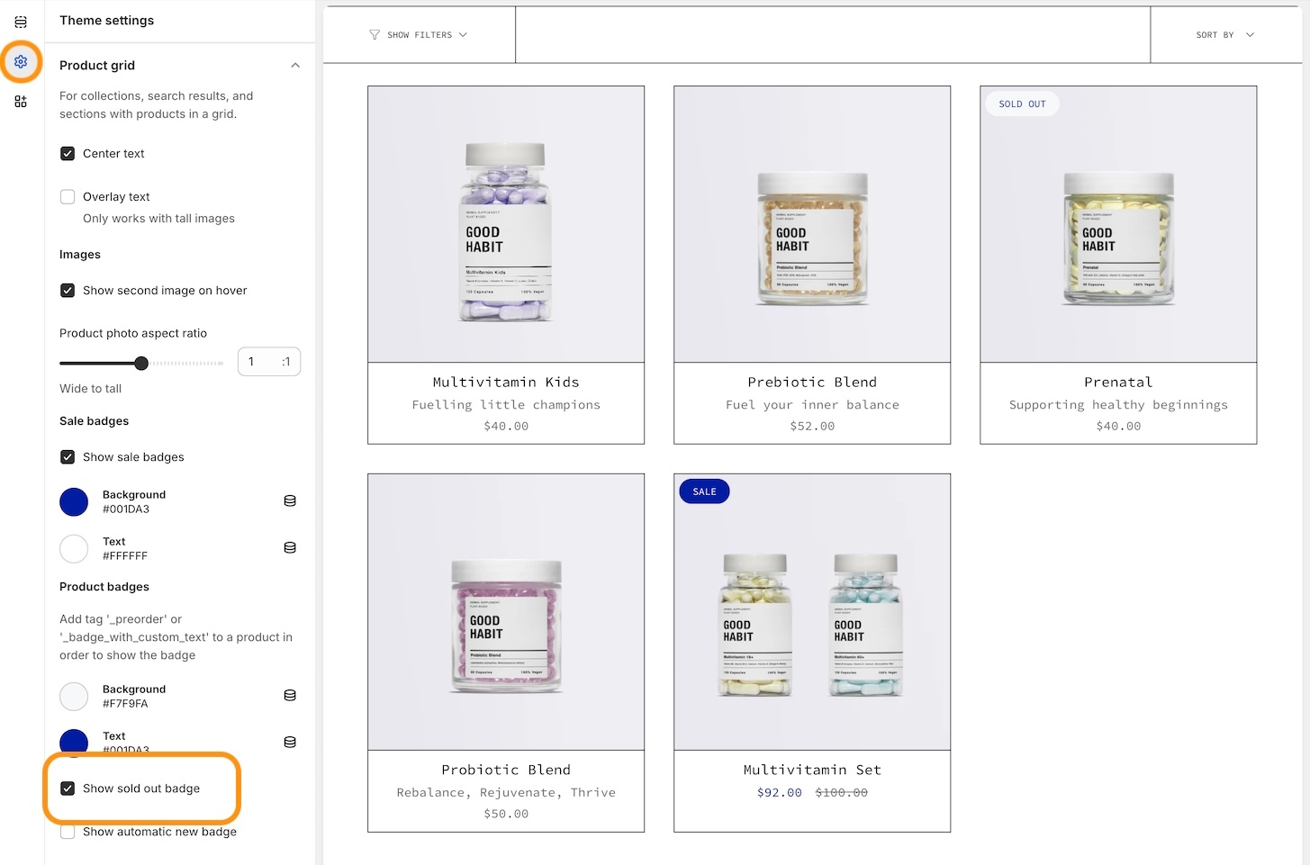
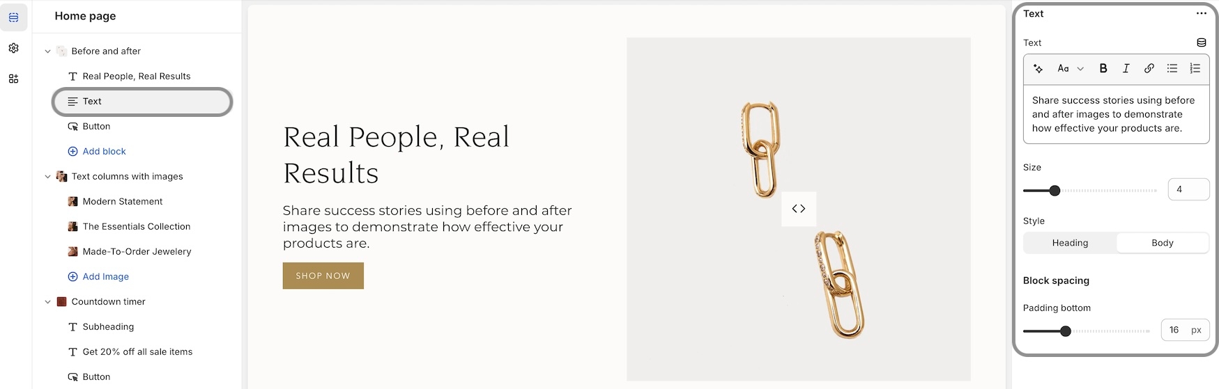
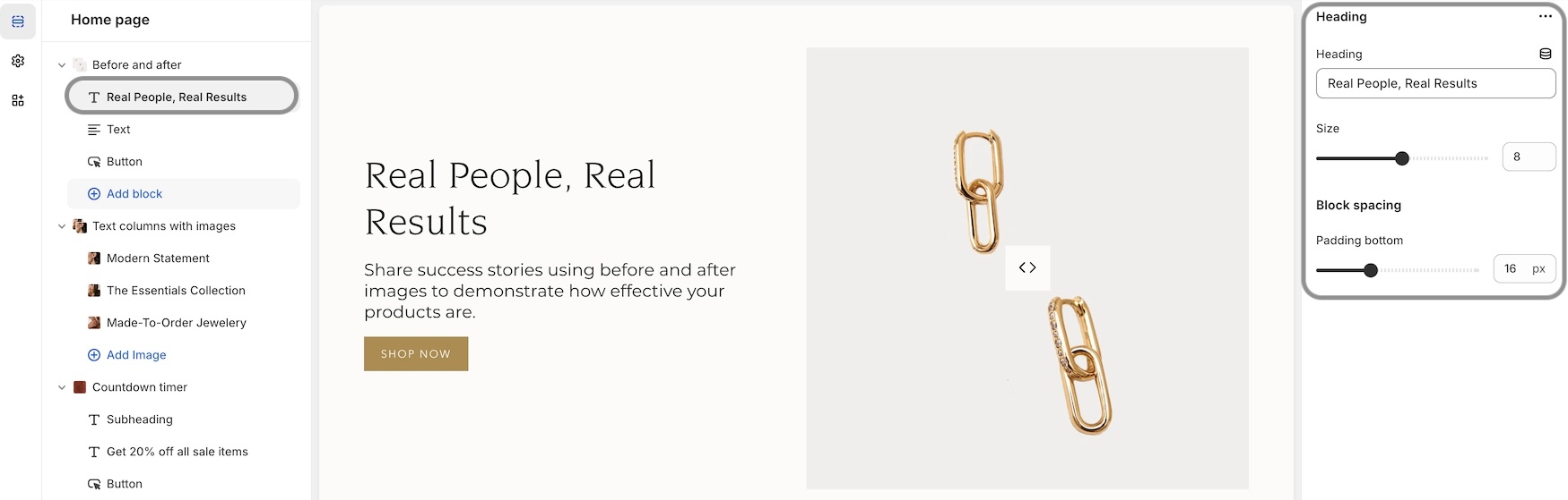
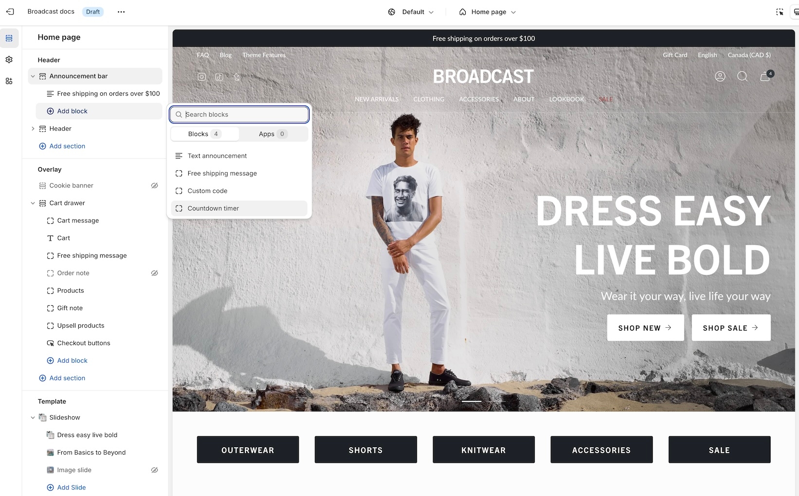
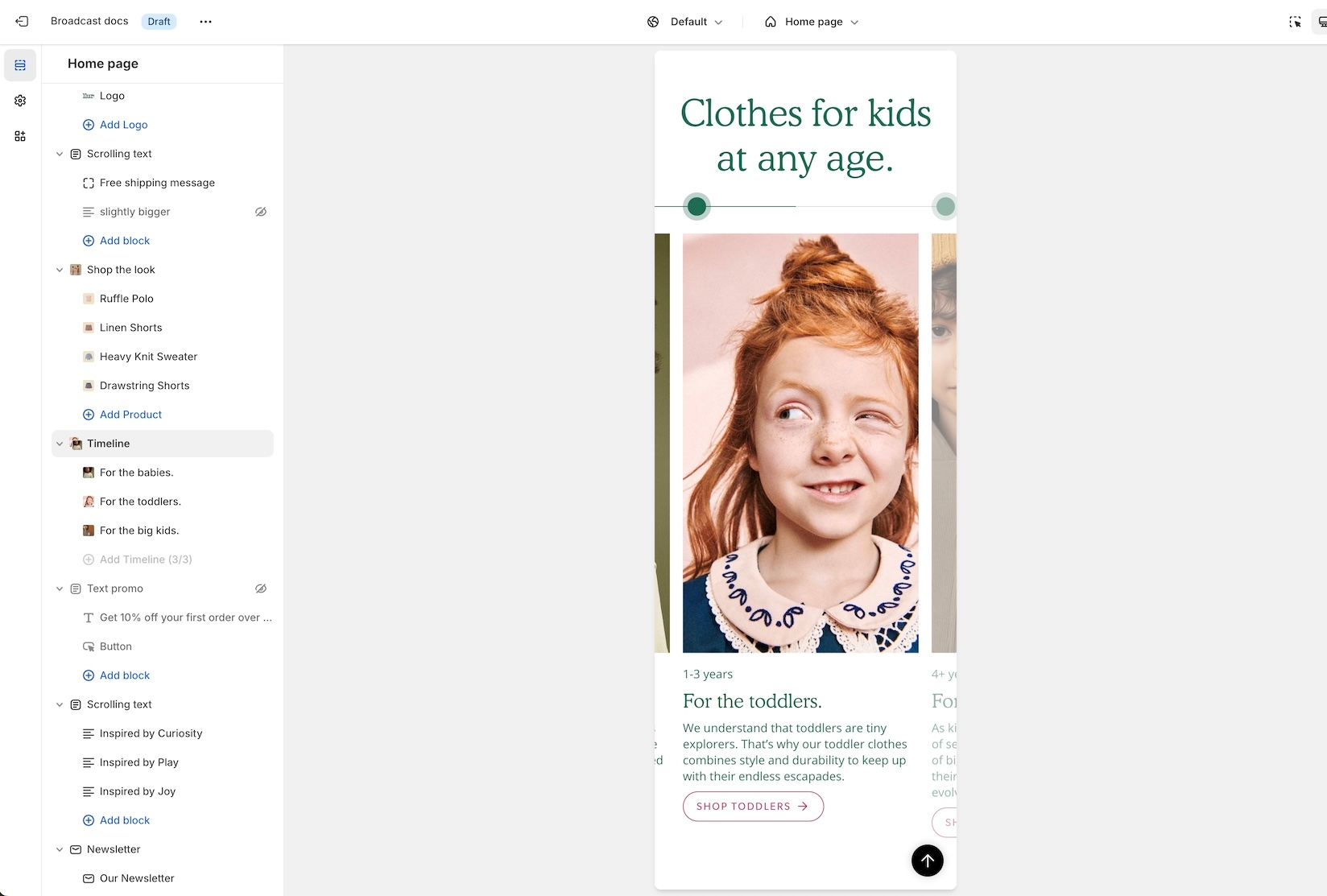
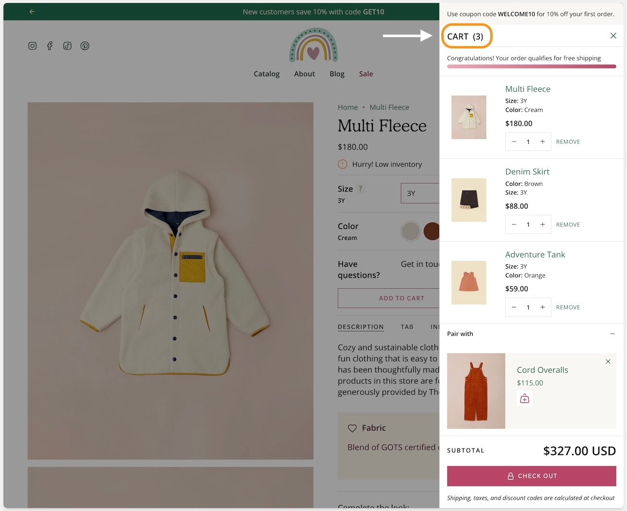
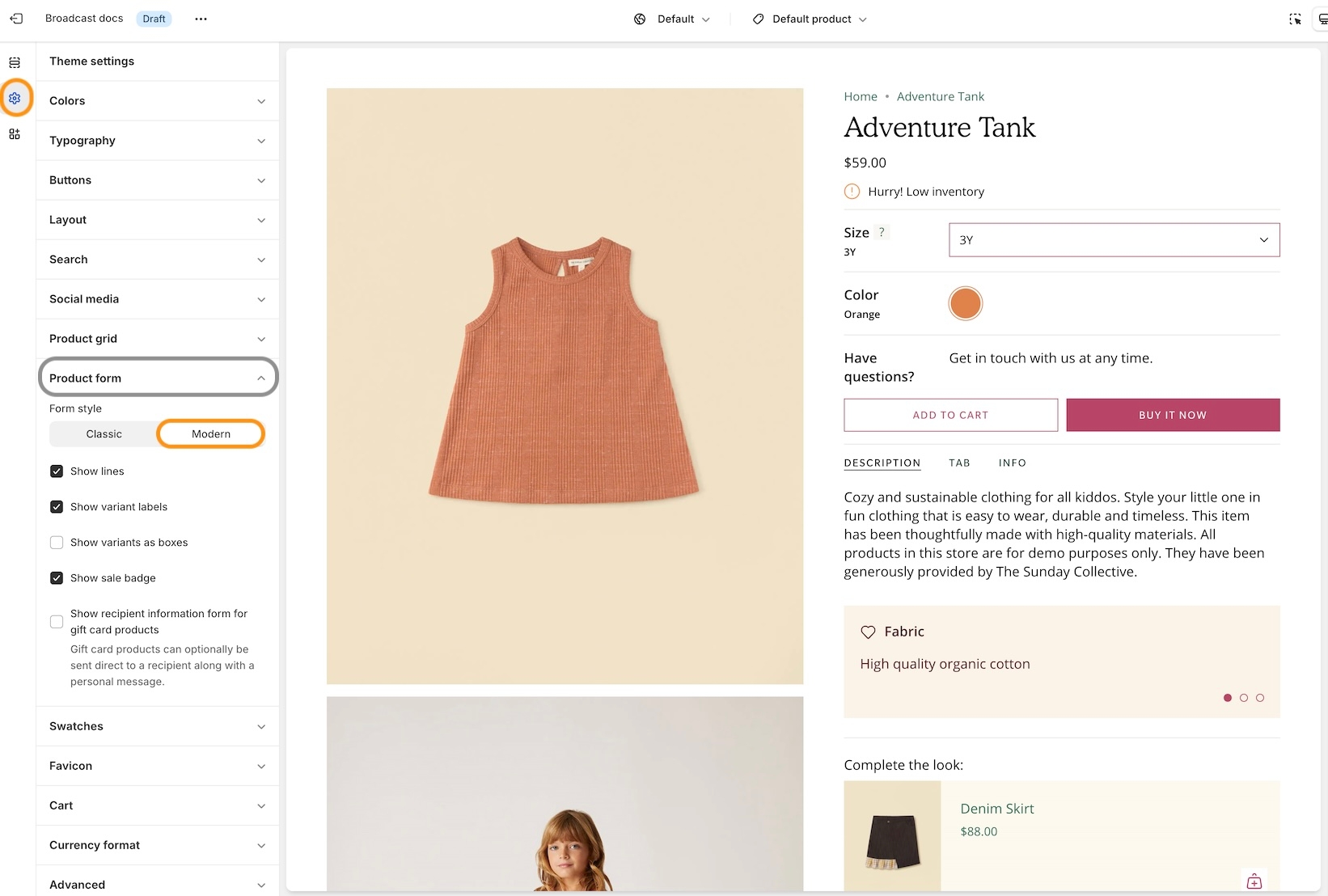
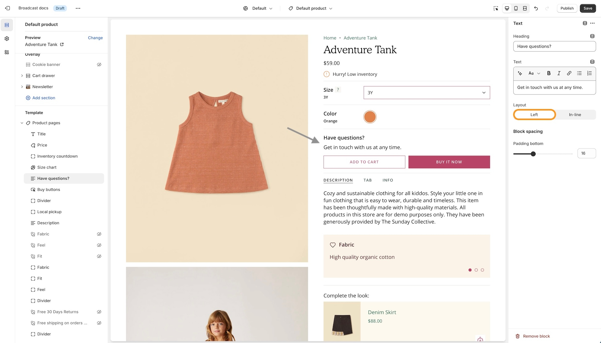
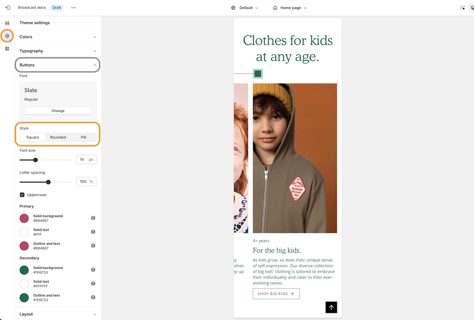
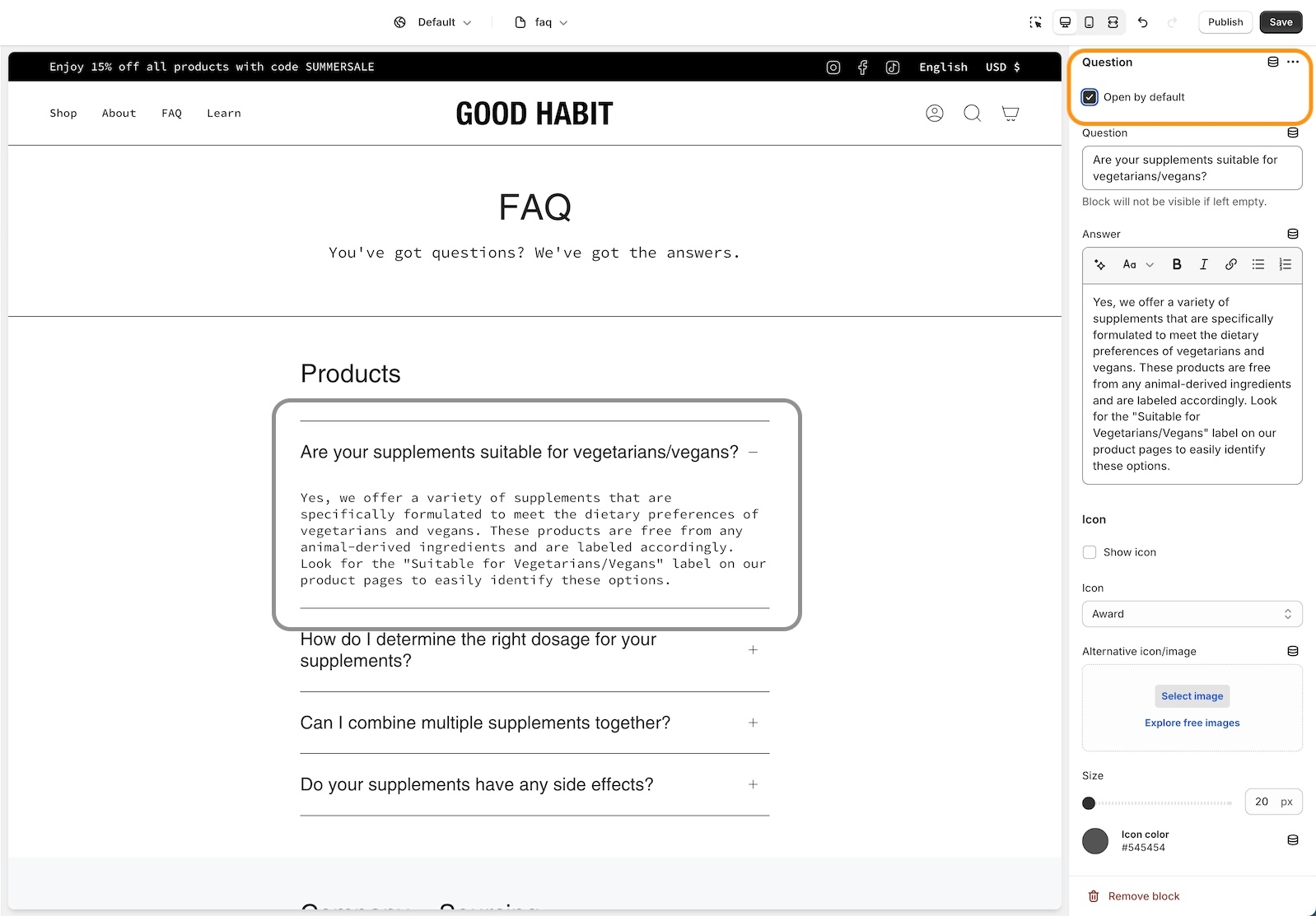
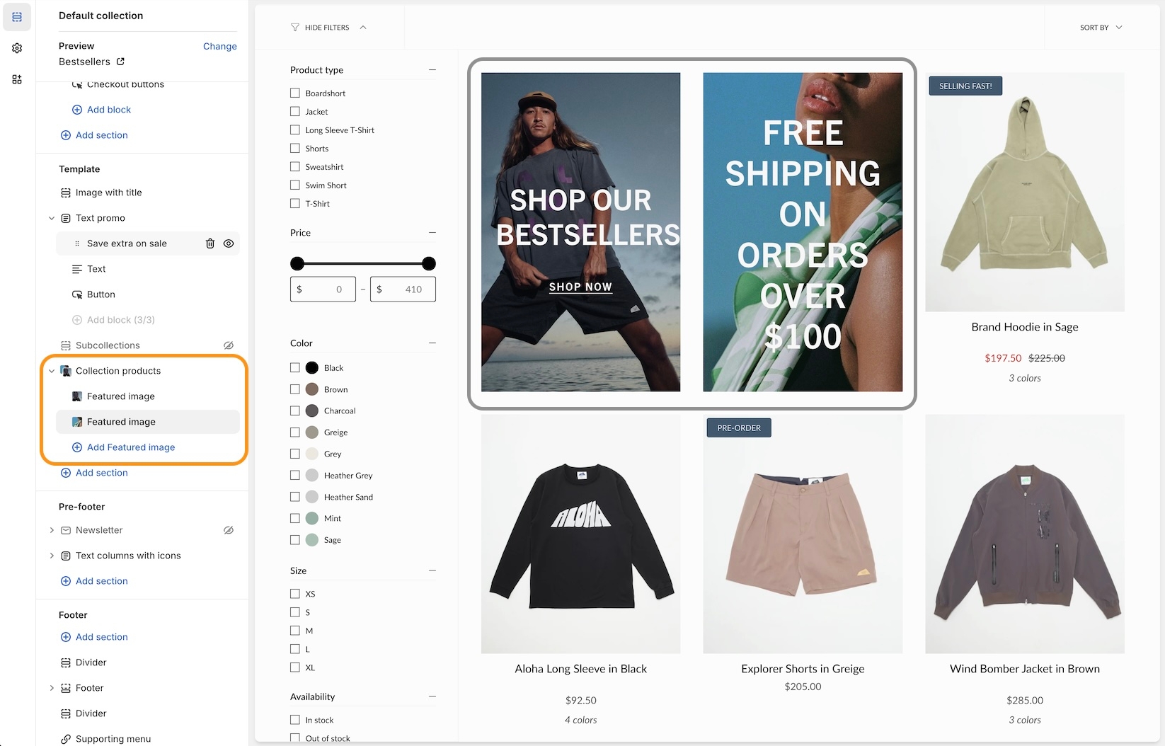
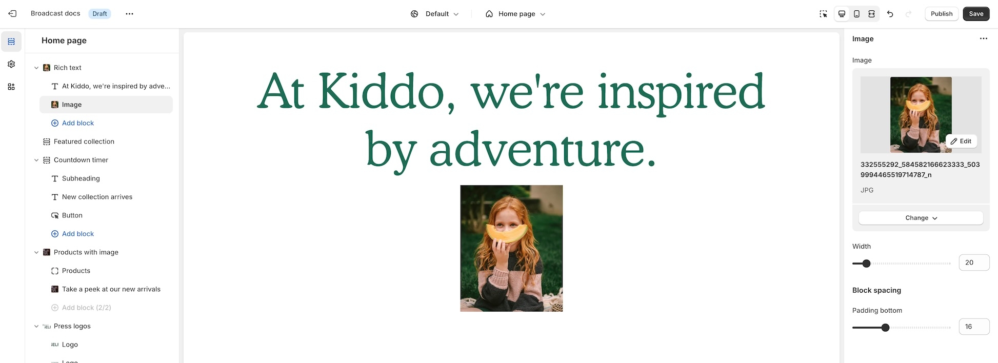
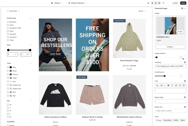
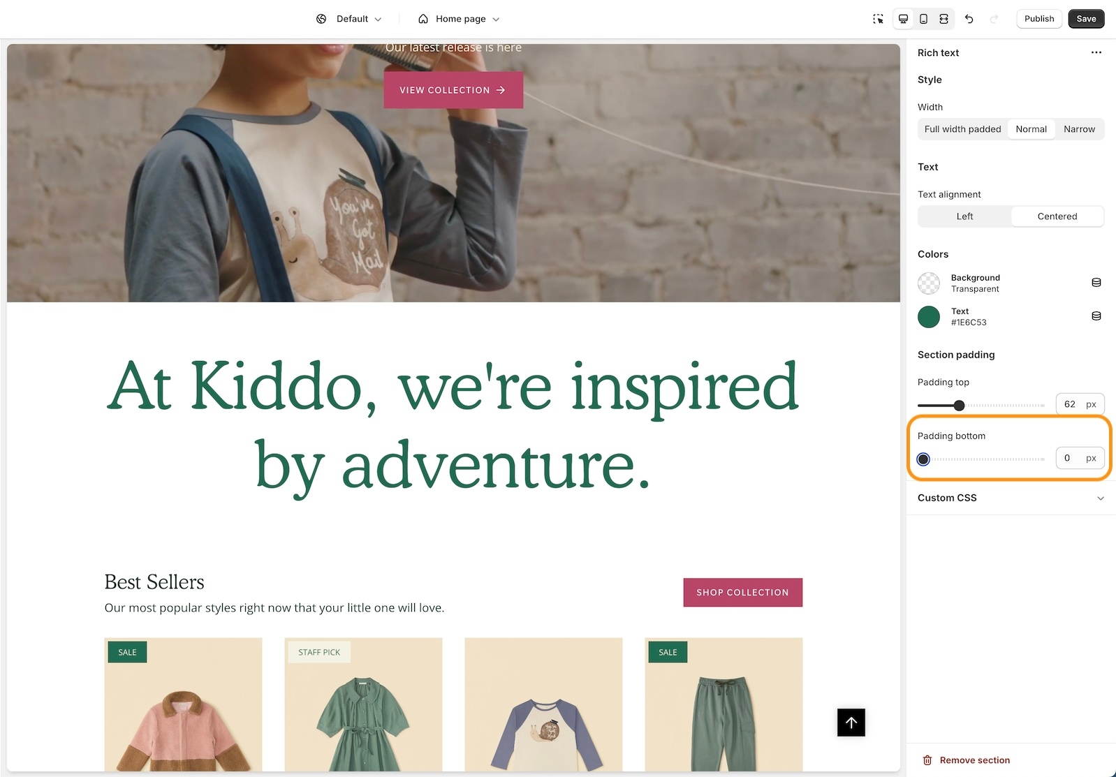
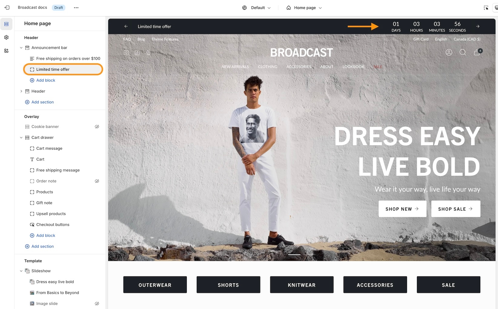
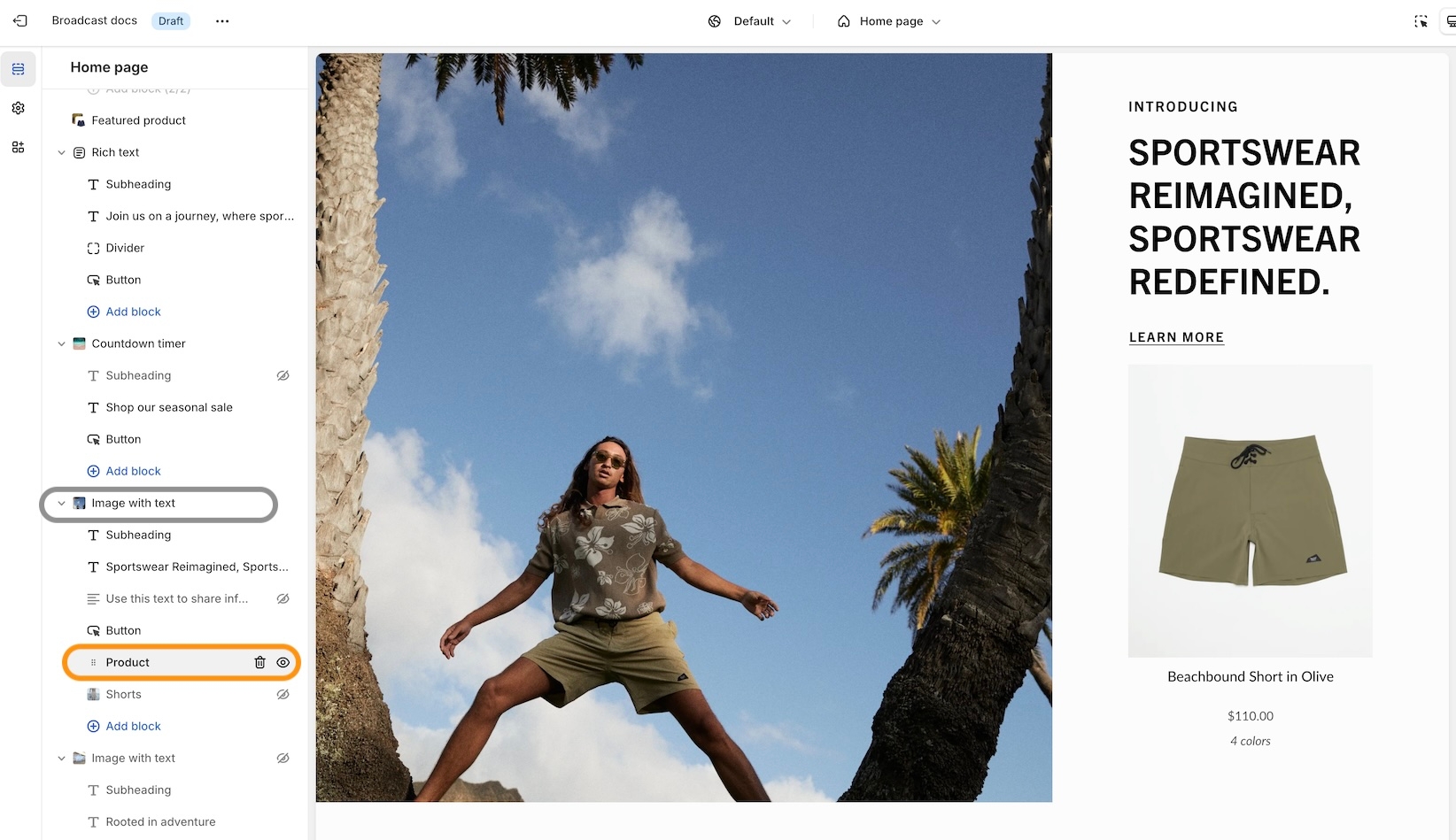
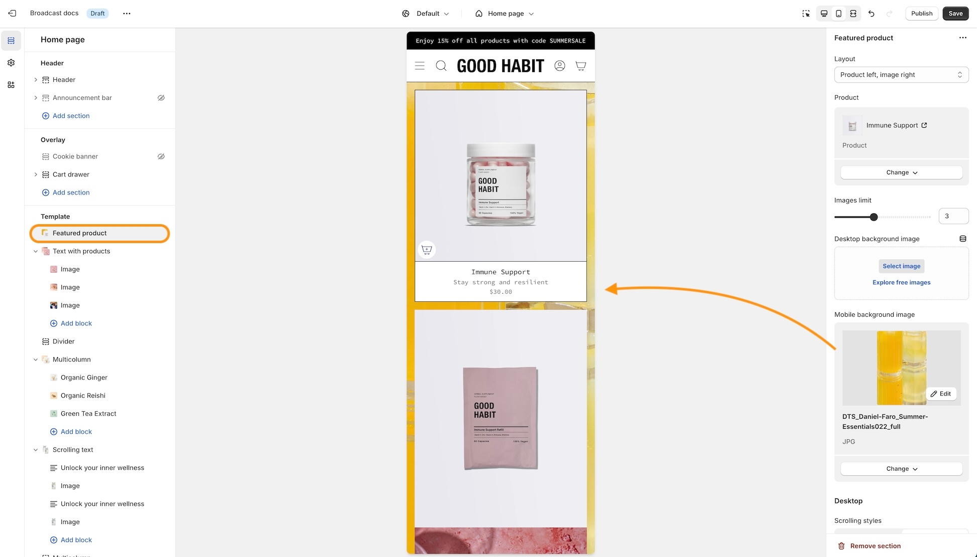
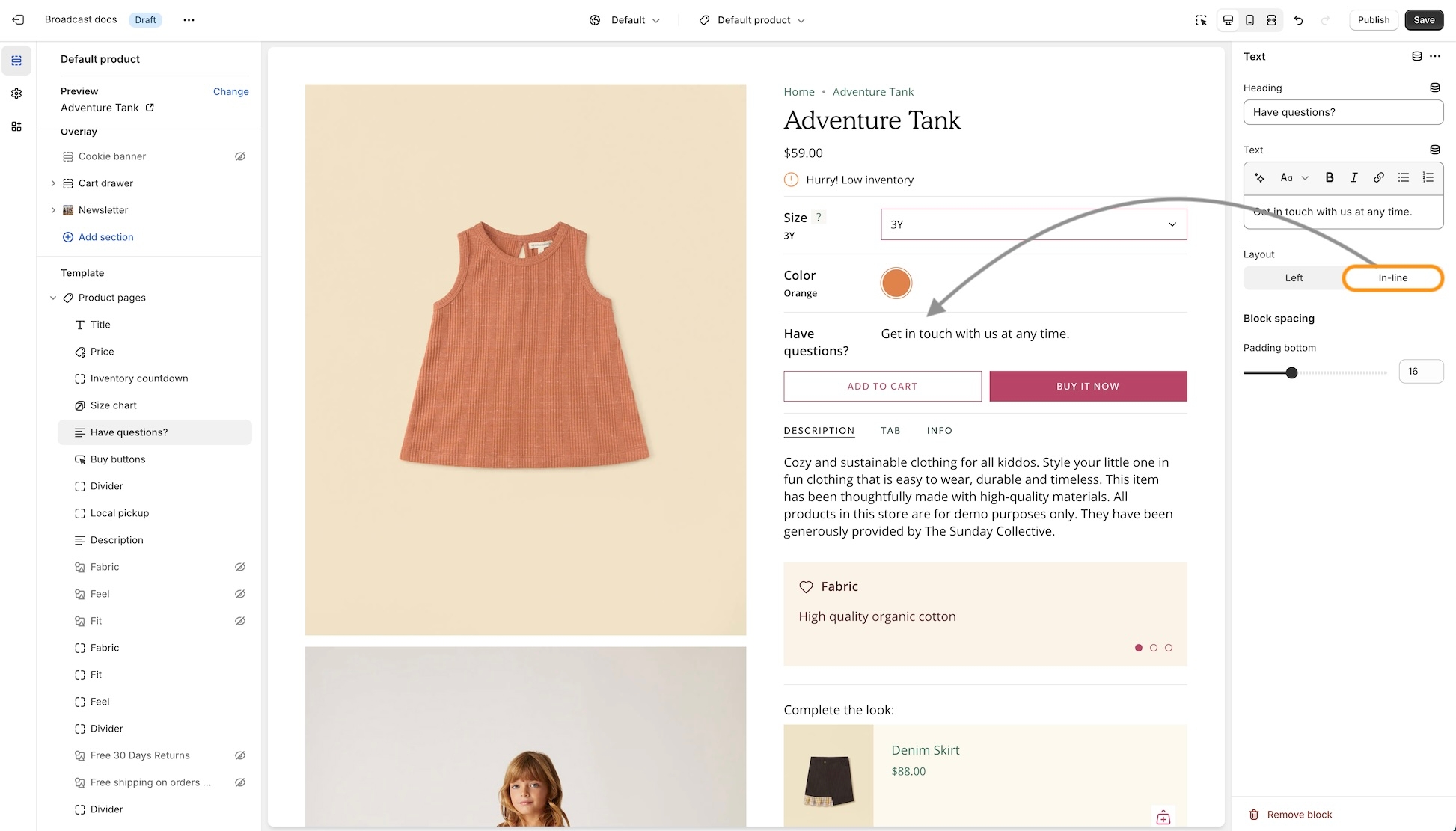
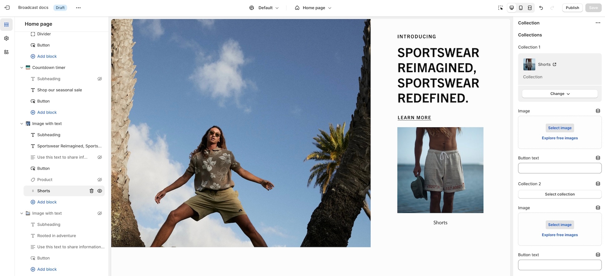
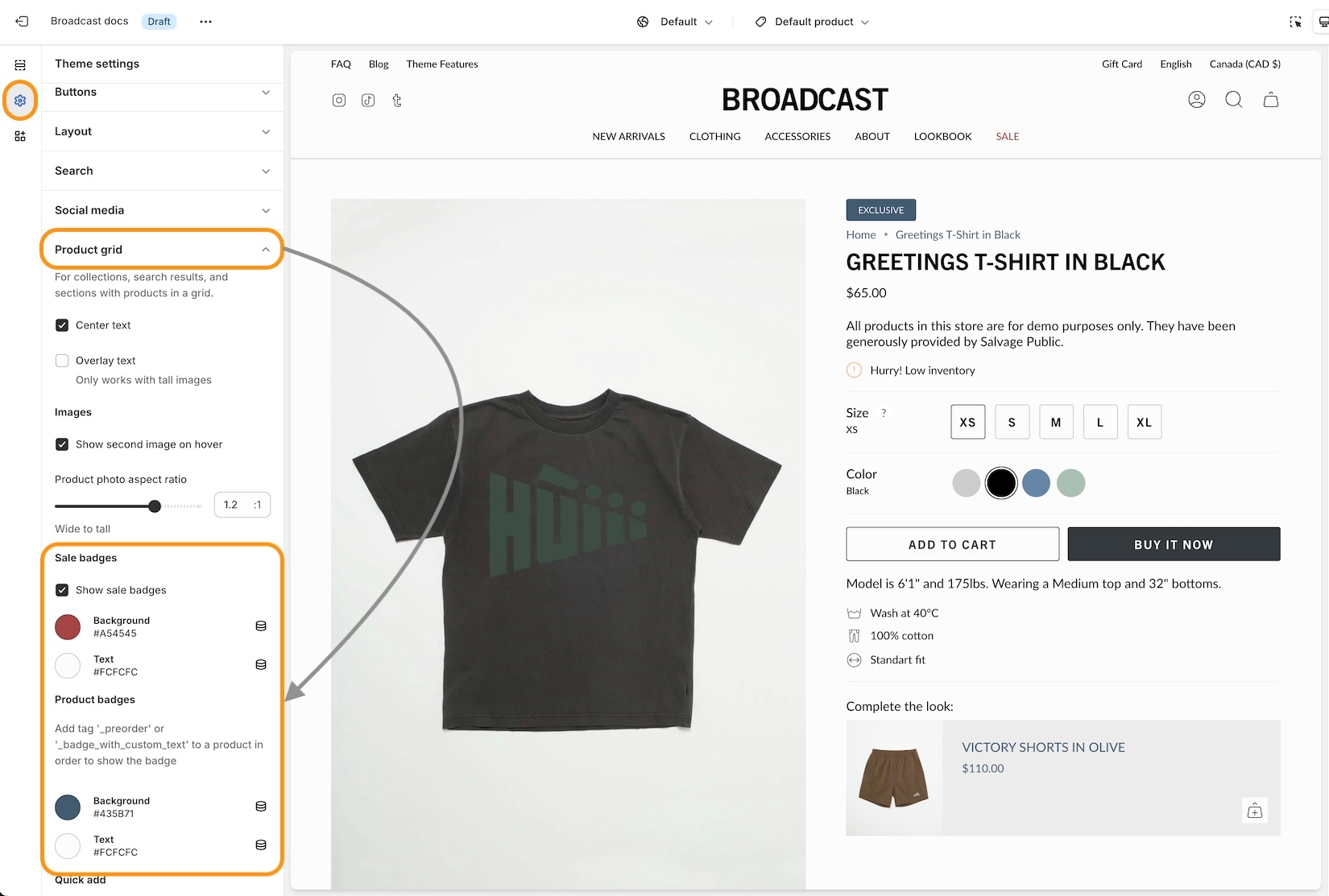
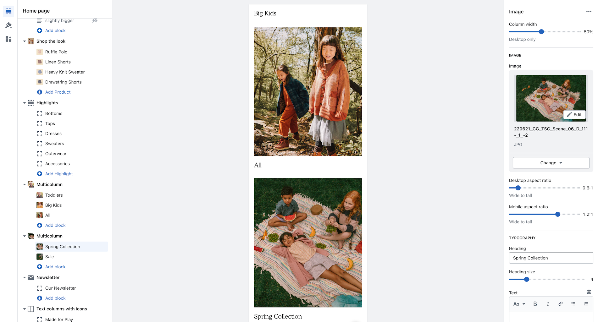
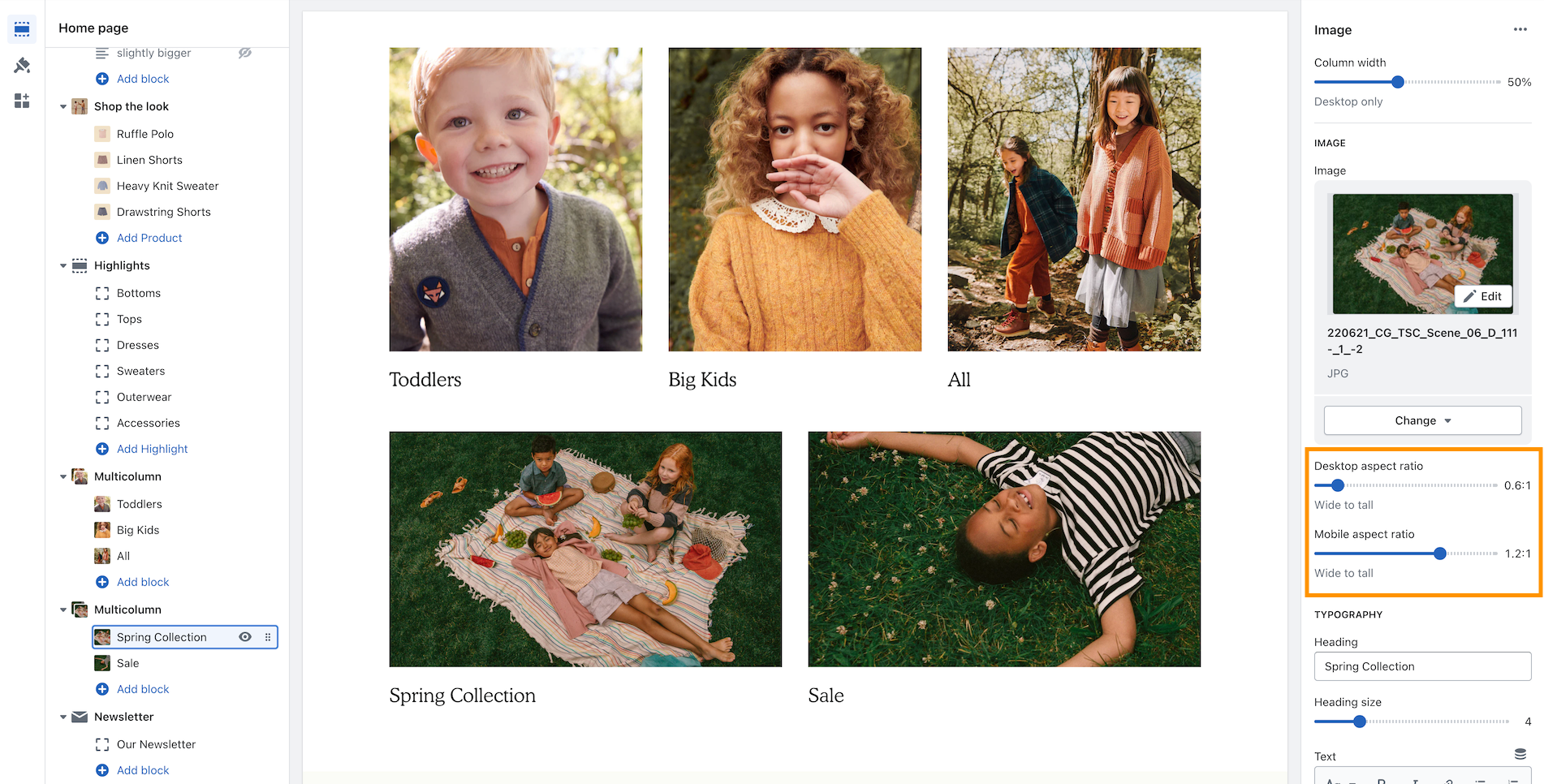
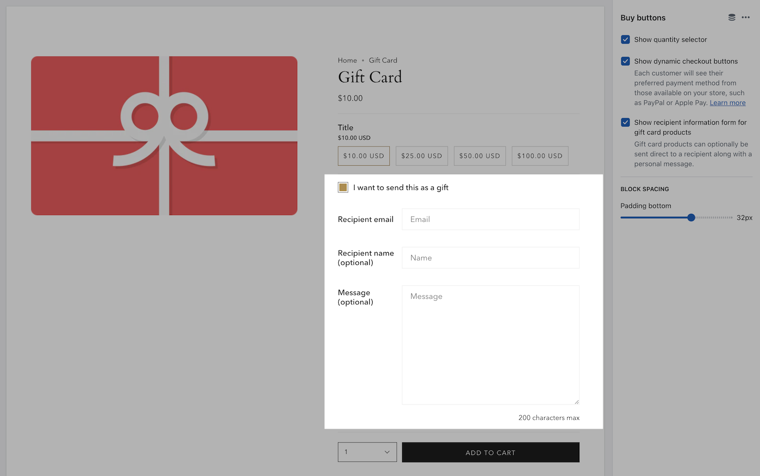
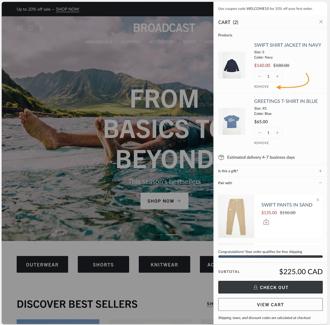
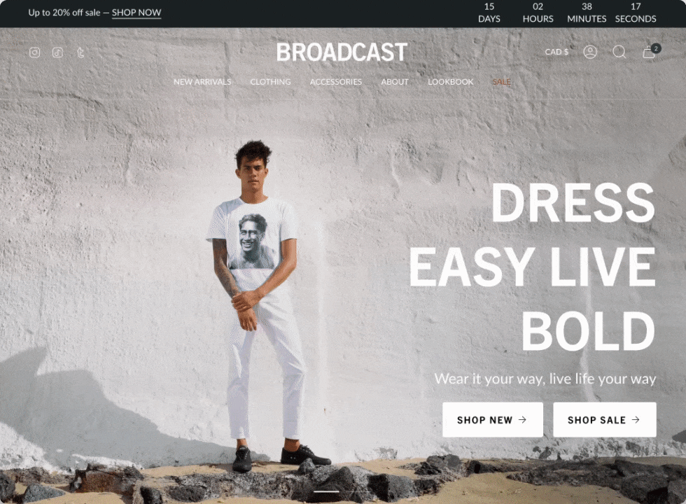
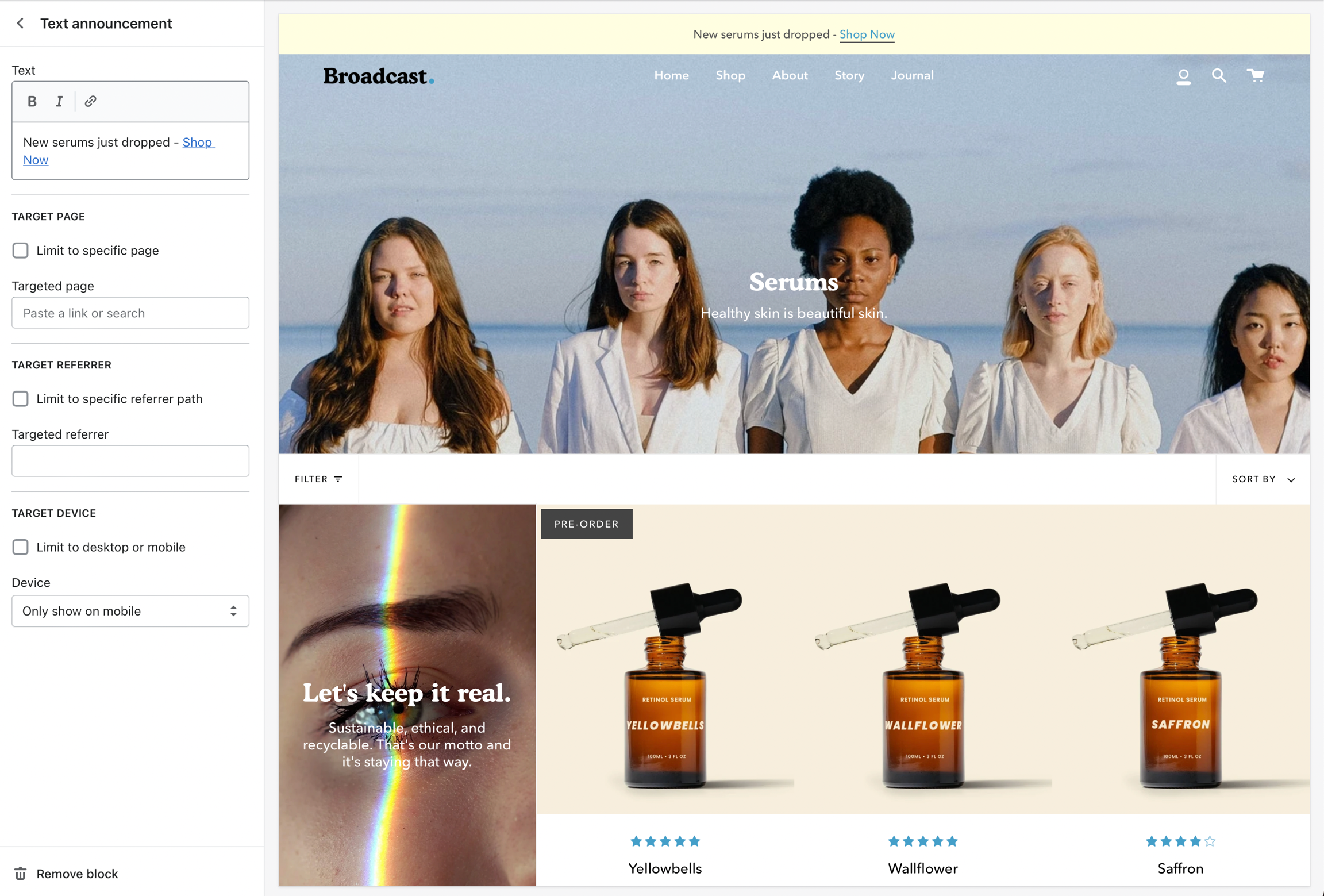
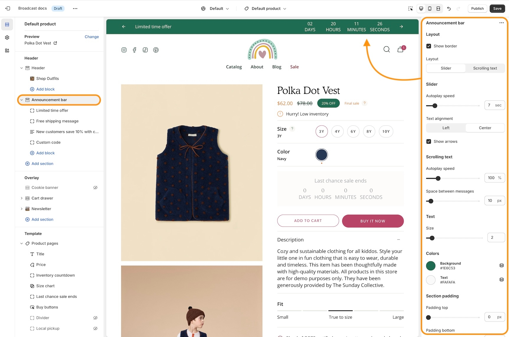


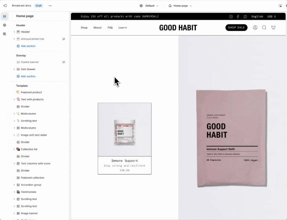
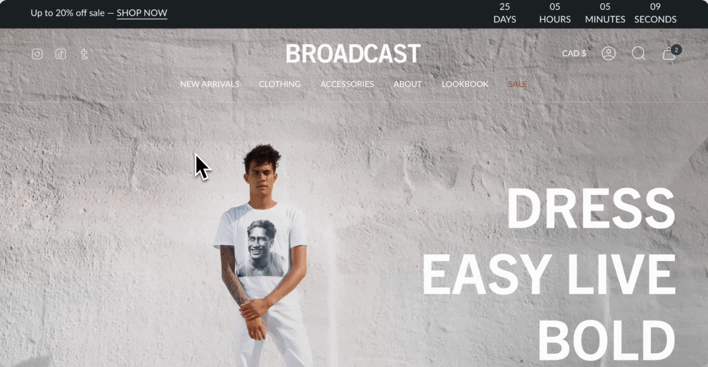

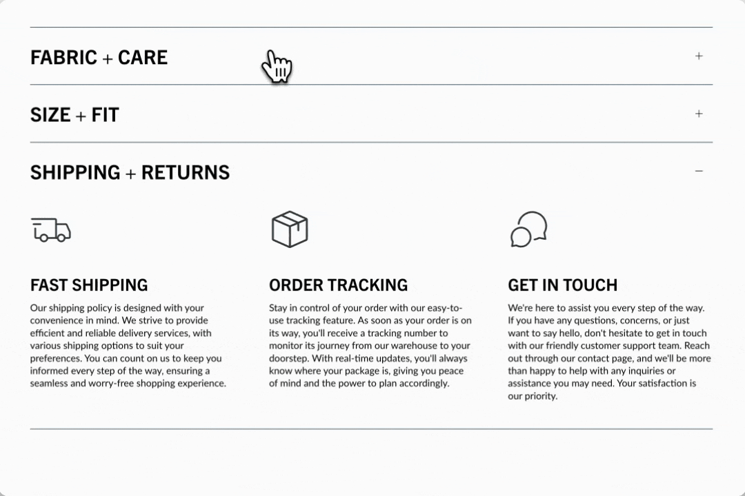
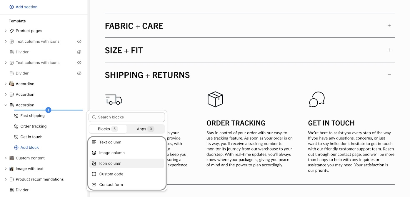


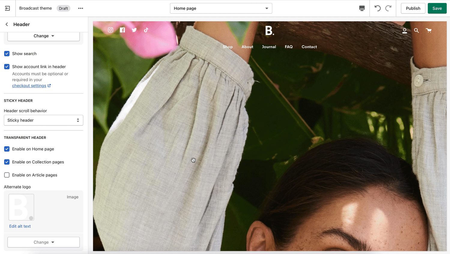
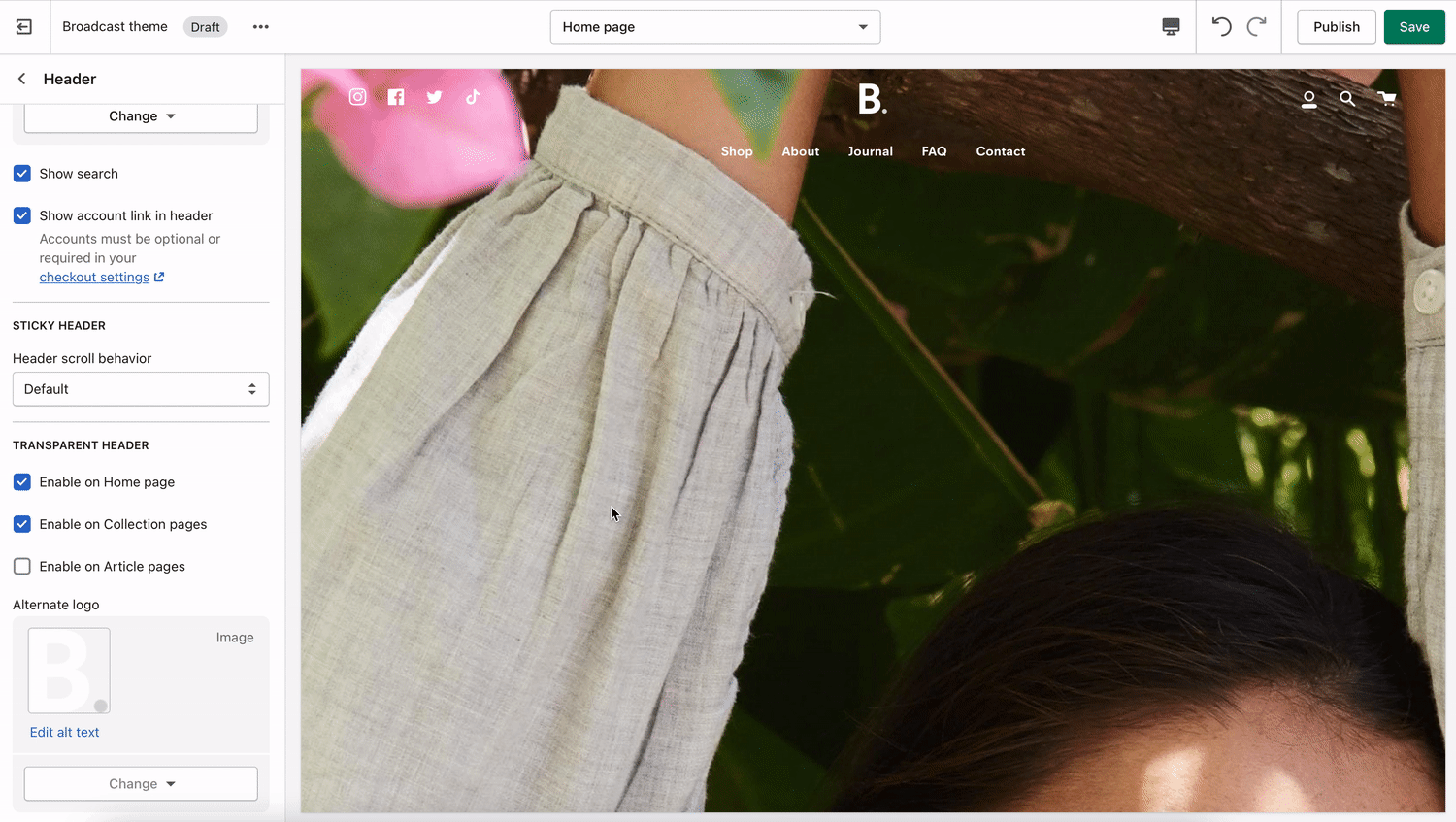
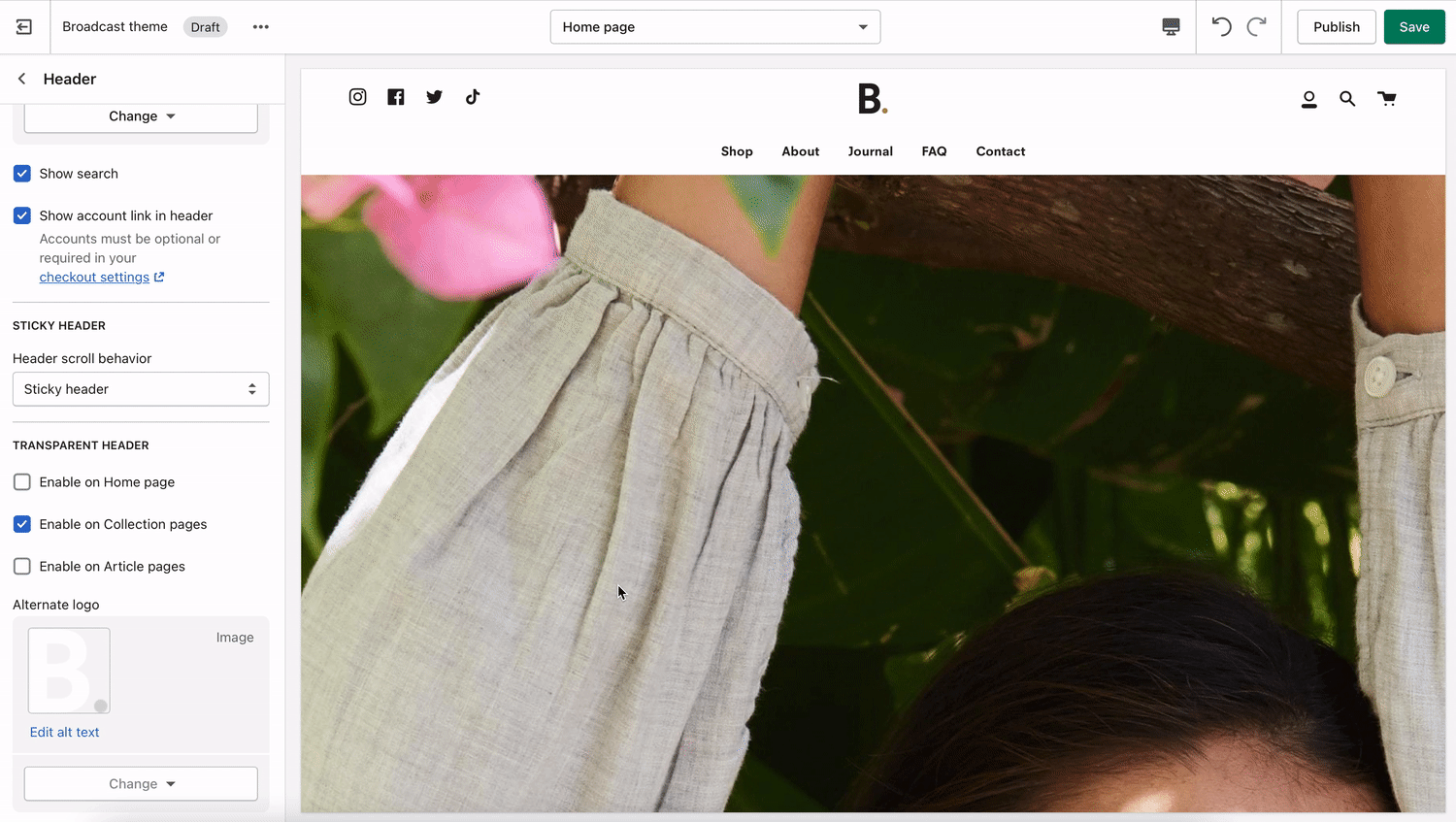
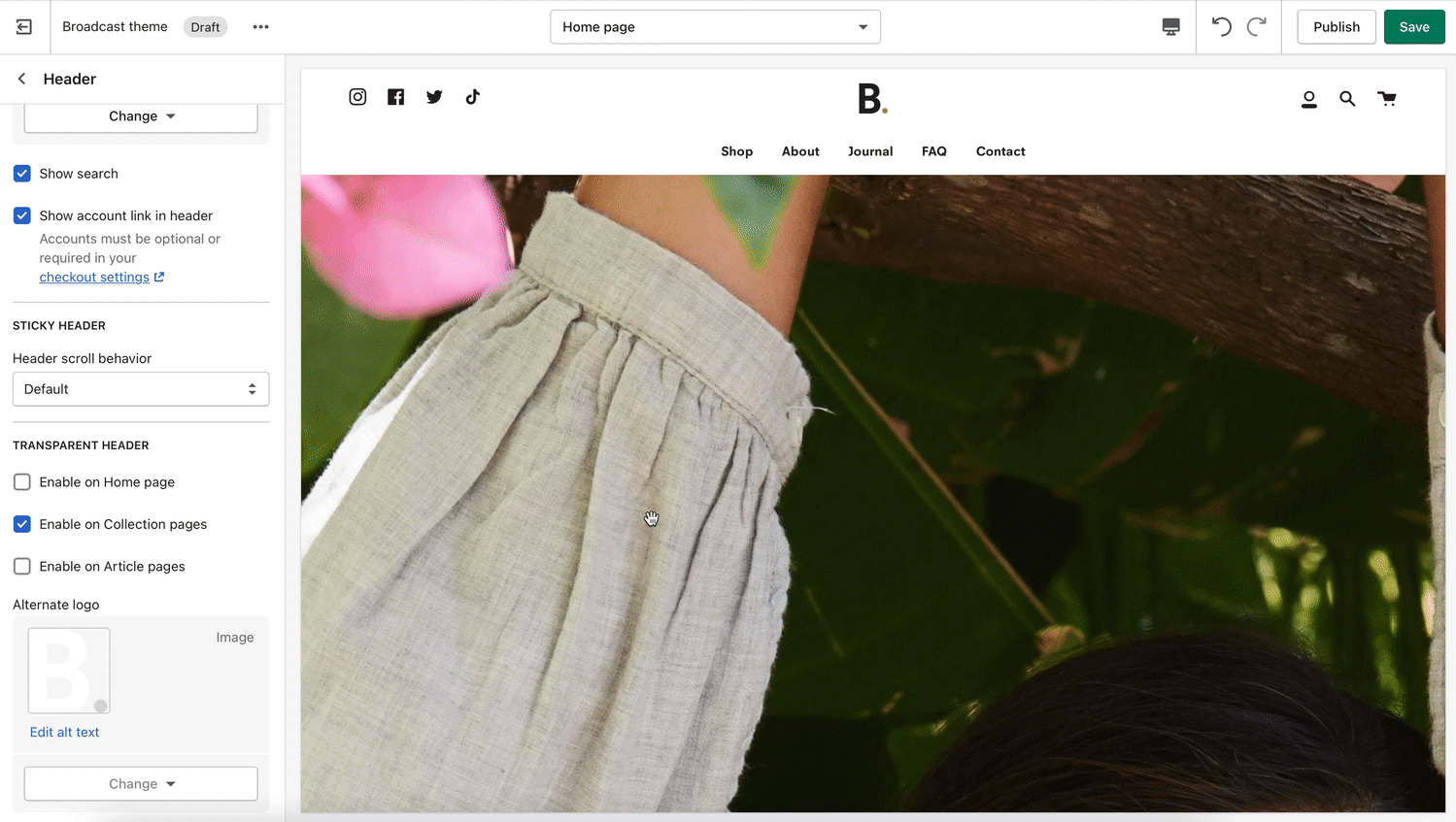
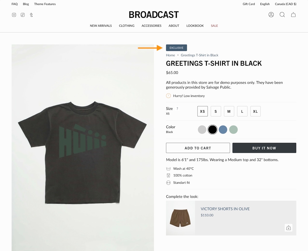
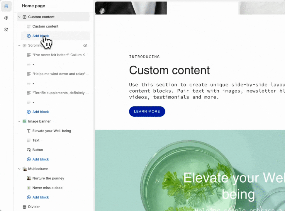

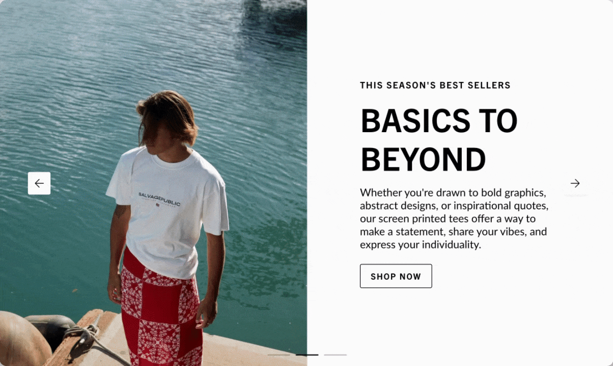


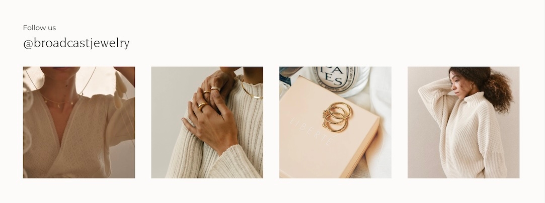
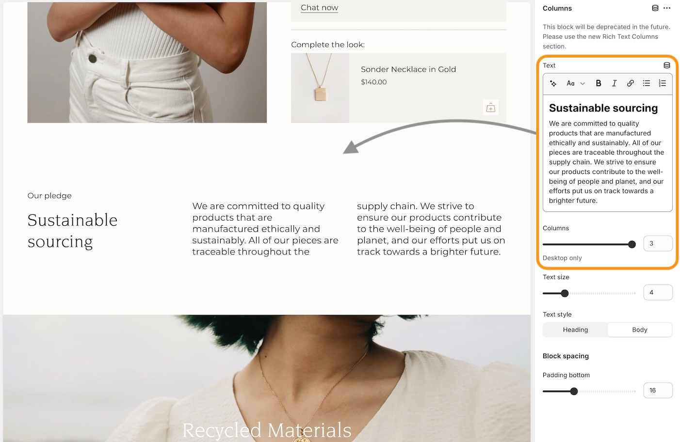
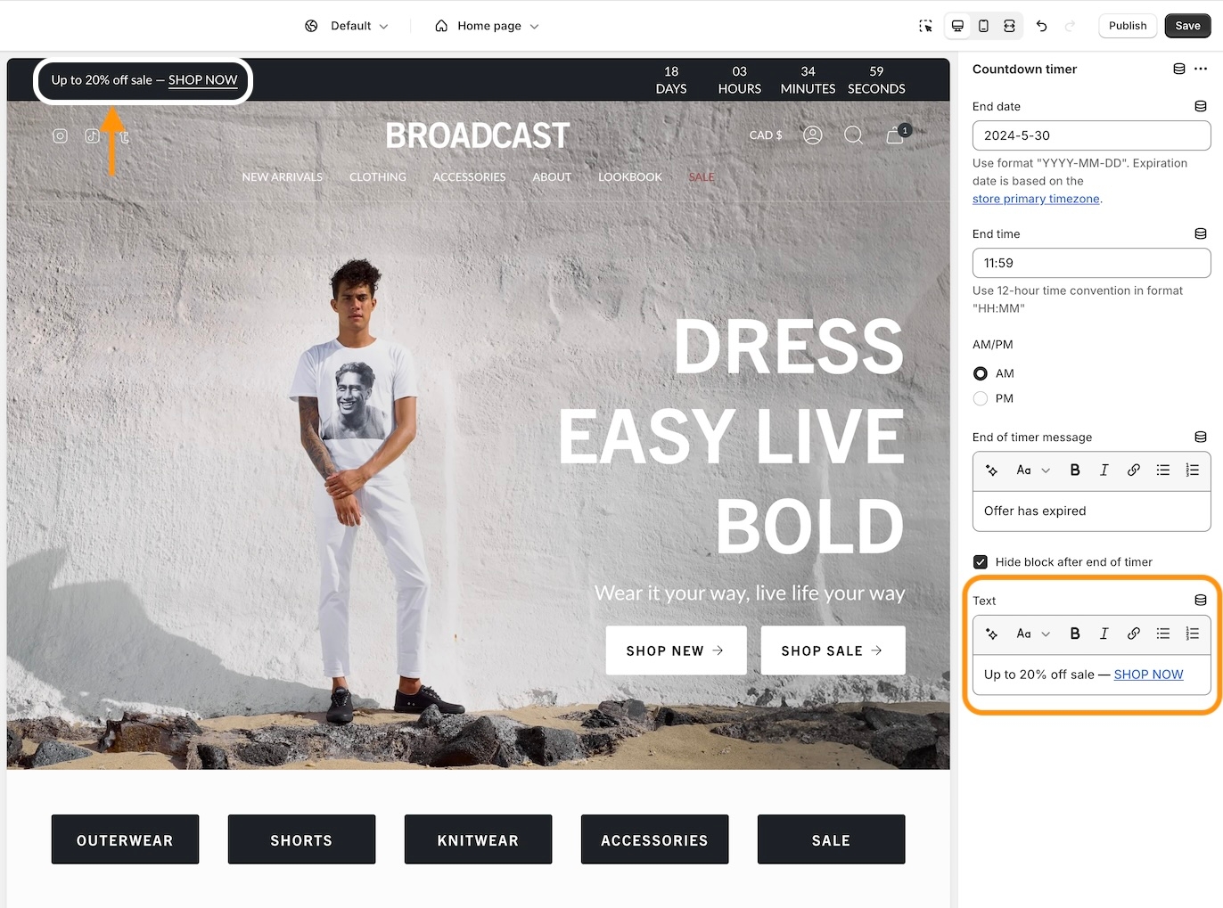
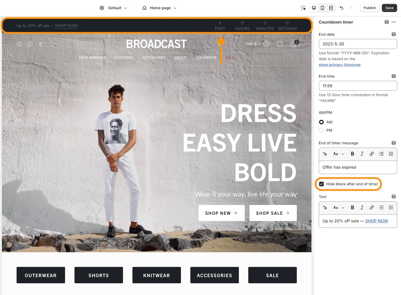
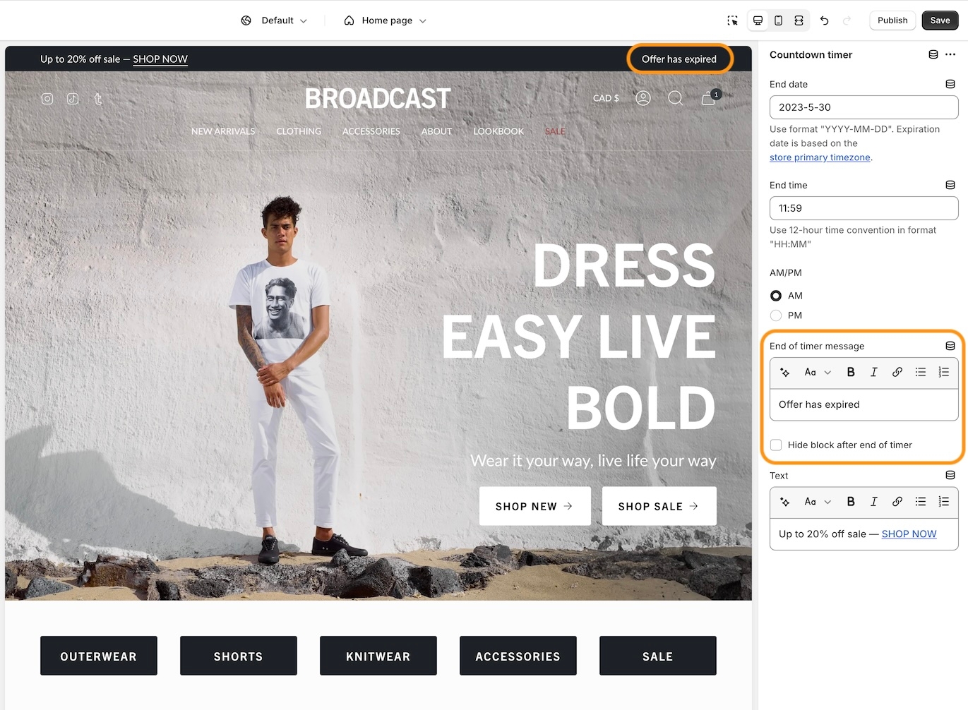
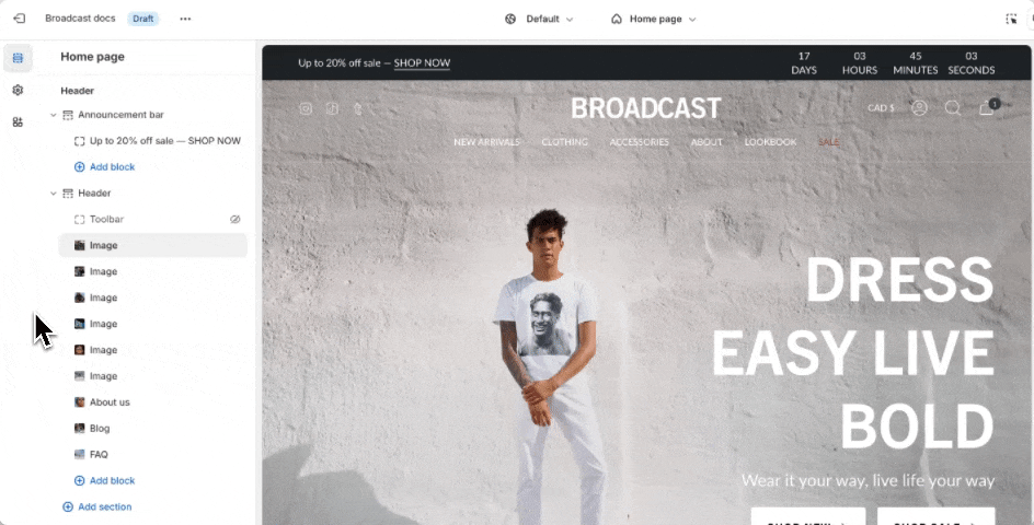
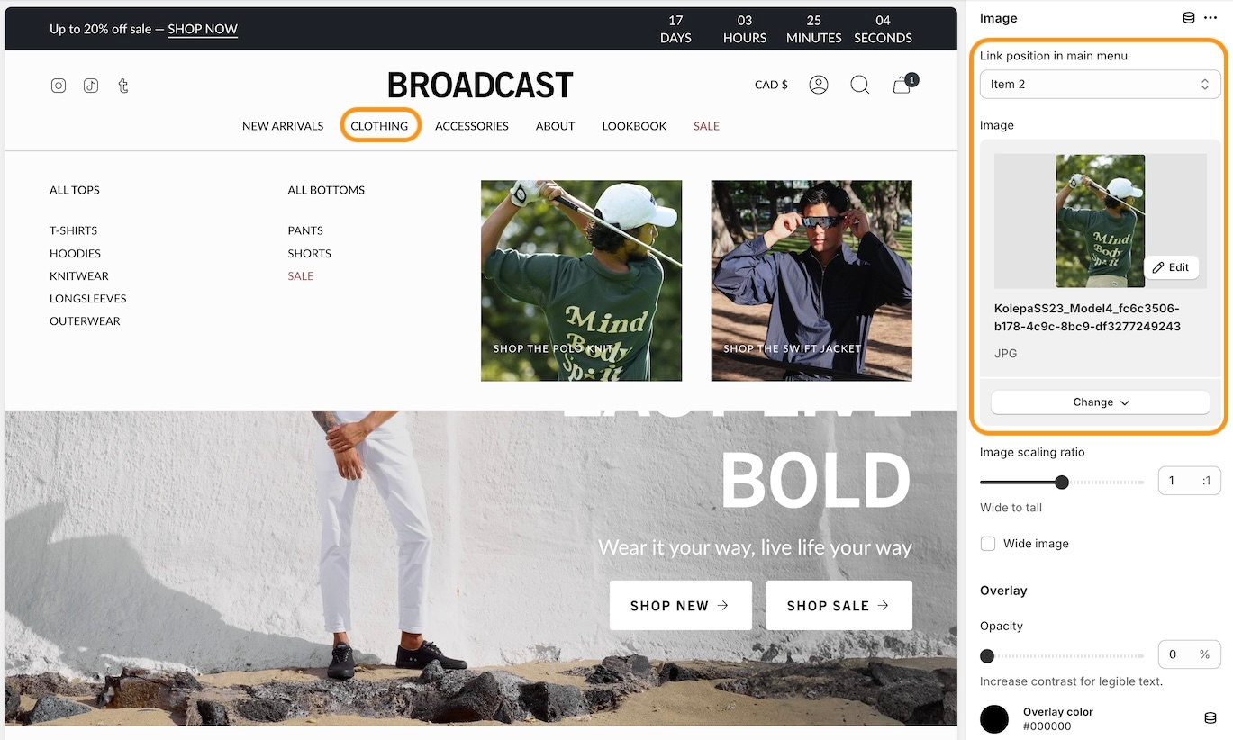
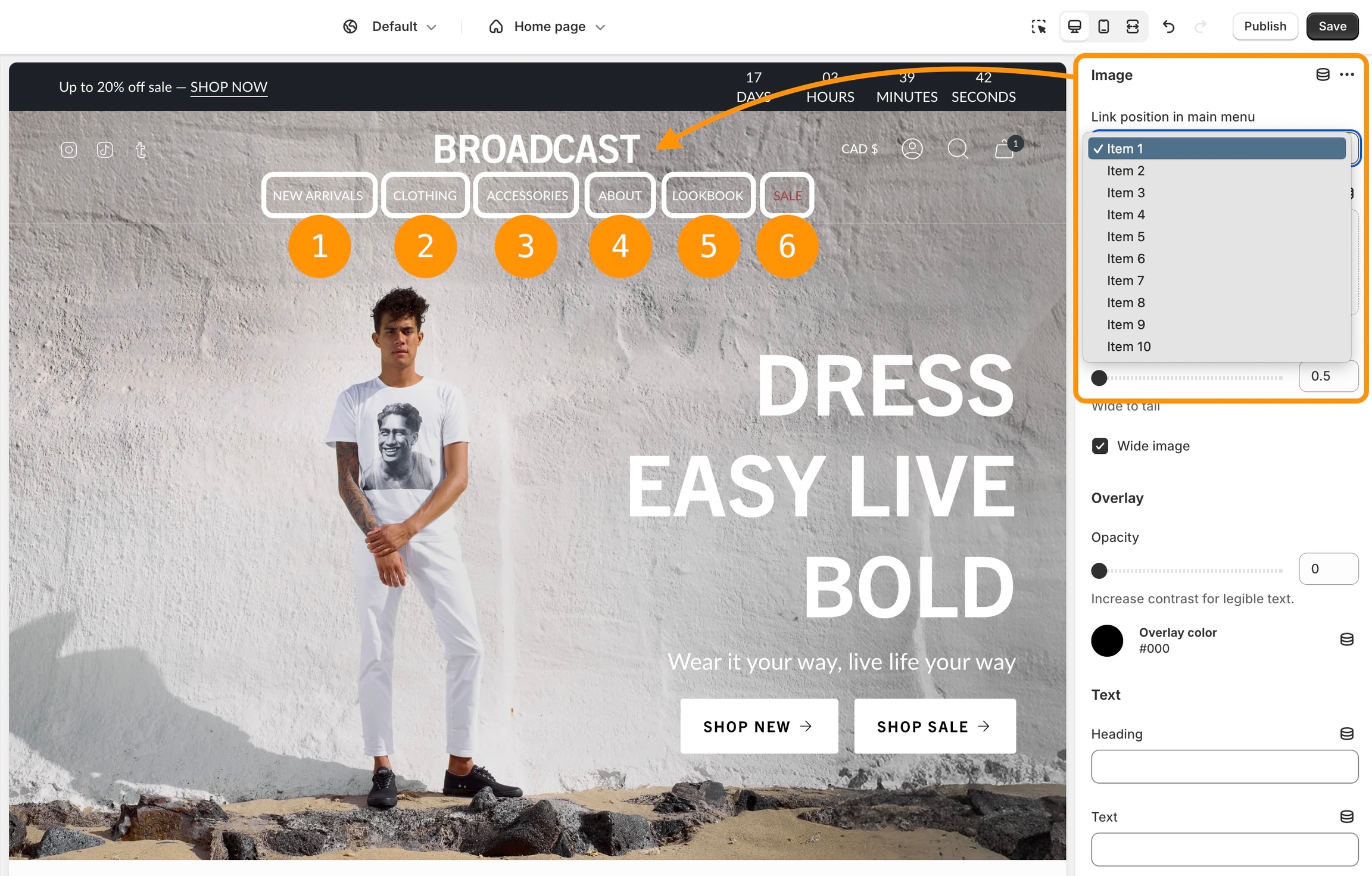

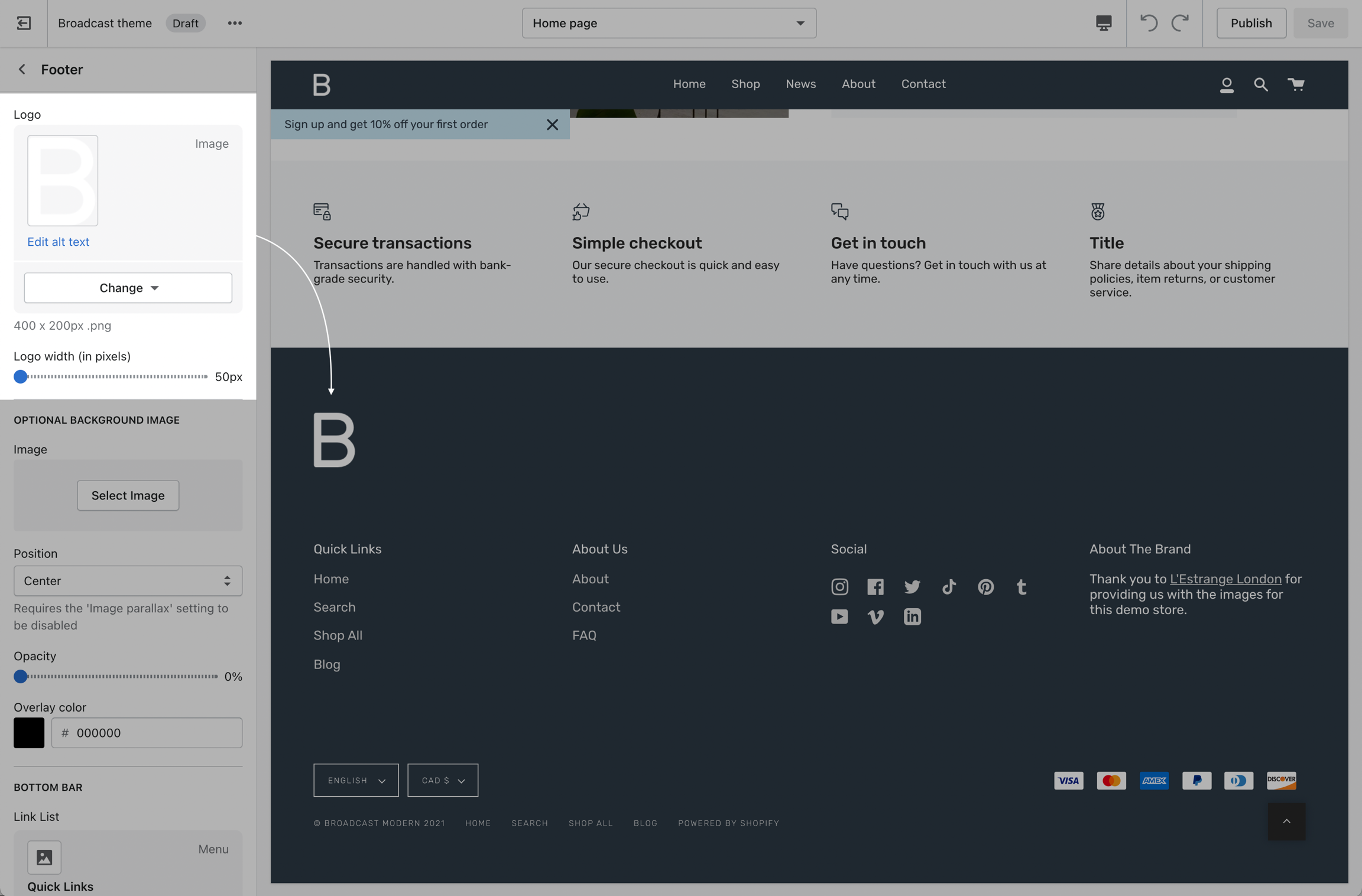


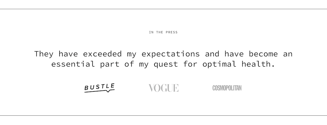

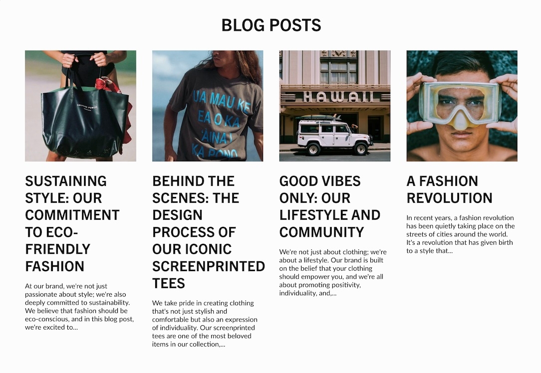
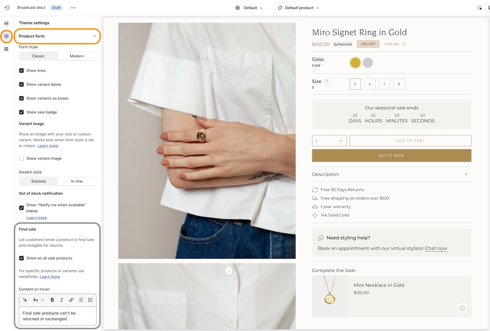
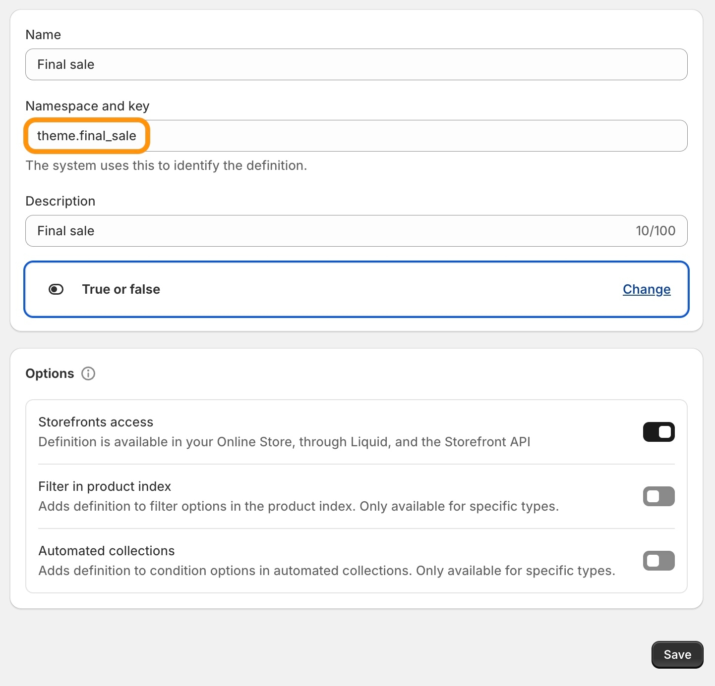
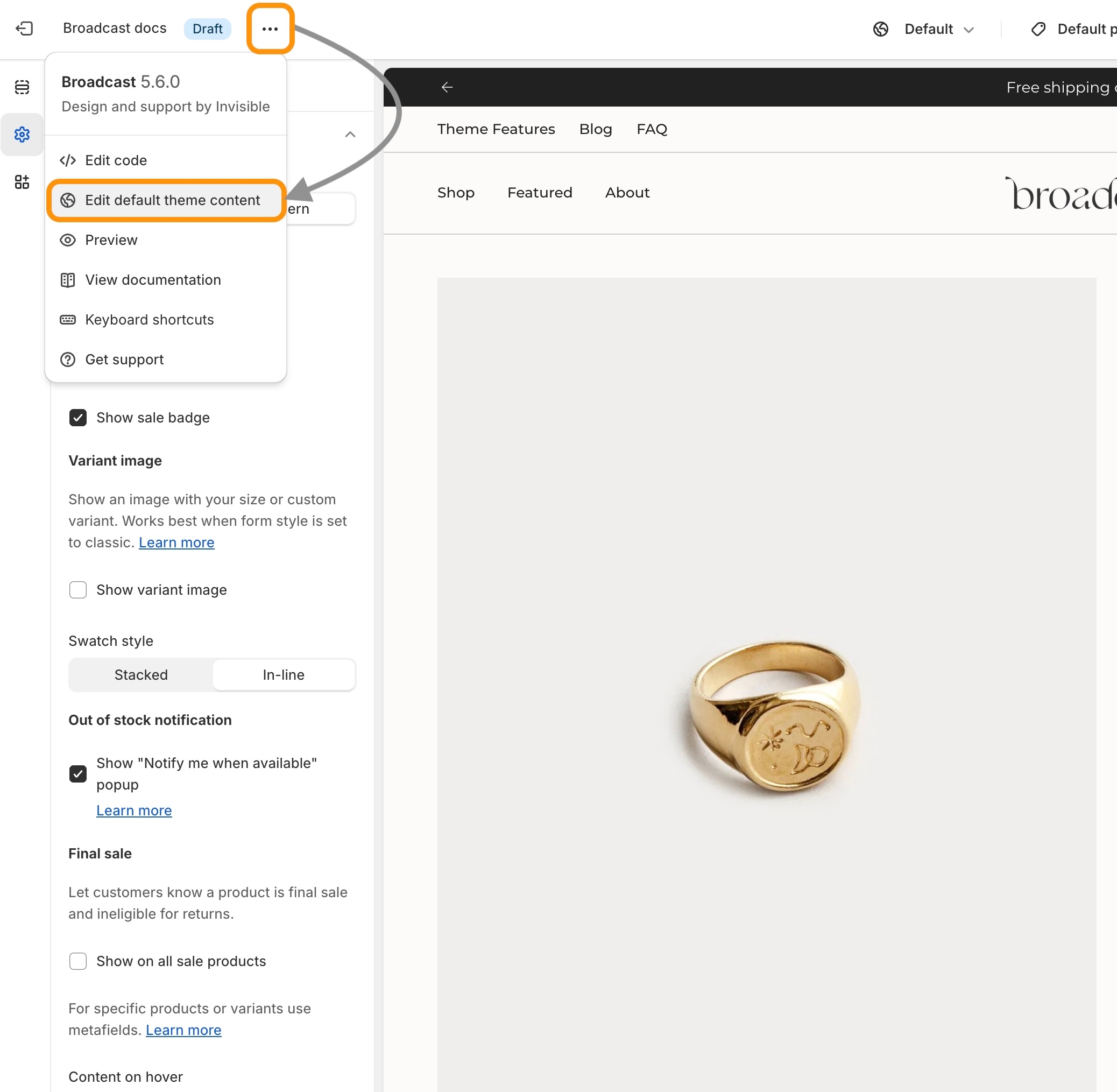
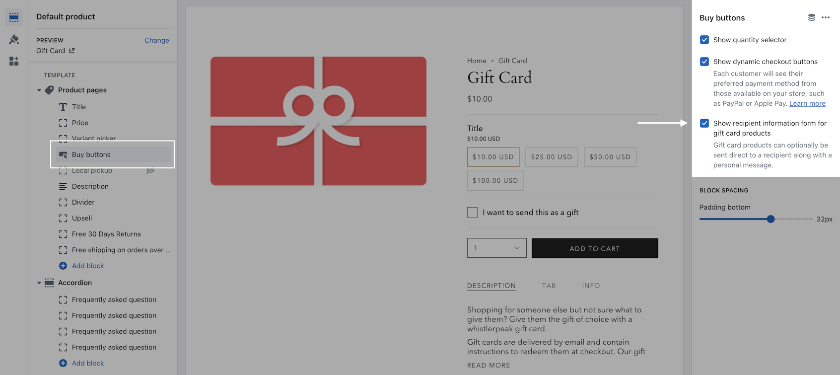
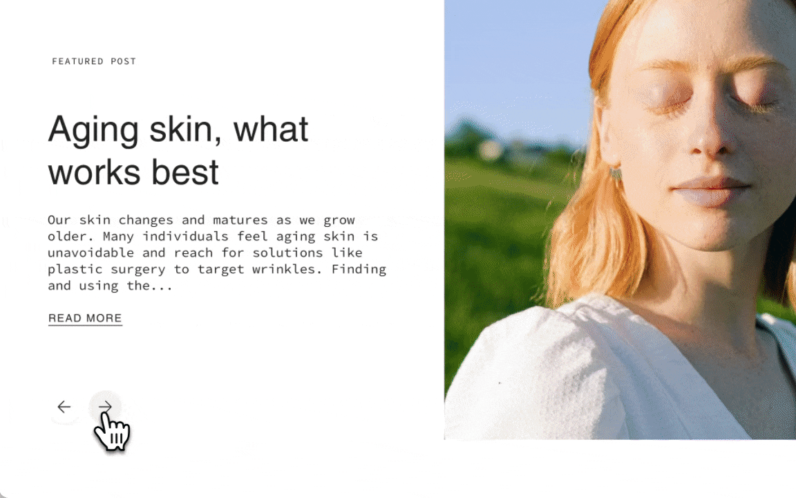
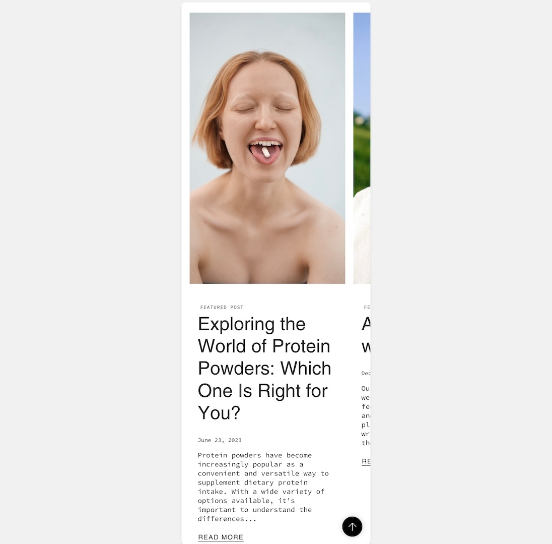

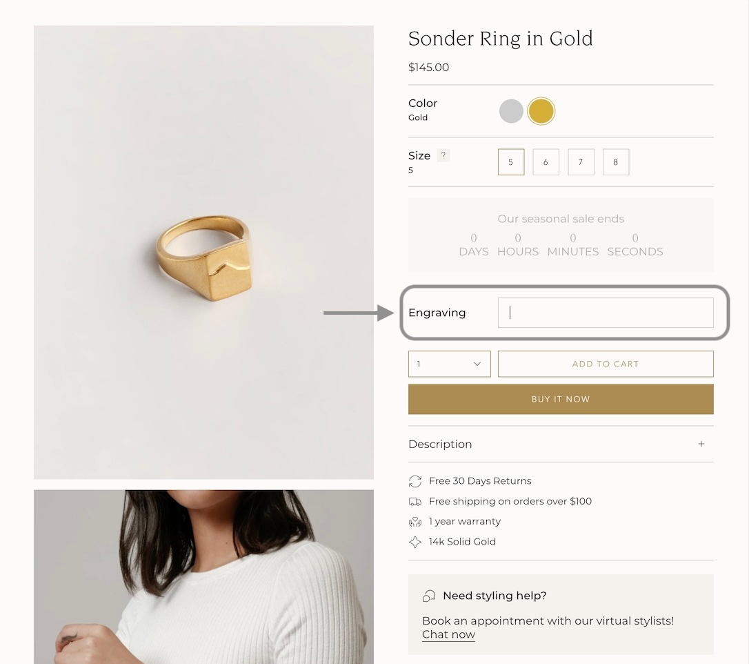
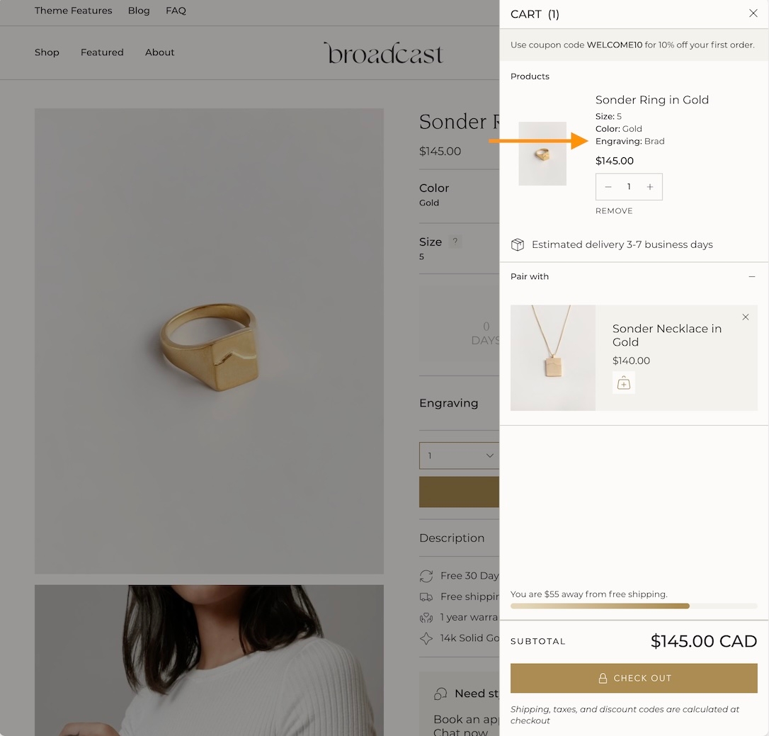

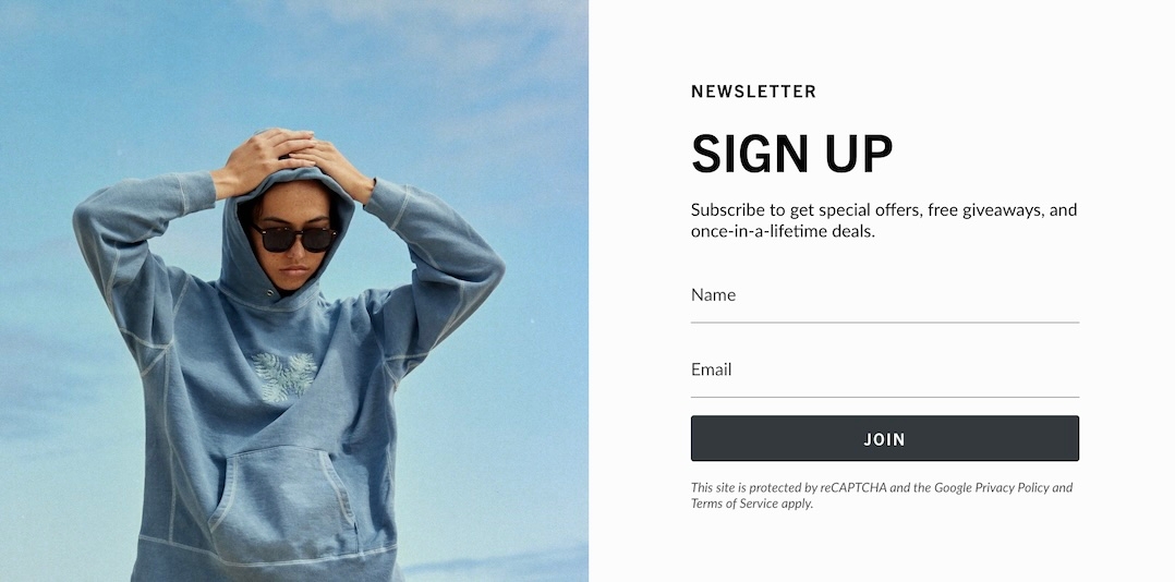

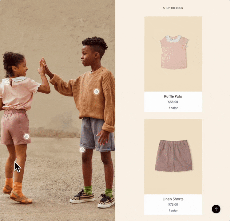


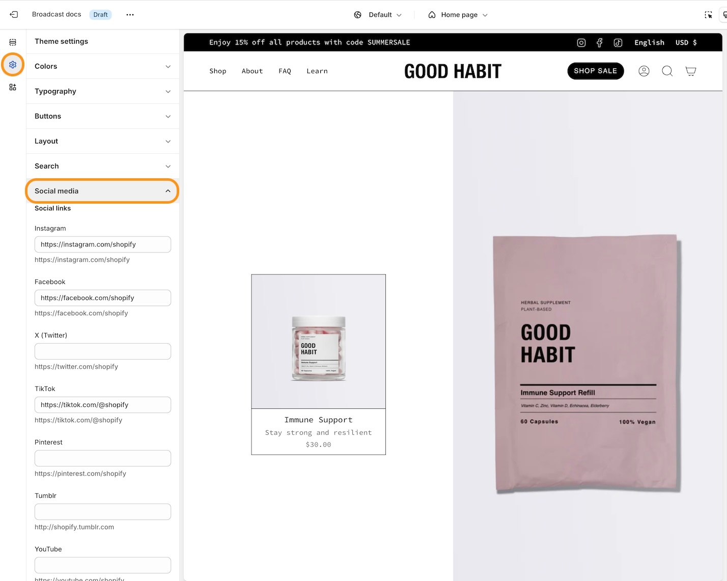
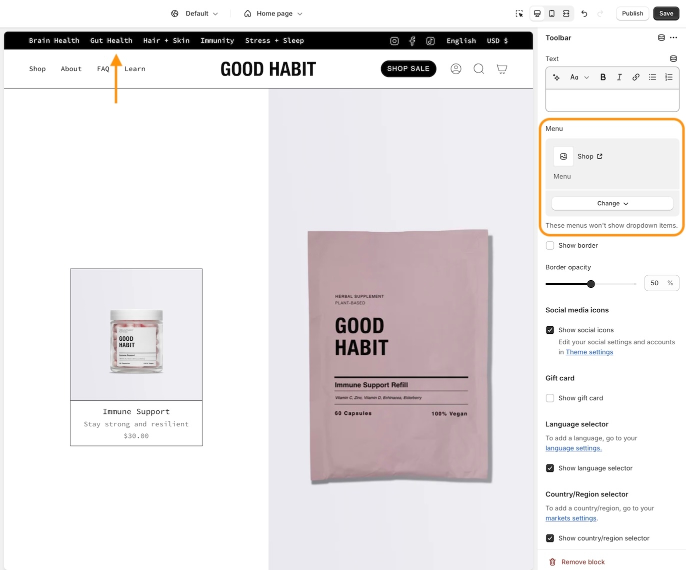
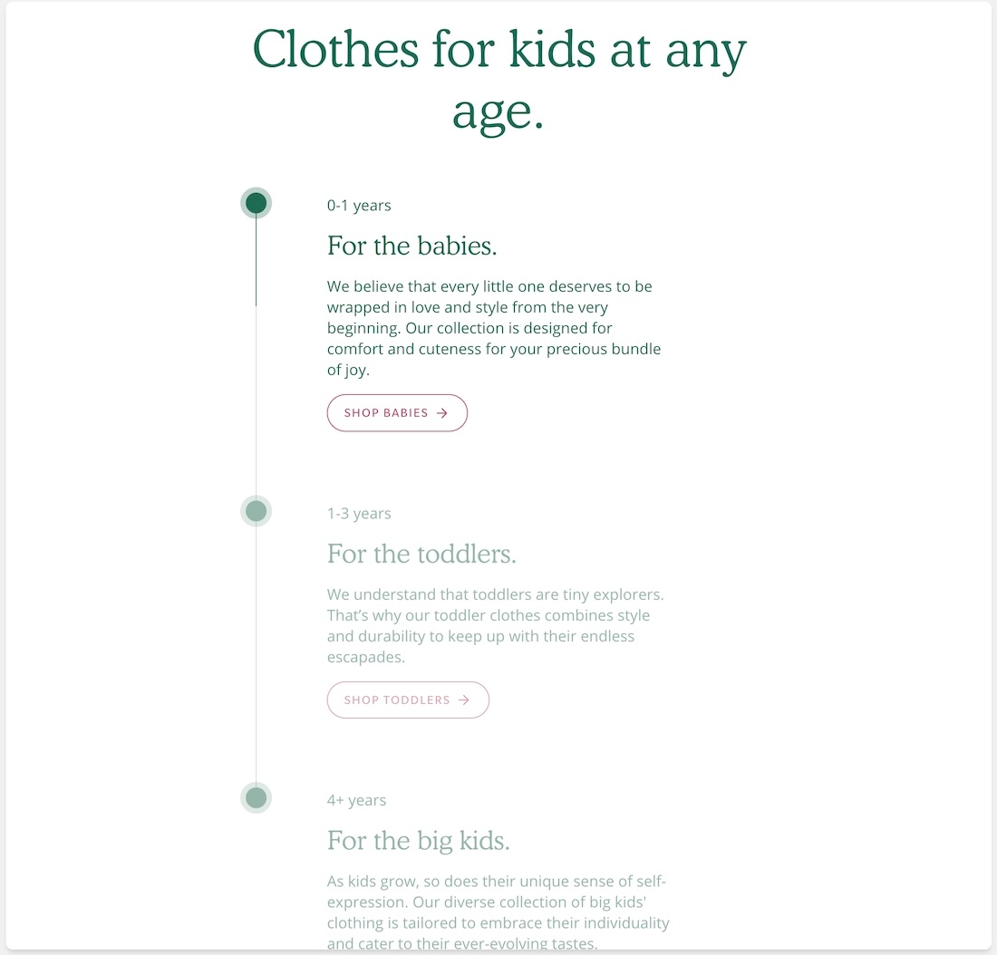
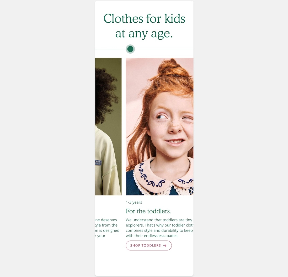
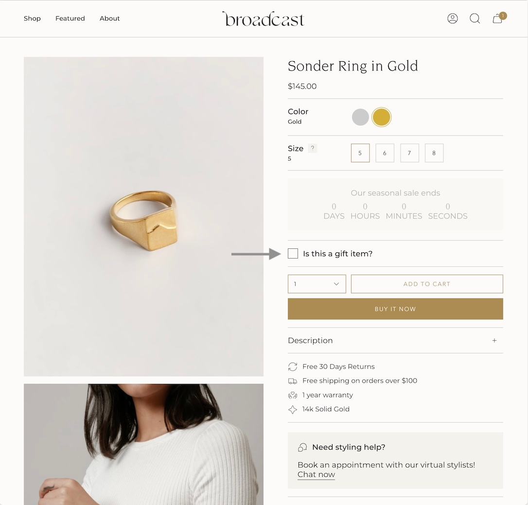
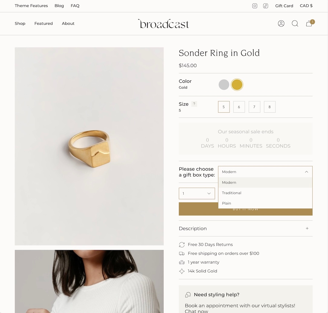


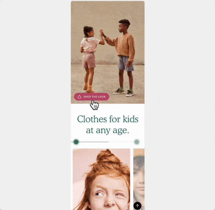
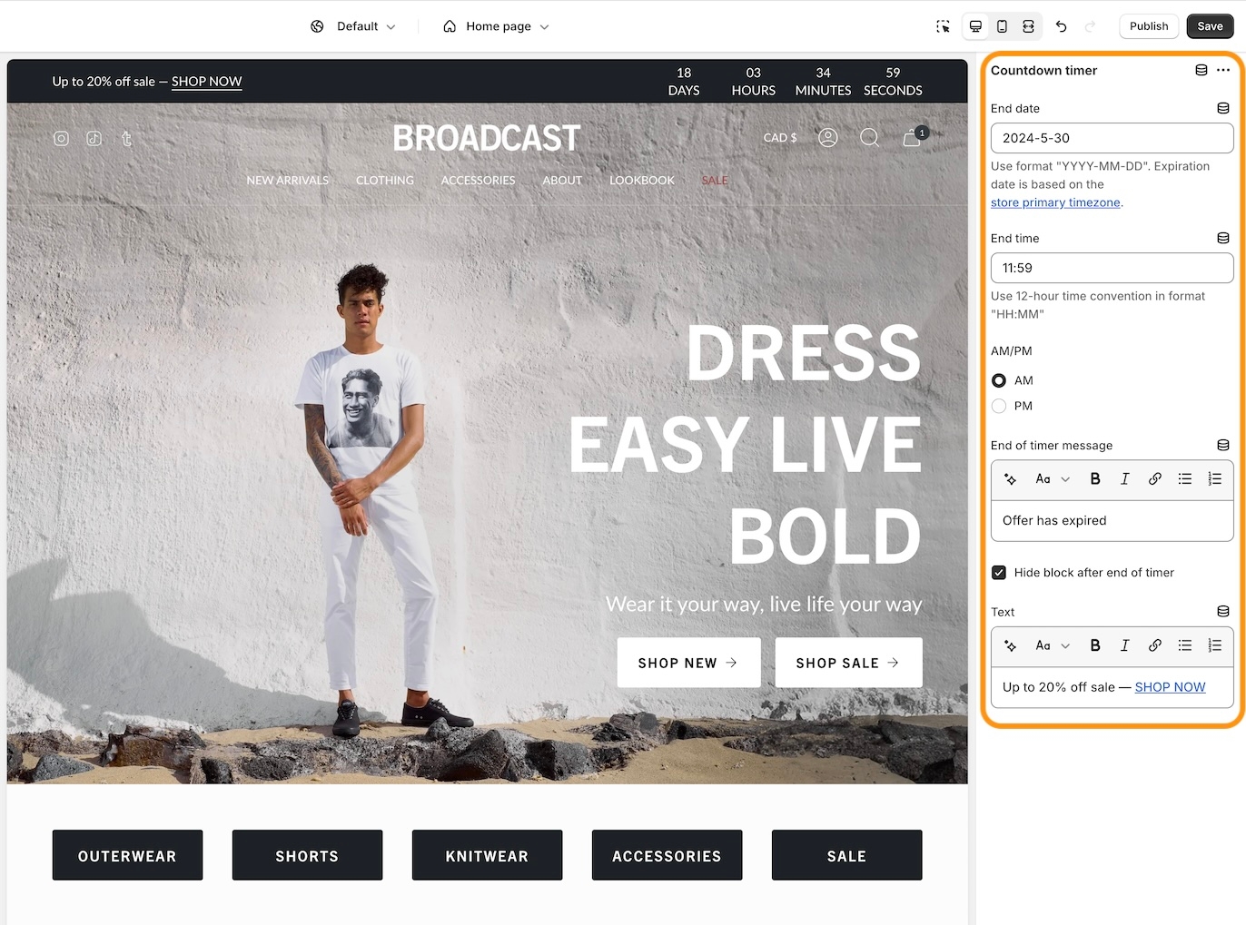
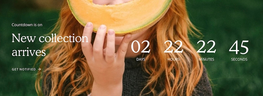
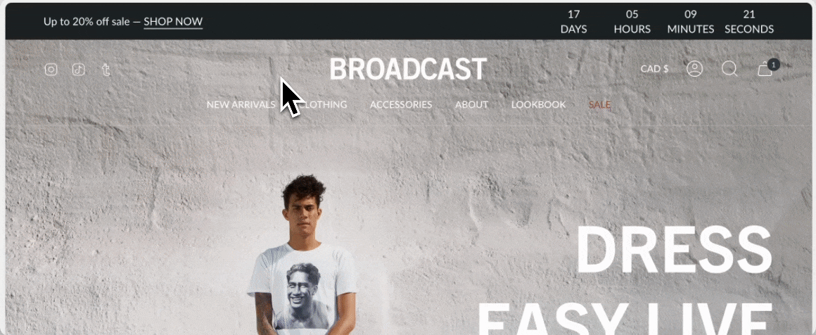
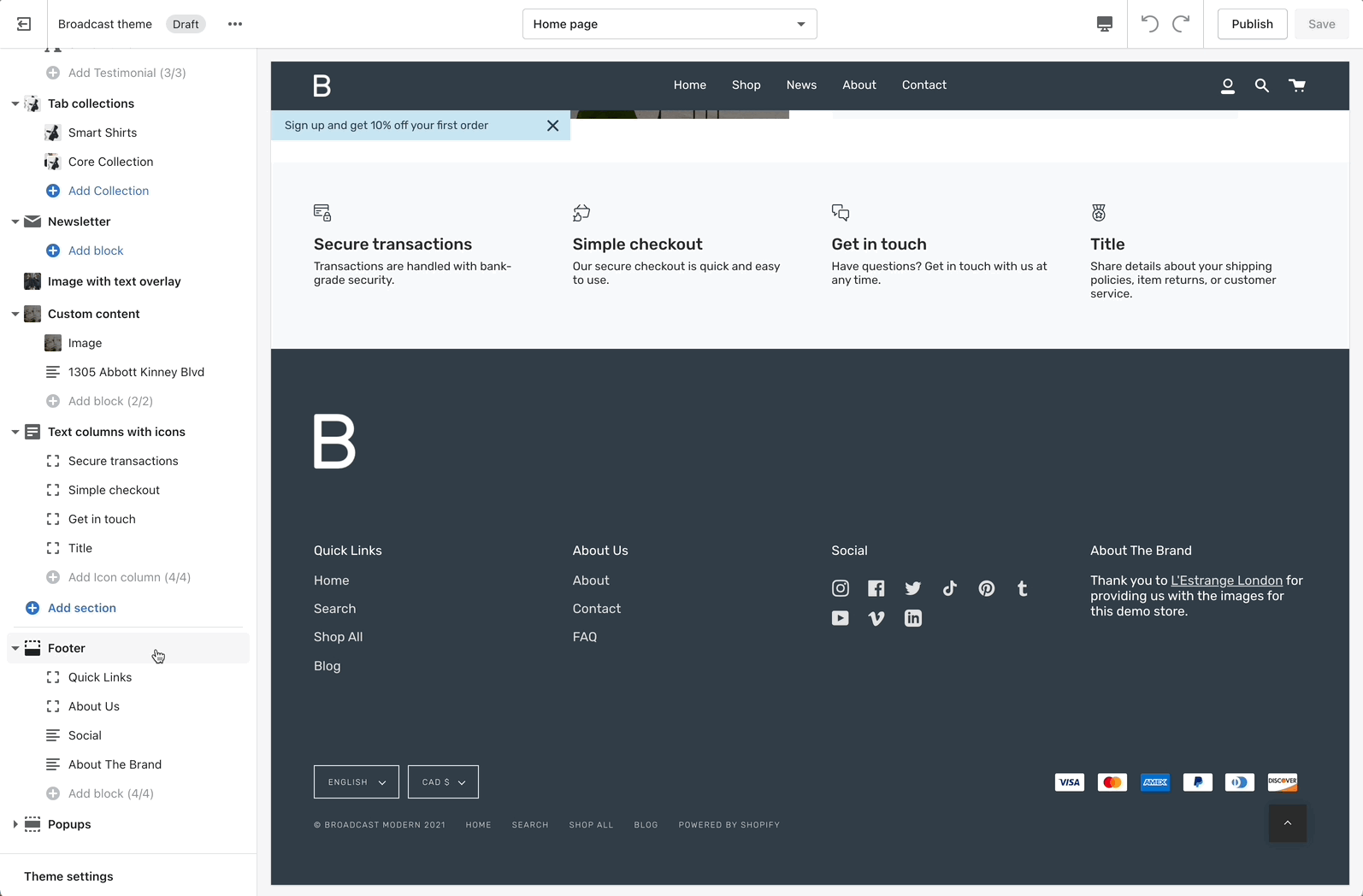

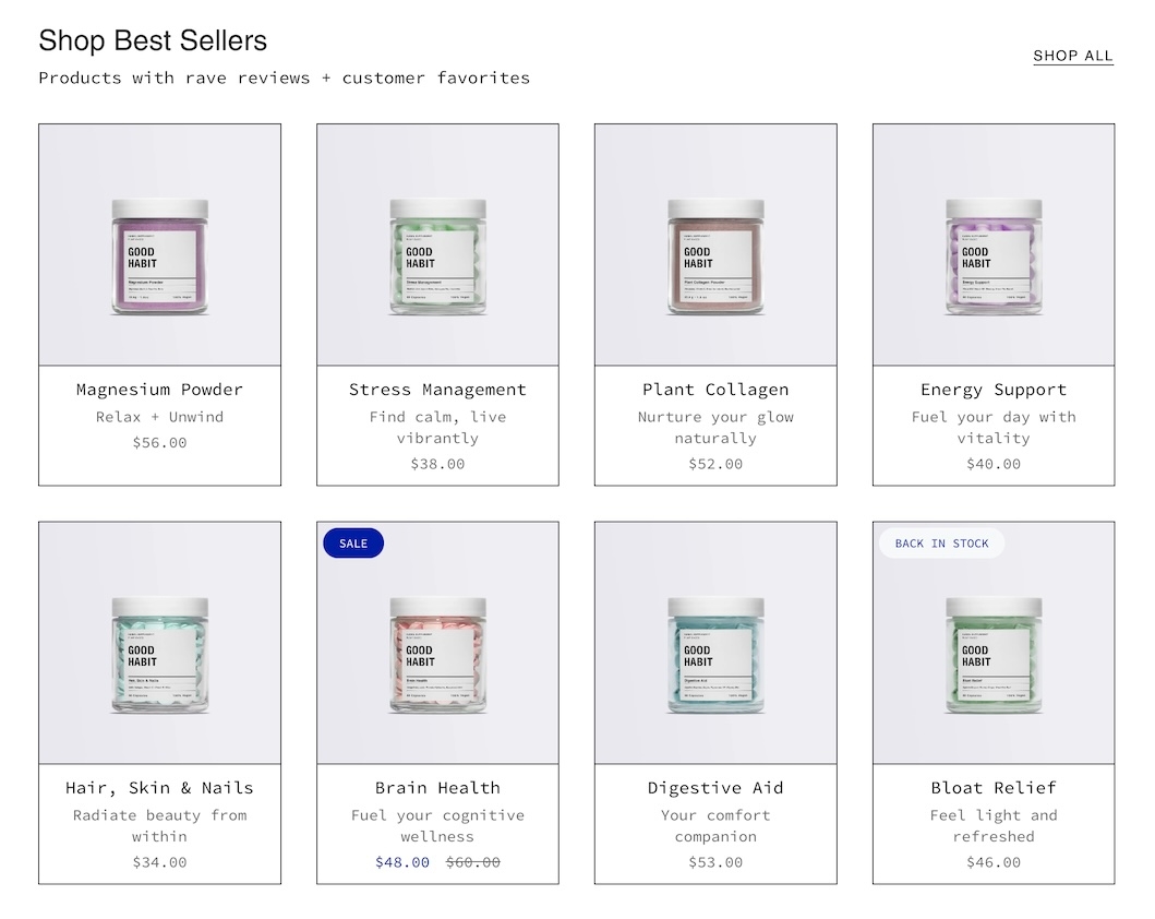
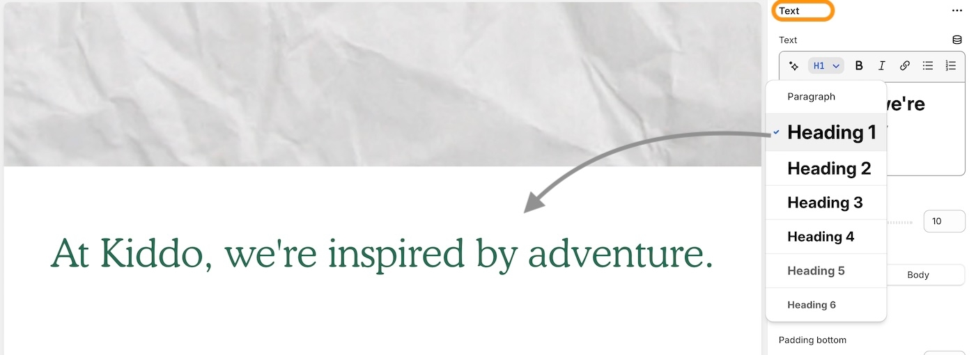
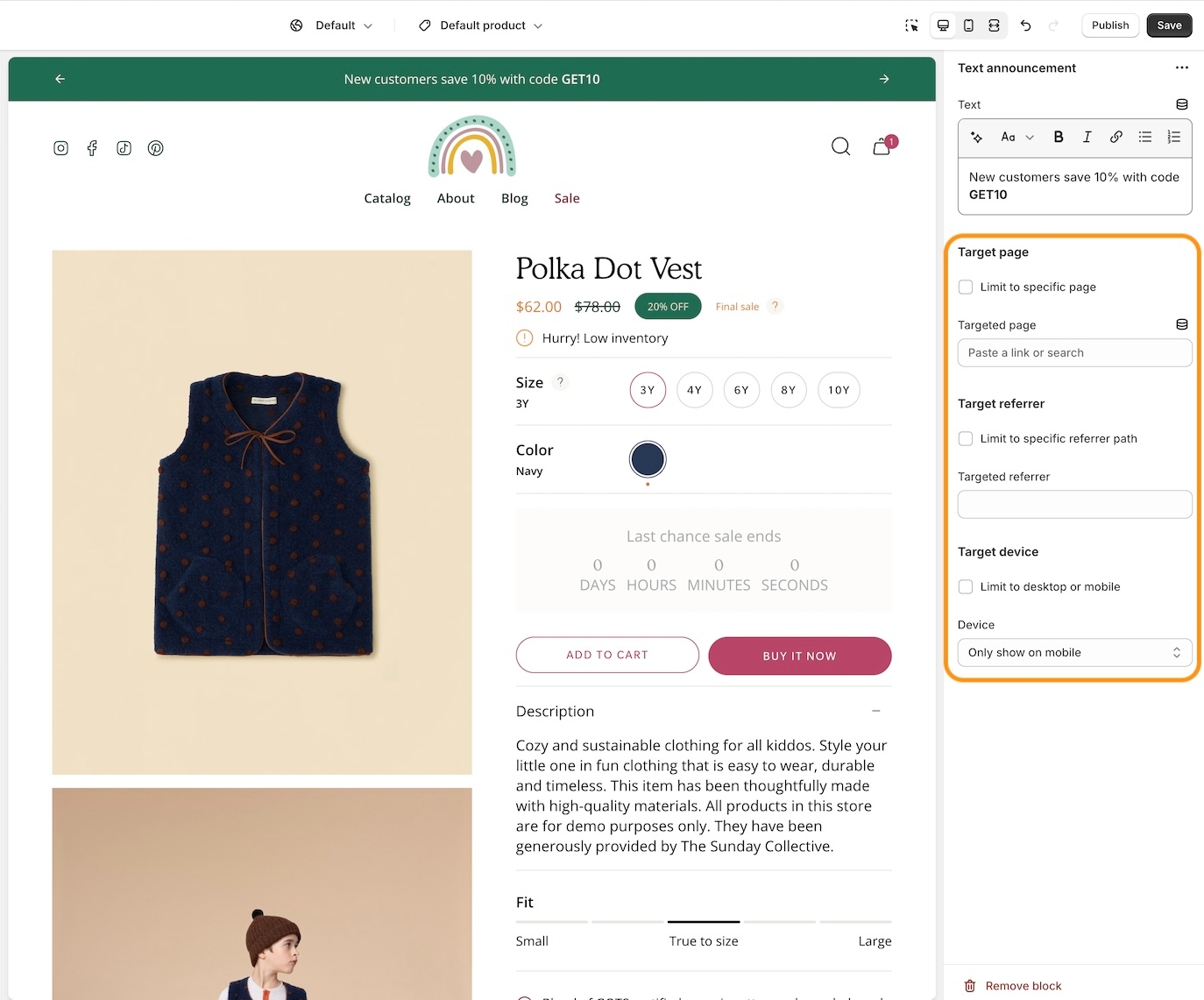
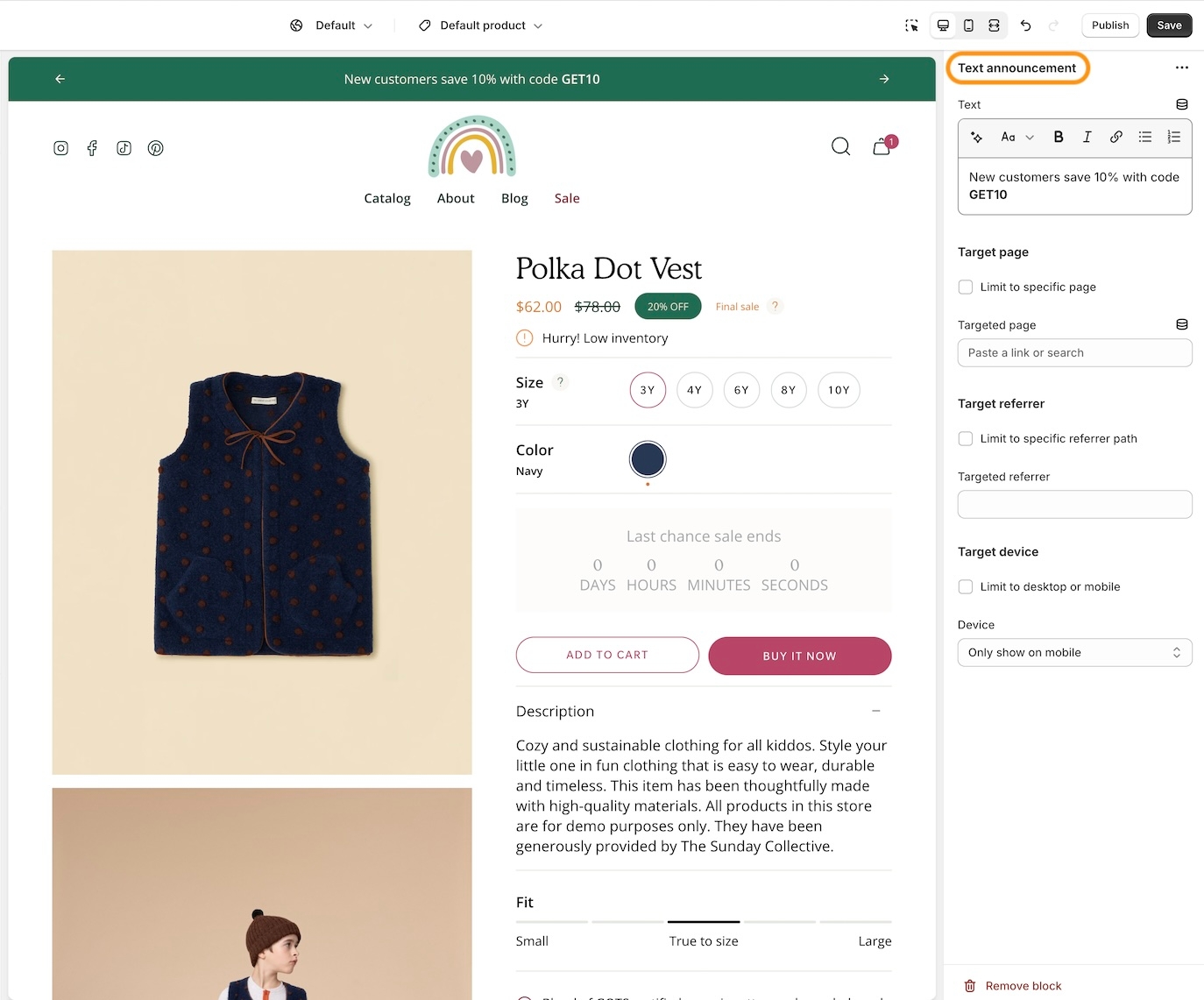
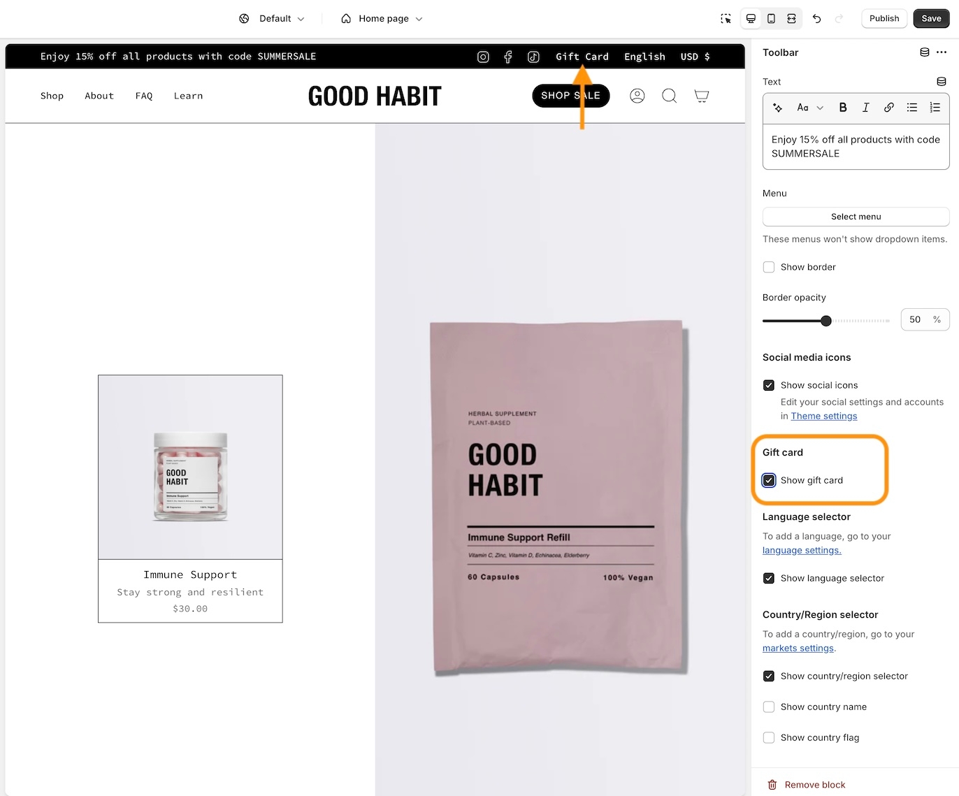
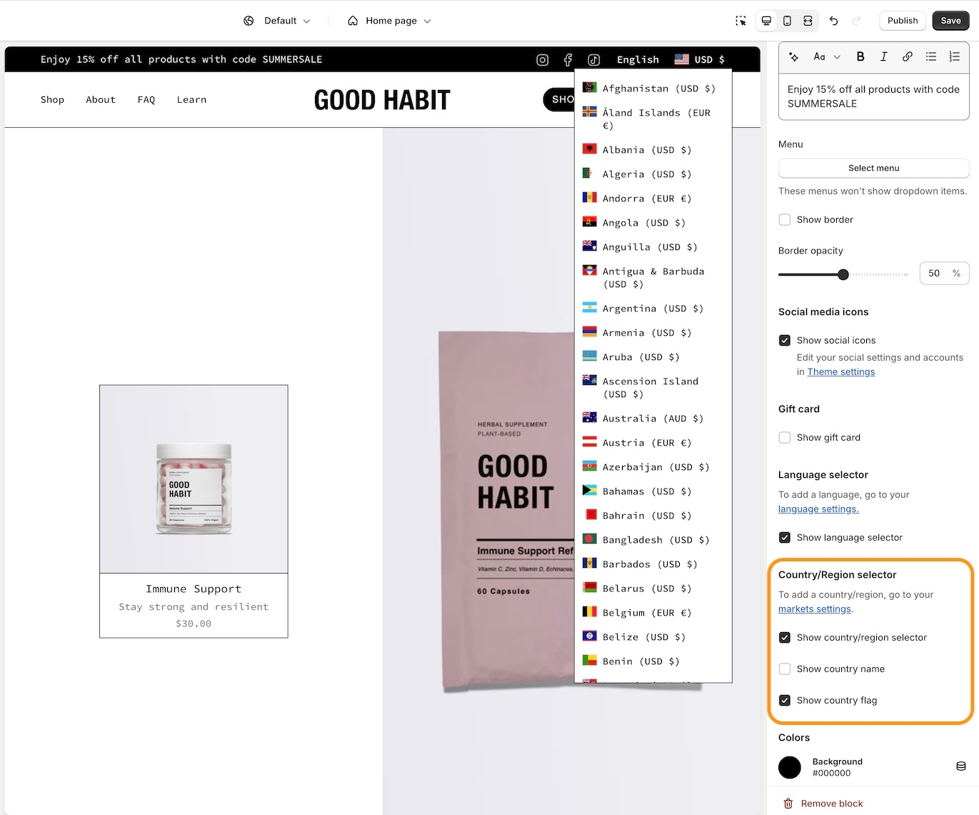
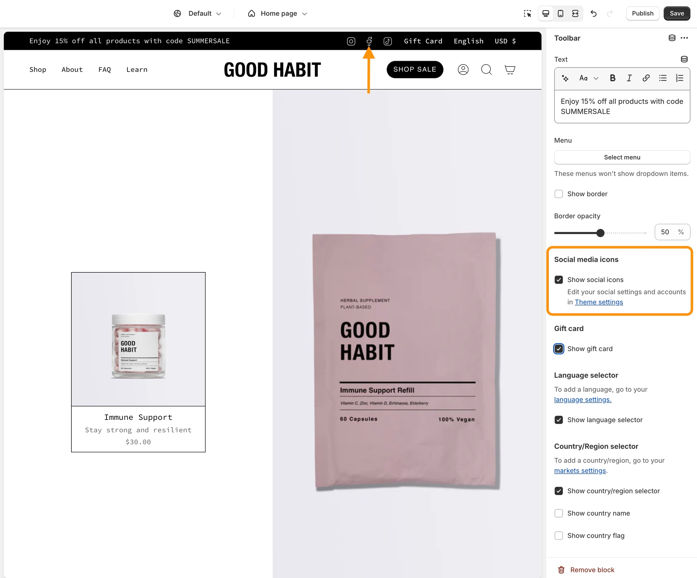
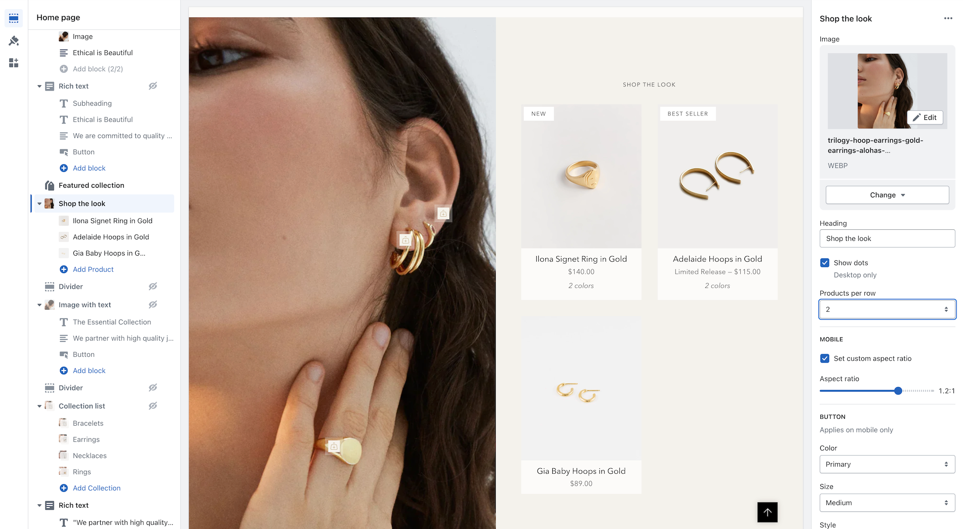
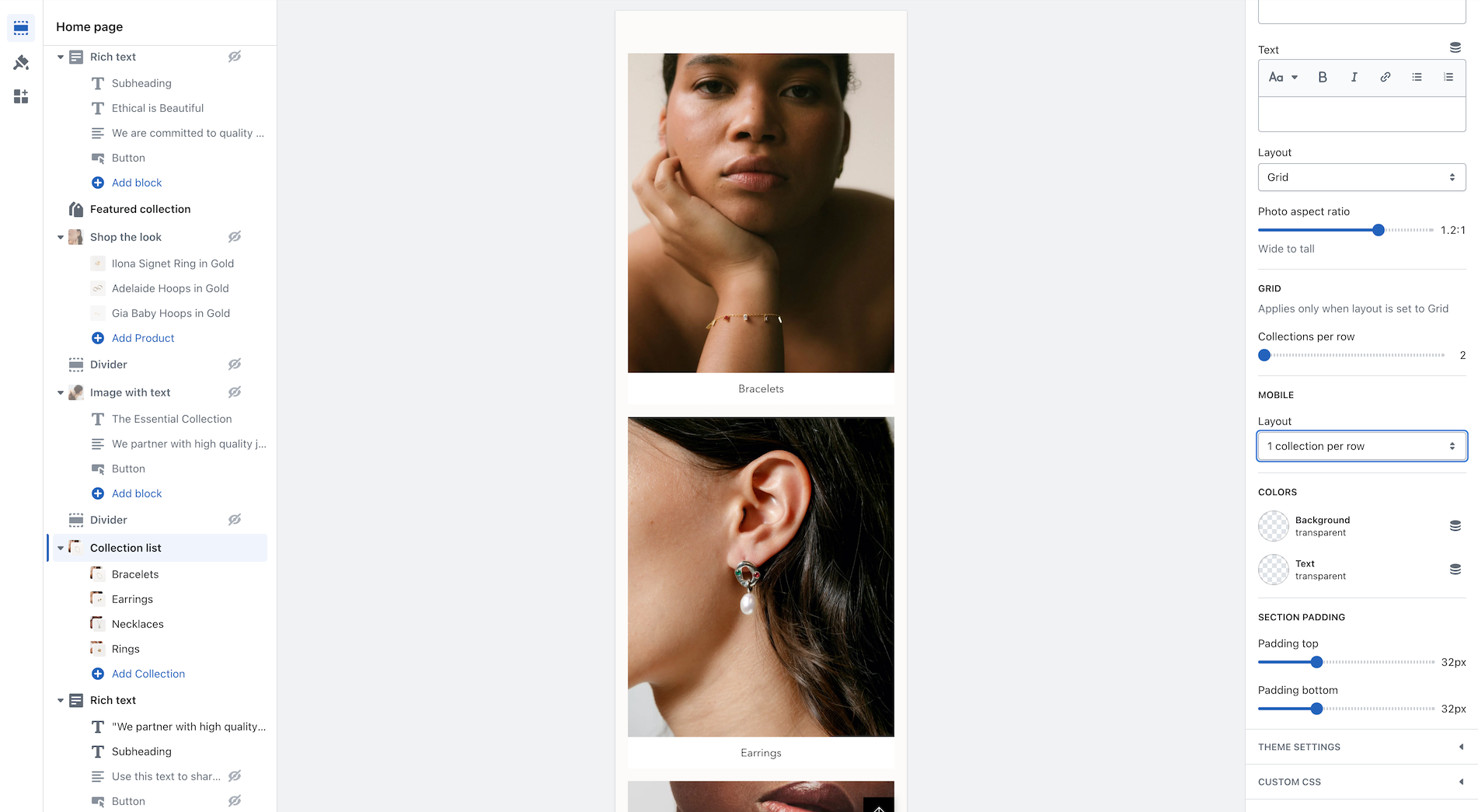
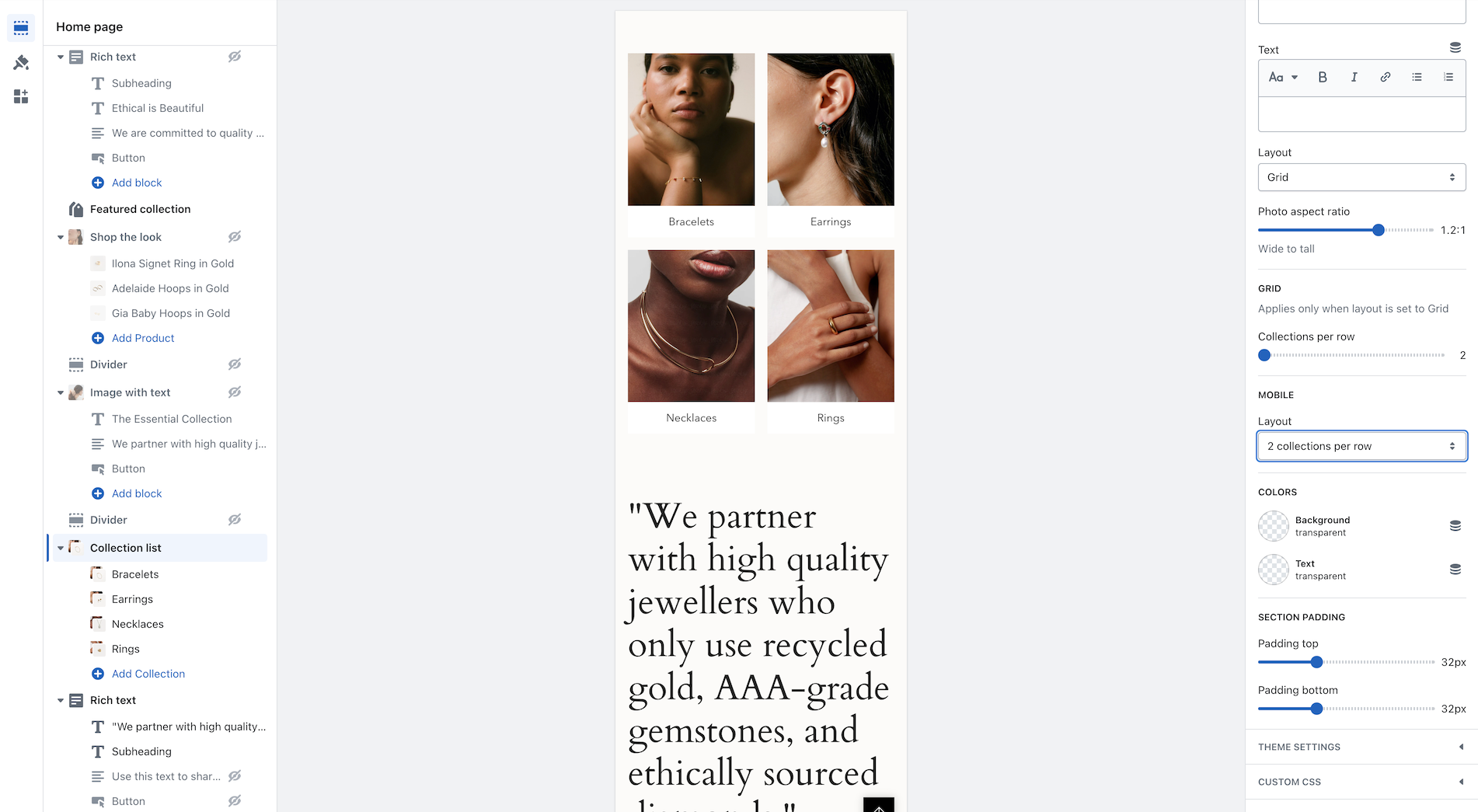
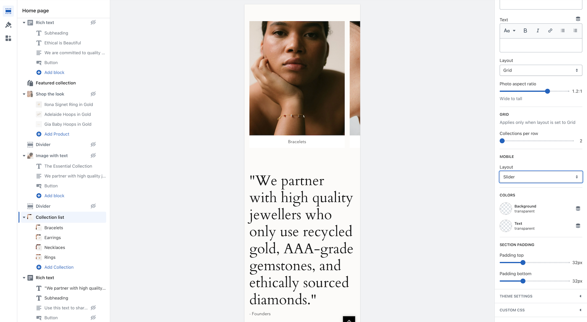
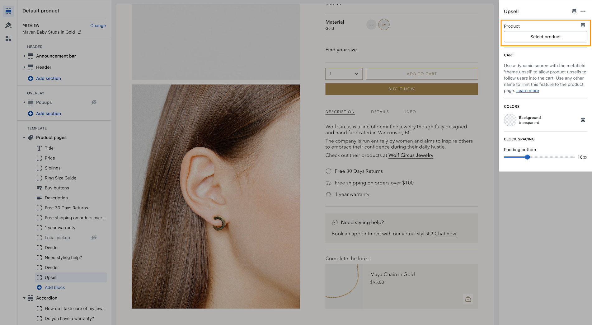
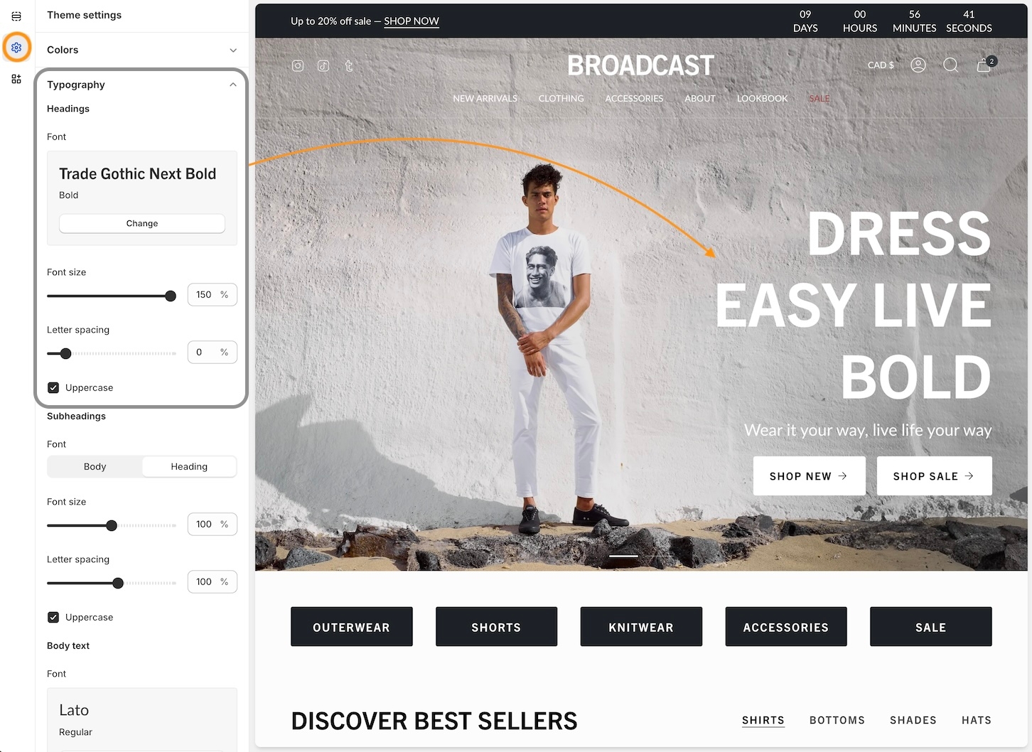
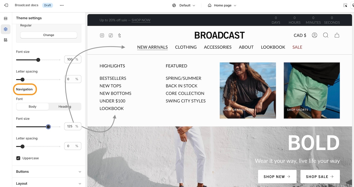

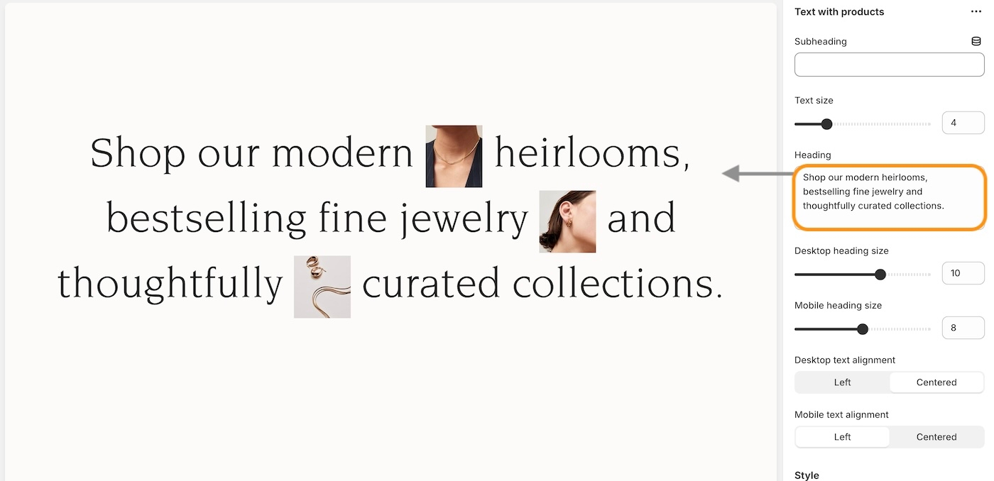

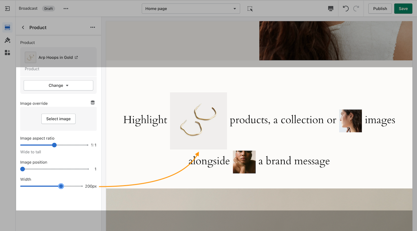
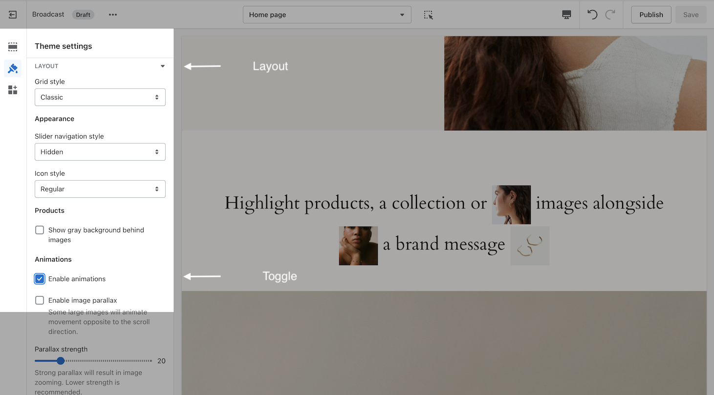

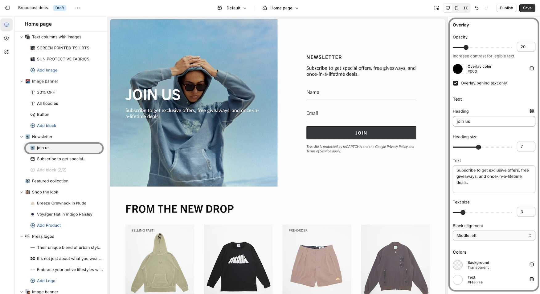
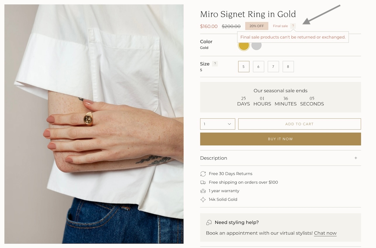


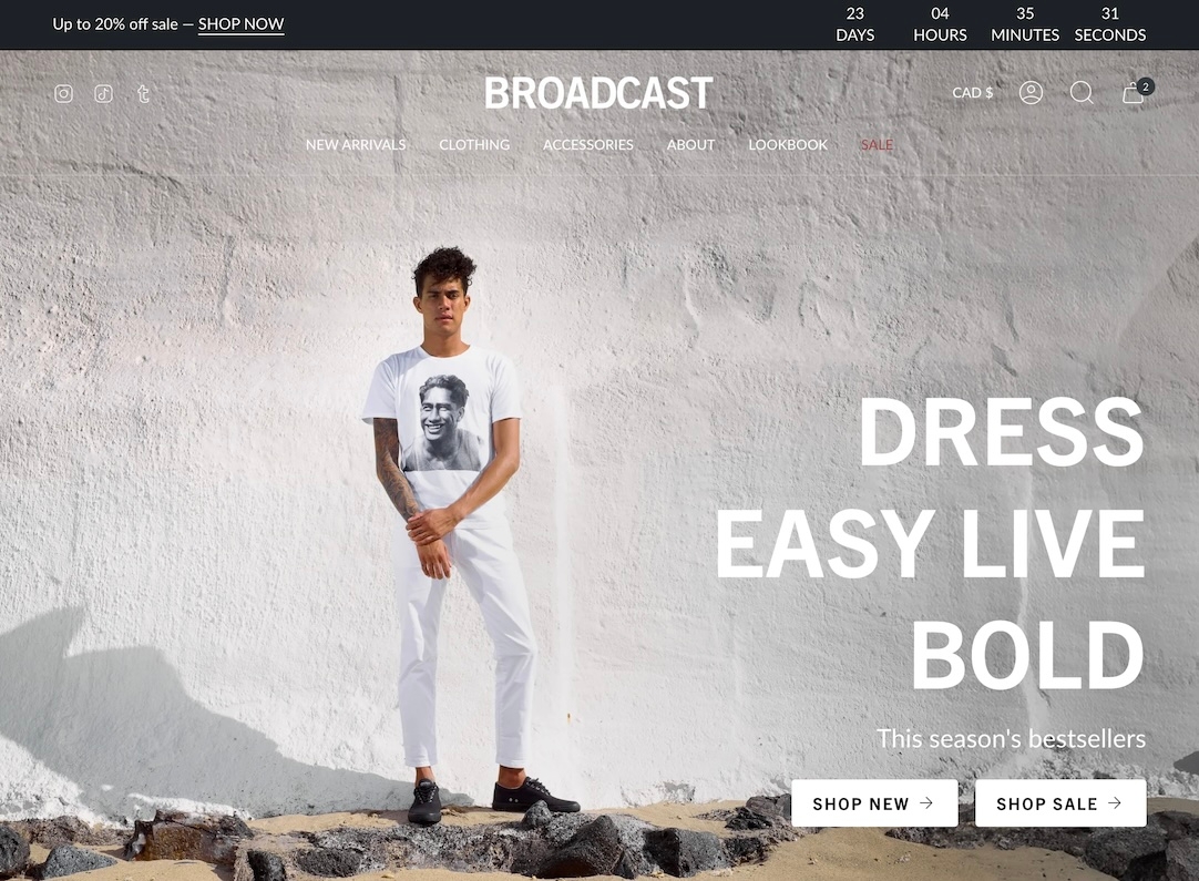
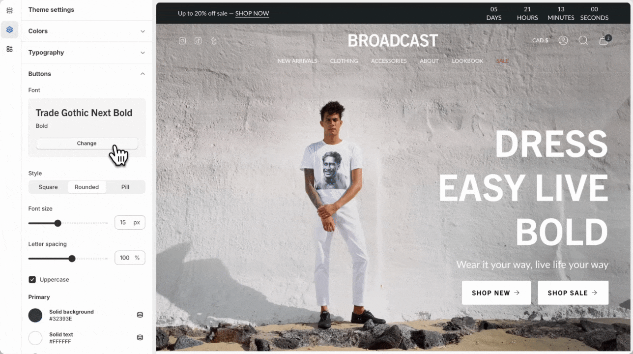
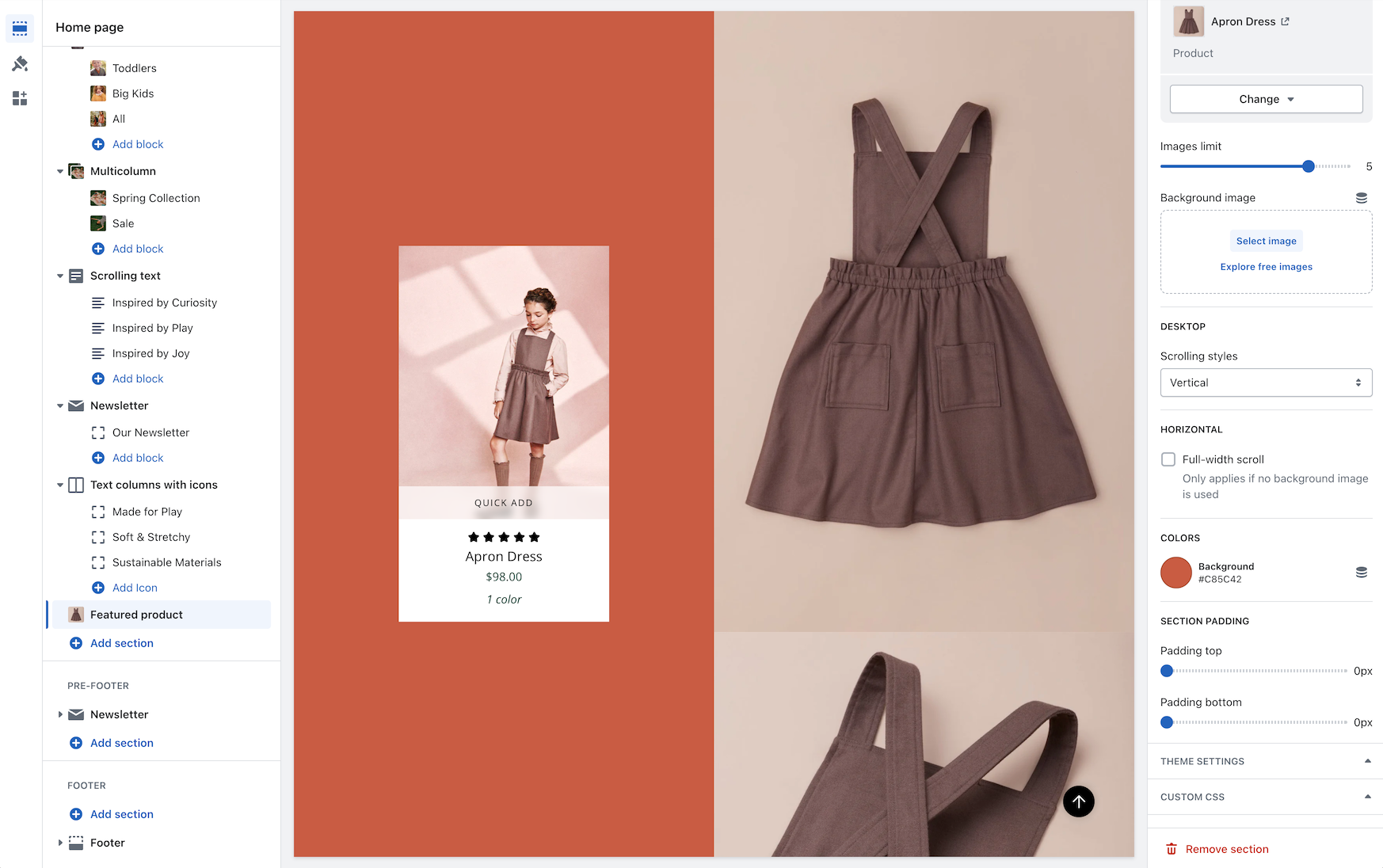
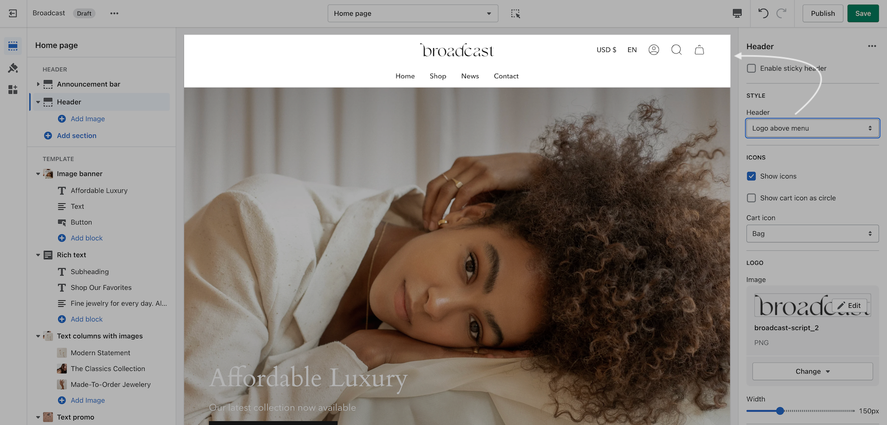
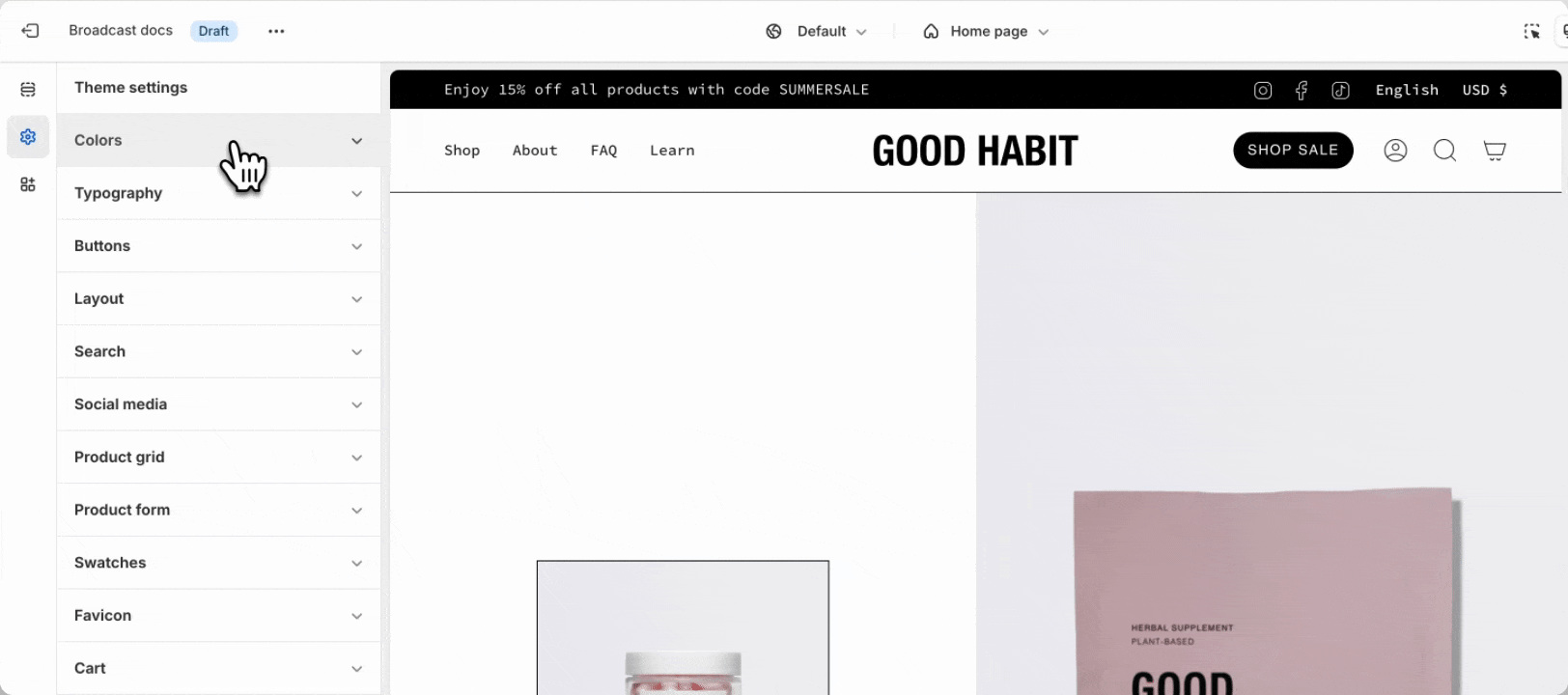
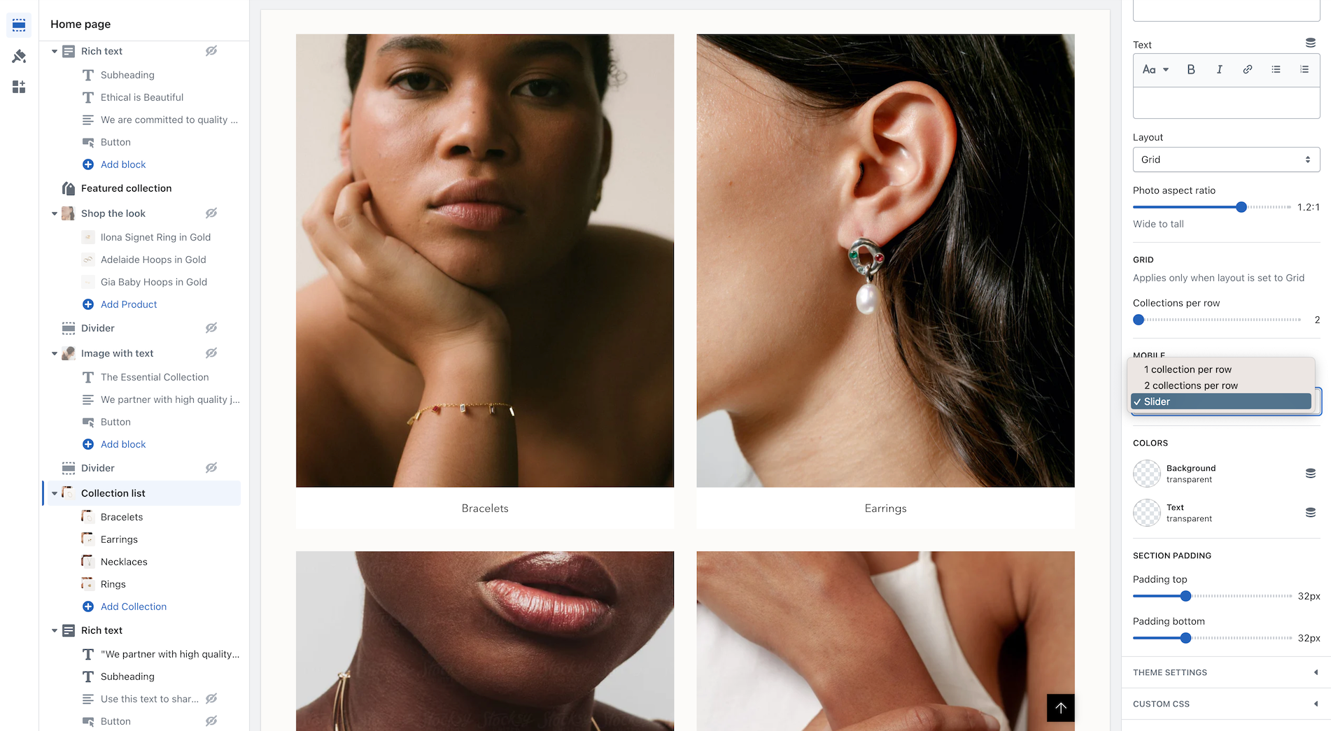
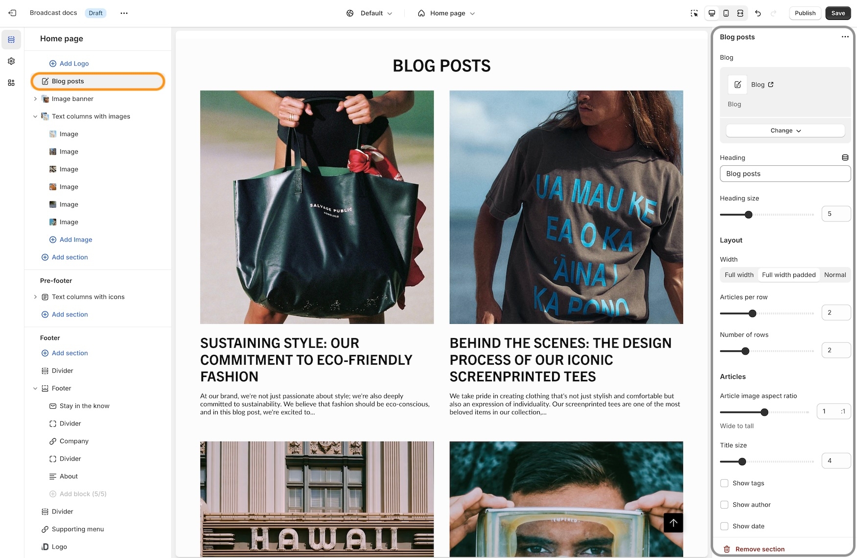

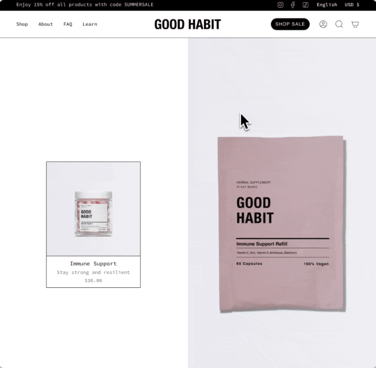

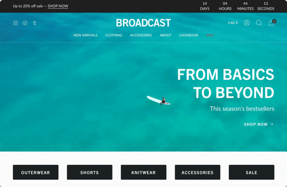
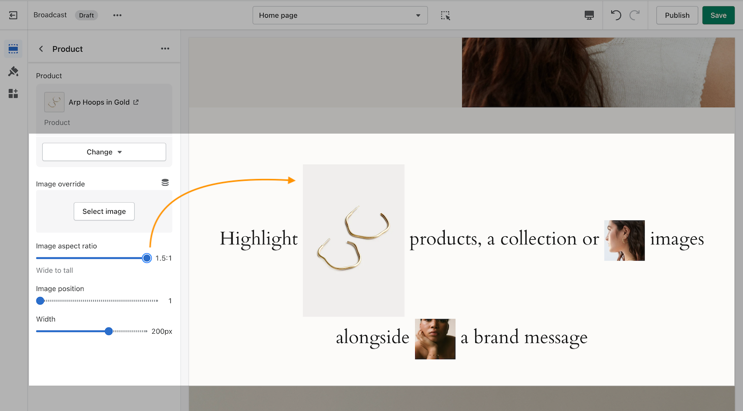
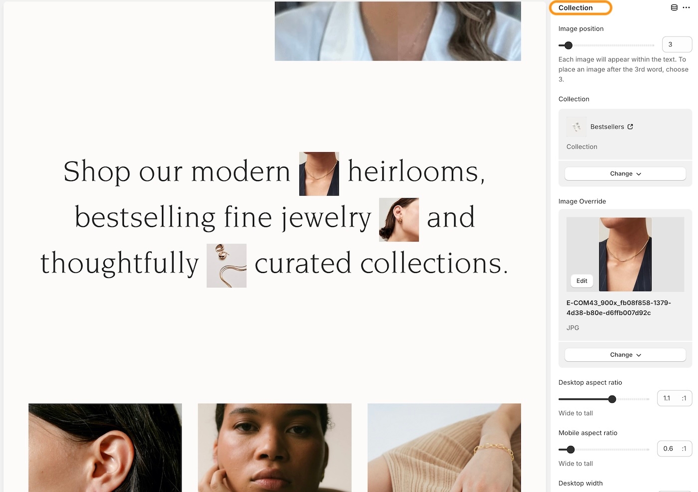
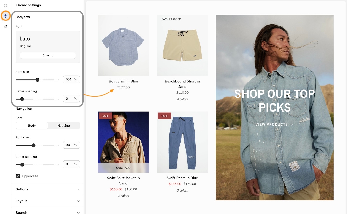
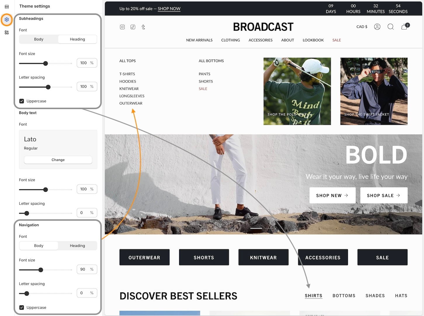

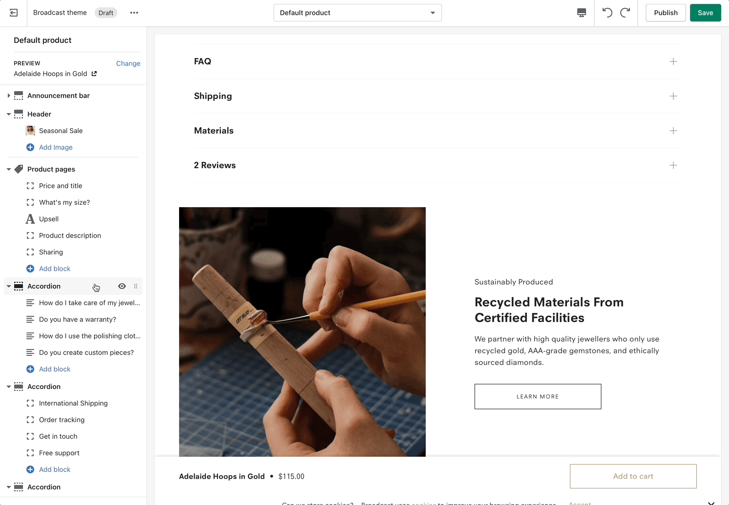
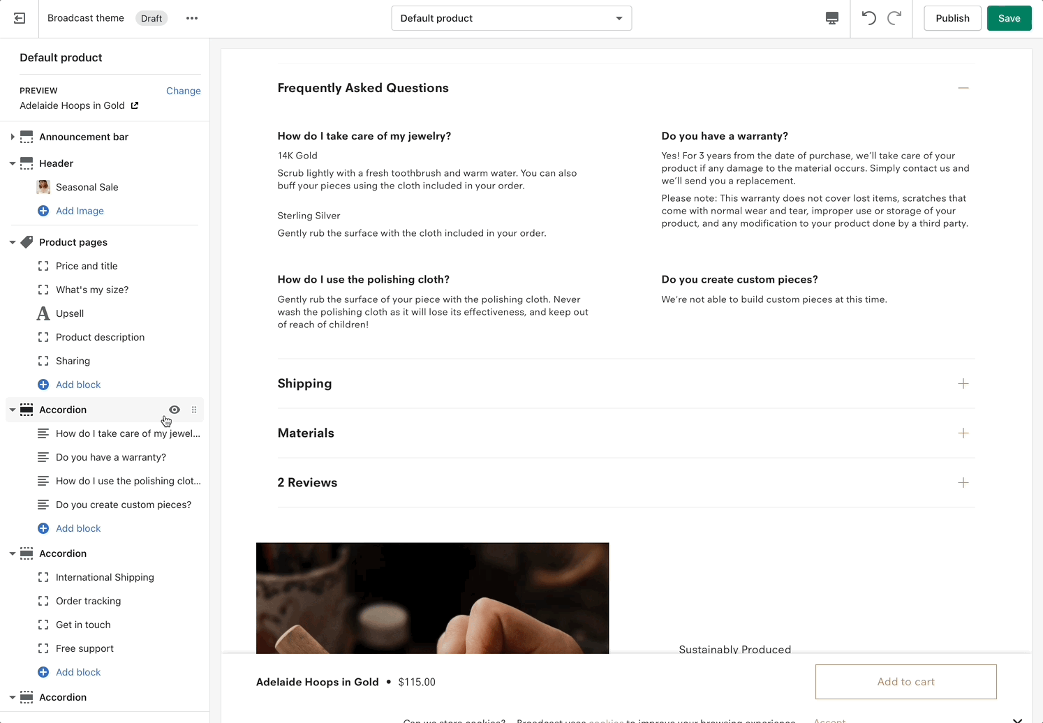

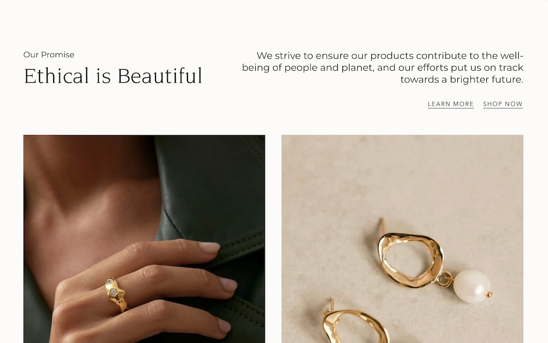
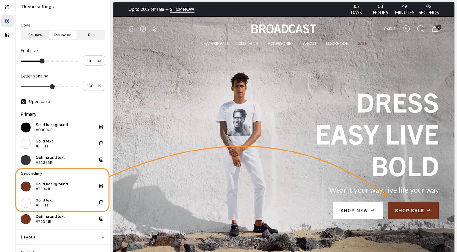
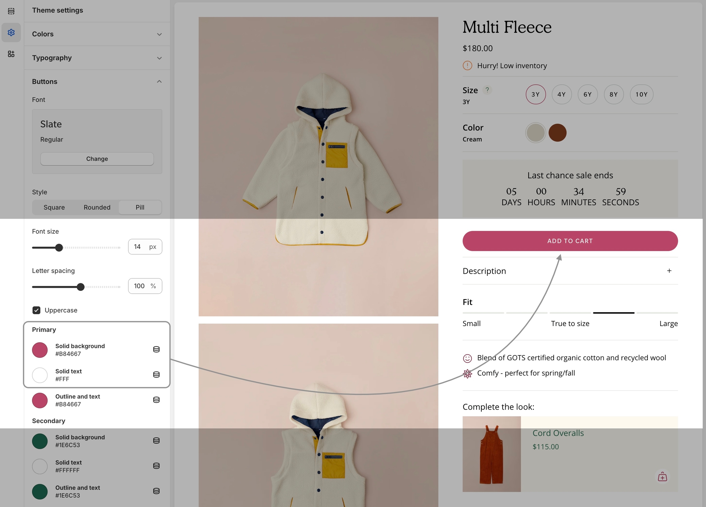
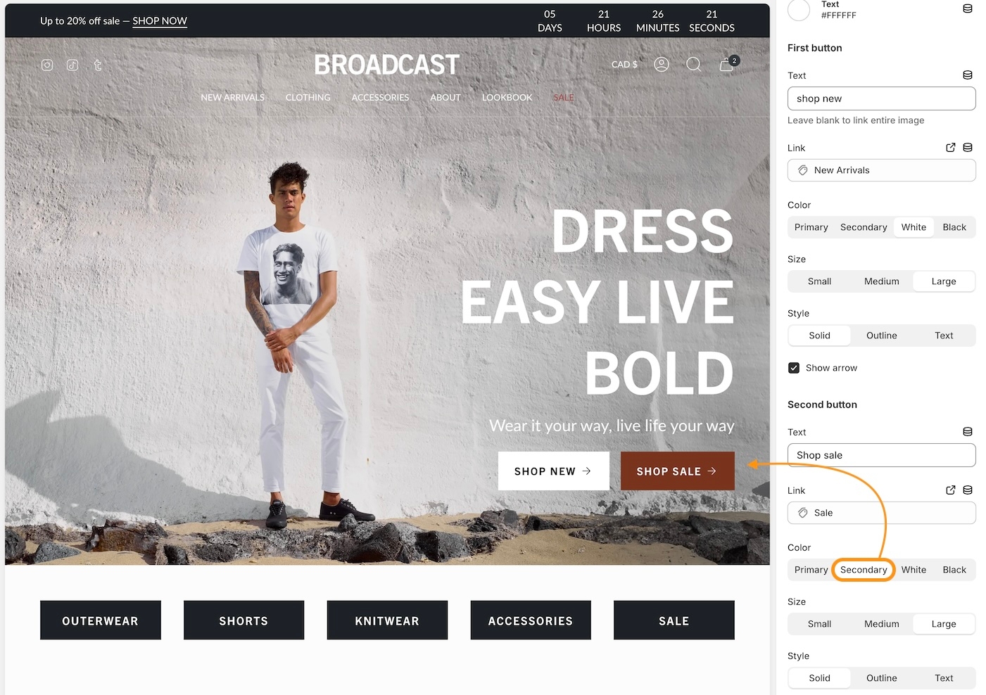
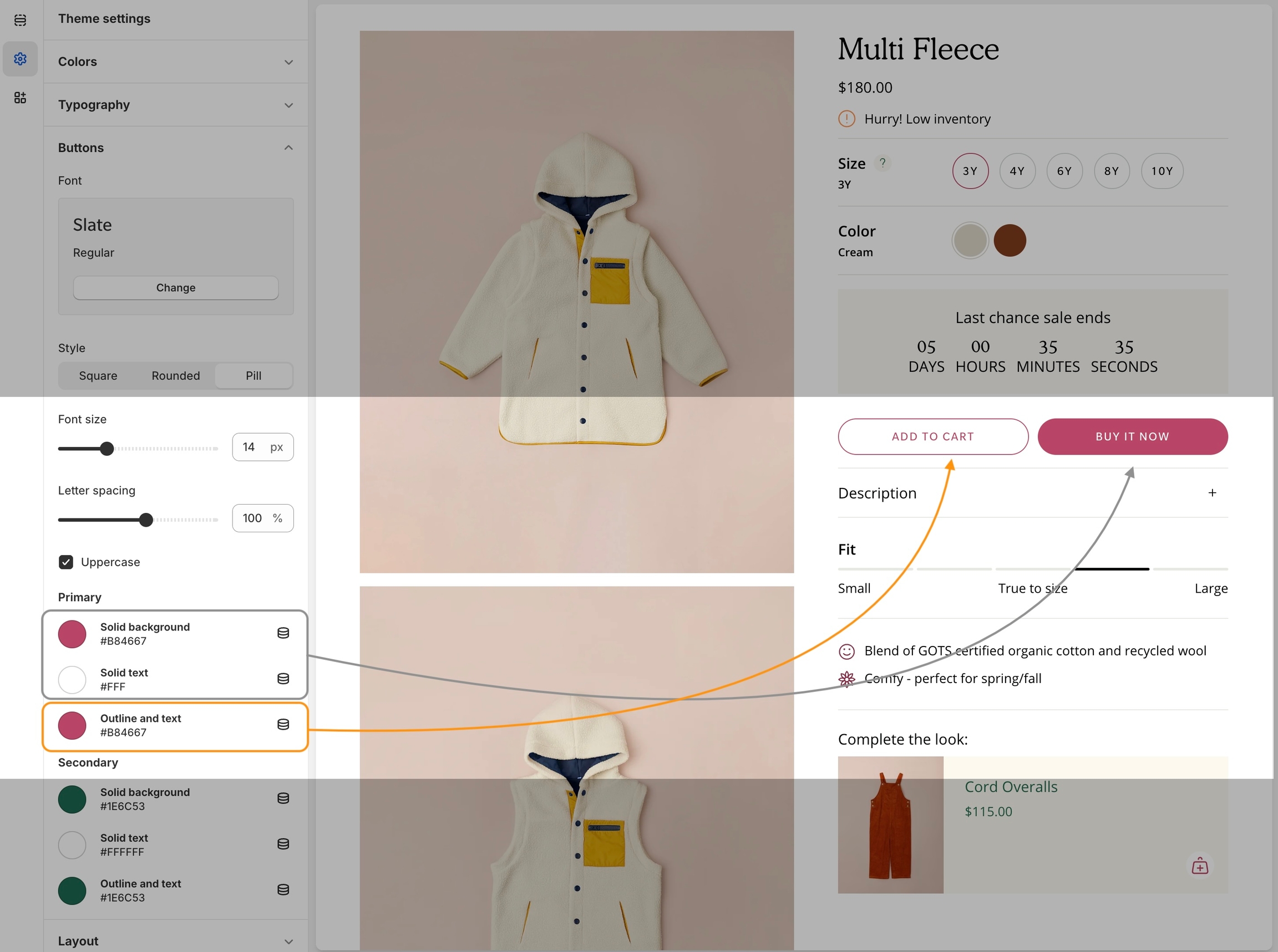
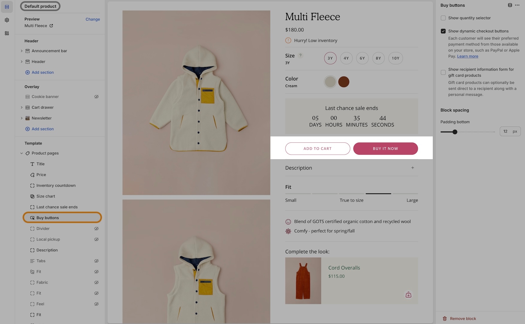
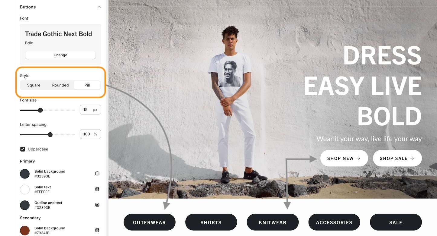
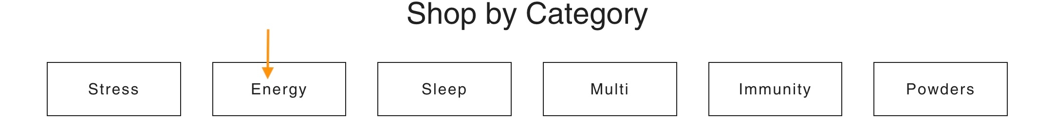
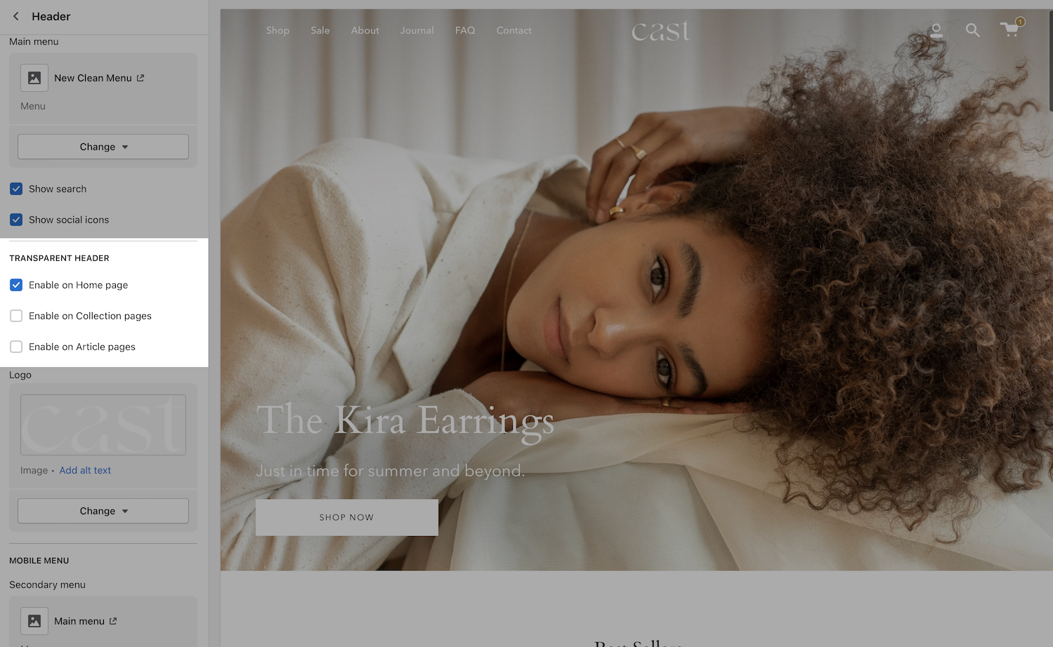
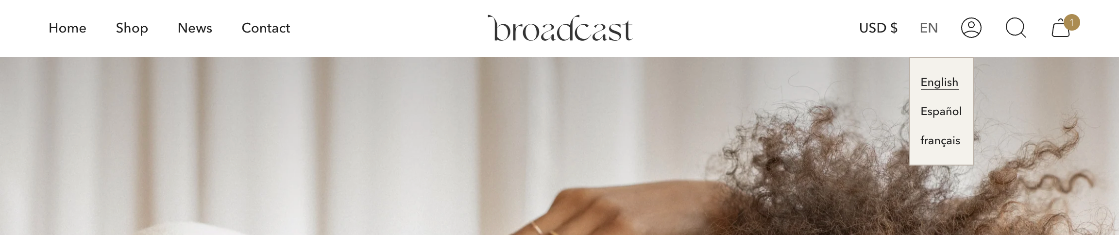

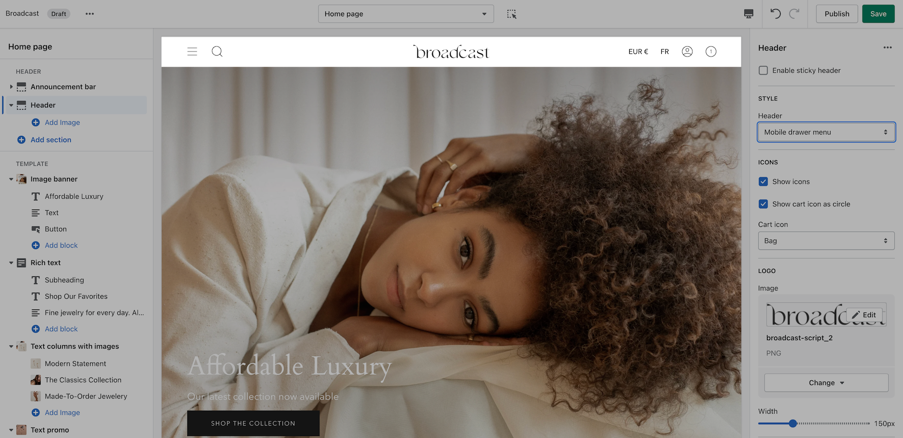
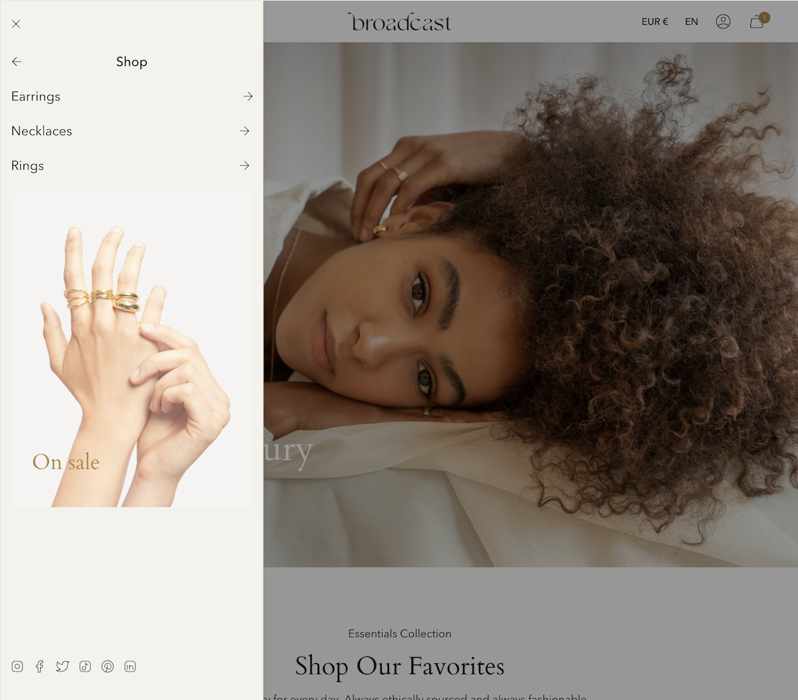
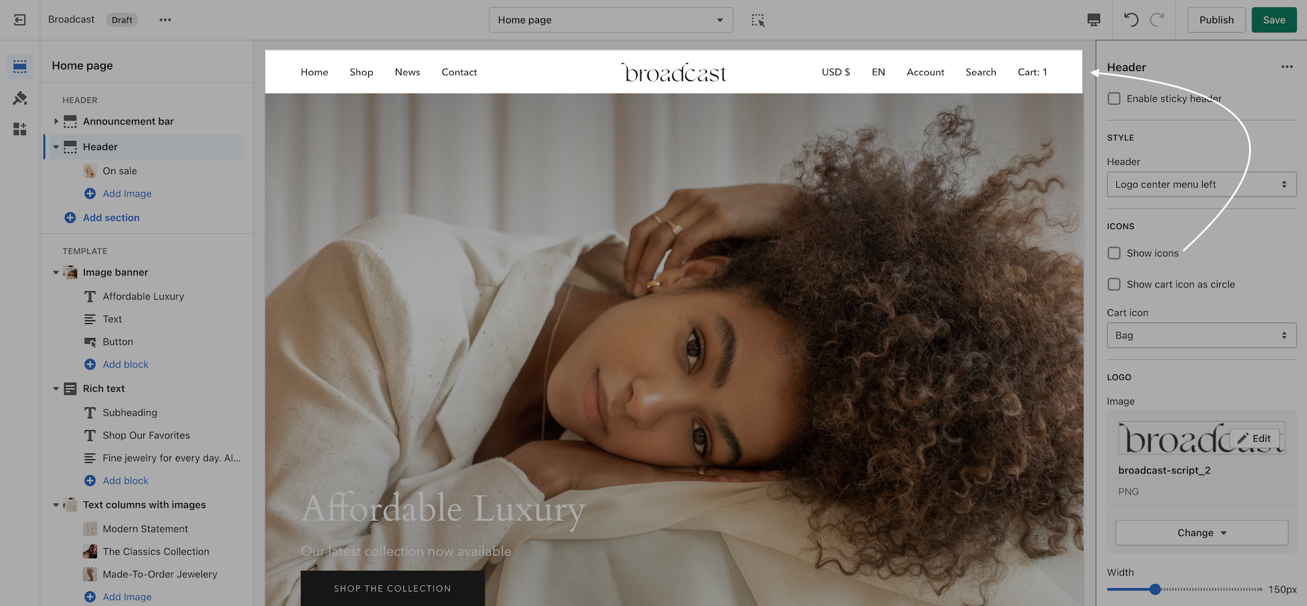
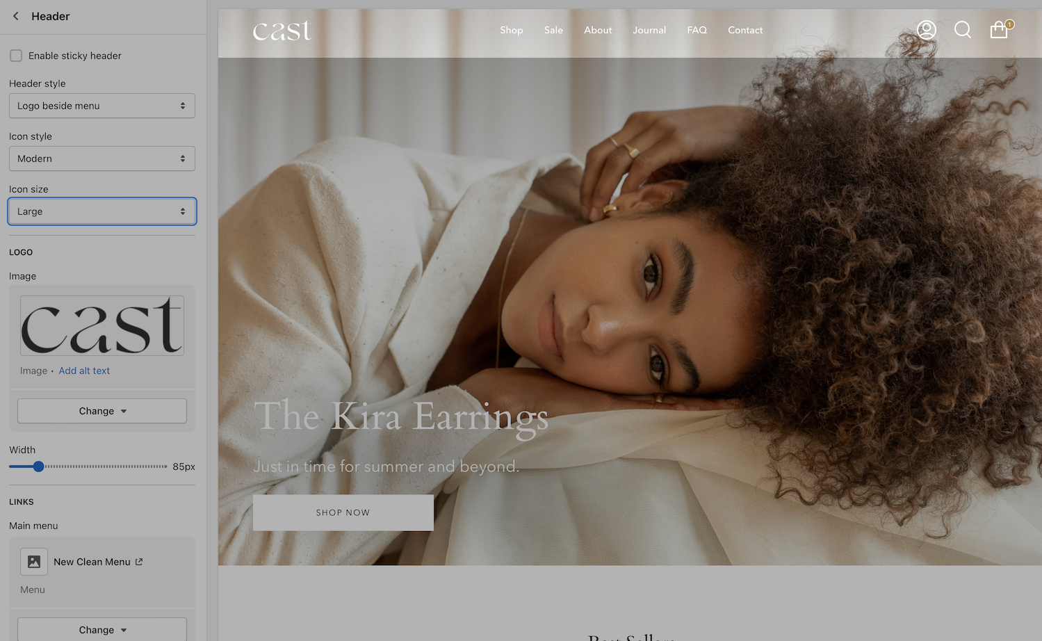
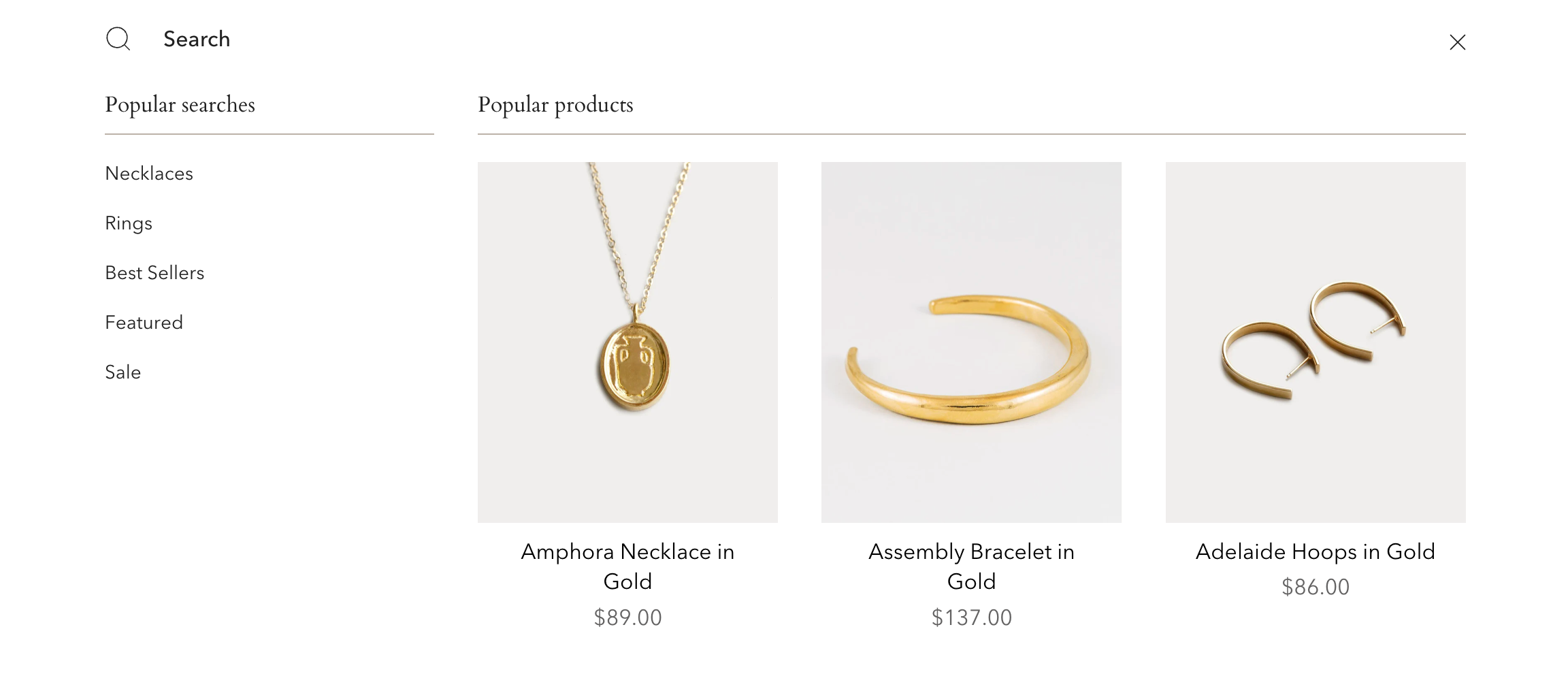
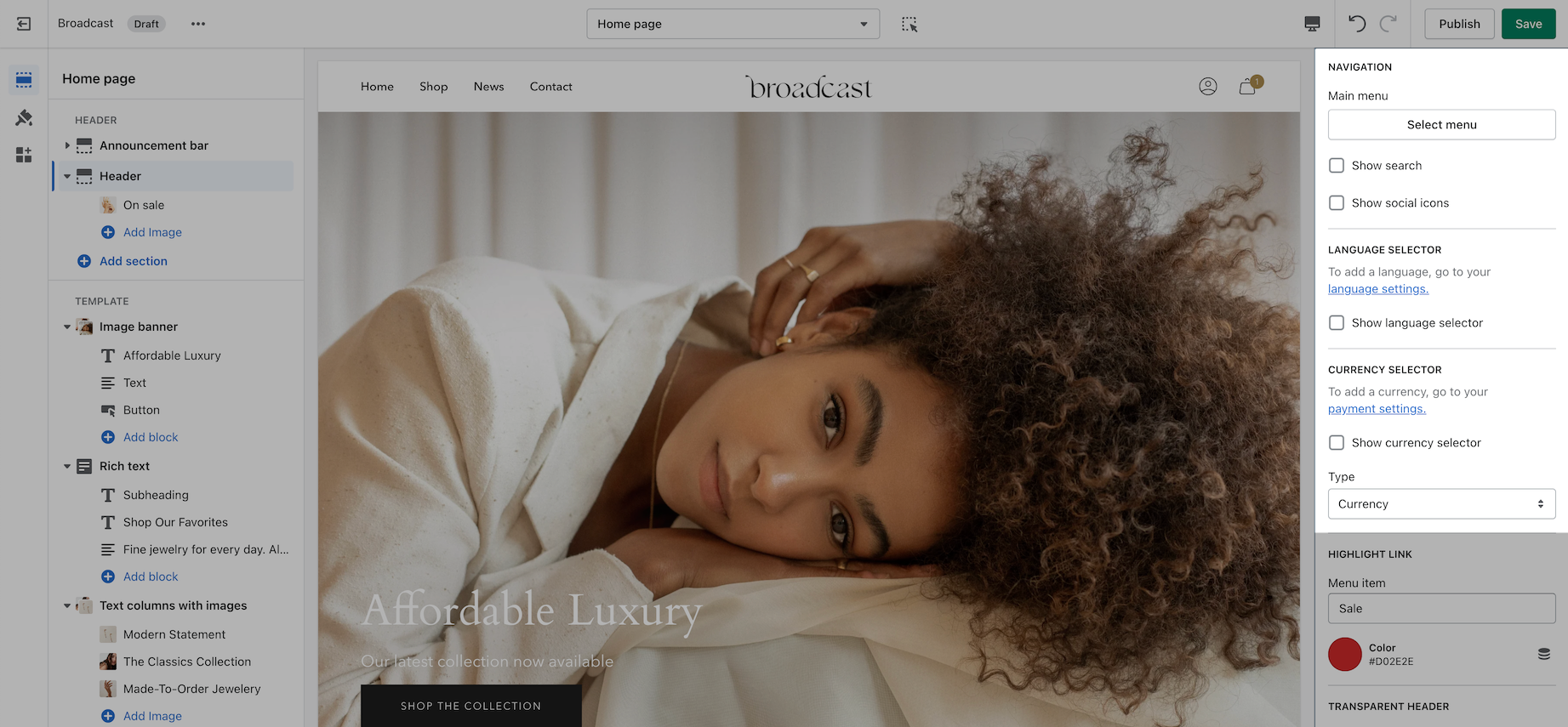
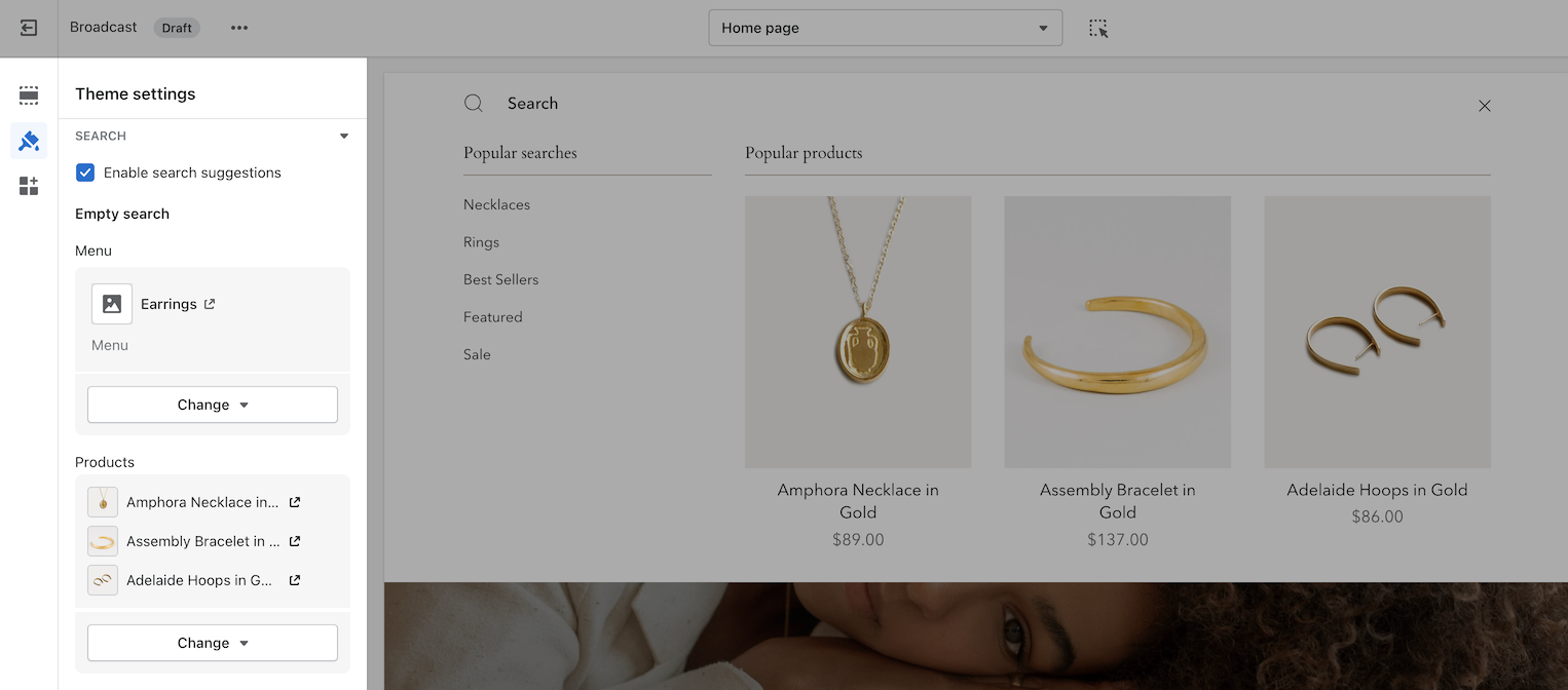
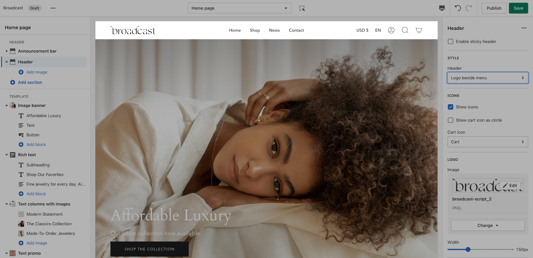
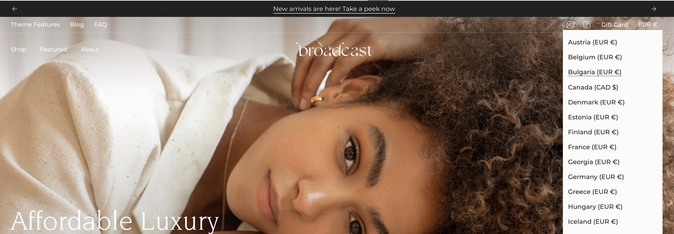
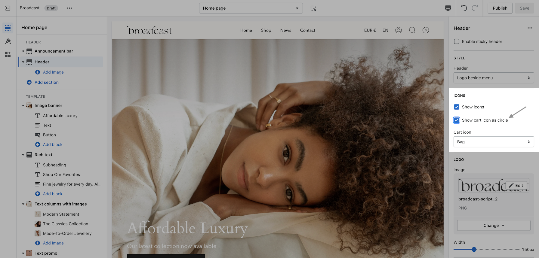