Accordion
Enhanced accordion with image columns, icon columns, a contact form and more
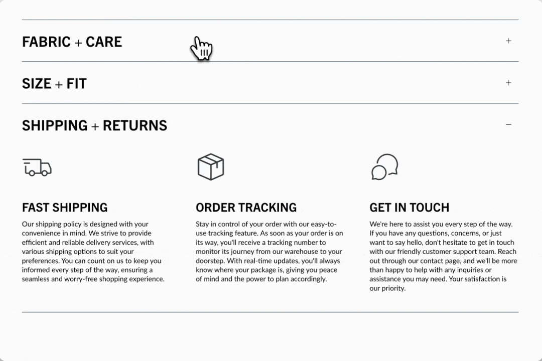
This Broadcast section is packed with full-featured accordion blocks to help you design and build rich, interactive content. Display columns of rich content, such as images, icons with messaging, and text.
Section settings
Build rich accordions on the home page, a lookbook, product pages, or anywhere on your site. Choose from a rich set of content blocks to display eye-catching information. Stack multiple accordion sections together to incorporate multiple column sizes.
Open by default
checkbox
When enabled, the first accordion item is expanded by default.
Typography
Heading
text
Main heading for the section. Hidden if left blank.
Heading size
select
Controls the size of the section heading. Options: Mini, Extra small, Small, Medium, Large, or Extra large.
Icon
Show icon
checkbox
Toggle visibility of icons for each item.
Icon
select
Choose from a list of themed icons.
Alternative icon/image
image_picker
Upload a custom image.
Size
range
Set the size of the icon/image.
Layout
Width
select
Choose between Normal or Narrow container width.
Colors
Color scheme
color_scheme
Select a predefined color scheme.
Icon
color
Set a custom icon color.
Padding
Top
range
Add top padding.
Bottom
range
Add bottom padding.
Video Overview
This video demonstrates how to create image, icon and text accordions in Broadcast:
See also
For pages with longer question-and-answer style content, Broadcast has a unique Sidebar section that automatically generates navigation to groups of questions or content:
SidebarFor a simple text-based question-and-answer section that supports one or two columns, Broadcast includes the Accordion group section:
Accordion groupText column
Commonly used for standard FAQ-style accordions.

Heading
text
Title for the accordion item.
Heading size
select
Controls the font size of the heading: Mini, Extra small, Small, Medium, Large, or Extra large.
Text
richtext
Main content area, use for FAQs, explanations, or supporting info.
Image column
Add images to your accordion for a more appealing branded experience.

Heading
text
Title for the accordion item.
Heading size
select
Controls the font size of the heading: Mini,Extra small, Small, Medium, Large, or Extra large.
Text
richtext
Description or supporting content under the heading.
Image
image_picker
Upload an image (recommended: 1400x1400px JPG).
Photo aspect ratio
range
Adjusts image height-to-width ratio.
Icon column
Choose from a rich set of modern icons by Broadcast or add your own.

Icon
select
Choose from a predefined list of themed icons.
Size
range
Adjusts the icon size.
Icon color
color
Set a custom color for the icon.
Heading
text
Title displayed beside or below the icon.
Heading size
select
Controls the font size of the heading: Mini,Extra small, Small, Medium, Large, or Extra large.
Icon alignment
select
Position of the icon: Left or Center.
Text
richtext
Descriptive text beneath the heading.
Text alignment
select
Align text: Left or Centered .
Custom code
Build your custom accordion column with app code, HTML or Liquid.

Custom code
liquid
Add your own HTML or Liquid code to display custom content.
Contact form
Incorporate a Contact form right into your accordions.

Show reCAPTCHA terms
checkbox
Displays reCAPTCHA terms if spam protection is enabled in store settings.