# Dynamic content

The dynamic content section allows you to showcase different content blocks such as images, text, icons, videos, and many more in a grid-based layout. It's perfect for creating unique content, and the possibilities with this section are almost infinite.

<figure><img src="https://2636770384-files.gitbook.io/~/files/v0/b/gitbook-x-prod.appspot.com/o/spaces%2FsD7BEEDU3B7WiEJlN0F7%2Fuploads%2FXIKHvmQw8qiBxe7FJawX%2Fimage.png?alt=media&#x26;token=6c11ea34-4d29-42e0-8b83-b563f348c06a" alt="Example of how the section looks for desktop with two images on each side with text and a single button in between them"><figcaption><p>
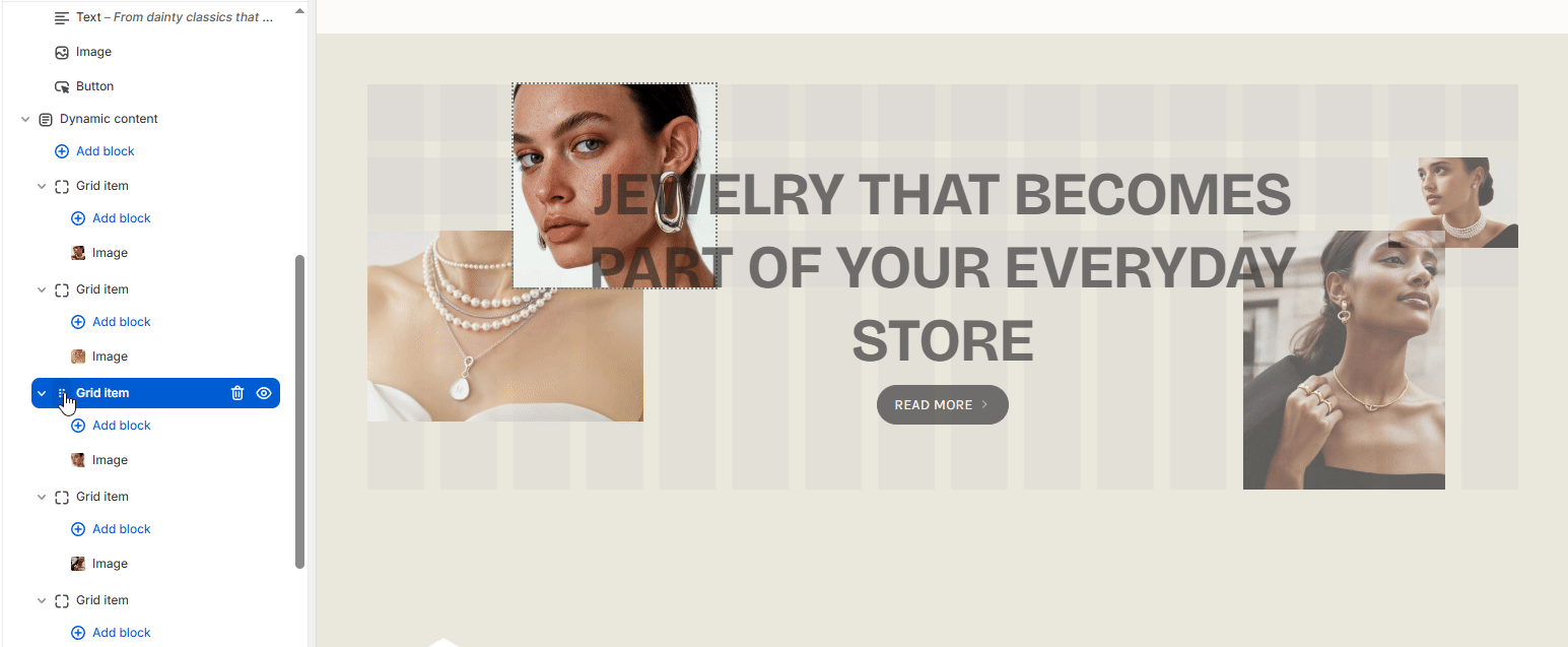
Example of how the section looks on preview for desktop</p></figcaption></figure>

<figure><img src="https://2636770384-files.gitbook.io/~/files/v0/b/gitbook-x-prod.appspot.com/o/spaces%2FsD7BEEDU3B7WiEJlN0F7%2Fuploads%2FFQS3dH81TjtfeUu7DjxY%2Fimage.png?alt=media&#x26;token=5e515364-0a76-4641-bf99-9336e2cc1f5c" alt="Example of how the section looks for mobile with two images on each side with text and a single button in between them"><figcaption><p>Example of how the section looks on preview for mobile</p></figcaption></figure>

### Customize

By default, the section uses a 16-column grid which adjusts automatically to fit your screen. On mobile, it uses an 8-column grid. These can both be customized under the main section settings.

<figure><img src="https://2636770384-files.gitbook.io/~/files/v0/b/gitbook-x-prod.appspot.com/o/spaces%2FsD7BEEDU3B7WiEJlN0F7%2Fuploads%2Fv2OhRMd9VcHzDhUGElrB%2Fimage.png?alt=media&#x26;token=37b08738-7ddb-4a77-9f89-0cacc1b74eb9" alt="Example of how the section looks inside the theme customizer with the grid system. There are 16-columns and all other blocks are rearranged inside them."><figcaption><p>Example of how the section looks inside the theme customizer with the grid system</p></figcaption></figure>

You can change the position of the blocks and tweak their sizes by editing the row and column positions.

<figure><img src="https://2636770384-files.gitbook.io/~/files/v0/b/gitbook-x-prod.appspot.com/o/spaces%2FsD7BEEDU3B7WiEJlN0F7%2Fuploads%2FI1MSaP6uTZx5GSBH0IXo%2Fchrome_l7ZVm9MEki.gif?alt=media&#x26;token=c1951239-c146-4665-8404-ad0e3541bae6" alt="A gif showing how to change the position a block for the dynamic content section through the theme customizer"><figcaption></figcaption></figure>

You can also drag and drop blocks above or below each other to change their priority.

<figure><img src="https://2636770384-files.gitbook.io/~/files/v0/b/gitbook-x-prod.appspot.com/o/spaces%2FsD7BEEDU3B7WiEJlN0F7%2Fuploads%2FnTiOrh6dOtFgGhrDAkJa%2Fchrome_a5Dglb6NMk.gif?alt=media&#x26;token=9ff6d12f-fdca-4b92-97ed-37cdab6450db" alt="A gif showing how to change the priority a block for the dynamic content section through the theme customizer"><figcaption></figcaption></figure>

{% hint style="info" %}
The lowest placed block will have the highest priority, while the highest block(the one closest to the dynamic content) will have the lowest priority.
{% endhint %}

Under each block, you will see an option to limit its visibility for specific devices. This way, you can create a design that fits both desktop and mobile.

<figure><img src="https://2636770384-files.gitbook.io/~/files/v0/b/gitbook-x-prod.appspot.com/o/spaces%2FsD7BEEDU3B7WiEJlN0F7%2Fuploads%2F9DQRlV7YTMiBX9gdEcYO%2Fchrome_vjON7T8X8t.gif?alt=media&#x26;token=2d6b8b2b-7baf-40d9-abe8-29217690f021" alt="A gif showing how the target devices option works when enabled/disabled"><figcaption></figcaption></figure>

### Section settings

| Settings         | Type           | Description                                                                                                                                                                 |
| ---------------- | -------------- | --------------------------------------------------------------------------------------------------------------------------------------------------------------------------- |
| **General**      |                |                                                                                                                                                                             |
| Color scheme     | `color_scheme` | Select the color scheme applied to the section. Default: `scheme_1`.                                                                                                        |
| **Desktop grid** |                |                                                                                                                                                                             |
| Info text        | `paragraph`    | Uses a 16-column grid. Rows adjust automatically to fit your content.                                                                                                       |
| Gap              | `range`        | Controls spacing between grid items on desktop. Range: 0–50px, step: 2px. Default: 16px.                                                                                    |
| **Mobile grid**  |                |                                                                                                                                                                             |
| Info text        | `paragraph`    | Uses an 8-column grid. Rows adjust automatically to fit your content. Switch to mobile preview to configure the section more easily.                                        |
| Gap              | `range`        | Controls spacing between grid items on mobile. Range: 0–50px, step: 2px. Default: 10px.                                                                                     |
| **Layout**       |                |                                                                                                                                                                             |
| Width            | `select`       | <p>Controls section width.<br>Options:</p><ul><li><code>wrapper--full</code> — Full width</li><li><code>wrapper--full-padded</code> — Full width padded (default)</li></ul> |
| **Padding**      |                |                                                                                                                                                                             |
| Top              | `range`        | Top padding of the section. Range: 0–200px, step: 2px. Default: 50px.                                                                                                       |
| Bottom           | `range`        | Bottom padding of the section. Range: 0–200px, step: 2px. Default: 50px.                                                                                                    |
