What's new in Broadcast
New features and updates in Broadcast
Release Notes
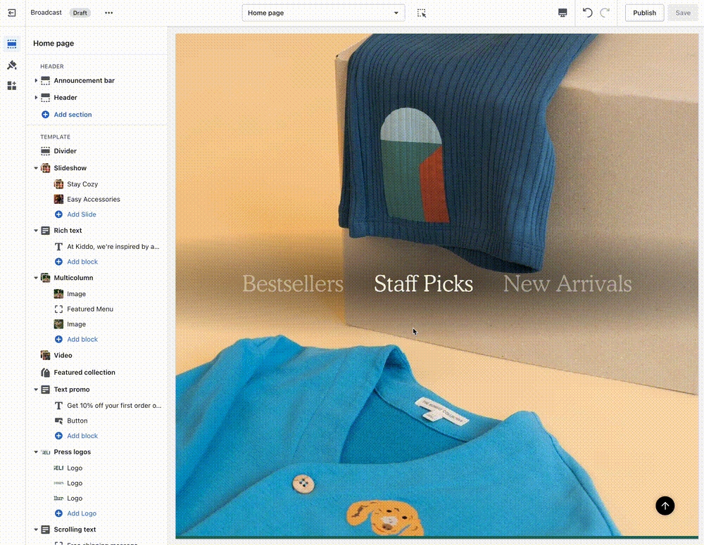
Broadcast theme updates
v5.8.4 - November 19, 2024
Added
New demo preset called "Groove"
Changed
Updated "Bright" demo preset colors and fonts to match new design
Demo Store
View the new Groove demo store >
v5.8.2 - October 2, 2024
Fixes and other improvements
Updated style presets to match the Clean demo store upon initial installation, including colors and default sections.
Accordion - If enabled, the "read more" button was not appearing on iOS devices
v5.8.1 - September 3, 2024
Added
Multicolumn - Product block that automatically pulls in product grid image and content
Option to have Collection "filter" accordions open by default
Input HTML into Slideshow header to bold, italicize, or include a CSS class for further design customization
Fixes and other improvements
"More payment options" text was missing below the Dynamic Checkout Button (Paypal, Shop Pay, etc.)
The header "circle" cart icon option was showing an underline on hover
Predictive search was showing the secondary product image instead of the first one
Footer content would show as a broken accordion if there were no "Heading" entered
Prevent drastic size adjustments by the browser if the chosen font size is too small
v5.8 - July 11, 2024
Added
New section - Image with scrolling text
New section - Image with product
New design element: A theme-wide optional "Superscript" design that shows the number of products in a collection for multiple sections.
Image banner and Slideshow sections - Top and bottom padding settings added.
Blog articles - A product list option was added to link multiple products easily.
Changed
Improved the "Show secondary image on hover" setting to include tablet and mobile functionality. Added the ability to scroll through product images (max 5 for speed load)
Fixes and other improvements
Final sale text was not appearing in the quick add
v5.7 - June 4, 2024
Added
A new section called “Rich text columns.”
Optional accordion style for the Footer blocks on mobile
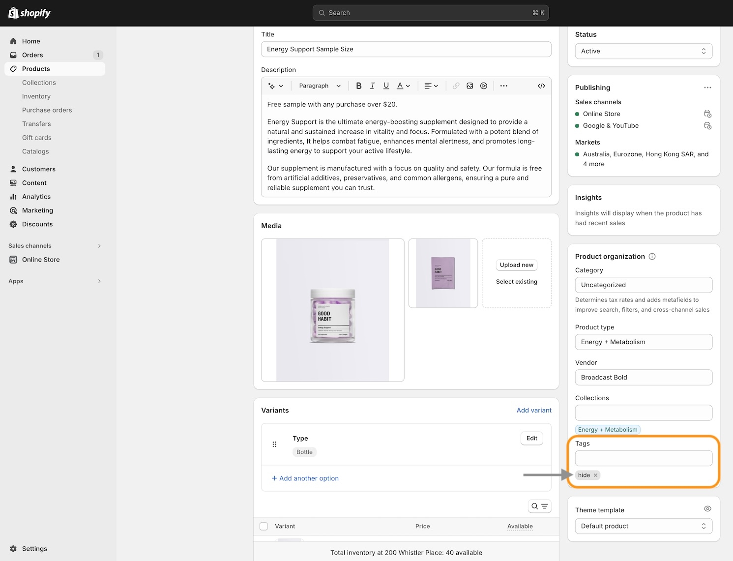
Added a “hide” tag to products to prevent them from showing on search results, collection pages, recommended and recently viewed (use case: samples)
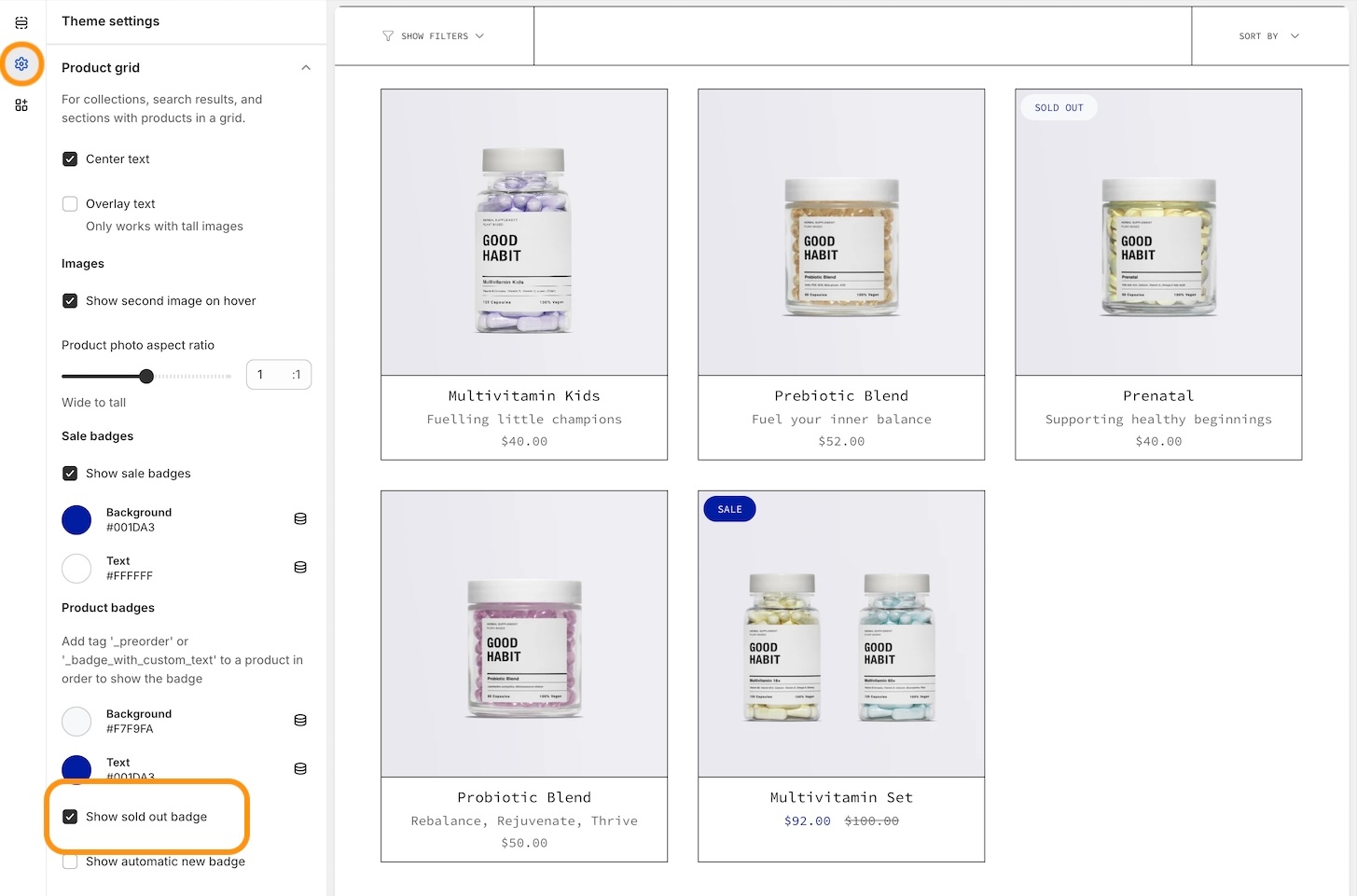
Sold out badge
Changed
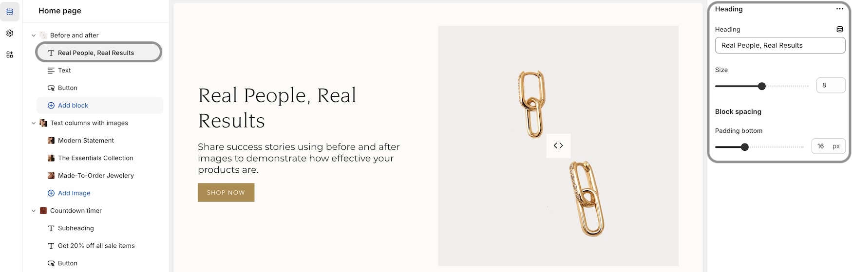
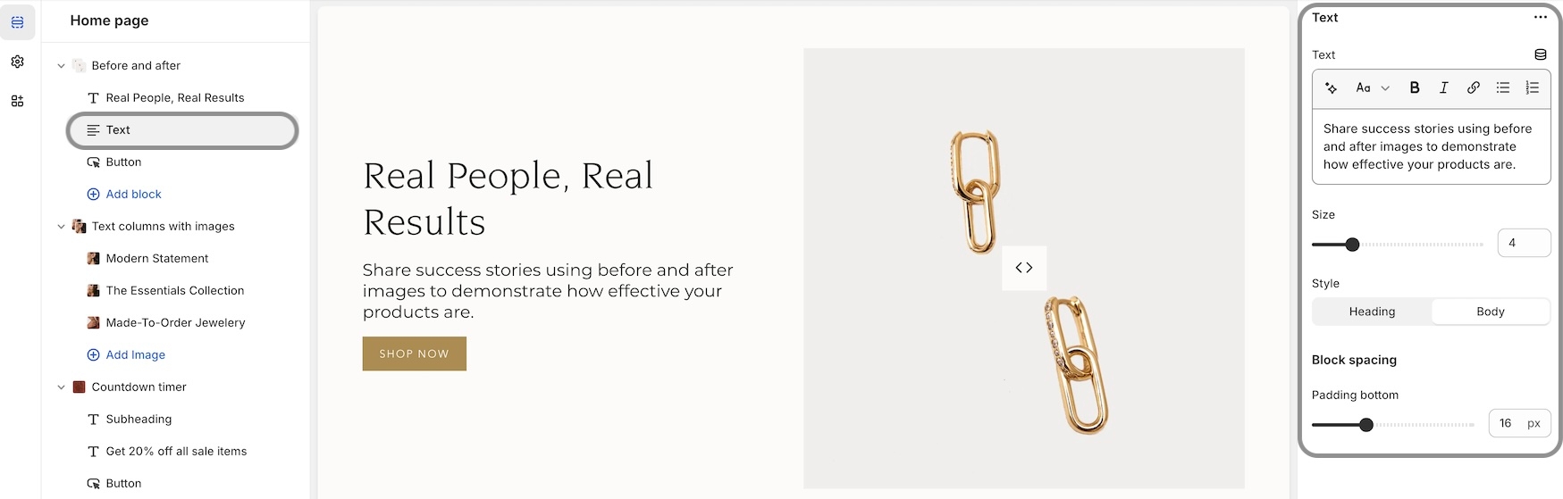
Additional size and spacing options were added to the text and button blocks in the "Before and after" section. The image will be forced to full-width image size if no blocks are present.
Timeline dots are clickable on mobile.
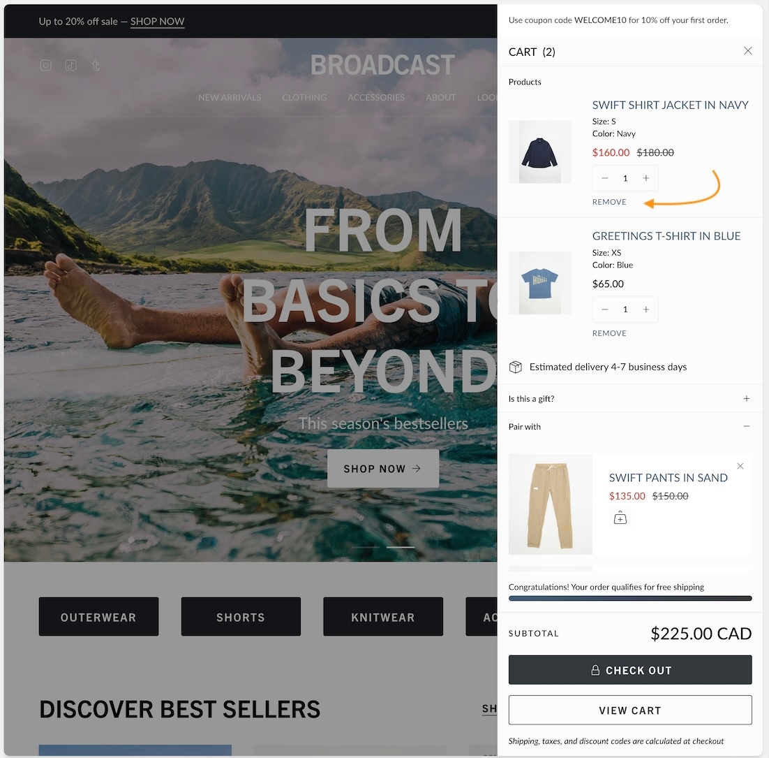
Moved the “Remove” text in the cart to underneath quantity for an improved user experience
Fixes and other improvements
Editions ’24 taxonomy and filter updates
Cart text was missing the zero if no products were in the cart
Out-of-stock notification form will appear on the sticky cart for no variant products
v5.6.1 - April 19, 2024
Fixes and other improvements
Fixed an issue where the Out of stock notification form was always choosing the first available variant combination.
v5.6 - April 15, 2024
Added
"Back in stock" notification feature for out-of-stock products
4 new styles for the collection color swatches
"Fit guide", "Countdown timer" and "SKU" block to the Product template
New blocks for the cart drawer: "Payment icons", "Icon", "Product list", and "Custom code"
Final sale shoutout on the product page to call out products that cannot be returned or exchanged
Connect images to your product variant boxes
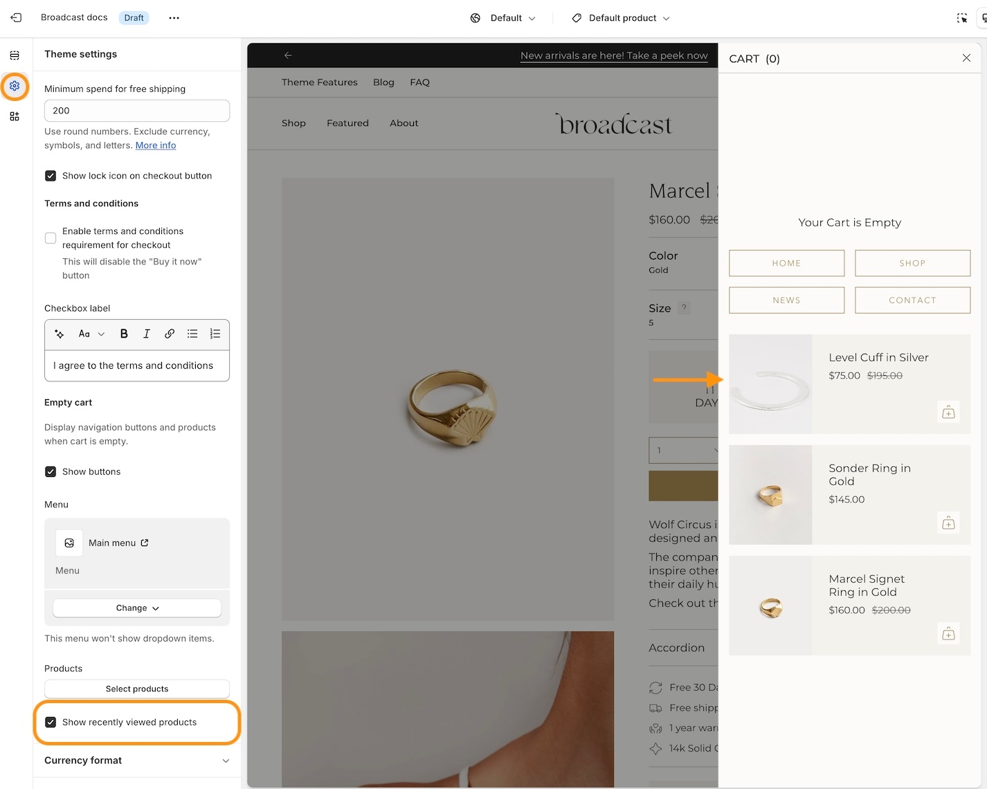
Show "Recently viewed" products in your empty cart
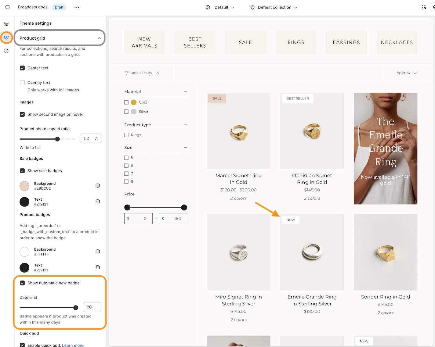
Automatically add a "New" badge based on when a product was created. Disappears after a set number of days
Important: Separated "Accordion", "Tabs" and "Description" styles on the product page into individual blocks for greater control. If upgrading, your description will automatically convert to the "Tabs" style
Changed
Hide default banner images on the product page if you are using metafields for some products and not others
Option to hide sold-out upsell products
Fixes and other improvements
"Cart drawer - Note" not saving in certain circumstances
"Popup" was not closing if you clicked outside of the area
Product grid images appeared blurry for some merchants
v5.5 - February 5, 2024
Added
Implemented blocks on the "Cart" template and "Cart drawer" section. Please note you may need to reconfigure these sections if you decide to upgrade.
Image with text - Introduced "Product" and "Collection" blocks
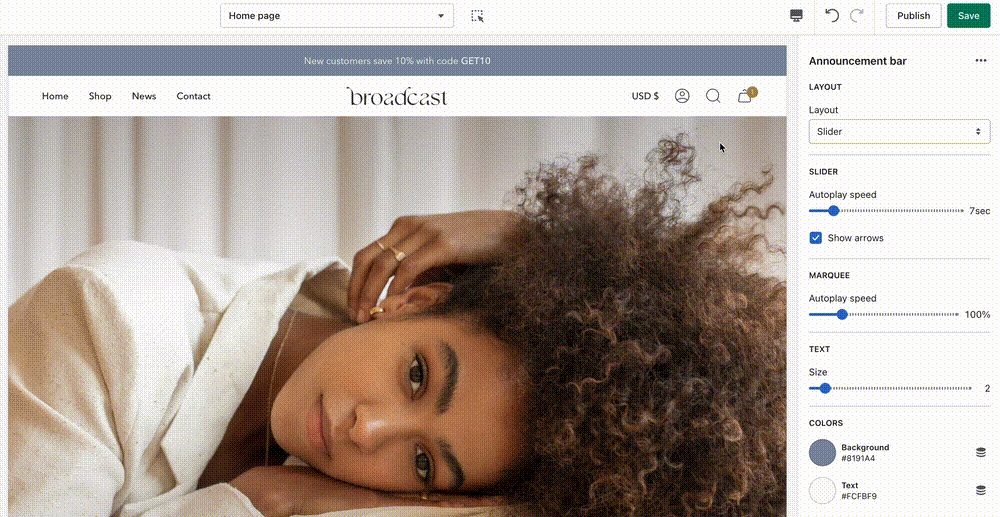
Announcement bar - New "Countdown timer" block
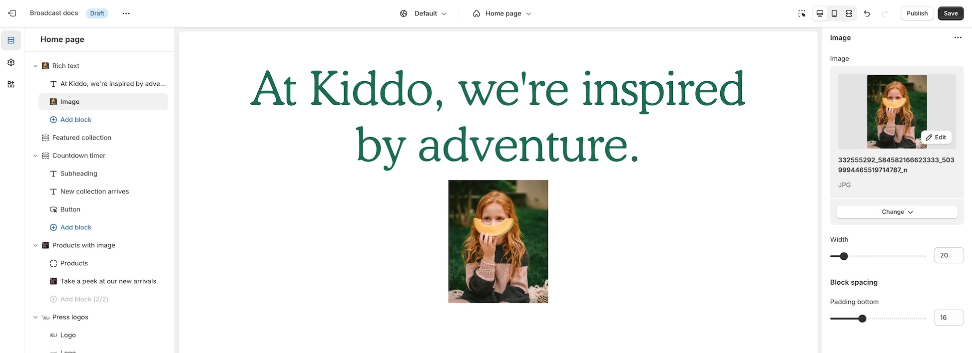
Rich text - Added an "Image" block
Collection - Added the ability to add more than one "Featured image" block
Changed
Added the option to show the product grid badges (sale, pre-order, custom) on the product page
Updated the design for the "Timeline" section on mobile screen sizes
Accordions - Option to show "open by default"
Image with text and Rich text - Customize spacing between blocks with the new "bottom spacing" setting
Added the number of items in the cart beside the cart header for a better user experience
Fixes and other improvements
Removed "Reviews" from the product page as the Shopify app is no longer available
Toolbar - Fixed a mobile issue that was causing the "Gift card" link to get cut off
Fixed an issue where the cart notes were not being saved if you selected "View cart"
v5.4.1 - December 14, 2023
Added
Added an optional icon setting to the Product page "Popup" block
Recommended products and Recently viewed products - New alignment and size settings
Products with image - New background color setting
Implement Shopify's new swatch collection filter
Introduced a "Swatch size" setting allowing for greater visibility for patterned swatches (new sizes: regular and large)
Changed
Countdown timer - Implemented new "height" setting to control desktop and mobile height separately.
Twitter - Updated icon to "X"
Fixes and other improvements
Product grid - Fixed a bug that was preventing the color swatch from showing on hover
Search - Closing icon was missing
Product page - The sticky cart bar was covering content on mobile
Collection - Additional white space appeared when filters were disabled
v5.4 - November 15, 2023
Added
New section - Text with products
Image with text - Added "Image" and "Video" blocks
Product page - Introduced a transparent header using product images. We recommend using the "Stretch" image size with this one!
Implemented "Subheading" styles for greater control over typography
Scrolling text - Added an option to choose the font family: heading or body
Fixes and other improvements
Quick view drawer - Fixed an issue where the focal point of the image was not centered
Collection "sort by" improved to work when filters are disabled
Removed "Upsell" product title when a product did not have an upsell associated with it
v5.3 - October 20, 2023
Added
New section - Timeline
New section - Countdown timer
Added icon options to the accordions
New “Popup” block on the product page
Ability to choose up to 3 upsell products (instead of just one)
Changed
Text columns with images/icons - New image per row setting
Updated design layout for the “Article” template
Fixes and other improvements
Fixed an issue with the toolbar content on mobile
v5.2 - September 18, 2023
Major release 🎉
About v5.2 releaseAdded
Header - New block available: Toolbar; Additional currency styles
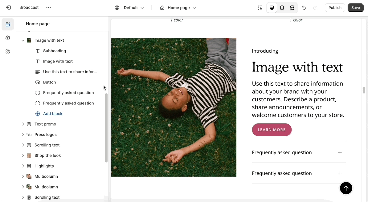
Image with text - New block: Accordion
Tabbed collections - New option: Mobile grid layout
Accordion group - New option: Show accordions in 2 columns
Multicolumn - New option: Image styles (set your images into circles)
Footer group - New block & section: Divider
Introduced more size chart styles
Changed
Custom content - Ensured the width options were consistent with the rest of the sections
Announcement bar - Arrows appear by default if enabled (instead of on hover)
Fixes and other improvements
Removed additional padding that was occurring on the product form for "Pre-order" products
Collection list - Linked the header to the collection
Search - The second product image was showing instead of the first one
Header - Fixed an issue with the mobile logo sizes not applying properly
v5.13 - July 19, 2023
Minor release
Fixes and other improvements
Fixed a liquid error coming from the
preload_tagURL filter onswatches.css.liquidfile
v5.1 - June 28, 2023
Major release 🎉
About v5.1 releaseADDED
New section - Image with text slider
Gift card - Added a date picker
Header - Added a mobile logo width option
Header - Introduced the option to enable a bottom border
Cart - Added a "Terms and conditions" checkbox
CHANGED
Improved color swatch implementation and introduced sibling color swatch options
Featured product - New design 🎉
Scrolling text - Added background image and image blocks
Featured collection - Introduced a width setting
FIXES AND IMPROVEMENTS
Slideshow - Fixed a linking issue that was preventing the entire slide from linking out to another page
Fixed a quick add bug that was causing problems in Firefox
v5.0 - May 1, 2023
Major release 🎉
About v5.0 releaseNEW
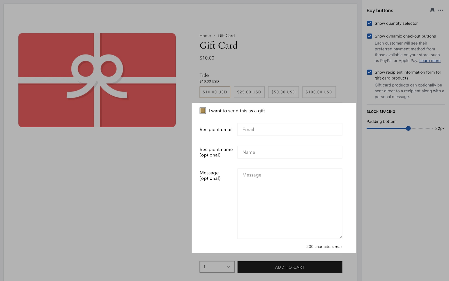
Gift card - Send directly to the recipient and include a message
Add a product to upsell in an empty cart
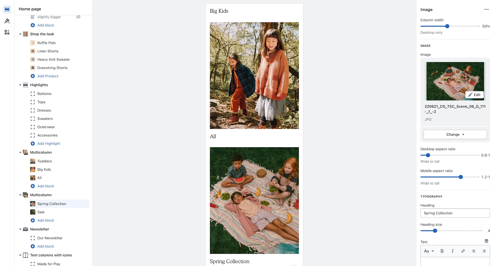
Multicolumn - New mobile aspect ratio setting
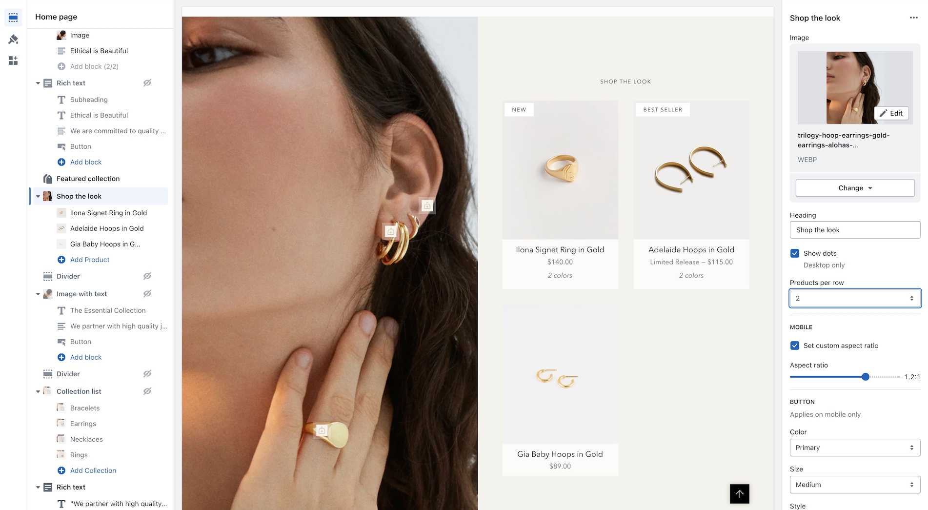
Shop the Look - New products per row (1 - 2) setting
Collection list - New mobile style options
CHANGED
Removed underline style when buttons set to "Text" with arrow enabled
Merged "Custom Liquid" and "Custom HTML" into one section called "Custom Code"
Updated "Upsell" functionality to work with one product and meta fields
FIXES AND IMPROVEMENTS
Cart.js optimizations
Learn more about the update:
v4.0 - March 15, 2023
Major release 🎉
This release introduces two new sections: collection list hover and text with products. We've also updated to include Shopify section groups and the new Shopify query suggestions for predictive search plus a few other improvements.
About v4.0 releaseNEW
New section: Collection list hover
New section: Text with products
Implemented Shopify's new search functionality
Page templates can use the transparent header option
CHANGED
Improved the Inventory Counter on the product form
Added more icon options
Included the "Divider" block into more sections
Modified secondary button styles – Buttons will now appear side-by-side instead of below
FIXES AND IMPROVEMENTS
Brought back the previous product form style as a design option
Improved video functionality and fixed button icon shift
Learn more about the update:
v3.8 - January 24, 2023
Major release 🎉
This release includes a significant update to the product form and shop the look section, improves button styles and functionality throughout the theme, and builds upon UX best practices.
NEW
Product form features have been separated into blocks.
Image with text – New secondary image style added.
Multi-column (previous "Text columns with images" and "Text columns with icons") – Added a "Menu" option with the ability to customize block widths
Focal points – This Shopify feature replaces our existing "position" setting.
CHANGED
Product form design.
Shop the look design and improvements to the mobile functionality of Shop the look.
Improved button functionality theme-wide.
Merge existing sections together for greater visibility*
The Split images section and Image Banner sections have been merged together as Image banner
The Text columns with images section and Text columns with icons section have both been merged into a new section called: Multi-column.
The Collection carousel section and Featured collection sections have both been merged into a new section called: Featured collection
*Note: You will need to reconfigure these sections when updating. Existing section settings will not migrate as they have been replaced by new sections. We recommend you manually add the new sections and configure them with the new options and controls.
FIXES AND IMPROVEMENTS
General consistency improvements for arrows, buttons, and underline styles.
v3.7 - November 9, 2022
Major release 🎉
In this release, we've introduced a new icon set, mobile height settings for all sections, and general improvements throughout.
NEW
Mobile height setting for all sections to improve the mobile experience
New "Image with text" section
New "Features" block on the product page
New mobile slider style for product images on the product template
Customize the width of each Footer block for unique layouts
CHANGED
New icon set!
Connected the "Size chart" to the "Size" variant
Modified the "Image banner" section to utilize blocks – If you are currently using this section, you will need to rebuild it to accommodate this new functionality
Cart drawer and upsell product popup animations have been improved
The free shipping design has been updated and appears in empty carts to market free shipping minimums
FIXES AND IMPROVEMENTS
Improved cart circle style for larger screen sizes
Optimized forms and newsletters for Google reCAPTCHA
Added color settings for the mega menu images to improve visibility
v3.6 - October 19, 2022
Minor release 🎉
NEW
New password page design
New predictive search results for blog, pages, and collections heading terms
UPDATED
Enhanced the responsive design for product pages
Introduced blocks for the "Rich text" section. This will require you to reconfigure your "Rich text" sections.
FIXES AND IMPROVEMENTS
Improved sibling functionality on Quick Add
v3.5 - October 6, 2022
Major release 🎉
This release adds support for product siblings, updates the collection page filters, and improves accessibility across the theme.
NEW
Product siblings - Link multiple products together as swatches. Learn more
Collection filters - New design and usability improvements
UPDATED
All new Quick Add design and functionality added with slide-out drawer
Introduced better cart animations
FIXES AND IMPROVEMENTS
Accessibility improvements
Product search and close icon sizing
v3.4.1 - September 15, 2022
Major release 🎉
NEW
New section called Highlights to showcase collections and text content
New metafield option to customize the text below product images on collection pages
New circle option for the Cart icon
New Newsletter section in the Footer which appears above the main Footer content
New an option to include an arrow on buttons and text links
New text alignment setting for the Tab Collections section
Ability to increase or decrease the padding between the product images on the collection
Ability to add a Linklist menu to an Empty cart
Italian language translations
UPDATED
The upsell design, now allows customers to choose their variants 🎉 - Learn how
An all new Testimonials section with refreshed design
Improved linked variants for sold out products
Added support for multi-currencies in the free shipping message
FIXED
Refined collection pagination when a Featured Product block was used
3.4.1 Release fixes a hamburger menu issue, where the closing "X" was missing
3.4.1 Added tooltips to the color swatches in the Upsell feature
v3.3.1 - June 9, 2022
Major release 🎉
NEW
Added granular padding options to each section. Now you manage easily manage the padding between various sections with top and bottom padding controls.
UPDATED
Improved sold-out variant styles. Swatches and variant boxes are now displayed as crossed out and drop-down variants will have sold out text next to them.
FIXED
v3.3.0 was displaying a dark background on the header image blocks. This has been removed.
v3.2.1 - April 21, 2022
Minor release
UPDATED
Improved the functionality of the mobile main menu animations.
Improved the video section on mobile if the device is in low power mode.
FIXED
Empty translation string error.
v3.2.0 - March 21, 2022
Major release 🎉
NEW
Now you can include a short description on the product grid sections like collections, collection list, and featured collection.
Add icons and text under product form on product pages
Pulsing loading icon that will appear on the first load of your website, or all pages. Example usage: Display your brand logo on page loads.
Inventory message. Low stock notification on the product form.
Before and after section to showcase customer results.
Sidebar section with sticky navigation. Recommended for FAQ and About pages.
Product page images can now appear 2 per row with the new grid setting.
Header design option for logo center and text left.
UPDATED
Added a text option for header icon styles.
Ability to use metafields for pre-order and badges instead of tags. Tagging option is still available.
Option to choose % off instead of $ off for sale items.
Upsell will now skip a product if that product is already in your customer's cart.
Video section now has the option for mobile-only image and height.
FIXED
Gift card translation issue.
Main Menu animation now works when using the back button.
Footer social media icons are opening pages in a new tab.
Footer opacity setting.
Minor padding and margin adjustments.
v3.1.0 - October 27, 2021
Major release 🎉
Fixed Issue with Cart Drawer clicking "X" not removing items
Product grid text elements like product title and price now use Body font for sizing
Improved sold out badge text visibility on the product grid
New header icon set and options
Improved language support in Cart when items are changed
Fixed issue with video playback on mobile when there is no sound
Fixed issue with flashing slideshow transitions
Improved support for iOS 15 - slideshow and size chart scrolling
Improved support for Reviews app with Recently Viewed and Product Recommendation sections
Improved small newsletter visibility on scroll
New Added support for $0 products in Language Editor (Edit languages)
New Added Liquid code block to Product form
New Added show after 3 seconds option and position options to Small newsletter
Fixed issue with transparent header upon page refresh
New native video player. Deprecated Plry.
Improved support for no image products
Improved a11y support for navigation dropdowns
App block supported added to Accordion section
Improved collection filter selection support
New Added hotspot links to products in Shop the look section
v3.0.1 - September 24, 2021
Fixed Collection filter bug
v3.0.0 - August 11, 2021
Major release 🎉
New Supports Shopify Online Store 2.0 (OS2) platform
New Support for Shopify’s Collection Filtering - Add collection filters in your Navigation admin
New Includes support for sections everywhere - Place sections on all page types including Products, Collections, Blogs, Pages, Cart and more
New Pickup options for product template
New Recently viewed section
v2.1.1 - July 19, 2021
Updates to home page collection sections to ensure consistency
Fixed product page over scroll
Fixed minor cart upsell issue
Improved FAQ template design
v2.1.0 - July 8, 2021
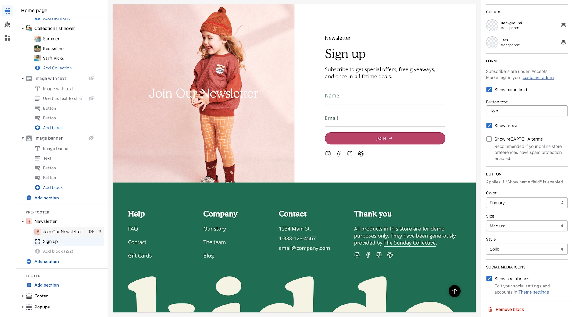
New newsletter popup with targeting functionality, including a cookie popup.
New "Pair with" functionality to upsell in the cart. This automatically integrates with our product page upsell feature.
New "Collection Carousel" section.
New "Tab Collections" section.
New size chart functionality for product pages with the ability to have custom popups per product.
New "Back to top" scroll feature.
New "Custom icon" setting for the "Text row with icons" section.
New "FAQ" page template.
New mobile image option on the "Slideshow" and "Image with text overlay" sections.
New custom label functionality allows you to add any text such as "coming soon" to a product on the collection template.
Updates to product page images, with a new size setting and a new thumbnail position. Thumbnails can now be placed on the left side of the main product image on the desktop!
Updates to announcement bar with dynamic free shipping message.
Improved animations and transitions.
Improved main menu and mega menu design.
v2.0.3 - June 8, 2021
Fixed issue with line item properties.
v2.0.2 - May 18, 2021
Fixed issue with iOS scroll lock which can prevent scrolling the cart body when there are many items in the cart.
v2.0.1 - May 11, 2021
Fixed password page login error.
v2.0.0 - May 11, 2021
New upsell feature on the product page
New quick add functionality, replaces Quickview
New about page template
New accordion sections to the product template
New “Featured collection” slider option
New cookie popup option
Updates to sticky cart functionality
Updates to color swatches on collection grid when quick add is disabled
Updates to accessibility
Added Shop Pay
v1.8.1 - April 14, 2021
Fixed issue with product variant images
v1.8.0 - Feb 23, 2021
Removed jQuery dependency
Improved speed and load times
Added a cart drawer setting
Updated design for mobile menu
Added new menu design settings
Switched to predictive search API for faster search
Added support for subscriptions / setting plans on cart and order pages
v1.7.2 - October 5, 2020
Fix secondary currency price formatting on cart popup and recently viewed products
Fix issue on recently viewed products where no-image product causes JS error
Fixes issue were app injected URL params were wiped by variant state changes
v1.7.1 - September 16, 2020
Add unit_price in cart popup
Fix bugs introduced by architectural changes in 1.7.0:
Fix index-blog not showing tags
Fix margin-top for blank/captcha template
Fix issue where header height calculation was incorrect when the search is disabled
Fix auto height on RTE images for legacy mobile devices
Fix product title size for recently viewed
Fix forgot password page
v1.7.0 - September 8, 2020
Convert snippets to use render which improves overall performance.
Added support for Unit pricing (currently supported for Shopify shops in Germany and France).
Convert to social image setting in shop admin. Now uses Shopify's admin setting for the social image.
Improved the speed with Quickview on collection pages and all product grid listings.
Lighthouse performance updates. Major overall theme speed performance.
New setting to show/hide reCAPTCHA terms
Minor improvements to mobile display and navigation including newsletter popup and updates with cart icon.
v1.6.3 - June 26, 2020
Improved mobile layout for newsletter pop-up when using an image. Resolves blurry image issues and small input space when button text is long.
Corrects PayPal dynamic payment button not displaying after quantity change on the cart page.
Fixes shipping calculator currency money format on the cart page.
Yotpo ratings will now appear correctly on collection pages after an endless scroll load.
v1.6.2 - June 4, 2020
URL fragments can now be used with variant history on the product page
Better variant focus states for tab-thru
Fixes issue with swatches on collection page after endless scroll occurs
Adds a simpler way to manage pre-order products
Fixes issue where leading or trailing non-breaking space could prevent megamenu from matching a name
Fix small screen grid for related products
v1.6.0 & 1.6.1 - March 26, 2020
Added support for checkout in multiple currencies when using Shopify Payments
Added currency switcher to the footer settings - View supported apps
New group filtering mode added - This allows you to build custom groups to filter by. Tag your products with custom prefixes and underscore to build custom groups
Adds Shopify Pay multi-currency select to footer
Removes currency estimator from header
Adds support for Store Languages
Adds a tag filtering sidebar popout
Moves tag and sort pop downs on the collection page
Show variants as boxes added to Product Grid settings (displays variants in box format similar to swatches instead of dropdowns)
v1.5.2 - March 17, 2020
Fixes an issue with the YouTube Background videos
v1.5.1 - Feb 25, 2020
Adds a custom HTML section to make Instagram app integration
v1.5.0 - Feb 20, 2020
Product Media - Shopify now supports Video and 3D model files on product pages. This release supports Shopify's new product media formats. Additional details.
Removes Instagram section Learn more
v1.3.0 - Jan 10, 2020
Add new bold preset
Adds a split here section
v1.2.3 - July 17, 2019
Corrects an issue with endless scroll. Most noticeable when loading the third page of products on collection pages.
Added the ability to turn off endless scroll in Layout settings under Theme settings.
v1.2.0 - June 10 2019
Adds support for automatic discounts and buy-one-get-one discounts
Adds support for the new product recommendations
Adds live search (using the old API for now, we built this right before the new API came out)
Improved add to cart popup cart notifications
Adds an image and text column section
Adds an icon with text section
Adds a logos section
v1.1.0 - April 24 2019
New translations: Portuguese and Spanish
Tweaks price and title mobile sizing
Switch open graph tags to JSON-LD remove messy itemprop markup
Improved screen reader performance
Improved homepage blog layout
Improved layout for collections list page
Transparent header setting
Meganav images
Sticky header setting
Add support for javascript currency switcher
Featured post section for the blog
Background video sound setting added for browsers that support audio autoplay
Update schema with contact url
Bug fix: Hide default variant title in cart
Bug fix: Fix quickview showing incorrect product on homepage with multiple collections
Bug fix: Fix footer social link colors
v1.0.0 - March 6 2019
Initial release 🎉
The Broadcast release log keeps track of the date and contents of each Broadcast release. Use this document to keep track of new versions and features. We always recommend staying up to date with the most recent version.
About v5.8 release
Additional information on recent Broadcast updates
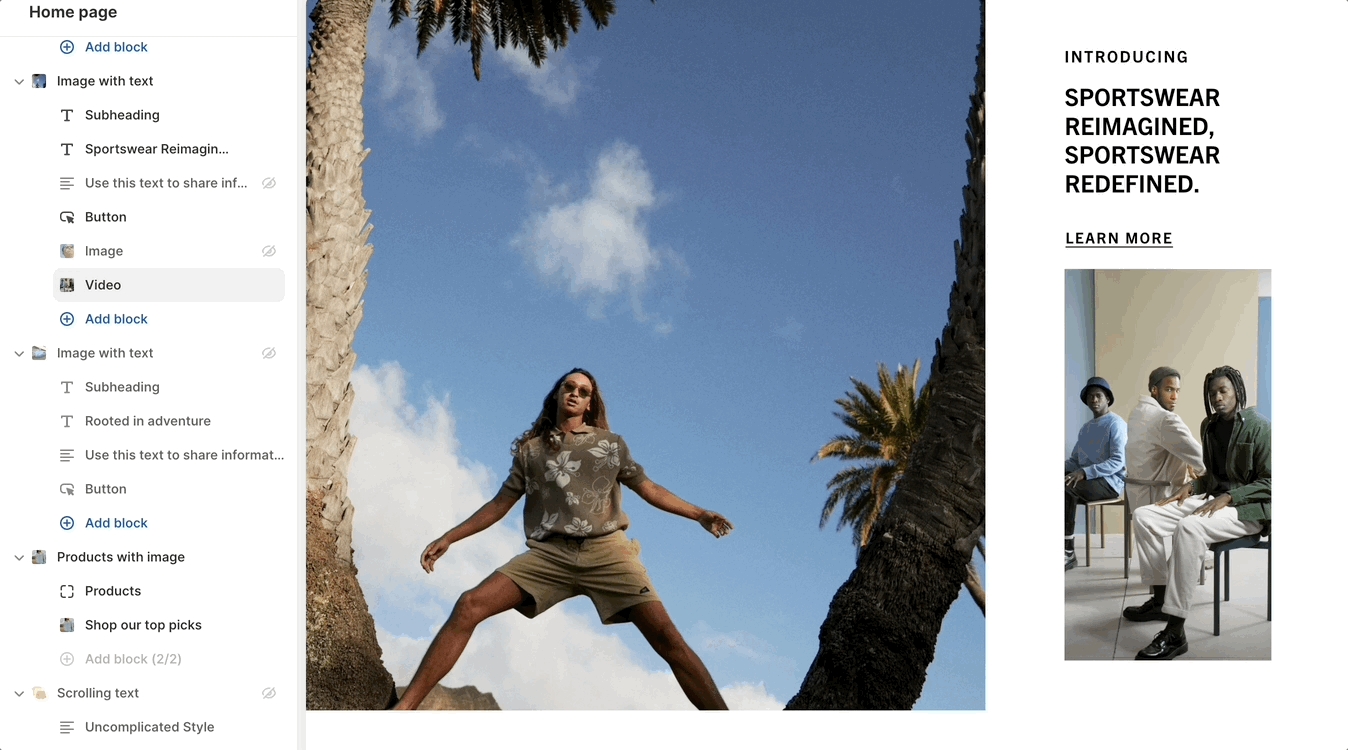
Image with scrolling text section
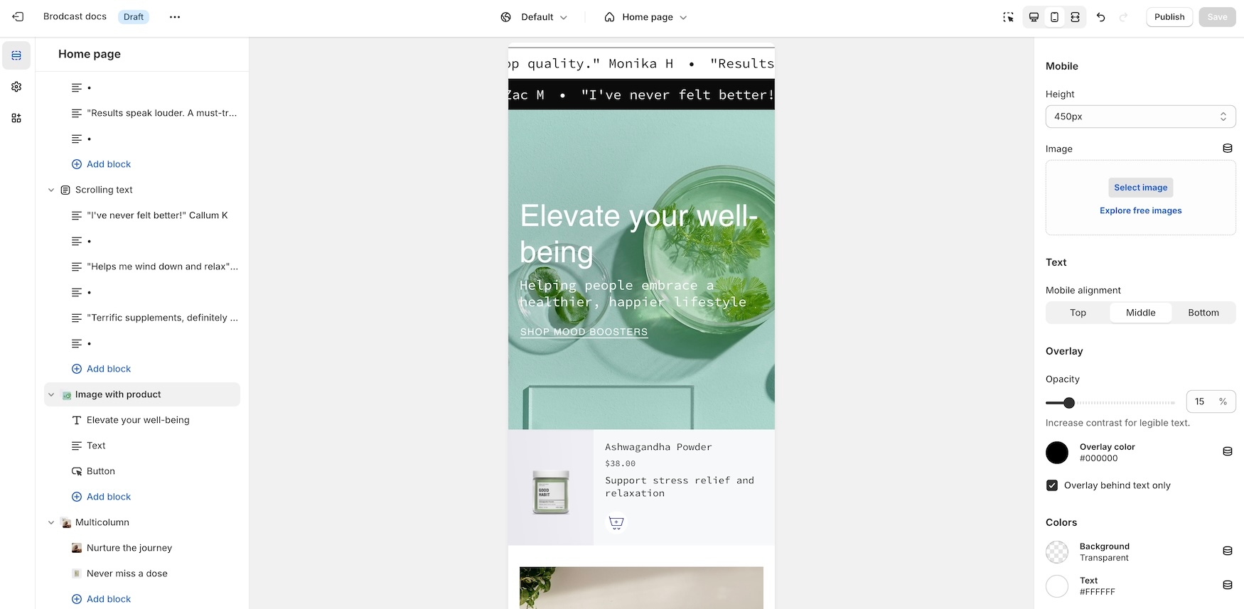
We've added a new section to expand the scrolling text feature by integrating a modern scrolling text element within an image banner-style section:
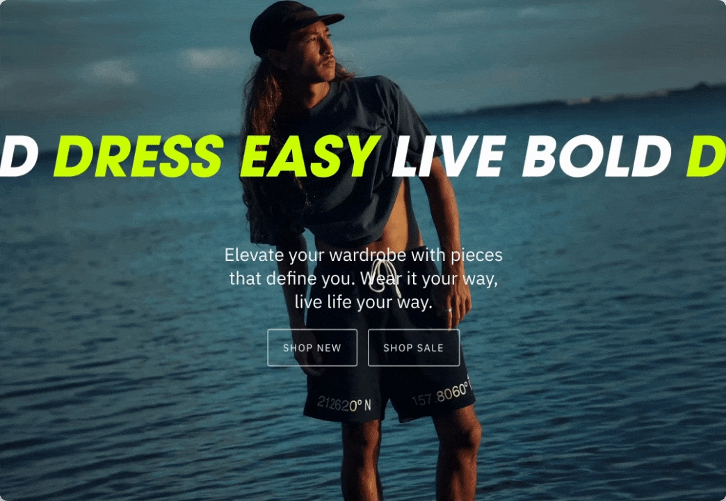
Flexible
The section includes settings for desktop and mobile images and heights. Choose from scrolling text, text, or button blocks to build the content. Buttons will be placed inline horizontally.
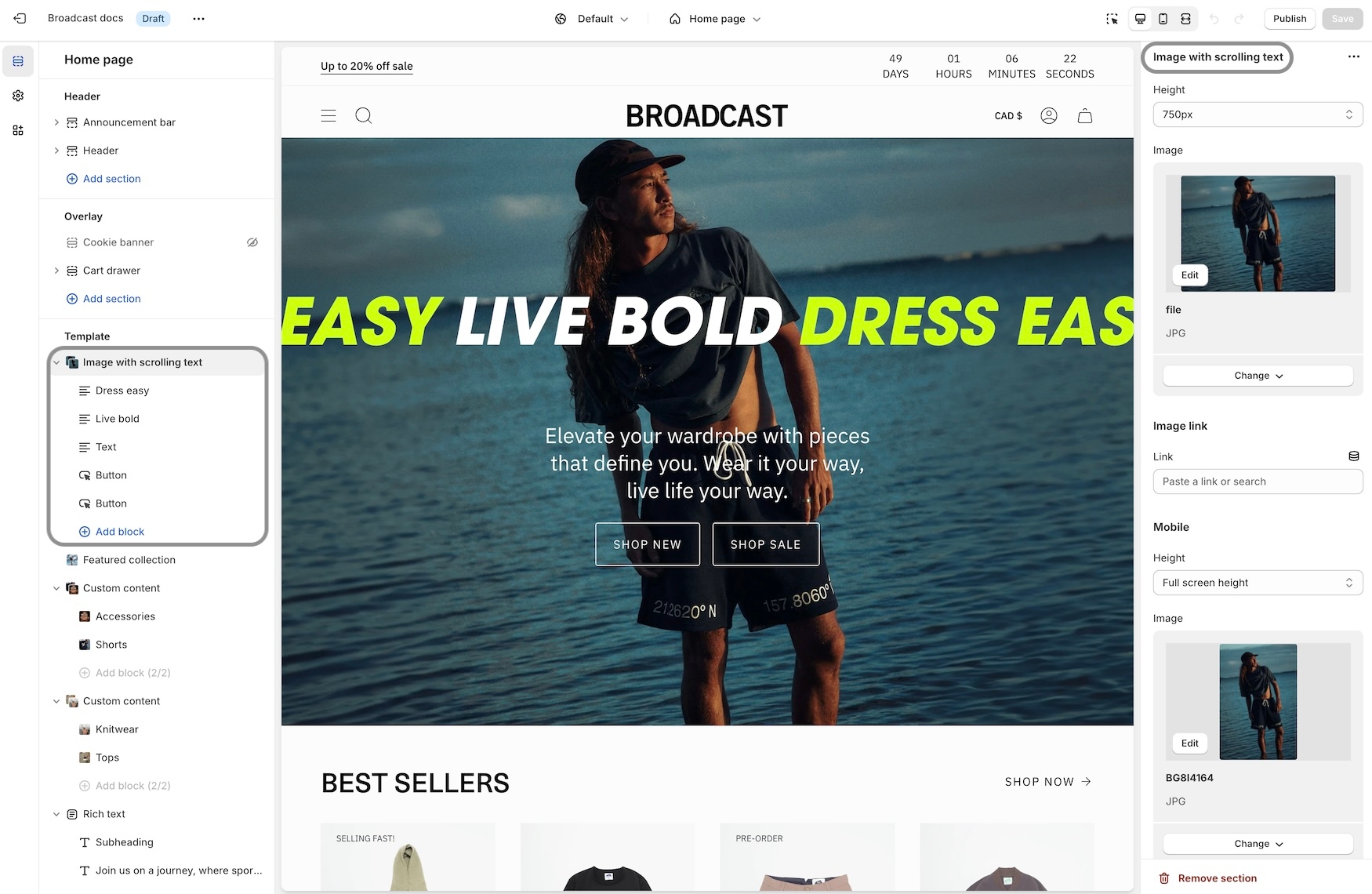
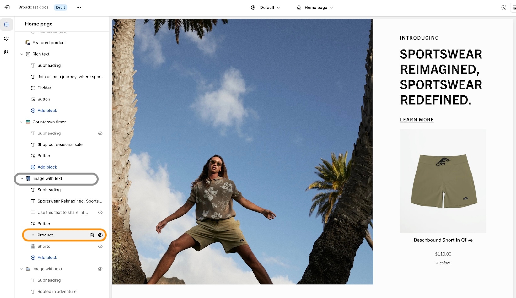
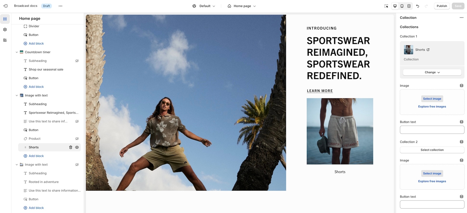
Image with product section
With Broadcast, you can now embed a product card right into an image banner-styled section:
Designed to be quick and easy to set up, this new section has incorporated the image and product settings into the section settings. Content blocks, including heading, text, button, and custom code, can be added to build the overlaying information on the left while the product card is shown on the right:
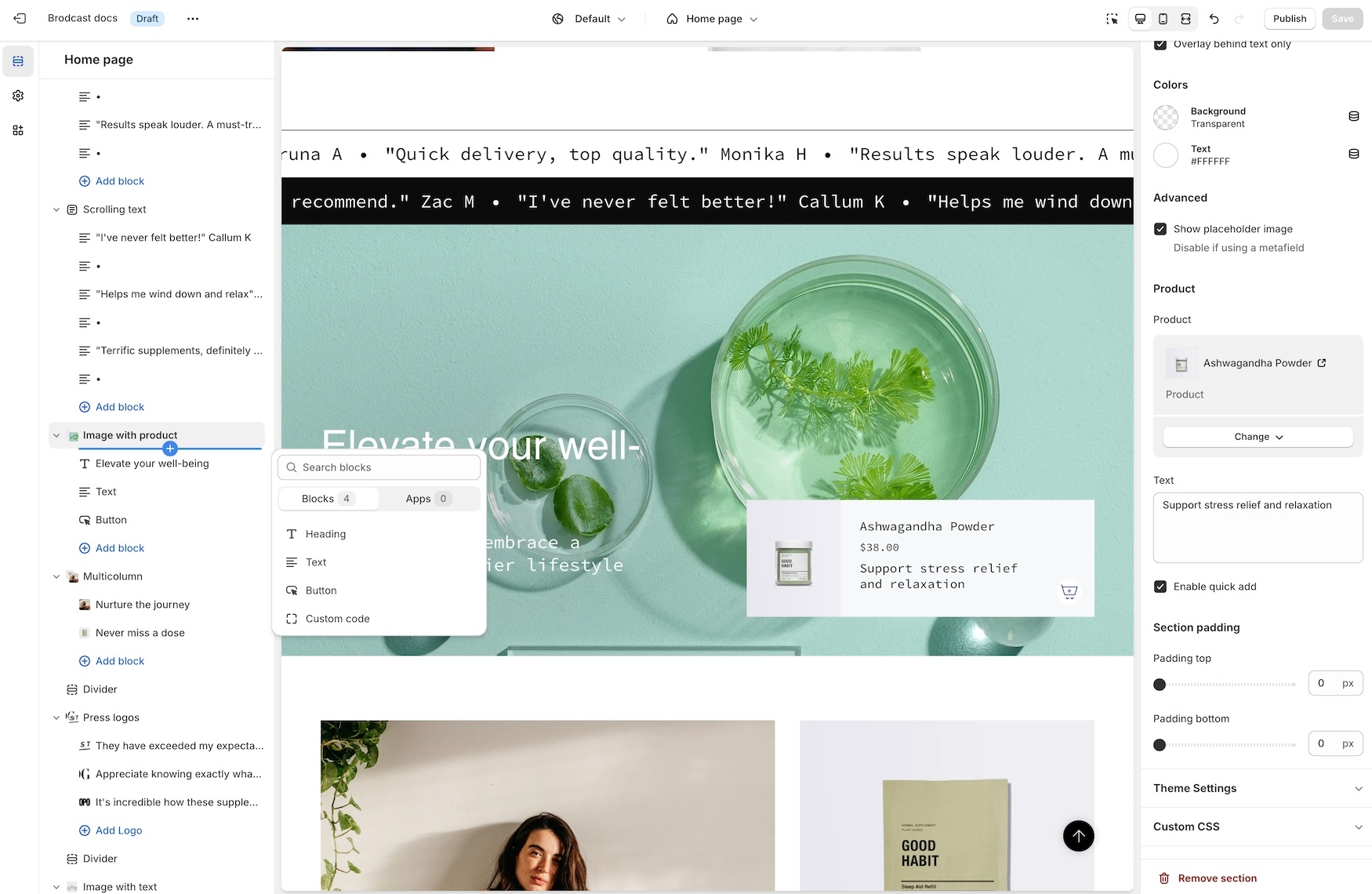
On mobile, the product card is placed below the image. The content can be positioned on top, in the middle, or at the bottom for the stacked view:
Superscript indicators
Broadcast can display the number of products that are in collections. The feature shows a numerical value next to the collection name in the dropdown navigation:
A theme-wide optional "Superscript" design option has been added, showing the number of products in a collection for multiple sections.
Learn more:
Quantity indicatorsBlog posts with product cards
Broadcast makes adding product cards to your blog posts even more effortless. Choose products from a list and add them to the sidebar:
Customize the heading and select products from the product list:
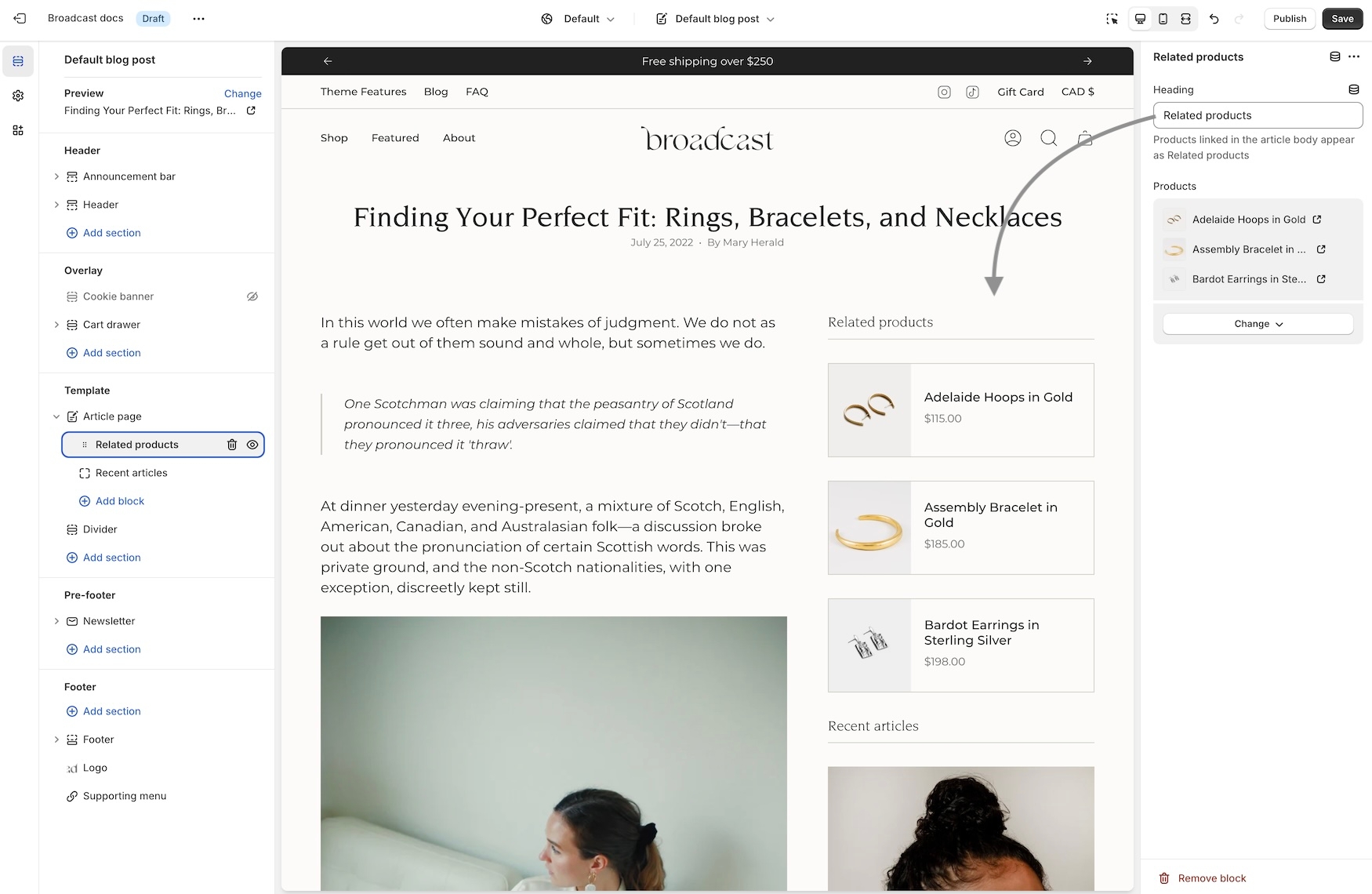
Note: Since Shopify's templating system will reuse these choices on other articles, you can create a new blog post template and then assign that to different posts.
Another option for a unique selection of products is to use metafields for the product list:
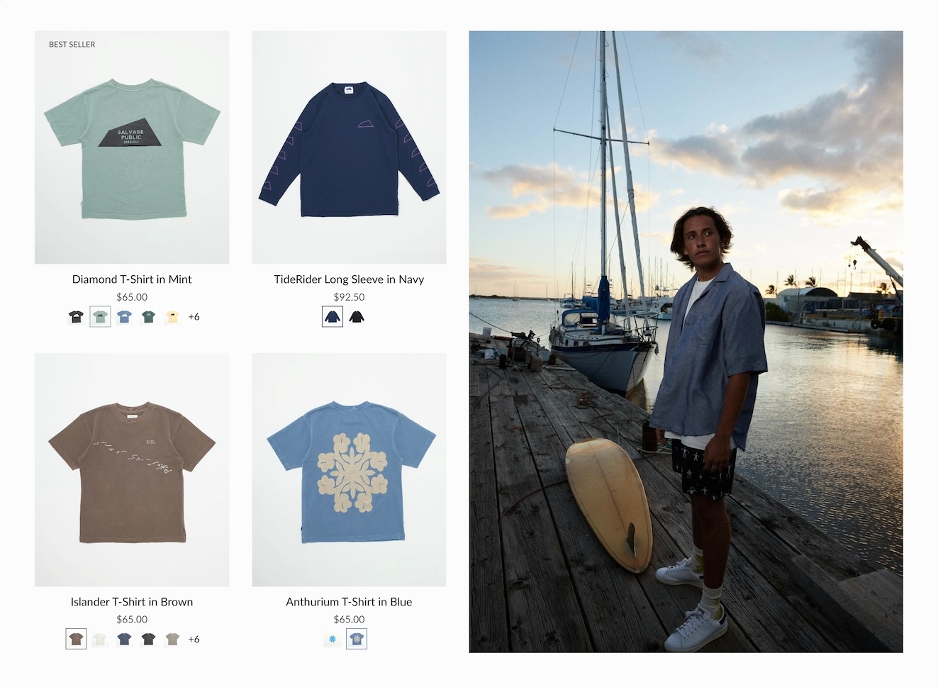
Second image on hover and Quick Add improvements
Broadcast has a new interface to support touchscreen laptops and devices. When a touch screen is detected, the "second image on hover" feature becomes a slideshow in the product grid. Now, the customer can see additional product images without requiring a hover action. This works for mobile devices and larger touchscreens.
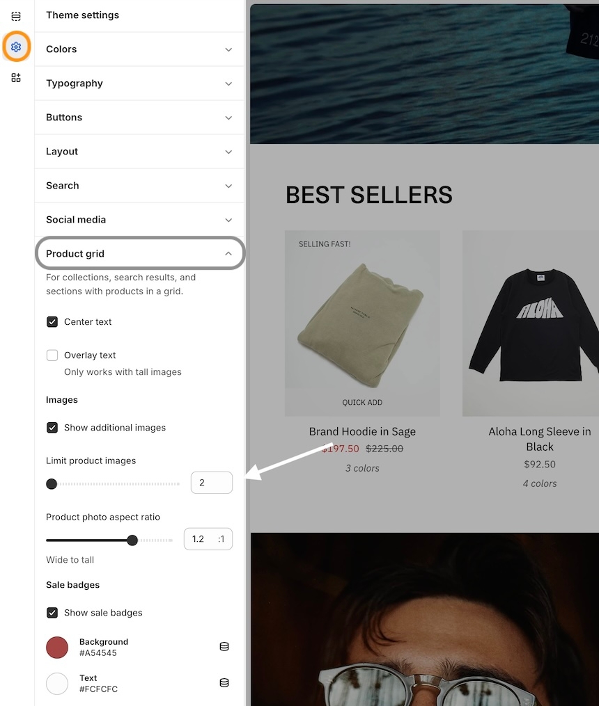
To adjust how many images appear in the slideshow, use the new setting in the Theme settings -> Product grid:
Quick Add
For larger touchscreen devices, the full "Quick Add" button is displayed below the product image. Mobile devices will use the icon-style button.
Release Notes
View the release notes for a complete listing of changes:
Release NotesAbout v5.7 release
Additional information on recent Broadcast updates
Rich text columns section
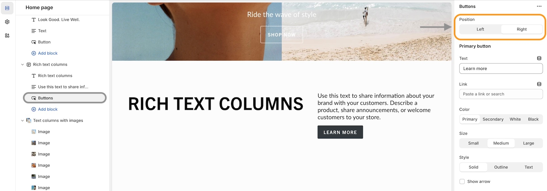
We've added a new section to quickly build text-based content and organize the elements into left and right columns.
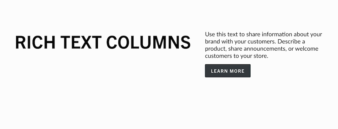
Each block has a position option for column placement:
Column sizes and text alignment can be adjusted in the section settings:
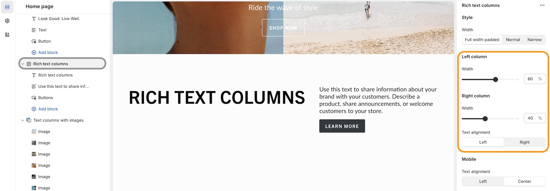
Mobile settings allow the stacked content to be left-aligned or centred.
Mobile footer accordion options
Display blocks inside an accordion for the mobile footer:
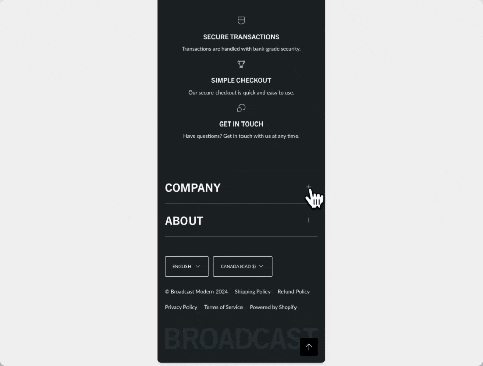
In the footer blocks, you can use the new checkbox to enable the accordion feature for mobile devices:
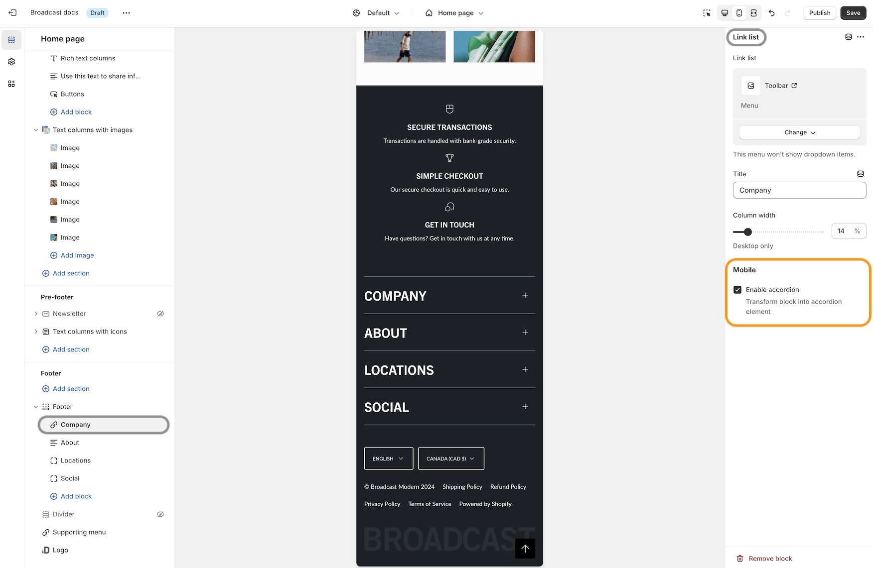
The accordion option is available on the following footer block types:
Link list
Text
Page
Social
The newsletter and divider blocks do not contain the option.
Hide tag for products
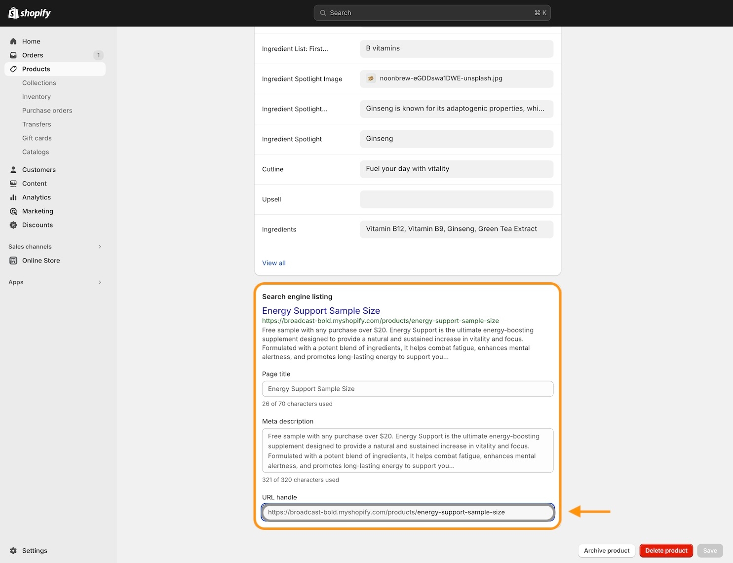
We've added the ability to hide products from searches and collections. Simply add the hide tag to your product:
After adding the hide tag, the product won't appear on collections and search results:
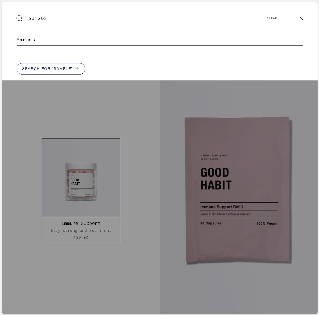
You can still view the product page by using the product URL:
Sold out badge
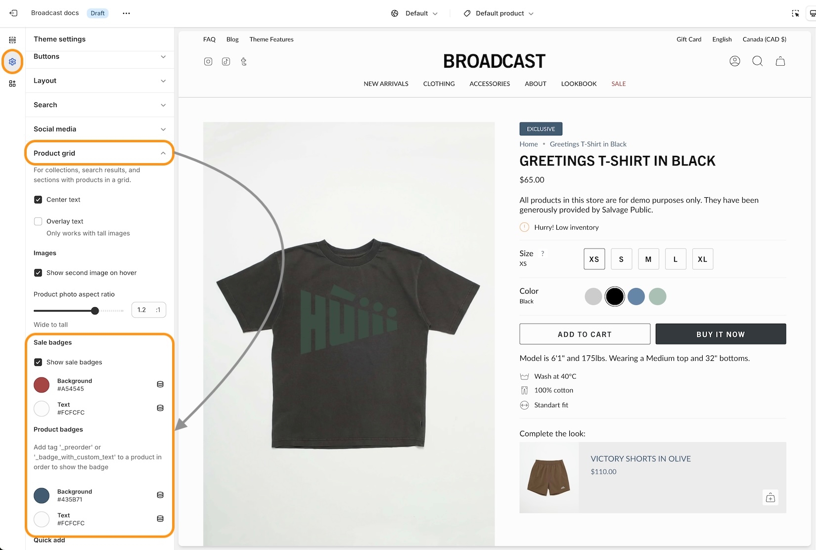
Items that are sold out can now display a badge on the product grid or collection listings. The price is now also shown with the product information:
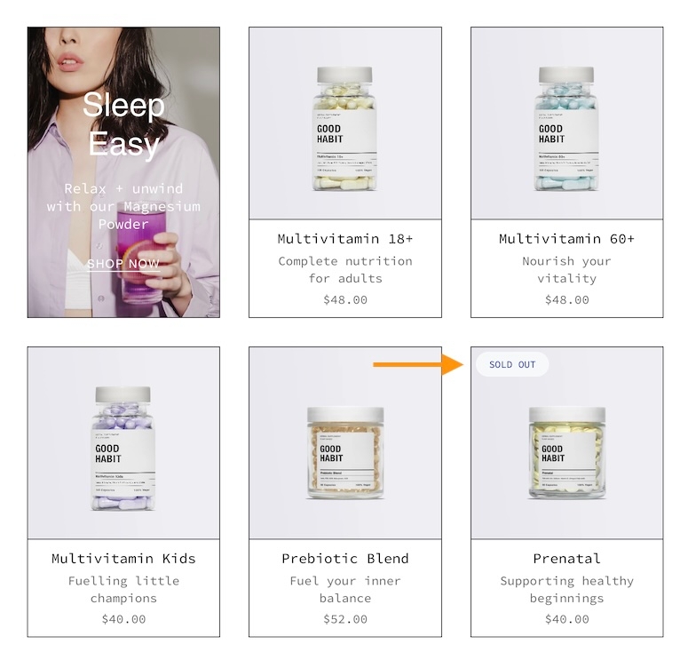
In the Theme settings -> Product grid, you can toggle the badge option:
Before and after block updates
We've added additional size and spacing options to the blocks in the "Before and After" section:
Remove link repositioned in the cart
We've improved the placement of the "Remove" items from the cart. The link is now below the quantity selector and left-aligned to match the other elements:
Release notes
View the release notes for a complete listing of changes:
Release NotesAbout v5.6 release
Additional information on recent Broadcast updates
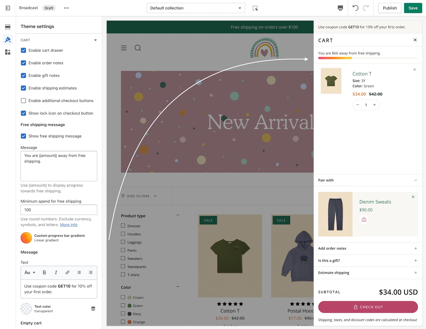
Cart drawer blocks
Broadcast 5.6 introduces Cart drawer blocks. Customize the cart drawer with a series of blocks to supercharge the cart experience :
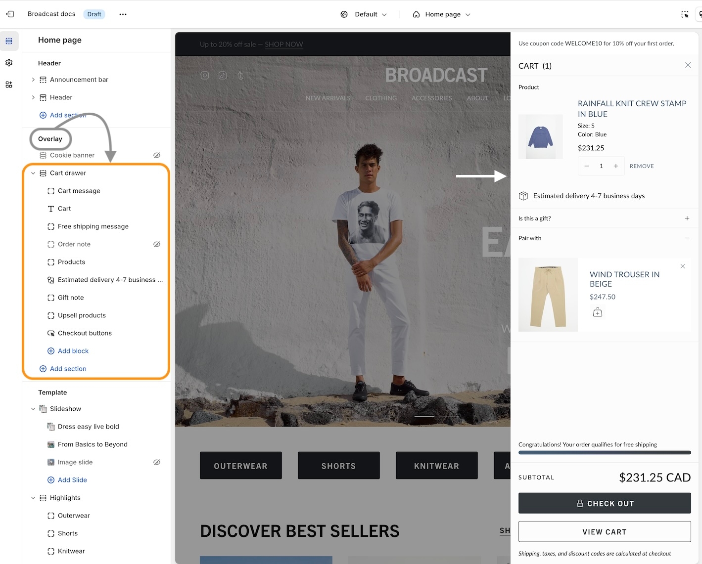
Cart blocks in Broadcast
Add, arrange, and configure any of these cart blocks for a fully customized cart experience:
Title
Cart message
Free shipping message
Products
Upsell products
Order note
Gift note
Shipping estimate
Icon
Product list (easy upsell)
Custom code (use for apps)
Payment icons
Checkout buttons
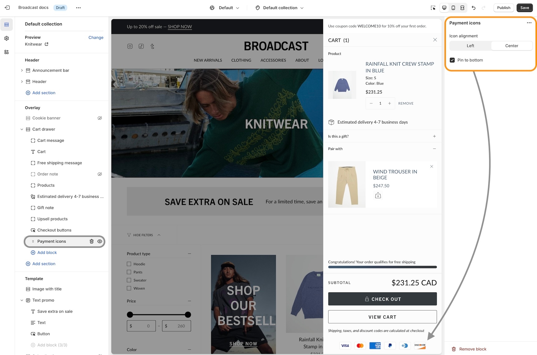
Individual settings
Each block has a set of customizable options. Example of Icon block used to display shipping message:

Pin to bottom
Pin blocks to the bottom like the Payment icons:
Fit Guide for products
Broadcast includes an easy-to-use fit guide block for Product pages. Help customers visually see how items fit. Each product can have a custom value for the line chart:
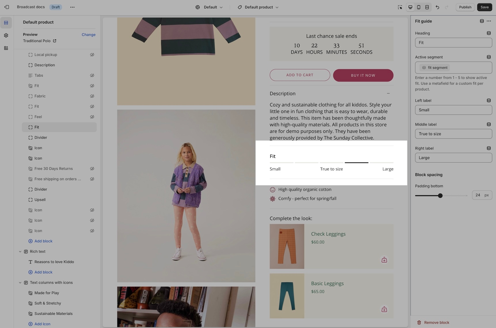
Video overview on how to use and set up the Fit guide block:
Video on how to customize the Fit Guide using custom values with metafields:
Variant images
Display images for any variant type on your product form. Help your customers visually see what a variant looks like. In addition to swatches, Broadcast can display an image for each Size variant or any other type you choose.
Two styles are available in Broadcast 5.6, in-line and stacked:
In-line style
Stacked style
Images are used from your Product setup:
The 'Size' variant is used by default. You can configure any variant to display images. The above example shows 'Type' to visually show the product style.
Learn more:
Variant imagesHeader call-to-action button
Now in Broadcast, you can add a call-to-action button right into the Header area:
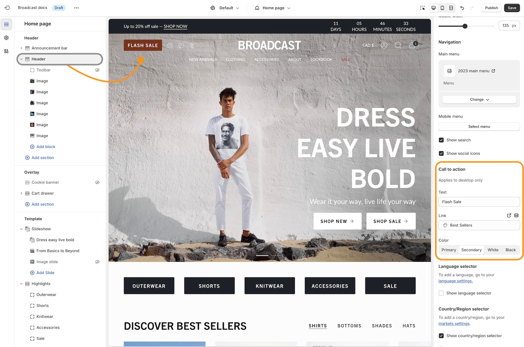
Use the Header section settings to customize the button color, text and link:
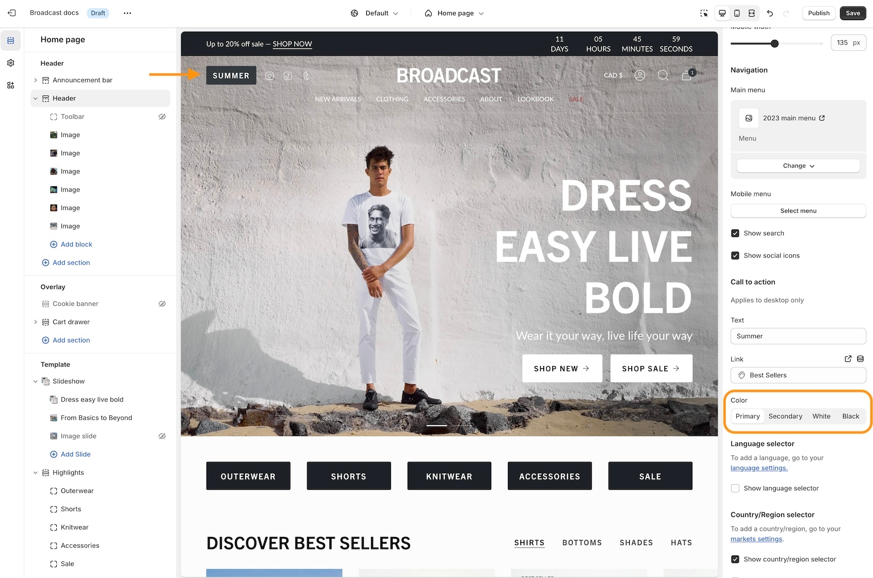
Experiment with different Header styles, the call-to-action button positions differently based on the style of header and navigation you use:
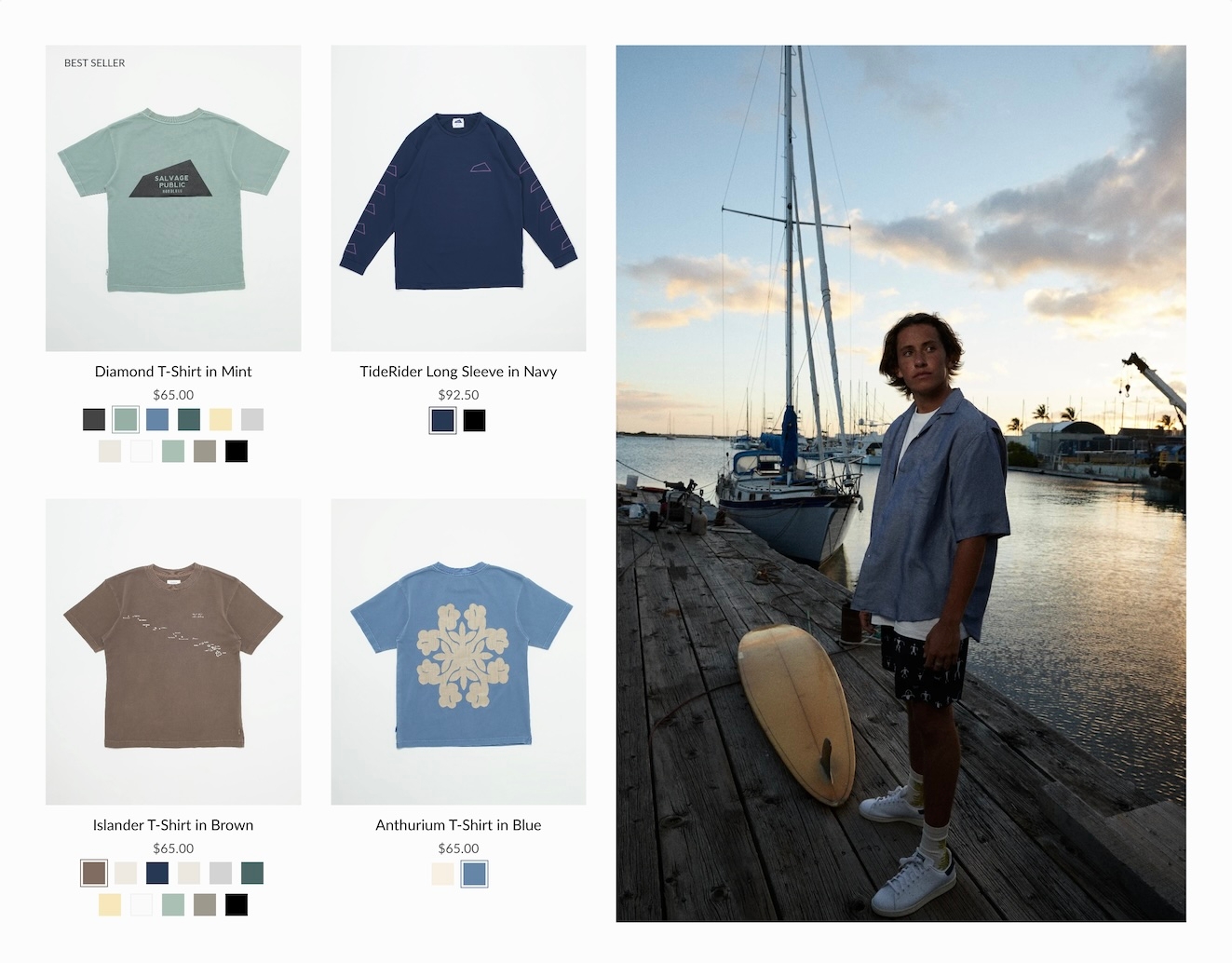
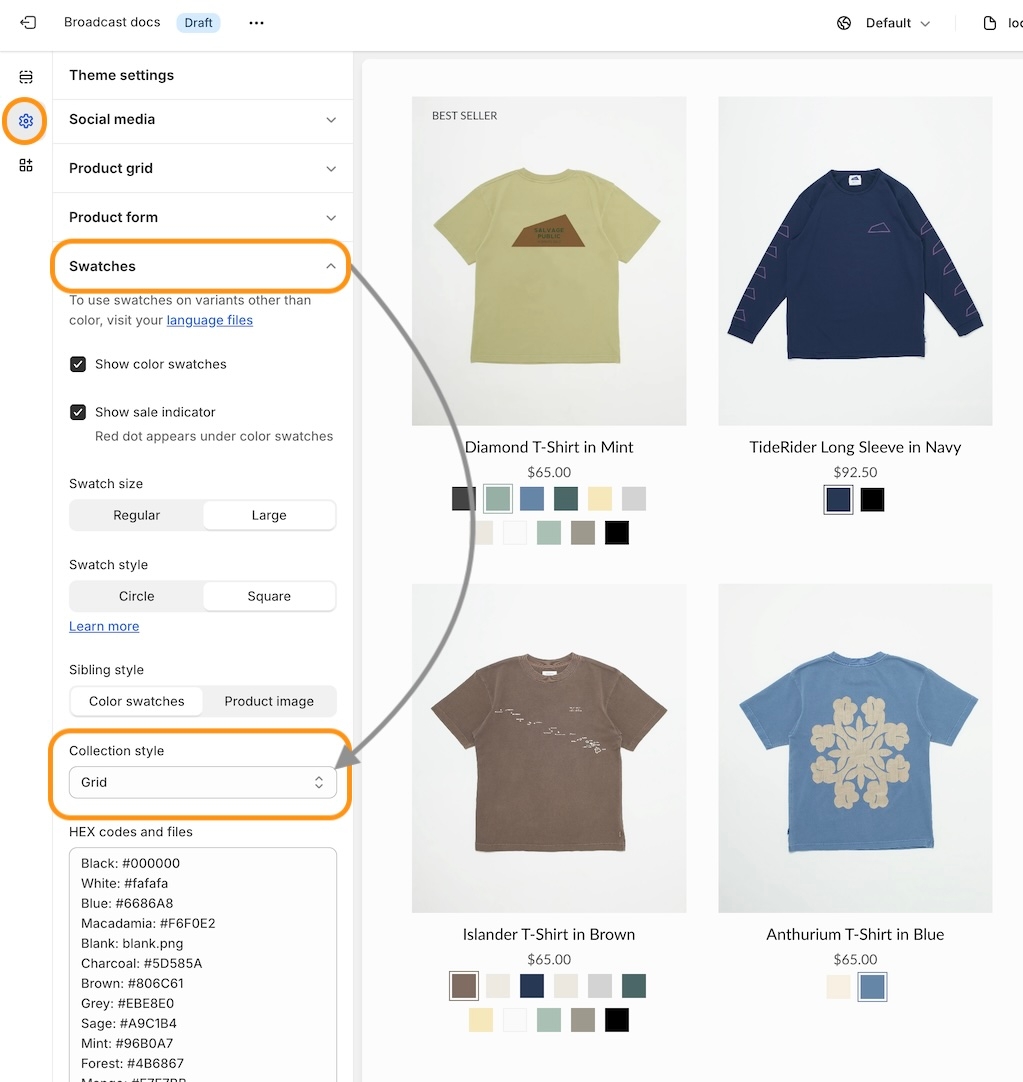
Swatch collection styles
Customize the swatch and siblings display style on the Product Grid. Now in Broadcast, you can choose from different swatch display styles. Examples include:
Slider on hover
Clean text is displayed on the Product grid. Upon hover, the text is replaced with swatches or siblings. The slider feature keeps all swatch options aligned horizontally on a single line:
Text only
A clean text version that displays the number of swatches or siblings which are available:
Swatches with text
Displays a sample of swatches or siblings on a single line and indicates how many additional options are available with text:
Slider
Displays the swatch or siblings slider on one line at all times:
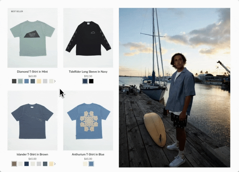
Grid
Displays all possible swatches or sibling options that are available to choose from:
How to configure
Use the global Theme Settings -> Swatches -> Collection style
Choose your collection style in the drop-down:
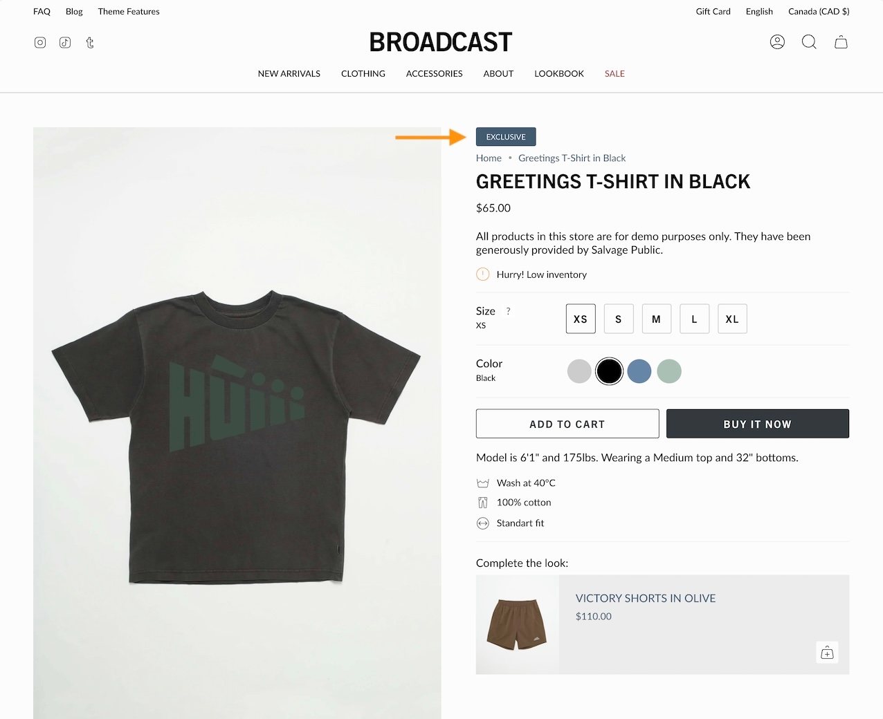
Final sale message
Display a 'Final sale' message with details of sale on sale items:
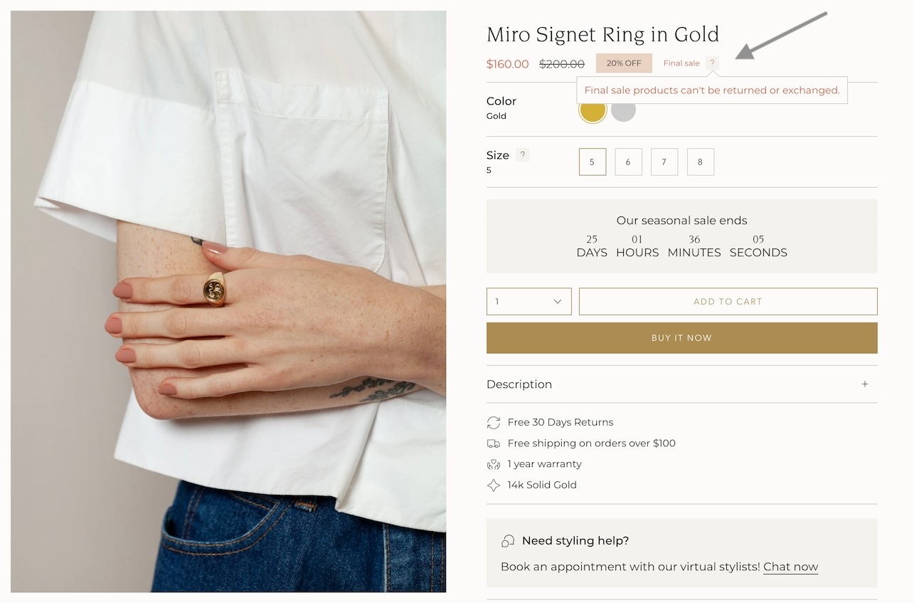
Configure the global settings under Theme settings -> Product form -> Final sale
Learn more:
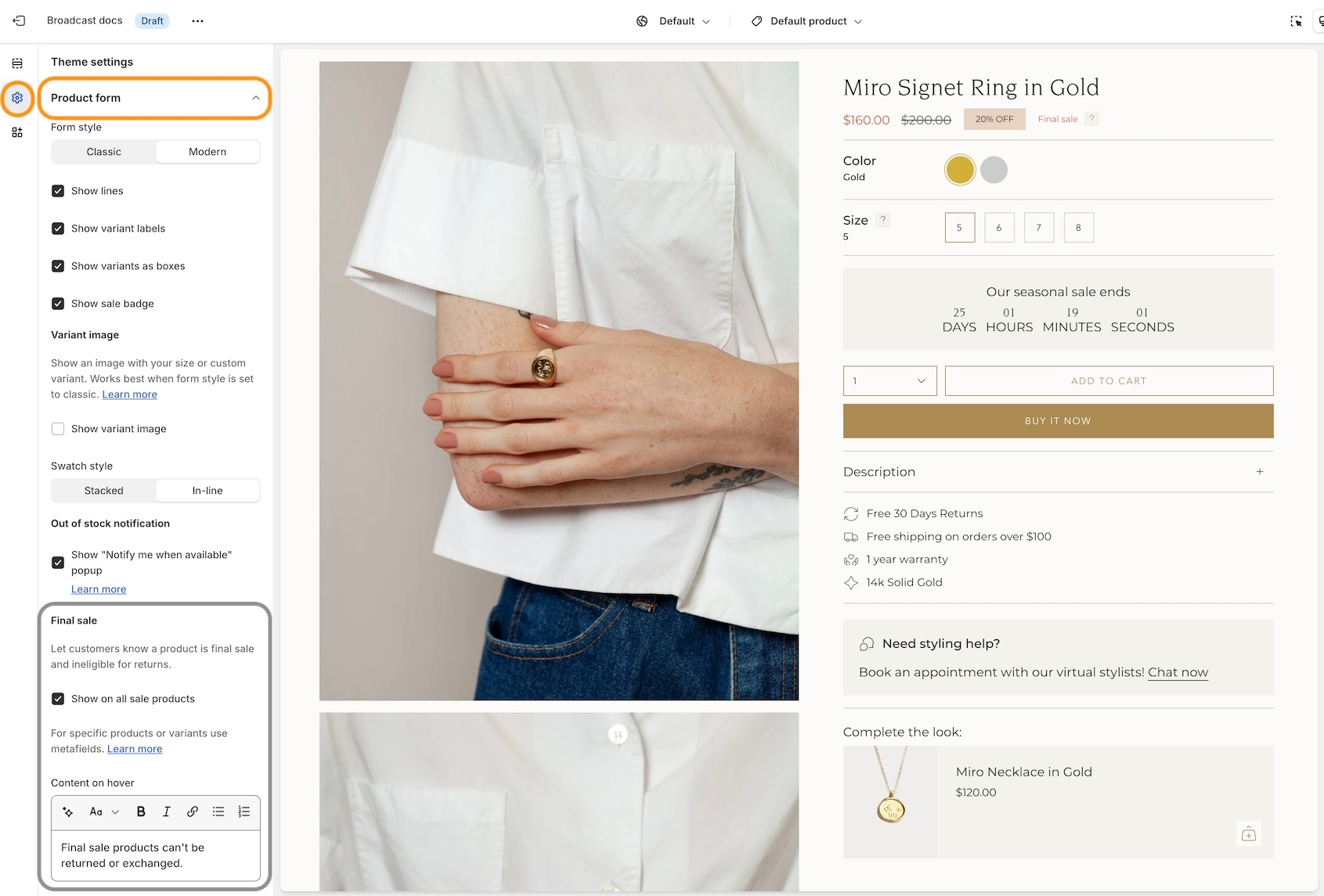
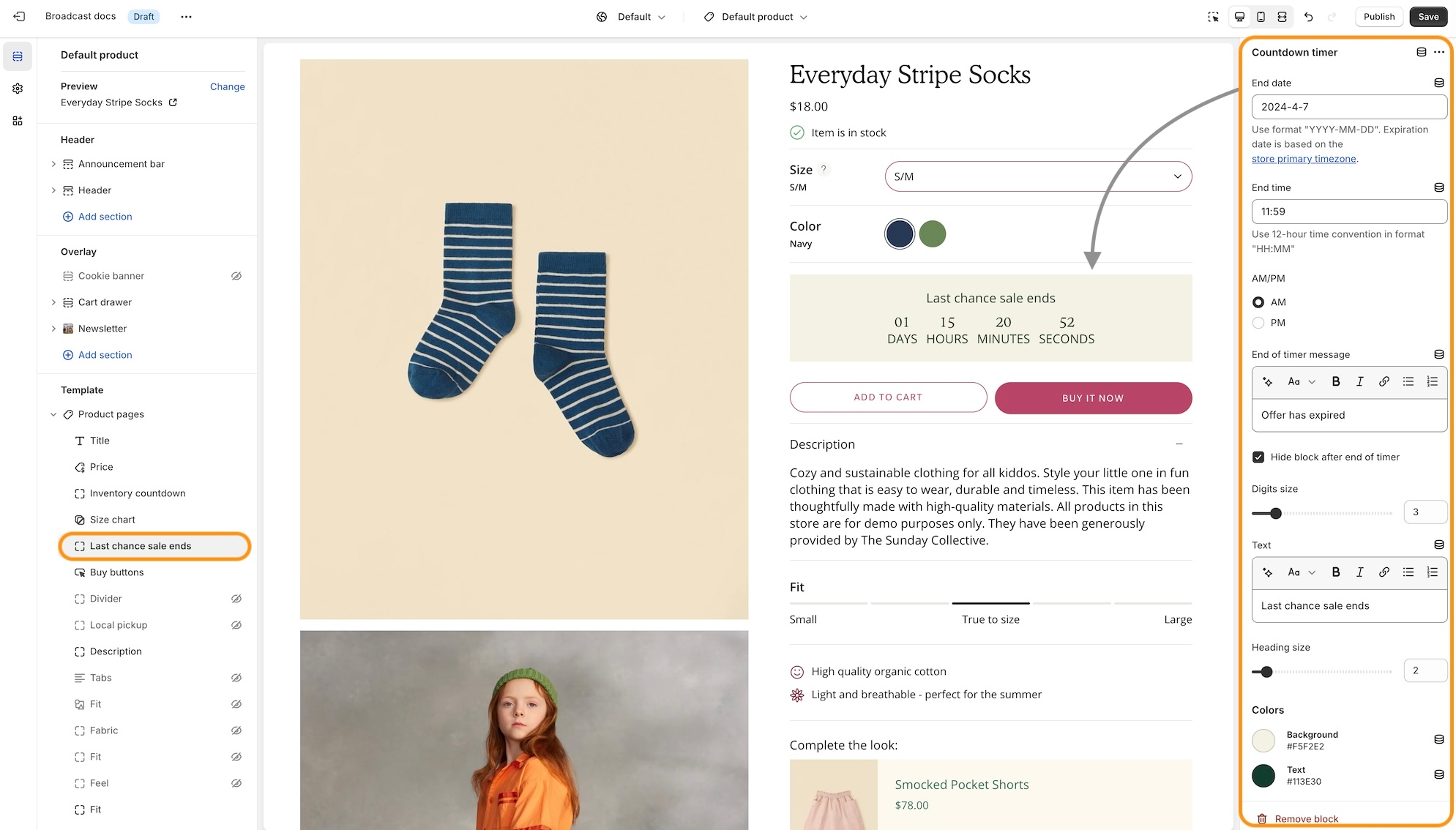
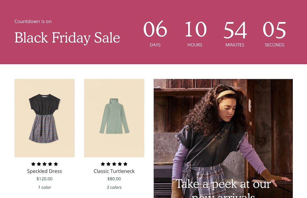
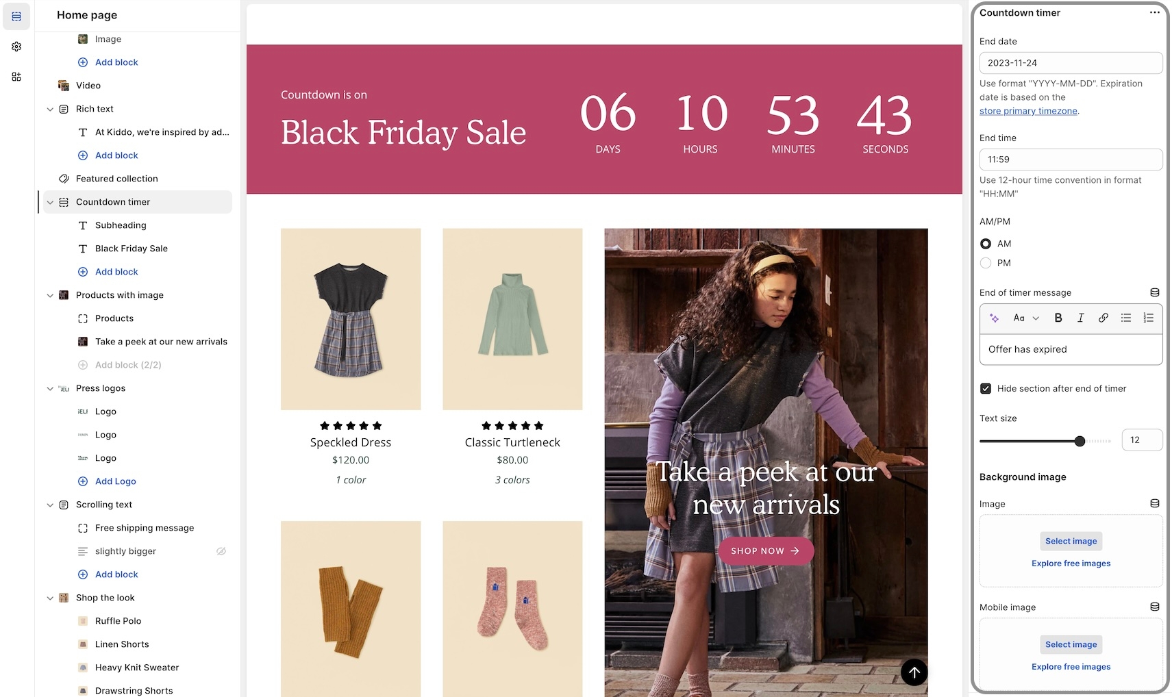
Final SaleCountdown timer block
We've added a countdown timer block to the Product form. You can now quickly add a countdown promotion right into the Product form:
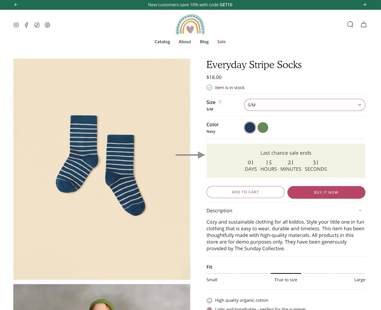
Add the countdown timer block and customize it with a wide-range of options. Use dynamic data sources to apply individual settings for any product:
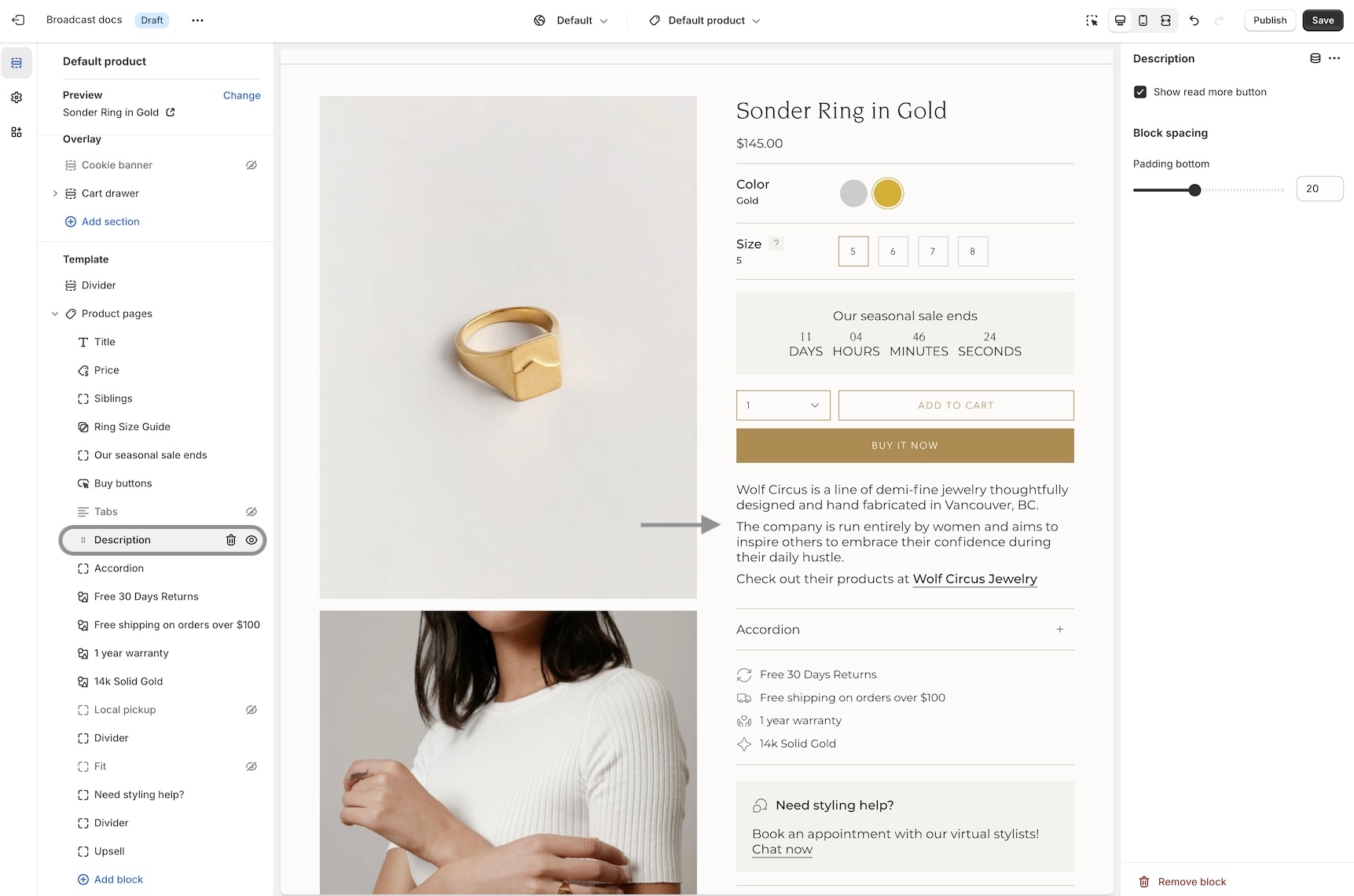
Accordions, Tabs and Description blocks for Product pages
We've separated out the accordion, tabs and description into individual blocks. Now with greater customization and flexibility.
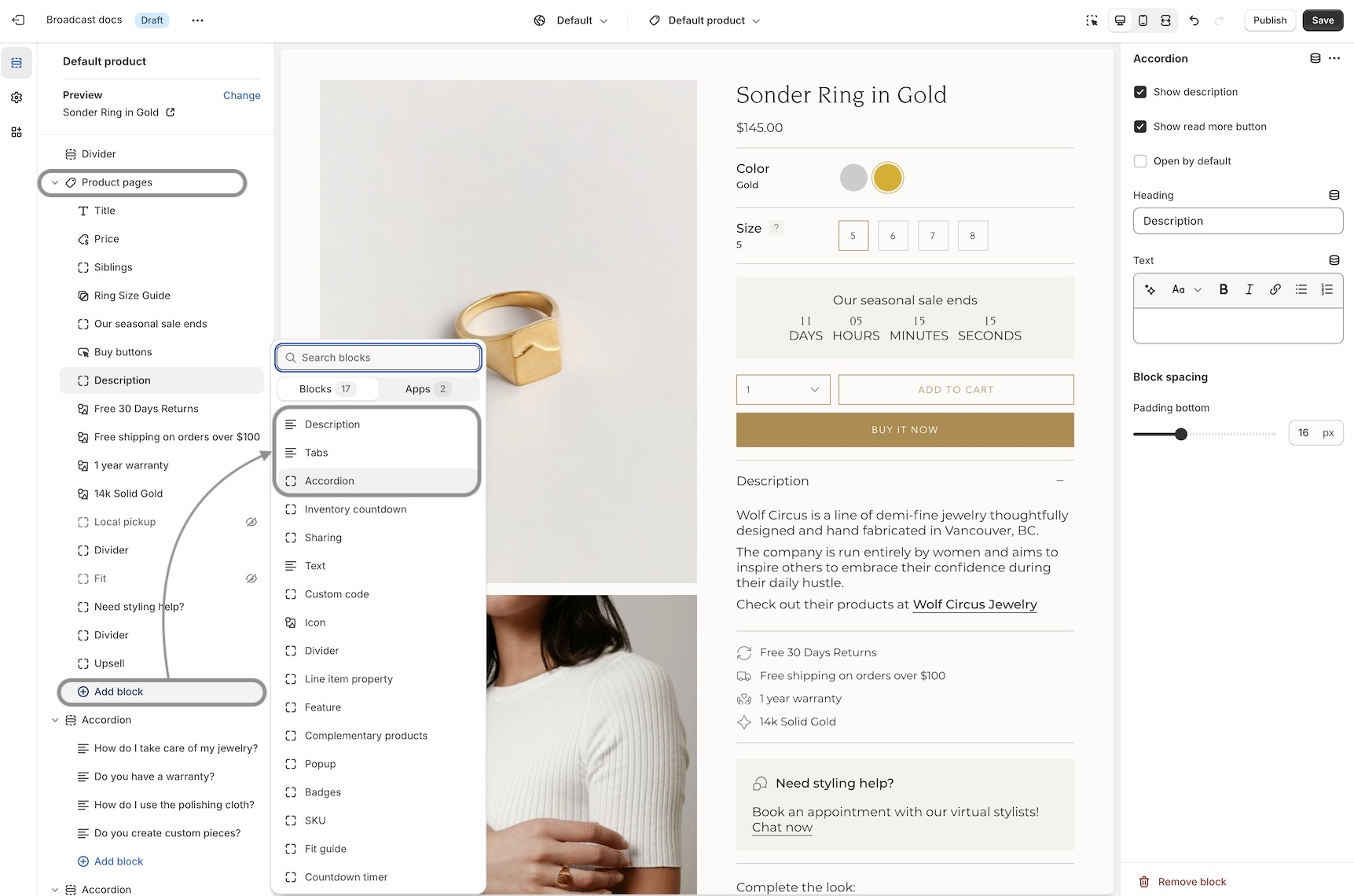
Example of Tabs block with options to show the description and read more button:
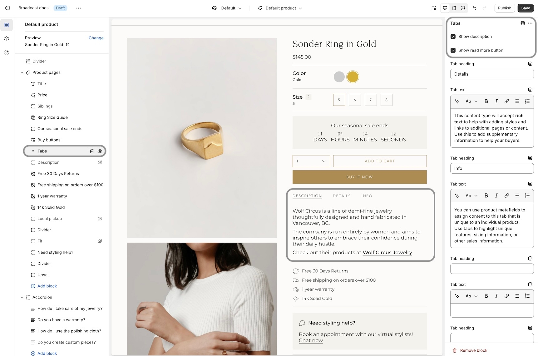
The Description block can be used to pull out the product description from an accordion or tab, and shown independently:
Out-of-stock notification
Let your customers know when a product or variant is back in stock. This new feature in Broadcast allows your customers to submit an email request with product and variant details for an item that is currently sold out:
Learn more:
Out-of-stock notificationSKU block for product pages
Add and position the SKU block to display the value on your product pages. Adjust the padding with the block settings:
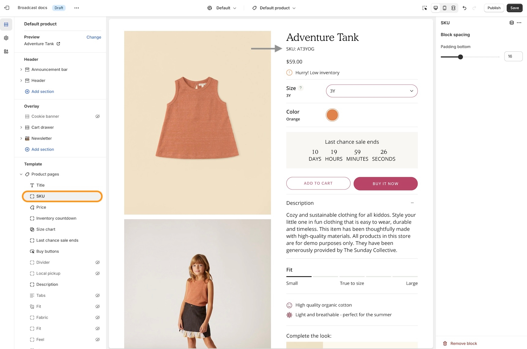
SKU values are taken from the product setup under variants:
Image banner placeholder on Product pages
Broadcast now includes a feature to hide the 'Image banner' placeholder image when using metafields. A new checkbox has been added to hide the placeholder for products that don't have a chosen metafield image.
Watch the video walkthrough on how this feature works:
This solves the problem of displaying an image banner section for specific products and excluding the banner from others with only one template.
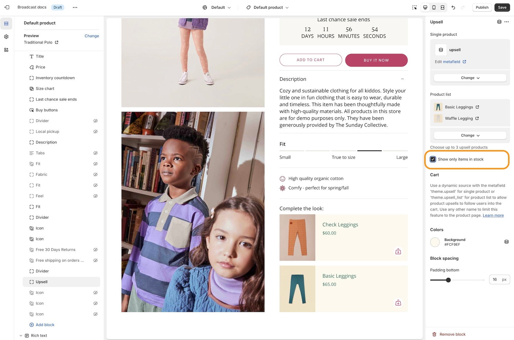
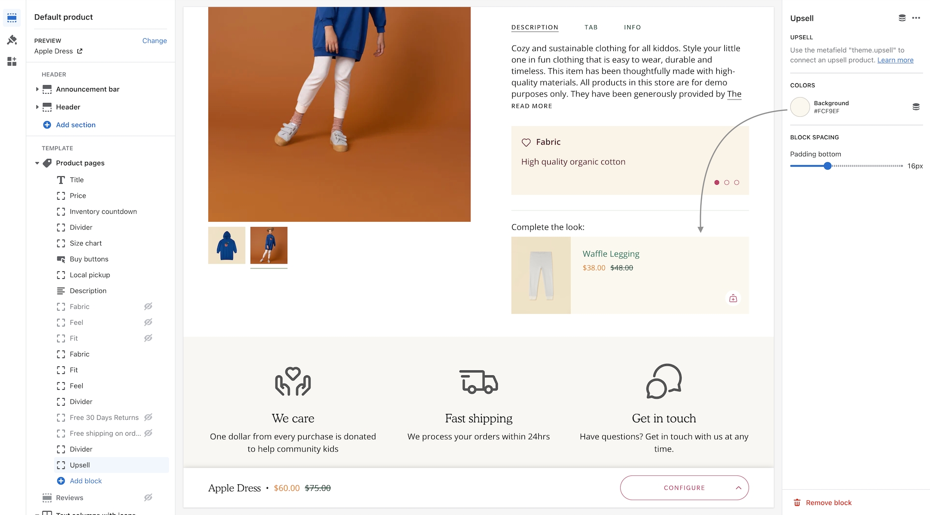
Show only upsell items that are available in stock
An option has been added only to show in-stock items for upsell promotions on Product pages.
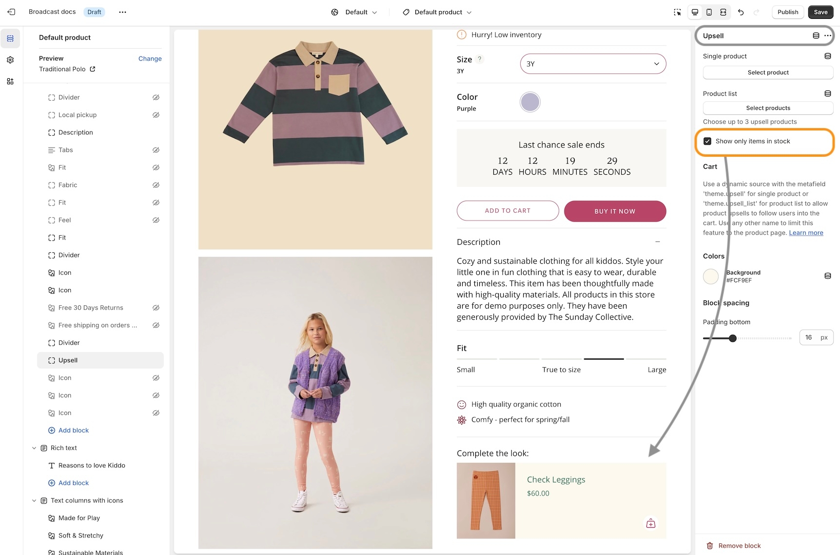
In the example below, the Waffle Legging is an upsell product. However, currently has no inventory:
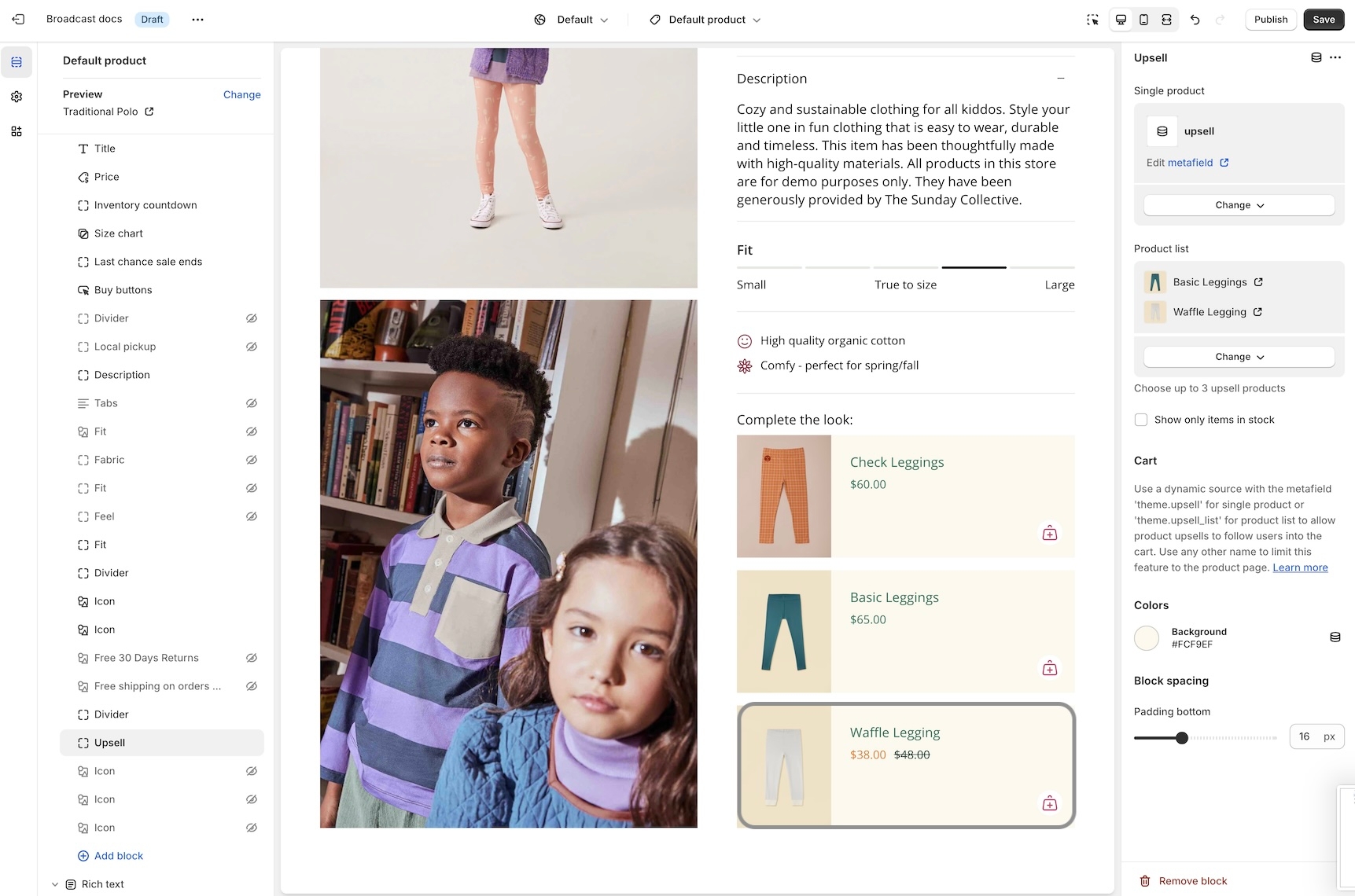
By turning on the feature, that out-of-stock item will not be displayed as an upsell option:
Setting for New badge
We've added an easy-to-use setting in the Theme Settings -> Product Grid to add and customize when the 'New' badge appears on collection pages and the product grid:
Recently viewed items in empty cart
You can now display recently viewed items in an empty cart. Broadcast includes a global theme setting under Theme settings -> Cart to toggle this feature:
Background image for the Rich text section
Dress up the 'Rich text' section with an option to display a background image with overlay options to help display the text over the image:
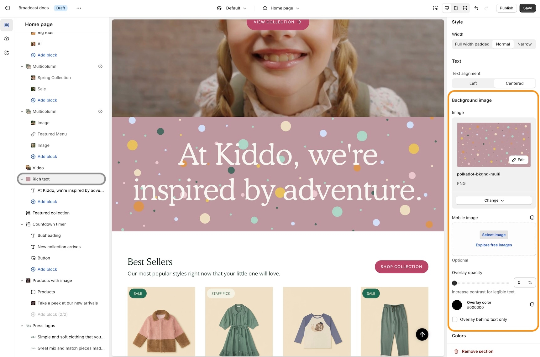
Customize with a different image for mobile devices. If no mobile image is selected, the desktop image is used.
About v5.5 release
Additional information on recent Broadcast updates
Badges block for Product pages
Badges can now be displayed on Broadcast Product pages. Broadcast can automatically display Sale badges or Custom badges that you create for individual products:
Learn more video:
Settings
Custom and Sale badges can be styled in the 'Theme Settings' tab under 'Product grid'. These settings are applied to badges placed on both the Product card (also known as Collections or Product Card) and now the Product form when using the Badges block:
Cart blocks
The Broadcast Cart now has blocks to customize the cart experience for your customers. Sort and arrange cart blocks, plus pin certain blocks to the bottom near the checkout button.
Cart drawer blocks video:
If you are updating from a previous version of Broadcast, please revisit the Theme Settings -> Cart to reconfigure your cart settings.
The new cart blocks are available under the Overlay section in the Theme Customizer.
Number of items in the cart
The number of items in the cart is shown in the main Cart heading:
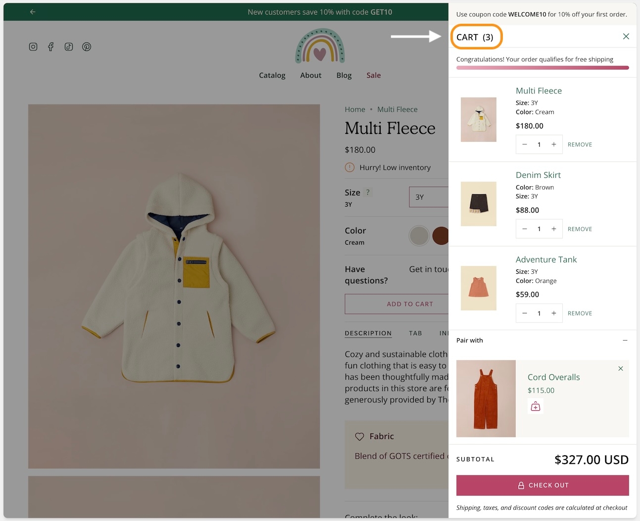
Image with text section - Product and Collection blocks
Easily display and link to products or collections with new blocks added to the Image with text section. These two new blocks can help you quickly build promotions on any page:
The collection block has options to choose a custom image and button text for the call to action:
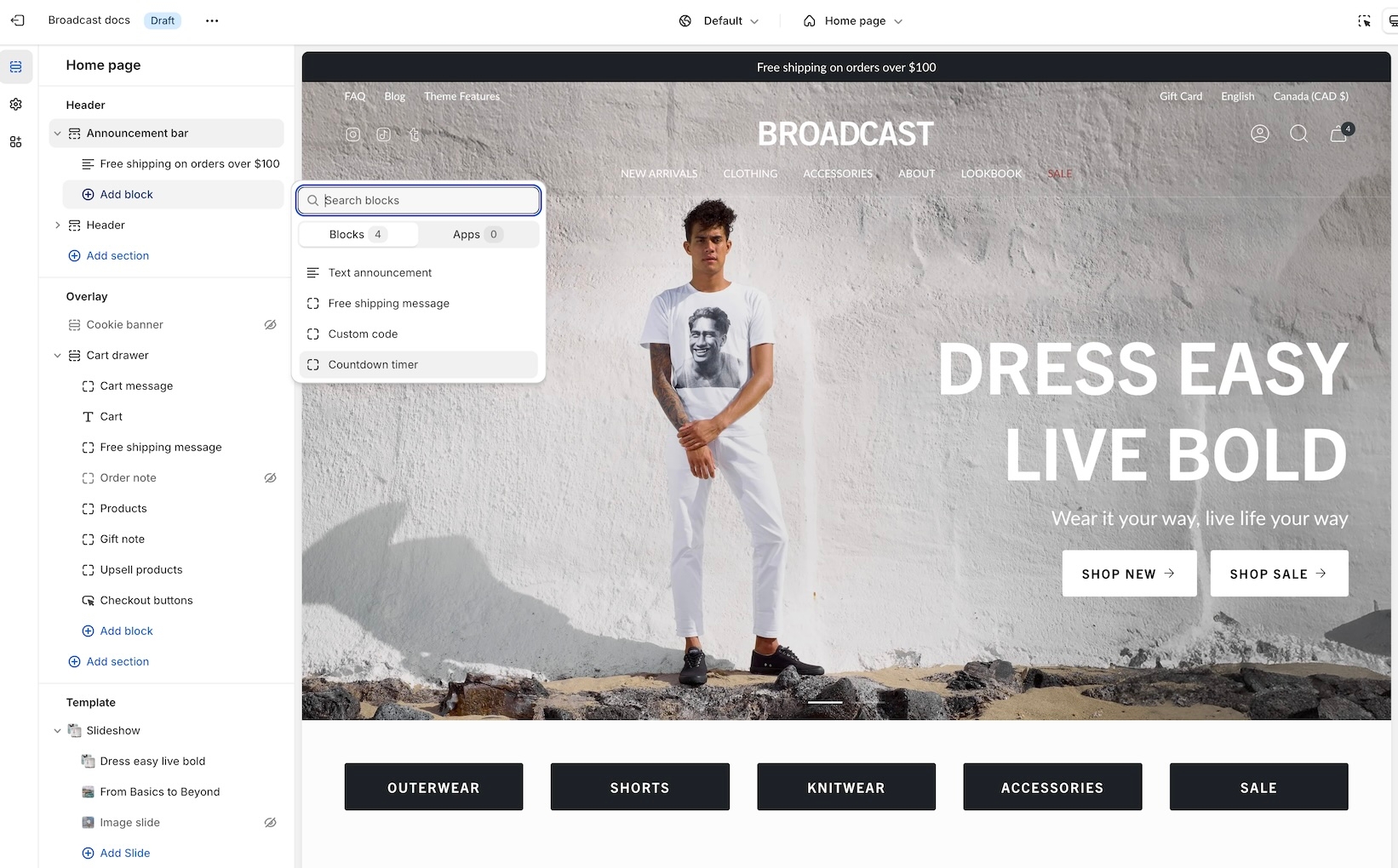
Countdown timer for the Announcement bar
Add a sense of urgency right into the main announcement bar with the new countdown timer block:
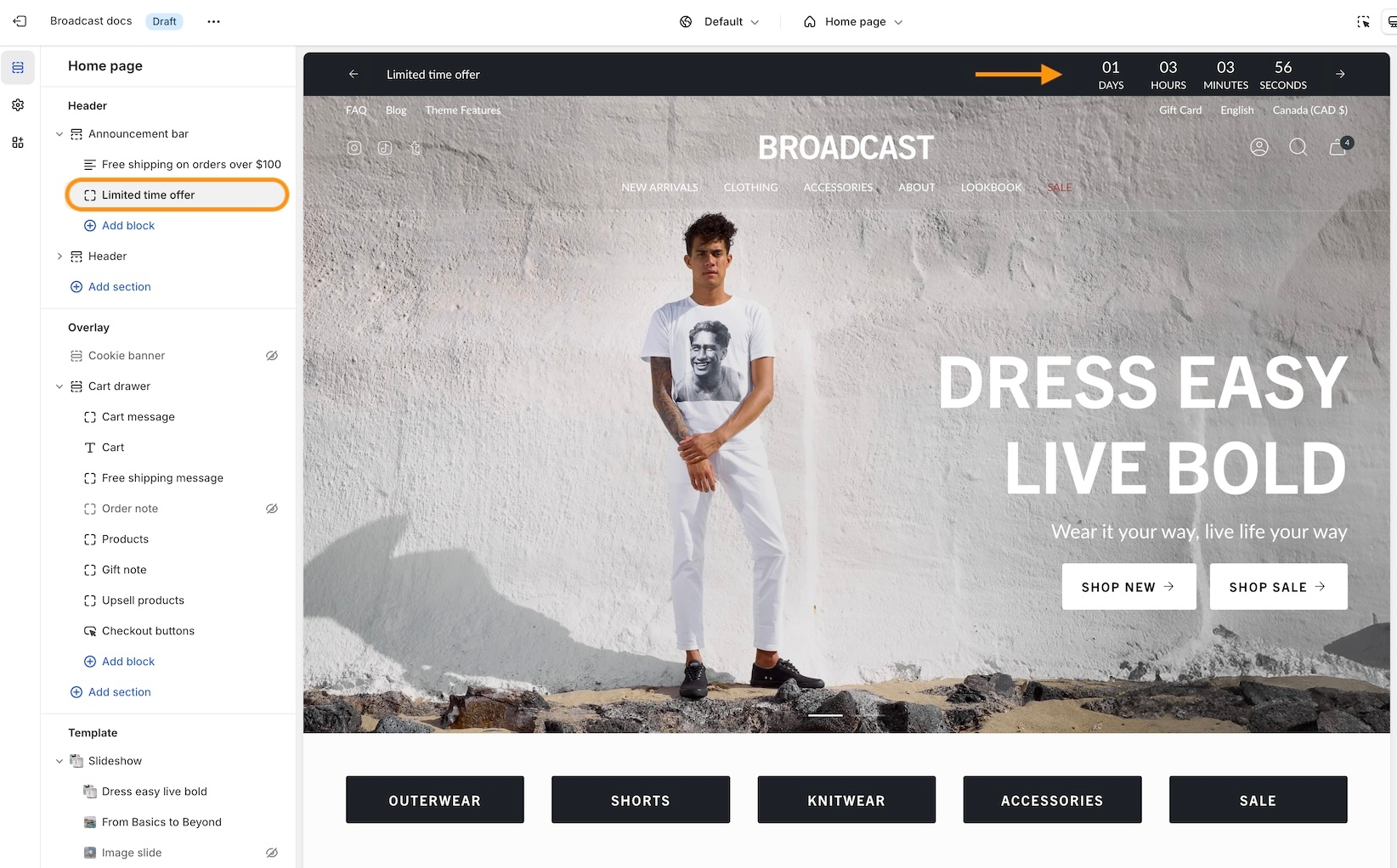
Add the block from the Header -> Announcement bar:
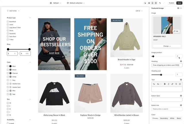
Collection promotions - Multiple featured image blocks
Now, you can add multiple promotions to your collection pages. Additional Featured image blocks can be added to collections:
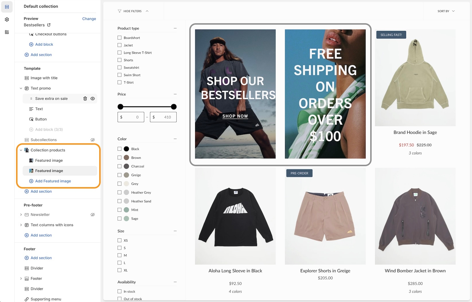
How to position
Position each Featured image block by using the Image position slider or enter the value manually:
Mobile timeline design
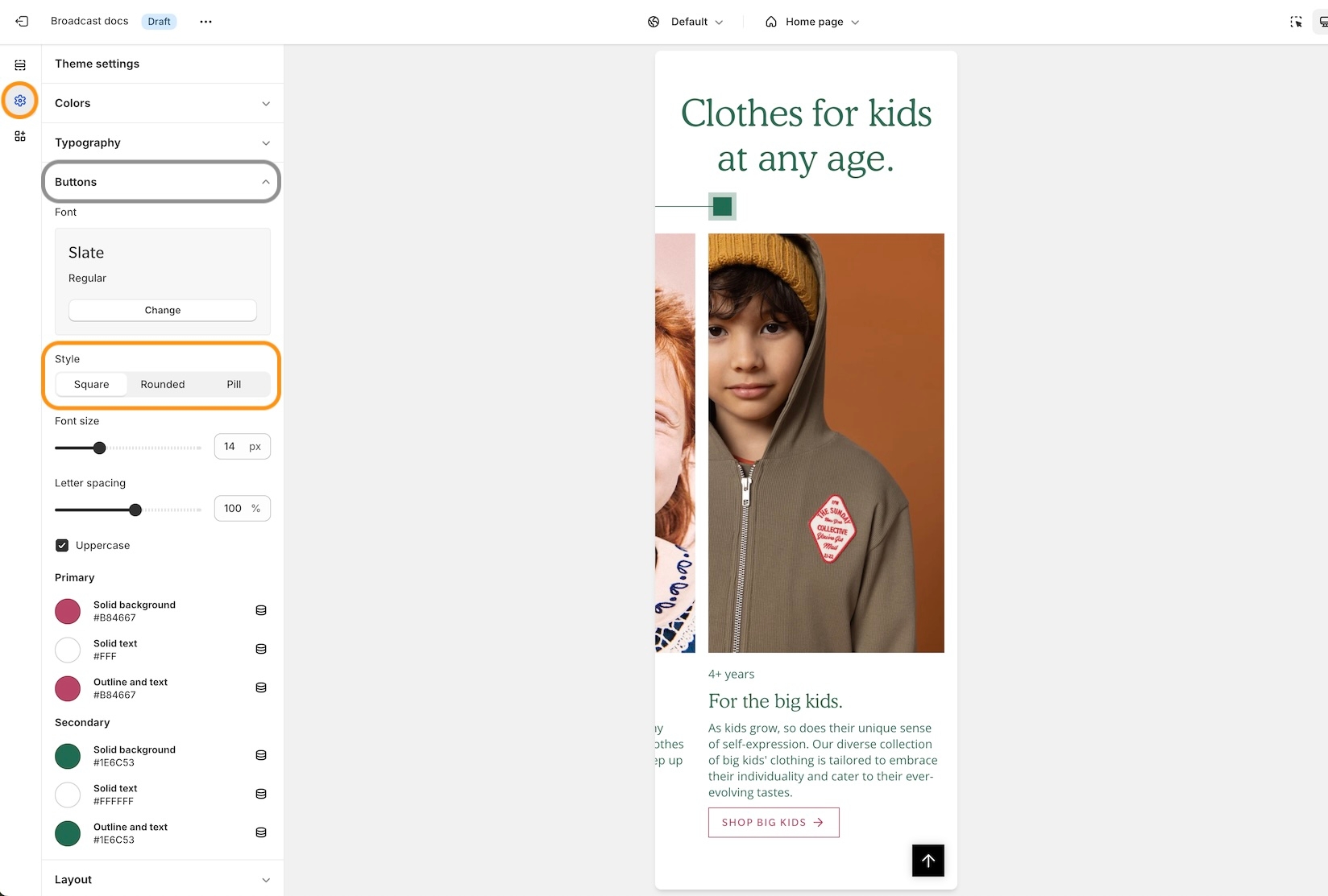
We've redesigned the mobile timeline section to include a horizontal scroller and cleaner visual presentation:
Settings
For square, rounded, or pill-styled period moments, use the options under Theme Settings -> Buttons:
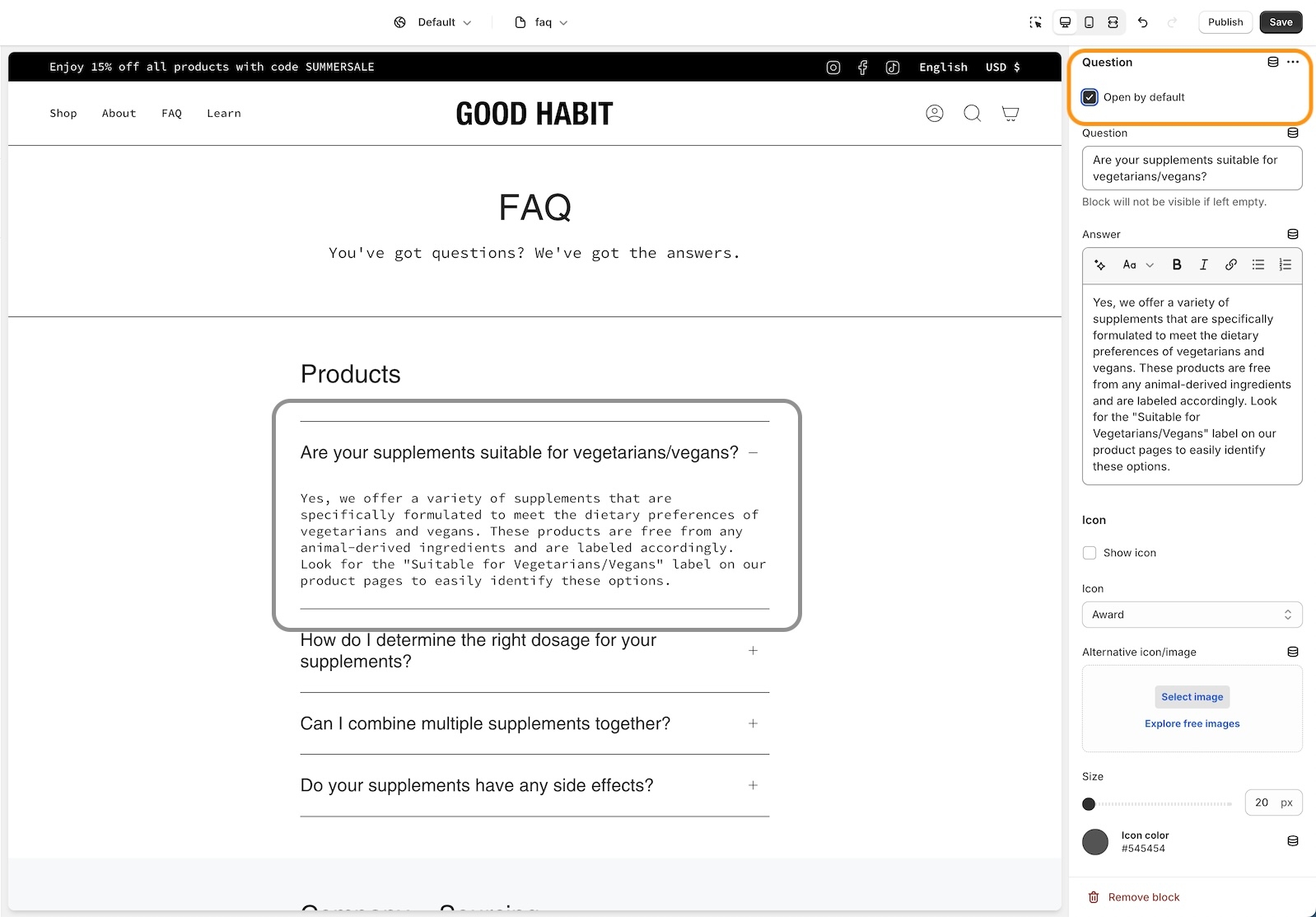
Accordion and Accordion groups
An open-by-default option has been added to keep certain accordion blocks open when the page is loaded:
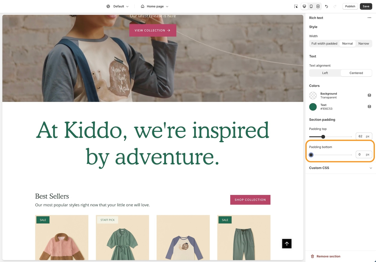
Rich text section and Image with text section
A bottom padding slider has been added to the Rich text and Image with text sections to help you manage spacing between sections:
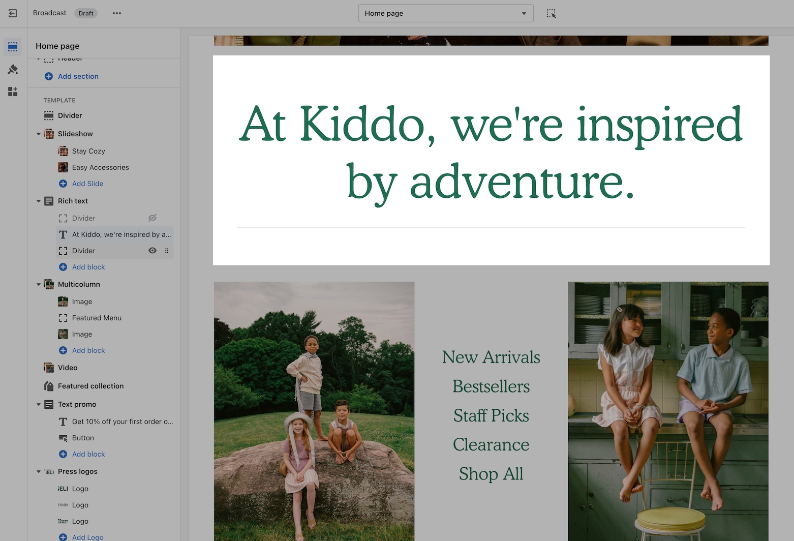
The Rich text section includes an image block option for adding a visual to the main text content:
Featured product section - Background mobile image
We've added a background image option for mobile devices to enhance the display and scrolling effect:
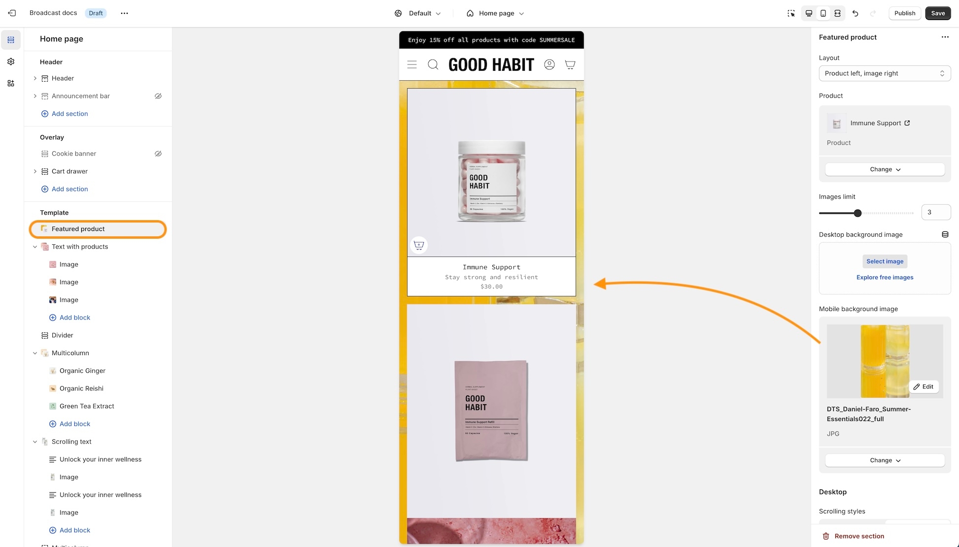
The background image remains sticky as the Featured Product elements are scrolled through:
Product form - Inline option for the text block
You can now have the text block styled to match the variant options when using the modern Product form layout. This places the heading to the left and the text in the next column that matches the style of the variants:
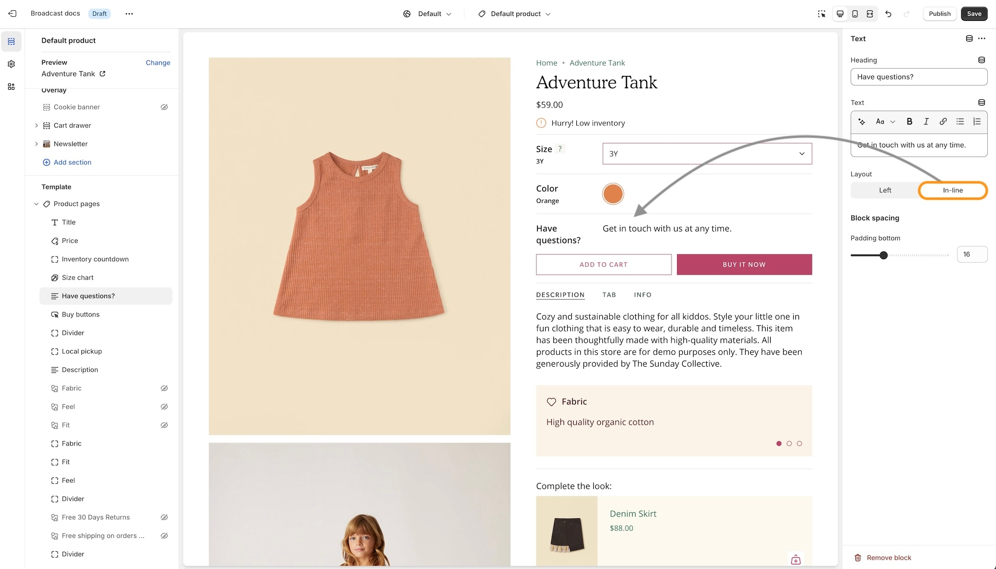
The Left option will show the heading and text in one column and two rows:
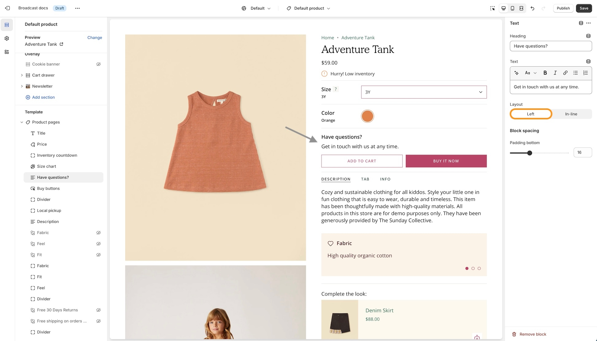
Settings
To enable this option, ensure the Modern form style is chosen under the Theme Settings -> Product form:
About v5.4 release
Additional information on recent Broadcast updates
Products with image - New section
Display a branded image with a selection of products with this new two-column style section:
The mobile version displays the image first, followed by the products:
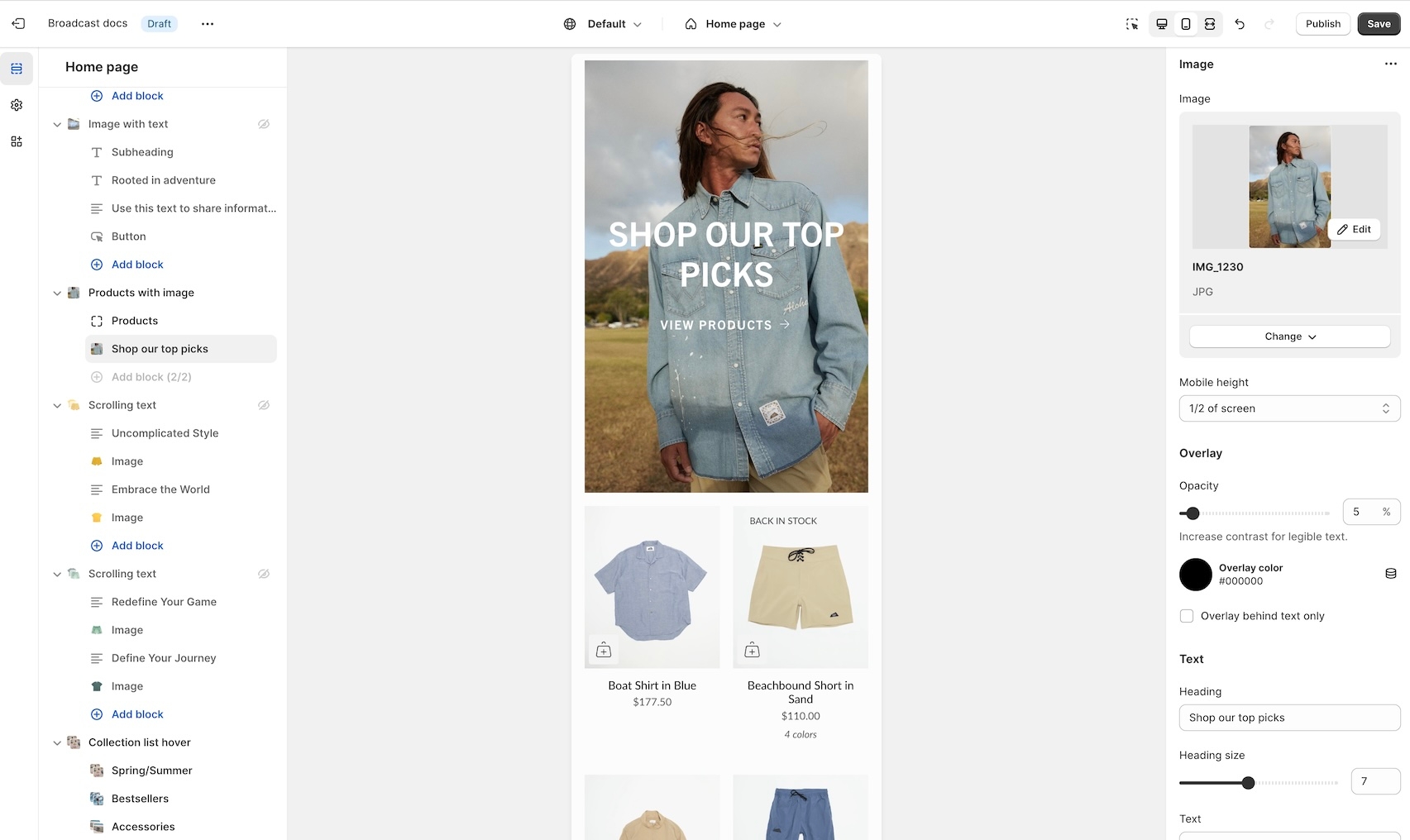
Image with text section now supports media in the text block
Add an image or video block into the text area of the Image with text section:

Insert an image or video into the text column:
The main image is configured in the section settings. The image block will add an image to the text area. Drag the image or video block to sort placement position in the text area.
Transparent header support for product pages
Create modern designs for product pages, now with transparent header support:
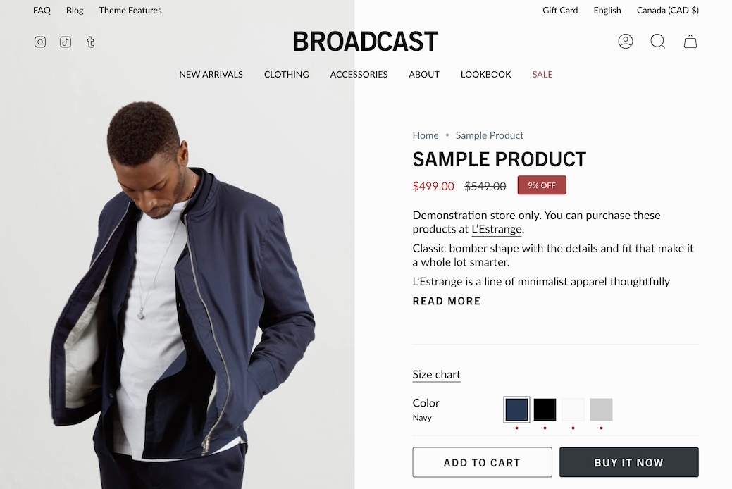
Find the settings in the Header section:
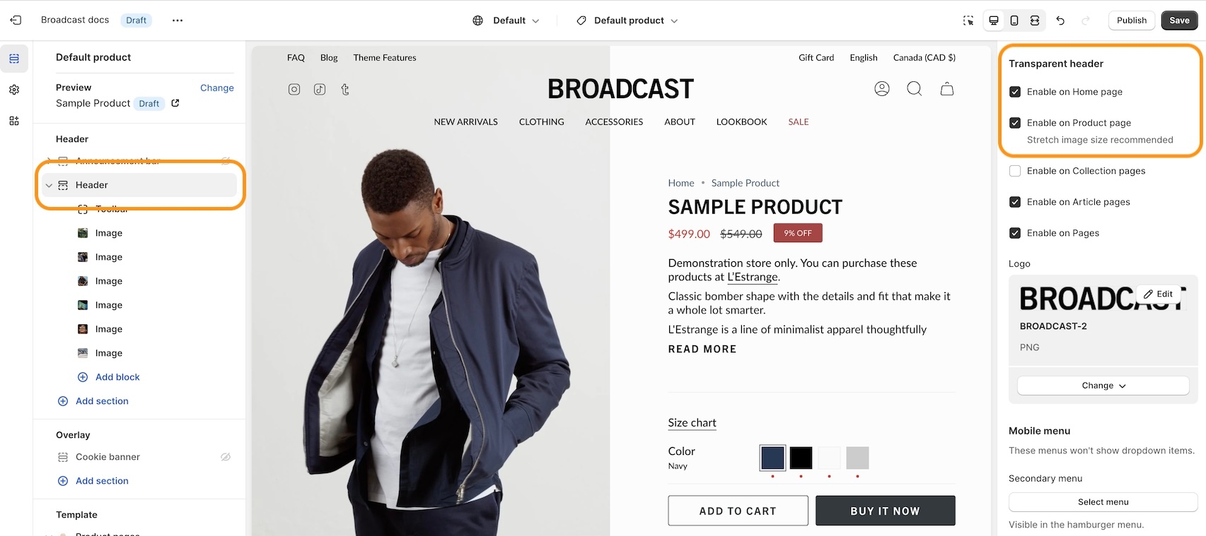
For best results, use the Stretched option for the Product page layout:
Subheading settings - New options
Now you can configure both the Body and Heading styles for Subheadings:
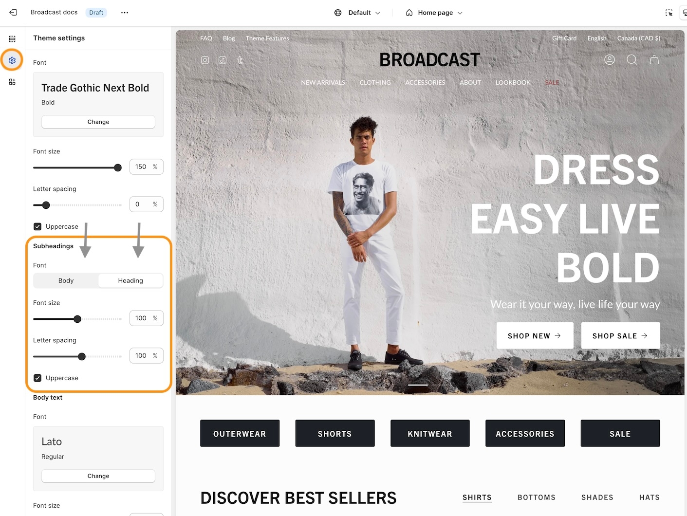
Adjust the font sizing, and letter spacing, plus an option to make subheadings in all uppercase.
About v5.3 release
Additional information on recent Broadcast updates
Countdown timer - New section
Add promotion-style countdown timers to your shop:
Design unique styles with backgrounds for desktop and mobile devices:
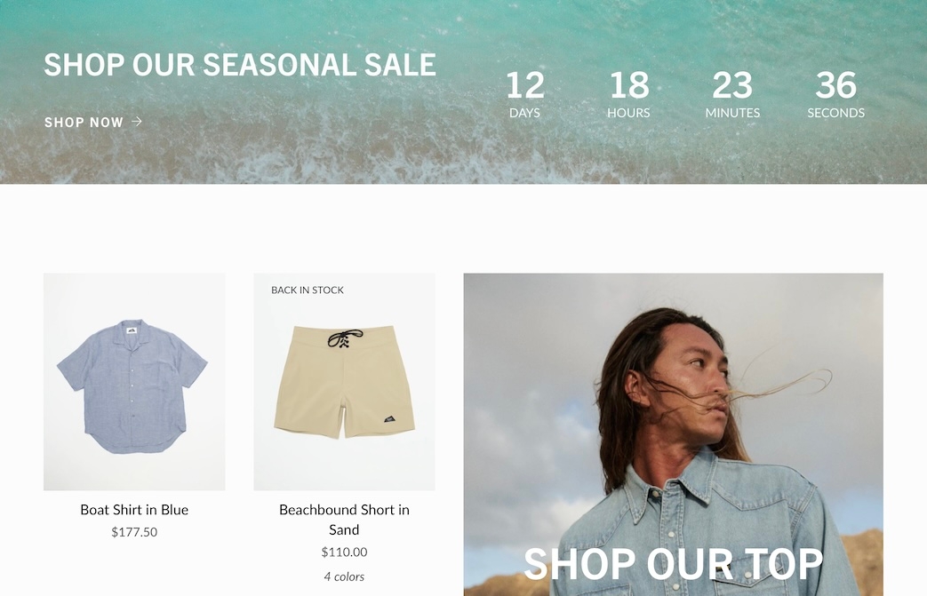
Customize with various section settings. Add blocks for text content:
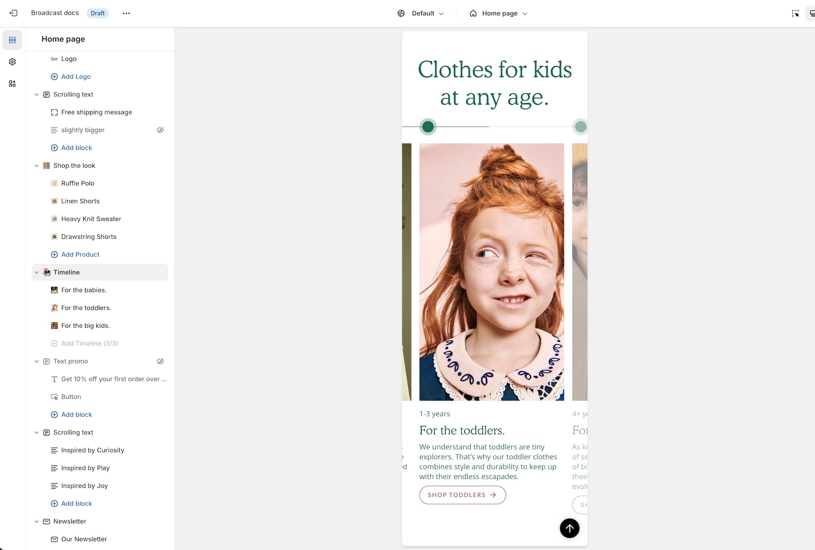
Timeline - New section
New to Broadcast is a unique Interactive section with beautiful animation to engage your customers:

Animated lines connect to timeline points as the customer scrolls down the page. Easy to build, add a timeline block for each entry. Use the section settings to customize the design:

Improved mobile layout for header
We've improved the header elements in the mobile navigation:

Content from the header is now placed in the lower section of mobile navigation.

About v5.2 release
Additional information on recent Broadcast updates
Header section: Toolbar block
Our latest header block allows you to add more menu items, more icons, and more functionality to your main navigation.
This new option has dedicated controls to show a menu, country and region selectors, a currency picker, social media icons as well as dedicated color settings (for the background and text).
Note: When the hamburger menu is enabled, links from the navigation menu will be added to the side drawer.
Image with text: Accordion block
Accordions are making their way to more sections. Add expandable blocks to your Image with text section.
Accordion group: new option
Show two columns of tabs with the new option in the accordion group section:
Multicolumn: new option
There are three new ways to display your image blocks in the multicolumn section. First, be sure to add an image block:
Select an image shape from the individual block settings. Try out the new blob and its hover animation!
Footer group: new block & section:
The divider section has made its way to the footer group. Use it to add a horizontal ruler and separate the content above the header.
There is also a divider block inside the footer section itself. Use the individual block settings to adjust the width and space everything perfectly around it:
About v5.1 release
Additional information on recent Broadcast updates
Featured product section
Fresh new design for the featured product section with new image scrolling options and additional section settings:
Discover the new vertical and horizontal image scrolling options with this quick video:
You have the option to add a background image to enhance the appearance of the section:
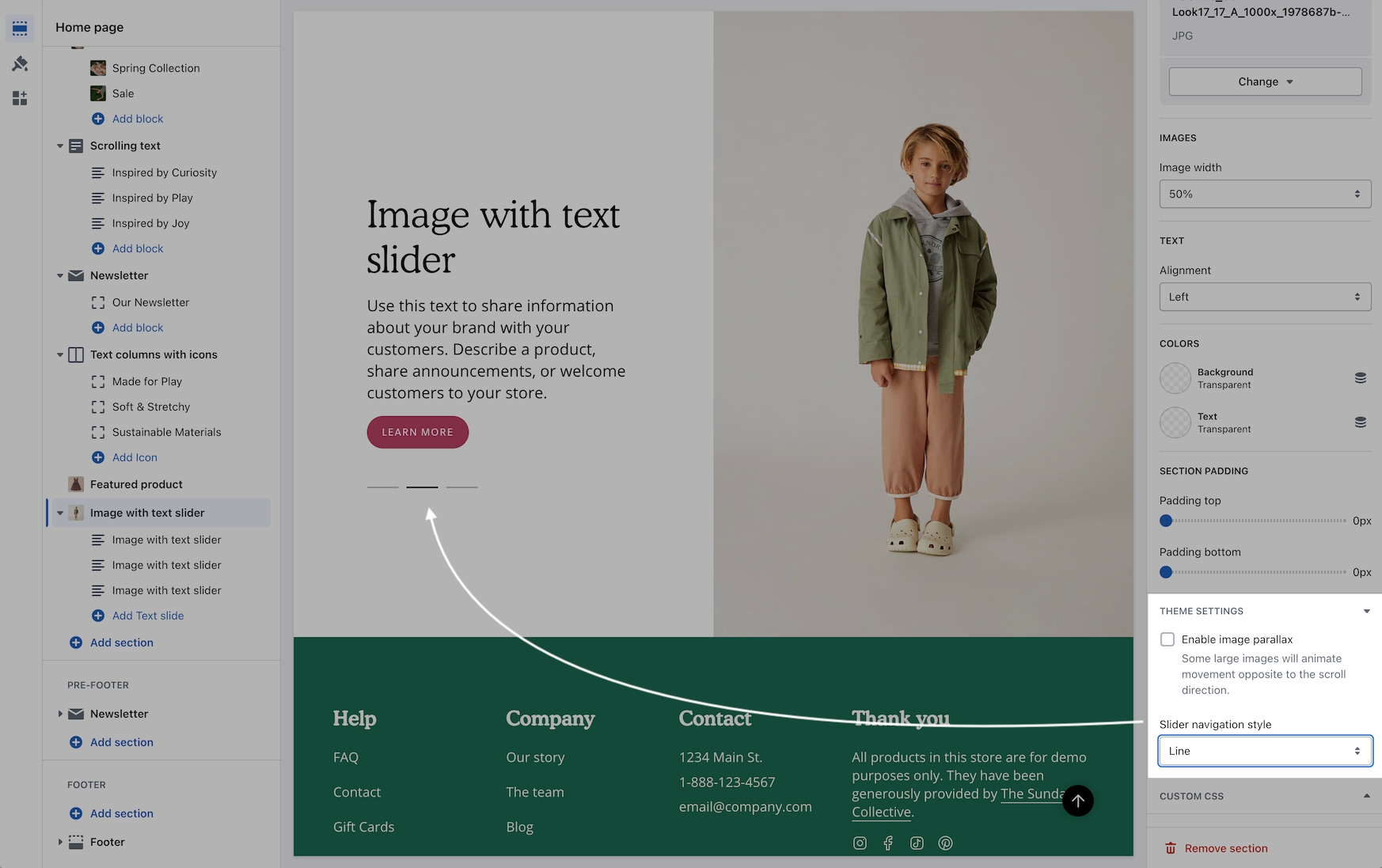
Image with text slider section
A new section added to Broadcast is a two-column image and text section with multiple text blocks. You can now add multiple text blocks that customers can slide through for additional information.
Watch this short video walk-through on the section and block settings:
On mobile devices, the images will rotate automatically and customers can swipe through the text blocks:
The slider navigation style can be adjusted under the Theme settings:
Color swatches
Swatches are now easier to manage and control. All the settings for color swatches around are found under Theme Settings -> Swatches
Video walk-through on all the changes:
Tab collection section
A new grid layout option for the desktop has been added for displaying the products within a tabbed collection. You can easily choose between the slider style or the new grid option:
In addition to the product layout, you can position the tabs with different layout options:
Scrolling text section
You can now add a background image to the scrolling text section and also image blocks in-line:
Video overview - Scrolling text updates:
Header line
An option has been added to help build a separation between the header and content:
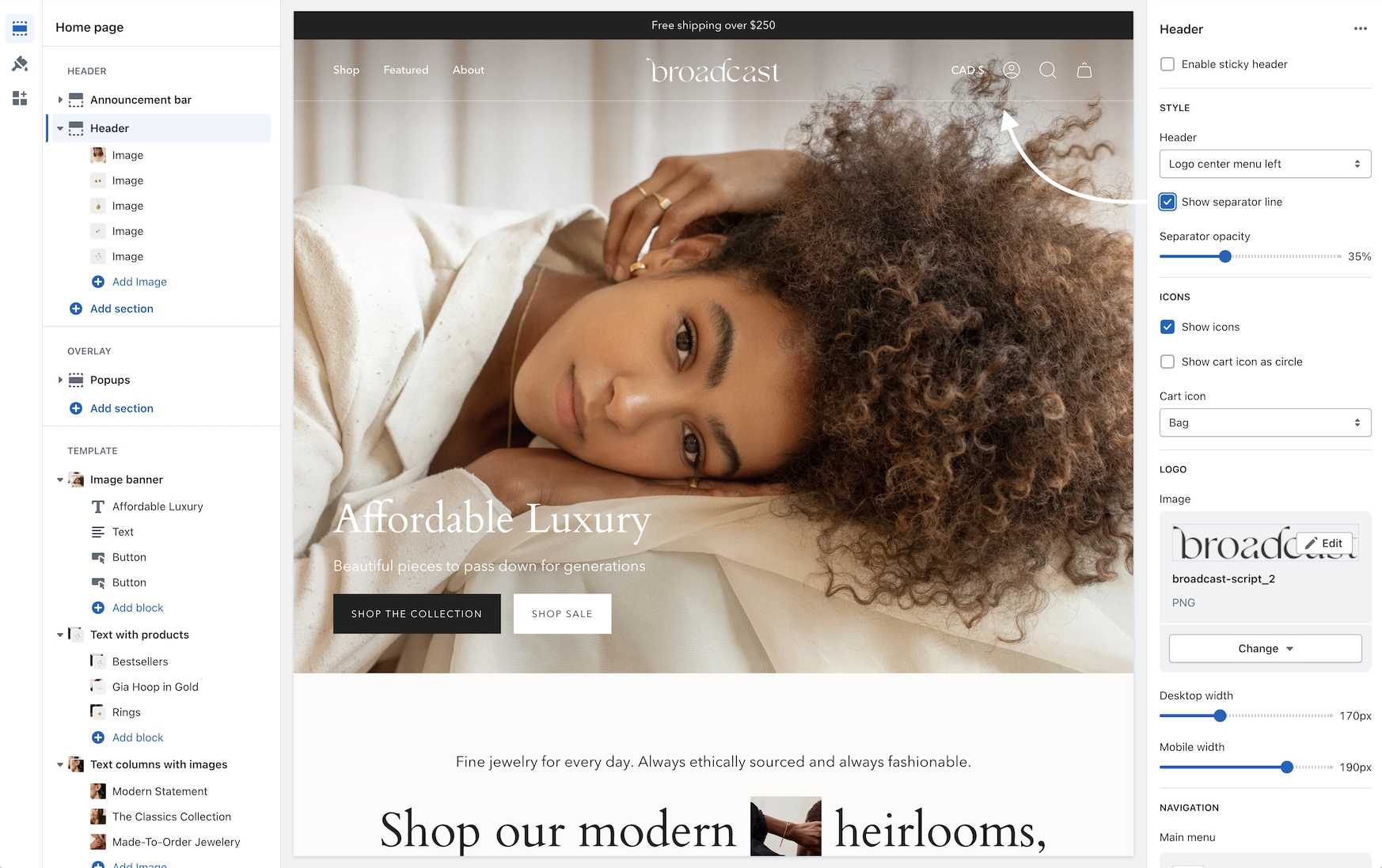
Header sizing
You can now adjust the padding in the header area to make larger or tighter headers:
Cart
A terms and conditions checkbox option has been added:
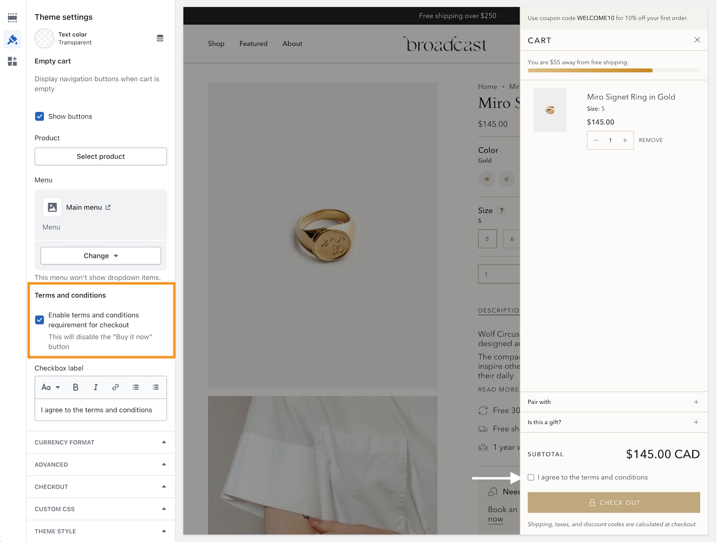
Use the Theme settings -> Cart to toggle. When enabled, the customer must check the box in order to proceed with checkout.
About v5.0 release
Additional information on recent Broadcast updates
Gift card - Send directly to the recipient with a message
Customers can now send a gift card directly to the recipient's email and include a personal message.
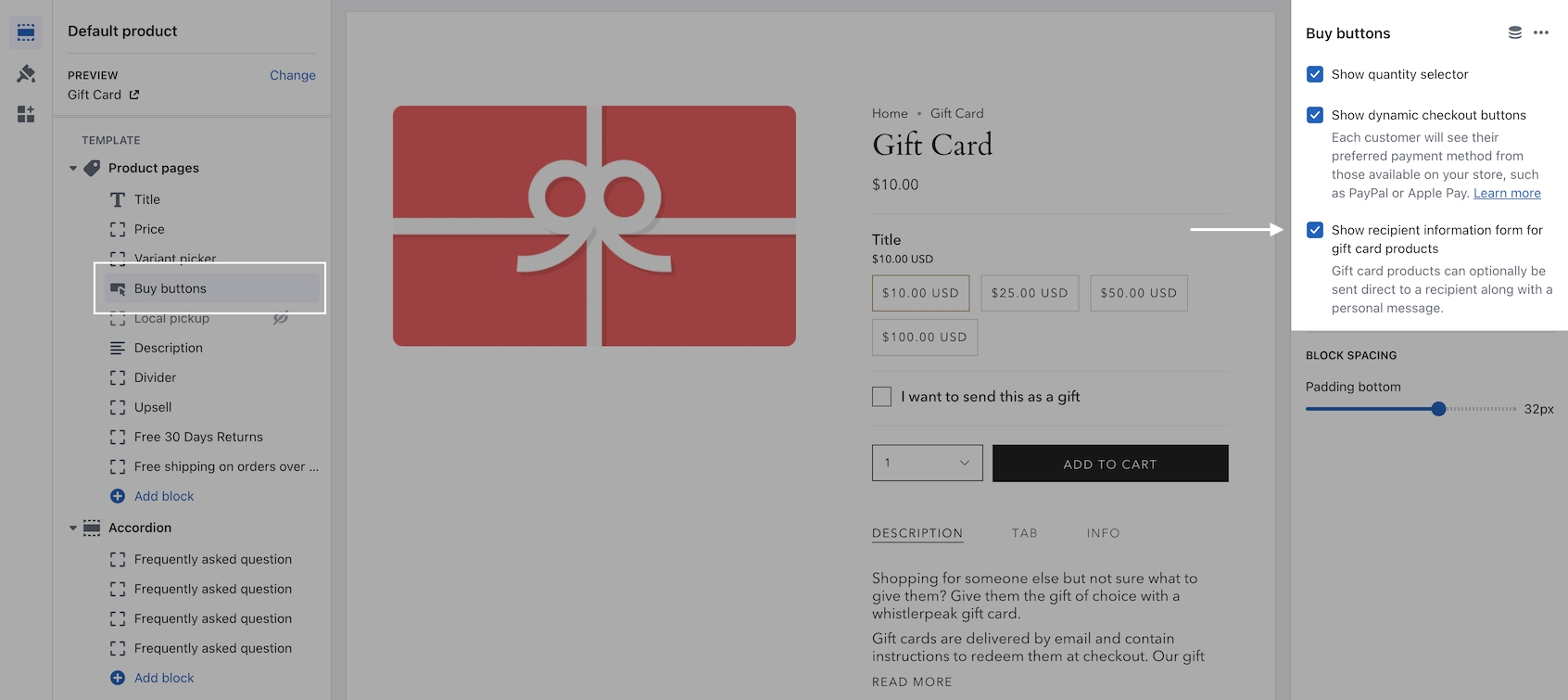
In the Theme Editor, use the checkbox option on the Buy buttons block to enable.
The customer will then have the option to send it as a gift:
Multicolumn - New mobile aspect ratio setting
An image aspect ratio for mobile has been added in Broadcast 5.0. This will help provide more flexibility when designing complex layouts. In the example below, two Multicolumn sections are used to build a mosaic. The second has wider images. With the new settings, the mobile aspect ratio can be adjusted to make the images consistent with the section above:
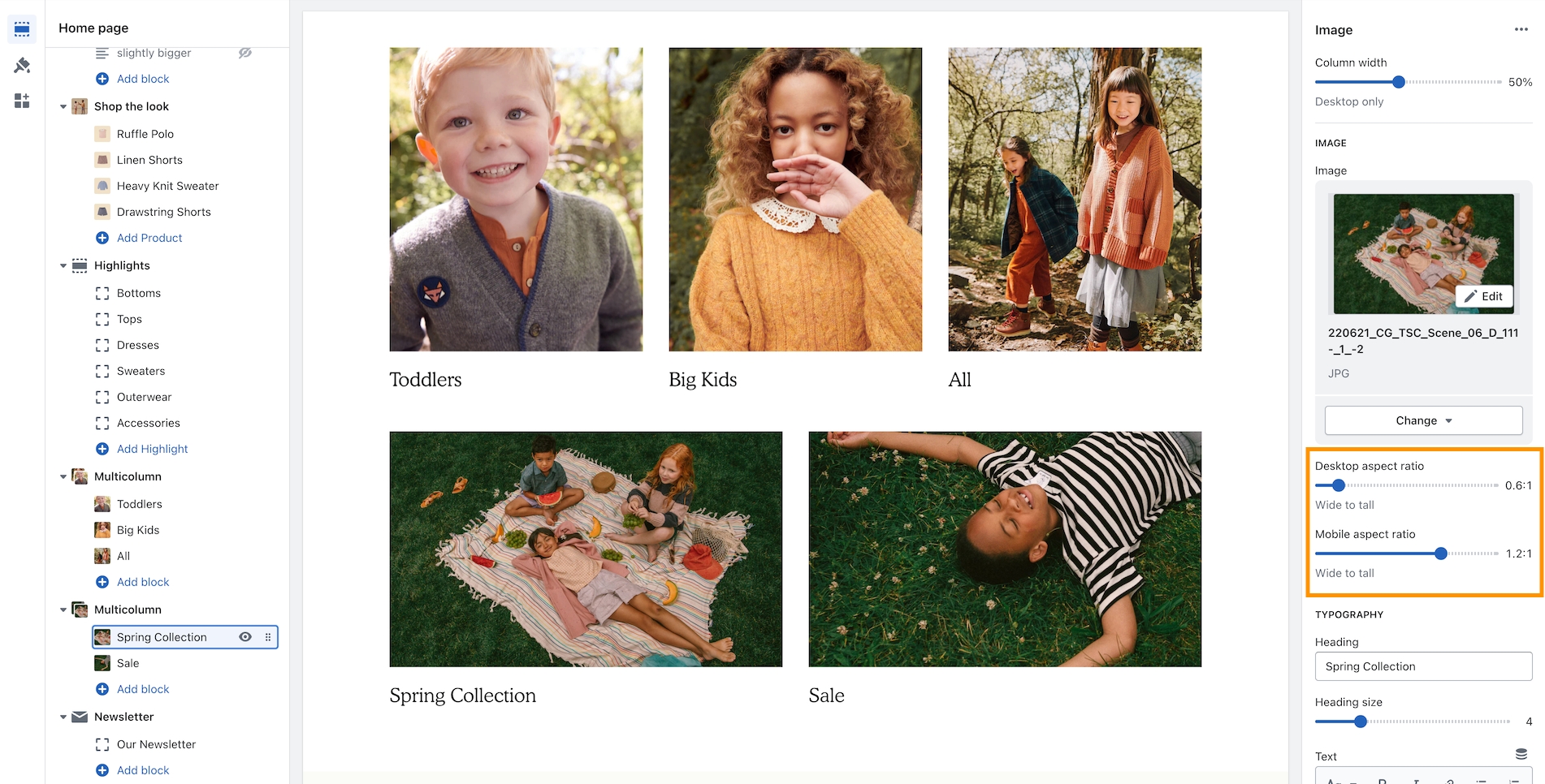
Example of wider desktop images showing with 1:2:1 aspect ratio for mobile which matches the section image sizes of the previous section:
Shop the look - Option for 2 per row
We've added the ability to show 2 product grid items per row. Ideal for showing more on desktop screens:
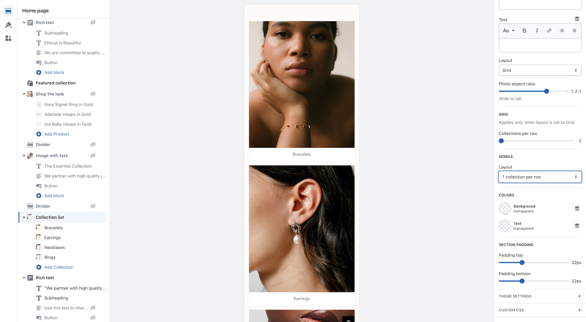
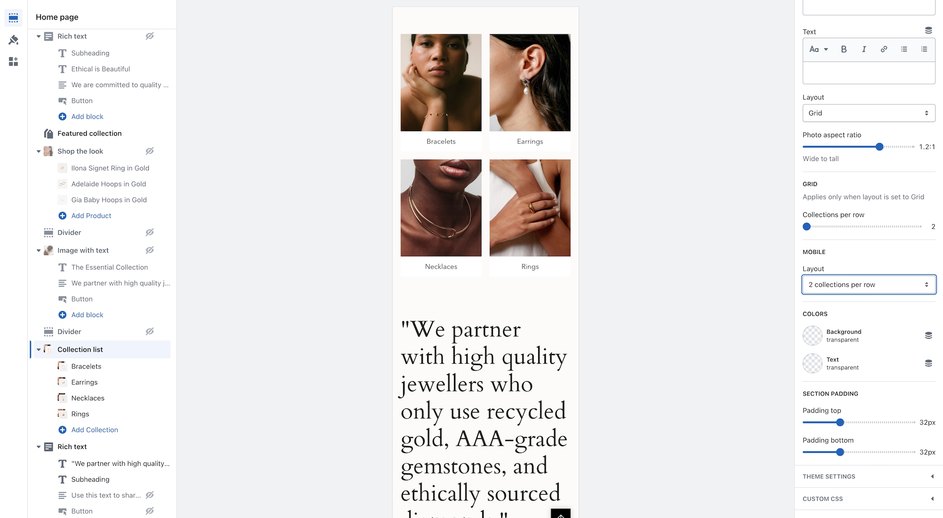
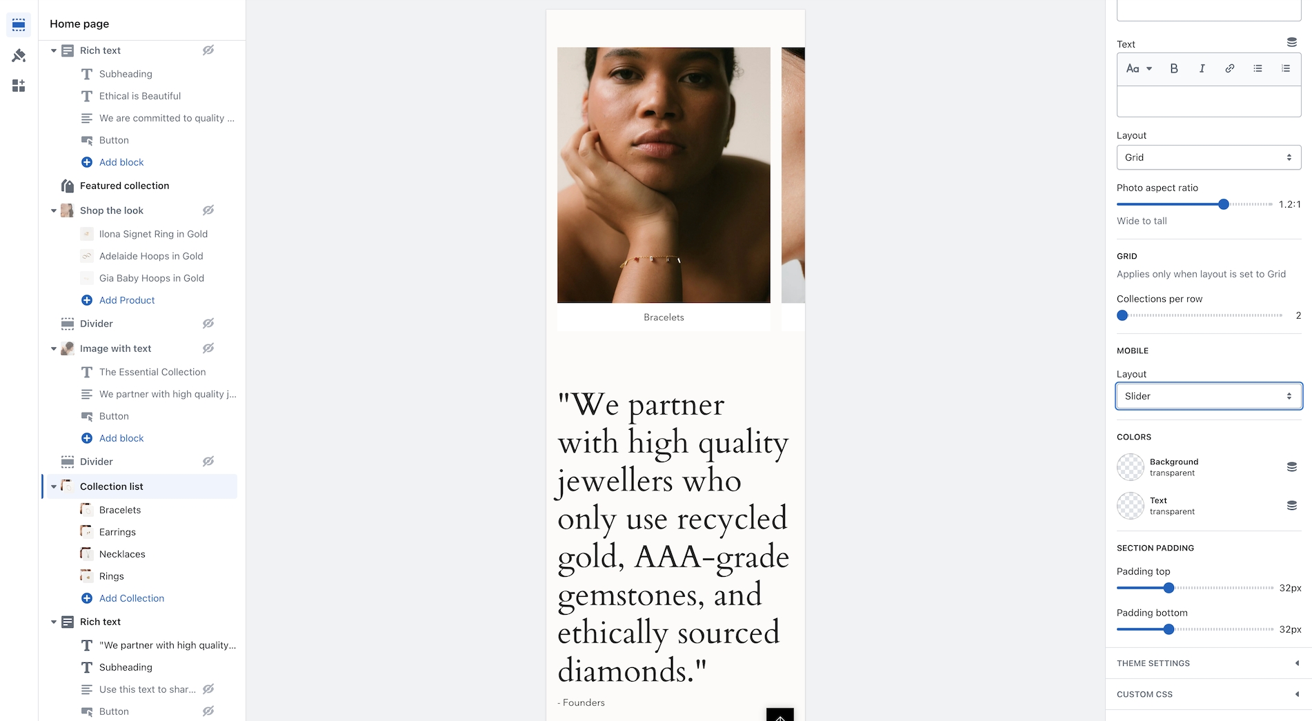
Collection list - New mobile layout styles
Broadcast now includes mobile layout styles for the Collection list section. You can choose to display 1 or 2 collections per row or the mobile slider:
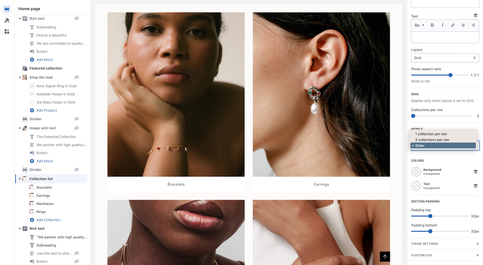
Layout examples for mobile:
Upsell functionality updated to work with one product and metafields
Now you can easily add one product right from the Theme Editor as your Upsell item which will instantly appear for all products using the same Product template.
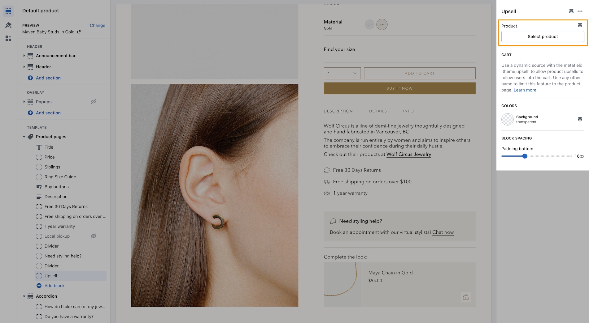
This method is a simple way to use the upsell feature without the complexity of using metafields. It will add the chosen product to all products using the same template. If you use multiple product templates, you can customize which product is selected for each template.
About v4.0 release
Additional information on recent Broadcast updates
Text with products
We've introduced a new section in Broadcast to display inline images within a rich text block. You can add Products, Collections, or custom images inline to capture your audience's attention:
Images have a lively animation when the customer reaches the section. Learn more:
Text with productsAnnouncement bar slider arrows
We've added arrows on hover to the announcement bar. When the layout setting is Slider, you now have the ability to show sliders in the same color as the message text:
Collection list hover
A new section added to Broadcast with an engaging presentation of images presented in a dynamic format, featuring full-sized graphics and prominent text to promote collections within your store:
Learn more about the new section:
Collection list hoverCart drawer - Gradient settings for free shipping bar
Enhance your customers' shopping experience by customizing the free shipping progress bar in the cart. Choose a creative gradient color scheme that will draw their attention and make their shopping journey even more enjoyable:
Find the setting under Theme settings -> Cart
Inventory countdown - Improved customization and options
We're excited to announce that we've expanded the range of options available for customizing the inventory countdown feature in Broadcast. With these new options, you have greater control over how the inventory countdown is displayed.
You can choose to always display the inventory, show it only when the inventory is low, or even hide the value altogether if desired. Our aim is to give you the flexibility to tailor the feature to your specific needs and preferences:
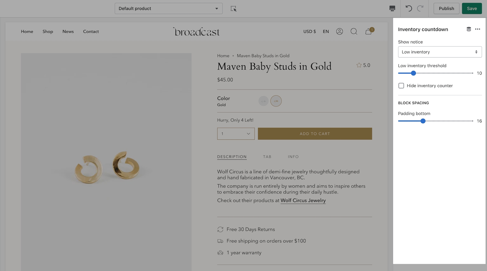
Learn more about the inventory countdown settings:
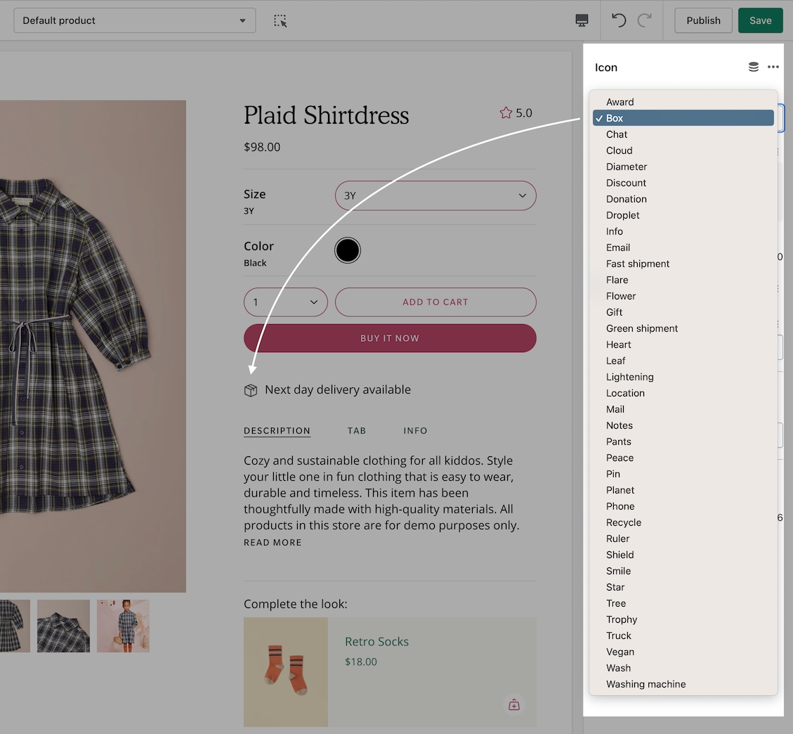
Low inventory messageAdditional icon options
We've added even more professionally designed commerce icons to multiple sections:
Find the new icon options within sections that support the icon block:
Transparent Header on pages now available
We've added support for the transparent header option to Shopify Pages:
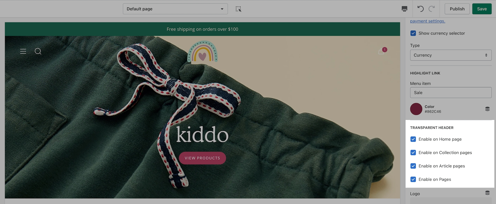
Ideal for page templates that use the banner or slideshow section at the top.
Text columns with icons section returns
Quickly create an icon-based section using Text columns with icons:
For more advanced options including adding custom images, the Multicolumn section is available alongside Text columns with images.
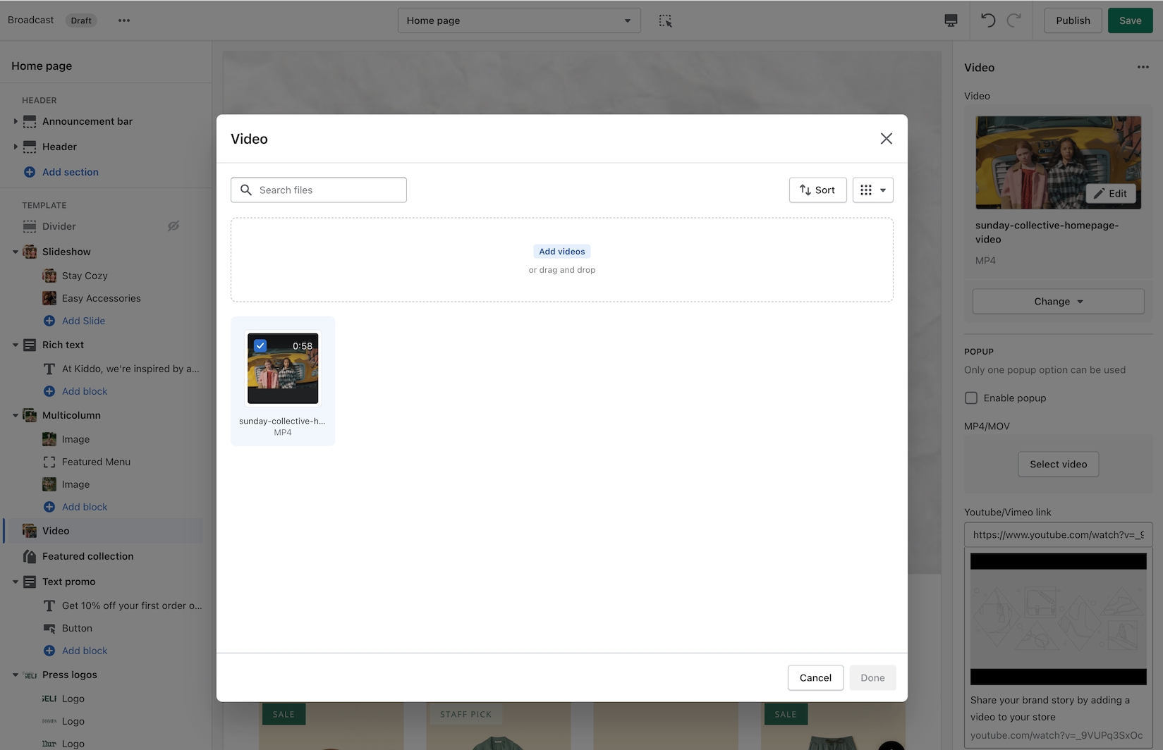
Easily add videos with new the new video picker
Now you can quickly choose an MP4 video from your files library or upload directly with the newly improved Shopify interface:
Divider block added to text sections
A divider block has been added to the Rich Text section and Image with text:
The divider block can be used to build separation with or without a line:
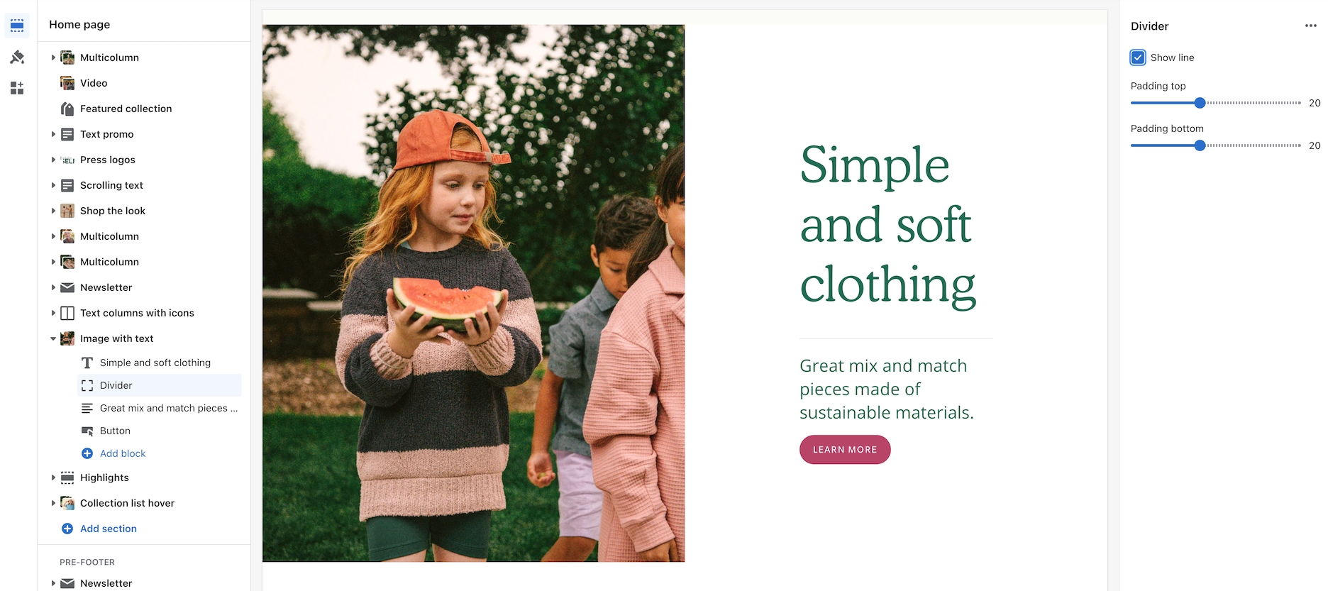
There is also a section called Divider which can be used between sections. The block version adds similar functionality inside sections.
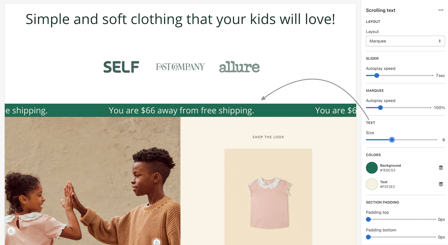
The Announcement bar section is now the Scrolling text section
The new Scrolling text section replaces the Announcement bar section in Broadcast 4.0.
You'll still find an Announcement bar section in the Header group.
Scrolling text can be added to the main Sections group.
A new text size option has been added to the Scrolling text section:
Smart second button alignment
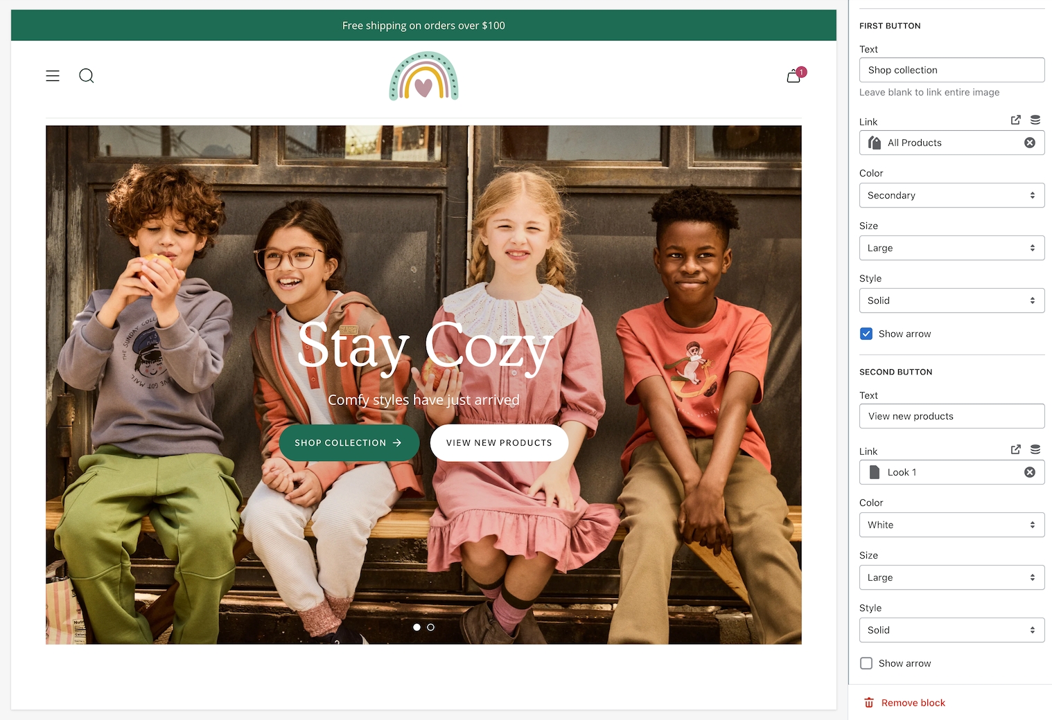
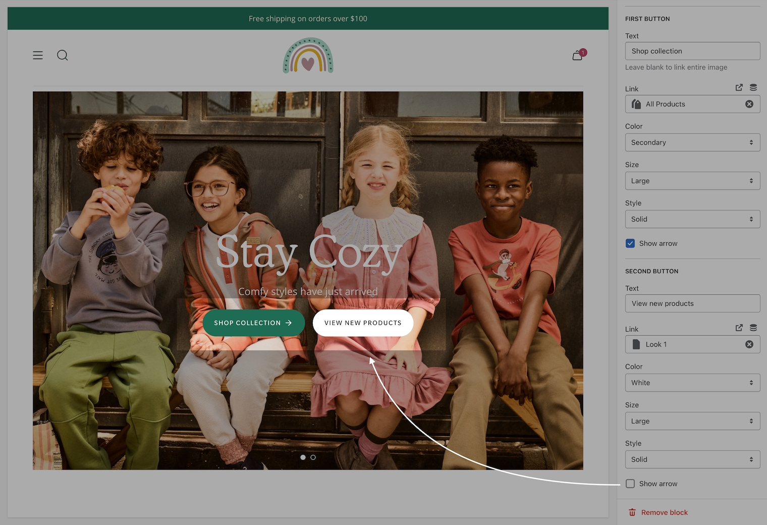
When the second button option is used, both buttons will align side-by-side on desktop and stacked on mobile.
Use the feature on full-width sections like:
Slideshow (slide block)
Banner (button block)
Rich text (button block)
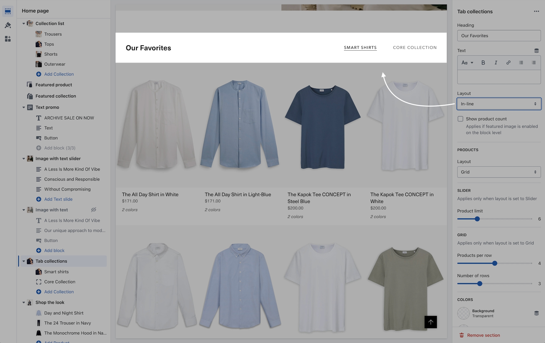
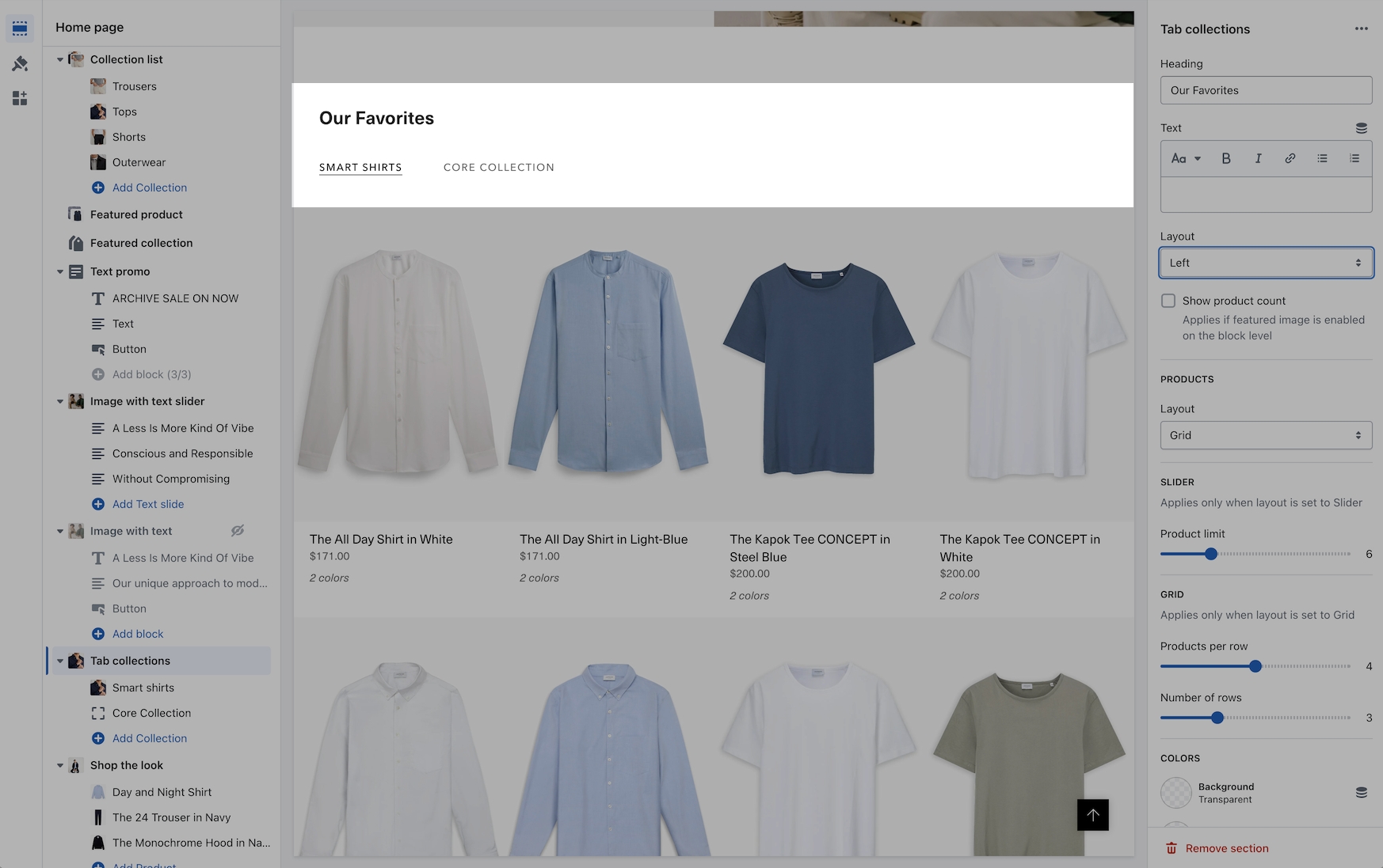
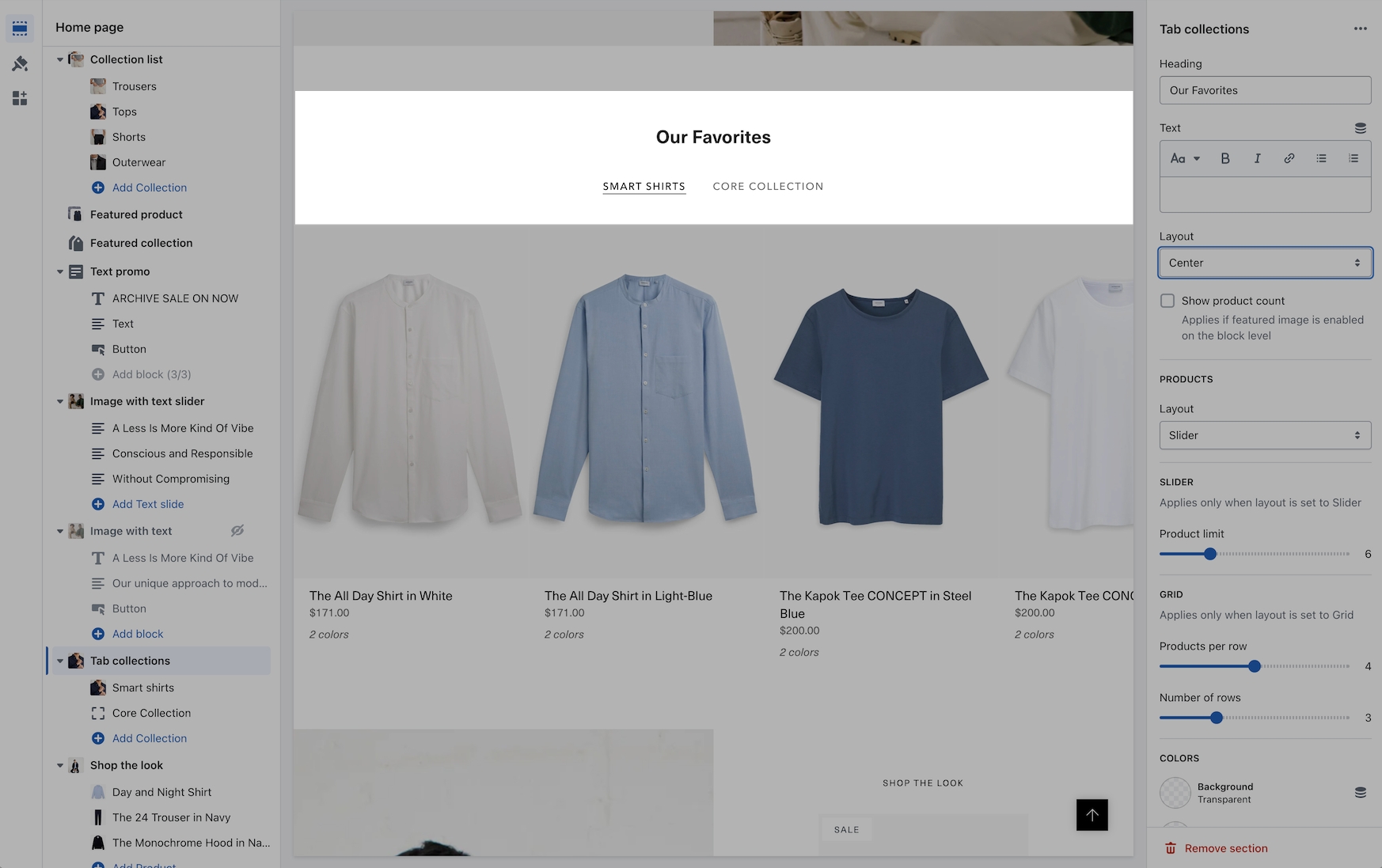
Tab collections section now includes a left alignment option
The tab collections section is one of Broadcast's most popular sections to feature multiple collections. Left alignment has been added in this release:
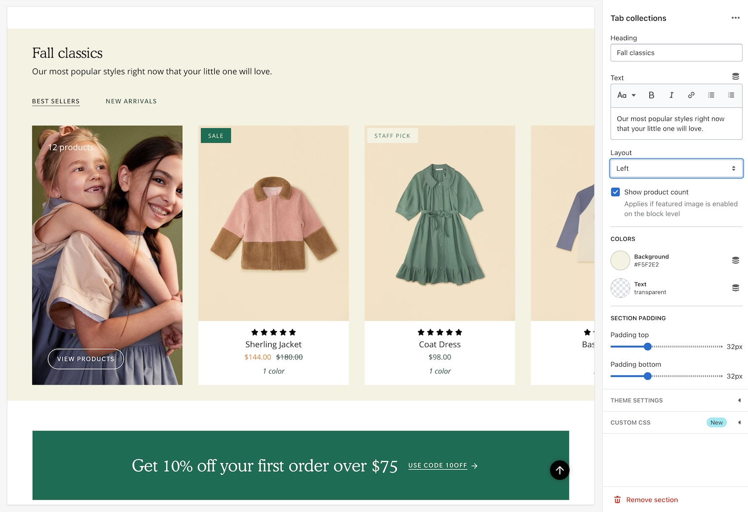
Using the Layout drop-down, you can now align the tabs and text content with the following options:
Left
Center
Inline
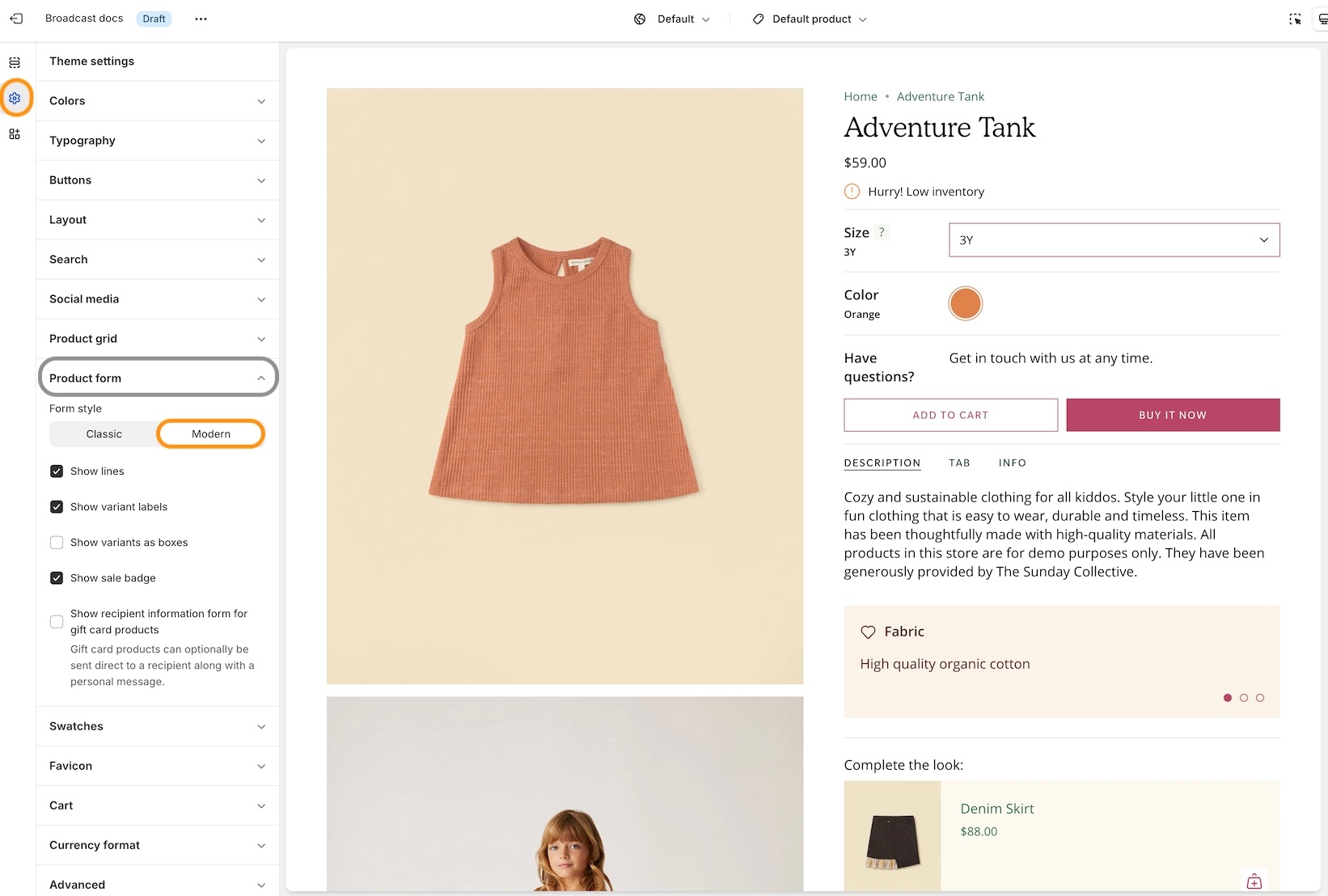
Product form style setting
We've introduced an option to switch between the newer Modern design Product Form and the original Classic design.
In the Theme Settings under Product Form, you can choose between the two styles.
Modern:
The variant labels and selections are displayed in line with the variant options:
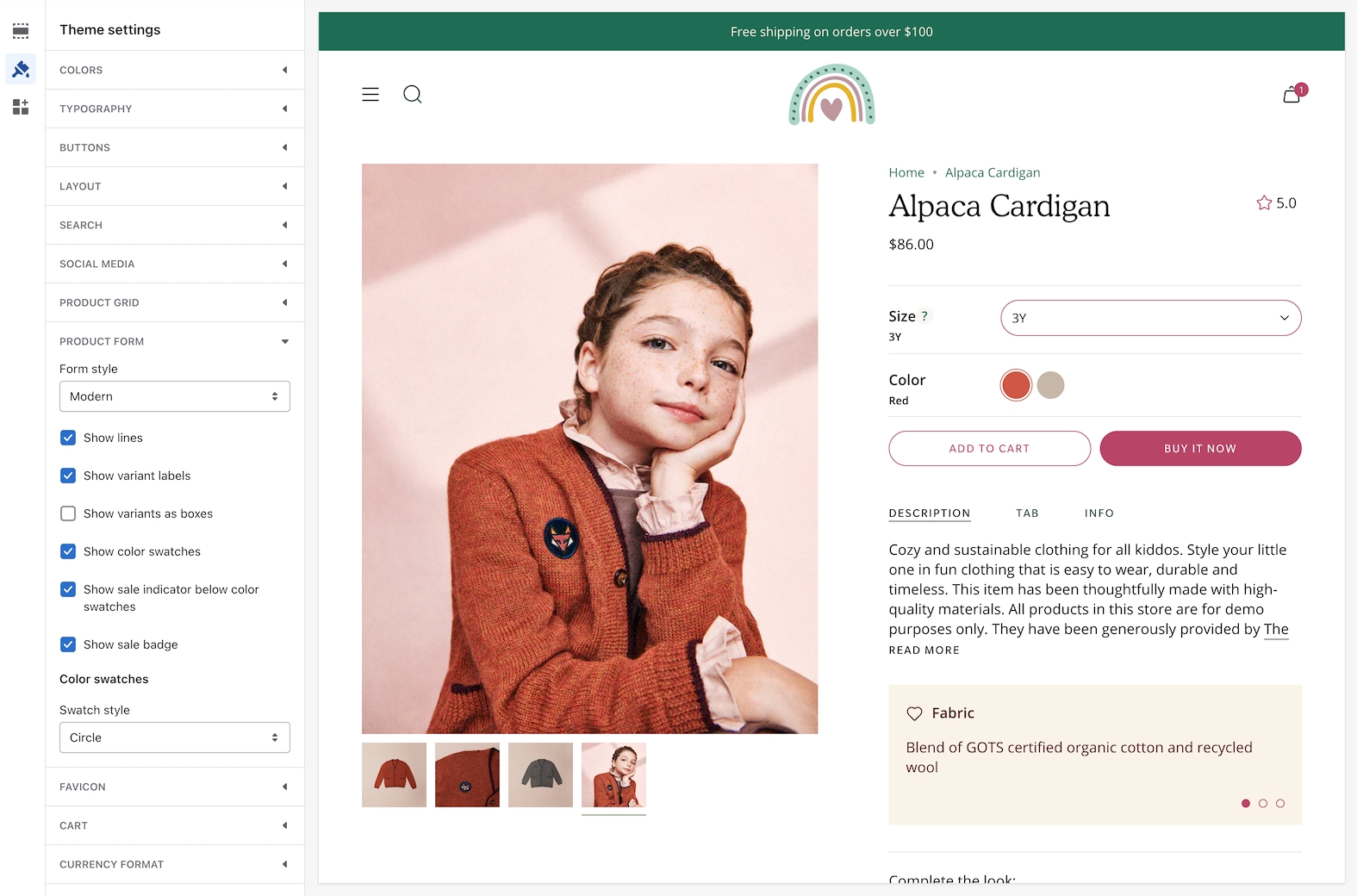
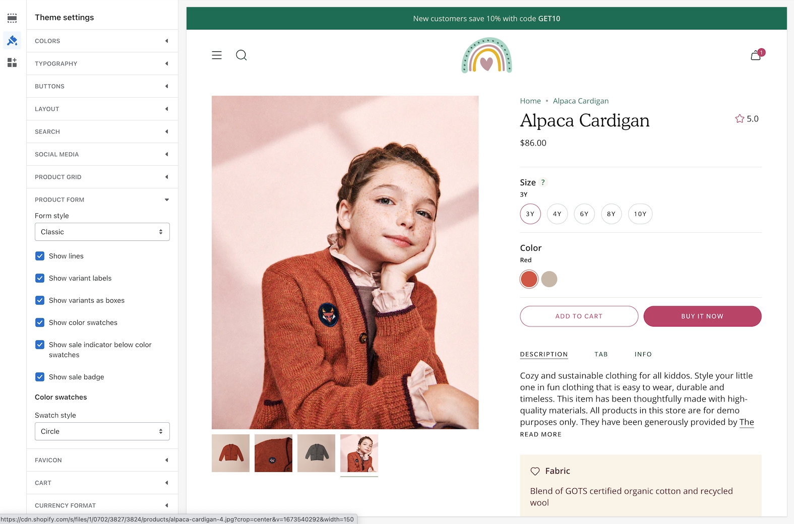
Classic:
The variant labels and selections are displayed above the variant options:
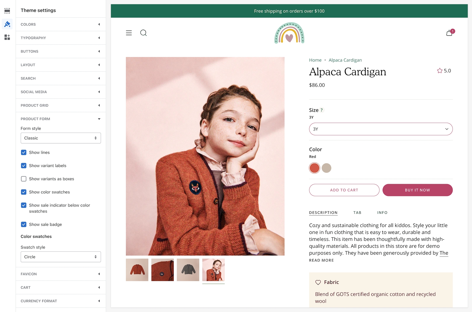
The Classic design is suitable for customers with a large number of variants. Since the labels are displayed above, there is more room below for the variant options.
Examples with Varients as boxes:

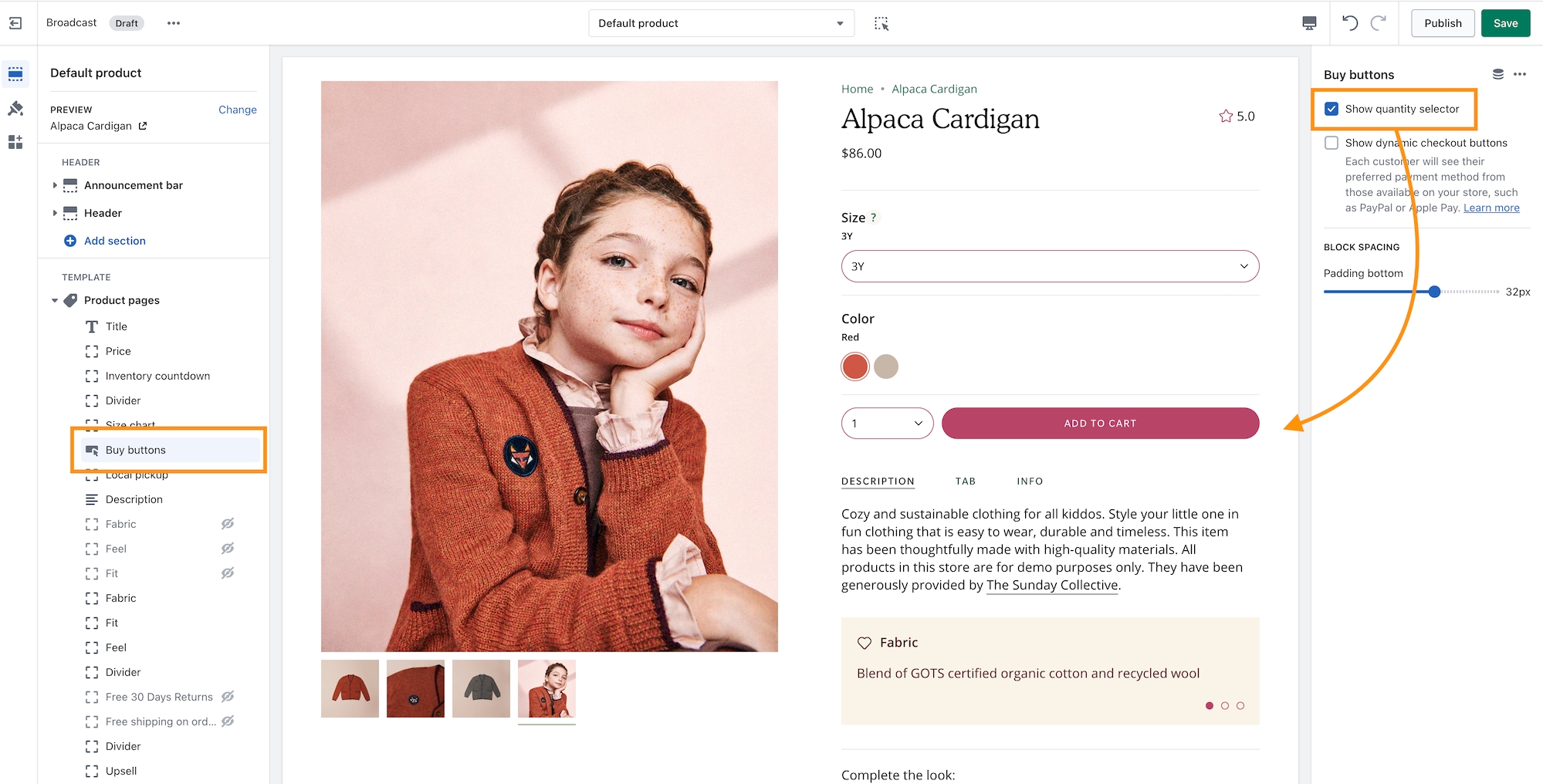
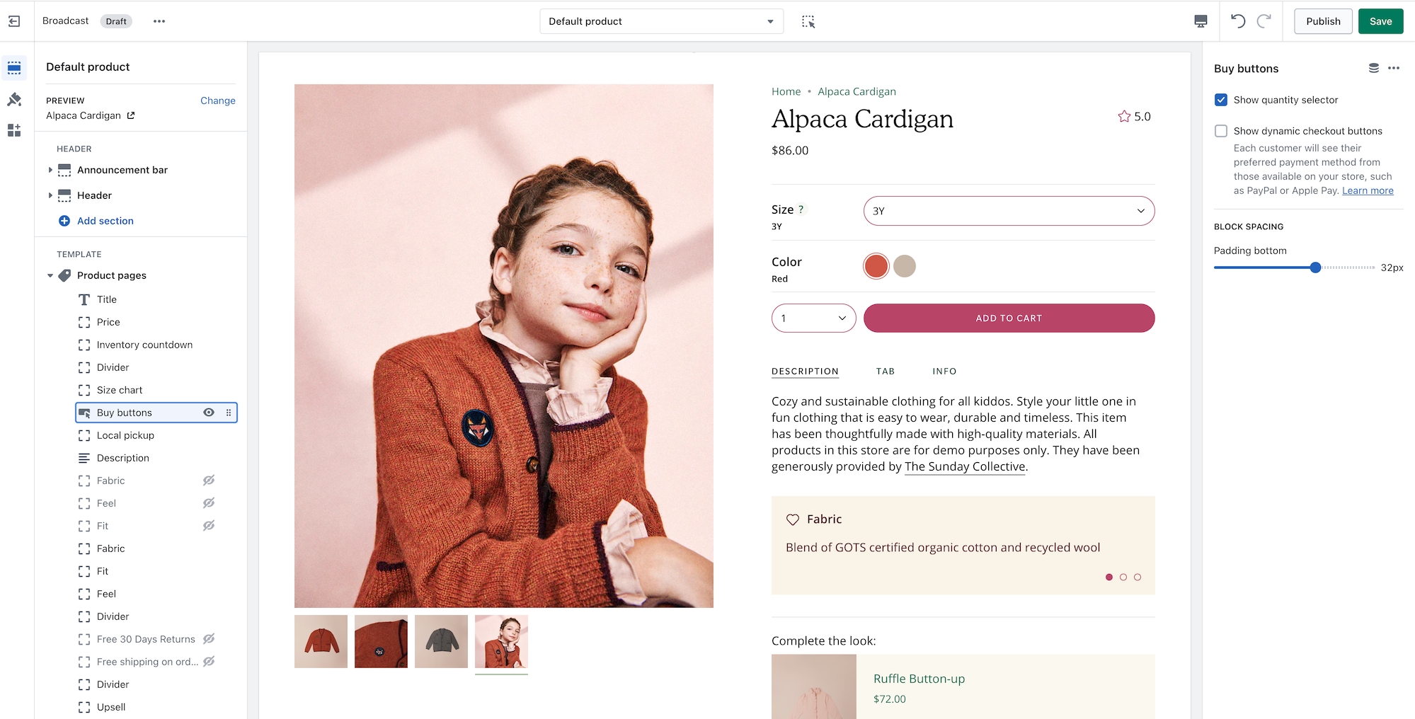
Quantity selector next to Add to Cart button
Both the Modern and Classic styles support the Quantity button next to the Add to Cart button. Use the Buy Button block settings to activate it:
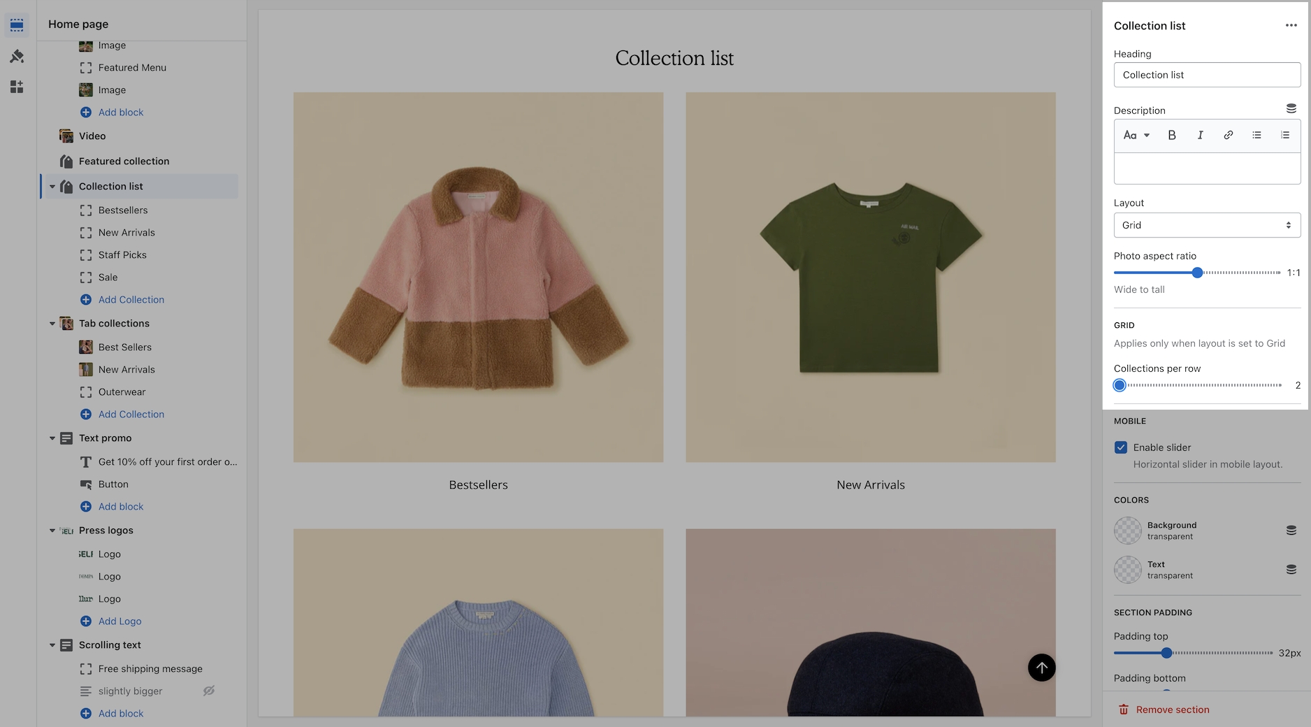
Collection list section
When using the grid layout in the Collection list section, you can now choose how many collections per row to display:
Upsell promotions
The upsell block now includes a background color picker to help match your brand style:
Pre-footer
The new pre-footer group provides your users with additional resources or options that can help them further engage with the website or accomplish their goals. Examples of content that may appear in a pre-footer include links to social media profiles, brand logos, and newsletter sign-ups.
We've included sections to help you add custom app code or some of our flexible sections for a quick pre-footer setup:
Show arrow has been added to individual sections
Each button will now have an option to 'Show arrow'. This option was previously in the global settings. Now you'll have the flexibility to show arrows on some buttons and hide for others:
Search improvements
We've added support for Shopify's Search and Discover app to help you customize search result recommendations:
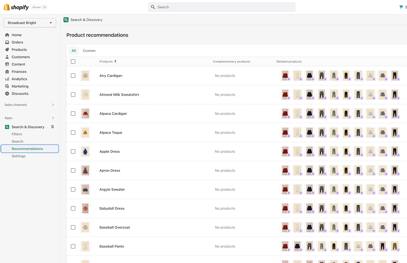
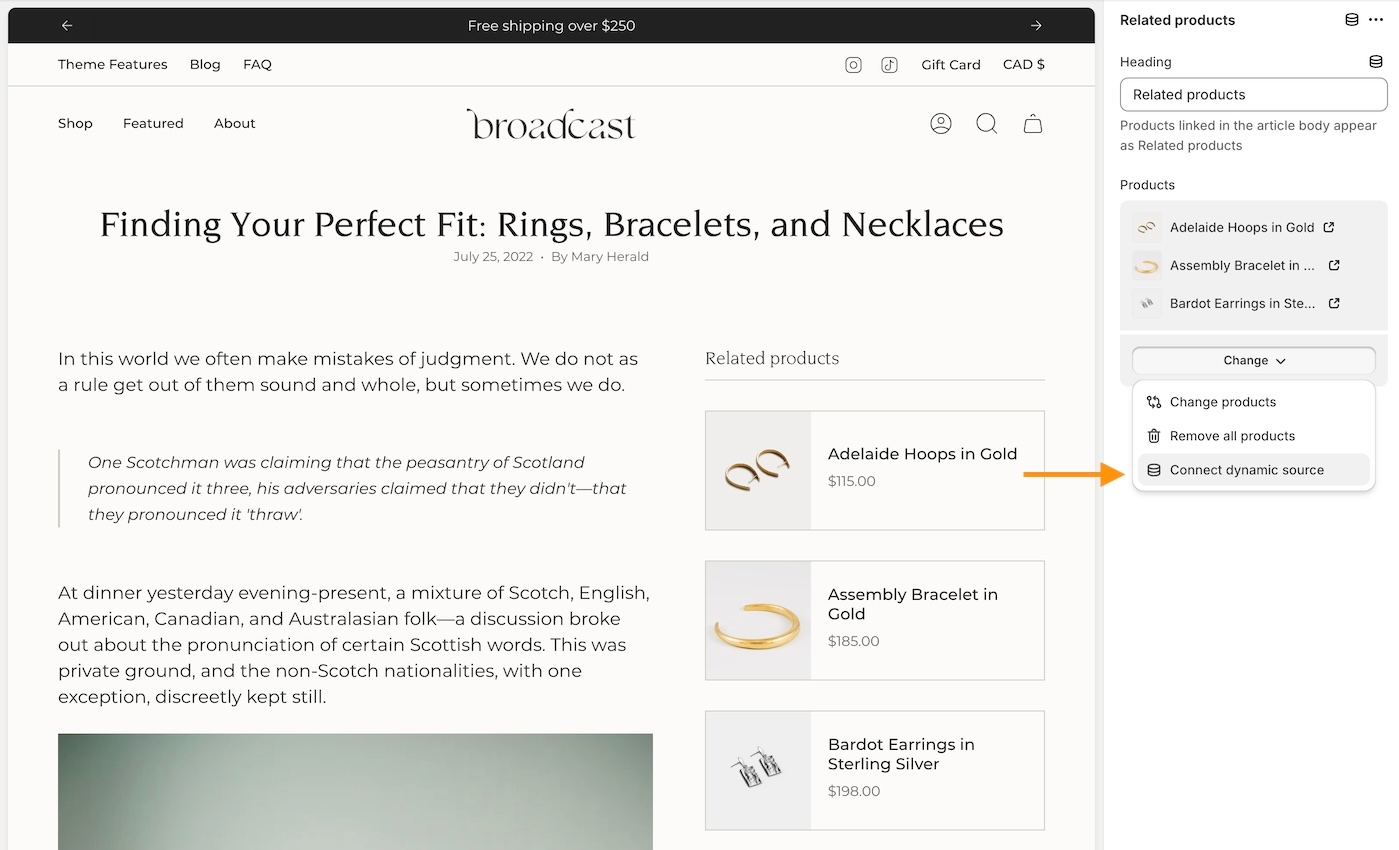
Related products and Recently viewed products
We've separated these into two separate blocks. You can now easily sort them by preference and we've also included an option to show them in Tab format or Stacked.
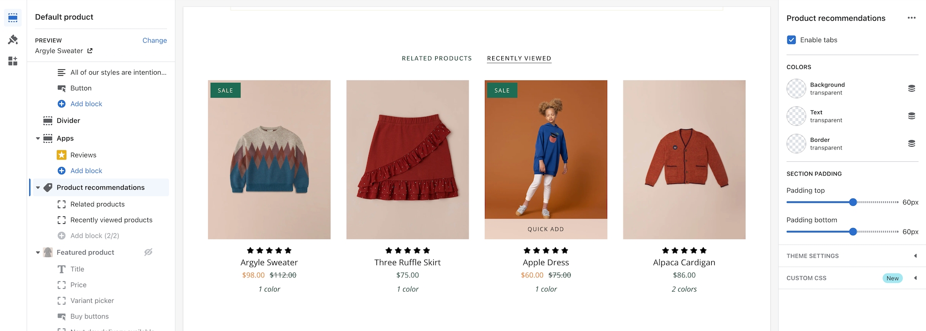
Toggle tabbed and stacked with the 'Enable tabs' checkbox.
To customize related products, use the Shopify Search and Discovery app.