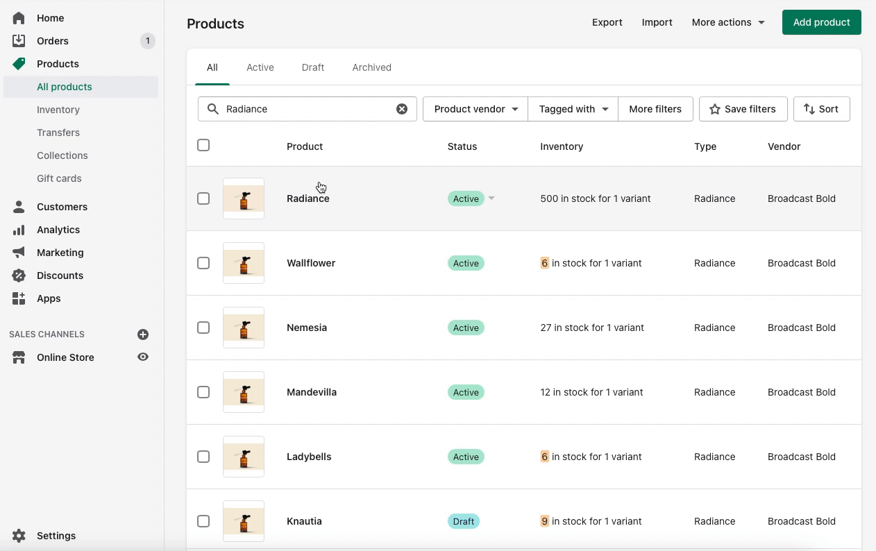
Showcase results with Broadcast's 'Before and After' section
'Before and After' - a powerful selling tool. This Broadcast section will display two images to show a before state and then an after state to compare results.
Customers can drag the slider between both photos to compare products or services.
Settings
There are no blocks for the 'Before and After' section. All settings are included under the section settings.
When selecting your photos, make sure that the focal point is the same on both images. This will ensure the best results with the most seamless transition.
Version
'Before and After' was introduced in Broadcast 3.2.0.
Accordion
A perfect tool to condence information
'Accordion' allows you to add different blocks. Use them to build out a unique layout with drop-down descriptions.
Add blocks
There are five block types to choose from. Each block has its own individual settings.
Text column
Image column
Icon cloumn
Custom HTML
Contact Form
Mix and match blocks to string together a unique layout.
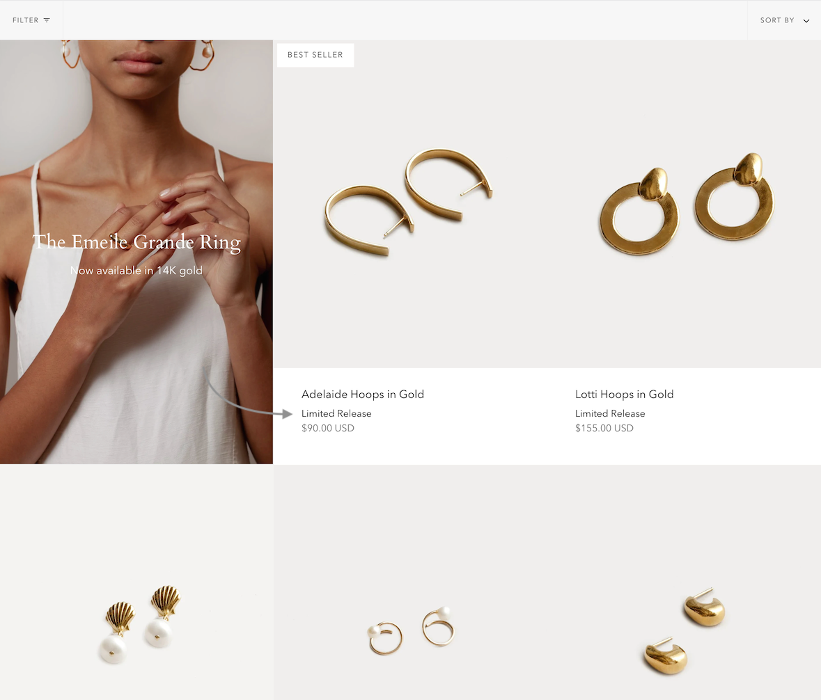
Featured collection
'Featured collection' is a simple way of adding links to your products to any page.
Some of the most commonly used settings are the option to set the number of products per row and the number of rows.
You can also change the image aspect ratio to fit your images.
Accordion group
Similar to 'Accordion', you can use 'Accordion group' to add tabs with information.
Use a 'Heading' block to separate groups. Add a 'Question' block to add a new text block under the same group.
Add blocks
The two different block types come with different settings.
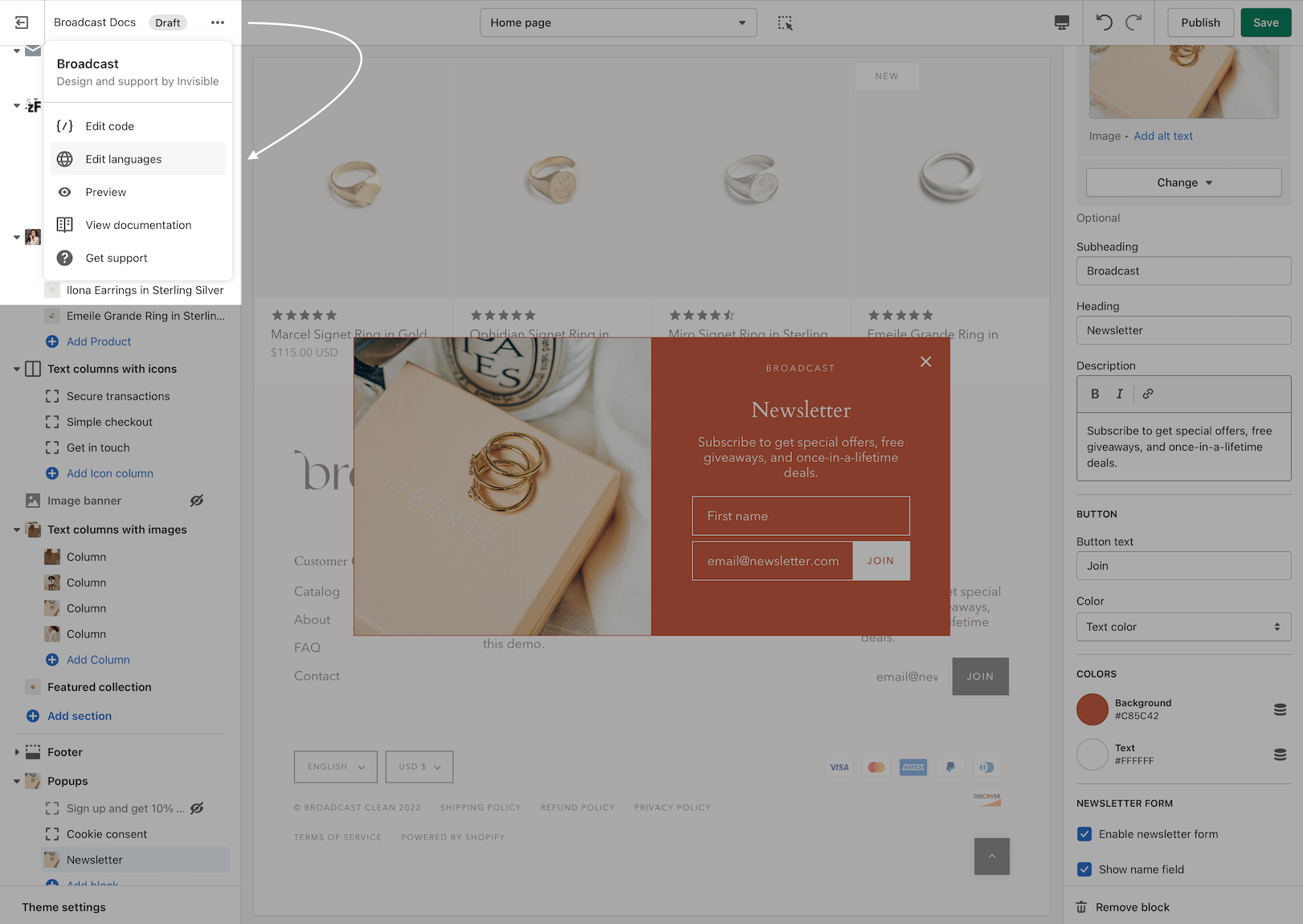
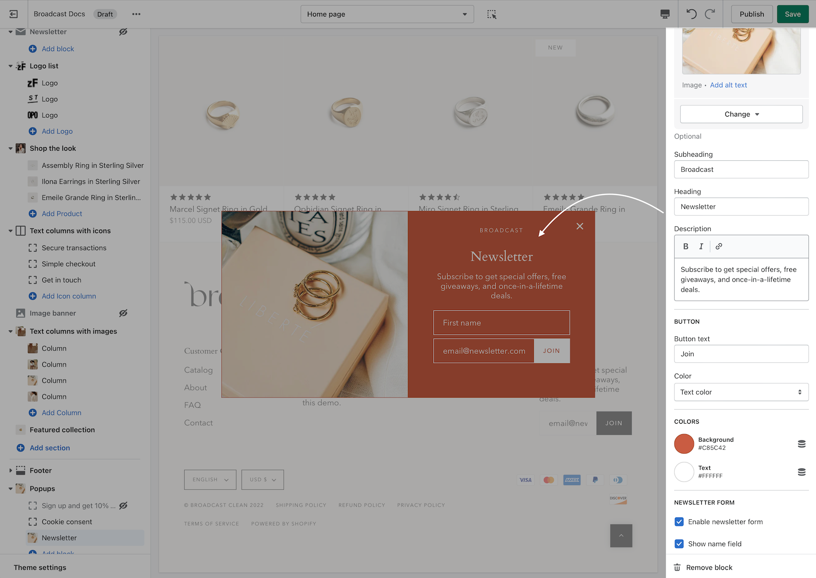
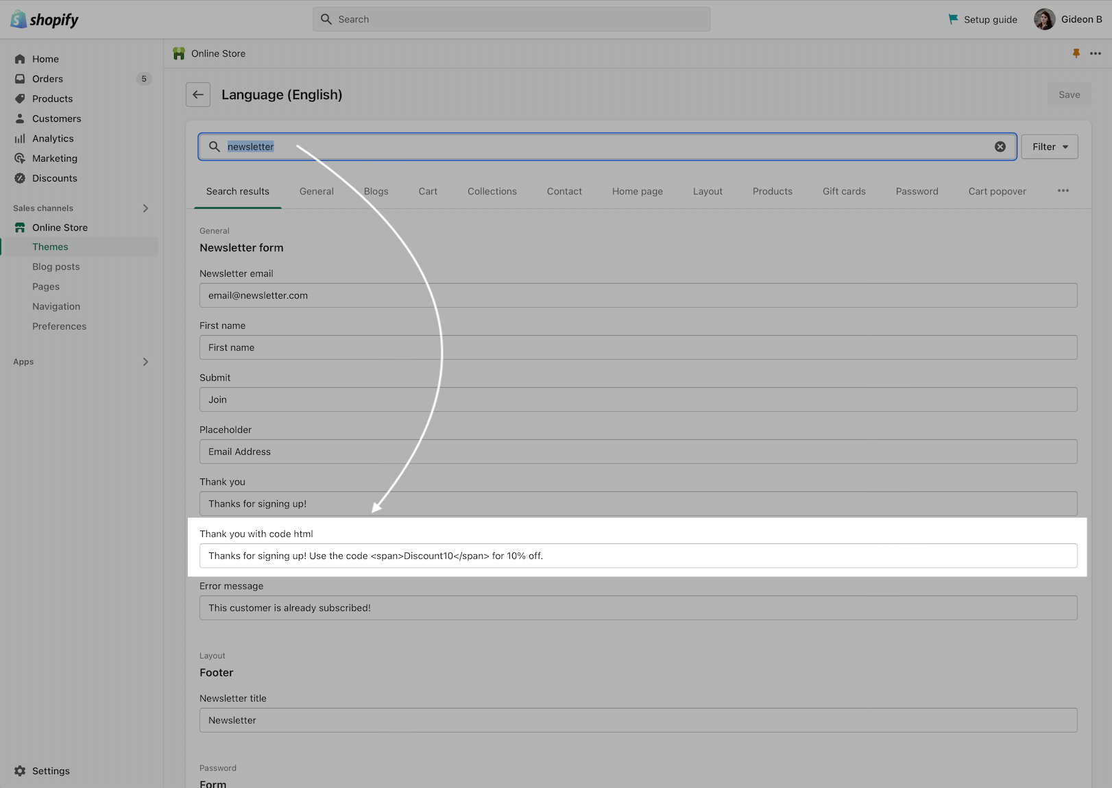
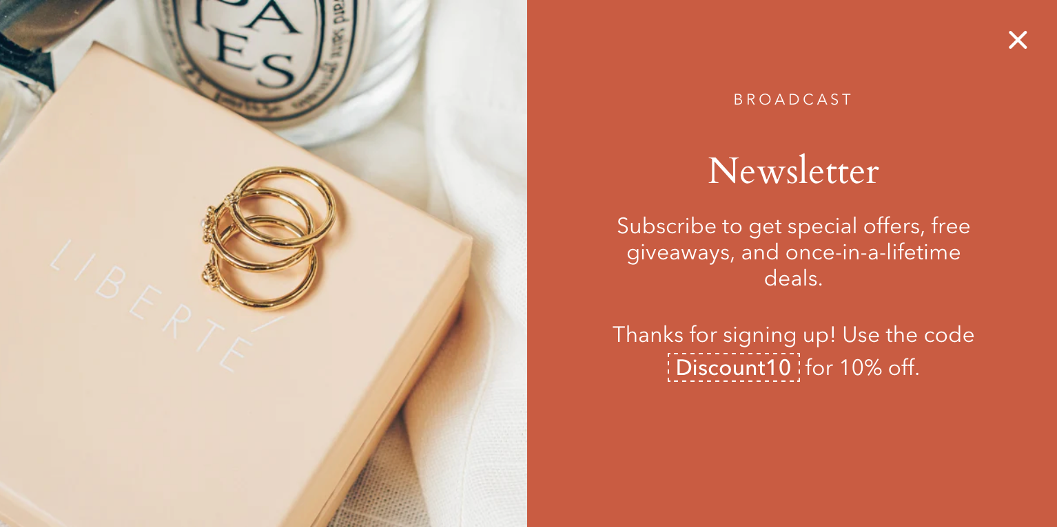
Newsletter
'Newsletter' is an important section to add to almost any store.
Any new subscribers will be seen as new 'Customers' in your Shopify admin tab.
Important: For automated emails and the creation of custom mailing lists we recommend using a third-party app.
Text columns with images
Similar to 'Blog posts', 'Text columns with images' allows you to create your own highlights from the theme editor without having the need to create blog posts.
Collection list
Add a grid of links to different collection pages using 'Collection list'.
Add blocks to build out your 'Collection list' section.
Featured blog posts
Similar to 'Blog posts', this section allows you to showcase your blog posts on any store page.
The most important advantage of 'Featured blog posts' is that you get to manually choose which blog posts to show.
Add individual blog posts by adding new blocks.
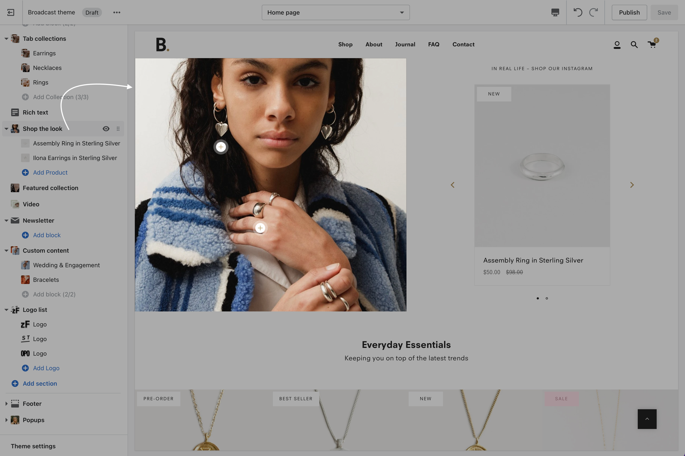
Shop the look
Highlight products showcased in images using 'Shop the look'.
Add blocks with individual settings. You can then select which product to showcase and where on the image it can be seen.
Testimonials
Add quotes from business partners and client testimonials to your store pages.
Add individual testimonial blocks to build out this section.
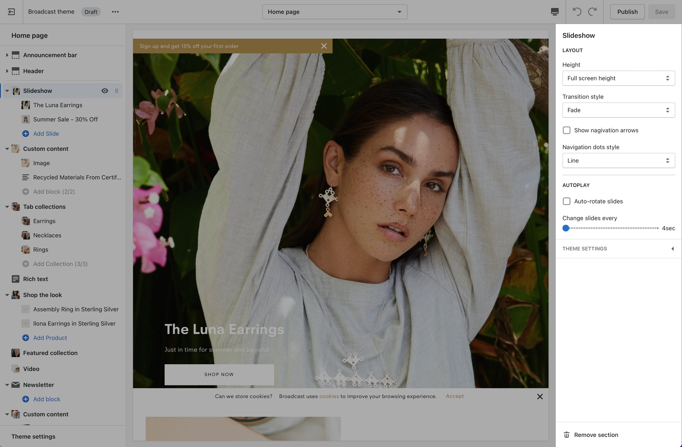
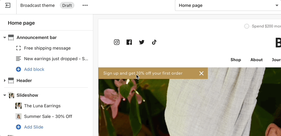
Announcement bar
Announcement bar settings and layout options
Click on Announcement bar to customize background and text colors and layout styles:
Layout options
Slider
Slider fades the current message out and fades in a new message when multiple messages are enabled. The Autoplay speed setting determines when messages rotate.
Marquee
Marquee option will auto-scroll messages across the browser or device width.
Custom HTML
Use HTML to build custom announcement messages with targeting options
Build custom announcement messages and use targeting options to provide complete customization for your promotions.
Update: Broadcast 5.0 is now out in the Shopify Theme Store. All customers can download the latest version for free.
Broadcast is likely the most feature-rich theme ever built for Shopify. We hope you didn’t notice. Broadcast is built to be a theme that is easy to set up and run for the first time and also a theme with rich features that you can tap into as your needs become more complex.
These docs are built to guide you along that journey. We hope to build themes that rarely need documentation but e-commerce is complex and some things just require explanation. In some cases these docs are opinionated. The authors of Broadcast have been working in e-commerce for over a decade, building Shopify themes, launching startups, and building large complex sites for international brands. We have opinions about best practices that are based on this experience. We have baked that ethos into Broadcast.
Image with text
'Image with text' is a simple way to add a split view section.
Set up your image settings from the section settings.
Add block
Add text and buttons by adding individual blocks.
Collection list hover
An animated collection list with full sized images and large text
Transform your store's collection promotion with a visually captivating presentation of high-resolution graphics and prominent text. Our dynamic format will keep your customers engaged, as they browse through the full-sized images to discover collections within your store.
How to use
Add the Collection list hover section from the Theme Editor:
Rich text
For what it is, 'Rich text' allows for a ton of customization. Use this section to tell a story to your customers.
Add block
Each part of the 'Rich text' is its own block with individual settings.
Social icons
Header options for displaying social media icons
Mobile drawer menu
When using this header style, the social media icons are displayed at the bottom:
Navigation images
How to add images into your navigation
Broadcast makes it simple to add images right into your Navigation. You can create a drop-down menu with just images or a combination of menu items and images.
Expand header to add an image block
Click on the expand icon to the left of the Header this will open the block options:
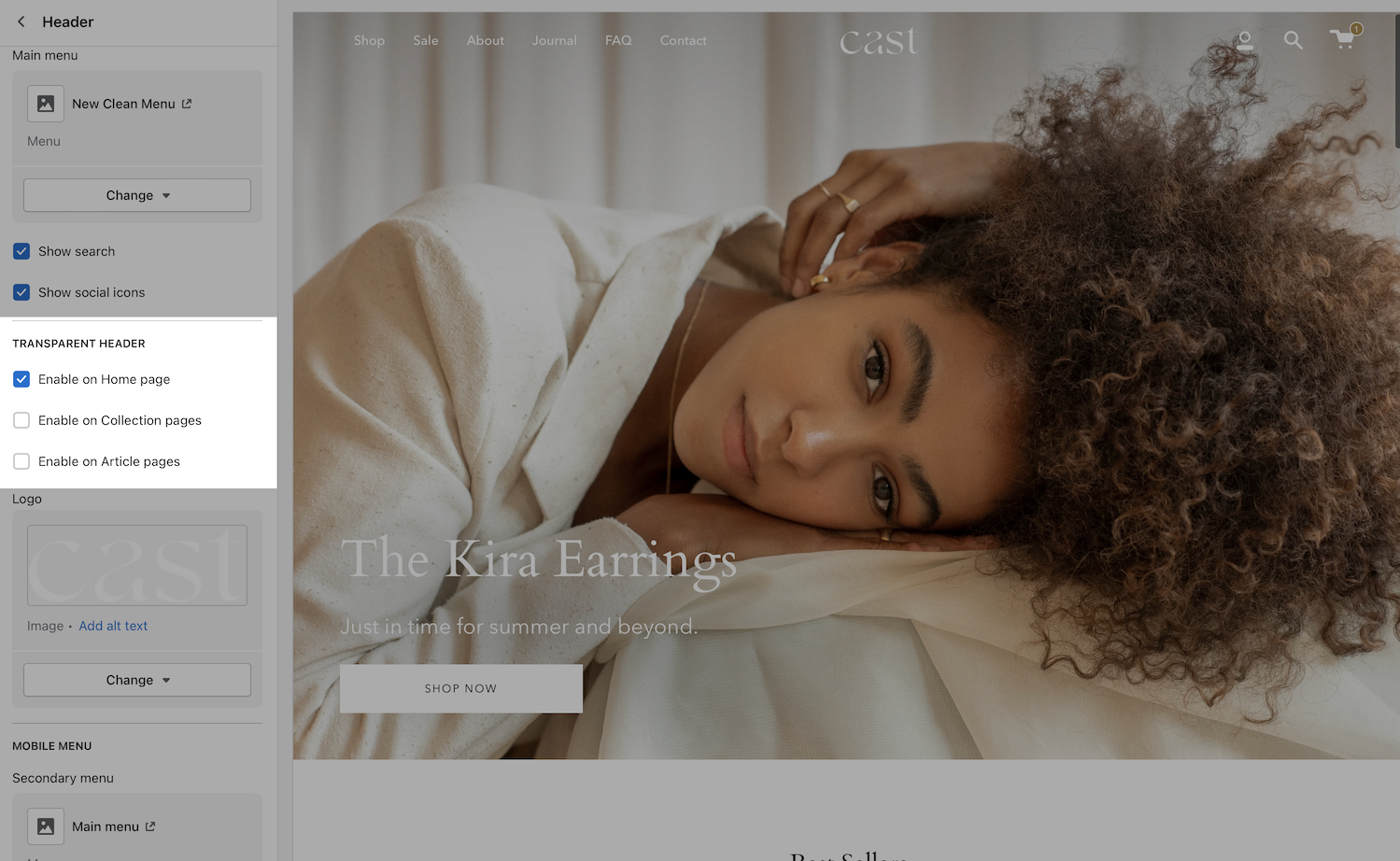
Transparent header
Change the opacity to blend header with background image asset
Broadcast can display a transparent header on the homepage, collection pages, and article pages:
When using a transparent header, you may include a second logo to provide contrast with your main homepage asset.
If a sticky header is also used, a darker logo will provide the needed contrast upon scroll.
Contact form
'Contact form' is a completely modular section. Set which components are required from the individual block settings.
Add blocks
There are 10 unique blocks to choose from. Build out a custom contact form by adding different blocks.
Multicolumn
'Multicolumn' is a great section to set your store apart.
Use the same block for a more consistent look or create a pattern of two (or more) blocks to create a unique layout.
Add block
Each block has its own individual settings.
Description
Displays the product description from the Product setup. Also displays tabs or accordions when configured.
Settings
Tab collections
'Tab collections' allows for multiple collections (up to three) to be showcased on the same line. Use the navigation links to switch between the active collection.
Change the width and layout from the section settings. Set the individual block links, images, text, and overlay.
Blog posts
'Blog posts' gives you a simple way of adding links to your latest blog posts on any page.
Some of the most commonly used settings are the option to set the number of posts per row and the number of rows.
You can also change the image aspect ratio to fit your images.
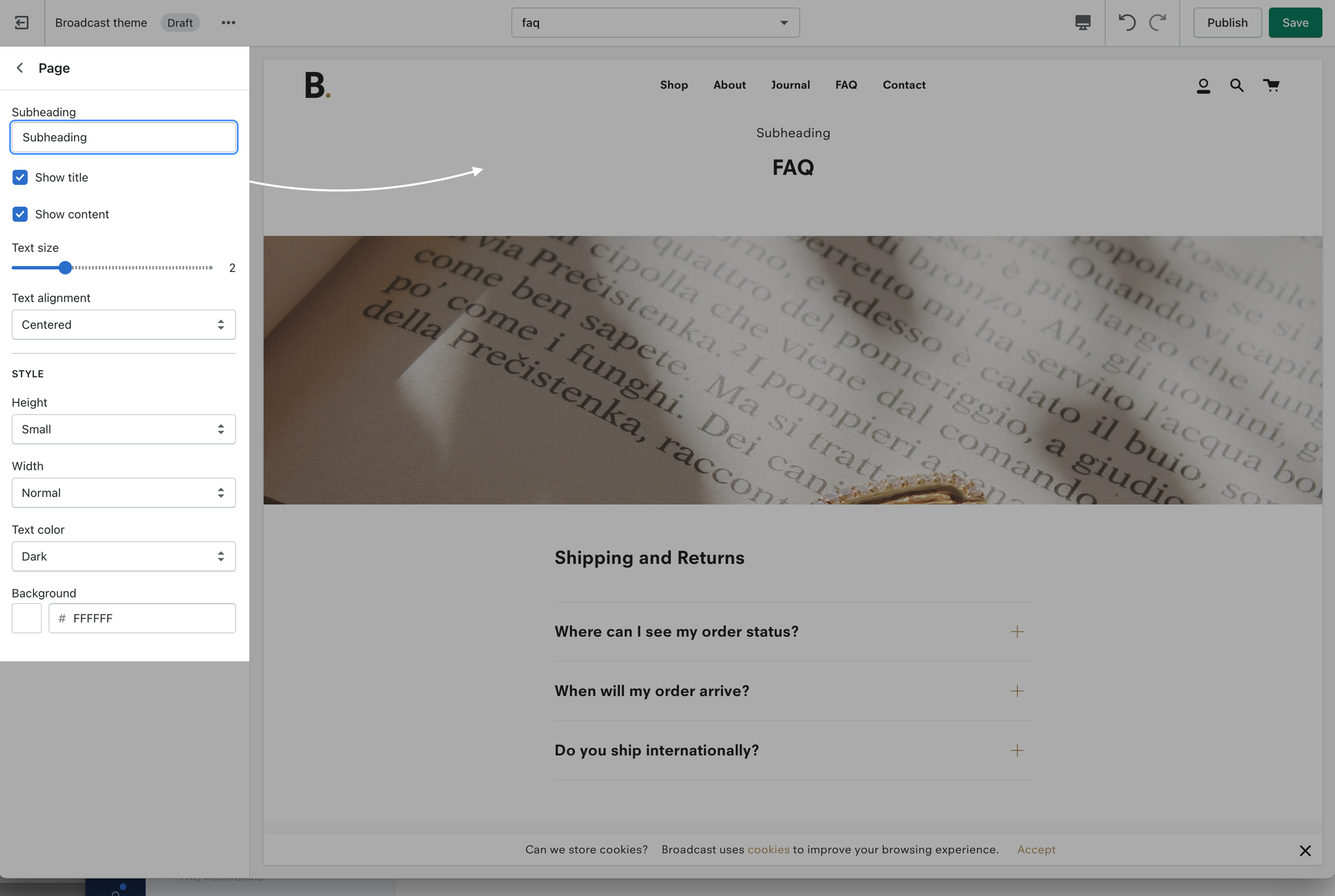
Title
Displays product price, title, and star rating when using the Shopify Ratings app.
Includes an option to display Navigation breadcrumb above the title (including vendor option, see settings)
Image banner
'Image banner' is a perfect opener. A lightweight section that can present a full-width image.
Use desktop and mobile options to build the best look for different devices.
Add block
Add and remove the blocks you don't need.
Variant picker
For products with variants, you can add a Variant picker block.
This block is not rendered when the product has no variants and will not slow down your pages.
A key feature of the Variant picker is the option to add a Size Chart. Use a regular store page to link into this block.
Buy buttons
To add items to the cart, we use two main buttons: Our theme's own 'Add to Cart' button and a Shopify button called 'But it Now'
To enable the 'But it Now' button, you can check the 'Dynamic checkout button' checkbox.
Siblings
Siblings are a powerful tool that helps link products together.
Learn more about Siblings here:
Related products
How to setup custom recommendations for each product
View the latest article at:
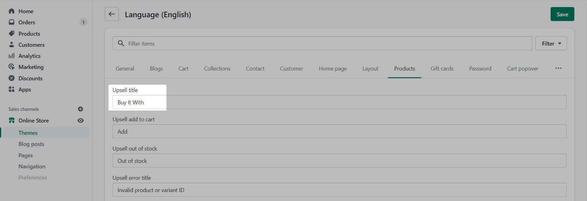
Upsell
Displays upsell promotion when paired with a custom tag
Settings
No customizable settings. Tags are required in Product setup to display paired products or specific paired product variants. .
Featured product
'Featured product' allows you to focus and boost sales of an individual product on any of your store pages.
Add blocks
A key feature of 'Featured product' is the ability to build out its layout in the same way you can on the product page.
About product siblings
Products as swatches
Feature introduced in Broadcast v3.5
Broadcast includes the ability to link directly to other products as product swatches. The result is rich product detail pages that include swatches with images that represent each variant option.
Clicking on a swatch displays only the images associated with that variant option and also the product details and prices for the variant:
Each product sibling appears automatically as a swatch:
Text promo
'Text promo' gives you the ability to let customers know about your discounts and current promotion on any store page.
Set an image with text overlay to highlight a promotion.
Text announcement
Flexible announcement message bar with targeting options
Add single or multiple text announcement bars with links to promote your offers:
Product Theme Blocks
Add, arrange and customize Product page theme blocks
Broadcast Product page theme blocks help you customize the primary or core content for your product pages and product templates.
Adding sections further enhances your merchandising.
Collection list hover
'Collection list hover' is a great way to seamlessly showcase different collections.
For mobile devices, 'Collection list hover' switches to a stacked view where you can seamlessly scroll through the collections.
Press logos
'Press logos' allows you to create a list of brand logos. Most often this is used to include partners or places your brand is featured.
Add new blocks for each logo with individual settings.
Our goal is to help you avoid pitfalls and build a site that is maintainable for the long term. In general, we don't document the obvious things. If you see documentation here, it’s probably worth reading — even if you are an expert. From all of us at Invisible, we hope you love it as much as we do.
Add Broadcast to your store today with our free trial version. All features are included. When you're happy with the theme, you can instantly purchase Broadcast and publish the theme live to all your customers:
If you have questions or need additional assistance with using the theme, our support staff is here to help you by email. We offer free theme-related support by email to all our customers with no extra fees. You can also inquire about features or ask us questions about the theme before your purchase:
Broadcast has grown with Shopify over the years. We are currently on our fourth generation of the theme. Choose the version toggle at the top of the page next to the logo.
Highlight products, a collection or images alongside a brand message
Looking to boost engagement and increase sales within your store? Consider adding inline images to your text sections that link directly to your products and collections. By incorporating visually appealing product images into your content, you can capture your audience's attention and guide them toward purchasing.
How to use
Add the section in the Theme Editor. You can quickly find the section when using the filter option:
Enter your primary text message into the Section settings:
Blocks
Add and configure blocks. Each block will be an image. The type of block will determine the call-to-action type. The block types are:
Image (custom link option)
Product (links directly to a product)
Collection (links to a collection of products)
Each block contains settings to help you design the right look and style:
Each block type has an image option. The product block for example uses the primary image of that product (first image). An image override option is available to use any image in your library.
Image position
Use this slider to place the image in the correct spot within your text message. Each position number is relative to the words in your message:
Image sizing
With the Image aspect ratio slider, you can adjust each block image to fit proportionally. The Width slider helps you size each image individually:
Animation settings
Images will animate into this section to give a lively look when the customer reaches the section. To disable the animations, use the toggle found under the Layout section of Theme Settings:
Sale items
Sale elements on the Product Detail Page and Product Grid sections
Broadcast adds sale elements to your Product Detail page, Collection pages, and to Product Grid sections to help your customers visually see sale times and their savings.
On a Product Detail page, Broadcast adds a sale badge next to the current price (sale price) and compare at price (original price) displaying the savings percentage:
Product Detail Page
The text that follows the percent symbol, "OFF" can be modified in the Language Editor.
On a Collection page or any section that uses the Product Grid, Broadcast can add a custom color SALE badge over the product image:
How to setup
Sale pricing is managed in the Product setup for each product where Price is the discounted price and Compare at is the original price or more expensive value:
Use the Theme Editor to customize the Sale badge feature which is used on Collection pages and Product Grid sections.
Under Theme Settings, select Product Grid:
Here, you can customize the badge colors and also toggle on/off the badge feature:
Customize language
With the Language Editor, you can modify the text used for both styles of badges. Begin by opening the Language Editor (Edit languages):
Sale badge on Collection pages and Product Grid sections
To modify the text "SALE" on Collection pages and Product Grid sections, the badge text value is found under Products, Product, On sale.
In the search box, type-in: Sale and scroll to the bottom to find On sale:
Percent off text on Product Detail pages
To modify the text "OFF" after the percent symbol on Product detail pages, type-in off, scroll to the bottom and change the value for Products, Product, Off:
Save your changes.
Tabs and accordions
Product description
This article is for Broadcast v3. For earlier versions of Broadcast, click here
Broadcast can show your product description in tabbed or accordion format. Add extra content to your product pages to help improve customer confidence in your products and brand.
Product description tabs
How to use
Start by clicking on Product description on any product template, to open the product description settings:
Tab style
Choosing Accordion will convert tabs to accordions:
Choosing Disable tabs will hide all tabs:
Hiding a single tab
To hide or disable a tab, remove the title or description of that tab. Both the title and description are required to display a tab.
Product Description tab content will appear on all your product pages (that use the same product template).
This is helpful if you need to display the same content on all your product pages. This also simplifies editing tab content. For unique content inside tabs, use Metafields.
Metafields for displaying unique and custom content
Product description tabs in Broadcast support Shopify's Dynamic source feature with Online Store 2.0.
Metafields allow you to attach custom content to each product and then display them on the product page.
Learn how to add unique content into each tab using metafields:
Sidebar
FAQ style content with sidebar navigation
Section introduced in Broadcast 3.2
Display accordion and text-based content in a section. Featuring autogenerated navigation that allows customers to navigate easily through your content blocks.
Sidebar's navigation is displayed on desktop devices and remains sticky for quick access to content areas.
How to use
View the complete overview of this section including adding blocks and section settings:
Settings
This section includes sections settings and multiple block options:
Blocks
Header (used to group and link to by dynamic sidebar navigation)
Accordion (main question or title, always shown)
Section
Section width
Colors (background and text both support dynamic source)
Version
The Sidebar section was introduced in Broadcast 3.2.0.
Price
Showing the product price is one of the most important things on product pages. We have a few tricks here as well.
If the product price is set to $0, it's replaced by a translatable string - 'Free'.
If you want to change this text you can go into your Online Store > Themes and click on Actions > Edit default theme content:
Search for free in the Filter bar and edit the field under General > Money > Free:
Free products
Display options for products that are sold as samples or for free
Broadcast can display a custom value or text for products that are sold at no cost. You can change the price from $0 to a text message:
Examples:
Sample
Free Gift
No charge
How to setup
In the Shopify Admin under Products, set the Price to a zero value for the base currency:
Use the Language Editor (now called 'Edit default theme content') to set your text value:
In the Search box, type in: Free and scroll to the bottom. Under General -> Money -> Free, you can customize the value:
Save your changes to finish.
The new value will be displayed on:
Collection pages
Siblings metafields
Feature introduced in Broadcast v3.5
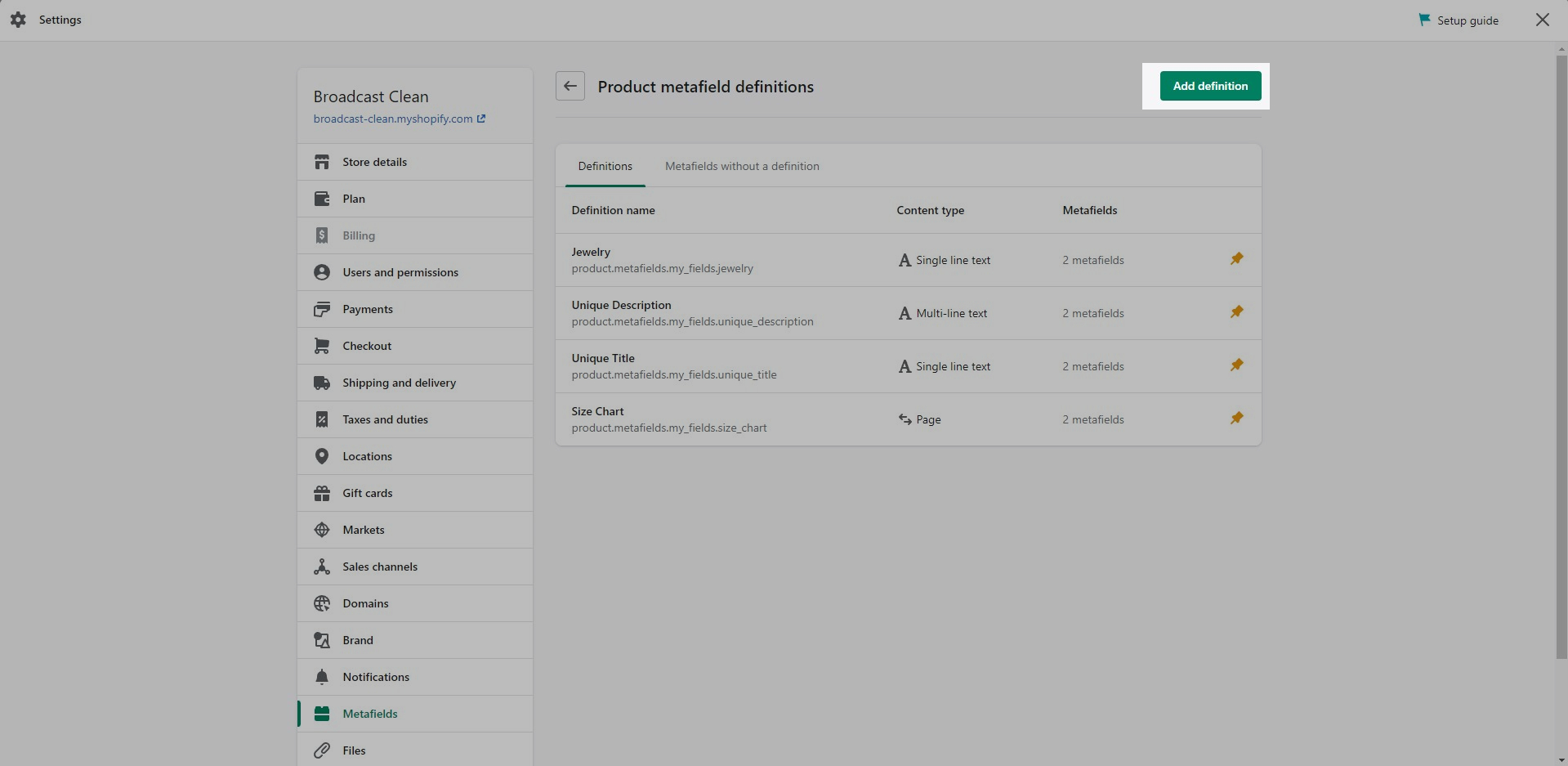
There are two product metafields definitions required to connect each of the products together and generate linked swatches.
Use the metafields editor under Settings in the Shopify Admin:
Both metafields will be defined under the category of Products:
Tip: If you are new to creating custom metafields, a good step-by-step walkthrough is also available in the article.
Next, create these two metafields:
Siblings collection
Metafield editor
Feature introduced in Broadcast 3.5
The second required metafield is theme.siblings
The content type is: Single line text and One value.
This metafield maps each product to the correct collection handle for the siblings.
Start by defining a Products metafield and name it Siblings.Then change the Namespace from custom to theme and the key to simply siblings.
Important steps:
Rename custom to theme
Next, add a description. You can name this one Collection handle for siblings. Then click on Select content type and choose Single line text and One value:
Save the definition.
Check the saved metafield
Your second metafield should look like this:
Please ensure you change the Namespace and key to this custom version for Pipeline:
theme.siblingsBy default, the namespace begins with custom. This will need to be changed to theme
Product setup
Next, we will use these newly defined metafields in the Product Setup for each product:
Siblings color
Metafield editor
Feature introduced in Broadcast 3.5
The first required metafield is theme.sibling_color
The content type is: Single line text and One value.
This metafield is used for both the swatch label for the product which helps with identifying the color version of the current product:
Start by defining a Products metafield and name it Sibling Color.Then change the Namespace from custom to theme:
Important step: Rename custom to theme
Next, add a description. You can use Siblings Color again. Then click on Select content type and choose Single line text and One value:
Save the definition.
Check the saved metafield
Your final metafield should look like this:
Please ensure you change the Namespace and key to this custom version for Pipeline:
theme.siblings_color
By default, the namespace begins with custom. This will need to be changed to theme.
The content type is Single line text and the style is One value.
Next step
We require a second metafield to be defined:
Icon
Add an icon and line of text in the product form to help promote features and offers
Broadcast includes a Product detail block called Icon that can be added to the Product form on any of your product templates. The block can be positioned in various locations on the form and has easy-to-use block settings to quickly choose a predefined icon and color choice or upload your own custom icon.
Feature introduced in Broadcast 3.2
Example of Icon block added below the call to action buttons:
Customization
Use the block settings to customize the icon by choosing a predefined icon from the drop-down list or add your own icon image.
In the block settings, you can choose a custom color for the icon to help draw attention to features or promotions or to simply match the design of the page.
Dynamic data sources are supported if you'd like to have a unique icon and message for certain products.
Add multiple blocks for multiple icon messages on your product form.
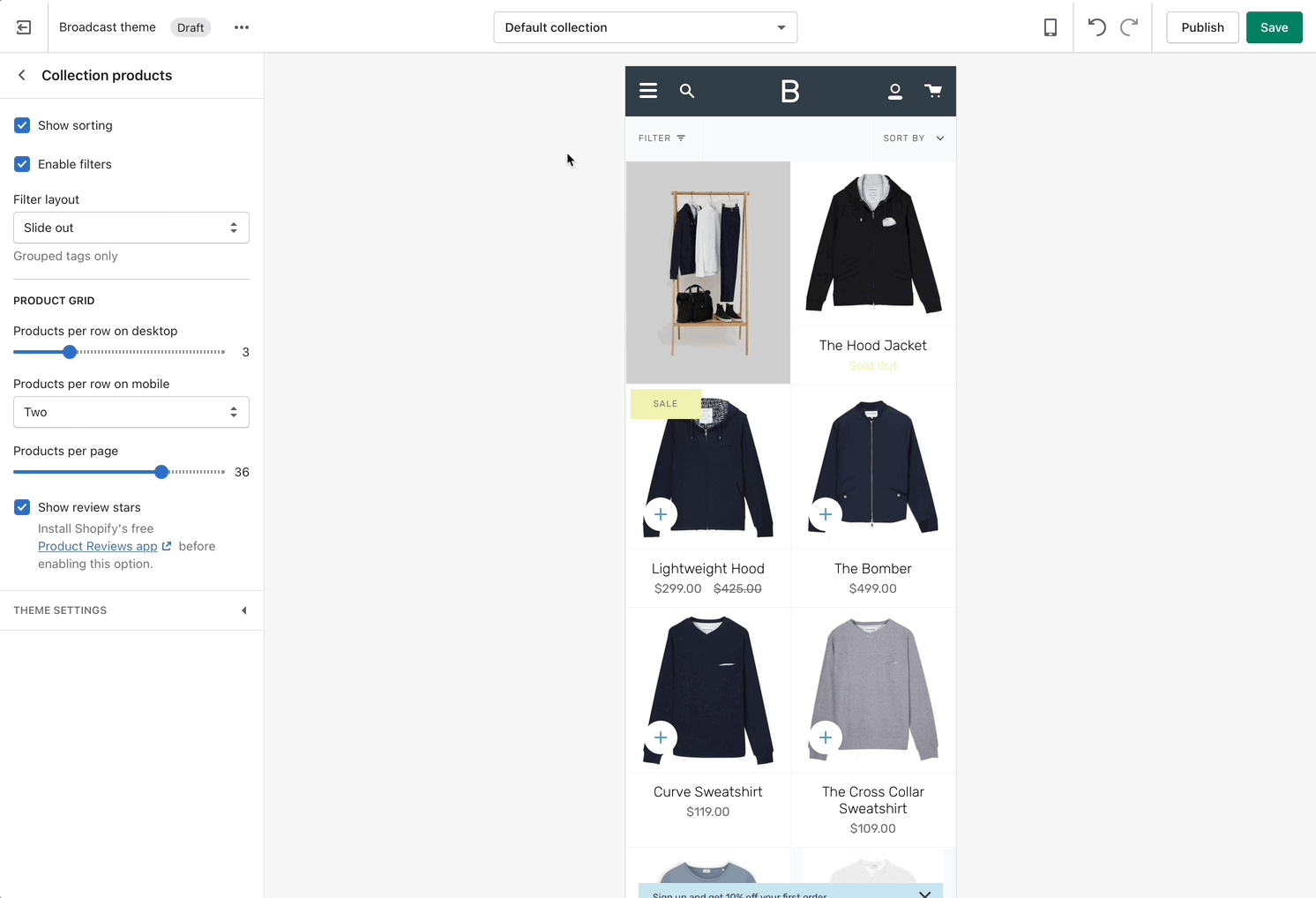
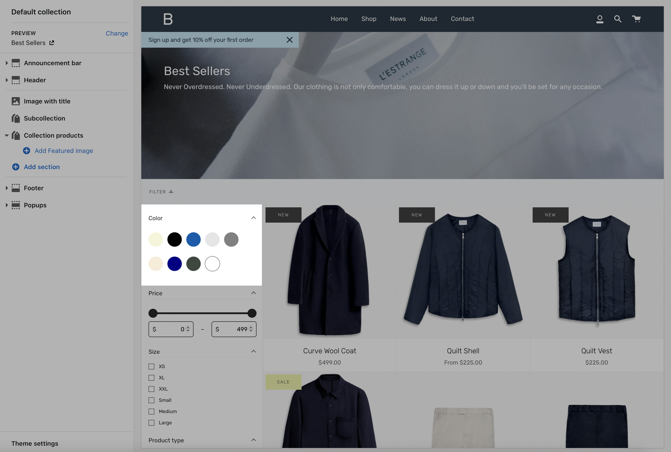
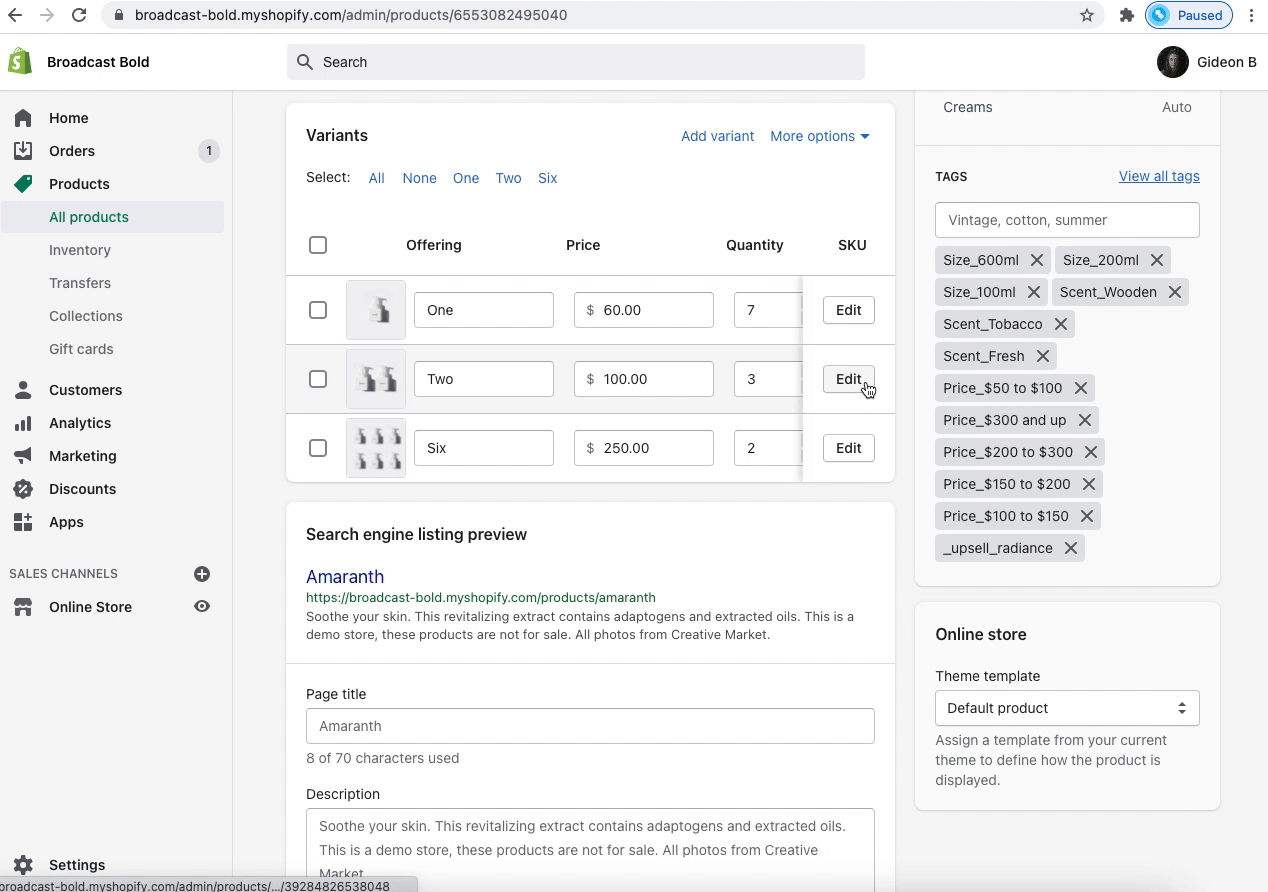
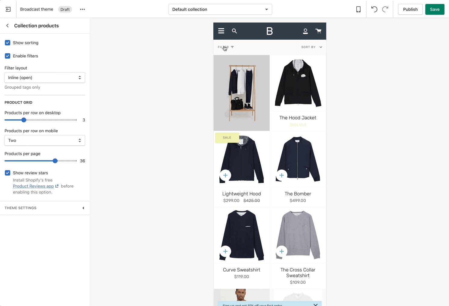
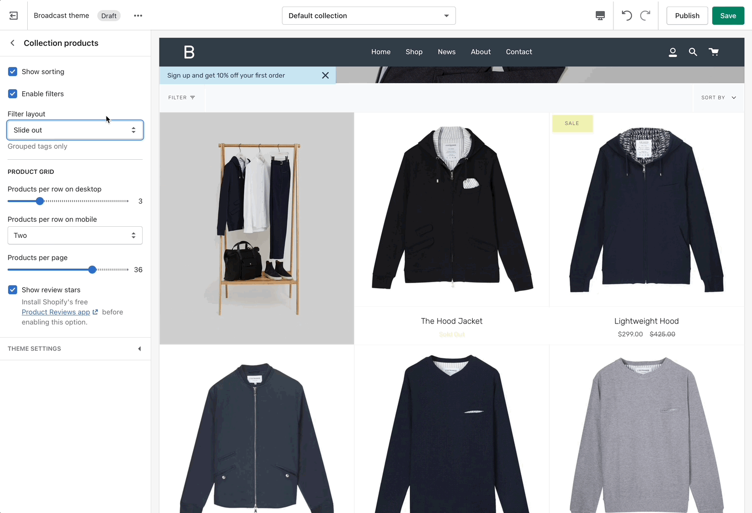
Collection page settings
Collection and Product grid settings and configuration options
Click on Collection products to view settings for Collection pages:
Product Grid
Use the Product Grid options to customize how many products per row are displayed on desktop and mobile. You can also configure how many products per page are shown before pagination is displayed.
Broadcast has integrated support for Shopify's 'Product Reviews' app. Review stars can be displayed in the collection grid.
Theme Settings
Expand the Theme Settings panel to view additional settings related to the product grid:
Show product star rating
Custom content
Create a unique split of blocks using 'Custom content'.
Add blocks
Choose between different block types to build out your own layout.
The available block types are:
Image
Text
Newsletter
Each block has its own individual settings similar to its section counterpart.
Free shipping message
Dynamic message to encourage increased items per transaction
Progress wheel
Animated progress wheel to help your customers know how close they are to free shipping. The wheel fills up and the value changes as items are added to the cart:
Use to encourage add-on sales and increased quantities
How to setup
Enable Show progress wheel in the settings:
Modify the message text as needed. Keep the || amount || custom short code to reference your set value from the Cart settings.
To adjust the free shipping value, navigate to Theme settings and then choose Cart:
Once the required amount is reached a message will show up on the cart page as well:
Header icons
Professionally designed and crafted for modern header styles
Broadcast includes a clean set of modern icons for the header. Multiple cart options are available to match your brand style.
Bag icon
Cart icon
Cart icon as circle
How to setup
In the theme editor under Header, choose Show icons and select a cart icon style:
To override the cart icon style with a circle option, use the checkbox for Show cart icon as circle:
Accordion section
Add rich accordions with many style options
The accordion section in Broadcast includes a robust selection of blocks to visually improve content displayed on product detail pages, homepage, blogs, pages, and more.
Content blocks include:
Text column
Image column
Icon column
Custom HTML
Contact form
Video overview
Full details about each block type for accordions:
Adding images to accordions
Images in accordions are added by using the Image column block. Here's a quick 1-minute video demonstrating how to add images:
Sticky header
Broadcast provides a sticky header option to keep the navigation always visible on scroll
Transparent header with sticky scrolling
As scrolling begins, solid header background is animated in
Transparent header default scrolling
Sticky scrolling, no transparent header
Default scrolling, no transparent header
Siblings block
Theme Editor
Feature introduced in Broadcast 3.5
After creating the metafields and adding values to each of your products, the final step is to add the Siblings block to your Product template under the Product pages section:
Video demonstration: How to add and configure the Siblings block in the Theme Editor:
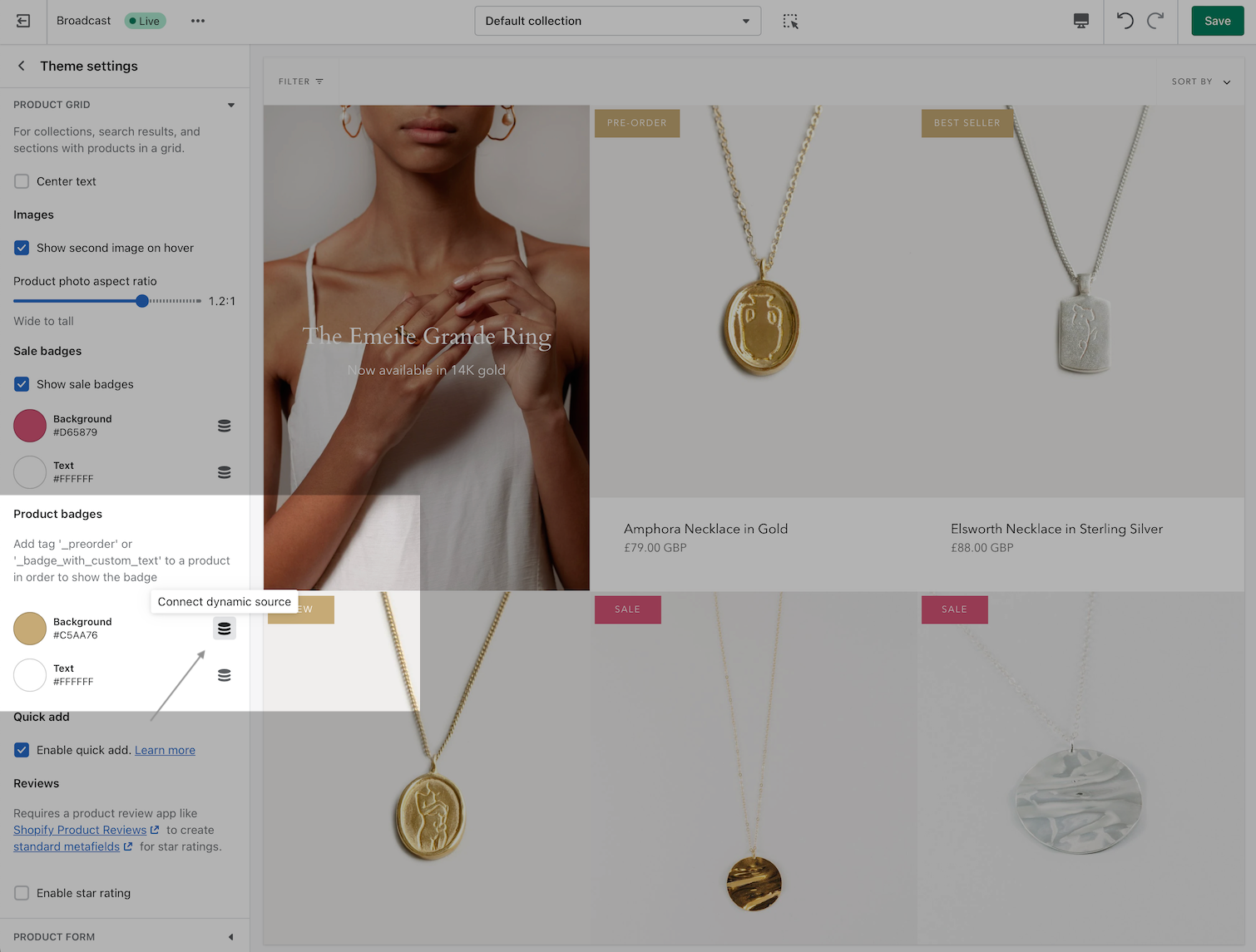
Product badges
Add custom product badges or sometimes known as stickers to individual products
Custom product badges in Broadcast allow you to create any type of badge or sticker for each of your products.
Custom Subscribe badge
Example Black Friday merchandising
Badge colors
Use the Broadcast theme settings to modify the background and foreground colors for Sale badges and Custom product badges:
How to create custom badges
Custom badges are easy to create and all done in your Product setup. You simply add a tag to any of your products with a custom prefix.
When Broadcast sees the custom tag, it sticks the badge right onto the product in any grid view like collections, searches, recommendations, and more.
Creating custom tags
When Broadcast sees a product that has a tag beginning with _badge_, it will take the following portion and apply that as the custom badge.
Example: _badge_Black_Friday
Displayed as:
Additional examples
Tag: _badge_subscribe
Displayed as:
Pre-order products using tags
Replace the add-to-cart button with a pre-order button using tags
If you have a product that is not yet ready to be shipped to customers, you can set it up as a pre-order product. Broadcast can replace the add-to-cart button with a pre-order button by using a _preorder tag.
How to use
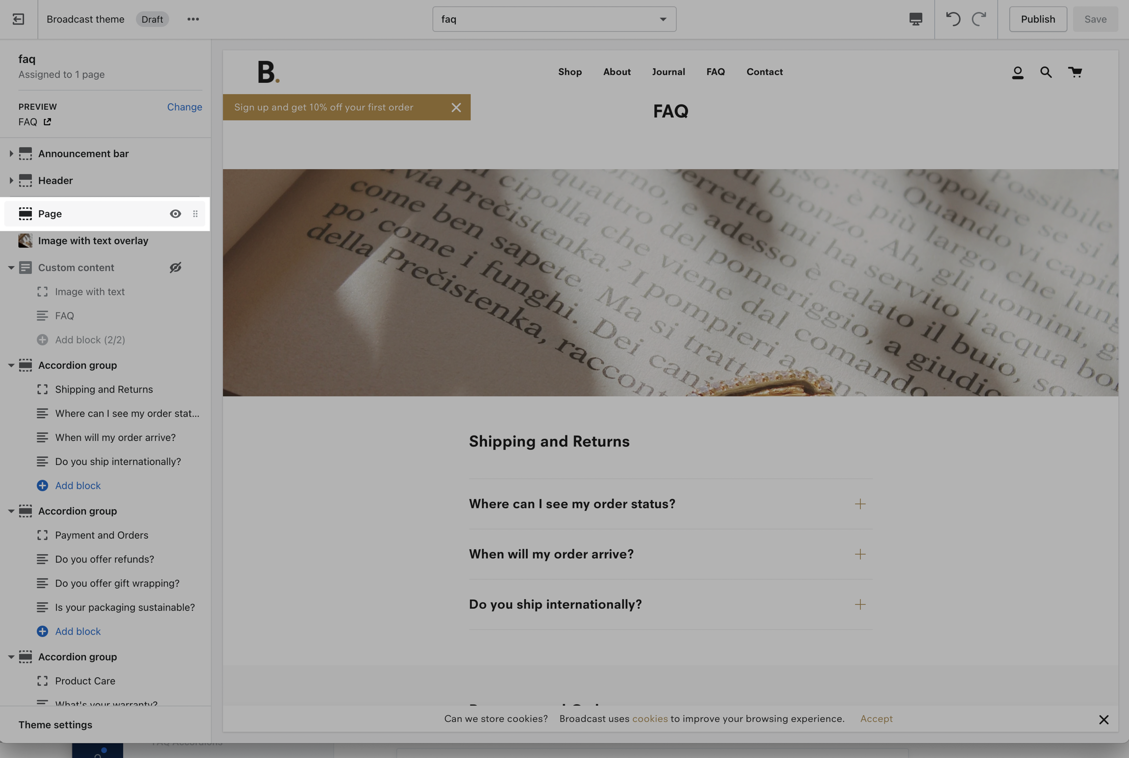
FAQ Accordions
Accordion group section included in default product template
Broadcast includes an accordion section with the default product template to help you provide frequently asked questions.
A place to promote your services and brand strengths. Include product reviews for the current product.
Theme blocks
Target Settings
Flexible announcement message bar with targeting options
Add single or multiple text announcement bars with links to promote your offers:
Target Page
Display a free shipping message to your customers only when the customer is browsing a certain page, product, collection, or blog post on your site.
Siblings product setup
Product admin
Feature introduced in Broadcast 3.5
After creating the metafields in the previous steps, we complete the setup in the Product Admin. Add the associating information to each of the newly created metafields for each product.
Siblings color
This value is to identify the swatch (color) and label-name of the swatch.
Pre-order using metafields
Replace the add-to-cart button with a pre-order button using metafields
Feature introduced in Broadcast 3.2
Broadcast supports metafields for creating pre-order products.
When you define a preorder metafield, you can easily toggle on or off the preorder feature which converts the Add to Cart button to a Pre-order button.
On the main product page, the Add to Cart button is replaced with a Pre-order button:
When viewing a collection page or any product grid-style section, a PRE-ORDER badge is added to the product:
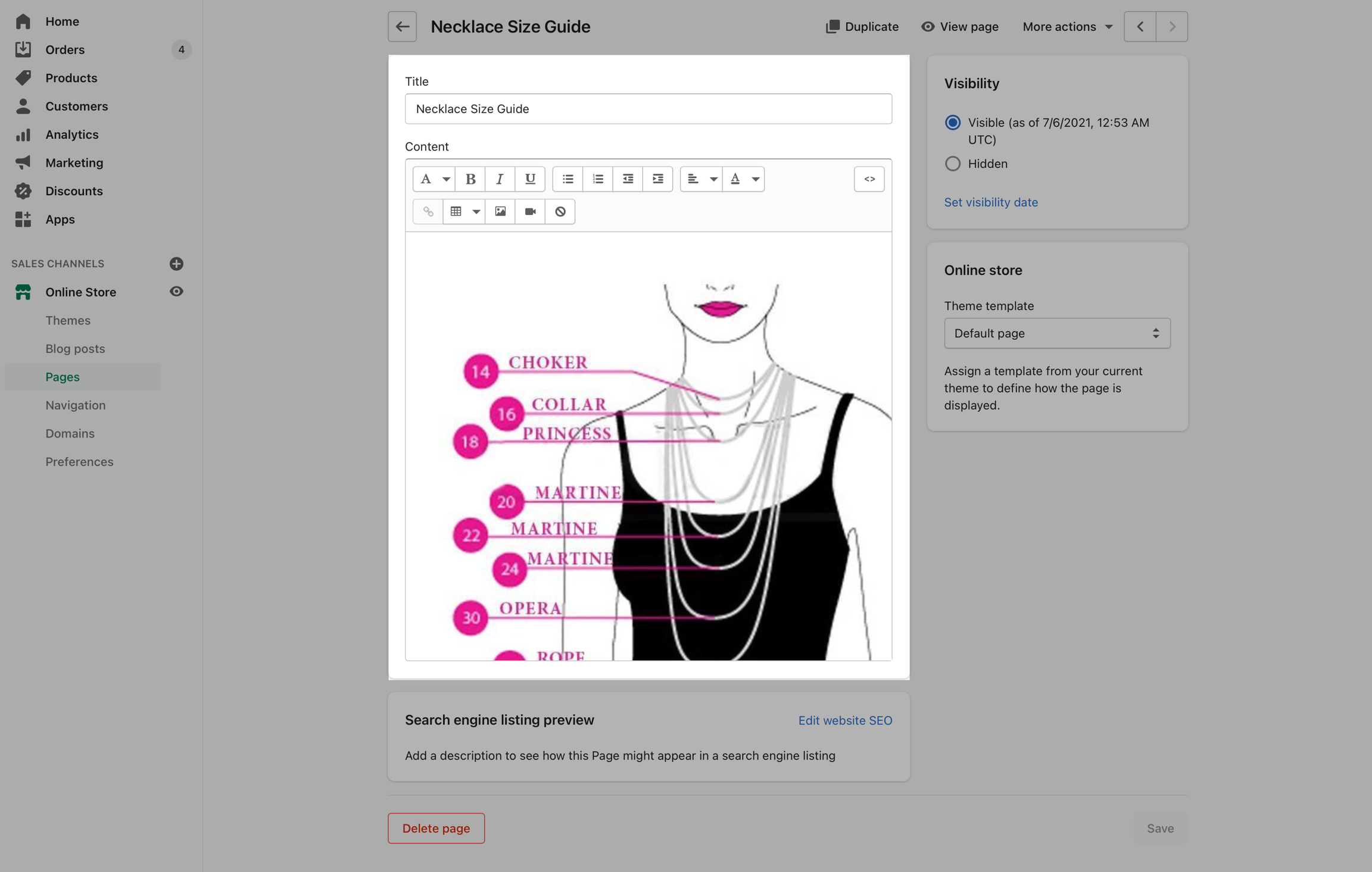
Size charts
Display different size charts on product pages
Broadcast includes a feature to display a custom size chart for any product you sell or a single size chart for all products when using the default product template:
Custom size chart for any product
Broadcast uses product metafields to display a custom Size Chart on each product page. This allows you to create multiple size charts and assign them to different products in your store.
How to setup siblings
Feature introduced in Broadcast v3.5
There are five main components to setting up product siblings:
Creating individual products. Each product can have variants like sizes.
Group the sibling products into a collection. This collection does not have to be displayed on your storefront.
Section blocks
Add and customize content within a section using section blocks
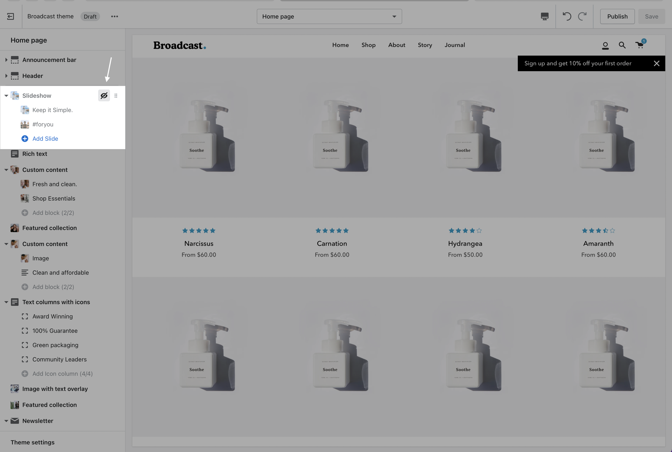
Many sections contain section blocks. These are blocks of content that you can add, configure, hide, reorder within a section, and remove.
An example of a content block is a slide in a slideshow section. You can configure each slide, hide a slide, reorder slides, and remove or delete a slide.
Adding blocks
Each section that supports blocks will have the option to add a block. For example, with the Slideshow section, adding a new block is called
theme.siblings
theme.sibling_color
Text (content within accordion, shown once expanded)
Choose the product you want to change into a preorder
Add the tag _preorder
Save the product
When Broadcast sees a product with this tag, the Add to cart button will automatically be changed to Pre-order.
Customize the button text
Use the language editor to customize the button text for pre-order.
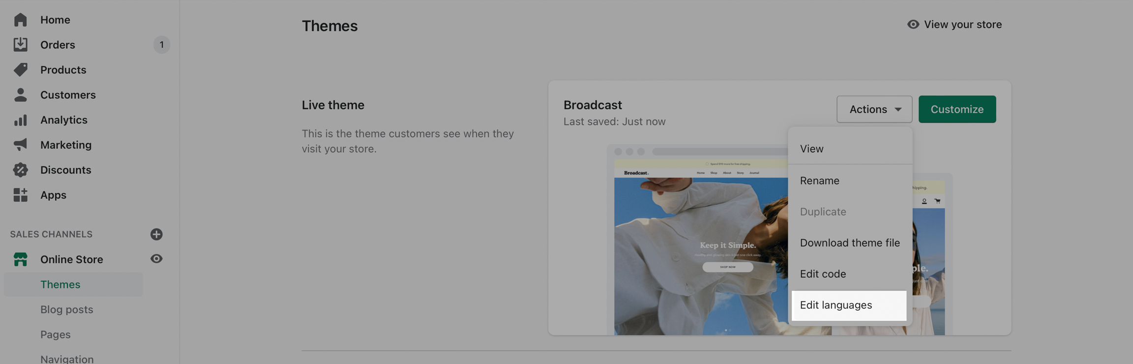
Choose Edit languages from the Actions button
Search for pre-order in the Filter bar:
Update value to change button text for any language
Manually capture payment
Pre-orders require that you set up payment options to manually capture payments instead of automatically.
From your Shopify admin, click Settings (bottom left), and then click Payments:
Scroll down to find the Payment capture section, choose Manage for Payment capture set to Manual:
Choose Manually capture payment for orders:
Learn more about Capturing payments from Shopify:
Convert the Add to cart button to Pre-order
Broadcast includes flexible content block types to help you quickly build rich accordions:
Text column
Image column
Icon column
Custom HTML
Content block types can be mixed and combined in each accordion section
Example of adding a new icon column
Customize icon and brand color
Changing the heading
Click on top-level of accordion to change heading
Hiding an entire accordion section
Use the eye icon to toggle a section or block
Displaying product reviews
When reviews are enabled, they will appear in the accordion. Broadcast has built-in support for the Shopify Reviews app (required).
Toggle under Reviews:
Custom content inside accordions
Using metafields, we can add custom unique content to accordion blocks for individual products.
Video tutorial - How to add custom content using metafields
Broadcast includes easy to use blocks to quickly add content
Target your message based on where customers are browsing your site:
Create a different announcement bar with custom messages for various pages of your site.
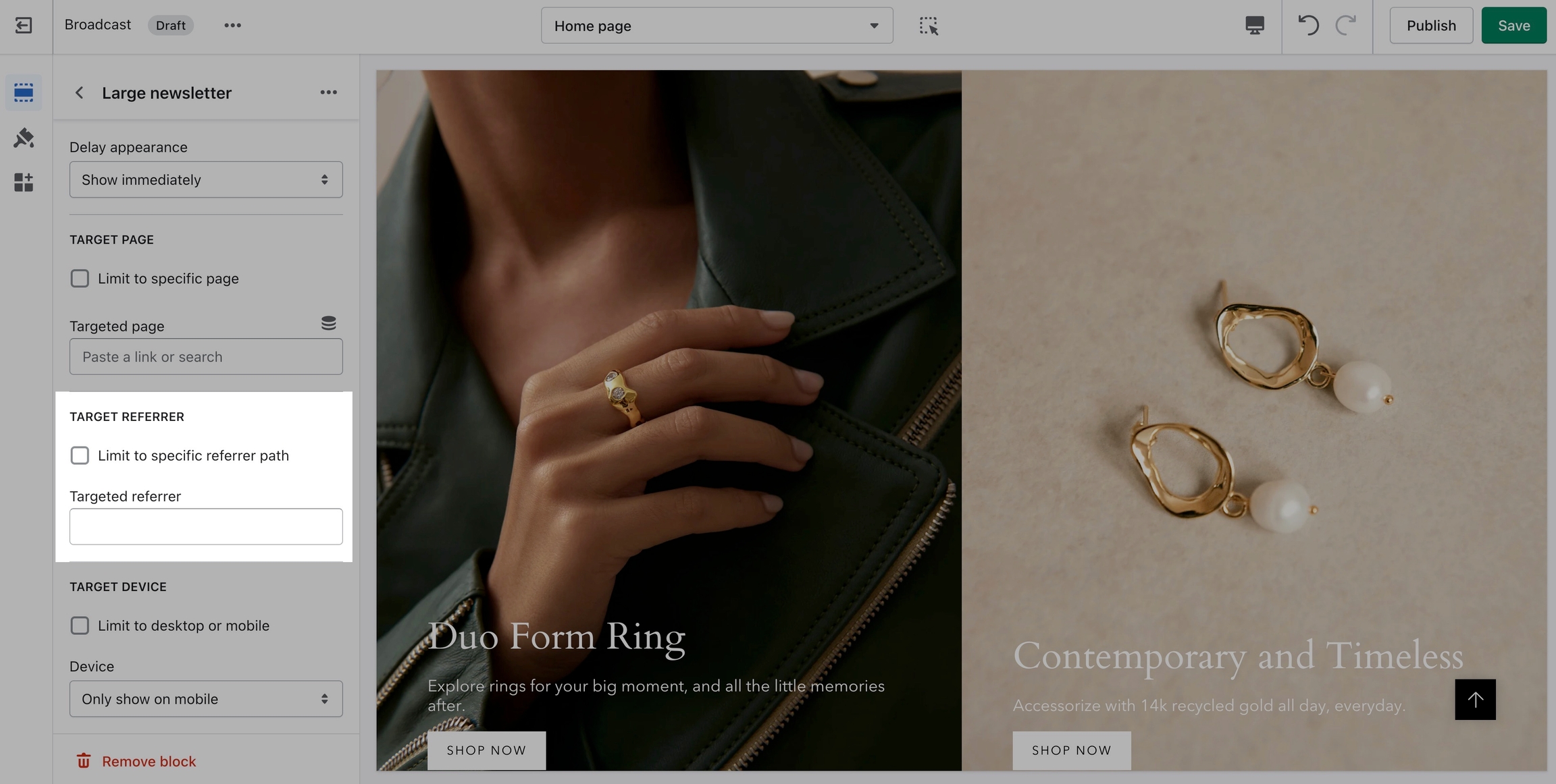
Target Referrer
Target a specific audience by using Target Referrer. Your announcement bar will only appear when the customer arrives at your site from a certain path or location.
Enable when running a promotion on another site.
Use to provide a custom message related to the source promotion
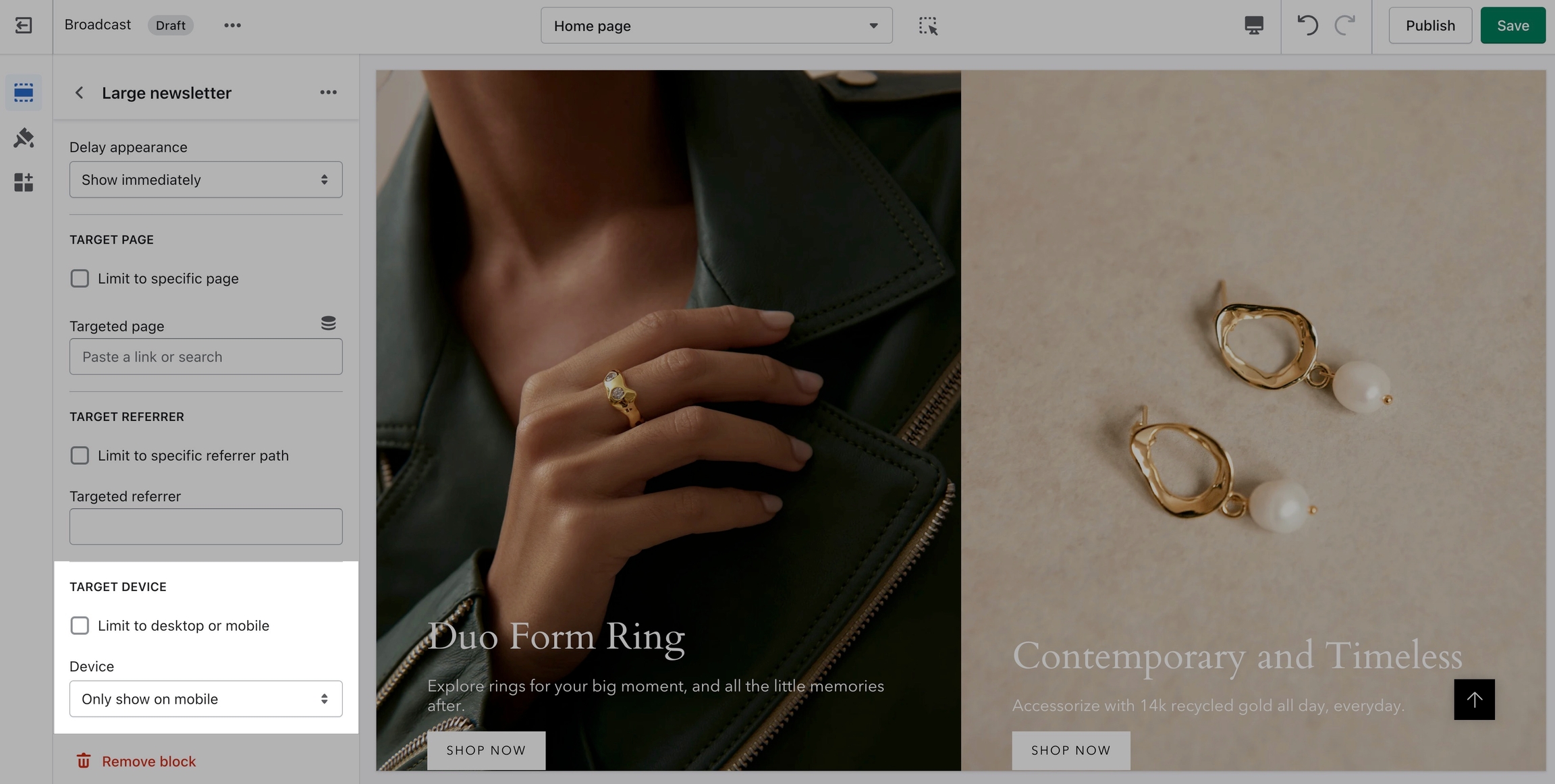
Target Device
Target only certain devices or create a custom announcement bar message for mobile devices and another for desktop browsers.
Enable custom announcement messages for mobile and desktop.
A nice advantage when using Siblings is the ability to create descriptive names for each swatch.
You're not limited to basic color names:
Example of siblings color value, Classic Light Blue
The siblings_color metafield value can be a long descriptive color name
Siblings collection
This metafield is used to map each product to the correct collection they belong to. Each group of products should have already been added to a collection.
For example, each product sibling for the product "The All Day Shirt" belongs to a collection with the handle of sibling-collarless:
Siblings collection is shown as simply siblings
Collection handle
Be sure to obtain the correct collection handle. Start choosing the collection you created:
Next, click on the Edit website SEO link:
Select and copy the entire handle at the end of the URL handle:
Verify you have the correct handle from the collection that is used for this current set of products.
Use this collection handle from the Search engine listing preview -> URL handle as the value in your Siblings collection metafield:
Complete for all products
Update the values for each of the products in your Siblings Collection with:
Siblings color
Siblings
Once completed, the final step is to add the Siblings block to the Product pages section in the Theme Editor:
Quick Add button is replaced with a PRE-ORDER button (on hover)
In the cart drawer and cart page, a message is included to indicate that the item is a pre-order:
Cart includes Pre-order message
How to setup
Setting up a preorder metafield is very simple and can be done right in your Shopify Admin.
This video covers all the steps needed for creating a preorder metafield plus additional customization options:
Reference
You can use the following reference information to help with the steps covered in the video.
Metafield definition
Create a product metafield with the namespace and key set to:
theme.preorder
Set the content type to True or false
Product setup
In the Metafields section of any product that you'd like to use the feature, change the preorder value to True:
Bottom of product setup page in the Shopify Admin -> Products
Preorder template
To remove the Buy it now button as shown in the video, you can create a preorder product template and uncheck Show dynamic checkout buttons under the Form block:
Additional information
When selling pre-order products on your store, you may want to manually capture payments:
Manually capture payments
You can customize the button text for pre-orders to match your language or simply use different wording:
Customize the button text
Add to Cart button is replaced with a Pre-order button (spelling and letter case can be changed)
How to setup
Create size chart pages
To begin, create as many size chart pages as needed in your Shopify Admin Page editor. If you have an image already created for your size chart, add that to the content section of the page:
Example page with image
Example page with table
Create a reference metafield
The next step is to define a Product metafield using Page as the reference type:
Allows you to assign any page to your products
Setup products
Your products will now have a Metafields section at the bottom. Use this to select which size chart page should be displayed when a customer is viewing this product.
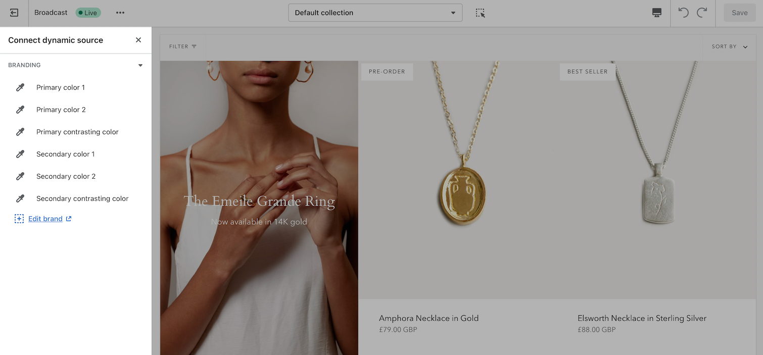
Connect dynamic data source
In the Theme editor, choose your Size Chart metafield as the dynamic source:
Video tutorial
Watch all the steps required to setup custom a metafield and connect to your products:
Steps covered in the video:
Create a reference metafield - Shopify Admin Settings
Assign a size chart to products (choose a page) - Shopify Product setup
Connect dynamic data source - Theme editor product template
Single Size Chart for all products
If your store requires only one Size Chart for all product pages, you can skip a few steps and simply choose a page in the From settings:
No metafields required when using one size chart on all pages
Define two custom metafields to link each product together which will automatically create linked product swatches.
Update the metafield information for each product.
Add the Siblings block to the Product template in the Theme Editor.
Let's begin with the product setup:
Individual products
Create individual products that are similar. Use the same name for the product title with each product:
In this example, we will combine all these products into one product using the Siblings feature.
Therefore, each product is a duplicate of the other with the exception of the color in the title and the product images.
Each product represents one color for the combined product.
Once connected to each other as siblings, they will appear with linked swatches to each other:
Each product can have its own images, inventory, prices, description, and variants like Size:
A Color variant isn't required as that will be replaced by image swatches and a metafield is used to display the color.
Tip: Create the first product with sizes and prices, then duplicate that product and add new images for each variation and adjust the description, inventory, and prices.
Collection for siblings
After creating the products, place them all in one collection. The collection does not need to be used for any other purpose (can be hidden from your storefront):
Metafields
The next step is to create two product metafields which are used to connect all the products and information together:
If the section is closed, click on the expand triangle icon which is left of the section title
Removing blocks to add new blocks
Some sections will have a limit to the number of blocks that can be added. For example, with the Custom content section, there is a limit of 2 blocks (2 columns). You can easily delete a block to add a different type of block:
Custom content has 2 columns, each column is a block
Broadcast includes a Custom content section which is a powerful and flexible section to use on any page. Each of the two blocks can be any of the following:
Image
Text
Newsletter
Testimonial
Product
Video
Collection
Using only one block will make the entire section that content. For example, you can use Custom content's Image block alone to display a hero-style banner. If you add a second block, the section becomes two columns.
Block settings
Similar to sections, each block has its own settings. These settings are where you customize the content inside your sections:
Each block type will have a different content settings
Explore sections and blocks
Build rich and creative sections on your homepage, product pages, collections, blogs, pages, and more by exploring different sections and block types.
Some sections include content in the section settings that complement content in blocks. For example Shop the look will have the primary image settings in the section:
Each block is then used in the product slideshow, allowing you to showcase multiple products on one image:
Explore the many different sections and block types in Broadcast to create beautiful and effective sections of content for your store.
Place sections on various pages and page templates to merchandise your entire store and share your brand experience with customers.
Hide and reorder blocks
Content blocks can be hidden to be used later or deleted if not required:
Custom content section
Content order can easily be changed using drag and drop:
Popups are a great way to get your customers' attention.
Blocks
We have different popup blocks meant to be used in different ways. We will learn more about them in the following articles.
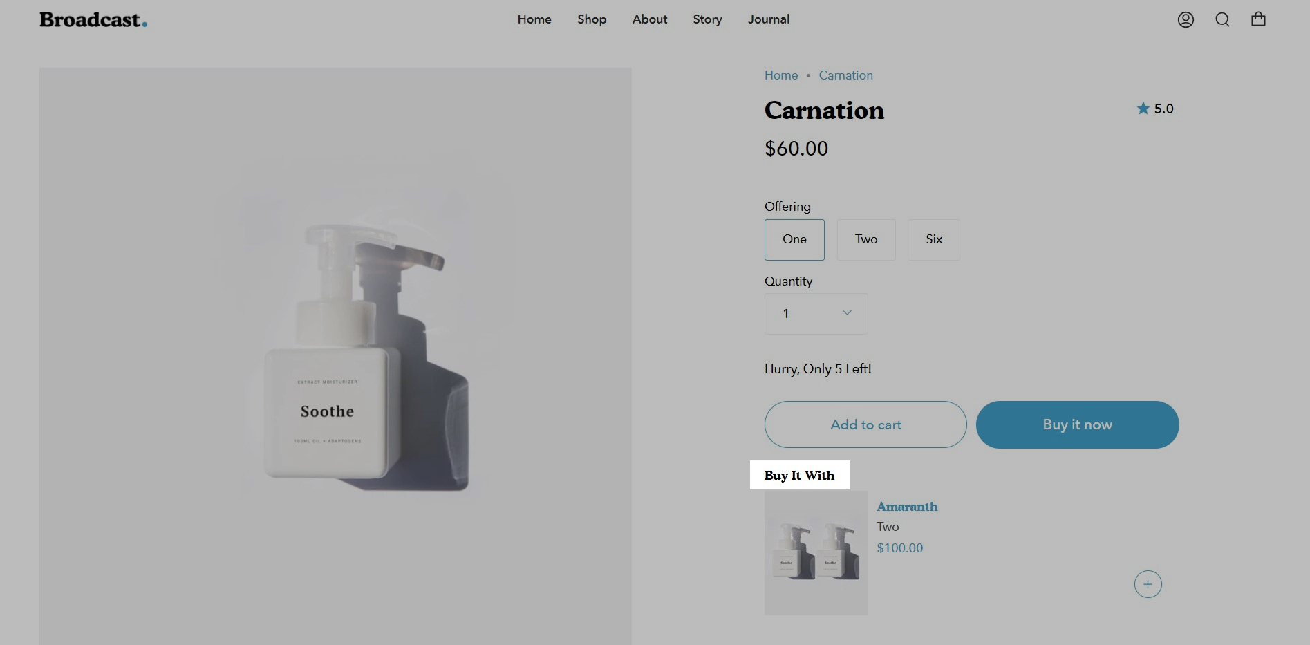
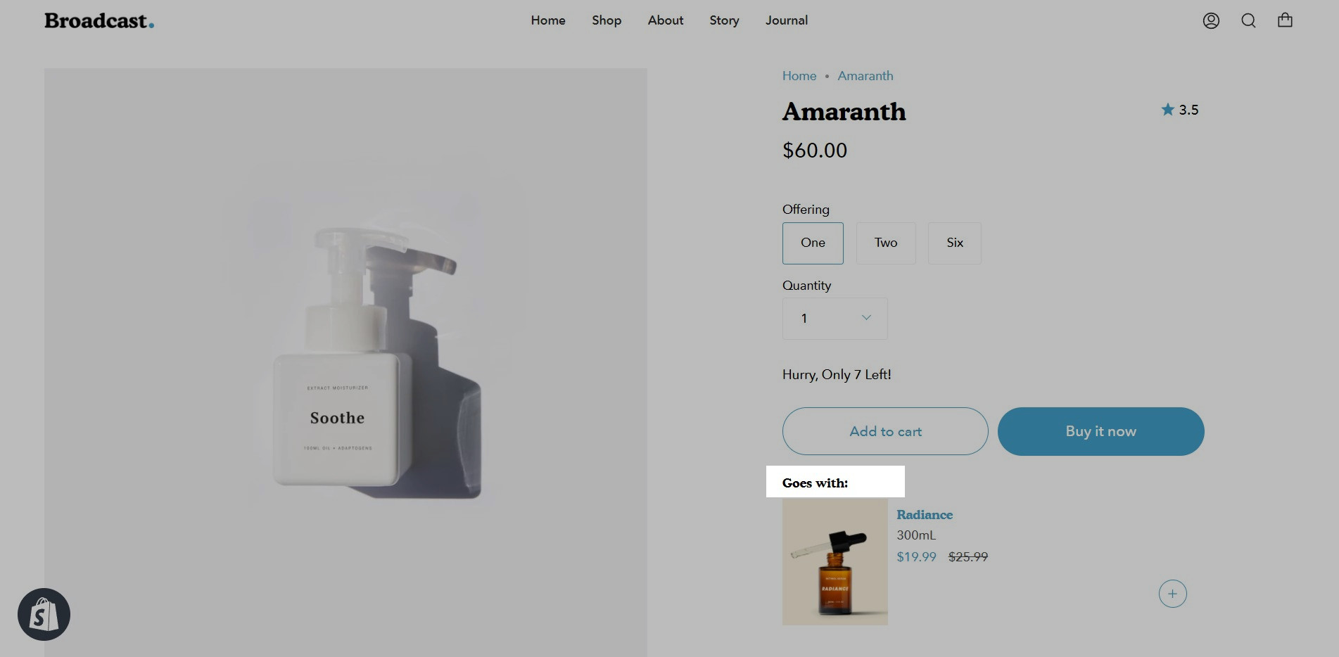
Upselling with metafields
Broadcast includes a Goes with feature to help upsell products on individual product pages using metafields
Feature added in Broadcast 3.4. For earlier versions
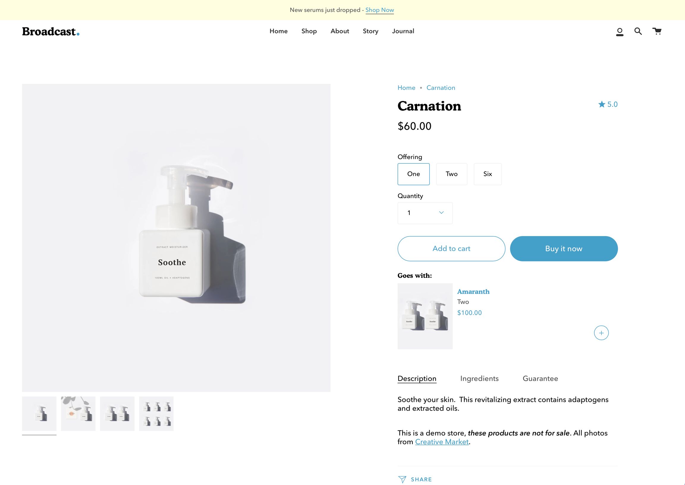
With Broadcast, you can suggest a pairing product on any of your Product pages. This allows the customer to purchase two separate products within one product page.
Broadcast includes an easy variant chooser for your products which have multiple variants:
Low inventory message
Product form setting to display low inventory message
Build a sense of urgency with Broadcast's low inventory message option in the product form:
Inventory count value can be hidden:
The message is customizable in Theme content and supports HTML. You can change the message and add basic styles:
Tab content using metafields
Add unique content to tabs and accordions using metafields
To add unique content to your product tabs or accordions, we can use metafields. With metafields, we can easily display unique content and information for all products or only specific products.
Example of unique tab content for one product:
Example tab content from another product:
Tabs are dynamic when using metafields. Some products may not display the tab entirely:
Product pages
Settings and layout options for Product pages
Click on Product pages to view settings and options:
Product description
Quick add
Quickly add items to cart from collection pages
This article is for Broadcast v3. For earlier versions of Broadcast,
The Quick Add feature in Broadcast allows customers to add products to their cart without leaving the page they are on.
When Quick Add is enabled, customers can either purchase the product immediately or if the product contains variants, are taken through the process of choosing variants.
Products without variants are instantly added to the cart with one click when using Quick Add.
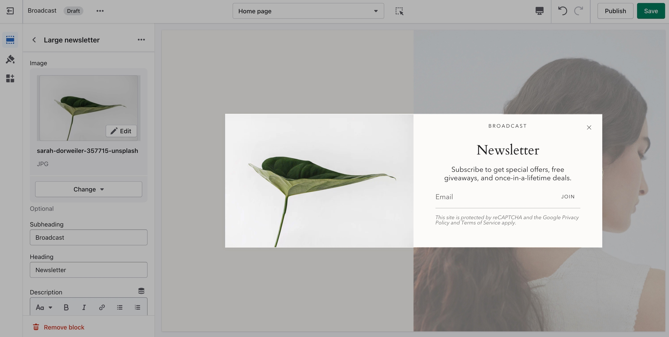
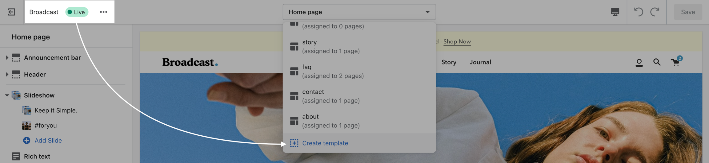
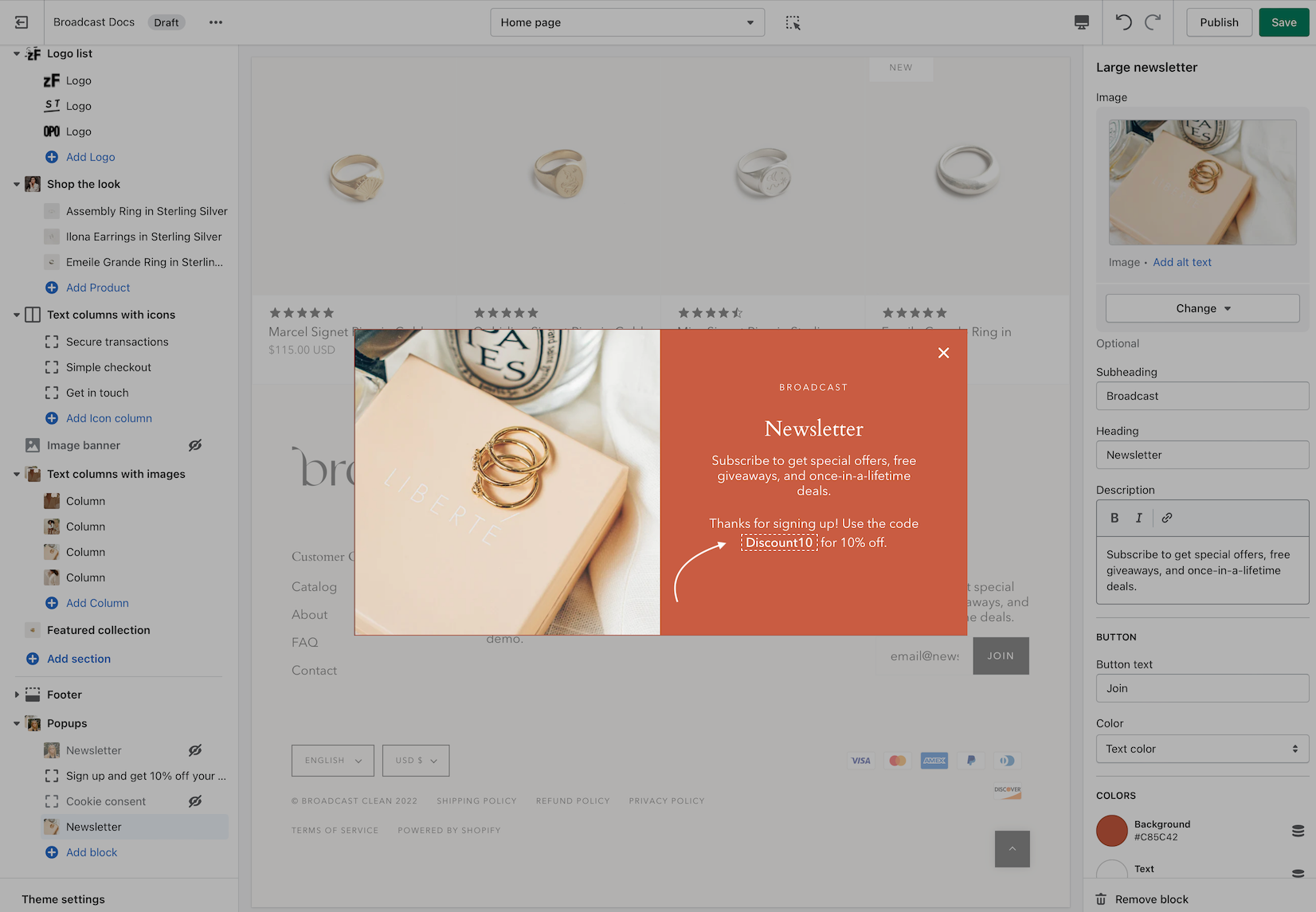
Large newsletter
Powerful and simple popup feature with the ability to target different pages, sources, and behavior
'Large newsletter' can be used as a newsletter popup or as a sales promotion tool to display custom messages.
You can also use it to give promo codes based on where the customer arrives from (path), is viewing (device), and how they are interacting with your site.
Cookie consent
This article is for Broadcast v3. For earlier versions of Broadcast,
Broadcast includes a Cookies consent popup which allows you to display a message an accept button and a link to your Privacy Policy page:
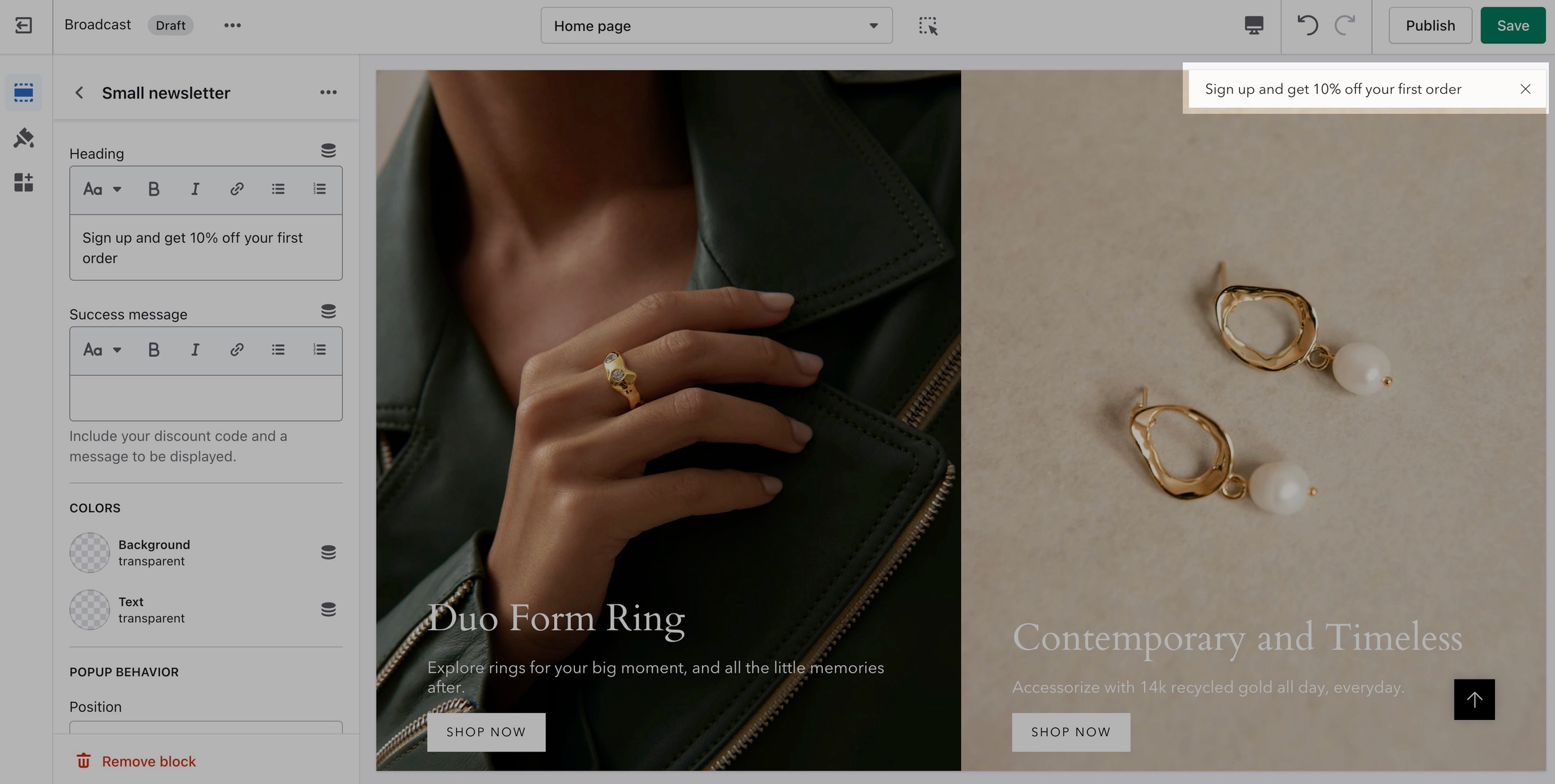
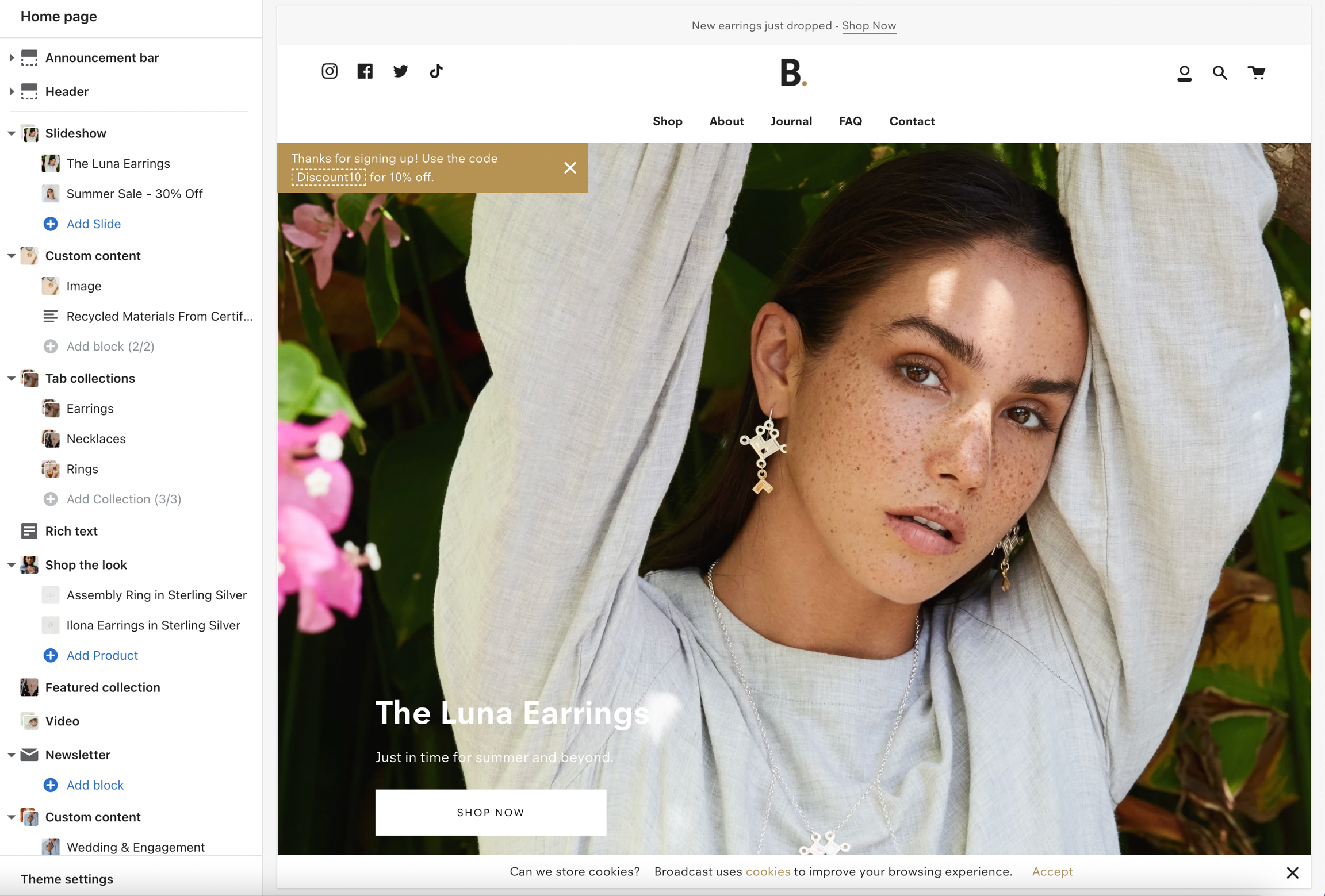
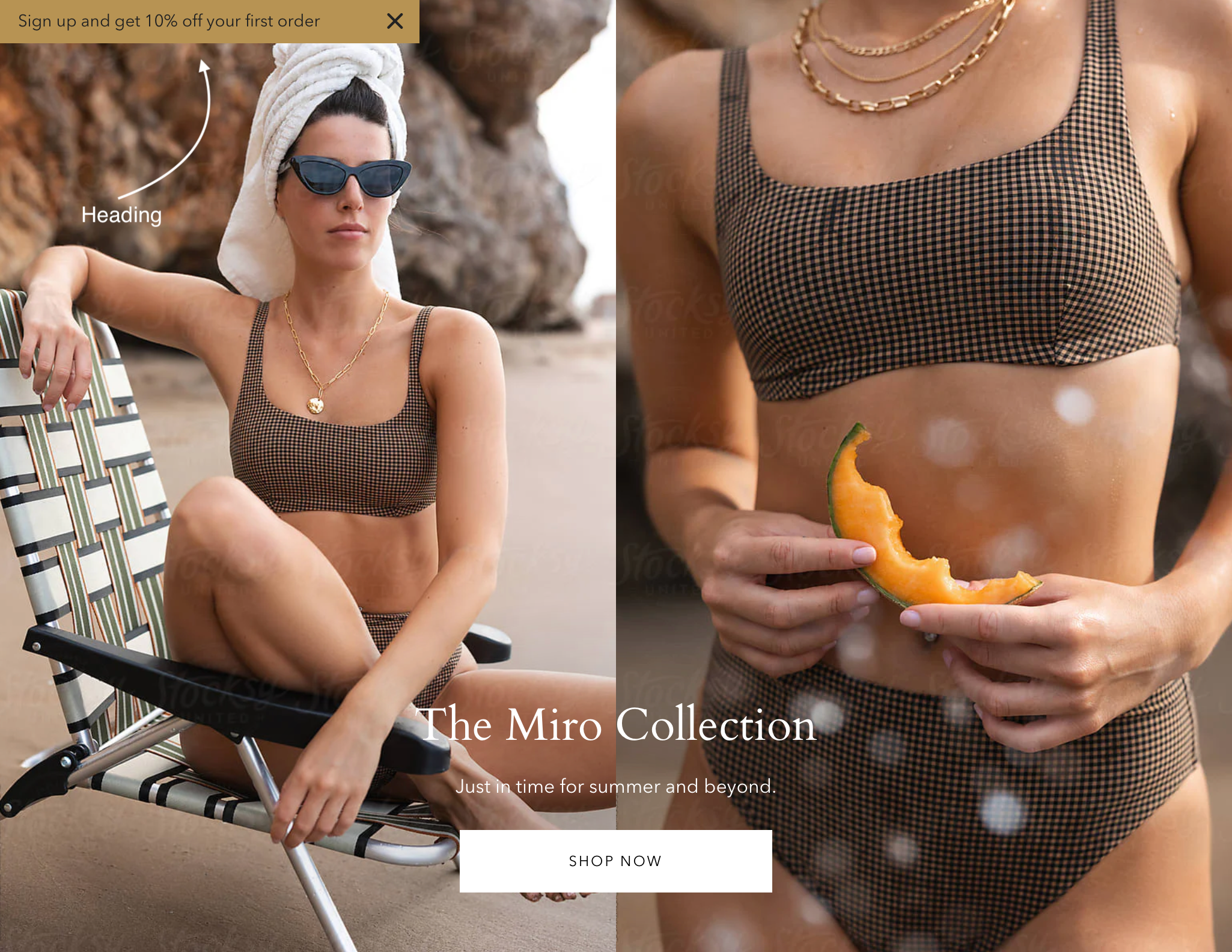
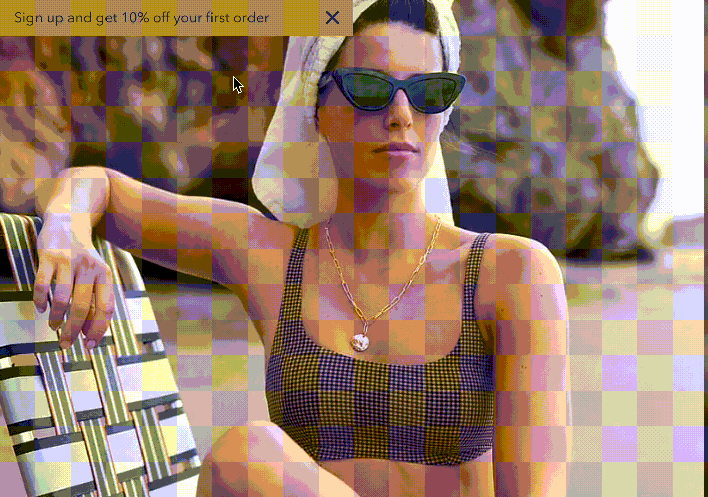
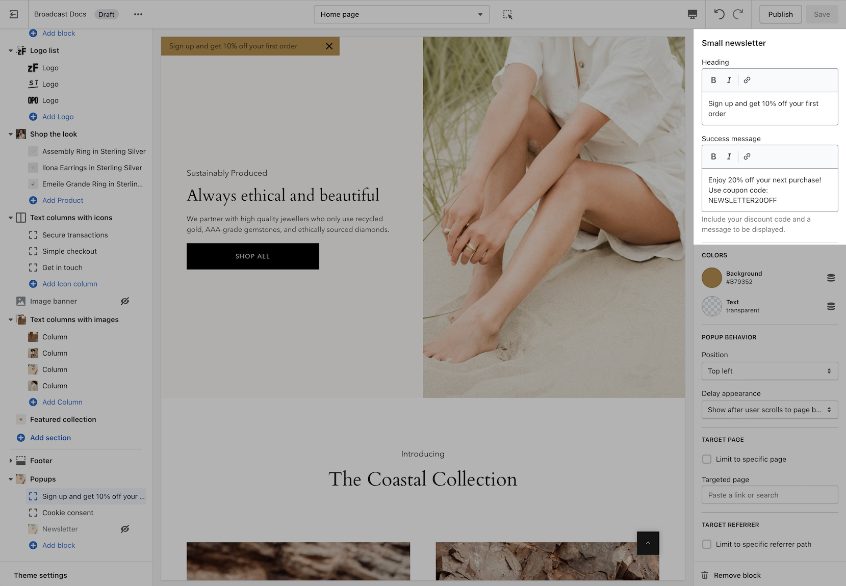
Small newsletter
Powerful and simple popup feature with the ability to target different pages, sources, and behavior
Display a small-sized newsletter signup popup message with powerful behavior and targeting options:
New Variant Chooser Drawer demonstration:
Variant chooser drawer and works together with the cart drawer using layers
Cart promotions
A second chance is available to the customer in the Cart drawer. If the customer doesn't use the Product page upsell promotion, they will have another opportunity in the Cart drawer:
Appears when original promotion is skipped
Broadcast now uses Shopify's Metafields feature to pair products with other products. A new Variant Chooser makes it easy for customers to select the right option.
How to setup
There are three main steps when using Broadcast's upsell feature:
Create a product metafield with a unique namespace and key called: theme.upsell
Link products together in the Product setup
Add the Upsell block to the Product form in the Theme Editor.
Let's begin with creating a new custom metafield:
Metafield configuration
The first step is to define a product metafield with the namespace and key of theme.upsell and type Reference to Product, Single product:
Start by defining a new metafield in your Shopify Admin under Settings:
Choose Metafields under Settings
Click on Add definition:
The important part
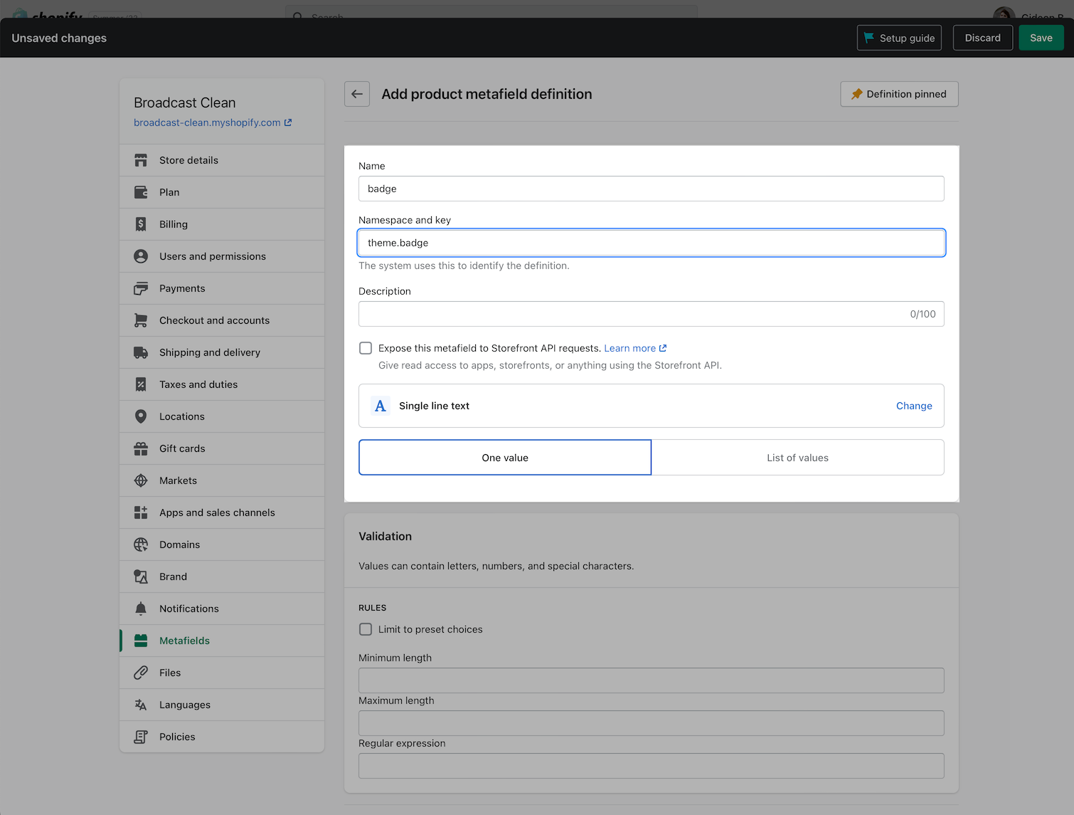
Name your metafield "Upsell" and make sure you change the default namespace from custom to theme. The namespace and key should be exactly: theme.upsell:
The Content type, should be Product, One product.
Creating metafield demonstration:
Change custom to theme in the Namespace and key = theme.upsell
Link products together
To pair products, use the Product setup in your Shopify Admin:
Choose a product, then scroll to the bottom where you'll find your newly created Upsell option under metafields.
Here you can easily choose a product to pair with:
Choosing a product demonstration:
Save your changes.
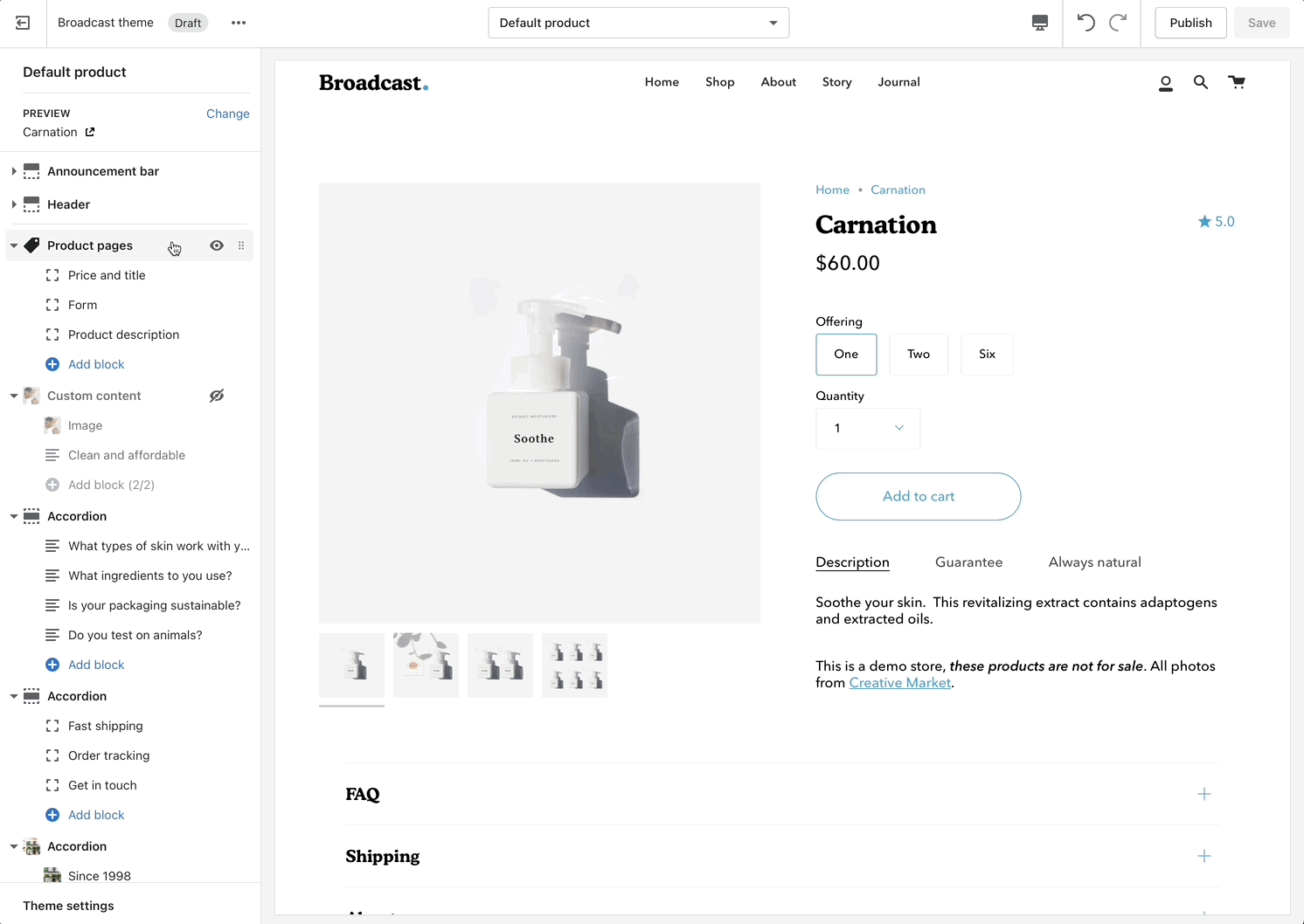
Final step, add the Upsell block in the Theme Editor
This is a quick step and is done in the Theme Editor. Navigate to a product in the Theme Editor or use the Default product template (or any product template):
There are three basic steps needed for the inventory countdown to appear correctly:
Steps
Enable inventory tracking in your product setup. The low inventory message is triggered if a product has 10 items or fewer available.
Add the Inventory countdown block to your product form.
Use the block options to show or hide counts and adjust spacing.
Optional - Change message text in Theme content (language editor).
Enable inventory tracking
The first step is to ensure your products in the main Product setup are using the Track quantity option. Be sure inventory quantities are being tracked in order for this feature to work:
Shopify Product Admin
Add the Inventory countdown block
In the next step, we'll use the Theme Editor and add the Inventory countdown block to the Product form:
Choose Add block and then add Inventory countdown
Move the block up to a preferred position on your product form. We've moved it right about the Buy buttons:
Drag the block using the handle icon on the right and place in position
Customize inventory features
The Inventory countdown block has a range of options to help you configure when and what is shown to your customers.
Block settings
Show notice
You have the ability to always show an inventory message or when the inventory for the current item is low.
Always - This is helpful for always displaying an inventory count to your customers or a message stating that the item is in stock.
Low inventory - Trigger a message with or without the count only when inventory is at a certain level. Using the threshold slider lets you configure when the message or count is displayed.
Hide inventory counter
Use this option to hide the inventory values and replace them with a message or when unchecked, the inventory count is displayed based on your Show notice setting.
Block spacing
Block spacing allows you to customize the padding below the message. Ideal to build some separation between buttons or other components.
Save your changes to view the Inventory countdown message on your product pages. If a product does not have inventory tracking activated in the Product setup, the message will not appear for that product. Other products that have active tracking will display a message based on your block settings.
The next step is optional, it allows you to modify the message text for your current language and additional languages.
Optional - Change message text
The message you display for any/all languages can be customized under Edit default theme content (language editor):
Theme content allows you to customize the text for various components within the theme. In the search box at the top, type in "inventory", then at the bottom you'll find two fields that can be customized in your current language:
Under Product, you should see Remaining html.
Here you can customize the message. Use the key code {{ inventory }} to display the counter value.
Update for all your languages if your shop supports multiple languages.
Tip
You can tweak the message with basic HTML to add some style
Here's an example of what we used to bring in the theme's primary color:
Example with HTML/CSS styles added
Code snippet:
Low inventory message with count
Low inventory message without count
HTML color style added
How to setup
There are three main easy steps when configuring your product template and products to use metafields.
Steps:
Define a product metafield in the Shopify Admin Settings.
Link the metafield to a product description tab in the Theme Editor.
Add unique tab content to individual products in the Shopify Admin Product setup.
The first two steps only need to be performed once. The third step is done to any or all your products individually.
Video walk-through
All steps are covered in this video:
Reference
You can use the following reference information to help with the steps covered in the video.
Define a product metafield
The first step is to create a product metafield under Shopify Admin -> Settings -> Metafields
Create or define a Product metafield for your tab content using Multi-line text as the content type.
Define a Product metafield:
Provide a Name like Tab Content
Use the default Namespace and key, no change is required.
Description is optional
Choose Multi-line text as the content type
Link the metafield to a product description tab
Using the Theme Editor, use the Insert Dynamic Source icon to link the metafield you created with the tab text section in the Product description settings.
Theme Editor -> Default product templateI
Theme Editor:
Under Product description in the Default product template, choose a tab.
Under Tab Text, click on the Insert Dynamic Source icon.
Choose the metafield you created/defined earlier.
Add unique tab content under Product Setup
You are now ready to add unique content to any of your products. All content is added in the main Shopify Admin -> Products
Shopify Admin -> Products
Find a product that will have custom tab content and scroll to the very bottom of the product setup. Under Metafields, add your text to the metafield you created:
Repeat this last step for each product in your inventory that requires unique tab information. Leave blank if no information is needed.
Artist tab - Product 1
Artist tab - Product 2
Enable sticky form
The product form stays in view while scrolling stacked images. This view is recommended for long pages with large images.
The main benefit is that it allows shoppers to have access to the call-to-action buttons while scrolling product images.
Sticky behavior ends when the shopper has reached the last product image and continues to the content below. This is best used with the 'stacked' image gallery.
Layout
Image display
Broadcast includes three different layout styles for displaying your product images and thumbnails:
Thumbnails - Bottom
Thumbnails - Left
Stacked
Grid (added in v3.2.0)
Thumbnails - Bottom
Thumbnails - Left
Stacked
Grid
Feature introduced in Broadcast v3.2
The grid layout displays a large first image followed by 2-column smaller images. A popular design choice as thumbnails are large and less scrolling is needed over the stacked layout design:
Image size
Broadcast also includes three image sizes to choose from to help match your product images:
Small
Normal
Stretch - No thumbnails
Cart bar
Enable cart bar
The cart bar remains visible to shoppers while scrolling through long product pages.
It includes the product name, price, and Add to Cart button making it easy for customers to add your product to the cart:
Media
Broadcast includes a powerful image zoom feature that allows customers to easily zoom in on product images and cycle through them in a full-screen browser window mode:
Section padding
Feature introduced in Broadcast v3.3
Section padding gives you granular control over the spacing above and below sections.
With product pages, the controls will help you increase or reduce white space at the top and bottom of the main product information:
How to enable or disable
Quick Add can be toggled on and off in the Theme settings under Product Grid:
Interactive popup, customer can enter their email address to sign-up
Coupon code can be sent after signup and Captcha verification
Product ratings
Display options for Product Reviews app within Broadcast
Broadcast has built-in support for Shopify's Product Reviews app. Star ratings can be shown throughout the theme. Here are some examples:
Product Detail page
Star and average rating value next to product name:
Individual reviews and forms to add a new review can be shown with Broadcast's accordions or separate below the product description:
Collection page and Product Grid sections
Stars shown above product name and price:
How to setup
Broadcast includes quick and easy settings in the Theme Editor to display ratings. The main requirement is that you have the Shopify Reviews app installed:
If you don't have the app installed, use this link to download and add:
Theme Editor Settings
For the Product Detail page, you can easily add the rating value, star, and number of ratings from the Price and title block:
There are checkboxes for the following:
Show ratings - Displays the average rating value for the current product.
Show star rating - Adds the star icon next to the rating number (requires show ratings to be checked as well)
Show rating count - Displays the number of reviews for the current product.
Broadcast includes a Reviews section on the Default product template, use that to display individual reviews and details:
Setting options include:
Enable reviews - Toggle to display reviews
Enable accordion - Integrate with Broadcast's accordion section
Alternatively, you can use App blocks to display the Product reviews and stars on the page:
Accordion integration option is only available with the Reviews section.
Collection pages and Product Grid sections
To display the rating stars on a Collection page or Product Grid sections, use the Theme settings -> Product grid settings:
Enable by using the checkbox:
Save your Theme Editor changes.
Swatches
Product variant swatches
Broadcast will display swatches for color variants in collection filtering and the product form on product pages.
Collection filtering
Product form, default product template
Broadcast will detect if your variant label is Color or Colour and automatically display swatches
Customize the trigger words
To customize the trigger words which activate swatches, use the Language Editor (Edit languages) and add or modify the values:
You can add more trigger words that will help use swatches for other options.
The result is the same and you can use different custom swatches as well.
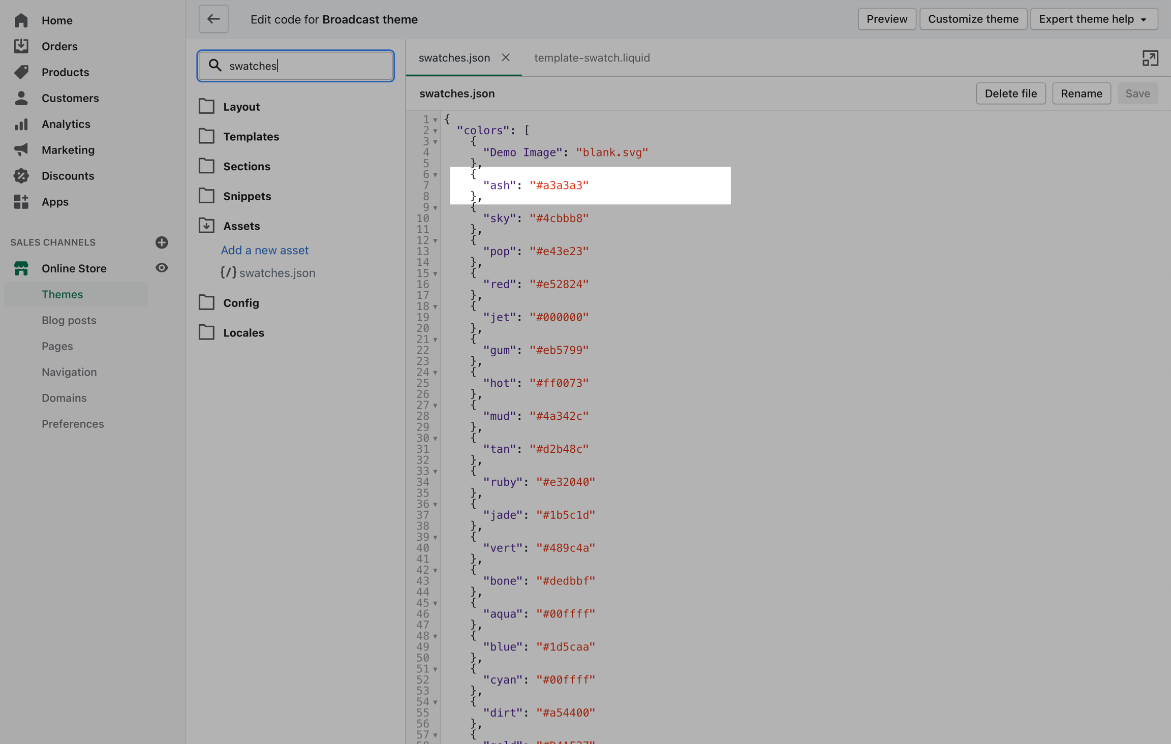
Colors
Broadcast can easily detect simple color names and convert them to swatches. There are a total of 140 color names Broadcast can detect, all other more complex names will be represented by a default grey color swatch.
You can upload your own custom color names and graphics as described below. Here is a full list of color names that will automatically be converted to swatches:
Customizing
If your products have color names other than the listed colors in the , you can add your own color names and values or upload images to the Assets folder:
Add custom color names and values to swatches.json
Use the swatches.json file located in the Assets folder to add your own custom names and HEX color values:
To find additional HEX color codes, visit:
Add custom images to the assets folder
With Broadcast, you can upload your own custom swatch images and display them on product and collection pages:
How to:
Create a small square image (60x60 or 100x100 for best results)
Upload to the Assets folder
Video tutorial
Reference from the video:
Avoid spaces in the filename
We recommend if your image has spaces, replace them with an underscore or dash:
Instead of "Light Navy.png" use "light_navy.png" or "light-navy.png"
For the JSON file, your multiword variant can look like this:
The variant name can have spaces. However, we recommend for the filename of the image, use an underscore or dash instead of a space.
Video tutorial - More tips for custom images
In this short video, we'll look at filenames and an example of creating a custom image for a swatch:
Disabling swatches
Swatches can be toggled on and off in the Theme settings under Product Grid:
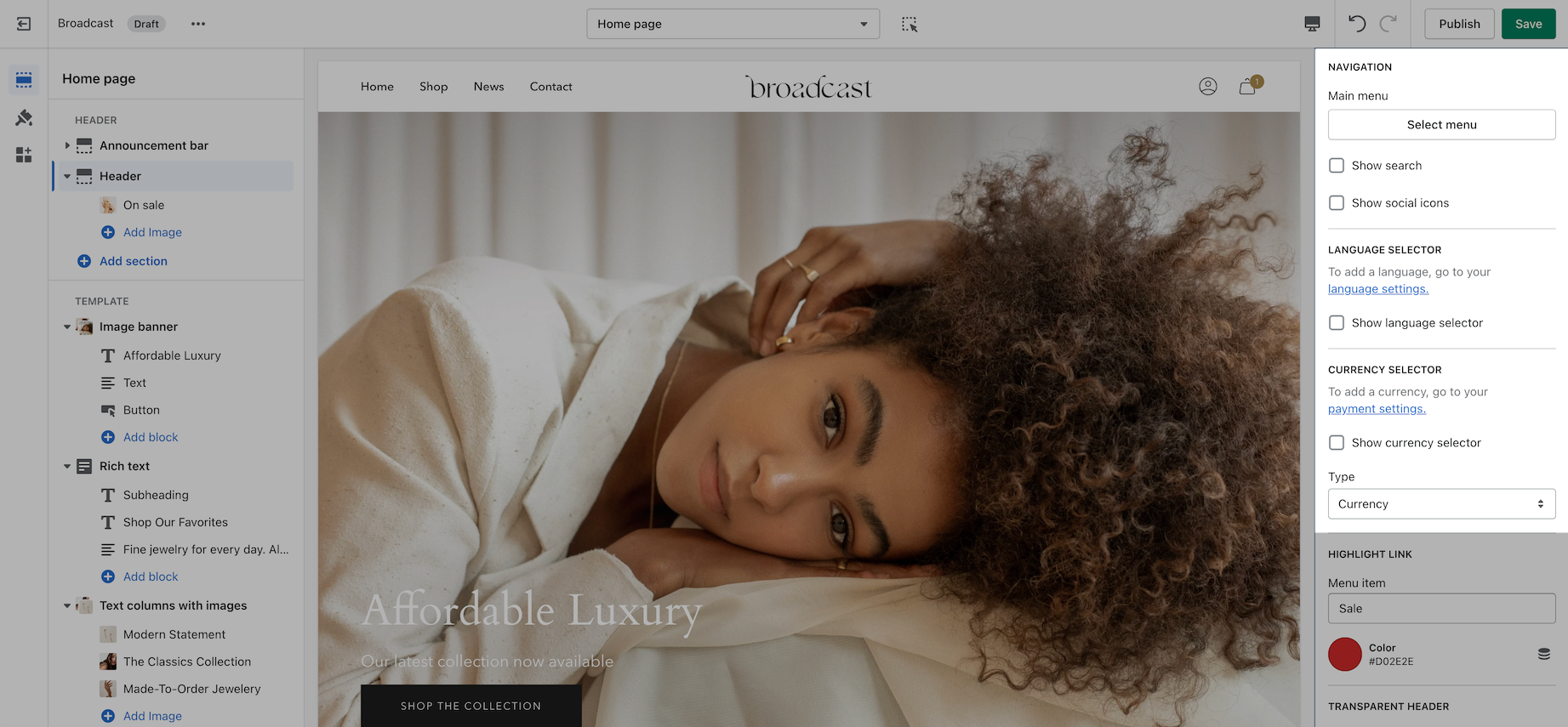
Header
Broadcast includes multiple header styles to easily customize the look of your main header
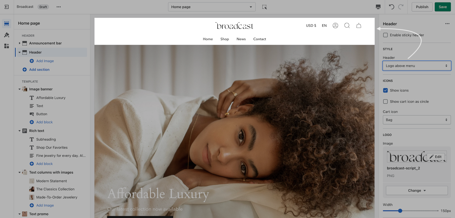
Logo above menu
Place the brand logo in the middle and navigation below.
The design allows for longer navigation. Stores with many menu items can place the navigation below the brand logo and position items like language selector, currency chooser, account, search, and cart icons on the top right:
Cart icon style: Bag
Logo beside menu
This style places the brand logo to the left with the navigation in the center. The design is a more compressed header area. Ideal for smaller/shorter navigation menus:
Mobile drawer menu
This minimal style adopts the mobile design pattern which is used on all mobile devices.
This style is the cleanest option, hiding the navigation into a mobile-style drawer and keeping consistency between mobile and desktop:
When the menu text or icon is clicked, the slide-out mobile drawer is displayed on both desktop and mobile:
The search icon is placed next to the mobile-style hamburger icon for balance. Account and cart icons are on the far right.
Logo center menu left
This common design presents the brand logo centered with navigation menu items on the left. Ideal for compact headers with a shorter top-level menu structure:
Text-based items
Broadcast can replace icons with text for text-forward designs:
Currency selector
Broadcast supports Shopify's Currency selector and can be placed in the header:
Currencies are configured in your main Shopify Admin payment settings.
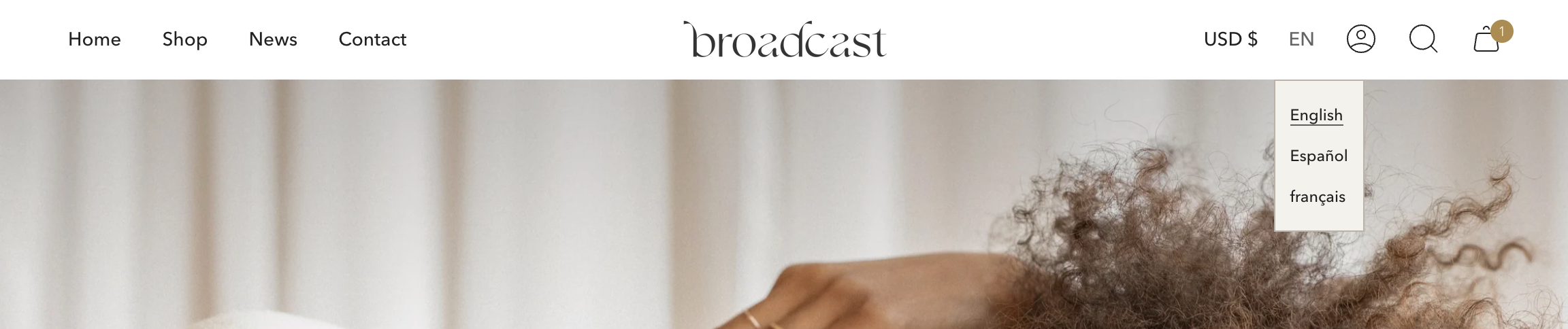
Language selector
Broadcast also supports Shopify's Language selector and can be placed in the header:
Languages are configured in your main Shopify Admin settings.
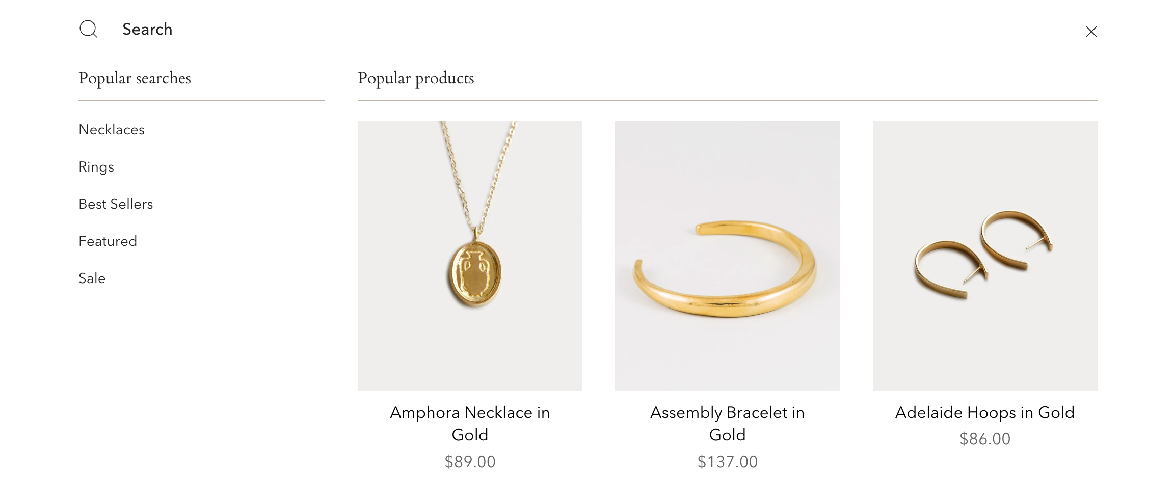
Predictive search
Broadcast includes a powerful redesigned search tool for finding products and resources within your site. Predictive search can be engaged right from the header. Addition menu options can be added to customize the shopping experience:
Configure and customize the search features under Theme Settings:
Currency, language, and search toggles
Each of these features can be individually toggled on or off to show in the main header area:
Transparent header
When using a transparent header, you can experiment with different icon styles to help the icons stand out with your background image.
A large icon size sometimes helps to bring attention to the icons:
Find the transparent header options lower in the Header section settings:
Sub-collections
Promote related collections on any collection page
Cross-promote other collections with sub-collections. Display a carousel or grid of links to related or similar collections on any collection page:
Promote other collections on your collection page
How it works
Broadcast uses Shopify's Navigation menu system to bring custom menu items into any collection page and displays them as sub-collections with a graphical image, collection name, description, and link.
How to setup
Sub-collections are already included with the default collection template, listed as a section called subcollection:
Settings for Subcollection:
Adding collections
Use the link in the settings to create a navigation list, the rest is done right in your Shopify Admin under Navigation. Choose Add menu to create a new menu:
Create a new menu with the same name as your collection:
For our example, we will be adding sub-collections to our Necklace collection, our menu will be called Necklaces and the handle in lowercase: necklaces
Next, we'll add menu items, these will be the sub-collection links that are displayed in the sub-collection carousel or grid:
Create a new menu item for each collection that be listed as a sub-collection
Save your menu and your sub-collections are ready to use.
Product badges with metafields
Add custom product badges to individual products easily using metafields
Feature introduced in Broadcast 3.2
Broadcast makes adding custom individual product badges or sometimes known as stickers very easy to implement and manage by using metafields.
When utilizing metafields you simply create one metafield to activate the functionality. From there you can add badge text to any of your products and Broadcast will automatically generate a custom badge for that product on collection pages or any section using a product grid.
How to setup
If your shop is using Broadcast v3.2 or higher, you can easily use this feature. The following quick video shows you how to setup the custom metafield and how to use with products:
Reference
You can use the following reference information to help with the steps covered in the video.
Metafield definition
Create a product metafield with the namespace and key set to:
theme.badge
Set the content type to Single line text, with one value
Product setup
In the Metafields section of any product that you'd like to use the feature. Add a value to the badge field.
This will become your custom badge when displayed in a collection or section that includes a product grid:
Result
When viewing a collection page or section with a product grid-style list, the custom badge is added to the top left corner if the product exists in that listing:
Each product can have its own custom badge label.
Badge colors
Colors are managed in the Theme Editor -> Theme settings -> PRODUCT GRID
Choose the background color and text color to set for all badges. Sale badges have their own values to help differentiate them from other badges:
How to find theme settings:
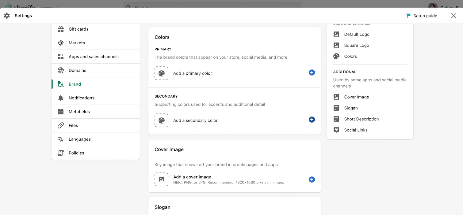
Brand colors
The data-source option for badge colors allows you to choose colors you've already configured in your brand colors configuration:
Brand colors are configured and managed in the Shopify Admin -> Settings -> Brand:
Page section
Settings and options for the page section
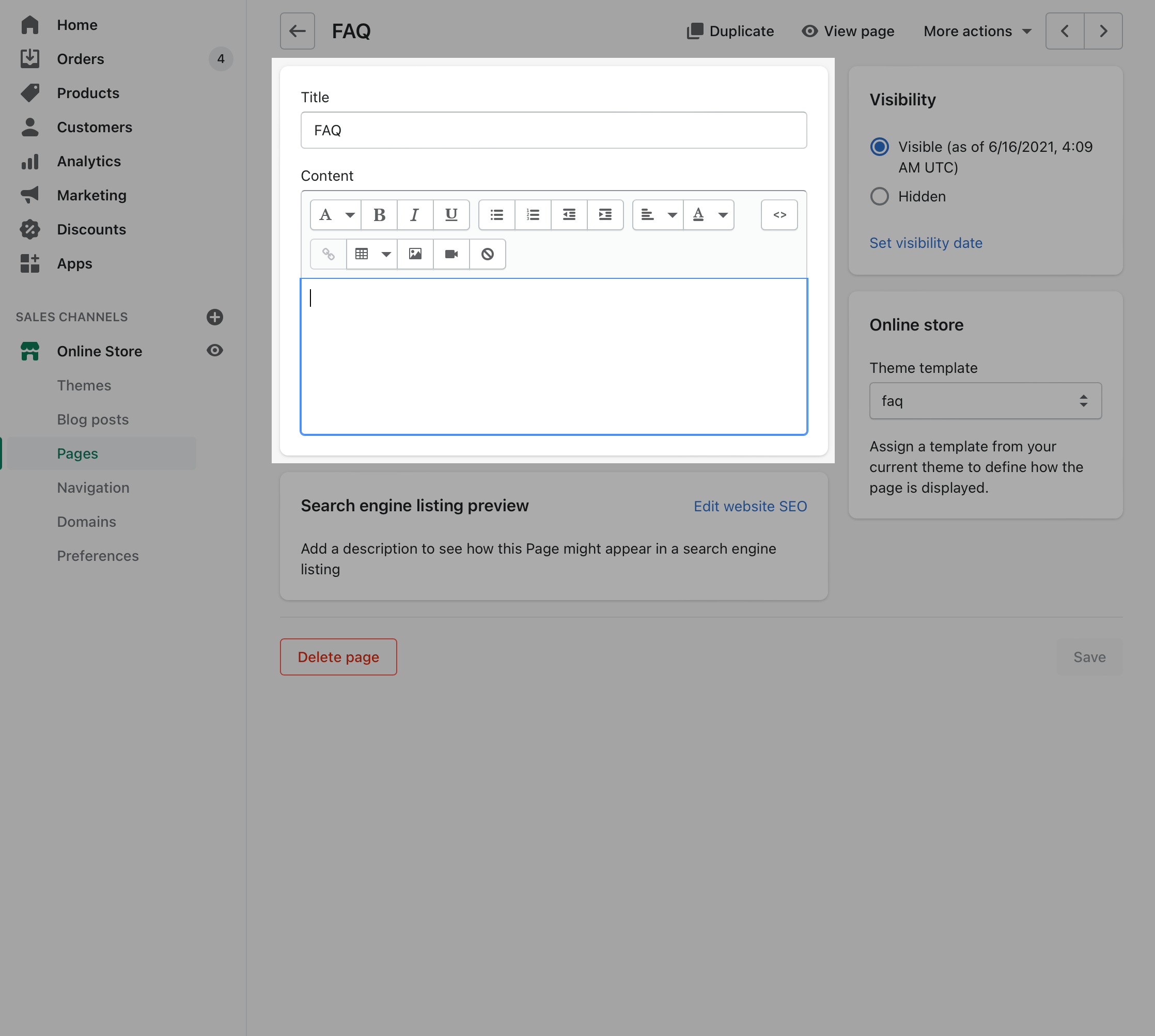
The Page section is available with all page templates and can be used to display the page title and page content from a page created in the Shopify Admin Page editor.
Use the Page section settings to toggle content from the Shopify page like title and content. You can also add a subheading and configure the layout of the section:
Click on Page section to view settings
Settings and options for Page section
The title and content are used from the page you created and assigned the template to:
Hiding and moving the Page section
In some cases you may want to hide the Page section and add your own hero-style banner with the title:
You can also move the Page section below the banner or another location to still display that information.
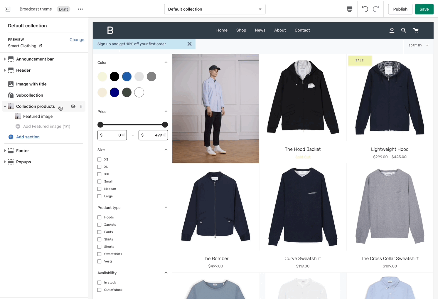
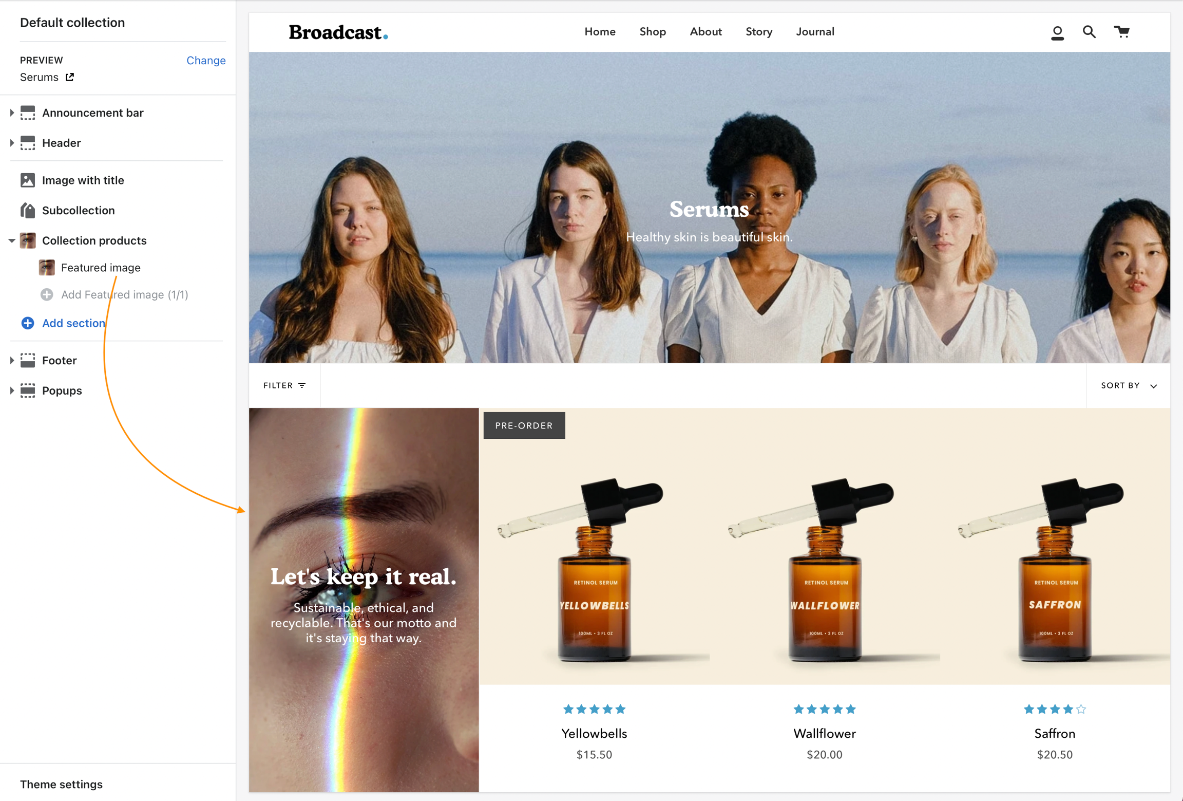
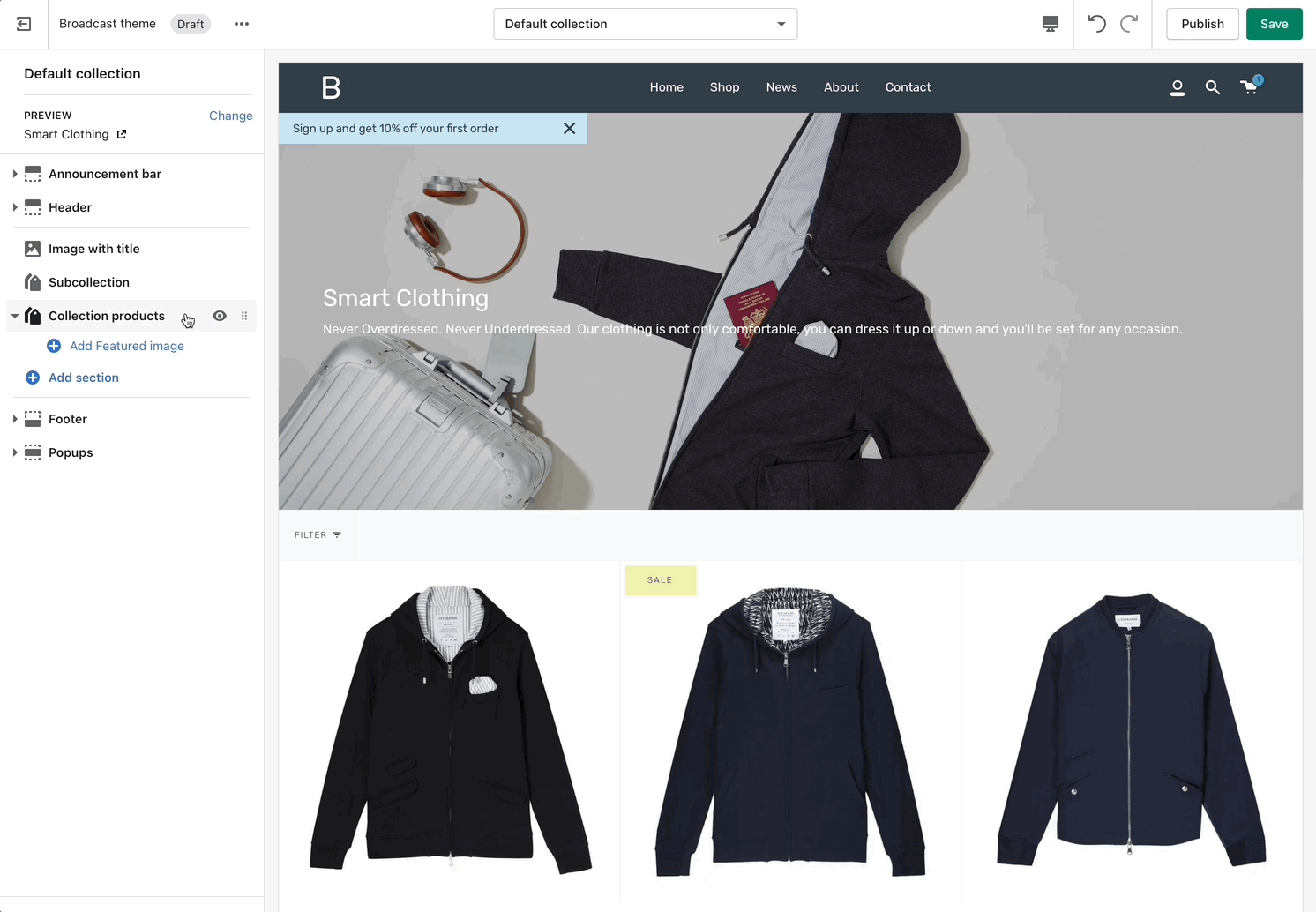
Featured image
Branding and promotion space for collections
Add a featured image to the first column and row of your collections to help promote your brand and product line:
How to use
'Featured image' is a content block for Collection products. Click on the expand icon (triangle left of Collection products) to open and choose Add Featured image:
How to use sections
Discover features and customization options in Broadcast sections
Broadcast comes complete with 25+ professional theme sections to help you merchandise your online store. Sections can be added to any page on your store.
Discover the complete range of sections and their settings. Experiment by adding different types of sections and section blocks to the homepage and the other pages within your store.
Collection carousel
Cutline second line
Add a second line of unique text on collection pages
Feature introduced in Broadcast 3.2.0
Add a custom tagline to individual products using metafields. The tagline will appear styled in the product grid on Collection pages and any section using a product grid view:
How to setup
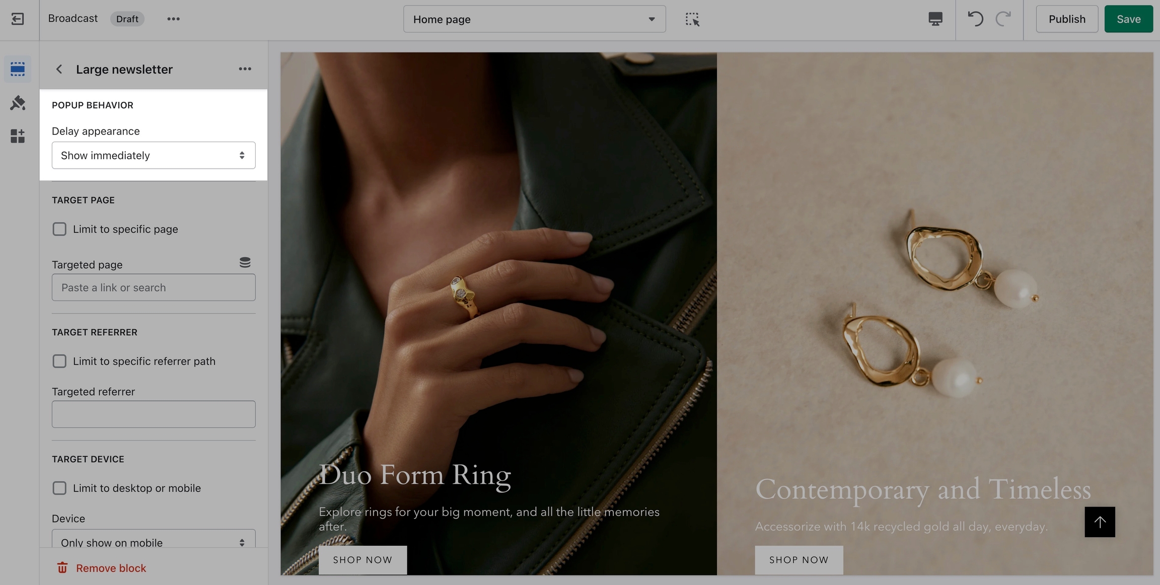
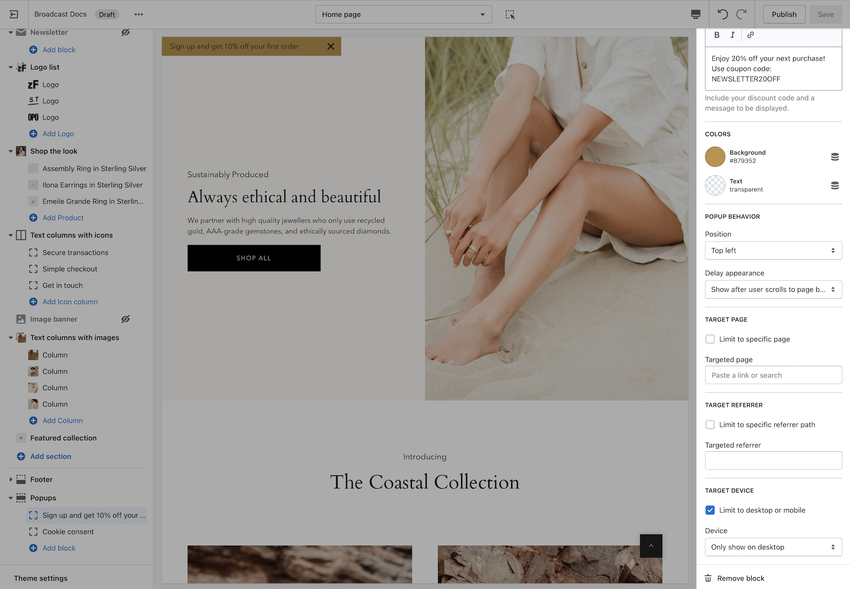
Popup Behavior and Target
Popup Behaviour
Popups can appear based on time or other behavior. Setting options include:
Popups can be positioned:
Creating page templates
Add additional page templates for each of your shop's pages
When using page templates with Shopify's Online Store 2.0, we recommend that you create a separate page template for each of your pages.
Page templates hold the content and settings of sections you've customized in the Theme editor.
If you create a second FAQ page and use the same template, all the same content will be shown from the first FAQ page.
For that reason, creating a new page template is needed to show different content.
Page templates
Using Page templates in Broadcast
Broadcast includes ready-to-use page templates for your store including:
About
Contact
<span style='color:var(---color-primary)'>►</span> Hurry, Only <strong>{{ inventory }}</strong> Left!
Modify swatches.json to include your color name and image
These sections can be placed on any page including:
Homepage
Product pages
Collection pages and Collection list
Blog index and Blog posts
Shopify pages
404 error page, Search page, Password page
Cart page
Section settings
To find the primary settings for each section, click on the section name to view the settings panel. These settings control
Choose from different settings to customize how the entire section looks and behaves
Wider desktops screens will display the settings panel on the right side of your screen:
Browsers 1600px and wider will place the settings on the right
Adding a section
Scroll towards the bottom, above Footer and Popups. Choose Add section:
Click on Show more to view additional sections
Navigate to any product page or choose the default product template. Use Add section located above Footer and Popups:
Click on Show more to view additional sections
When adding sections to the default product template, the sections and their content will appear on all your product pages.
To provide unique content for certain products, create a new template and assign a product to that template. All products using that template will have the same section content but will be different from the default template. Always create new templates on the live published theme for them to appear as options in your product setup.
Another method is to use Shopify's insert dynamic source option (metafields) to blocks and then customize content for each product in your product setup.
Navigate to any page on your site or choose any template from the top drop-down. Choose Add section, which is located above Footer and Popups on the left panel:
When adding a section to a certain template. The same content will appear on all pages that are also using that template.
You can create additional templates such as a new page template or collection template and then assign a page or collection to that new template. This will allow you to create multiple pages with different content.
Hiding a section
Use the eye icon next to the section title to toggle the display of the entire section:
Hide an entire section
Tip - Blocks have their own eye icon, be sure to select the section eye icon to toggle display of the entire section.
Reordering sections
Use the handle icon which is located next to the eye icon to drag a section and drop it in a new position:
Helpful when adding new sections as they appear at the bottom of your section list.
Sections contain content and settings. Experiment with different section types to add rich content on the homepage and all pages within your site. Use the settings to adjust behavior and layout.
The first step is to add or define a new product metafield. This is a custom metafield you'll create the Settings of your Shopify Admin.
Add a new product metafield
To set up a Cutline, you need to define (create) a new, custom, metafield definition that Broadcast can recognize.
The most important part is to use this namespace and key: theme.cutline
Verify the namespace and key are changed to theme.cutline
How to create the metafield
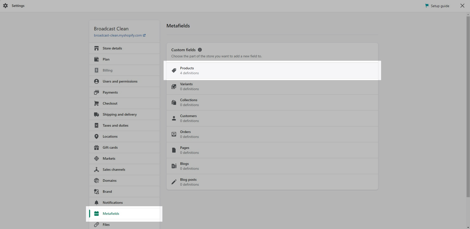
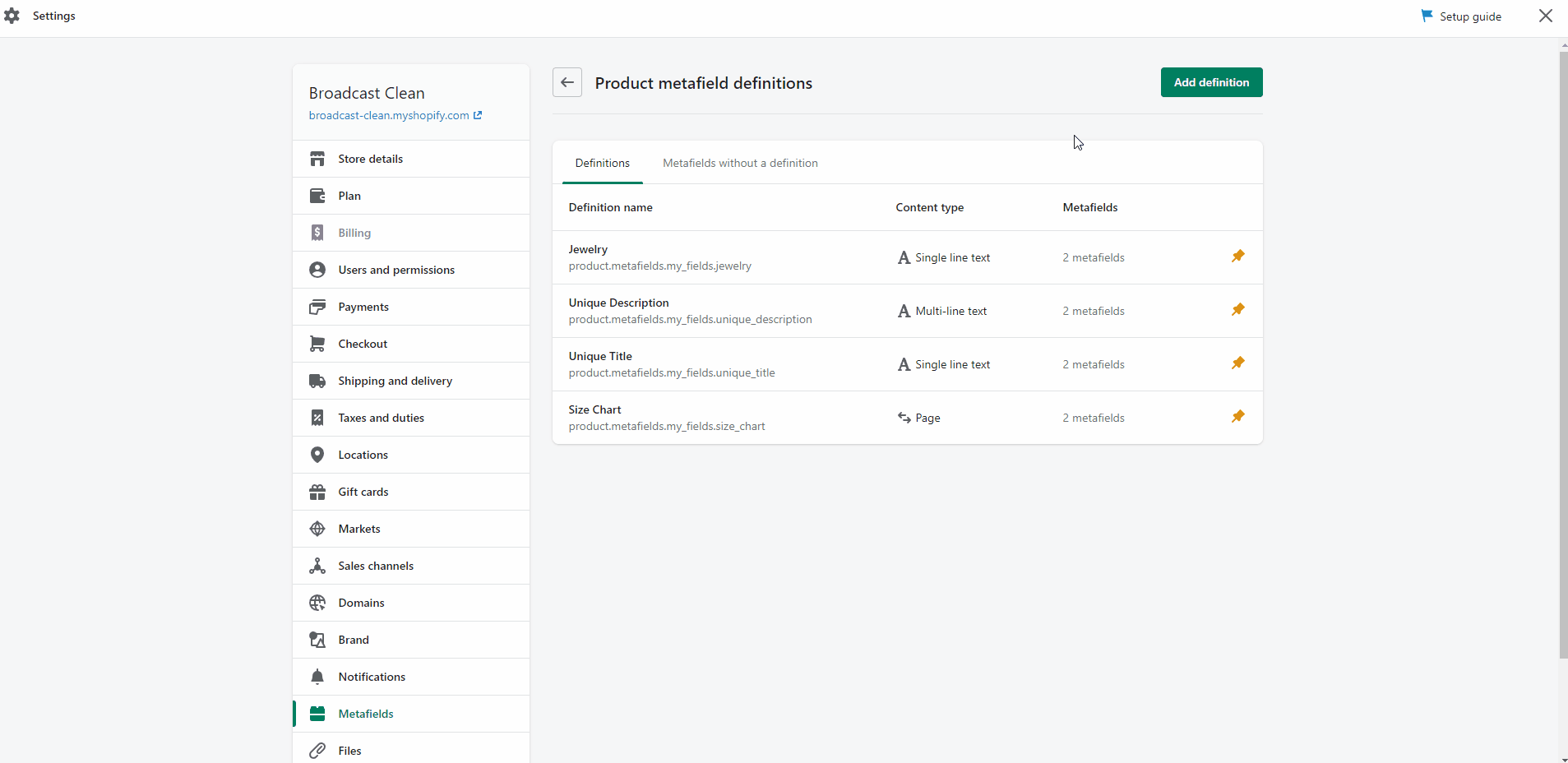
To start, navigate to your Shopify Admin -> Settings and choose Metafields from the left panel. Next, click on Products(click images to zoom):
Under 'Metafields', click on 'Products'
Click on the 'Add definition' button
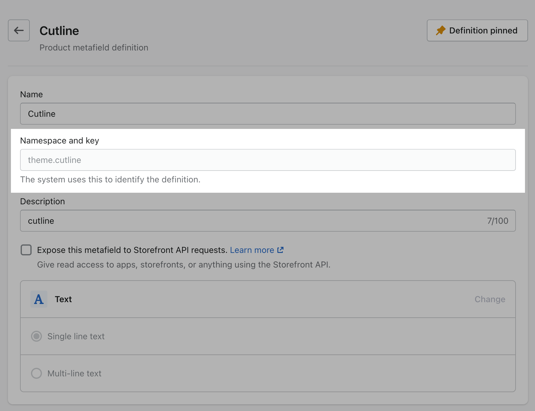
Click the Add definition button to begin. Choose a name, we'll use 'cutline'. Next, we will use a custom namespace. This is required.
A crucial step here is to change the default namespace (usually called 'custom') to theme
Namespace.key = theme.cutline
Add a description (this is optional) then choose Select content type. Next, choose Text and use Single line text and One value (it's the default option):
Your definition is ready, press the Save button to complete.
Product setup
Now that our custom metafield has been defined, the final step is to edit any of your products in the Shopify Admin -> Products and update the new cutline metafield.
All you need to do is scroll to the bottom of the product setup page and fill them in:
After adding the cutline metafield value, press the Save button to save the product changes.
Now you're ready to preview the cutline text. View on a collection page or any section that uses the product grid layout:
Preview your unique cutline text on a Collection page
Your cutline text will only appear for this product. You can now add unique cutline text to any product in your store.
If a product does not have the cutline metafield text information added, nothing will appear.
Only products with a value for the cutline metafield will display that information on a product-gird or collection page.
Add your unique cutline information for all/any products that require the cutline information displayed on collection pages and product-grid sections.
Cutline is a second line for additional information
Left
Right
Center
Popups can appear based on time or other behavior. Setting options include:
Show immediately
Show 10 seconds after page load
Show after the user scrolls to the page bottom
Show after the user has been idle for 1 minute
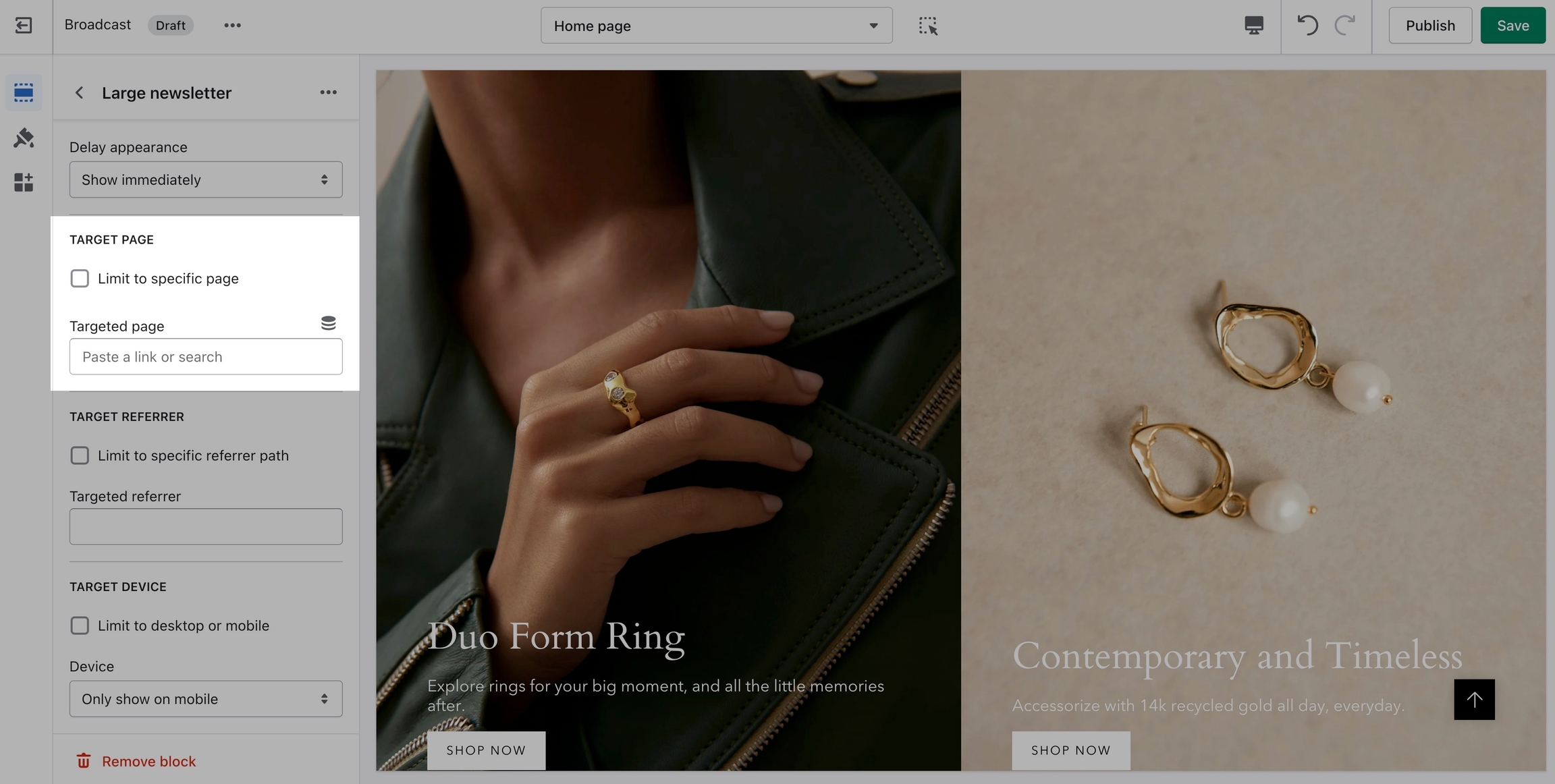
Target Page
Display a custom popup to your customers only when the customer is browsing a certain page, product, collection, or blog post on your site.
Target your message based on where customers are browsing your site:
Create different popups and messages for various pages of your site.
Target Referrer
Target a specific audience by using Target Referrer. Your popup will only appear when the customer arrives at your site from a certain path or location.
Enable when running a promotion on another site.
Use to provide a custom discount code to your customers when they arrive from a social media or other paid promotion.
Target Device
Create a custom popup for mobile devices and another popup for desktop browsers with Target Device. Each popup can be customized with different assets and messaging.
Enable custom popups for mobile and desktop.
When pages use the same template, the same section content is displayed on all those pages.
The Page section is the only exception as it displays the page title and page content from the Shopify Admin Page editor.
All other sections will display the same content when templates are shared.
Identifying if the same template is used with multiple pages:
We recommend using one template per page
How to create
Creating templates is simple, there is an option to create a new page template at the bottom of the Pages list:
Provide a name for the template and choose which template to base on
Verify you're customizing the Live theme when creating templates:
🚨 When creating a new Page template or any type of new template with Shopify Online Store 2.0, you must create the template while customizing your Live published theme.
If you're customizing a Draft theme, the template will not appear as an option in the Shopify Admin Page editor. This is a restriction of the Shopify Platform.
How to assign a page template
After creating a page template, return to the Shopify Admin Page editor and assign your page to the newly created template:
Under Theme template, choose a page template
After you've created a page template and then associated a page with that template, you can customize the page in the Theme editor.
Experiment with different sections and blocks to build rich custom pages with unique layouts.
Draft themes
If you're setting up a draft theme, here are some steps to help with creating new templates:
Create the new page template from the Live published theme using the Theme editor.
Assign your page to the newly created template in the Shopify Admin Page editor.
Return to the Draft theme in the Theme editor.
Create the same page template again as you did in the Live published theme. Your live theme version will not appear in the draft theme.
Configure the page settings and sections.
Video tutorial
This 1-minute video shows you how to create a new template and assign to a page, plus additional information:
FAQ
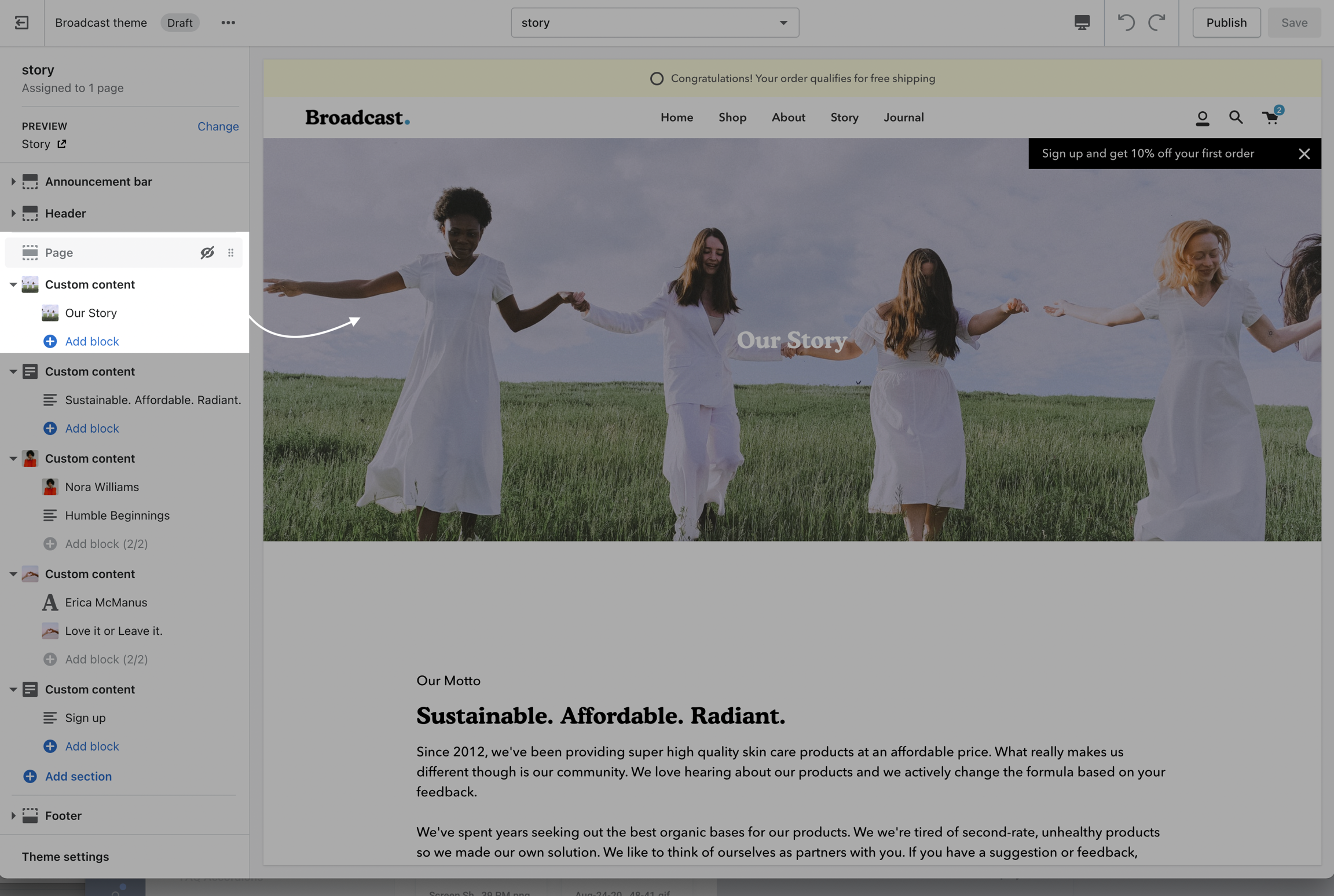
Story
Team
Default page
These templates make it easy for you to quickly add content and build out pages that add value to your customer experience and company branding.
How to use page templates
Creating a page
Pages are created in your Shopify Admin under Pages. Choose Add page to create a new page:
Give your page a title (required), the content is optional. Next, choose a Theme template to be used, also known as Page template:
Use the drop-down list to choose a template
Customizing pages
Using the Theme editor, you can customize the template that's been assigned to your page:
Choose under Pages
You can start customizing the page with the pre-defined sections included in Broadcast.
You can hide, reorder, remove sections that are included, and also add any new selection from Broadcast's list of over 25+ sections.
Learn more about using sections and blocks in Broadcast:
Cart icon shown as circle with number of items in cart
Cart icon style: Bag shown with items in cart indicator
Toggle off the Show icons option
Currency drop-down
Language drop-down
Customize the search to help customers find common items
Icon style: Modern
Icon style: Bold
The Namespace and key must be theme.badge
Theme Editor -> Theme settings -> PRODUCT GRID
Connect dynamic source
Choose brand colors
Brand color palettes in Shopify Admin -> Settings
Page content is hidden, Custom content is used as hero banner
Expand Collection products to add and configure Featured image
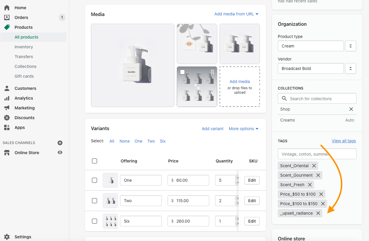
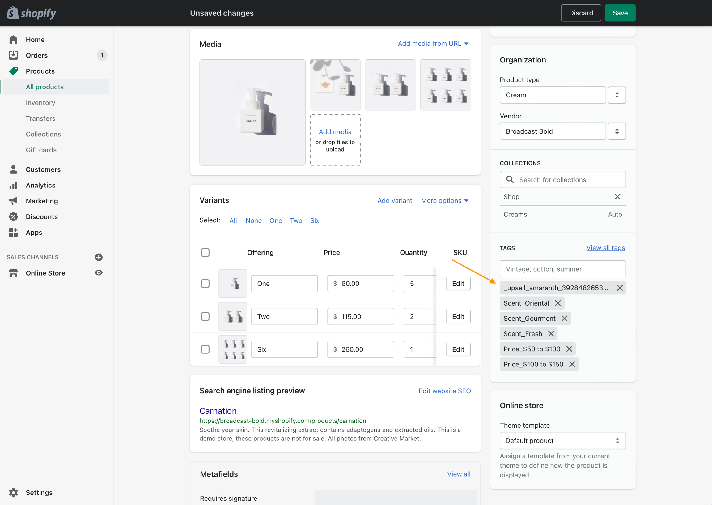
Upselling with tags
Broadcast includes a "Goes with" feature to help upsell products on individual product pages
This article is for Broadcast v3.0 to v3.3.1 only. Tags are not supported as of v3.4
With Broadcast, you can suggest a pairing product on any of your Product pages. This allows the customer to purchase two separate products within one product page.
Two upsell opportunities
One - Broadcast can suggest a product to pair with. The customer can choose the upsell product from the Cart after adding the primary product.
Two - Customer can add the upsell product to the Cart directly from the main product page and also add the primary product to Cart.
How to:
There are two steps involved with setting up upselling:
Add the Upsell theme block to the default product template
Tag your product with a custom upsell tag to pair/link with another product
1. Add the Upsell theme block to the default product template
Position the upsell promotion
Use drag-and-drop to position the upsell theme block on your product page:
2. Tag your product with a custom upsell tag to pair with another product
To pair a product with another, you simply add a tag to the main product with a custom tag. The tag links to the upsell product or links directly to a variant of the upsell product.
Here's an example of a primary product called Carnation. We'll add the custom upsell tag here. This tells Broadcast that when a customer is viewing the Carnation product, to suggest an upsell product as well. The upsell product is the custom tag (Radiance):
We simply add a tag called _upsell_radiance to Carnation which implies that Radiance is the product we want to promote on the Carnation page
Creating upsell tags
There are three parts to creating your custom upsell tags:
The first part of the tag must start with _upsell_
The second part of the tag must match the product handle of the upsell item
The last part is the variant id if your product has variants. This is only required for products with variants.
Example of a completed tag without variants: _upsell_radiance
Variants
Broadcast can suggest more than just an upsell product, Broadcast can suggest an exact variant of a product to upsell. This is can be helpful if you're trying to upsell a certain color, size, or weight of the product.
Example of a completed tag for a product that has variants: _upsell_amaranth_39284826538048
Finding the product handle
All Shopify products have a unique product handle. You can easily find the product handle in the main Shopify Admin under Products. Choose any product in your Shopify Admin for Products, then simply used the Edit website SEO link to view details about that product including the handle:
Use that product handle with the prefix of _upsell_ to make your upsell tag = _upsell_radiance
If your product has variants, simply add the variant id to the end of the custom upsell tag prefixed with an underscore. Example:
_upsell_handle_variantid
Finding the product variant id
All Shopify products with variants have a unique ID number associated with the product.
To find the variant id, browse the product in your Shopify Product Admin, choose the Edit button next to the desired variant, and find the variant id at the end of your browser URL address:
Let's put that all together:
In this example, we'll upsell a different product called, Amaranth. This product has variants. To make our correct custom upsell tag, we'll need:
Upsell tag prefix which is always: _upsell_
We'll need the product handle
Lastly, the variant id for the variant we will be upselling
First, we'll get the product handle:
The product handle is amaranth
Great, now let's get the variant id:
The variant id is: 39284826538048
Perfect, we now have everything we need to create our upsell tag:
_upsell_amaranth_39284826538048
Finally, let's add this to our primary product called Carnation product so we can upsell the Amaranth two-pack variant:
We can now view the product page for Carnation and see the upsell promotion:
Demo of adding both products to the cart:
Remember, only products with one or more variants require the variant id in the upsell tag. If your product has no variants like our Radiance example, you only need the prefix and handle
Cart upsell promotions are only supported when Cart Drawer is enabled in the Theme Settings.
Stacking upsell promotions
In the Cart, Broadcast can stack upsell promotions. If the upsell product itself has an upsell tag to another product, Broadcast will promote both in the cart if the buyer adds the first upsell item.
Example:
The primary product is Carnation. Carnation has an upsell product called Amaranth. Amaranth also has an upsell product called Radiance.
Changing the "Goes with" heading
The main heading for this block uses a translatable string:
To change this heading you can go into your Online Store > Themes and click on Actions > Edit Languages:
In the Products tab edit the 'Upsell title' field:
Save the changes and check your Product pages:
Product filtering
Collection filtering
Broadcast supports Shopify's Online Store 2.0 Product filtering for fast, customizable, and reliable collection filtering.
Click on Collection products for settings
How to setup
Setup with Broadcast is fast and simple. Using the Theme Editor, navigate to any collection page (or choose the default collection template) and click on Collection products to view the settings:
Steps:
Enable filters
Customize filter options and sort order
Filter layout options
Slide out
Slide out has a larger area and uses the entire height of the shopper's browser or device:
Inline (closed and open)
Inline places the filter tools within the collection area for both desktop and mobile.
When using Inline close, the customer can click or tap on the filter link to open, the product grid becomes smaller as the filter tools animate open.
Part 2 - Shopify Search and Discover App
The rest is all done using the Shopify Search and Discover app. Using the app, you can customize which filter options to display and sort the order.
Watch this quick video on how to customize the filter options:
Where to download the Shopify Search and Discover app:
Click to view more information on changing the button label
    {
      "Stripes": "stripes.jpg"
    },
    {
      "Light Navy": "light_navy.png"
    },
Tip: Watch the video at 1.2X or 1.5X speed, slow down when needed.
Experiment with creating and customizing new templates in the Theme Editor. As a second step, remember to assign that template to a certain page or collection.
For example, create a new collection template to display a different layout and include different sections. Then in the Shopify Admin under Products -> Collections, choose your collection and assign the newly created template to that collection.
🚨 Important tip: New templates must be created on the published theme. They will not appear as a template option for assignments if created in a draft theme. This is a Shopify Platform restriction. Always make new templates on the live published theme.
Click on Show more to view additional sections
Paired with product appears as an option in the cart
Custom _upsell_radiance tag added
Product handle is: radiance
Variant ID is the last number in your browser's address bar
Product handle is found under Edit website SEO at the bottom
Amaranth Two pack variant is promoted as the upsell option
Correct variant option is added to cart
Stacked upsell promotions
Click on Collection products to view settings
Slide out - Desktop
Slide out - Mobile
Inline closed - Desktop
Inline open and closed - Mobile
Coupon codes
How to send a coupon code after signing up for a newsletter
When using the newsletter popups in Broadcast, a coupon code can be displayed for your customer after they successfully enter their email address:
Large newsletter:
Success message with coupon code appears after sign-up
Small newsletter:
Small newsletter replaces original message with success message
How to setup
There are two newsletter styles in Broadcast.
A Large newsletter block which uses a modal window popup and has the ability to show an image or a Small newsletter block which is a minimal design and retains sticky.
We will cover the steps for both below.
Large newsletter
The Large newsletter uses the Language editor to manage the success message. This is especially helpful if your store is supporting multiple languages.
Steps:
In the Theme Editor, add the Large newsletter block under Popups:
Configure the block settings to design your newsletter popup:
To configure the success message and include the Coupon Code, use the Language editor (Edit languages).
You can open the Language Editor by clicking on the 3-dot ellipsis icon at the top of Theme Editor:
In the Language Editor, type-in newsletter in the filter/search box and find this section:
Here you can customize the success message and include your Coupon Code.
if you use the <span>Coupon Code</span> format, the information inside the span tags will be styled to highlight the code in your message:
Small newsletter
The smaller newsletter uses very little space on the screen and can be positioned in various locations on the screen. The success message is configured right in the block settings.
Steps:
In the Theme Editor, add the Small newsletter block under Popups:
In the block settings, add the initial text that will be displayed to your customer under Heading. Then add the coupon code under Success message:
Use the additional settings to customize the look and behavior of the popup:
Order of action
The Heading text is displayed first:
Customers can click on the popup and enter their email address:
A Success message is displayed afterwards:
Customers can copy the instant Coupon Code for immediate or future use based on the type of coupon code you've created.
More tips on adding custom images
Bottom of the Theme Editor
Open the Language Editor to edit the Success message
Thank . you with code html
The <span> tags will style your code with a dashed outline

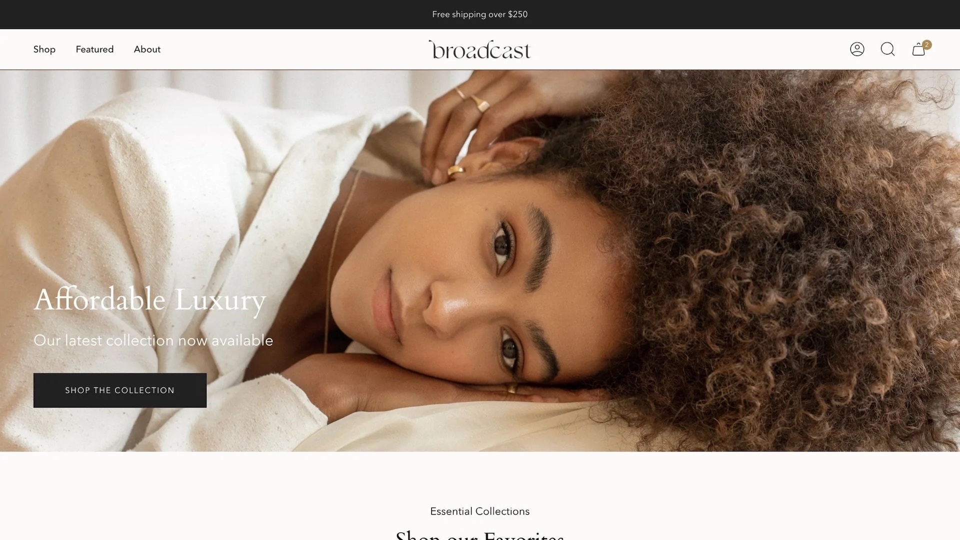


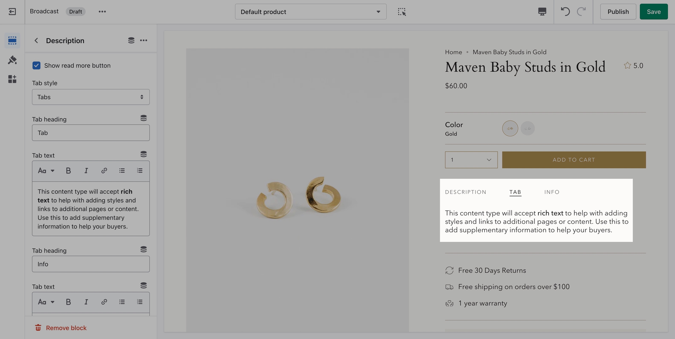


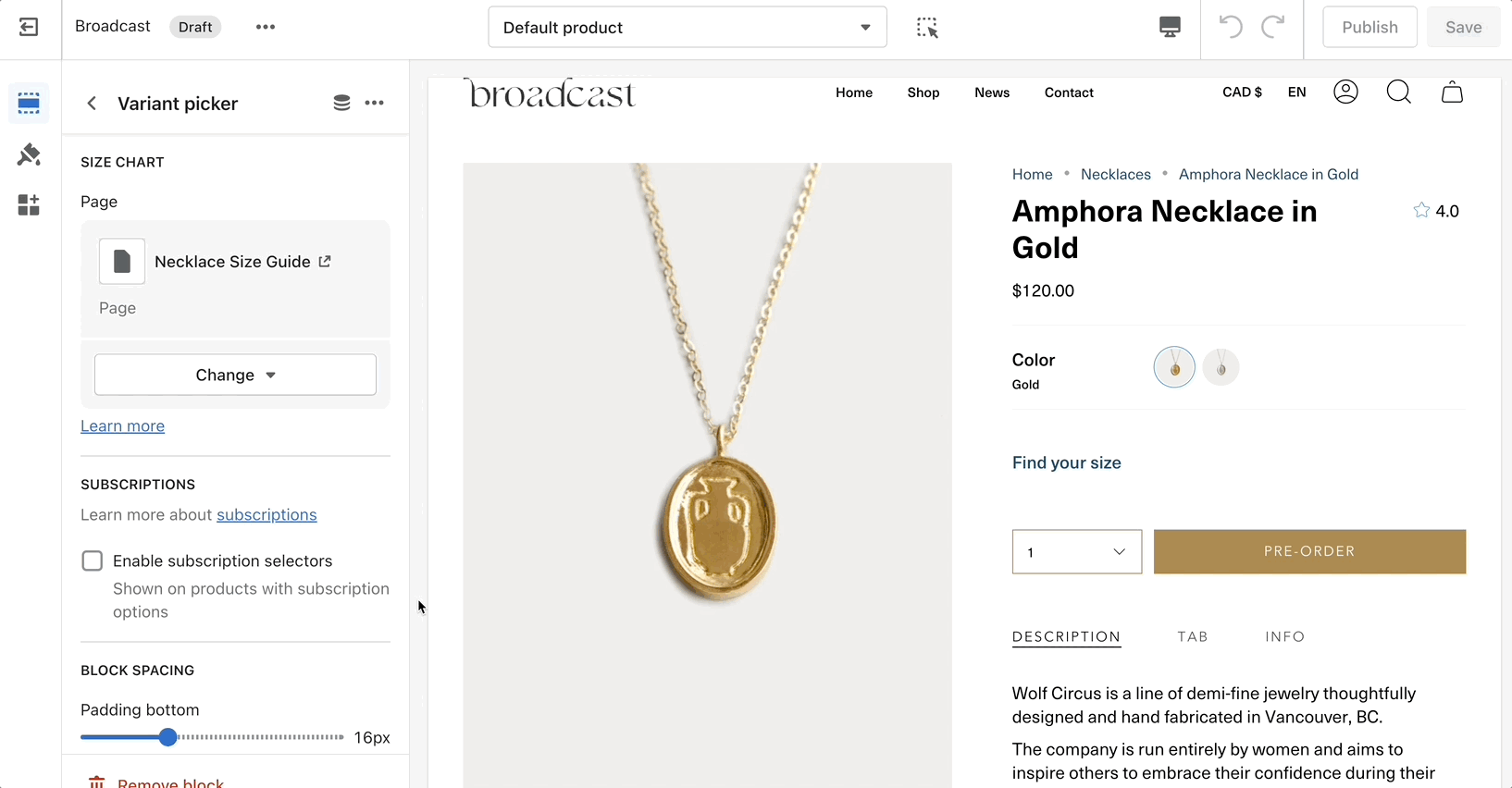


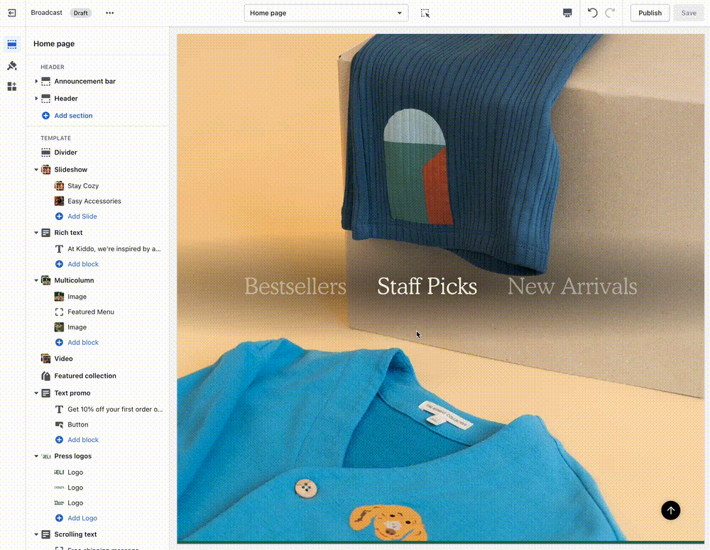
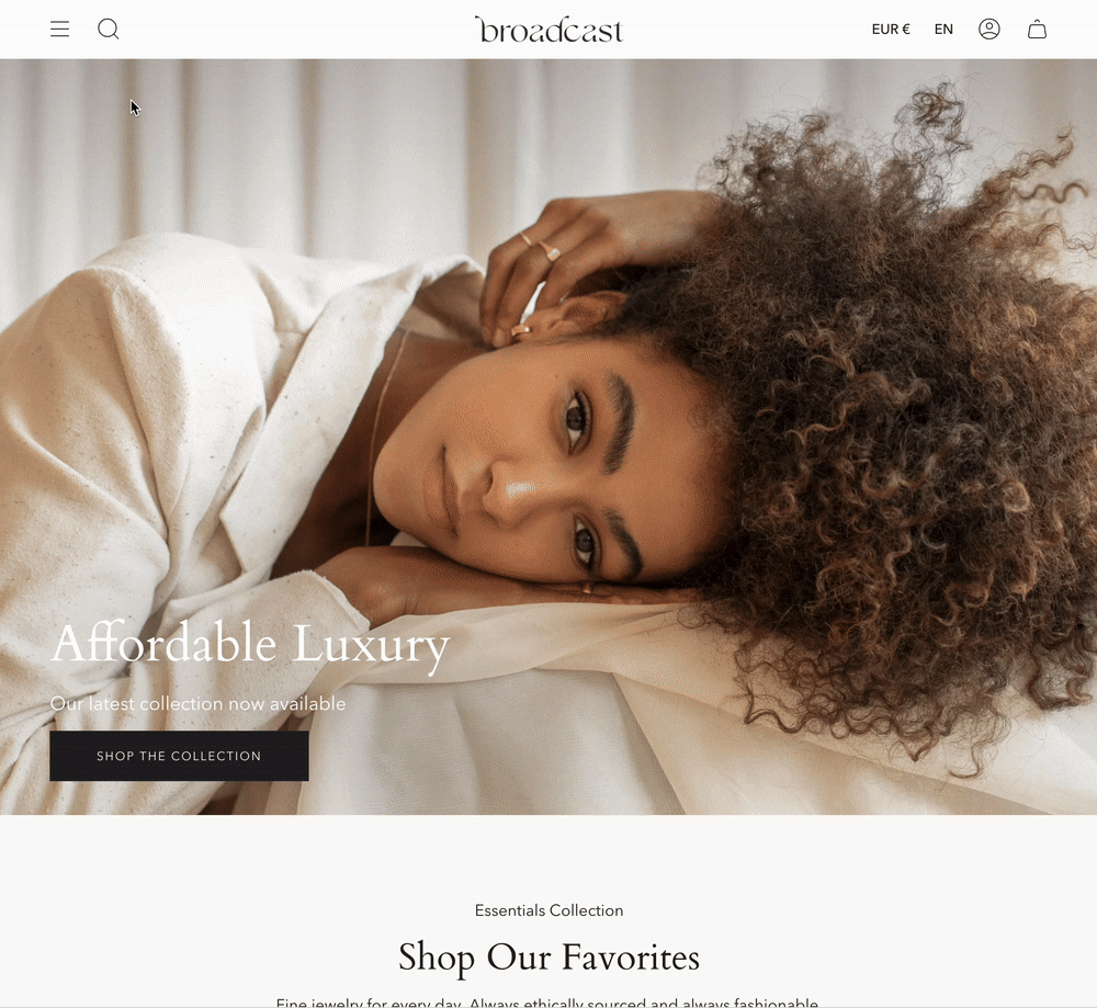
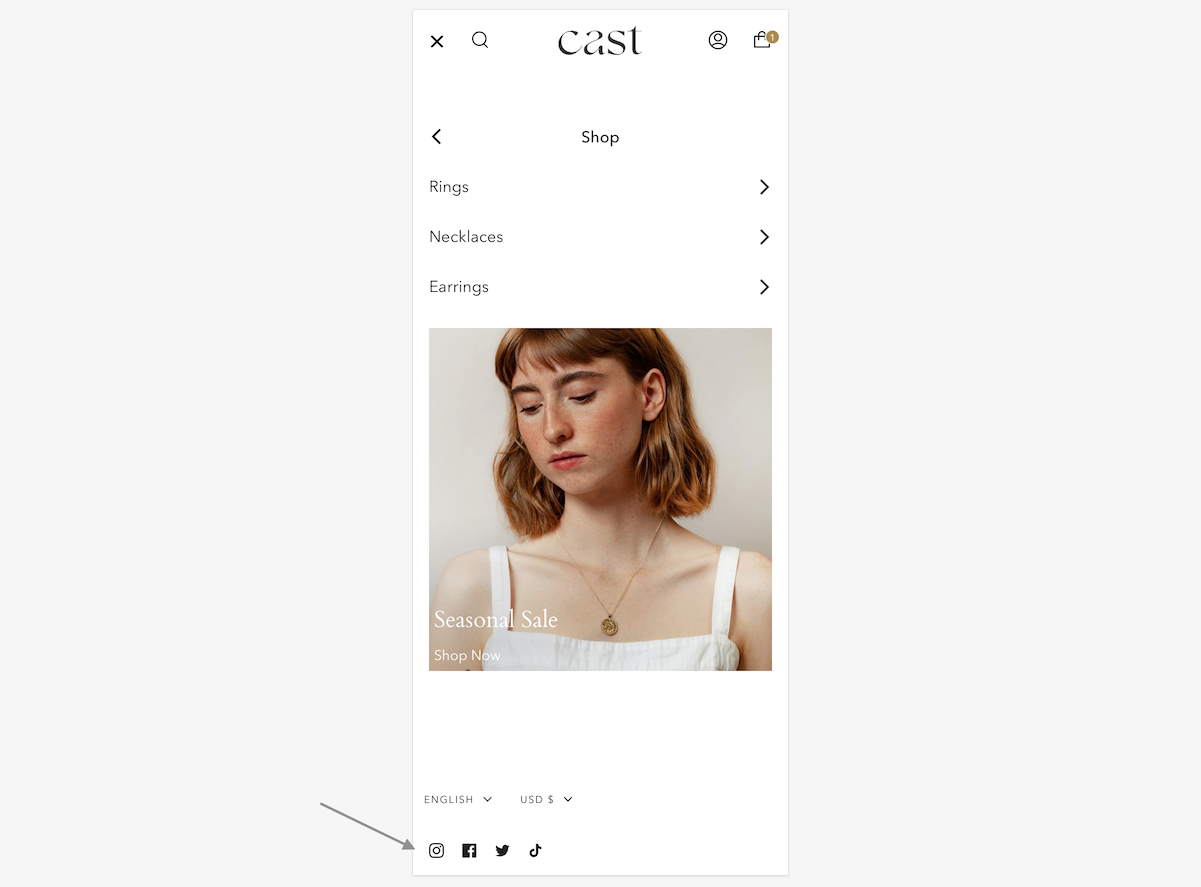
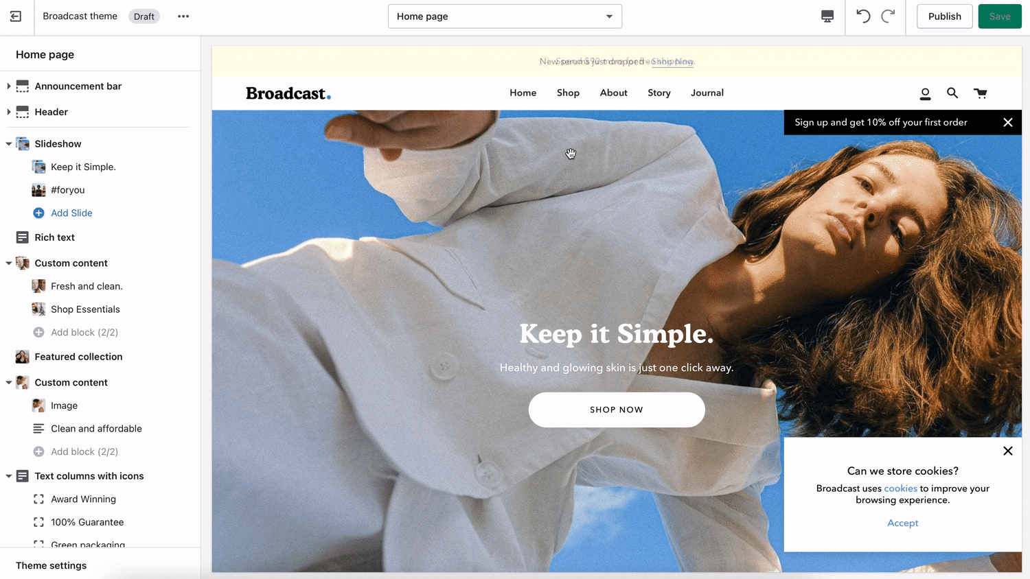


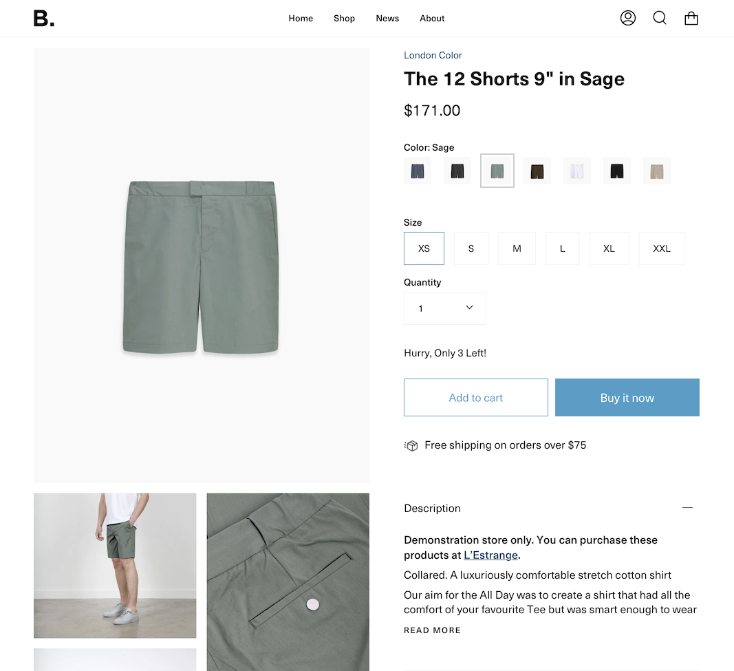
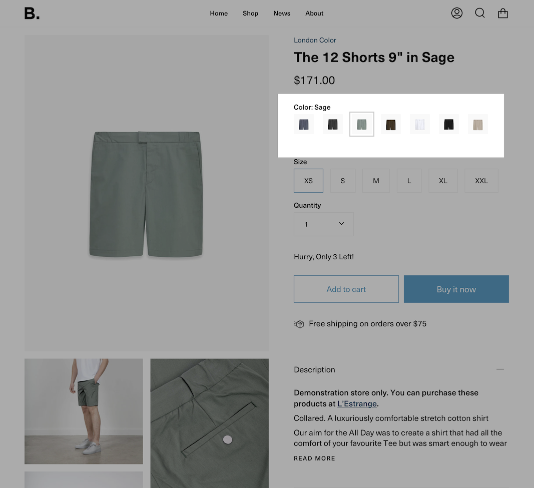


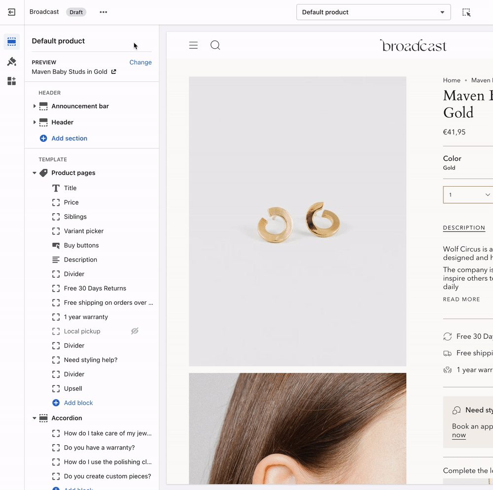
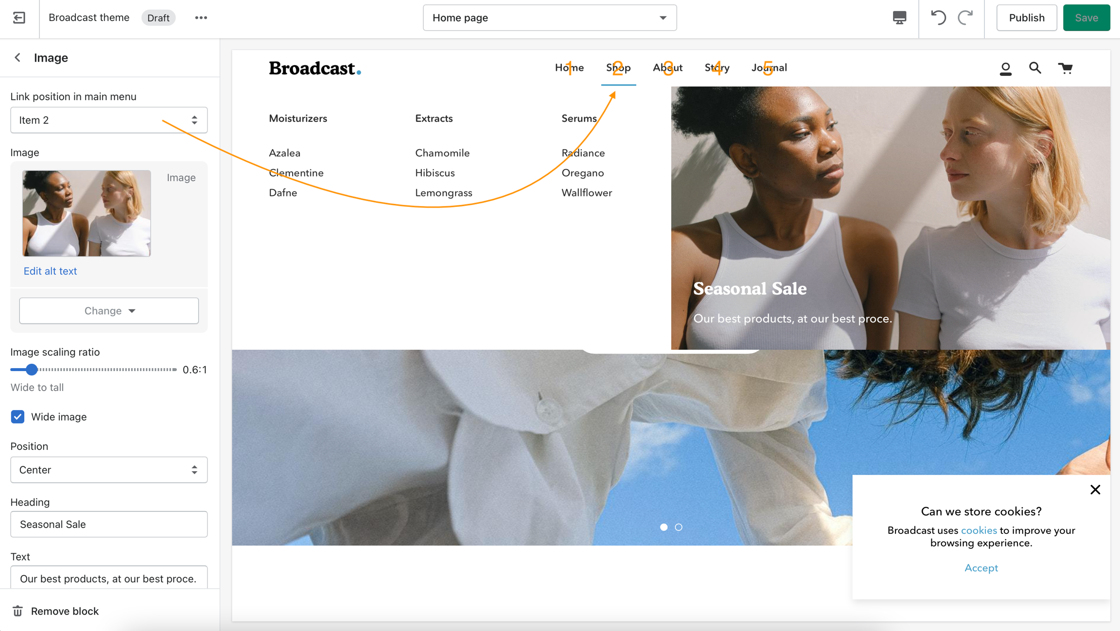
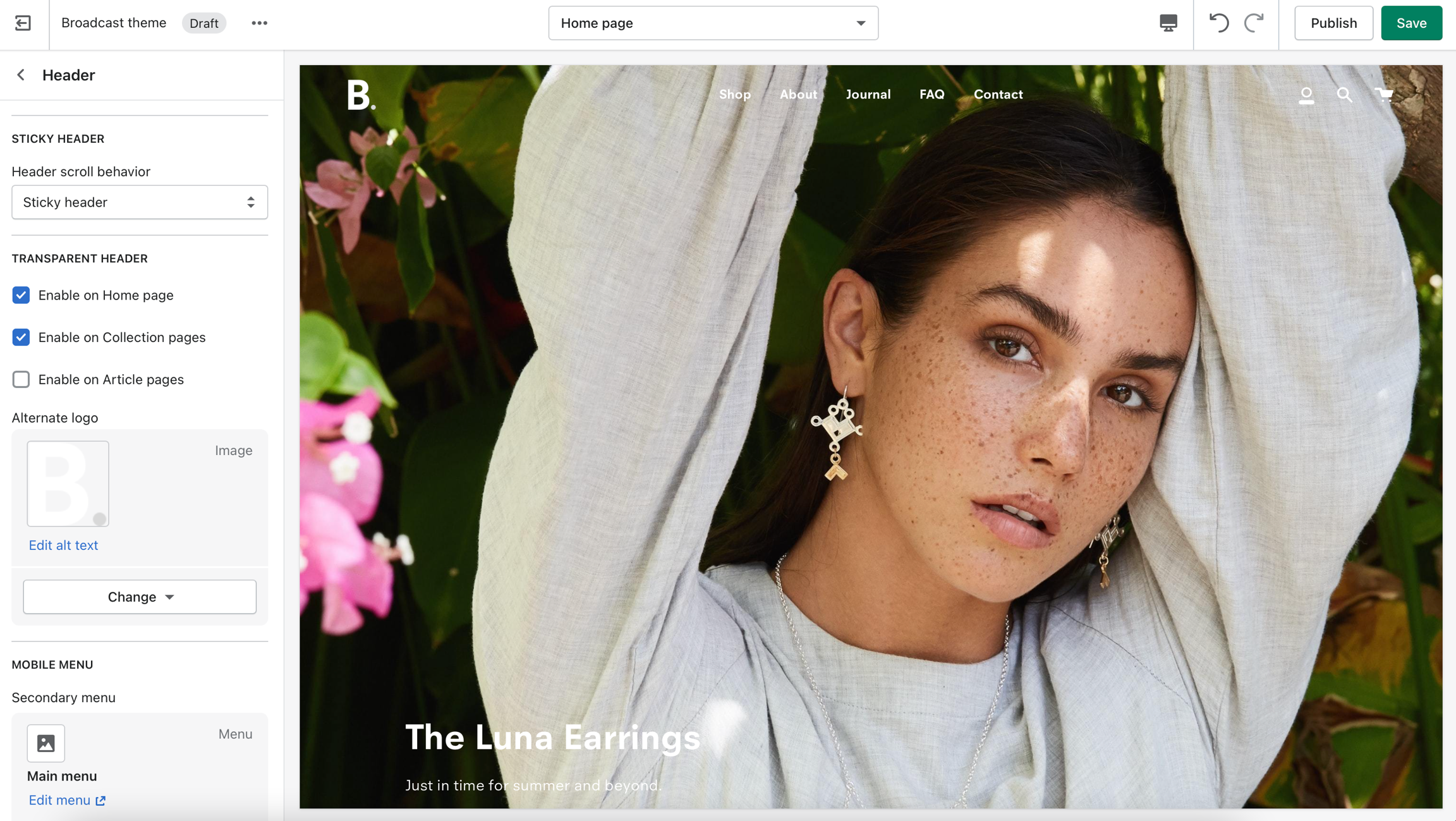
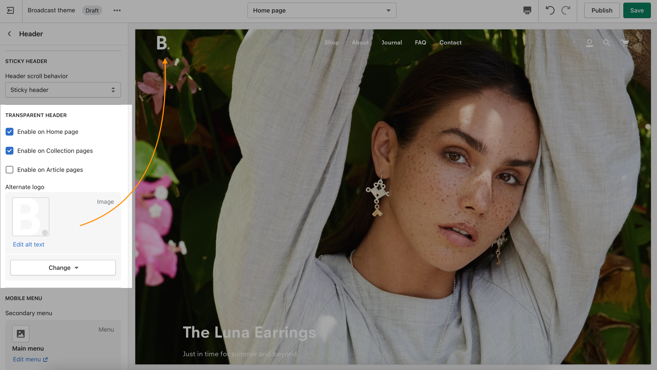
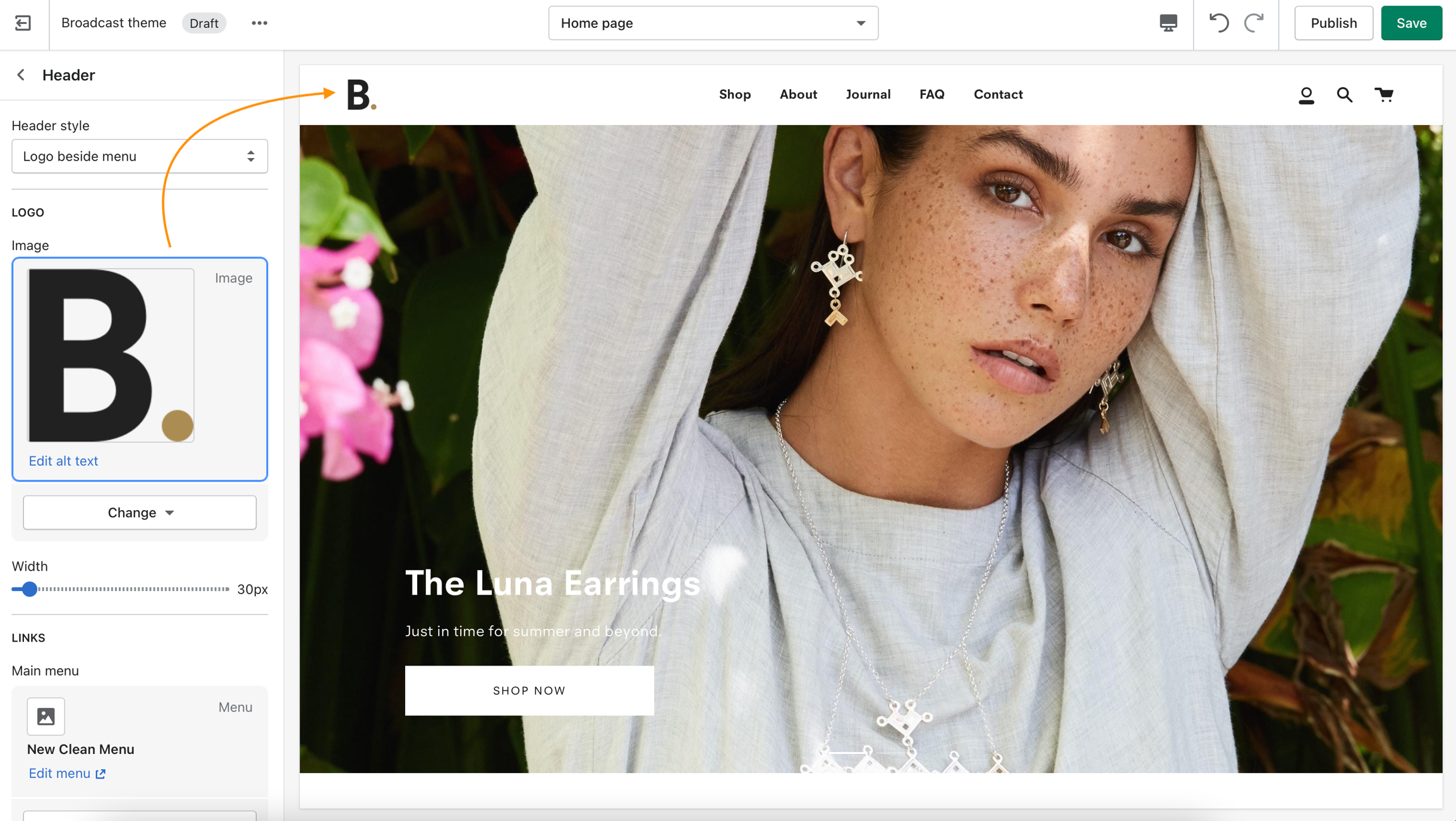


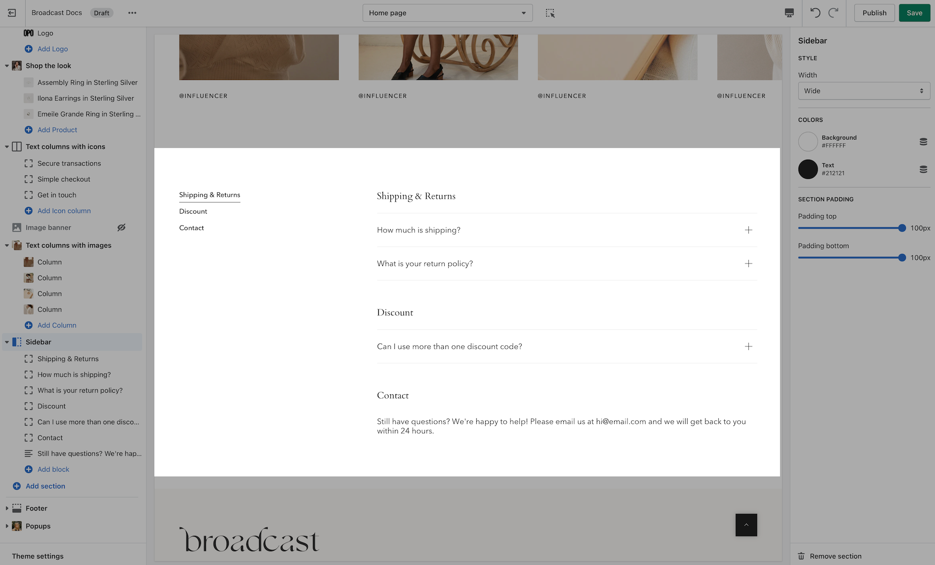
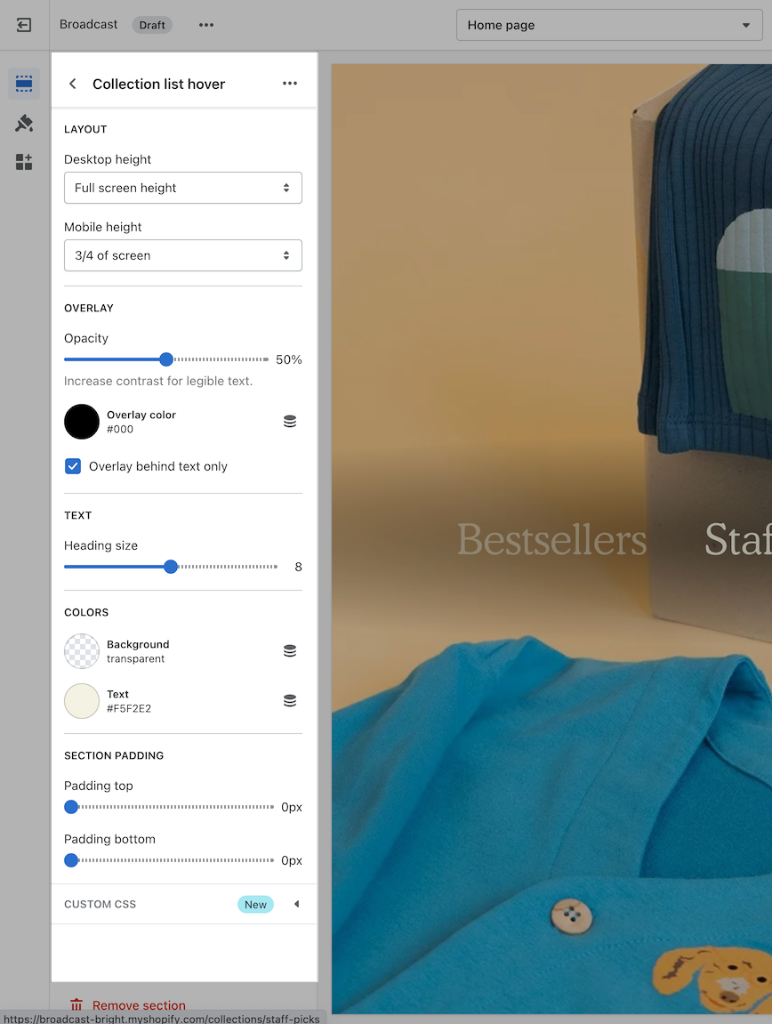
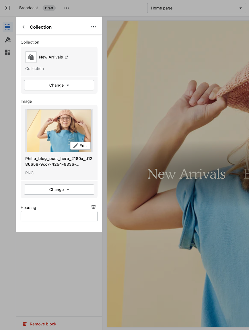
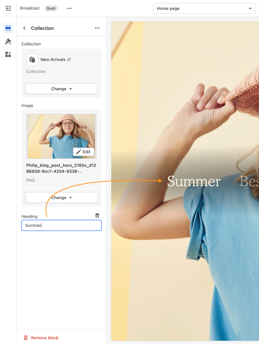
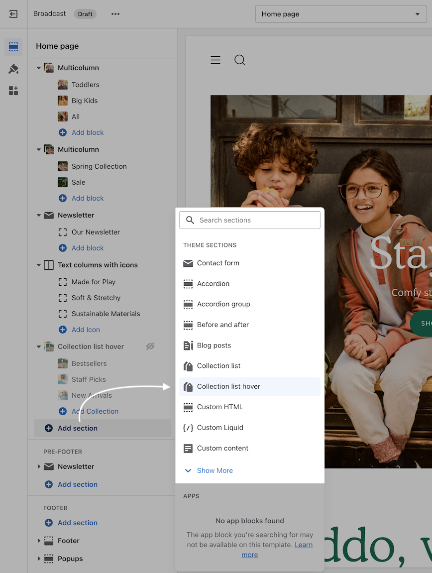
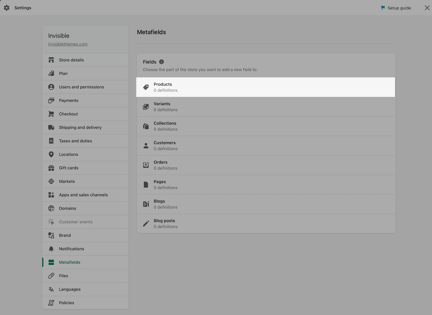
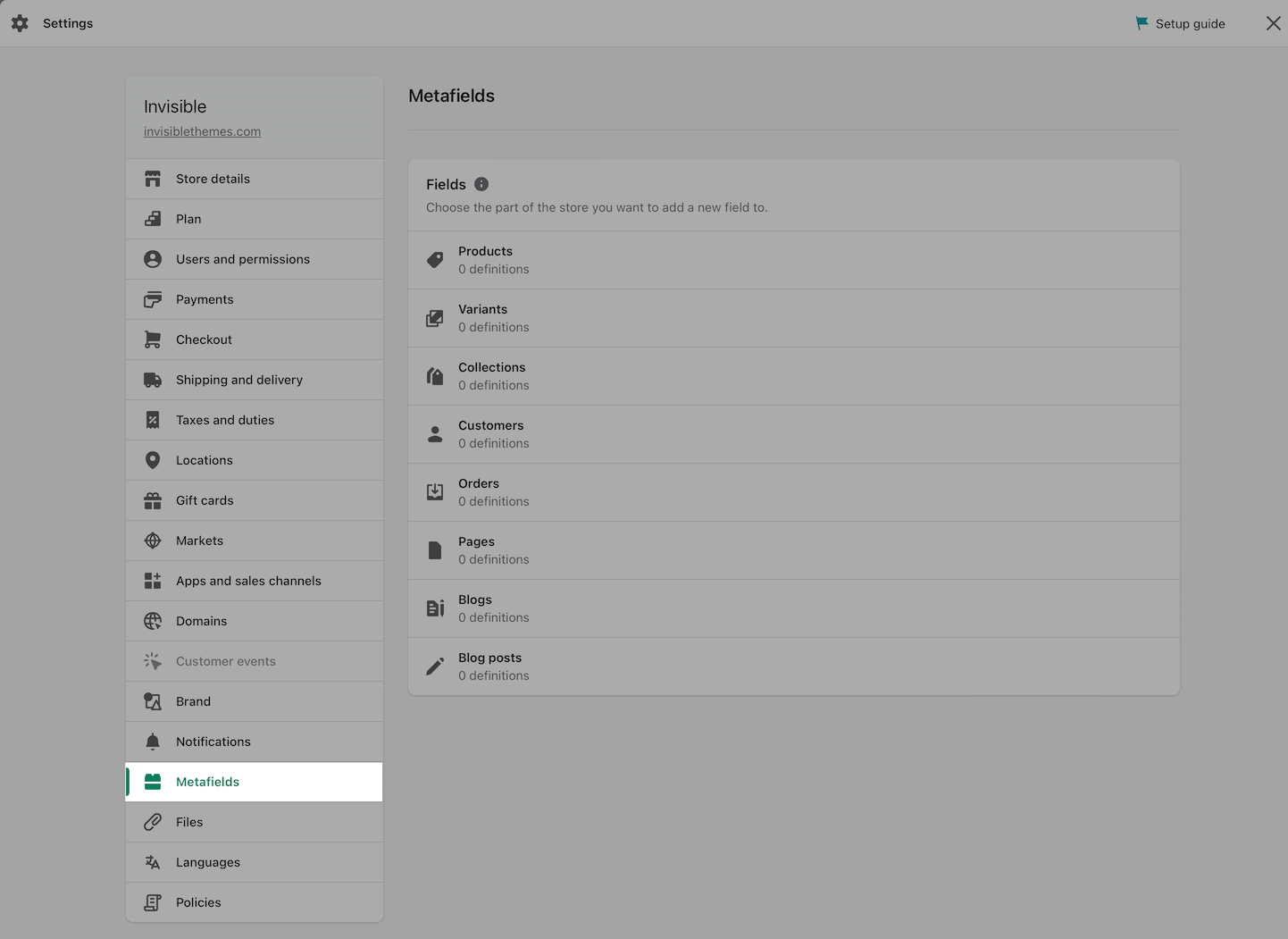


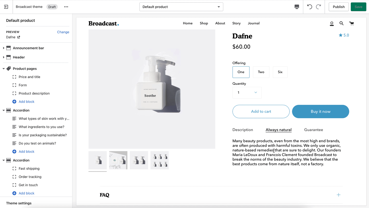
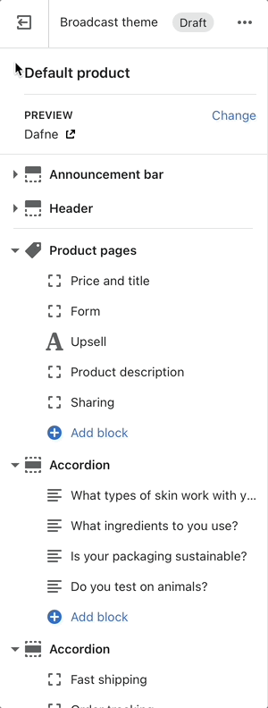
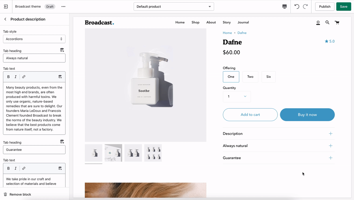
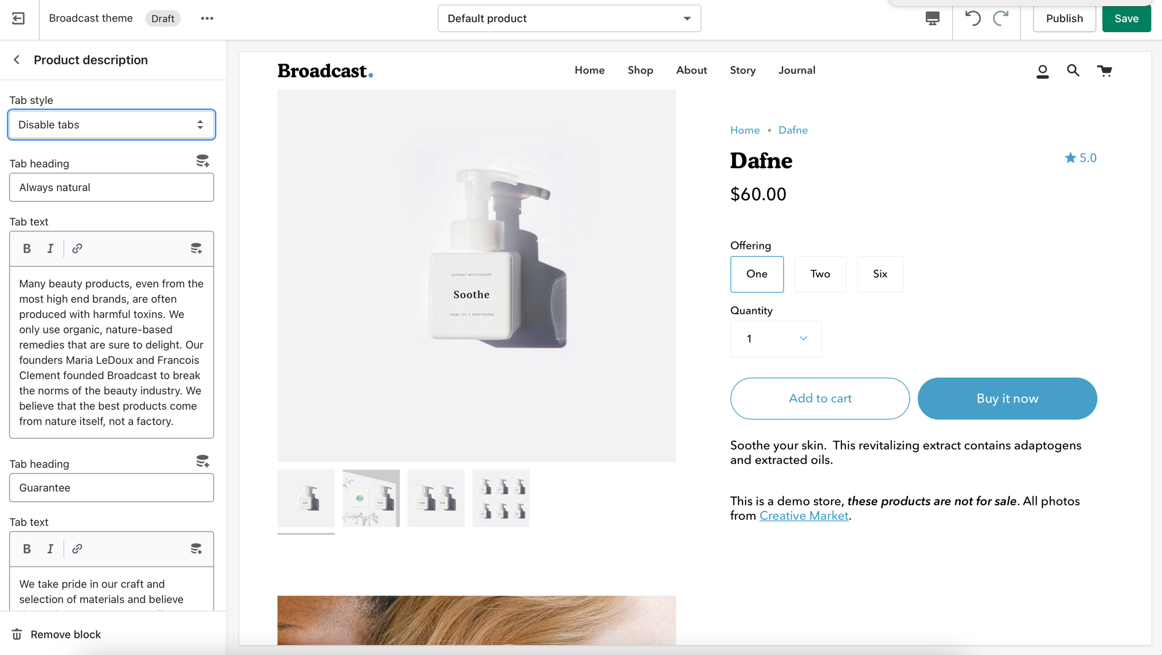
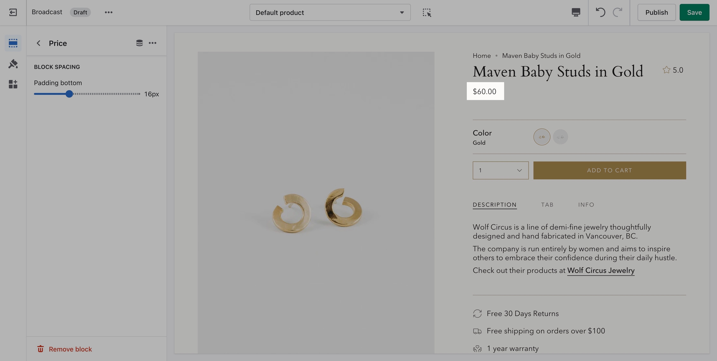
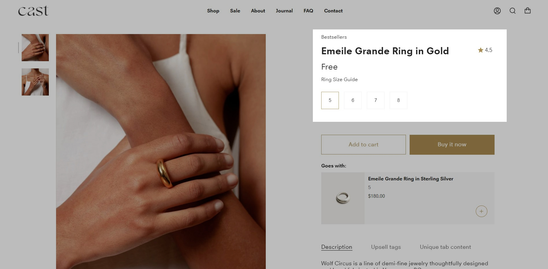
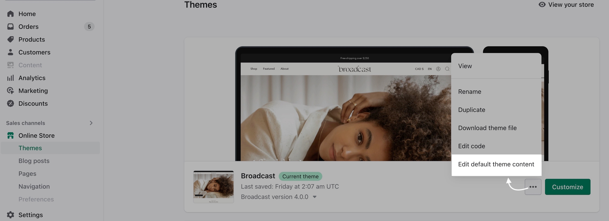
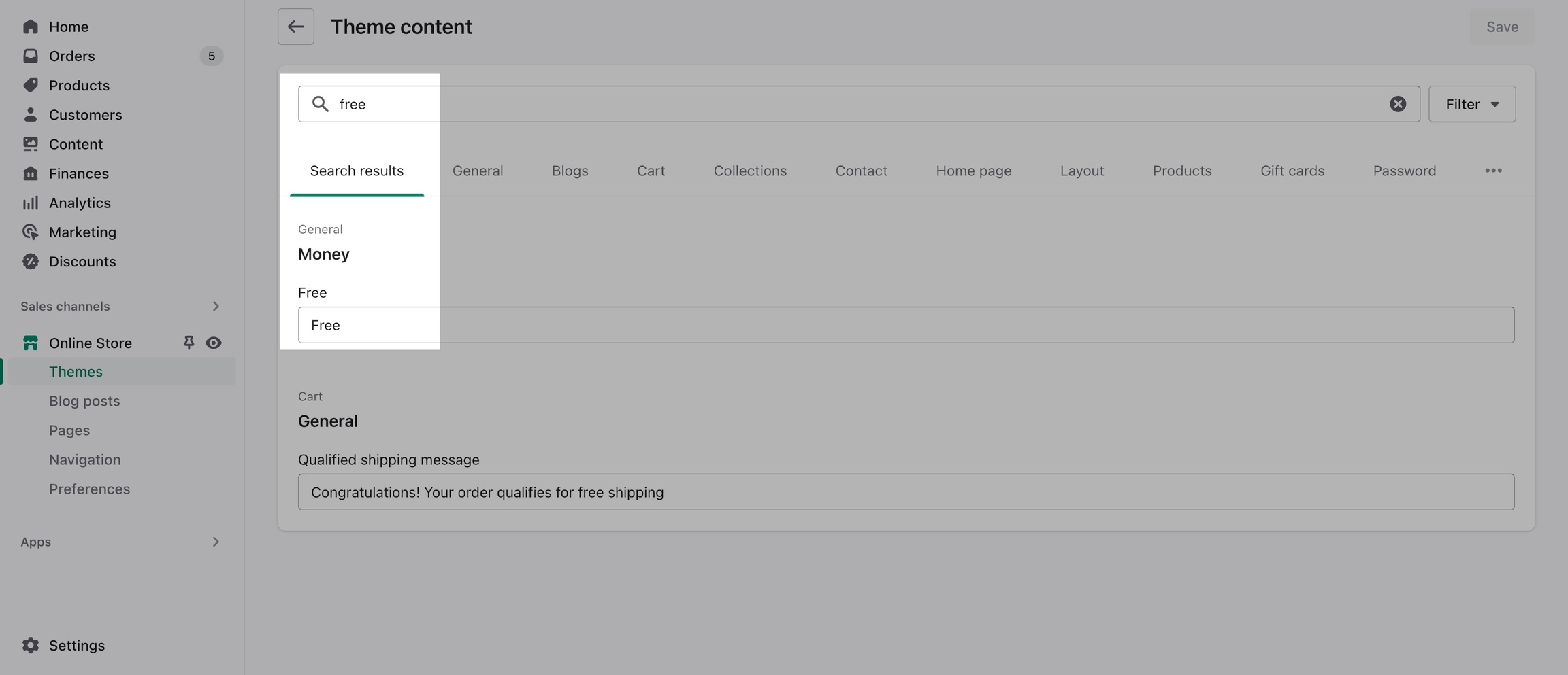
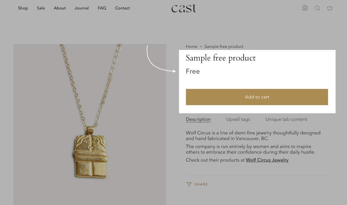
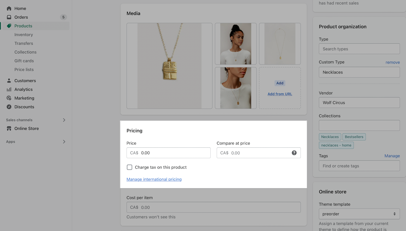
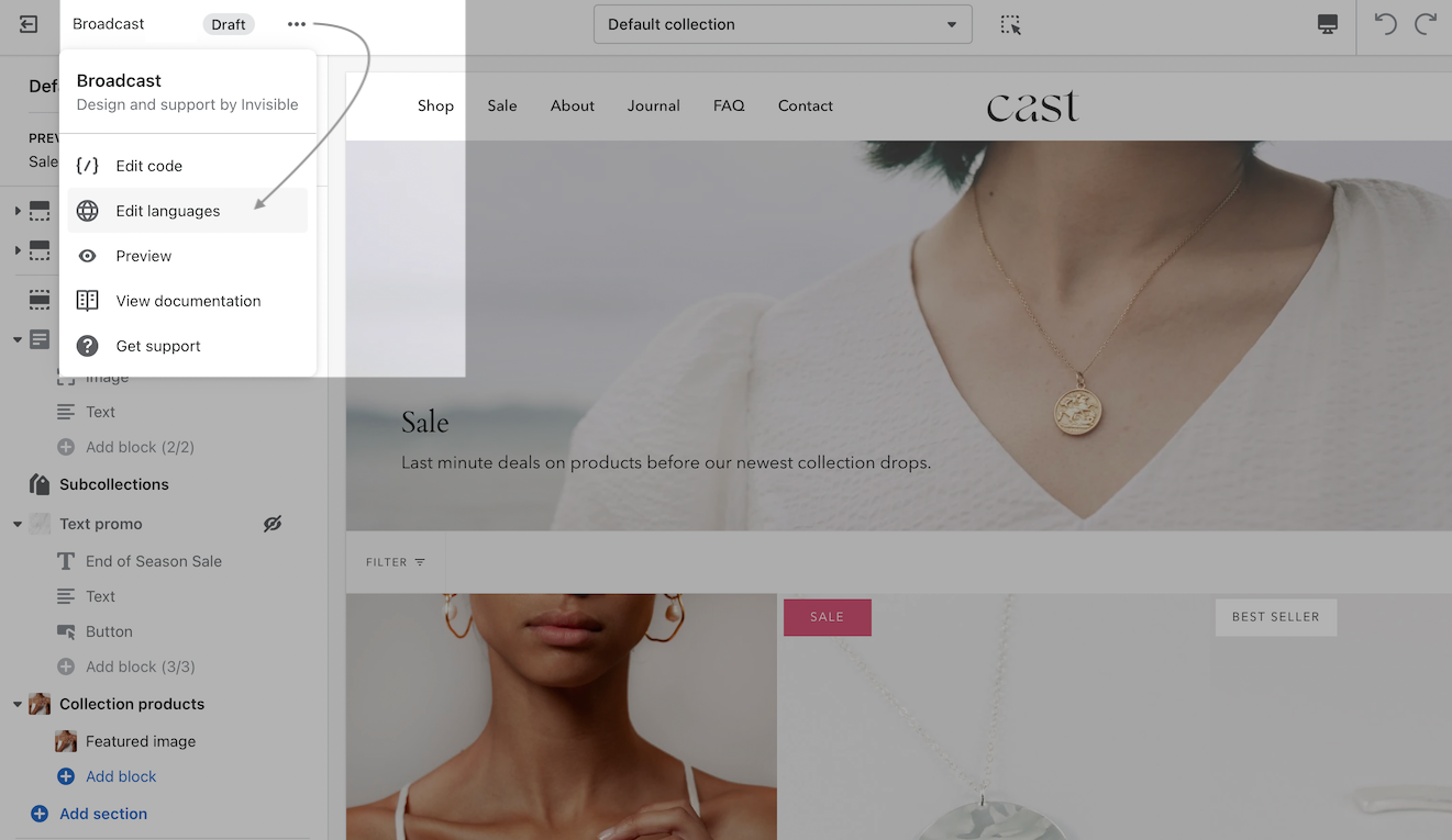

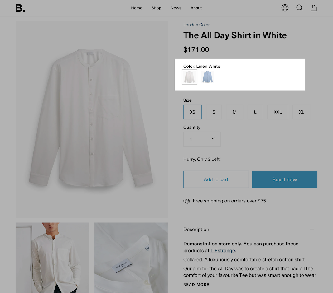
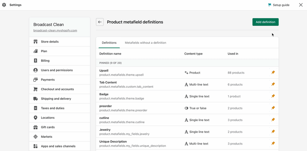
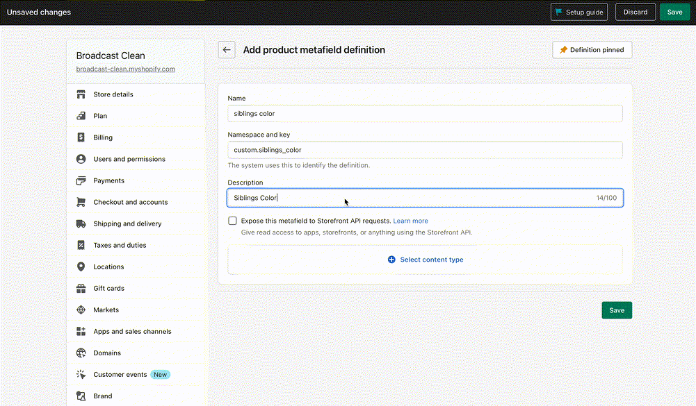
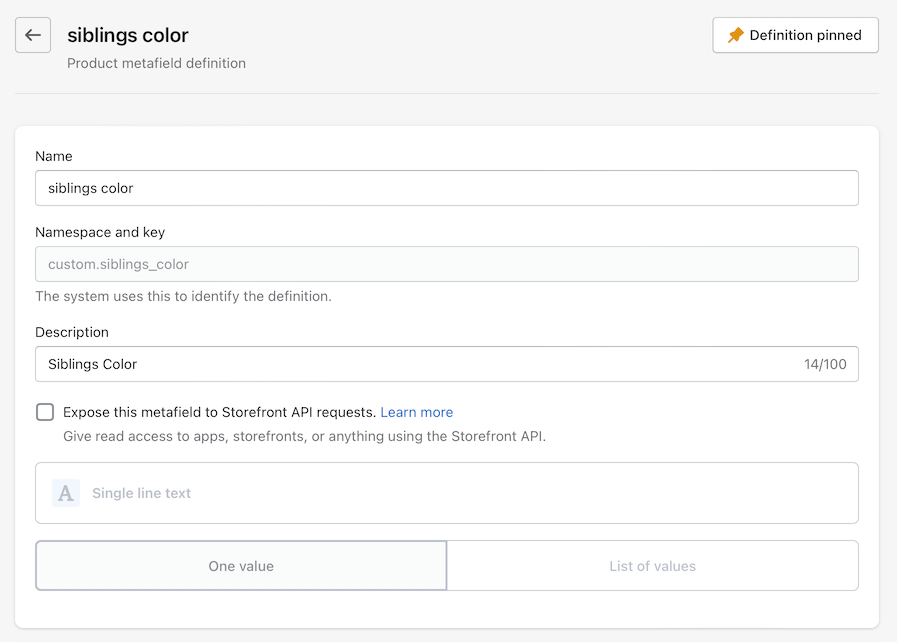

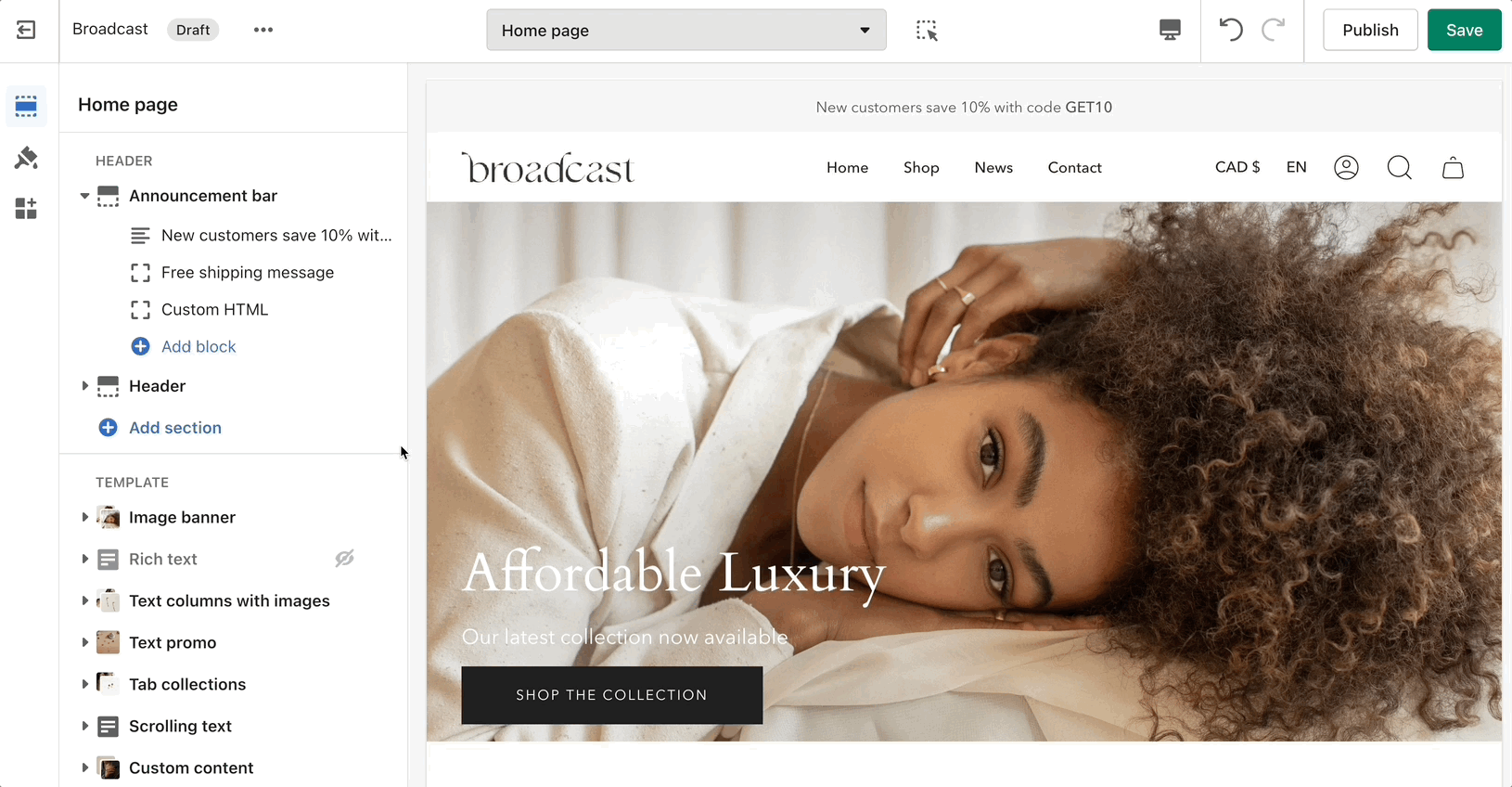

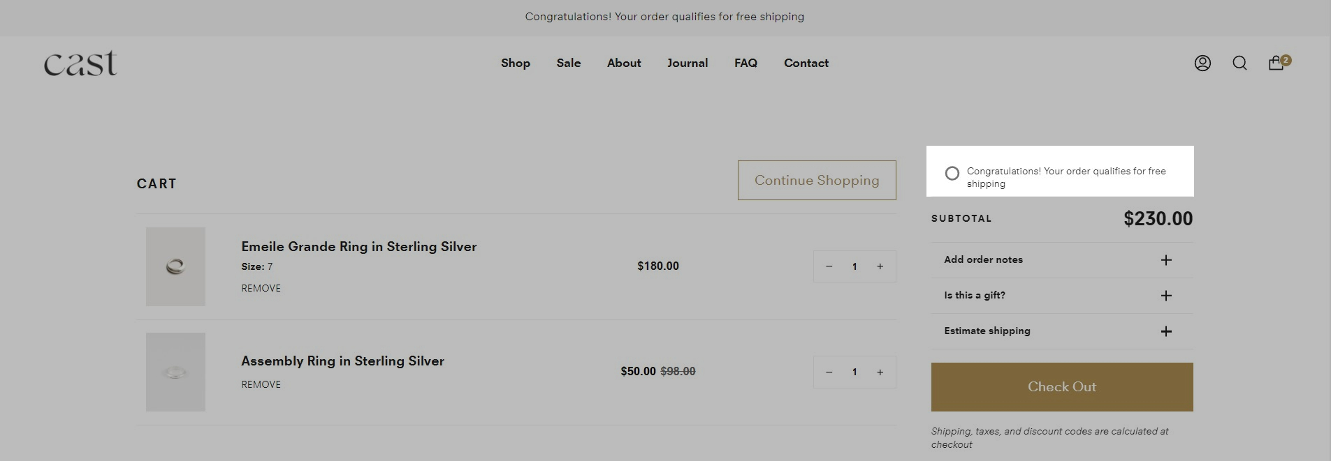
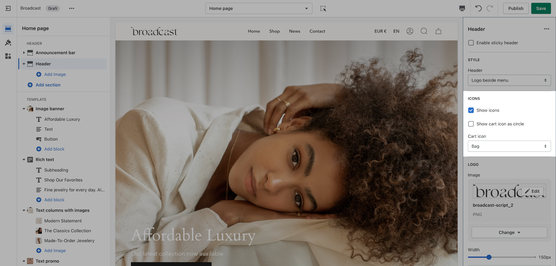
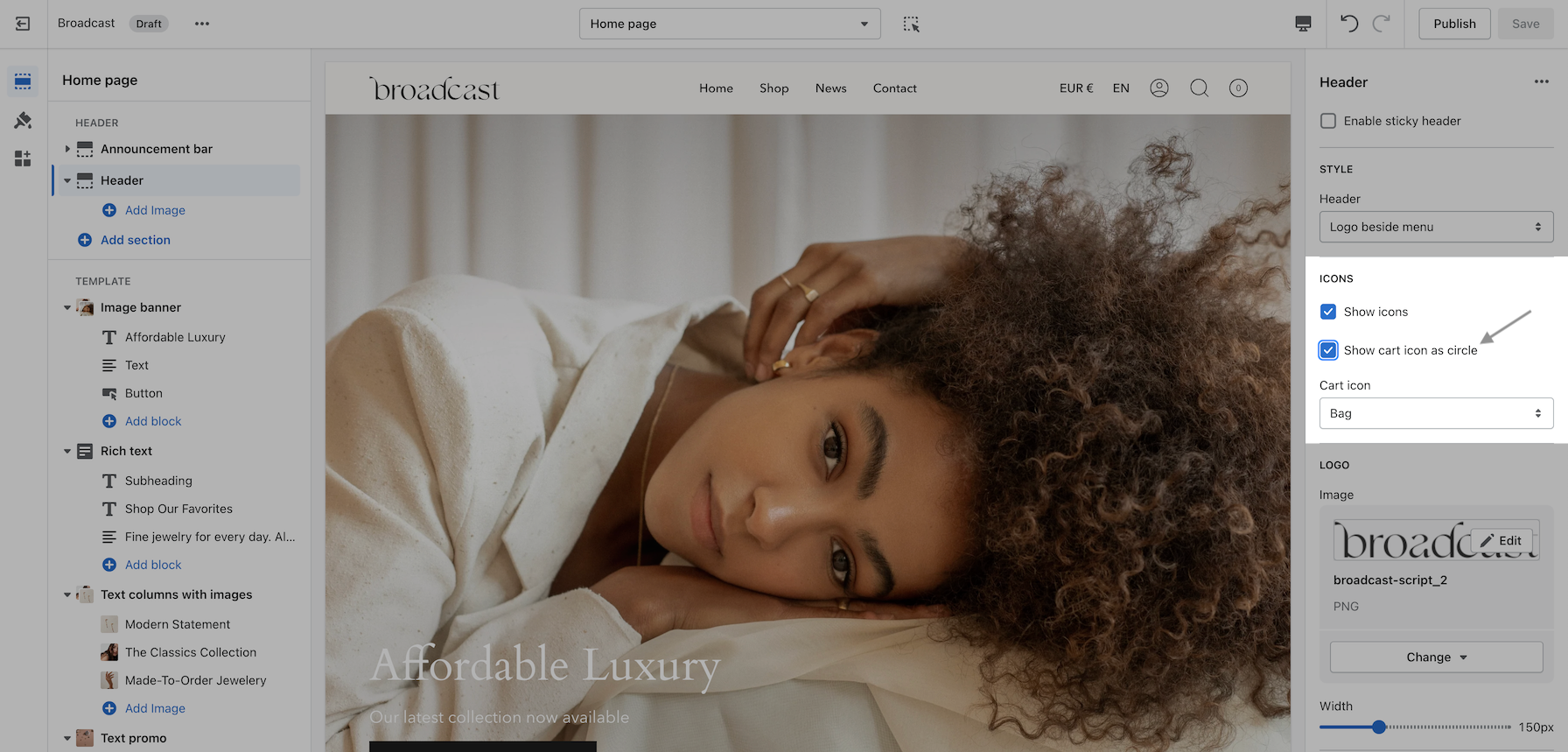


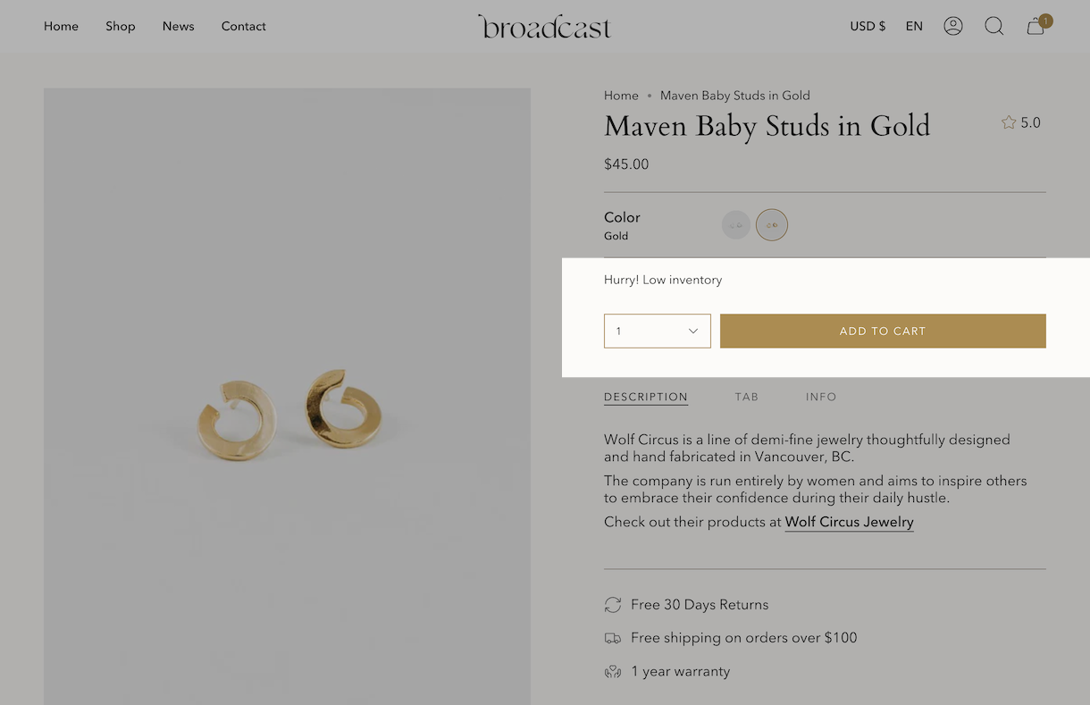
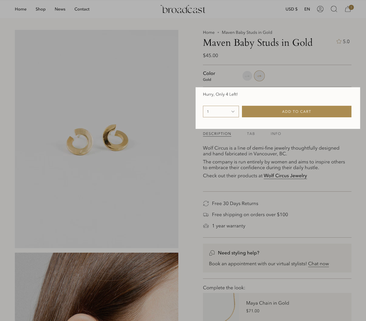
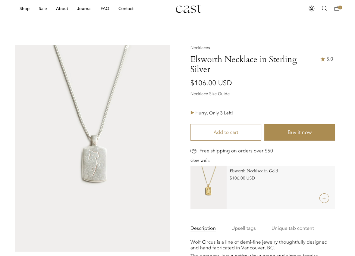
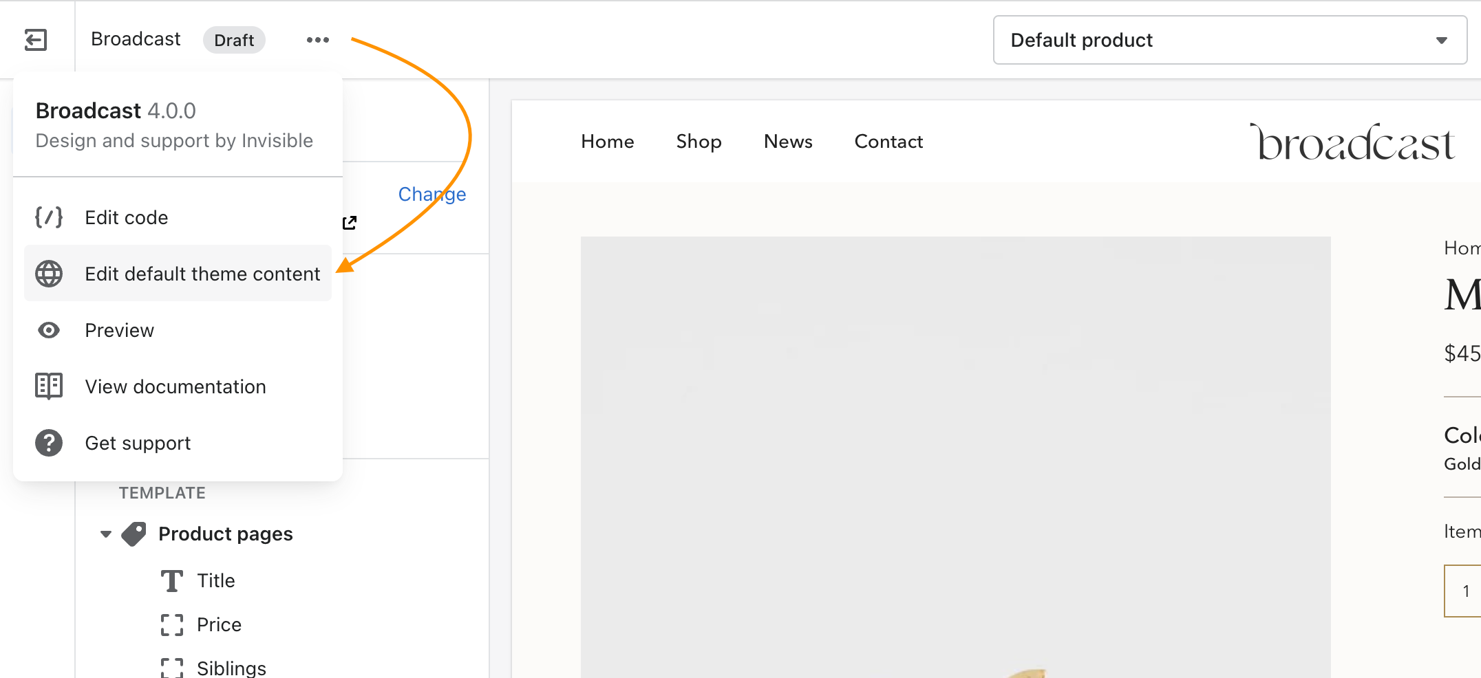
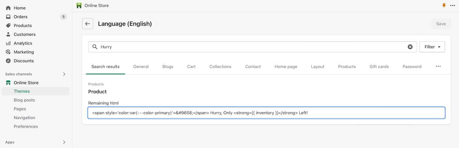
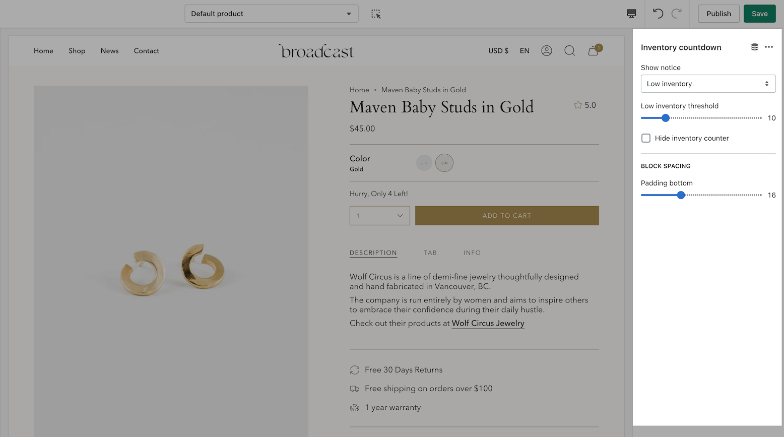
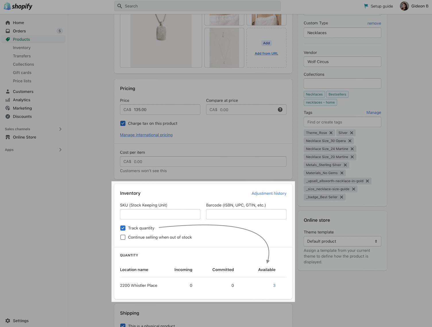
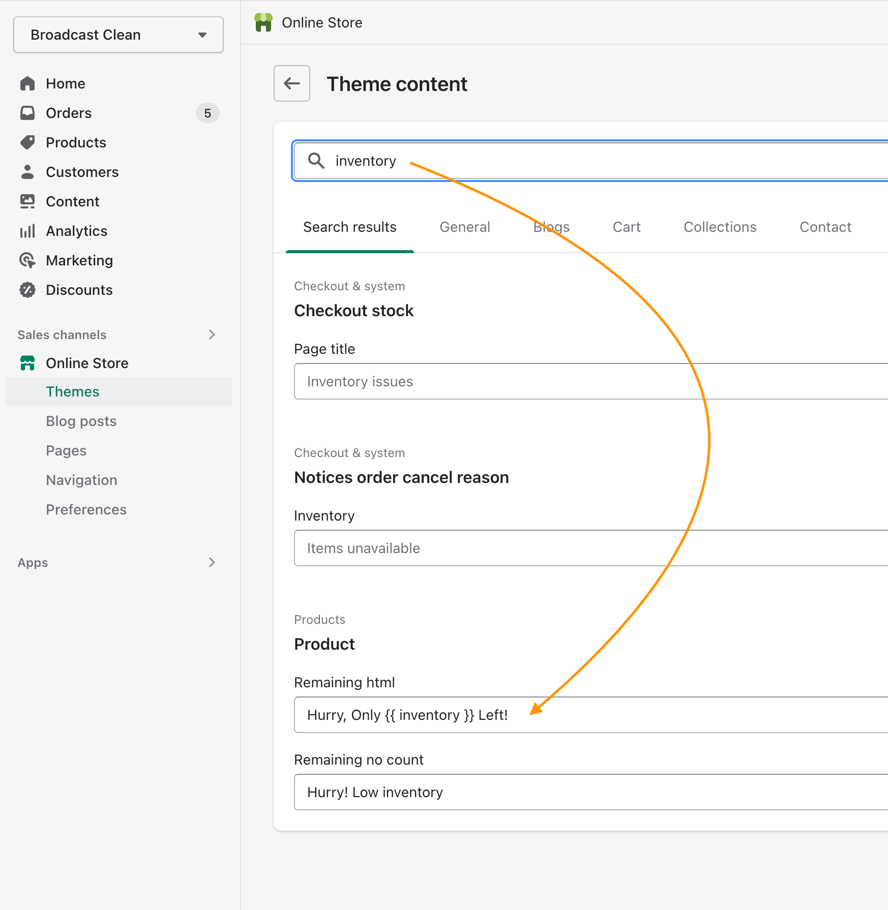
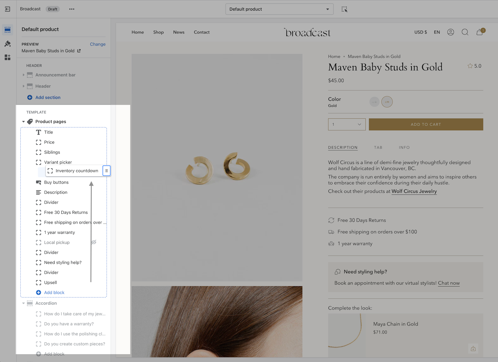
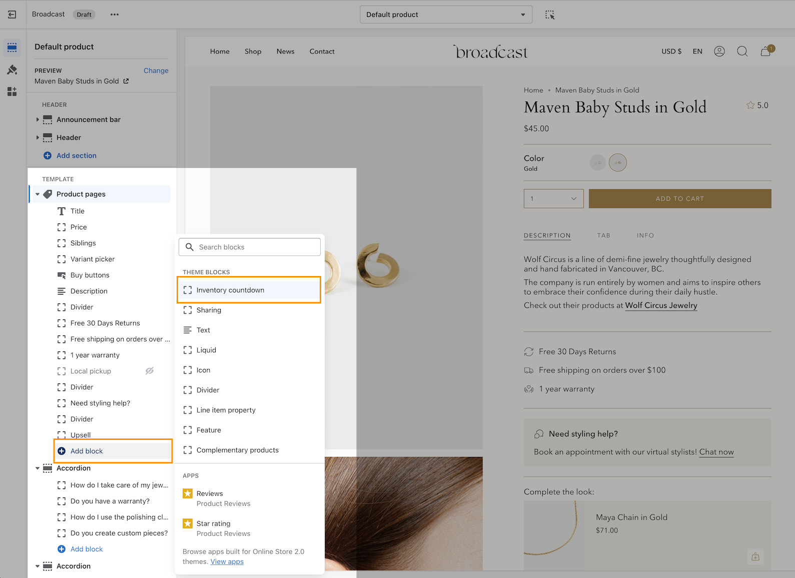
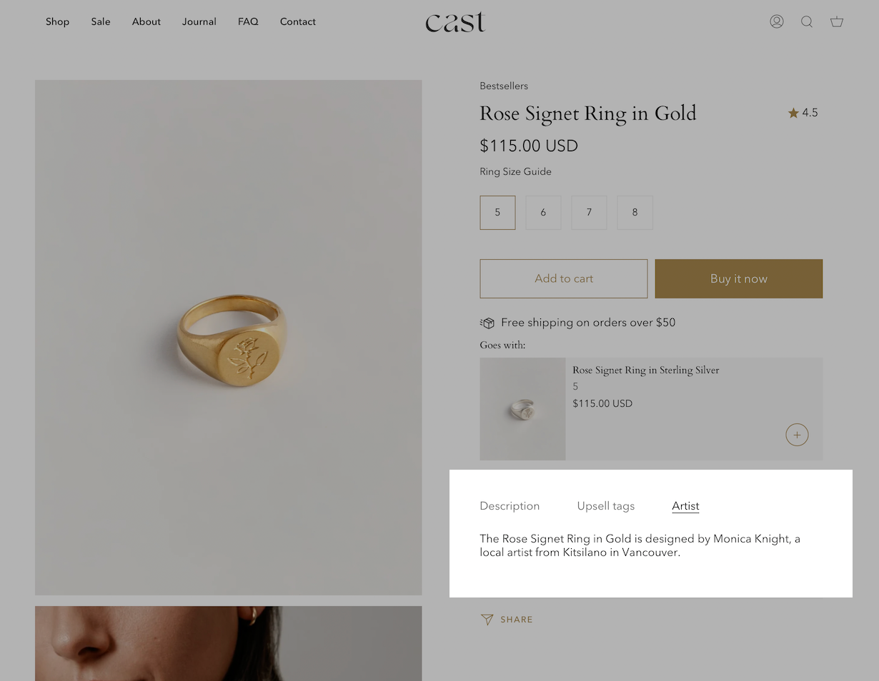
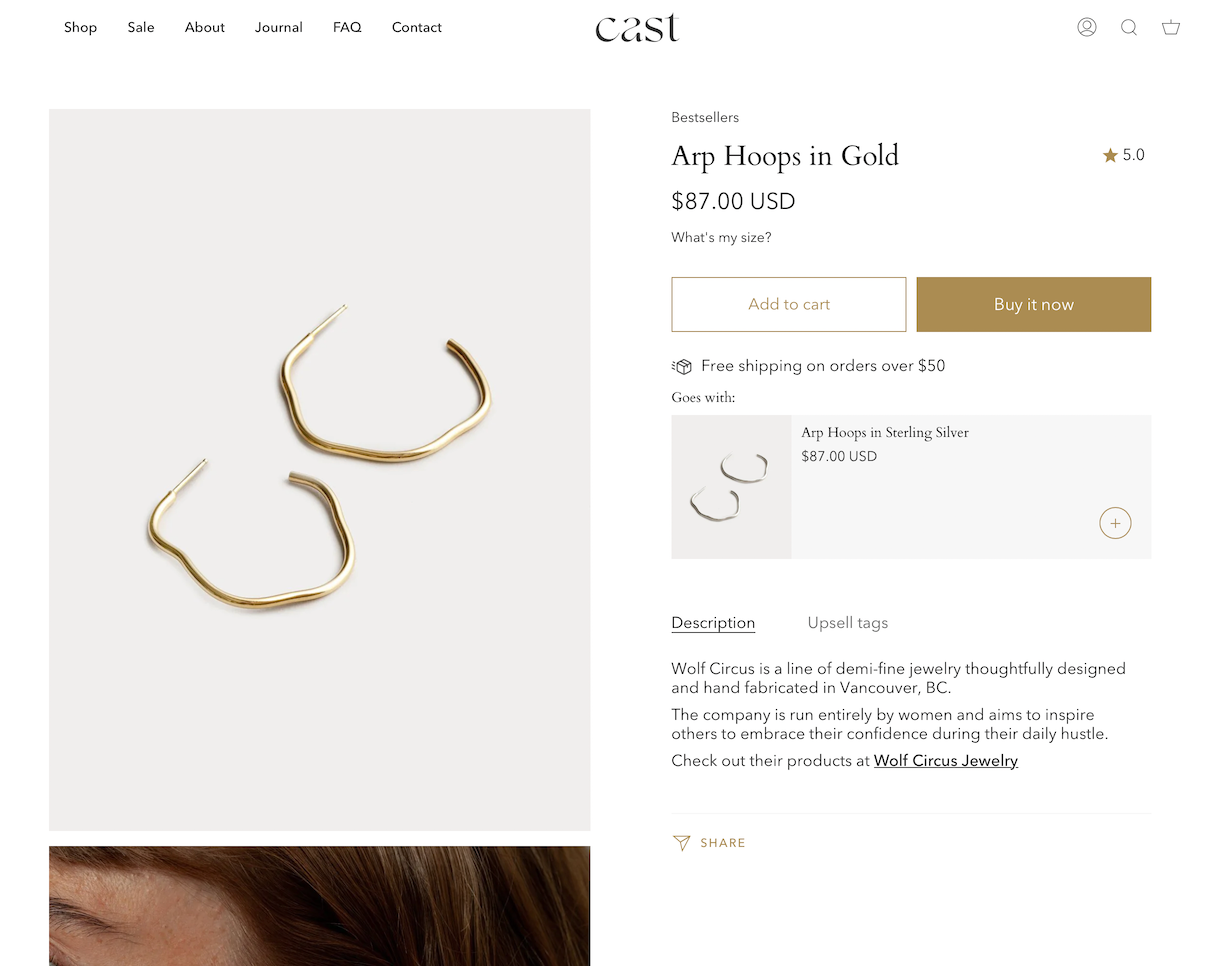
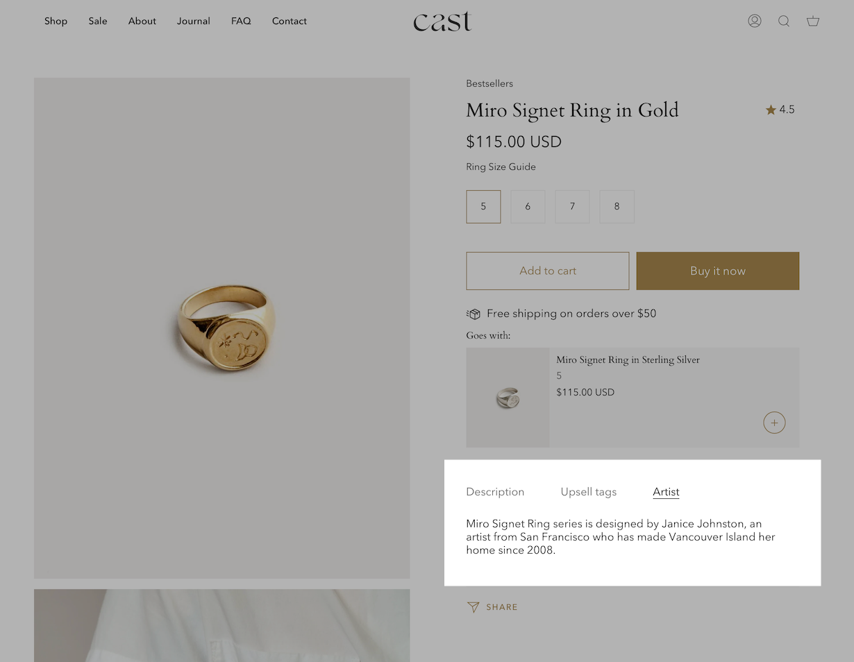
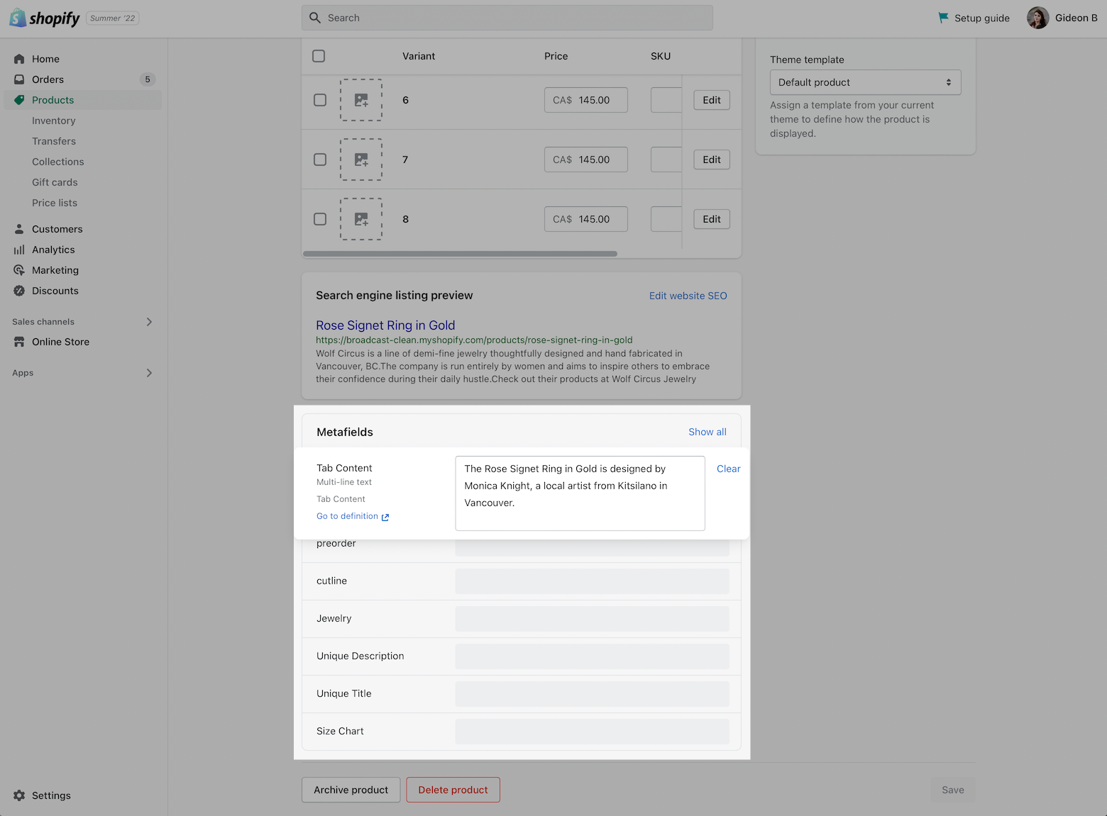
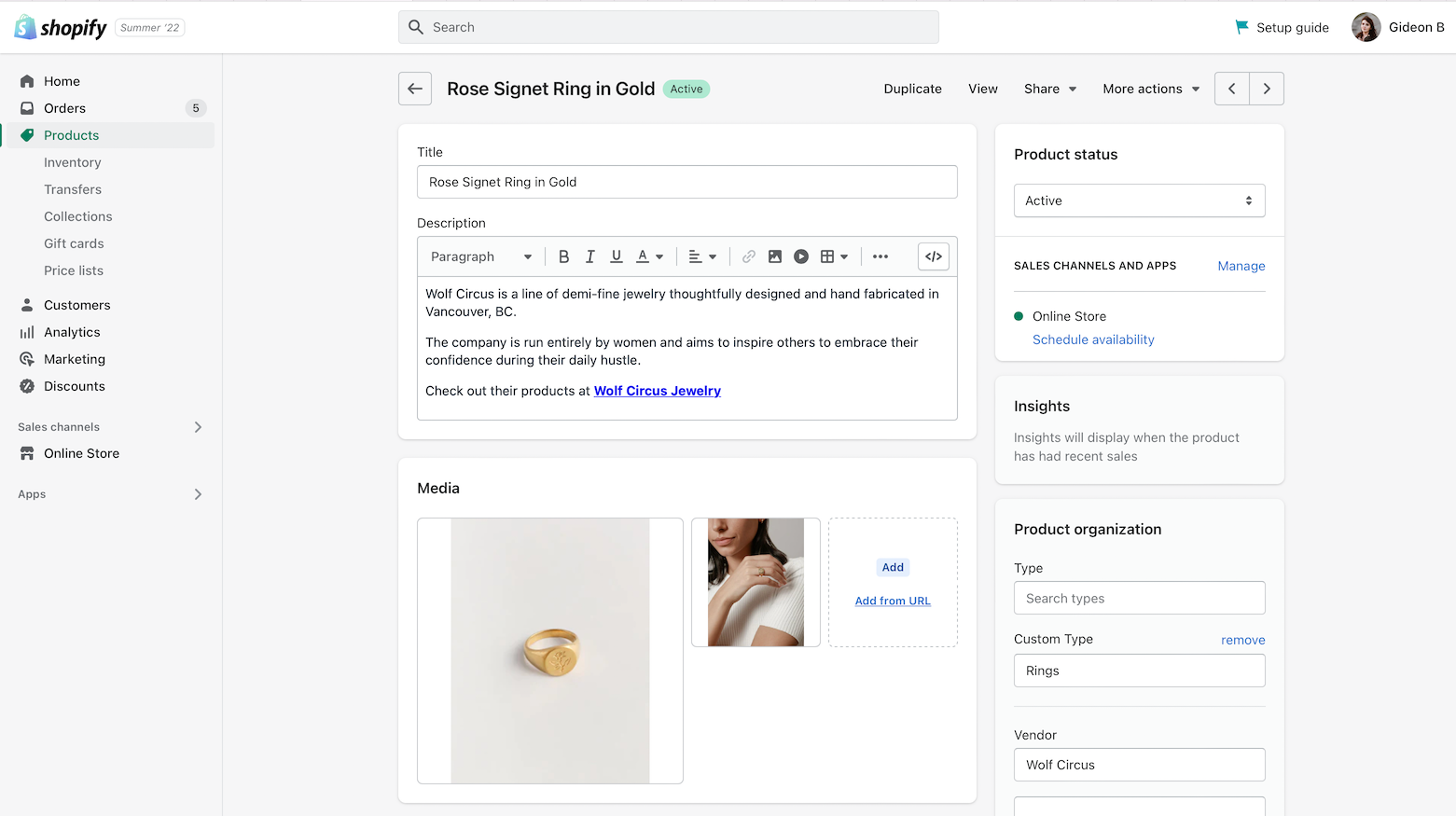
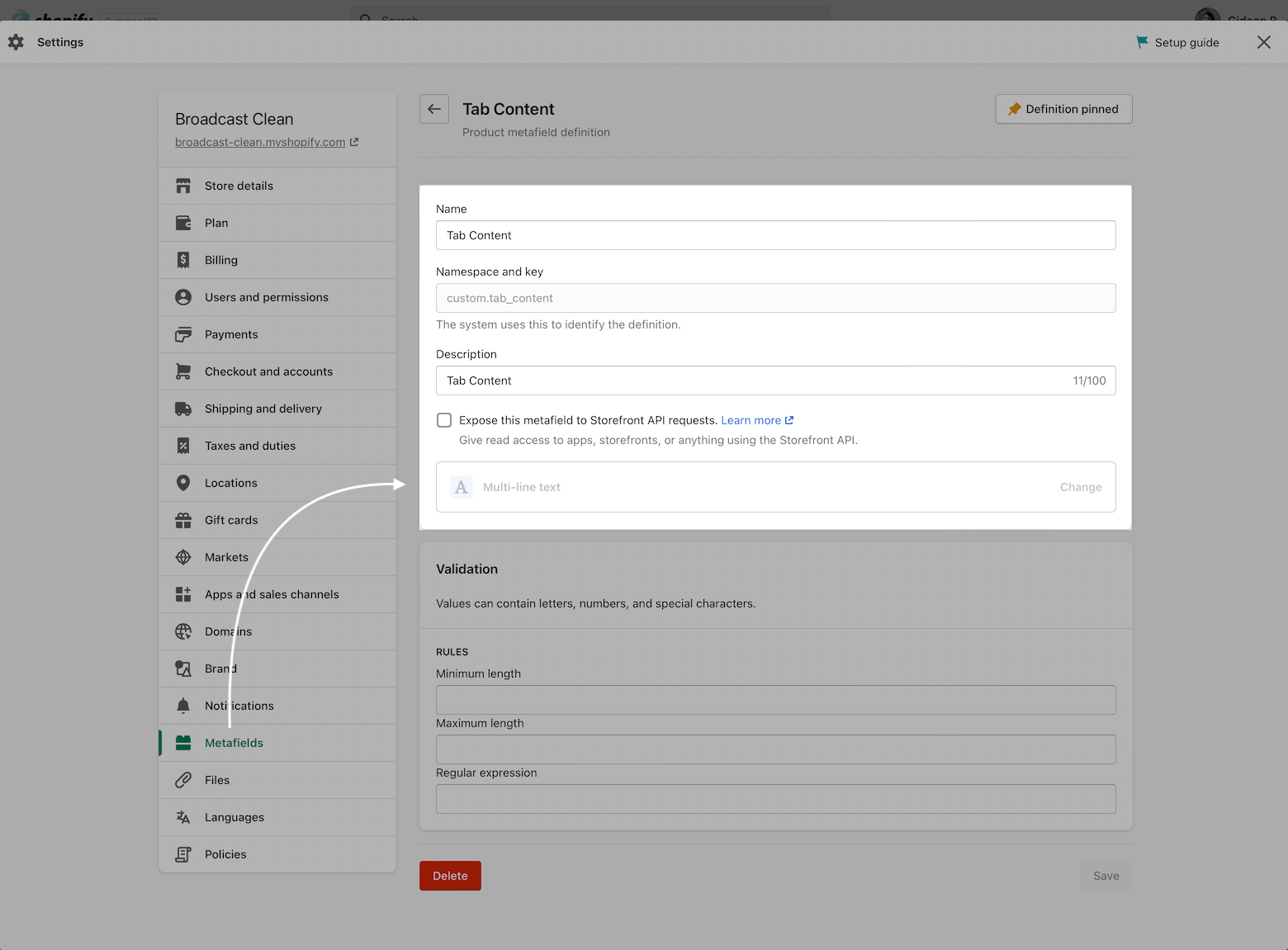
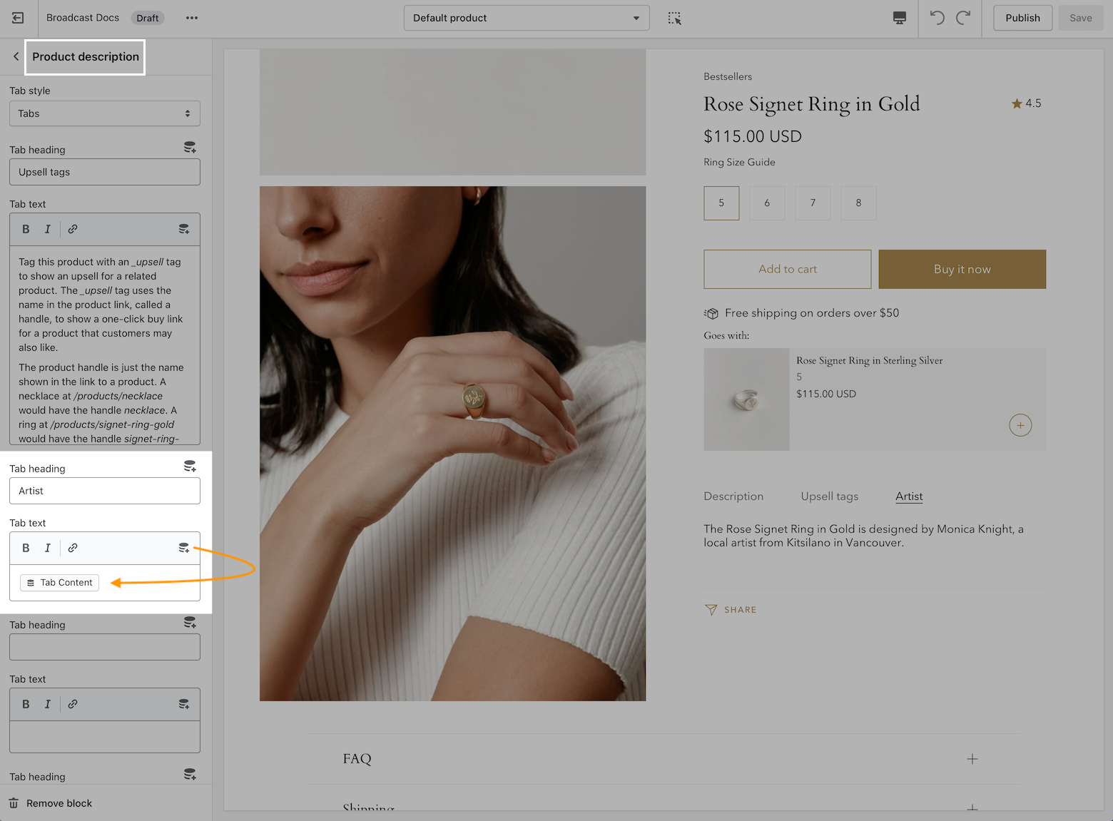
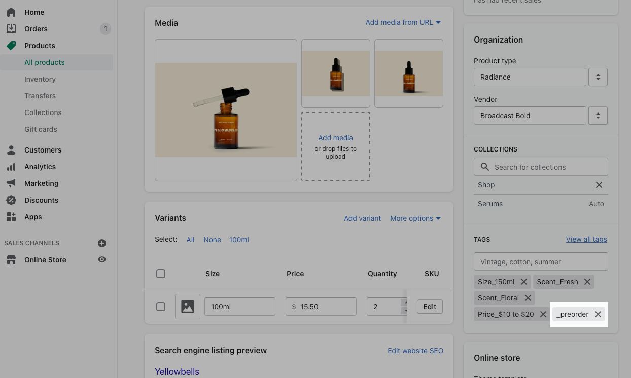
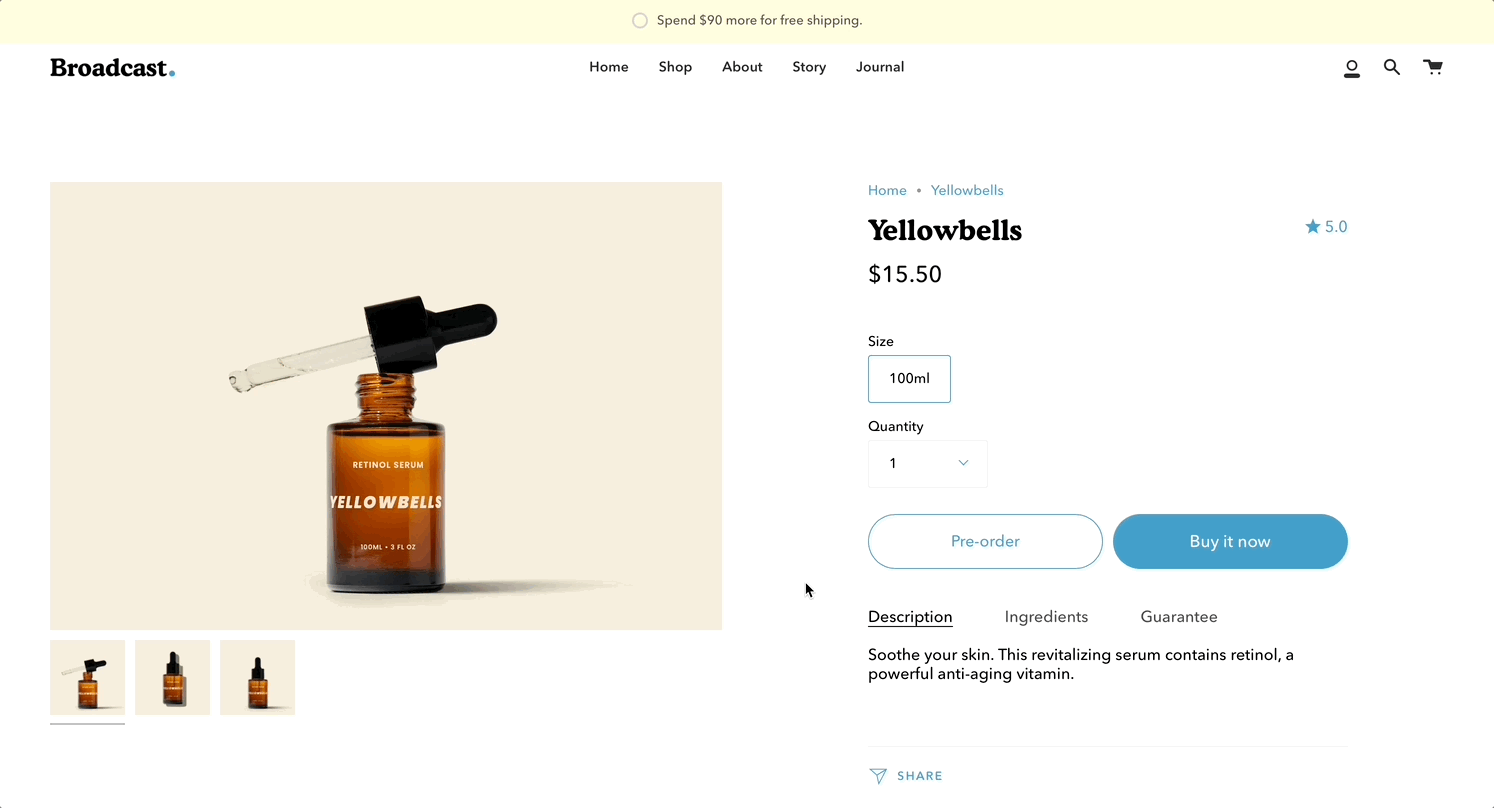

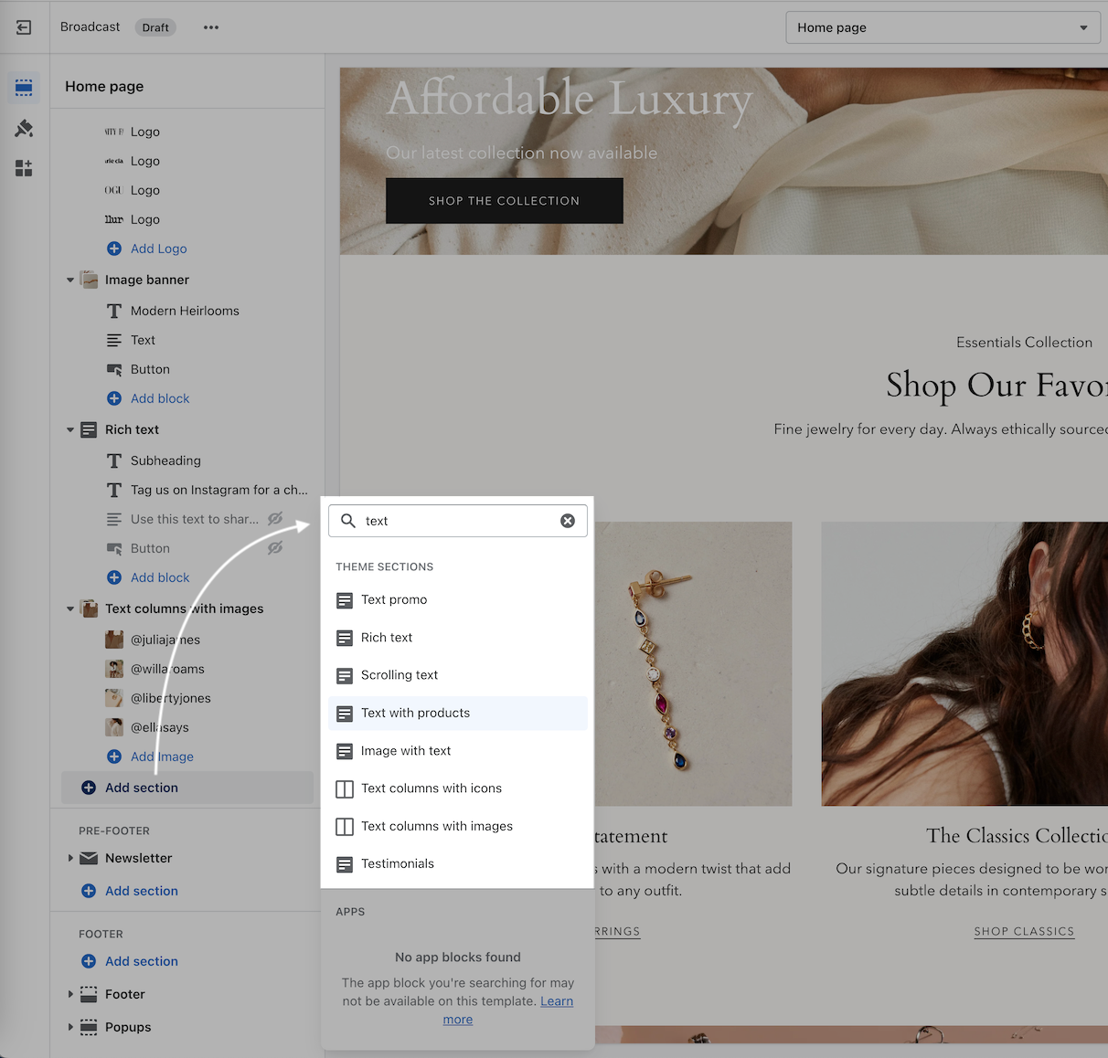
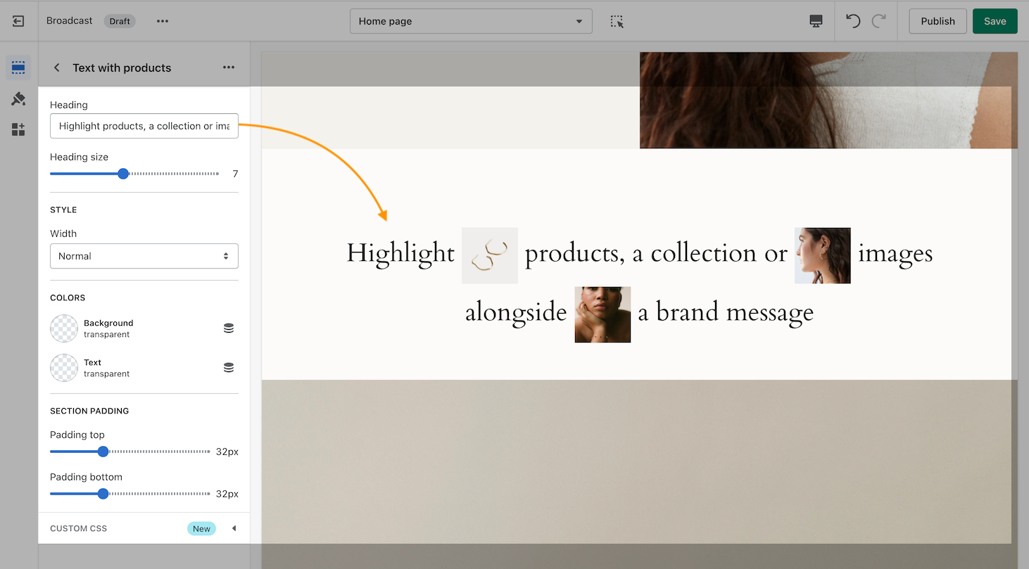
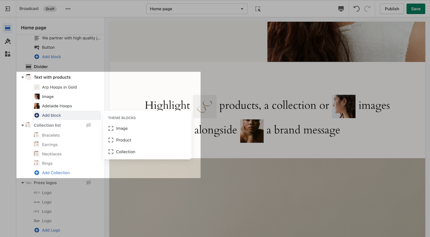
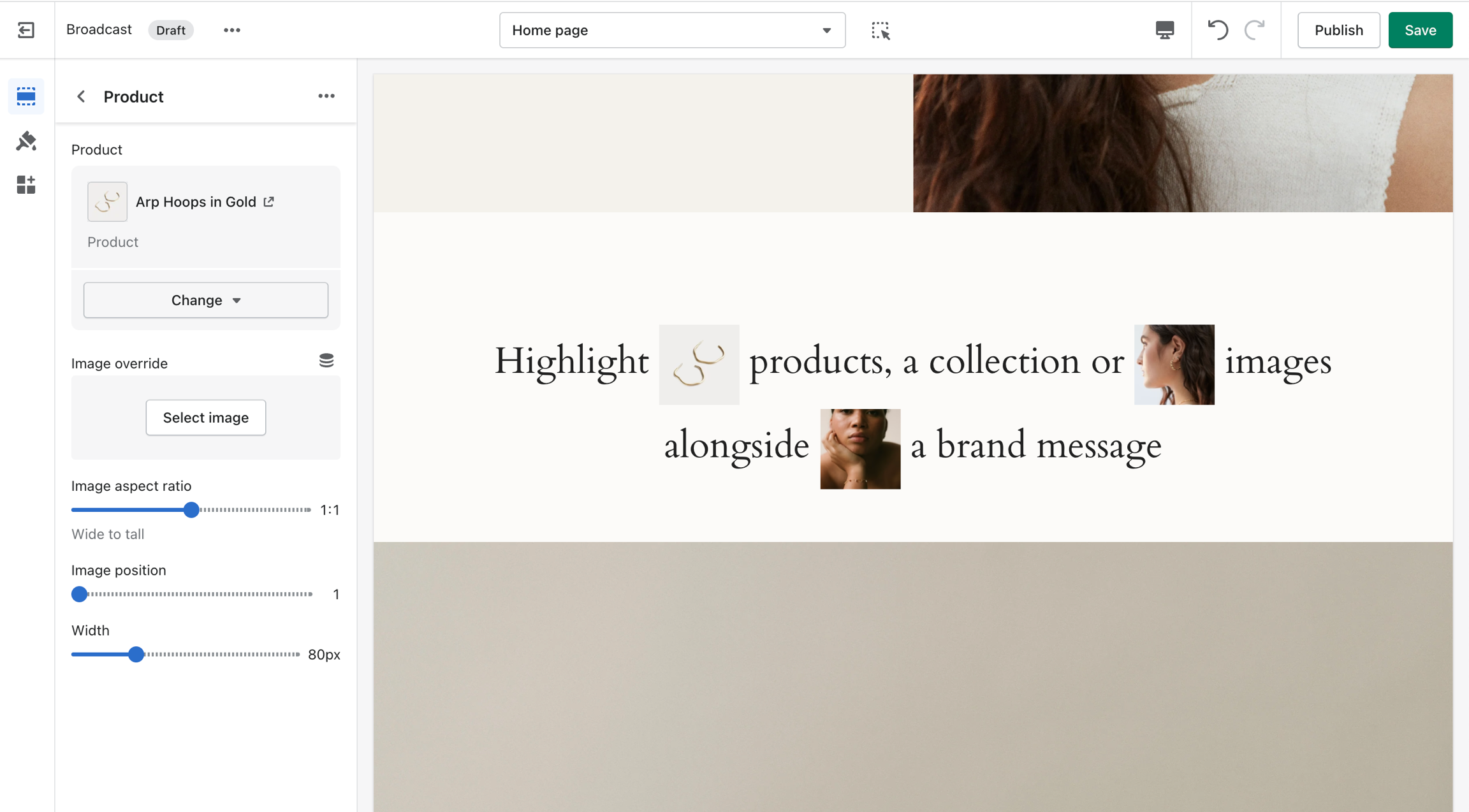

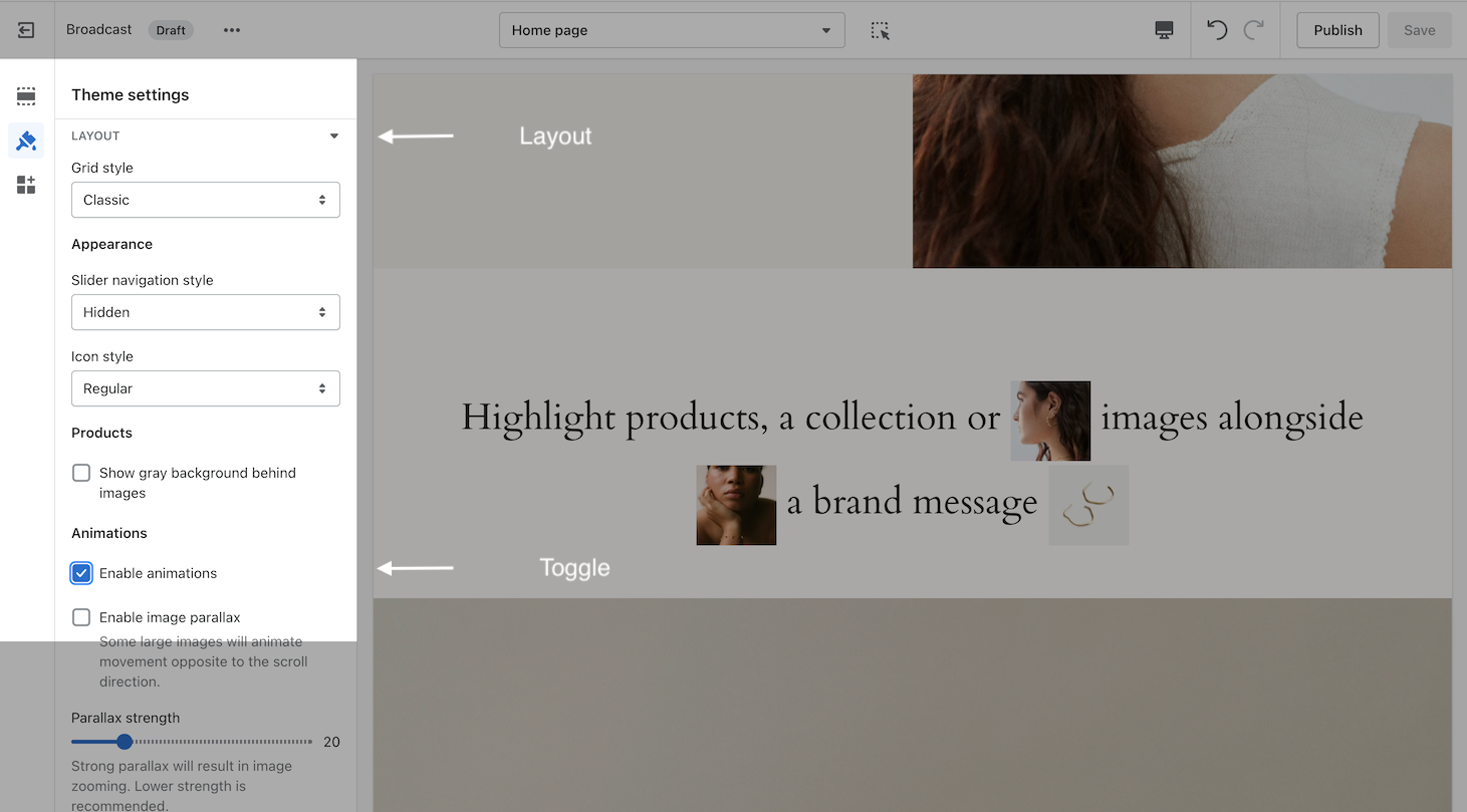
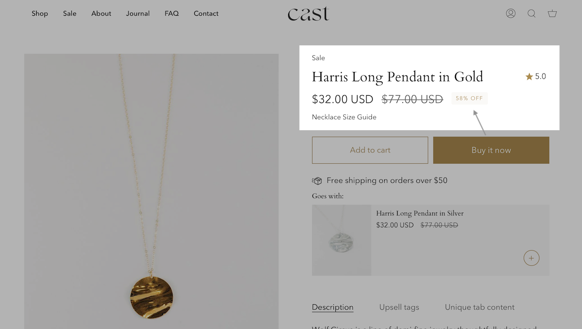
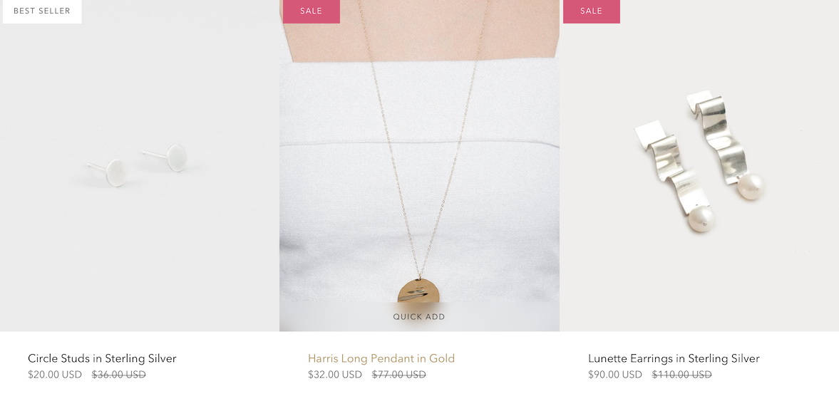
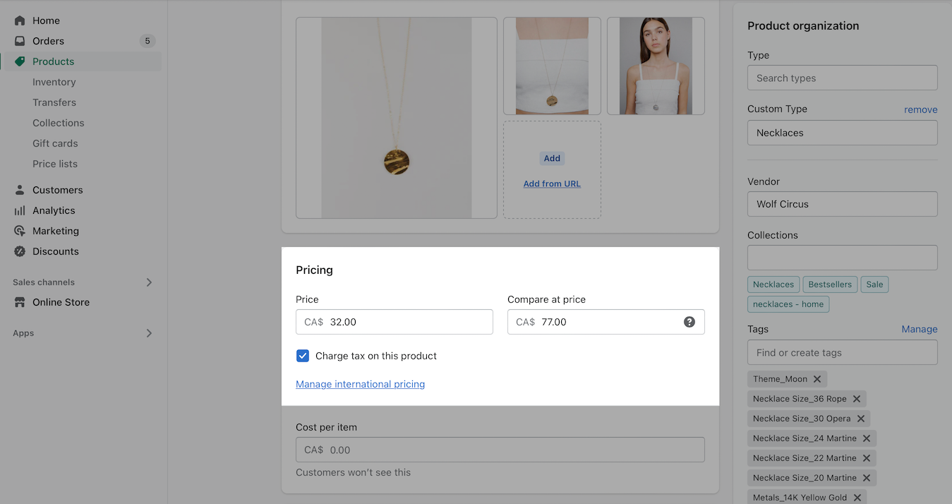
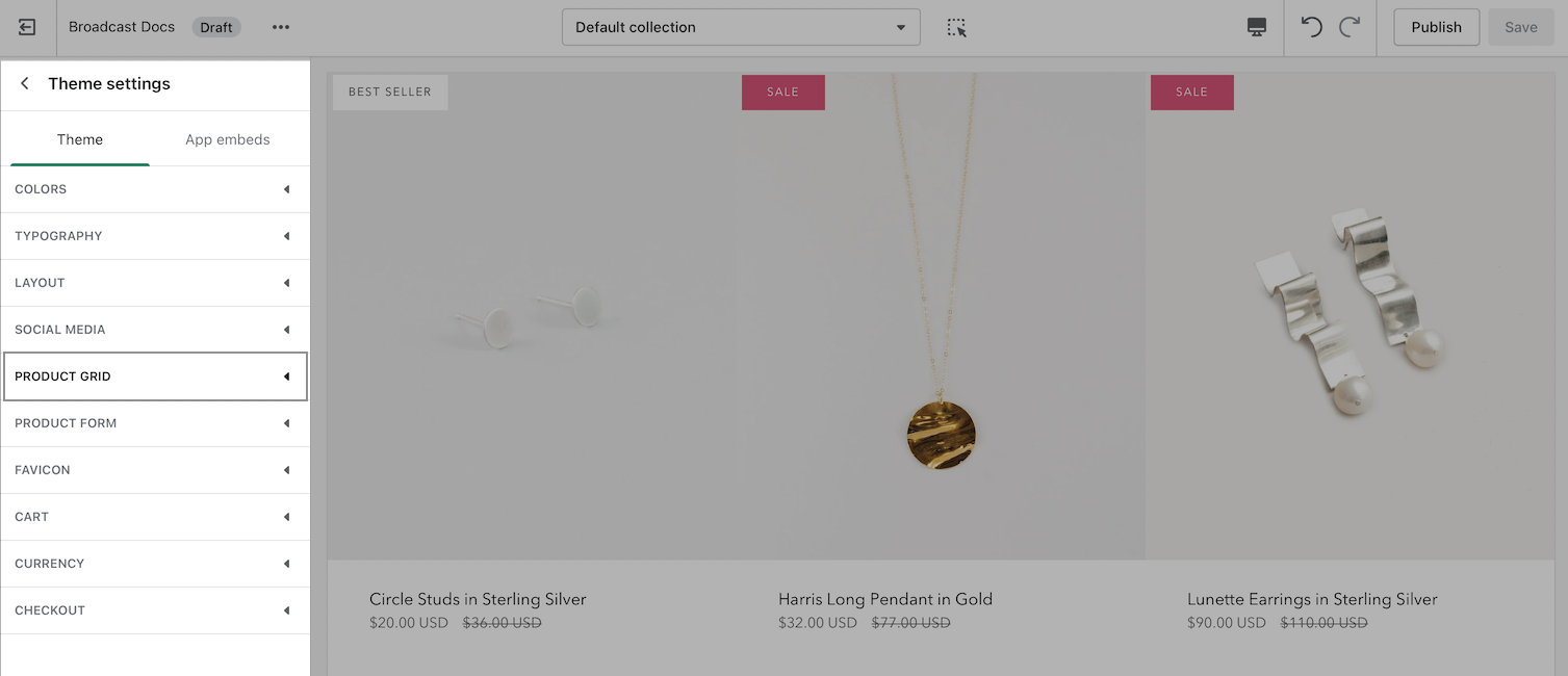
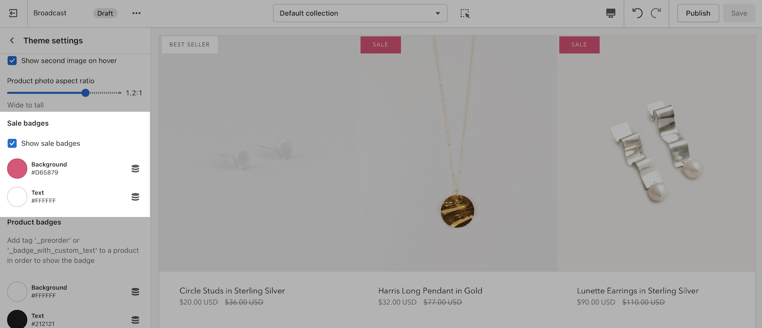


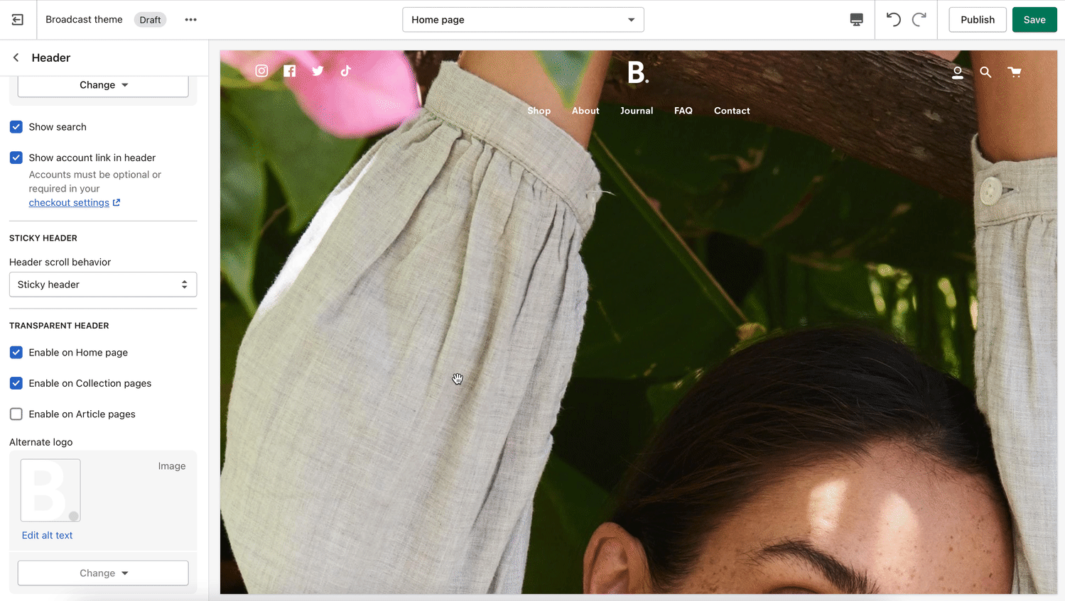
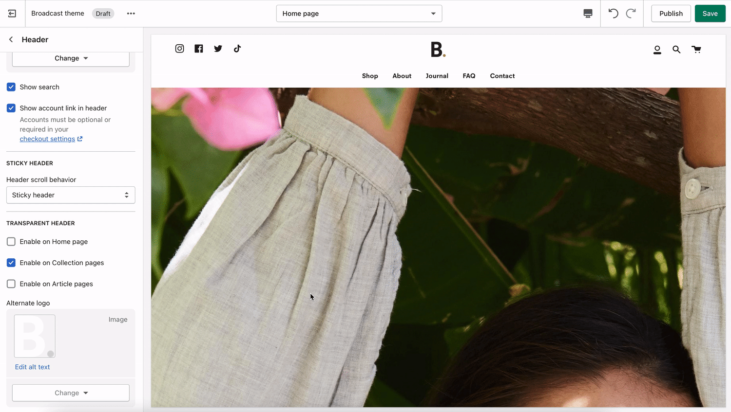
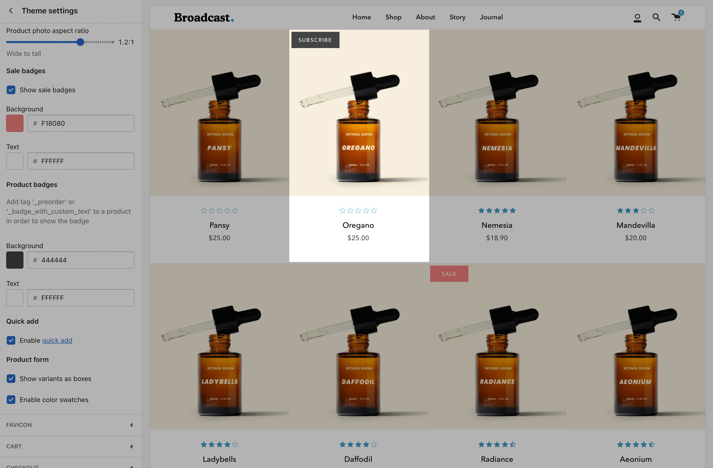
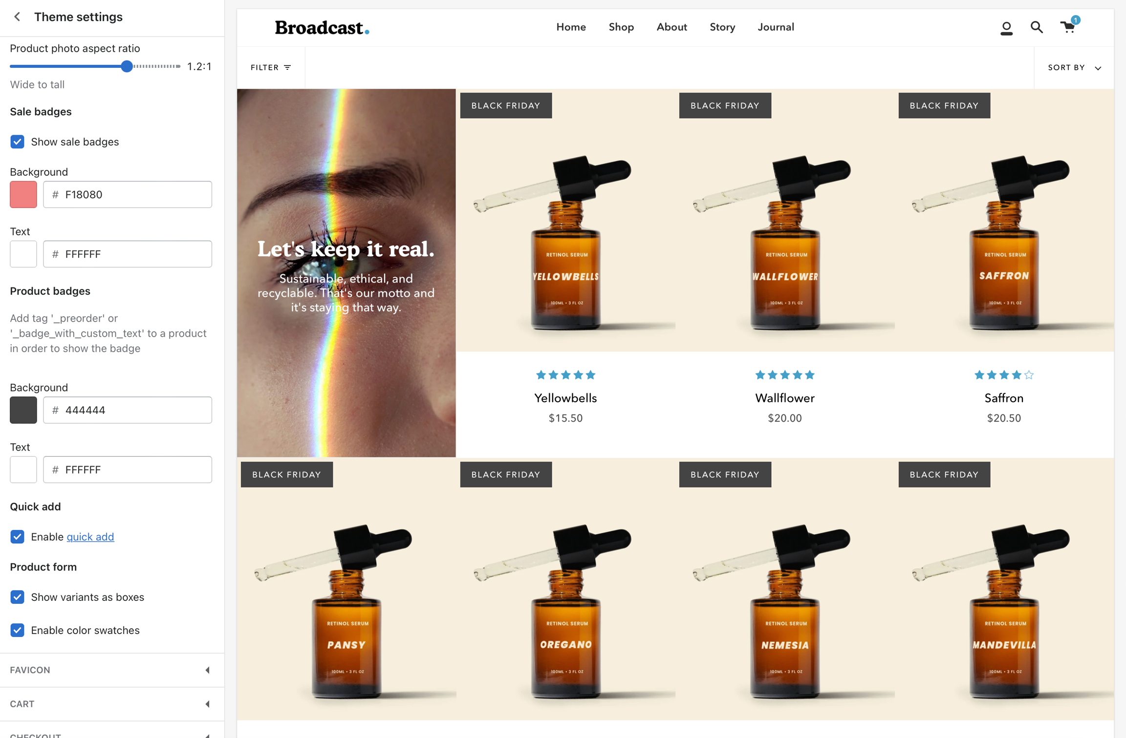
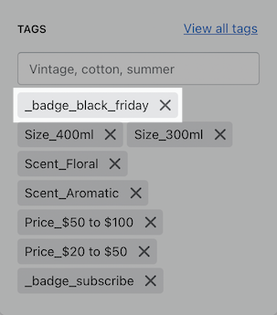
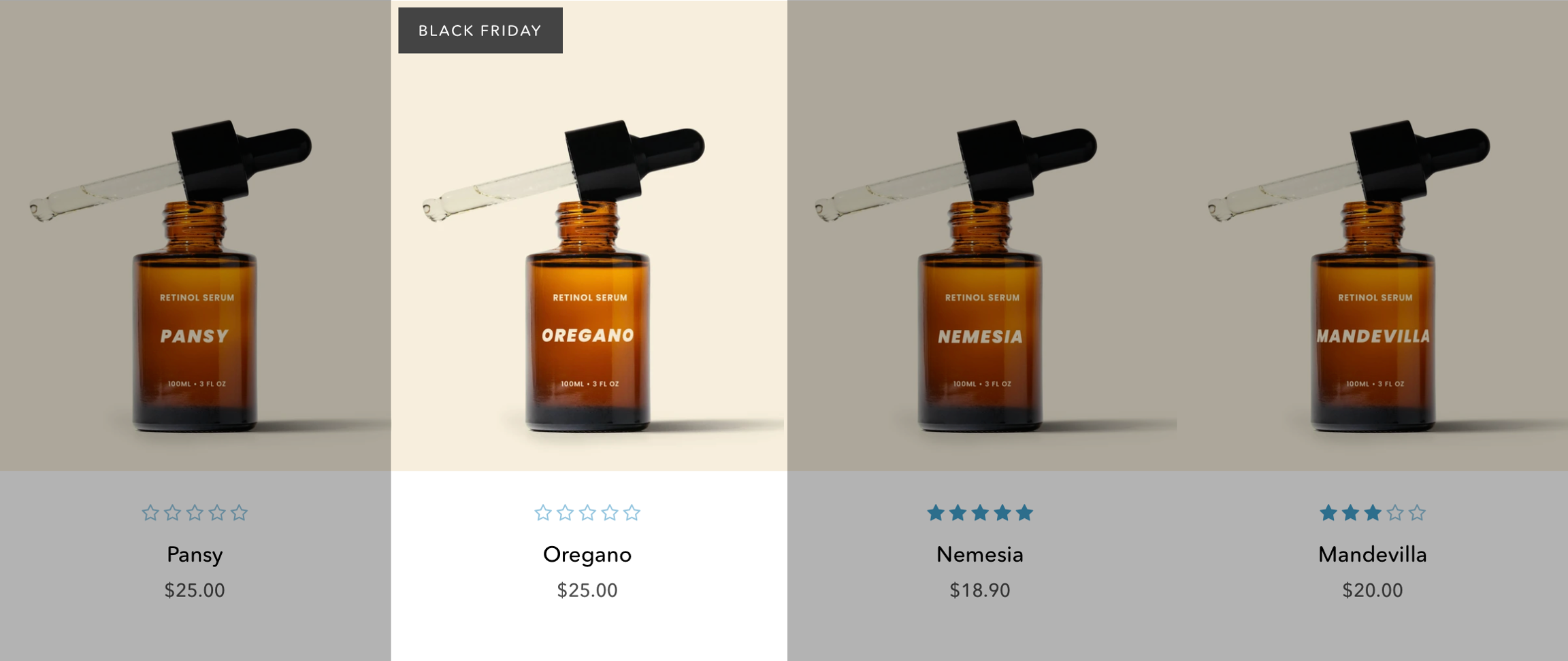
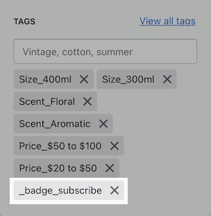
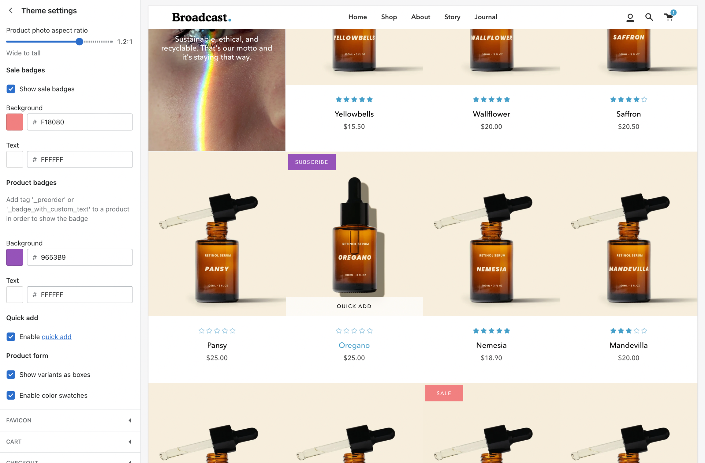
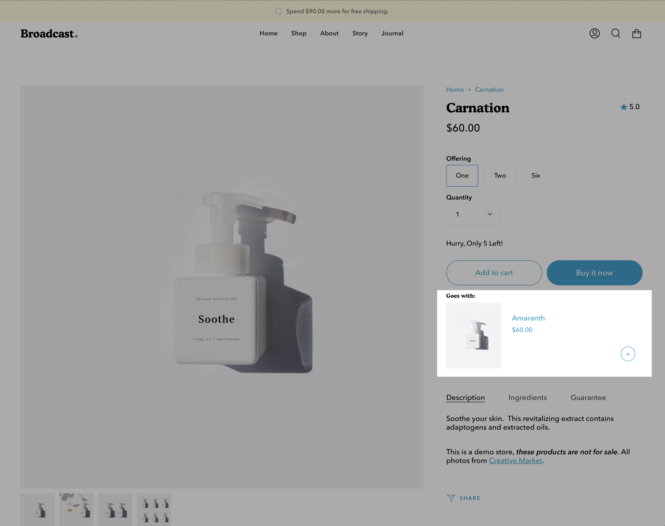
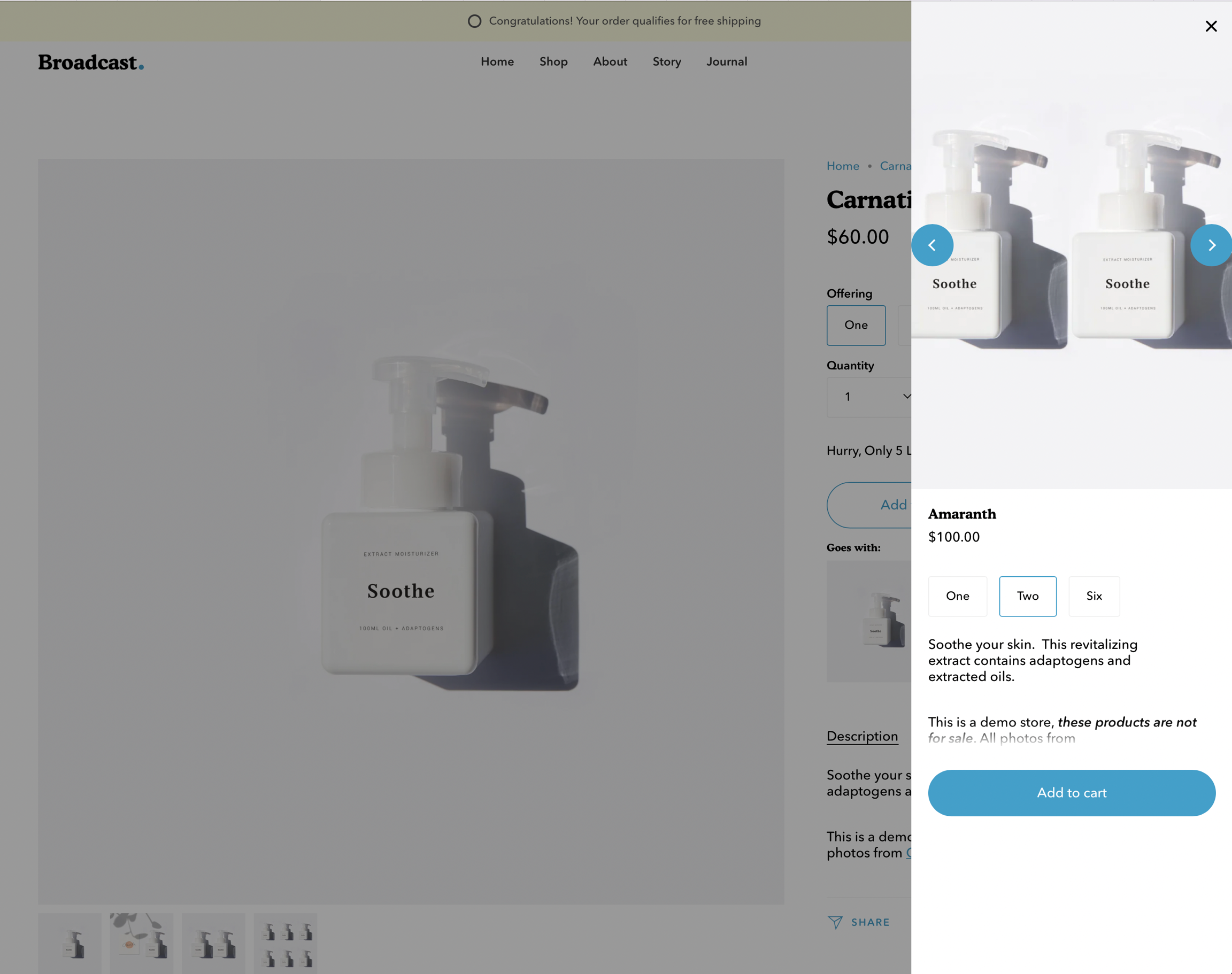
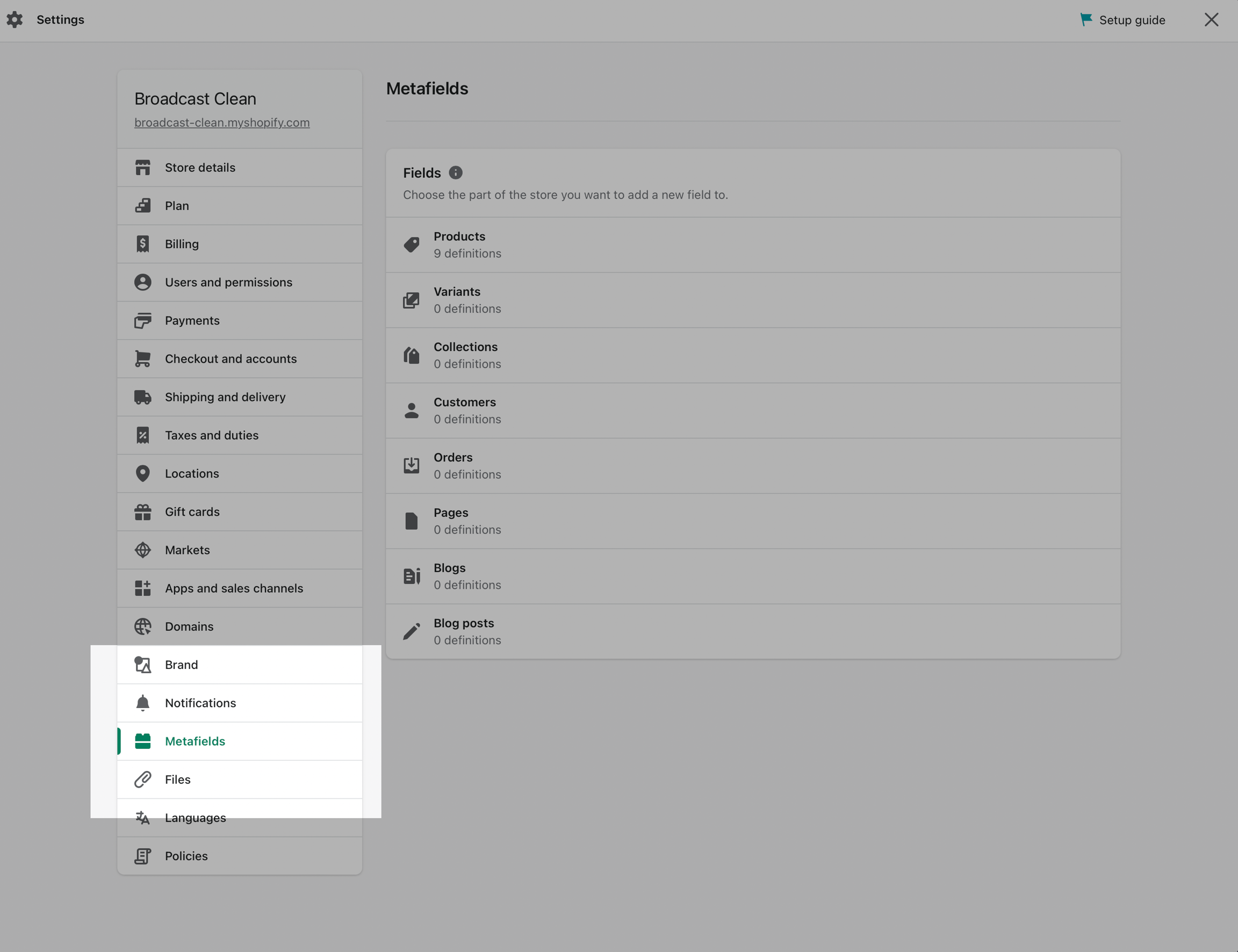
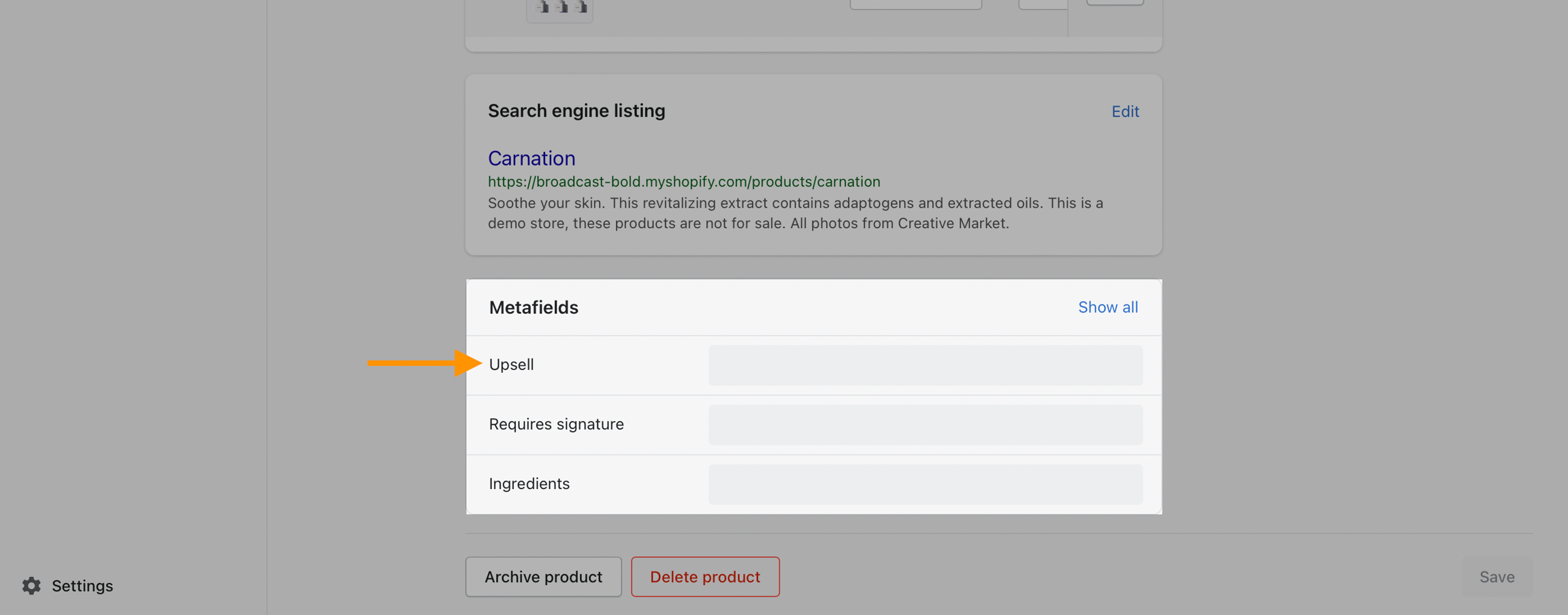
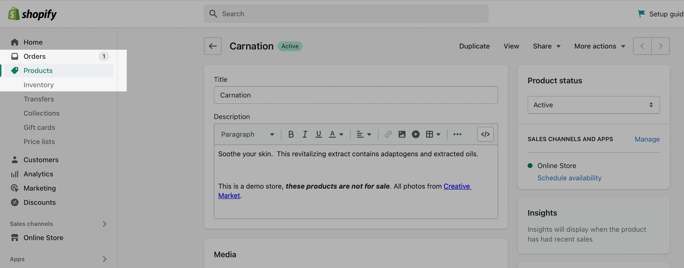
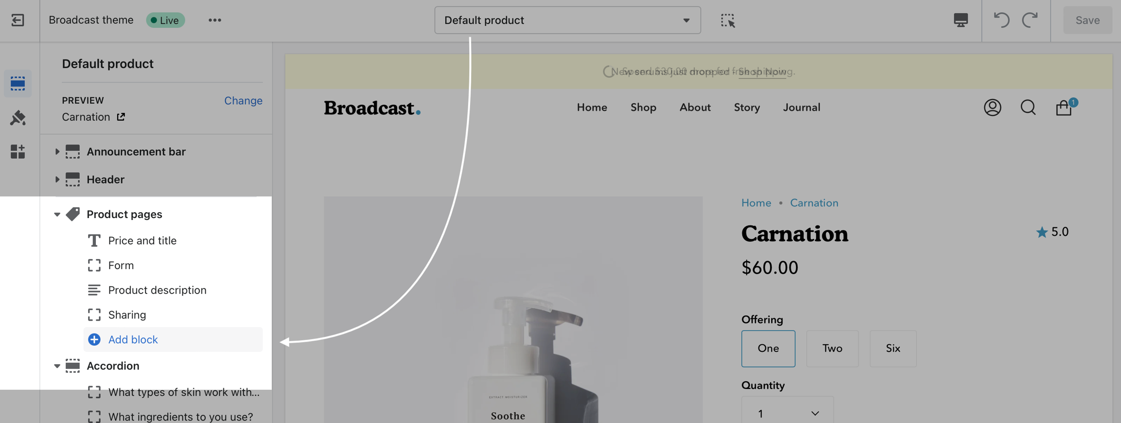


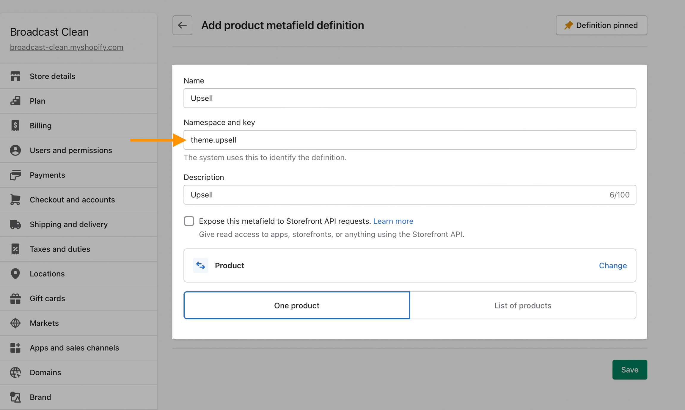

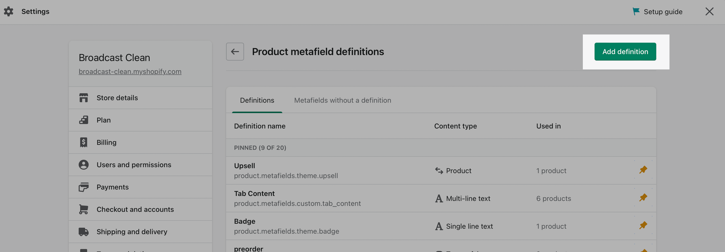
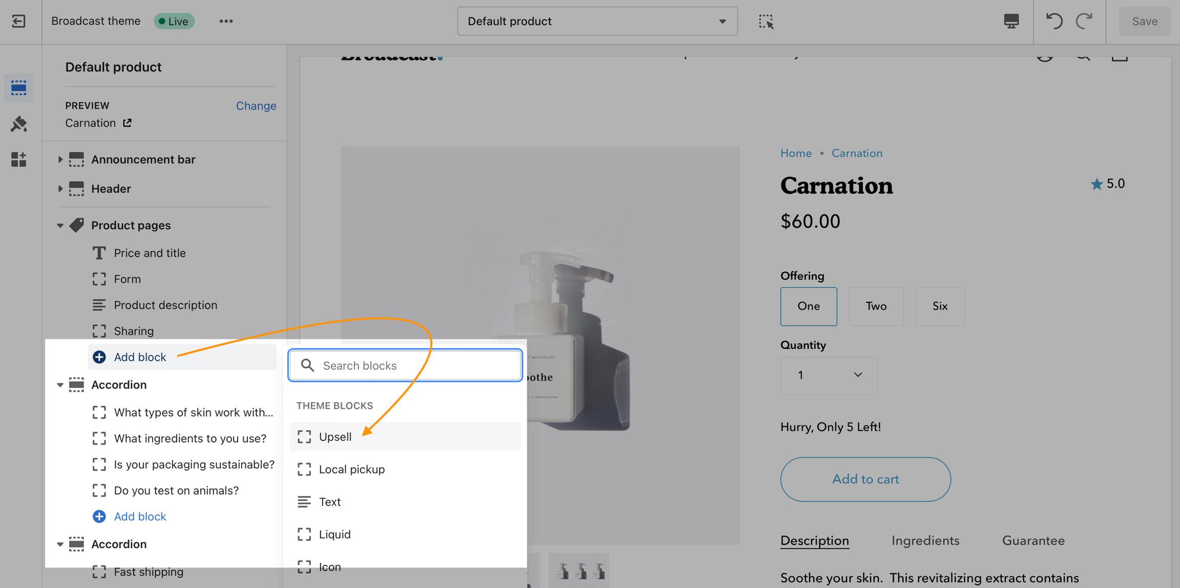

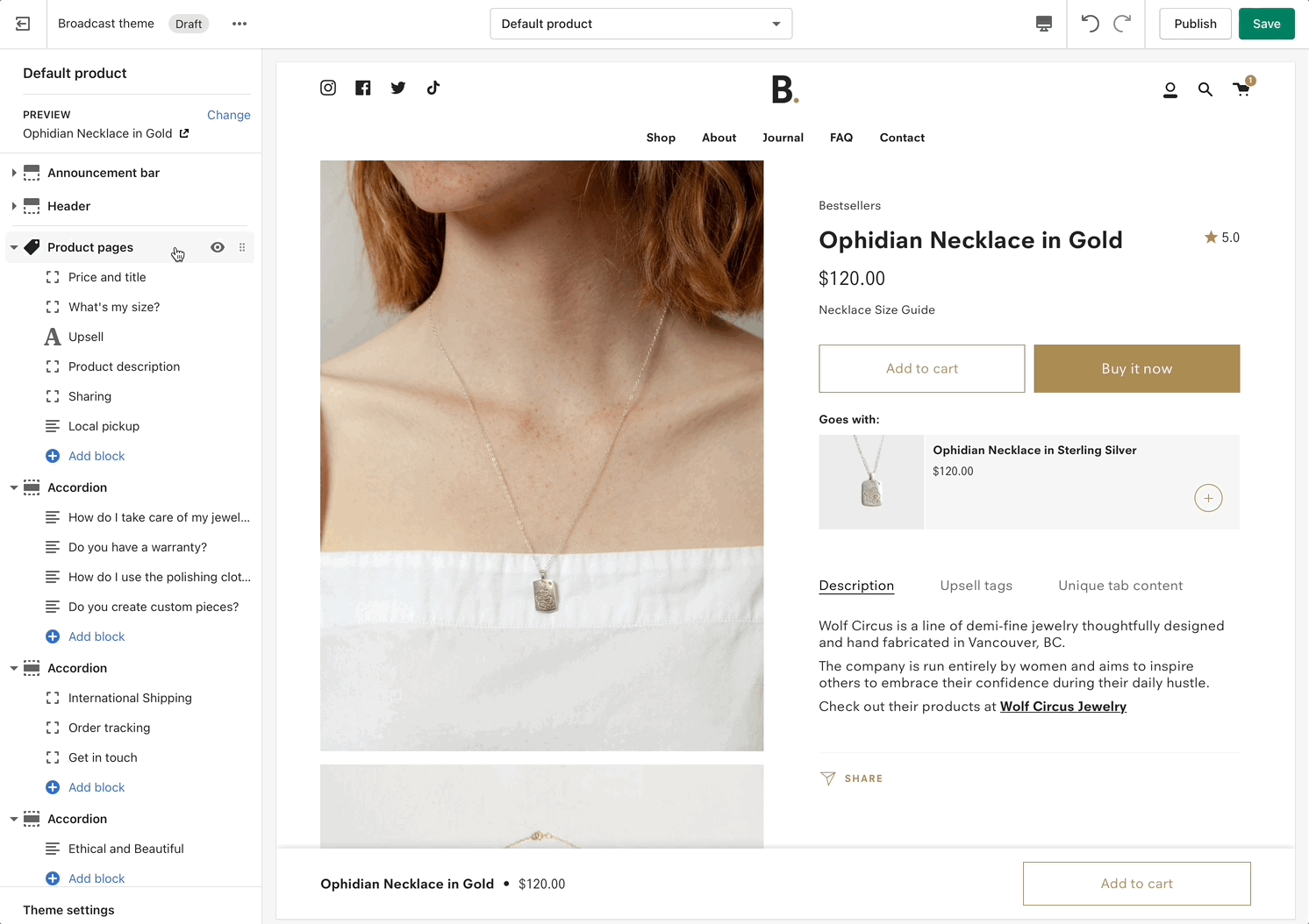
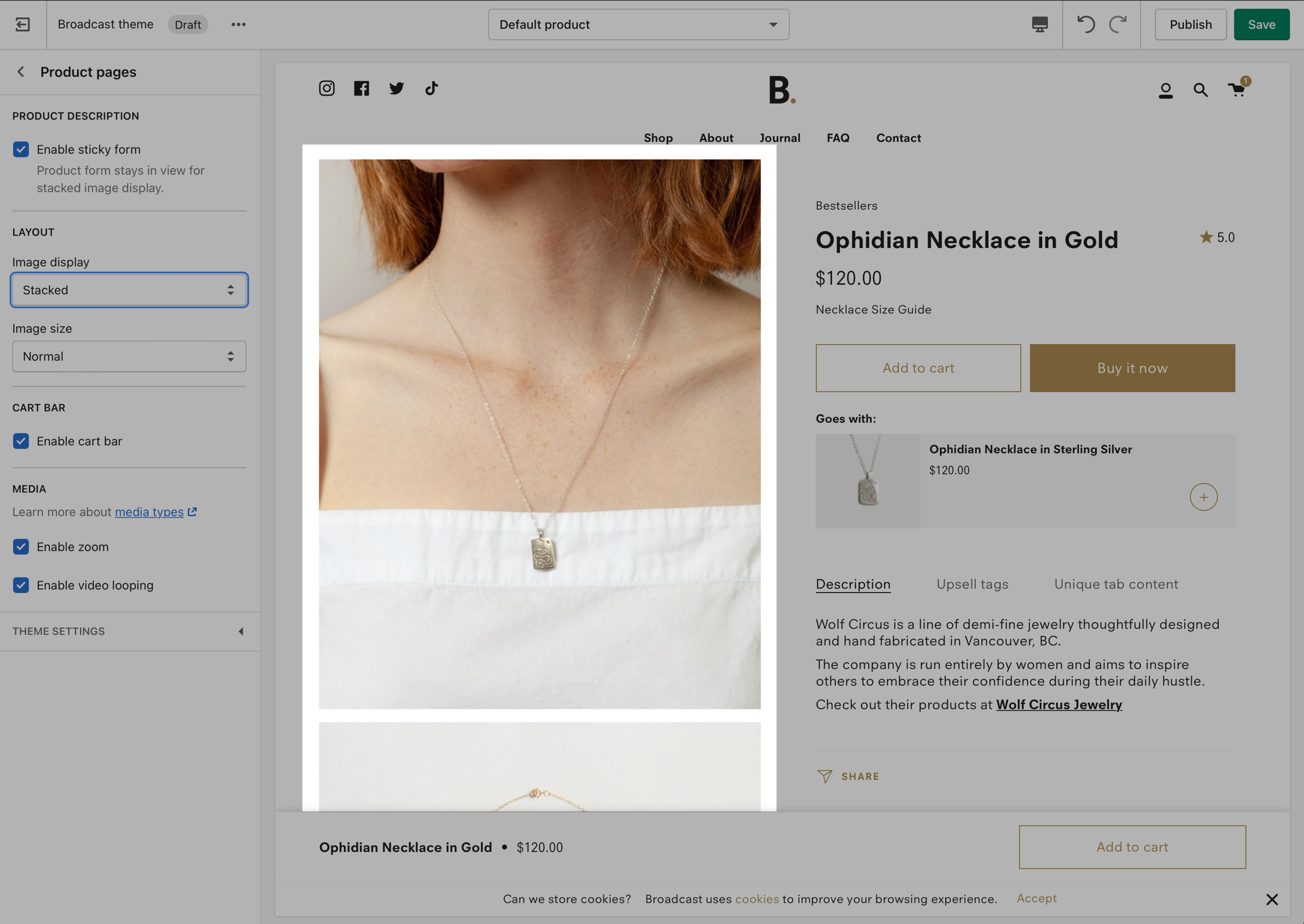
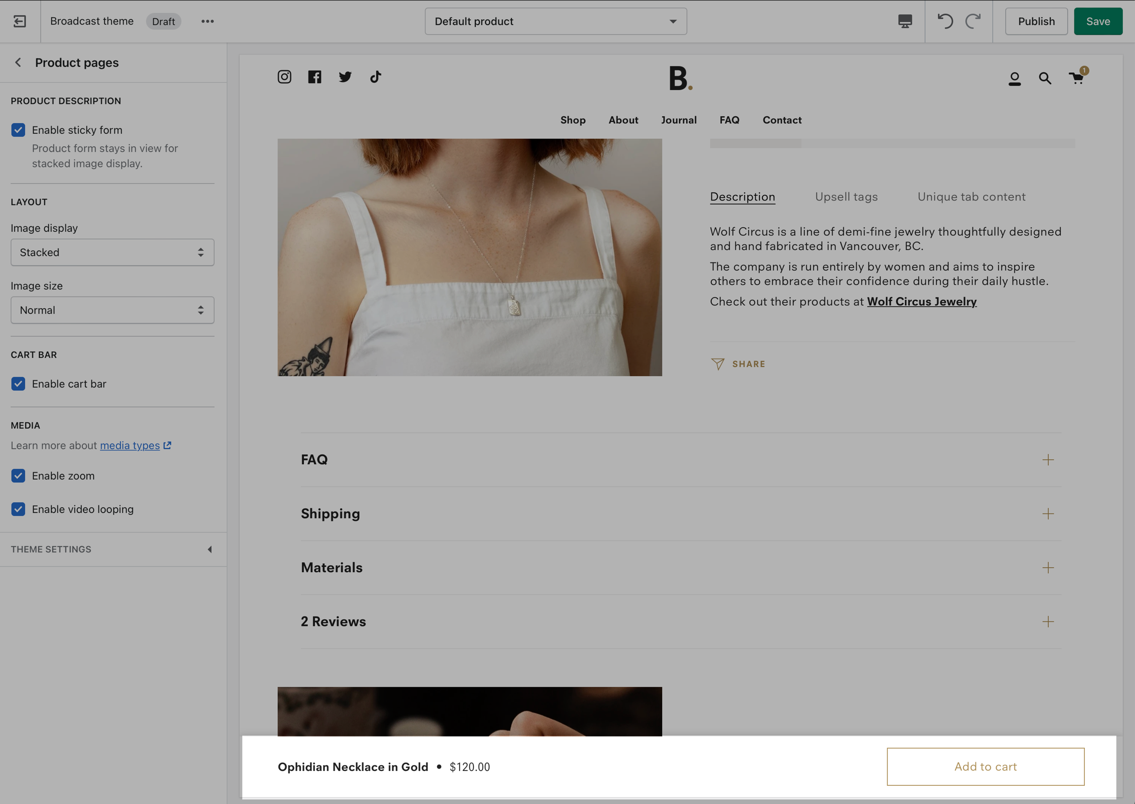
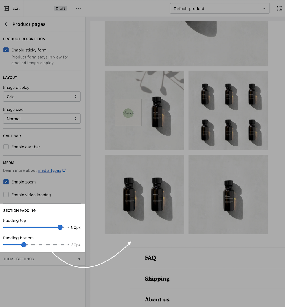

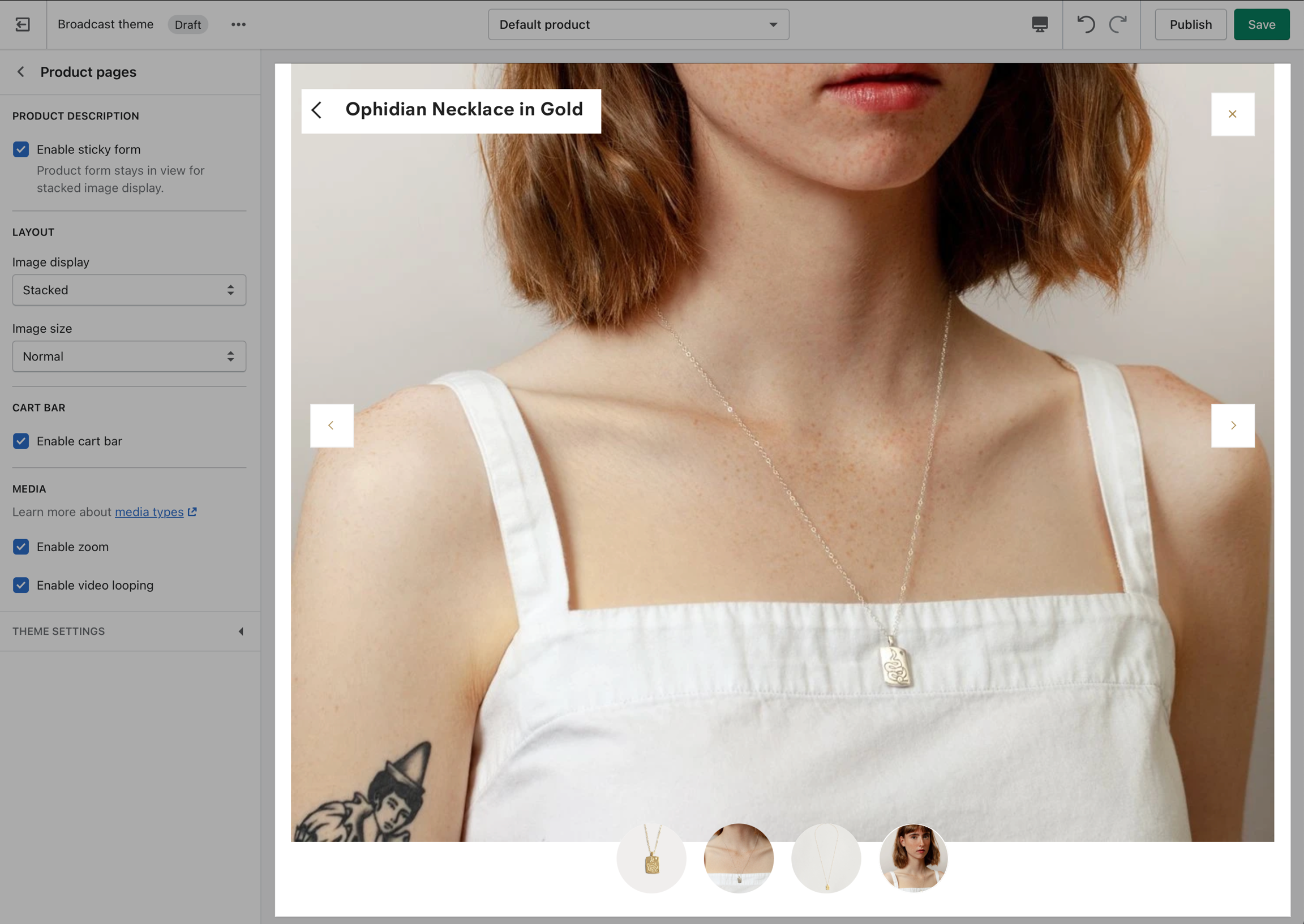
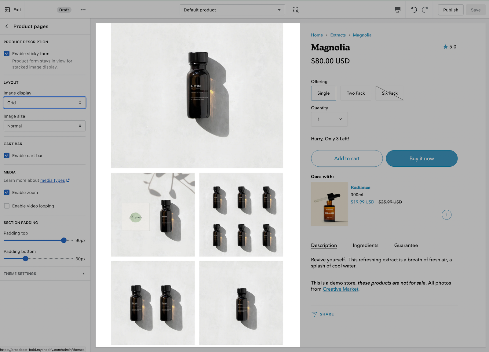
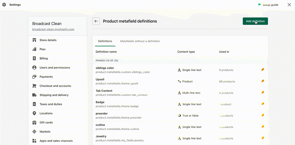
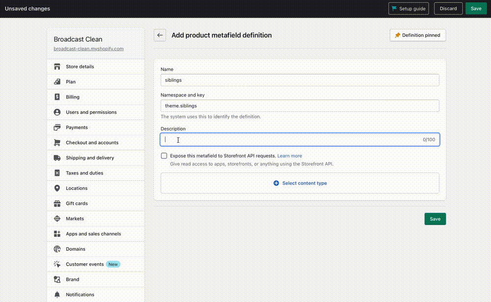

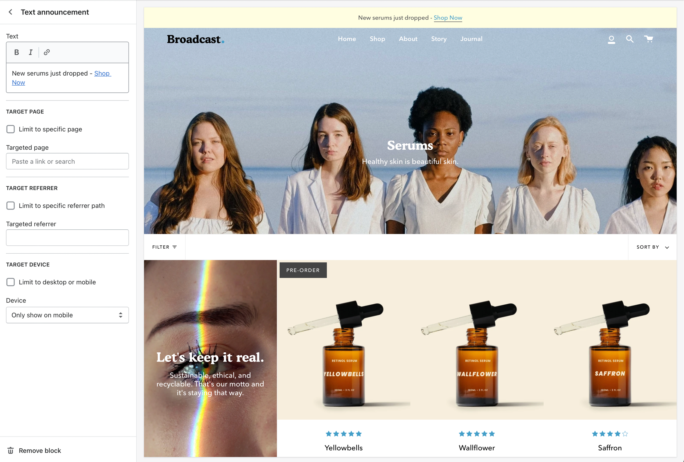
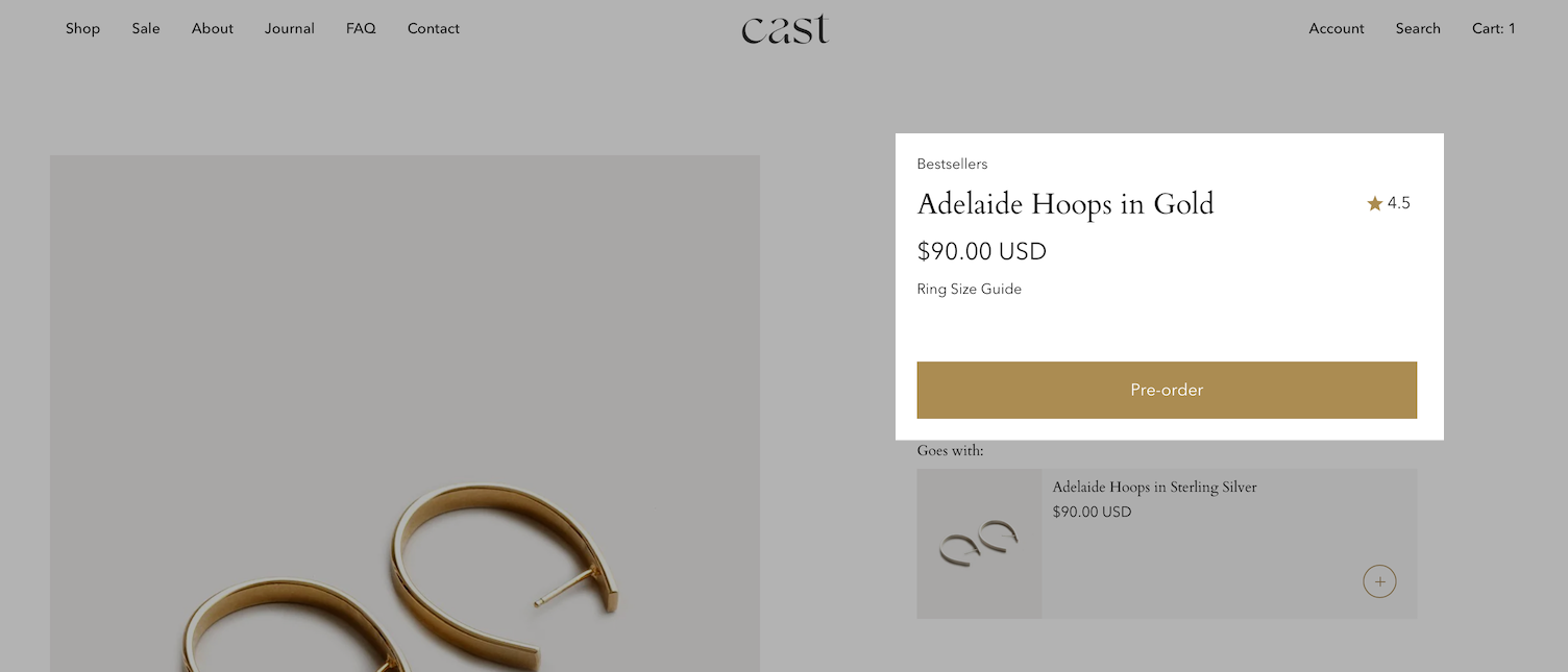

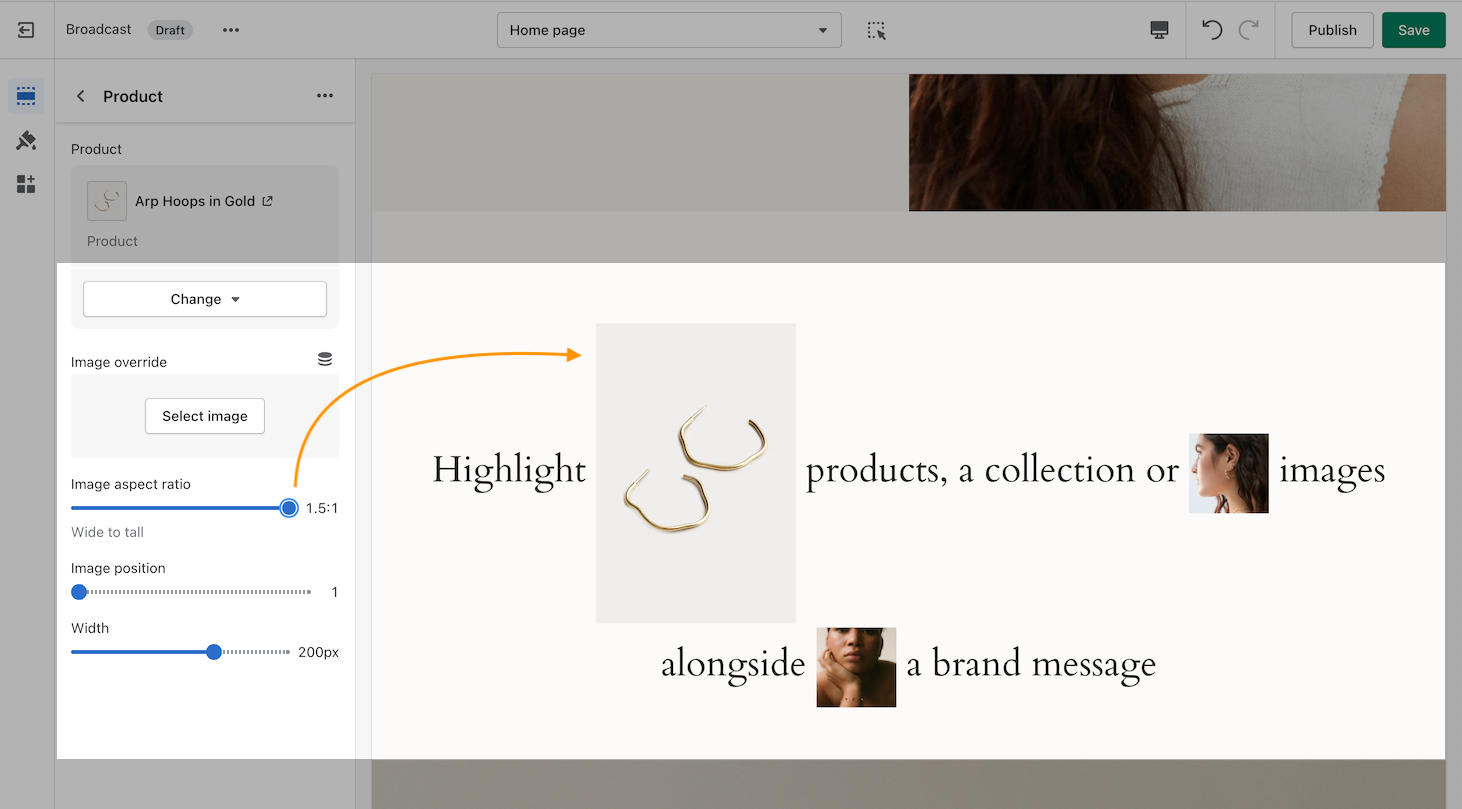
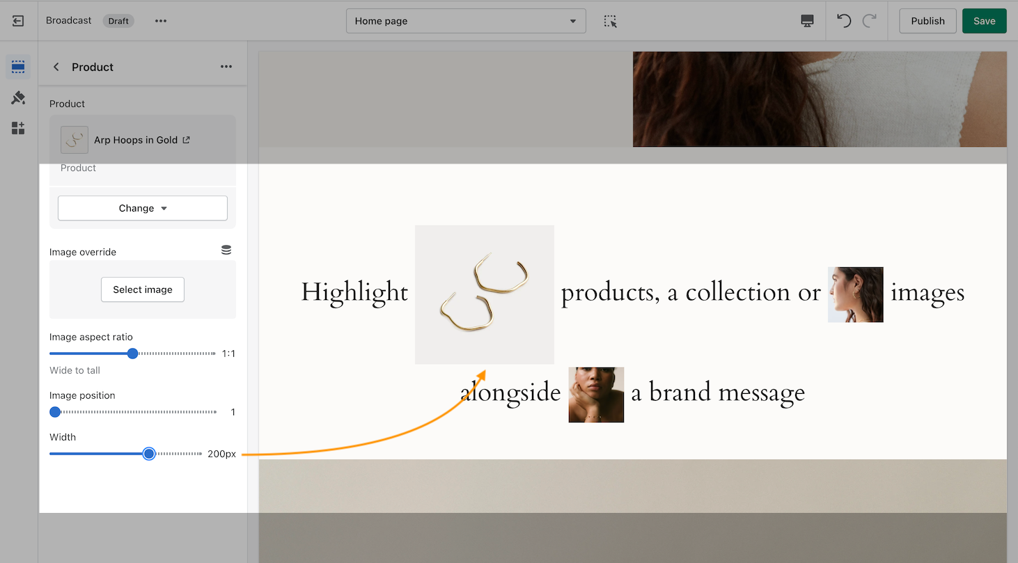
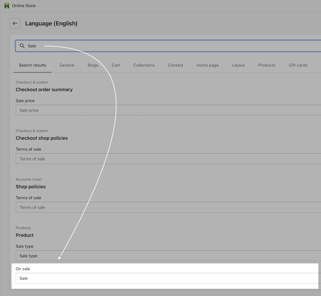
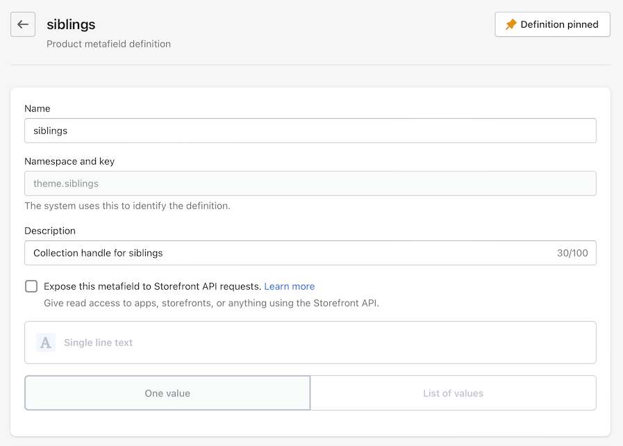

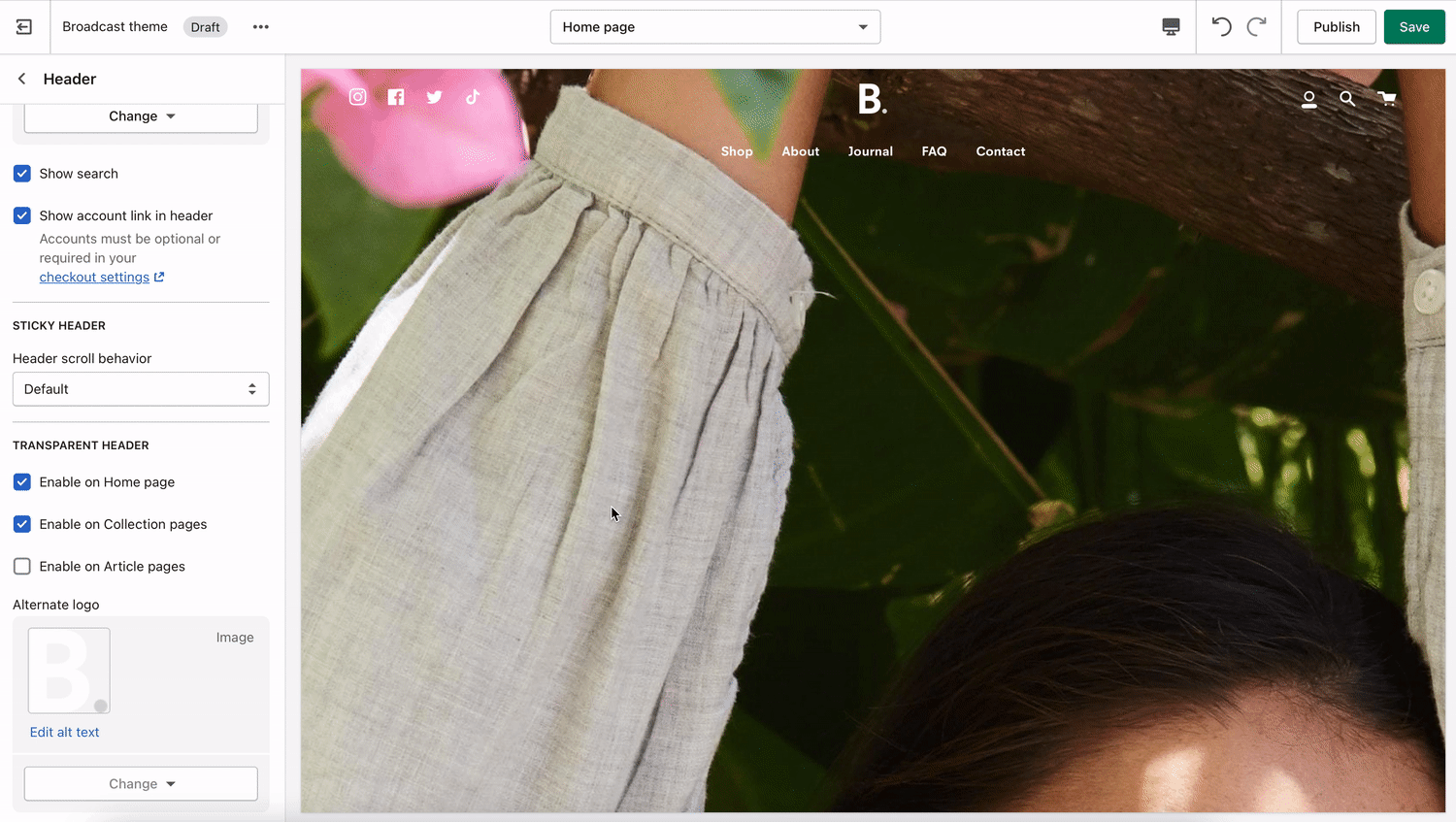
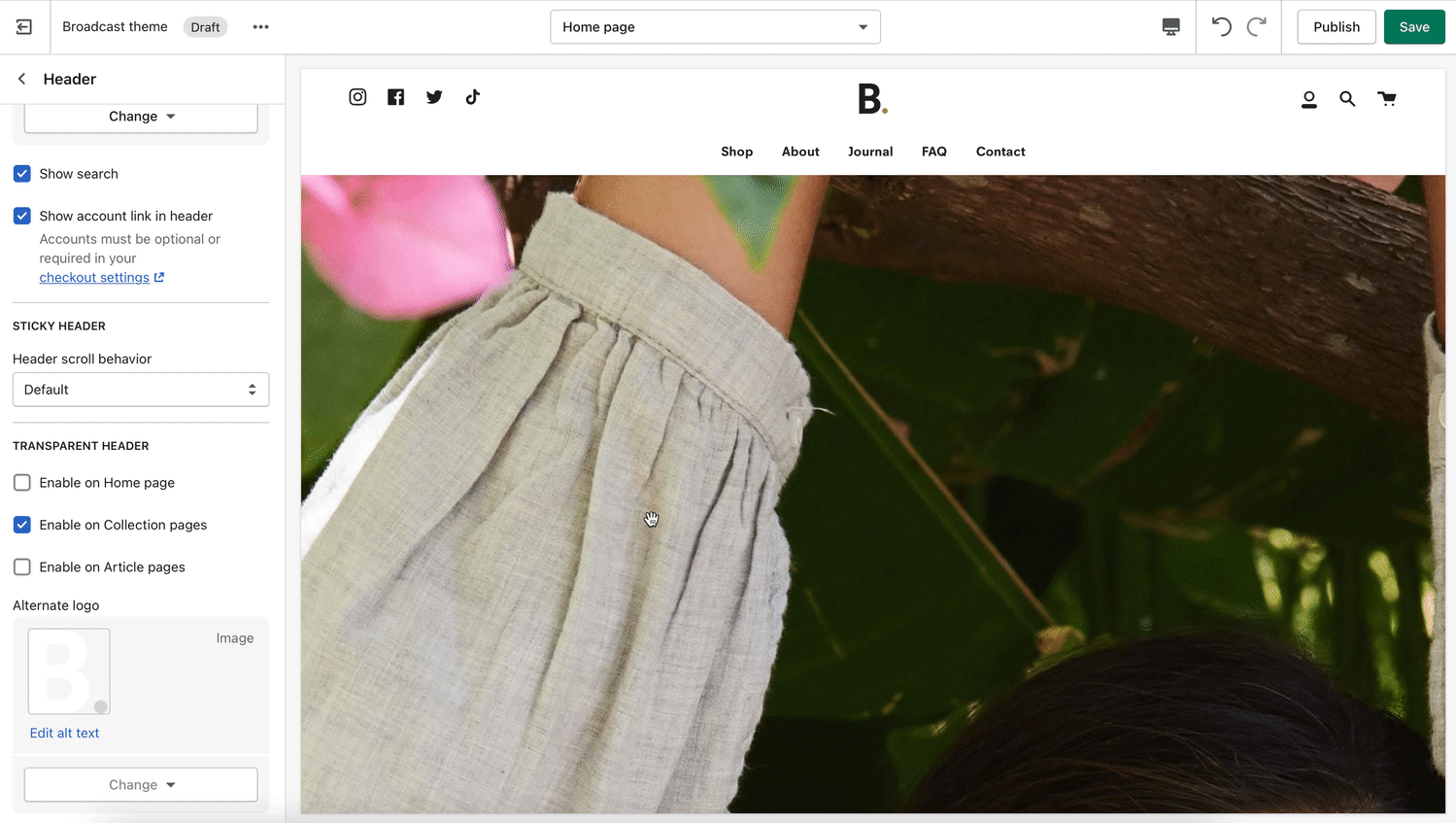
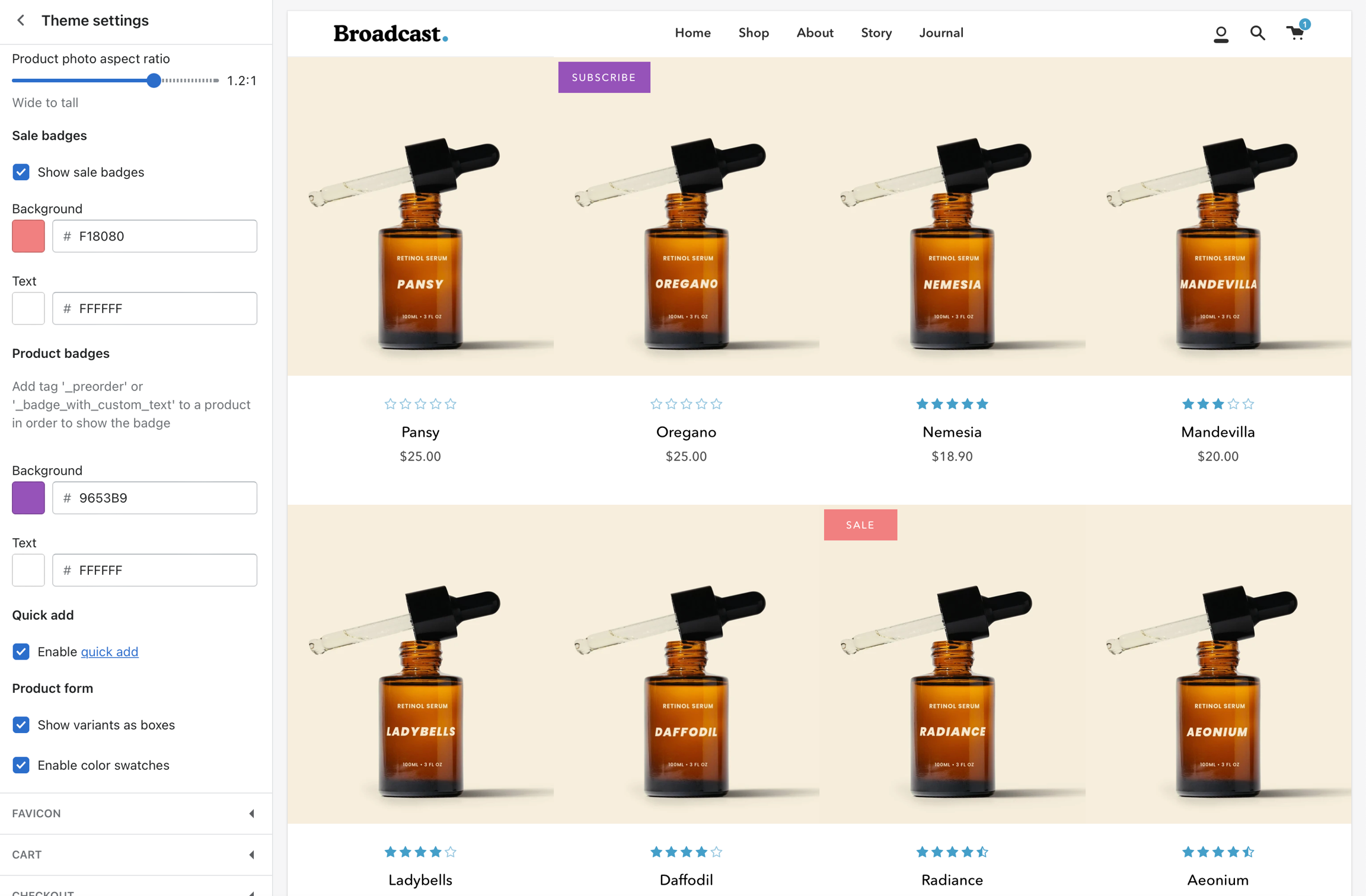
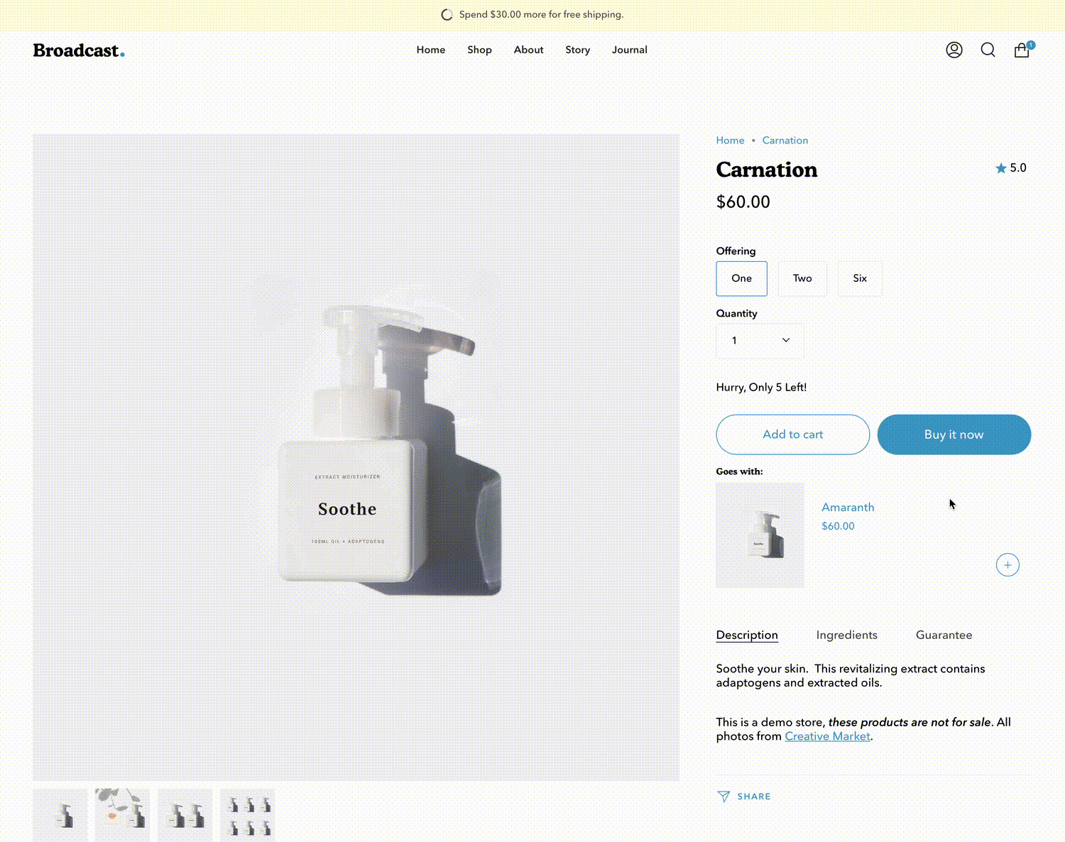
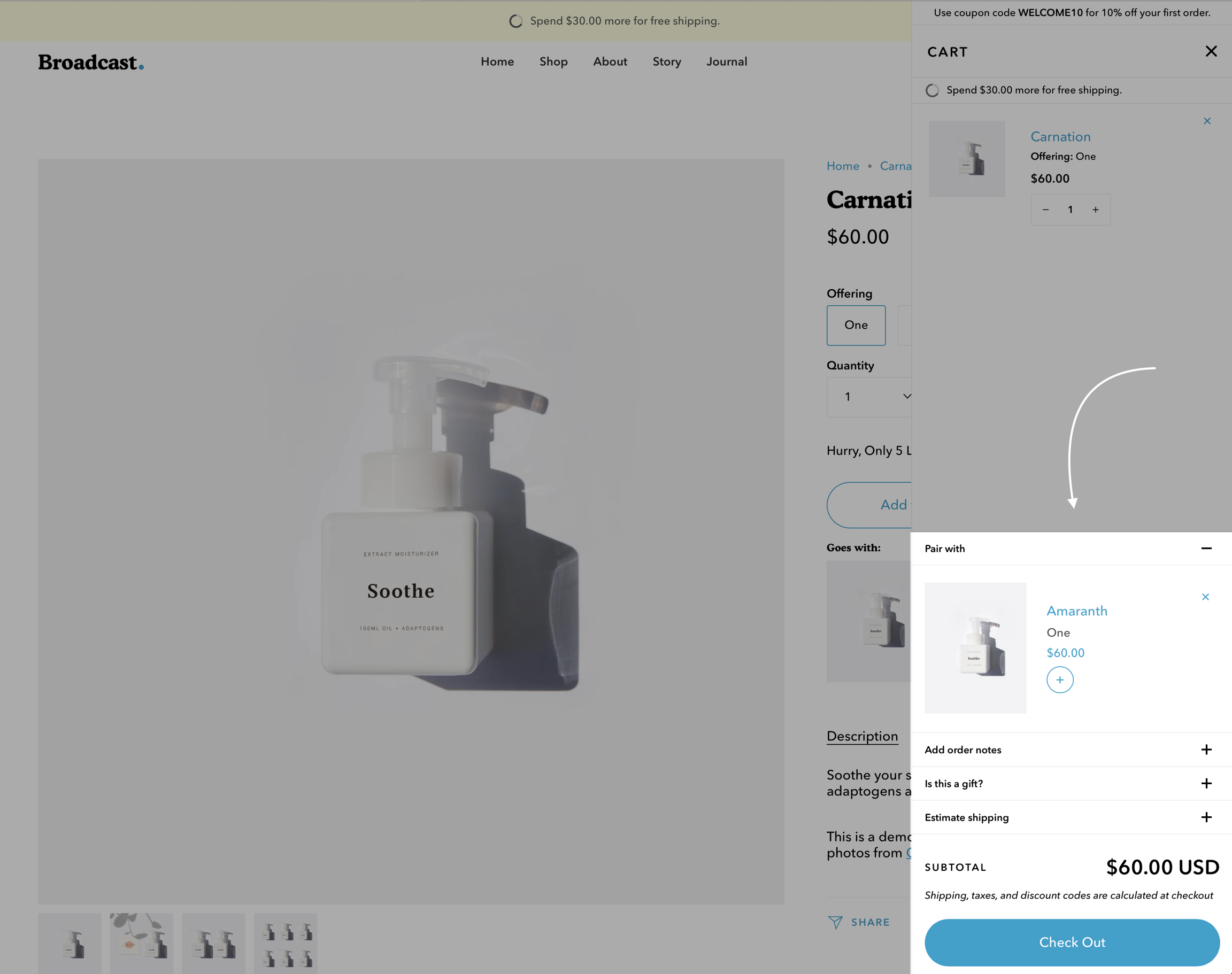
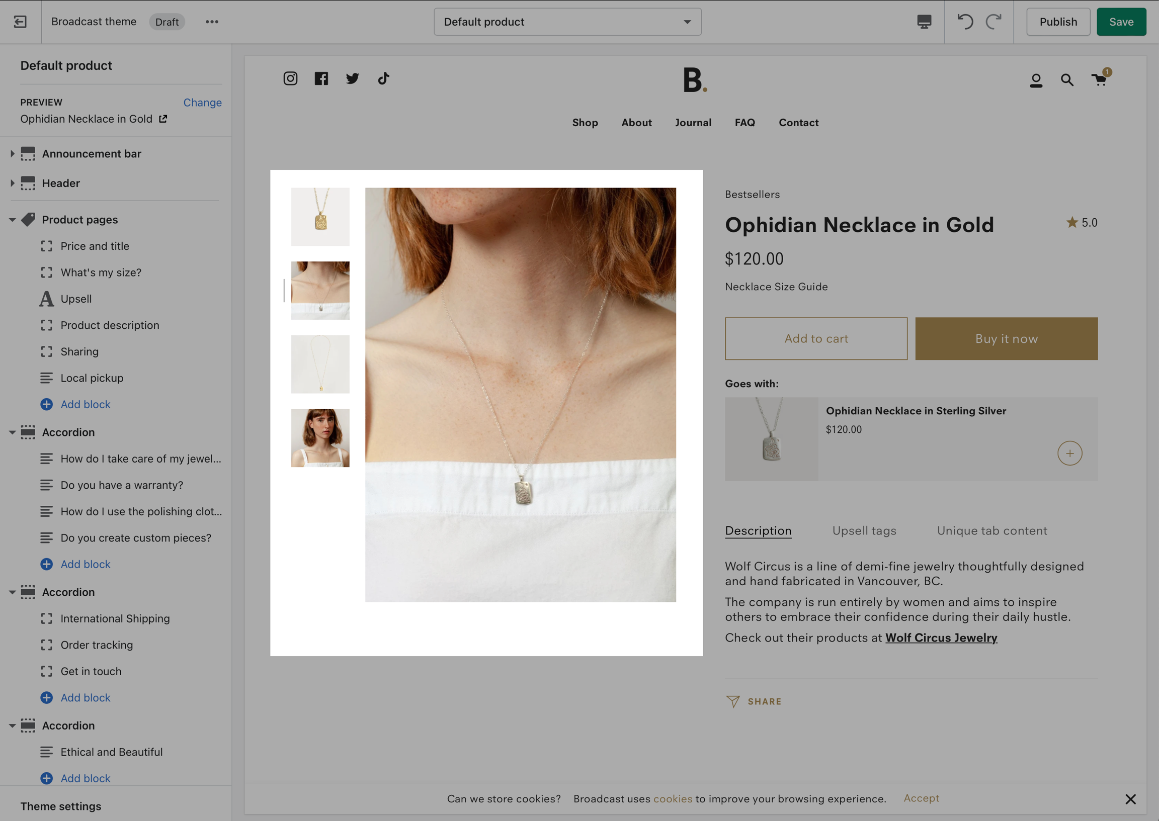
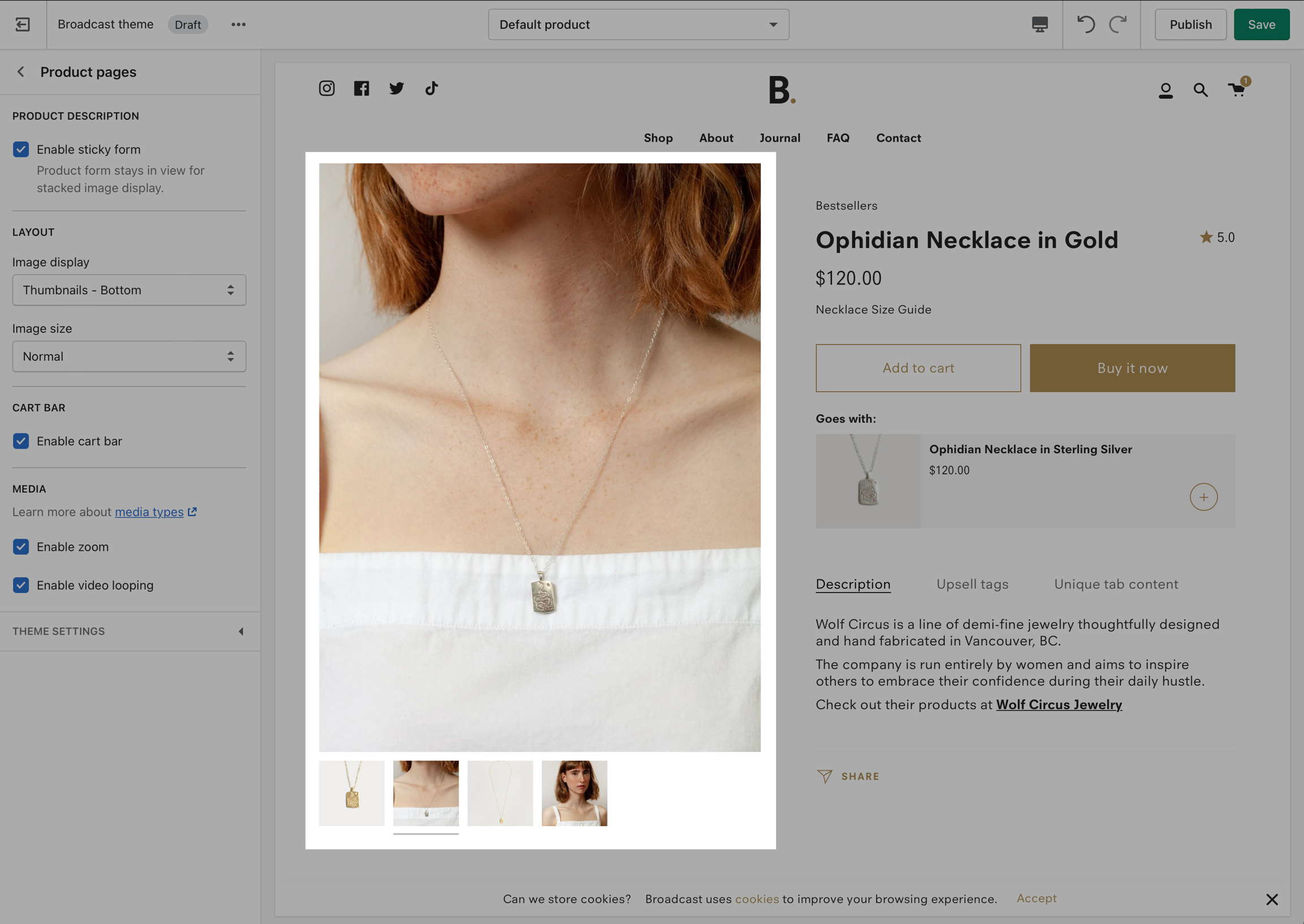
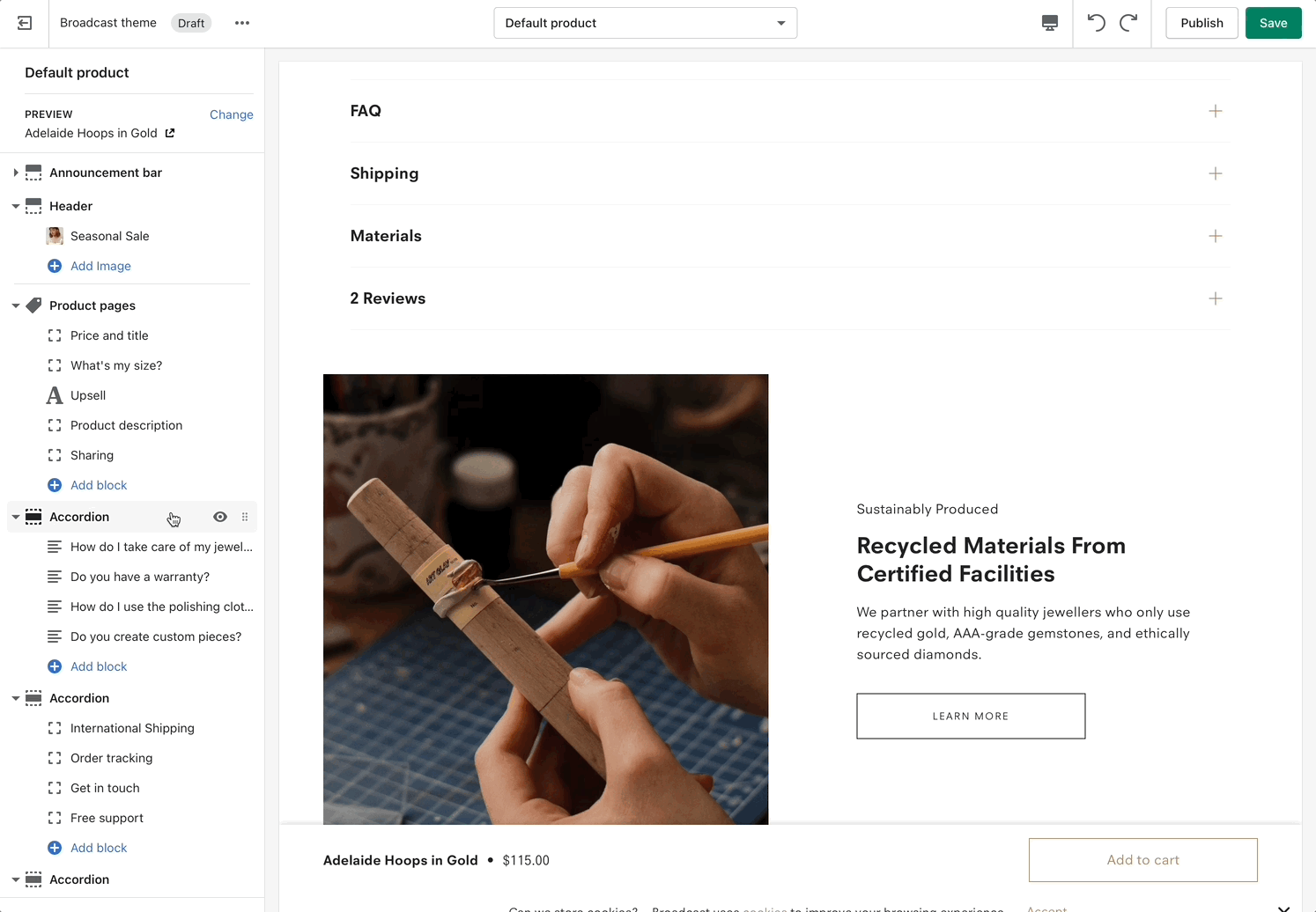
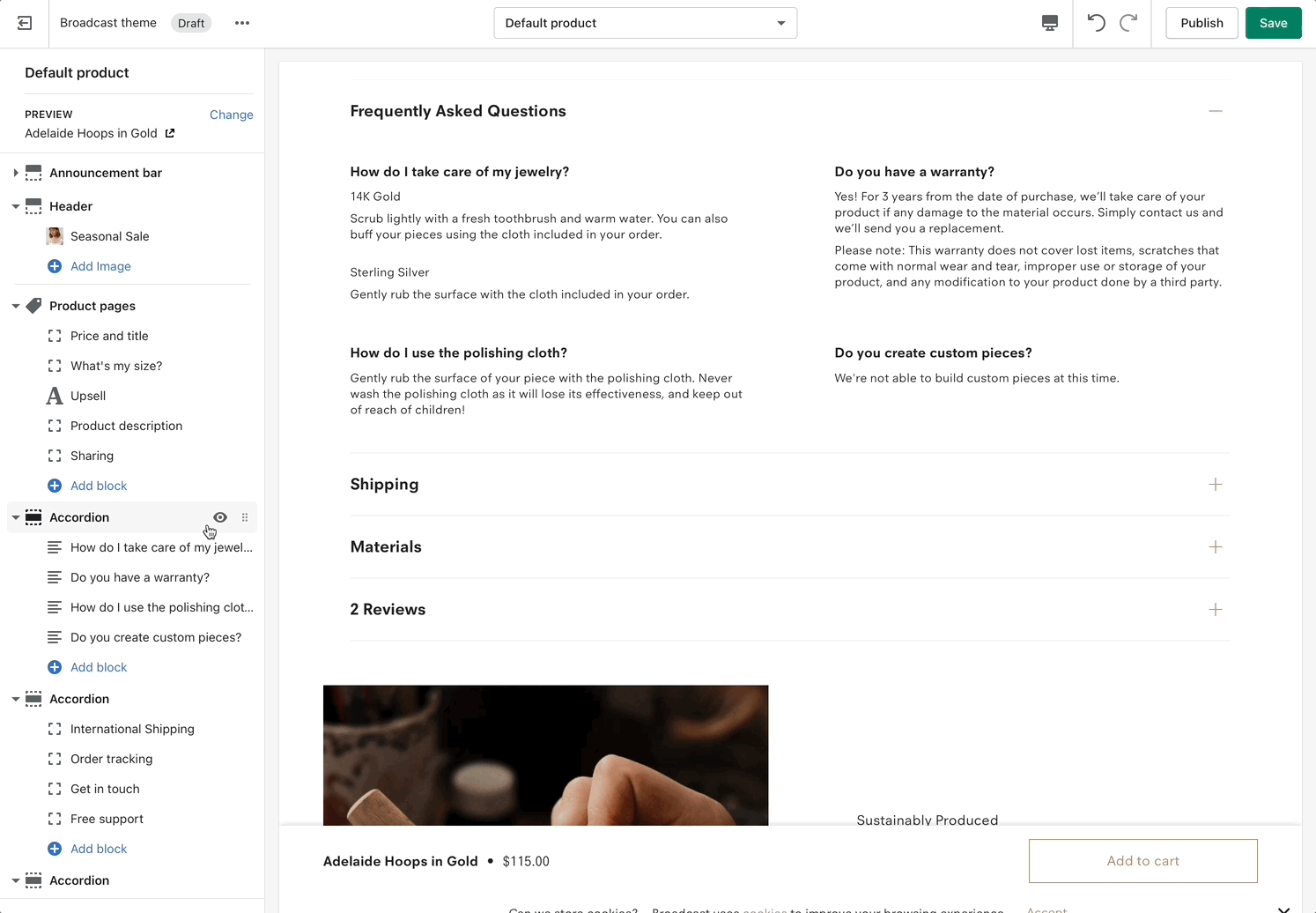

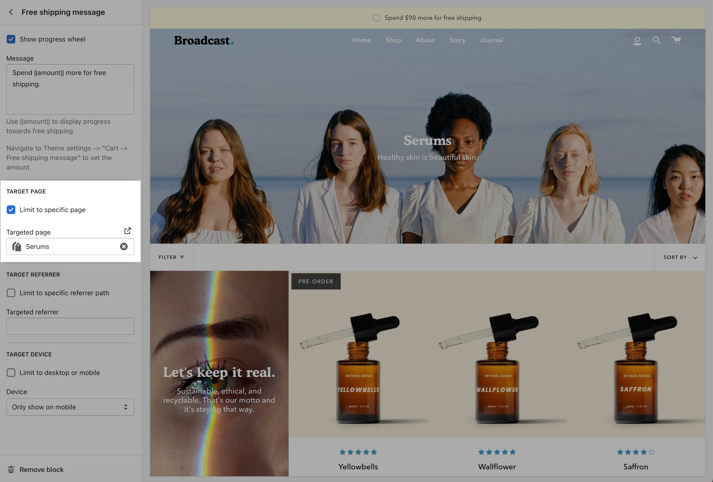
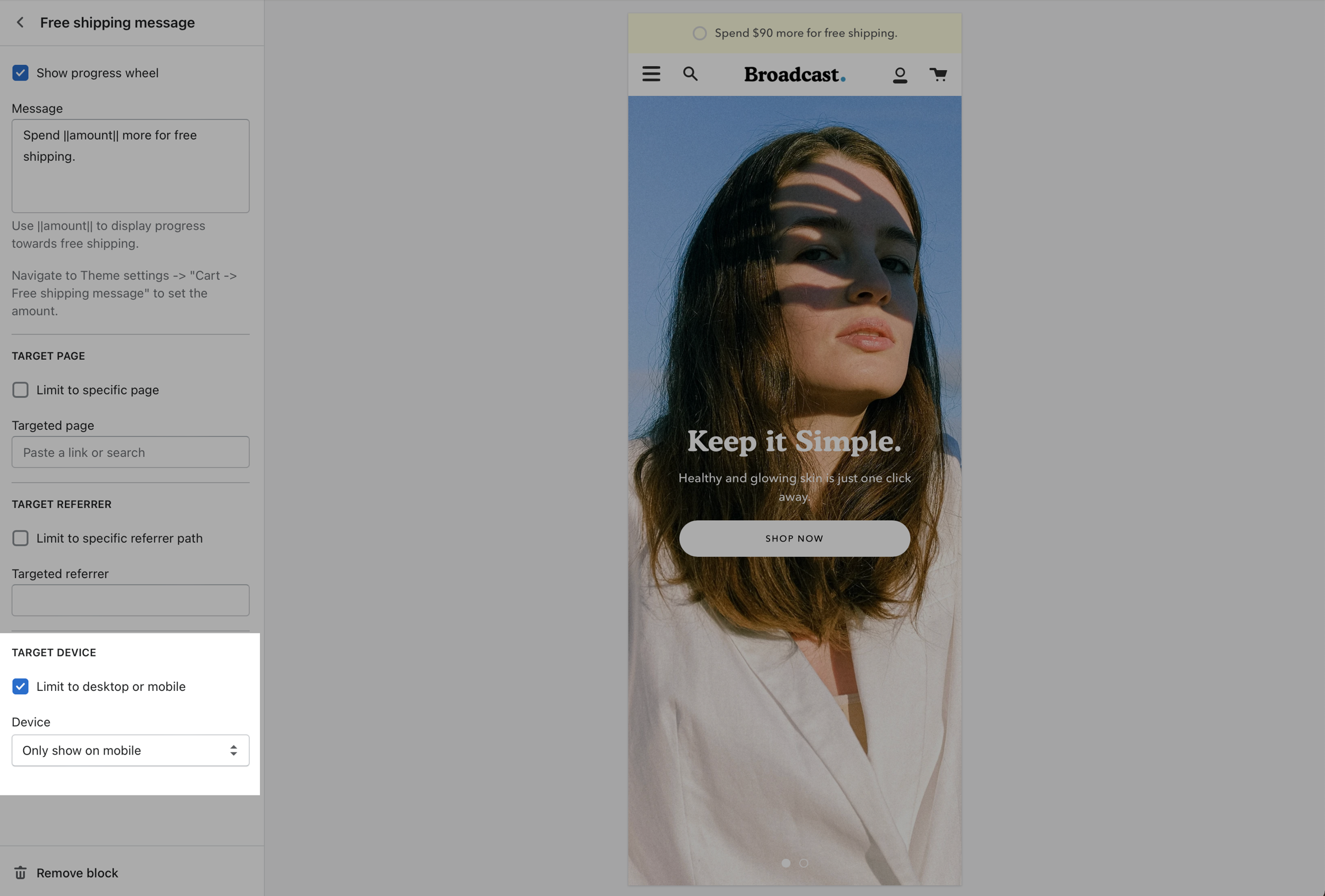
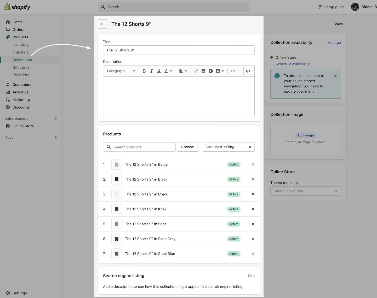

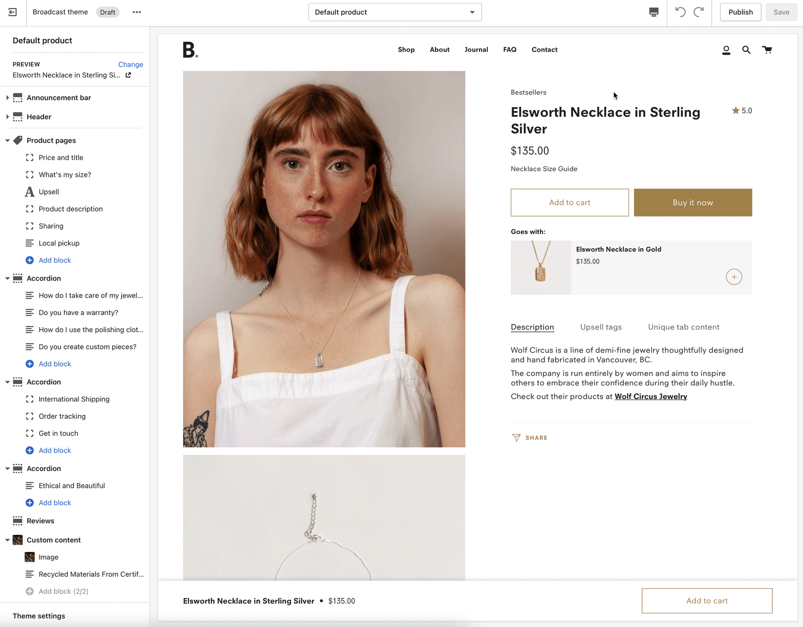
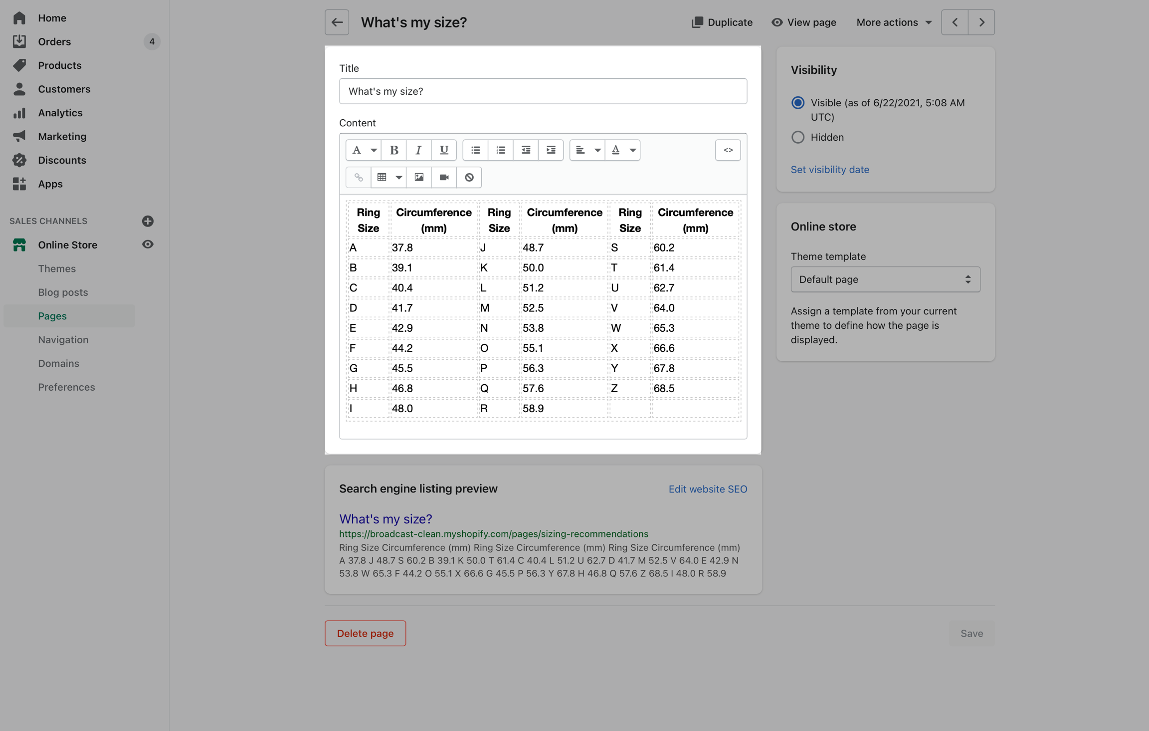
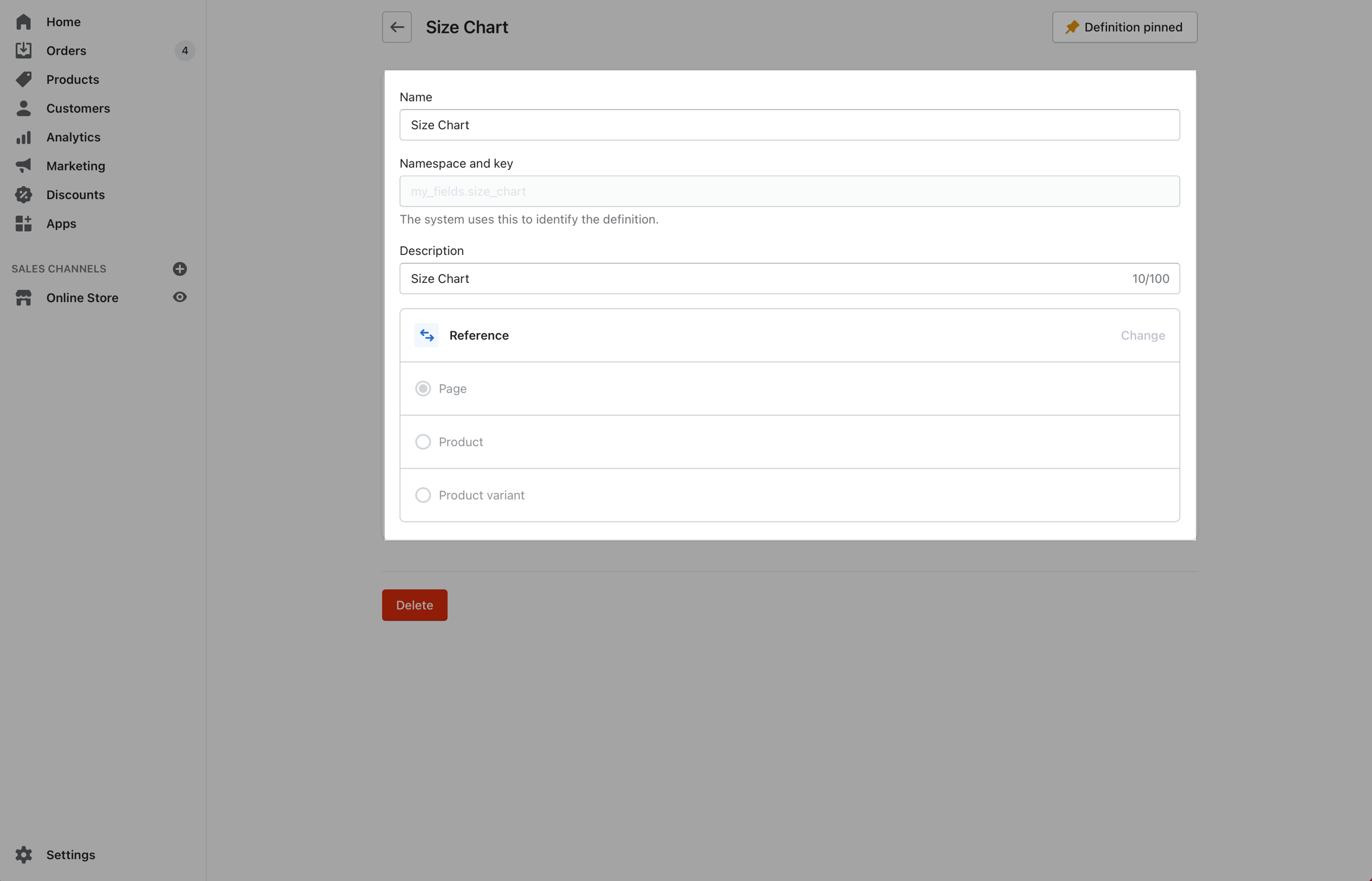
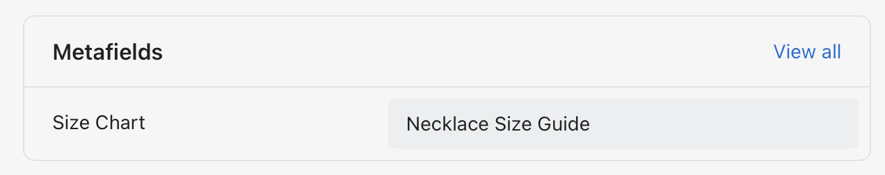

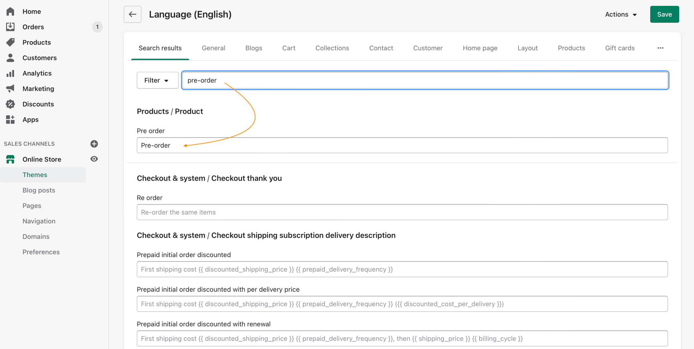
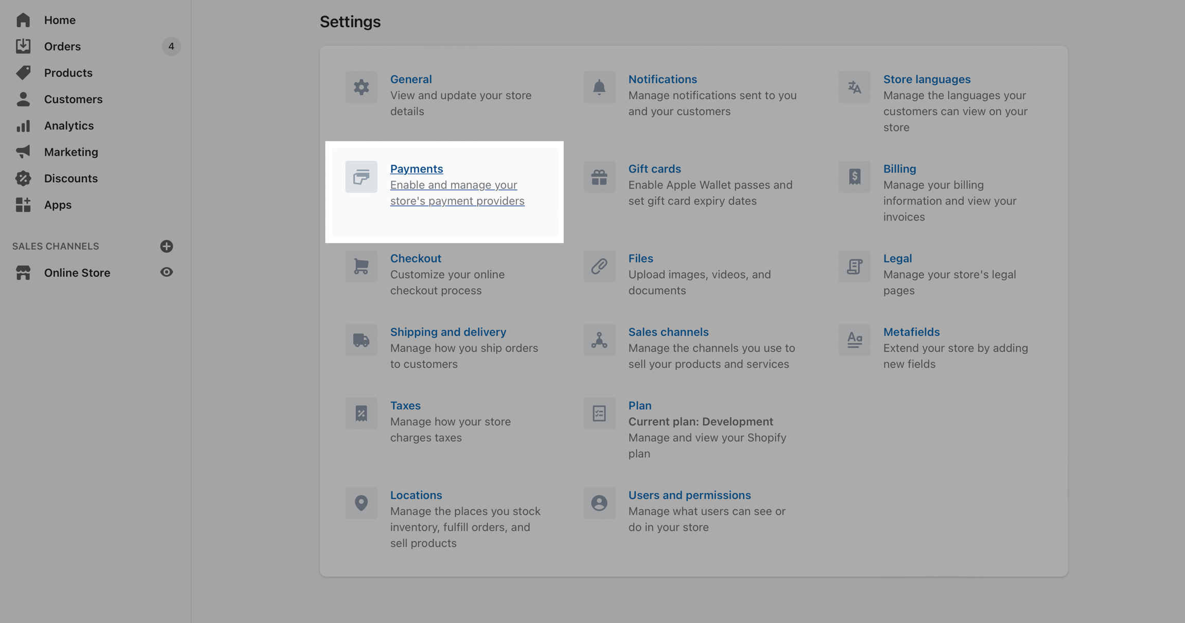
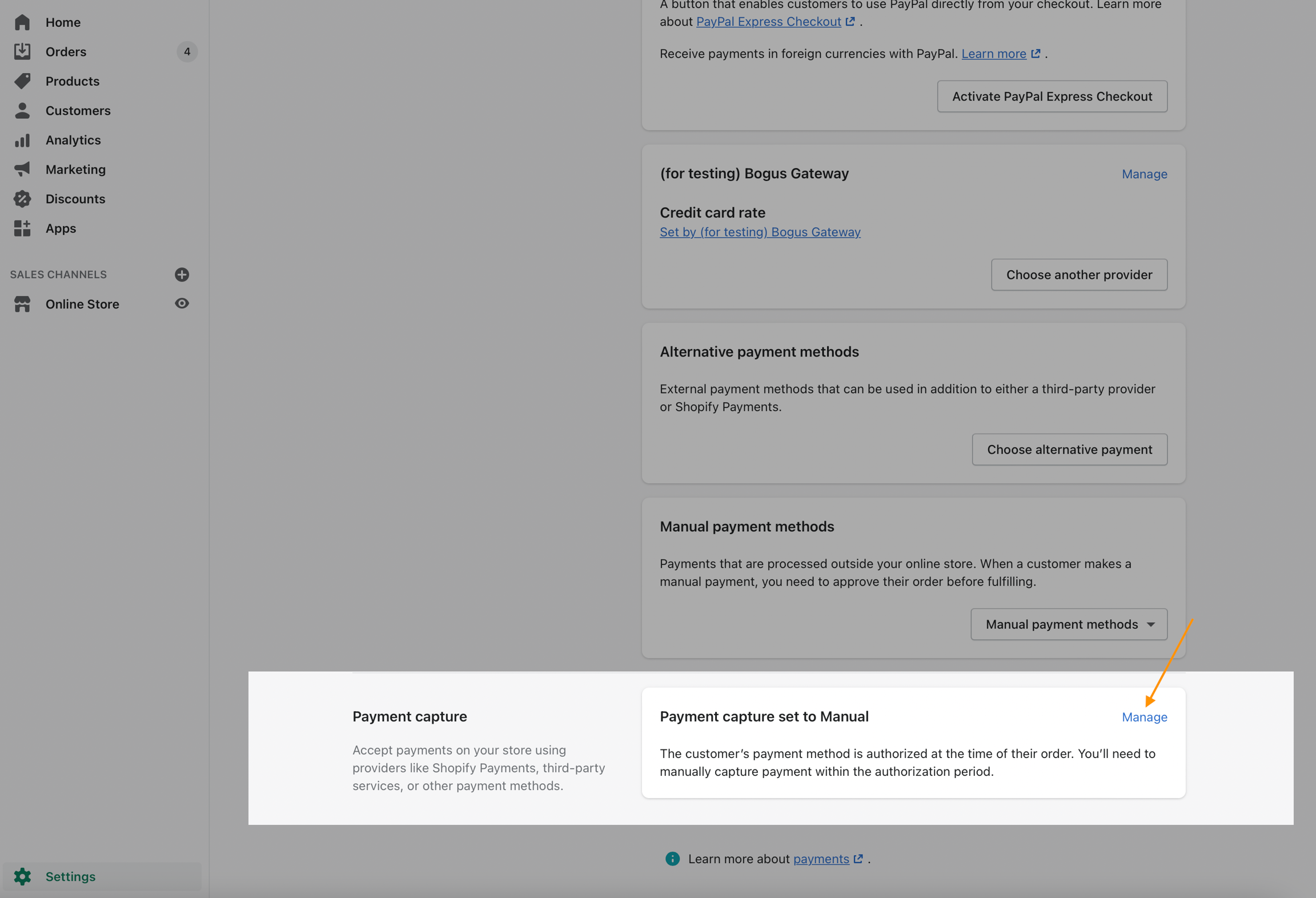
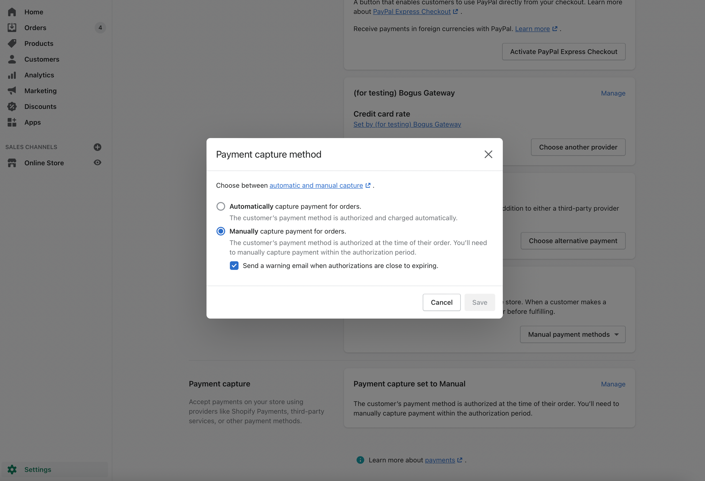


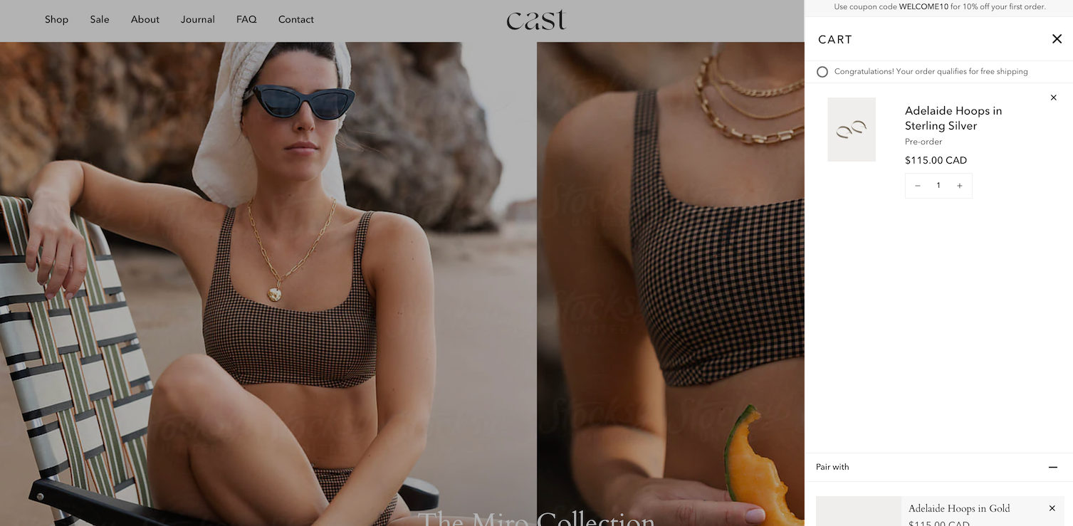
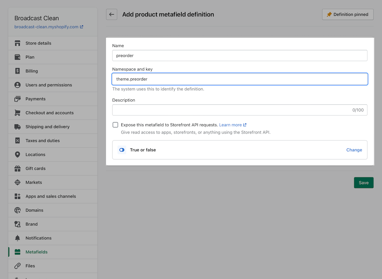
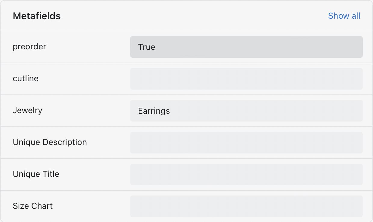
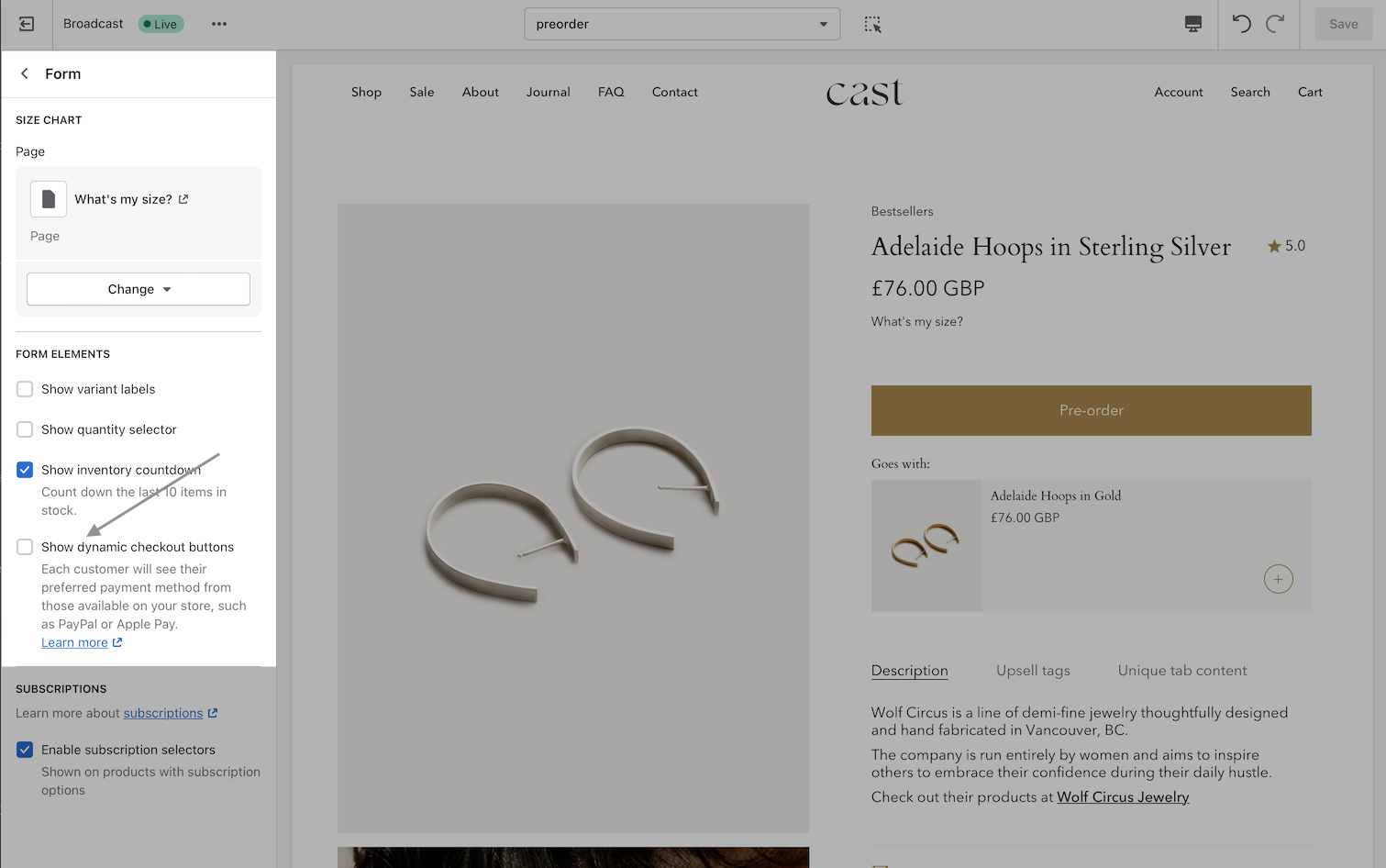


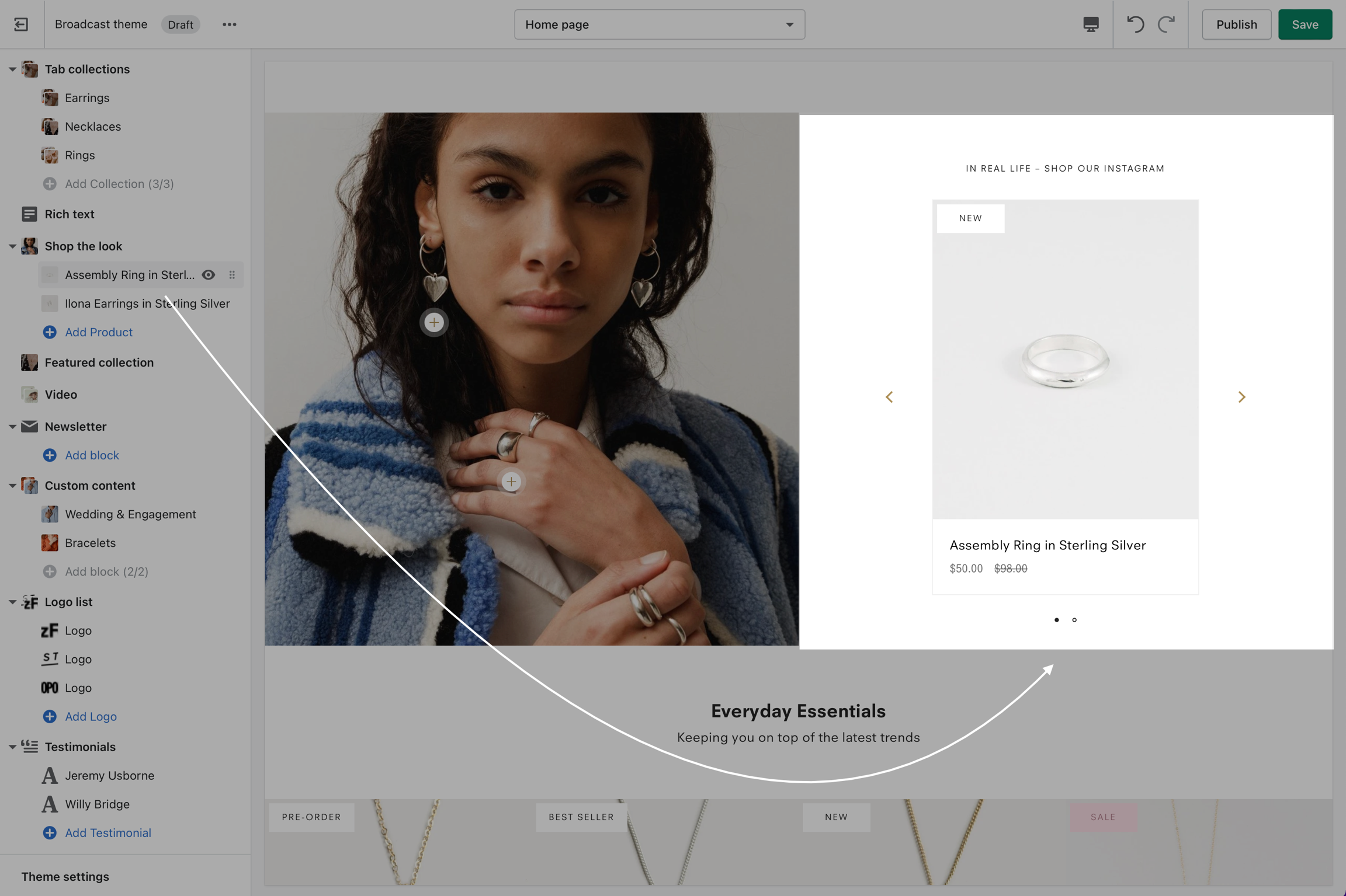

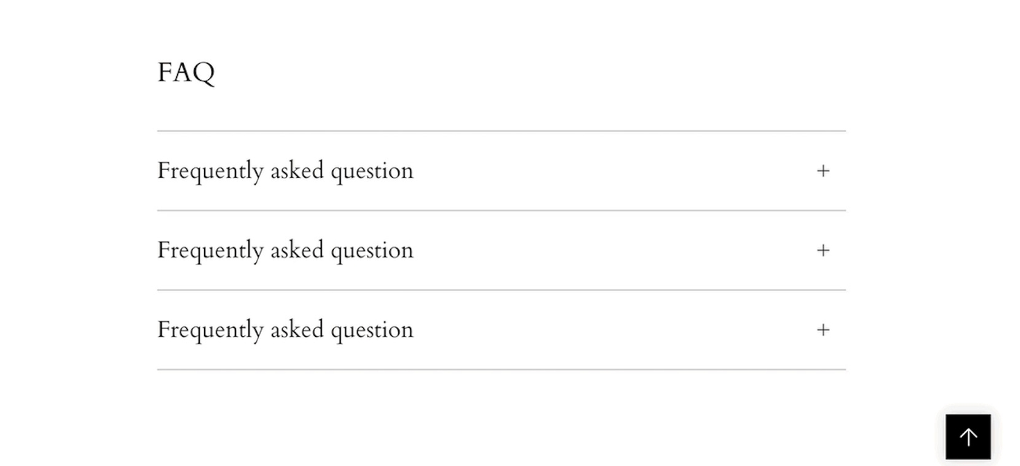
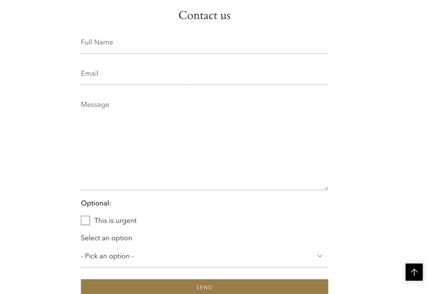
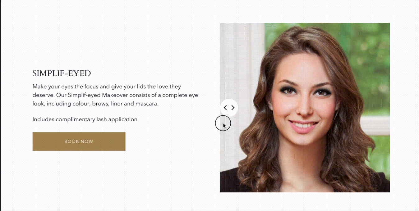
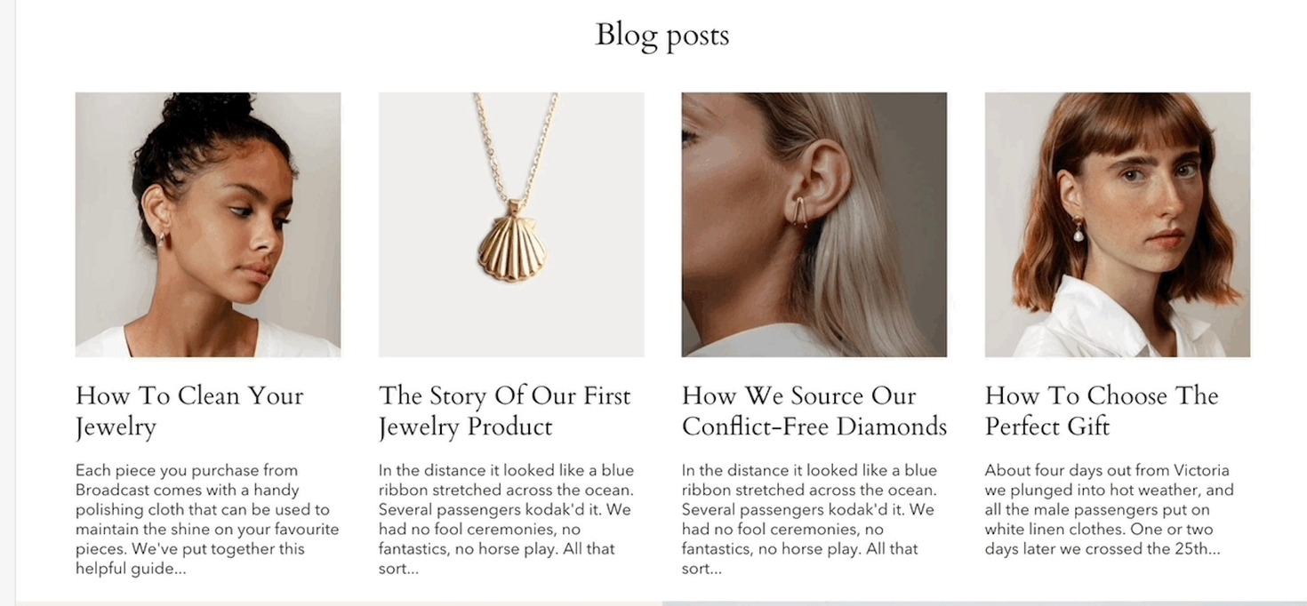
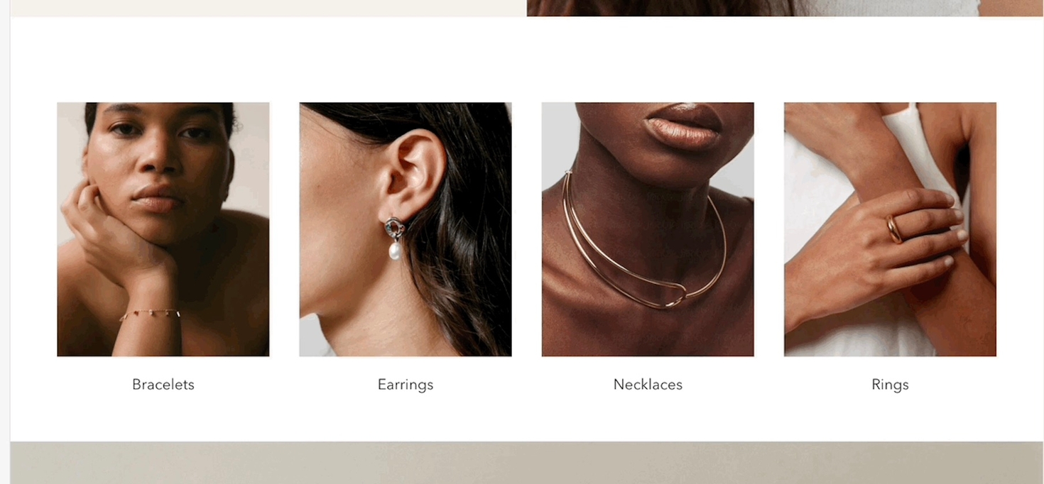
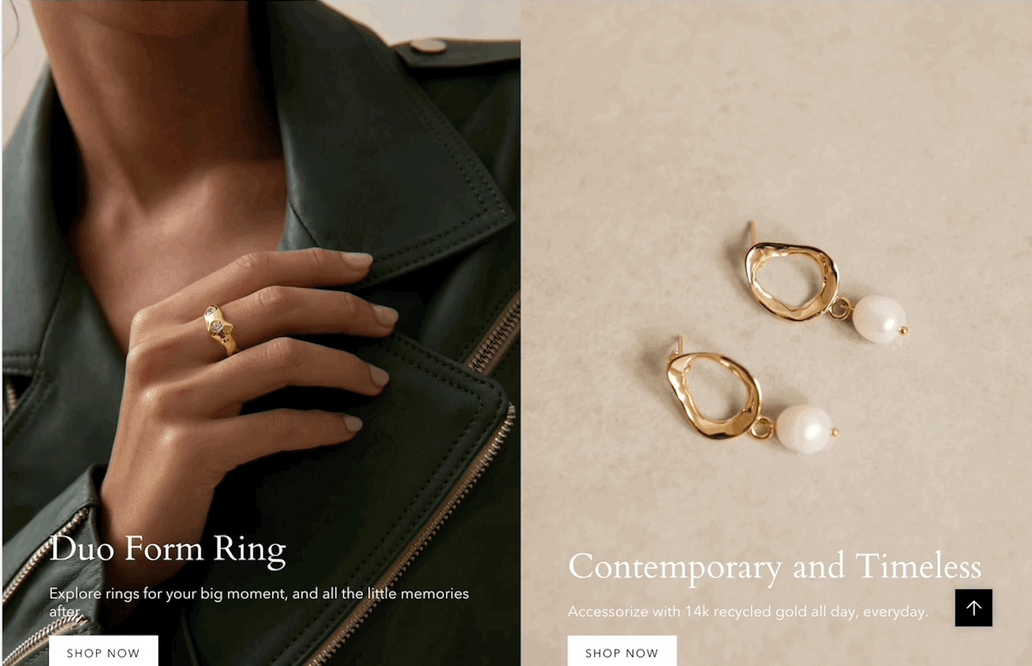
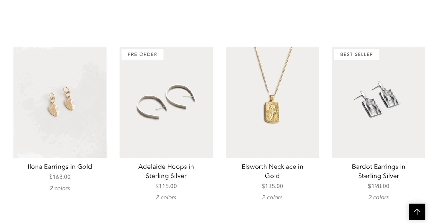
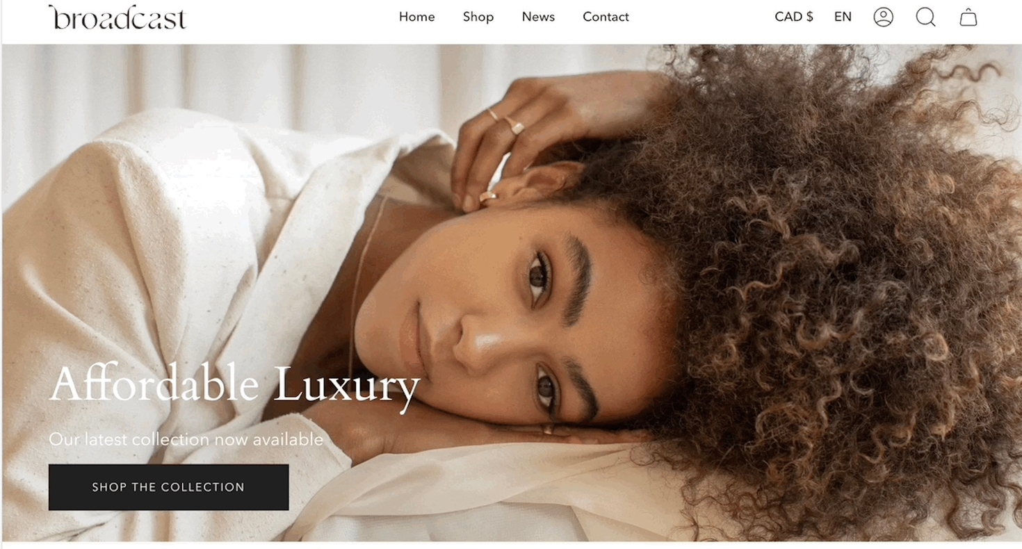
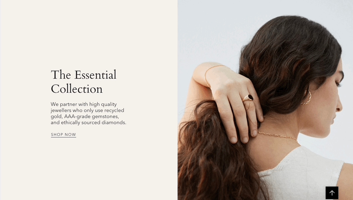
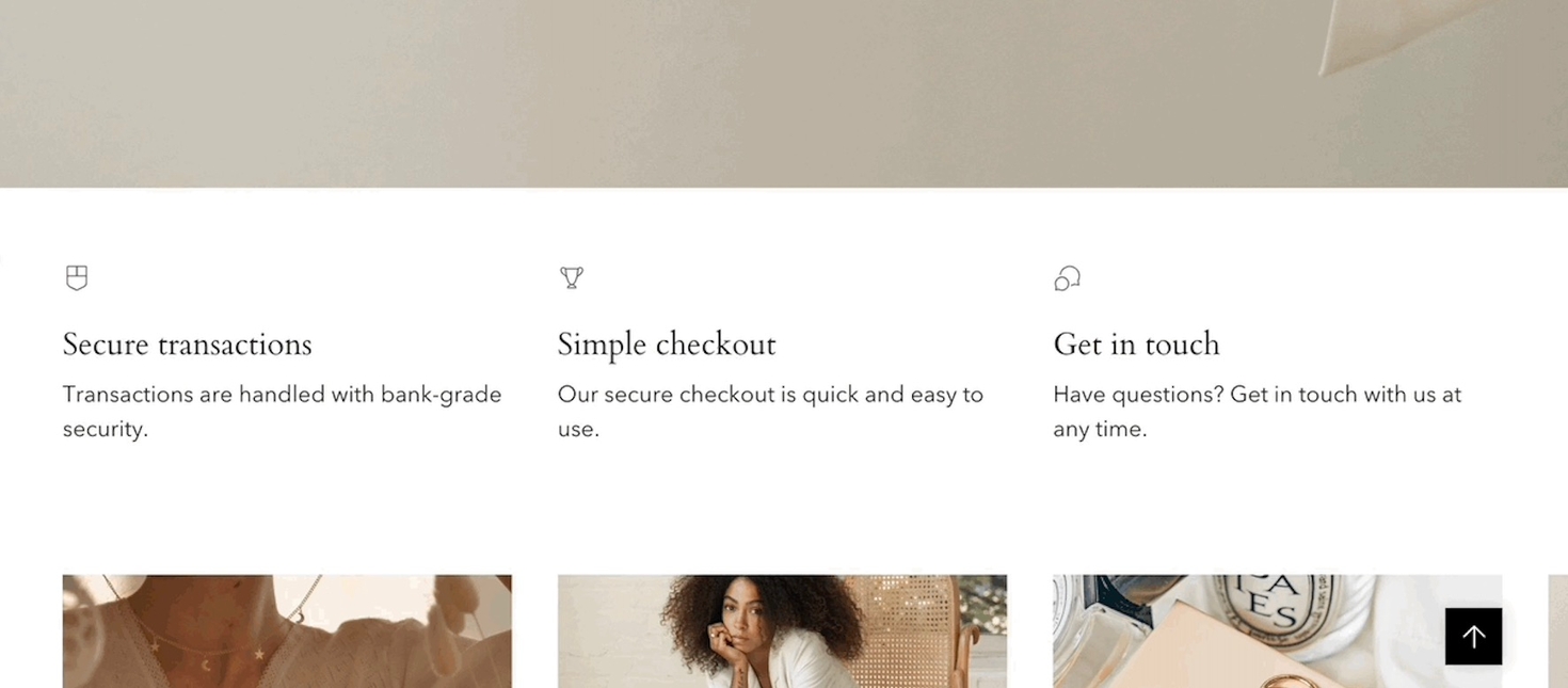
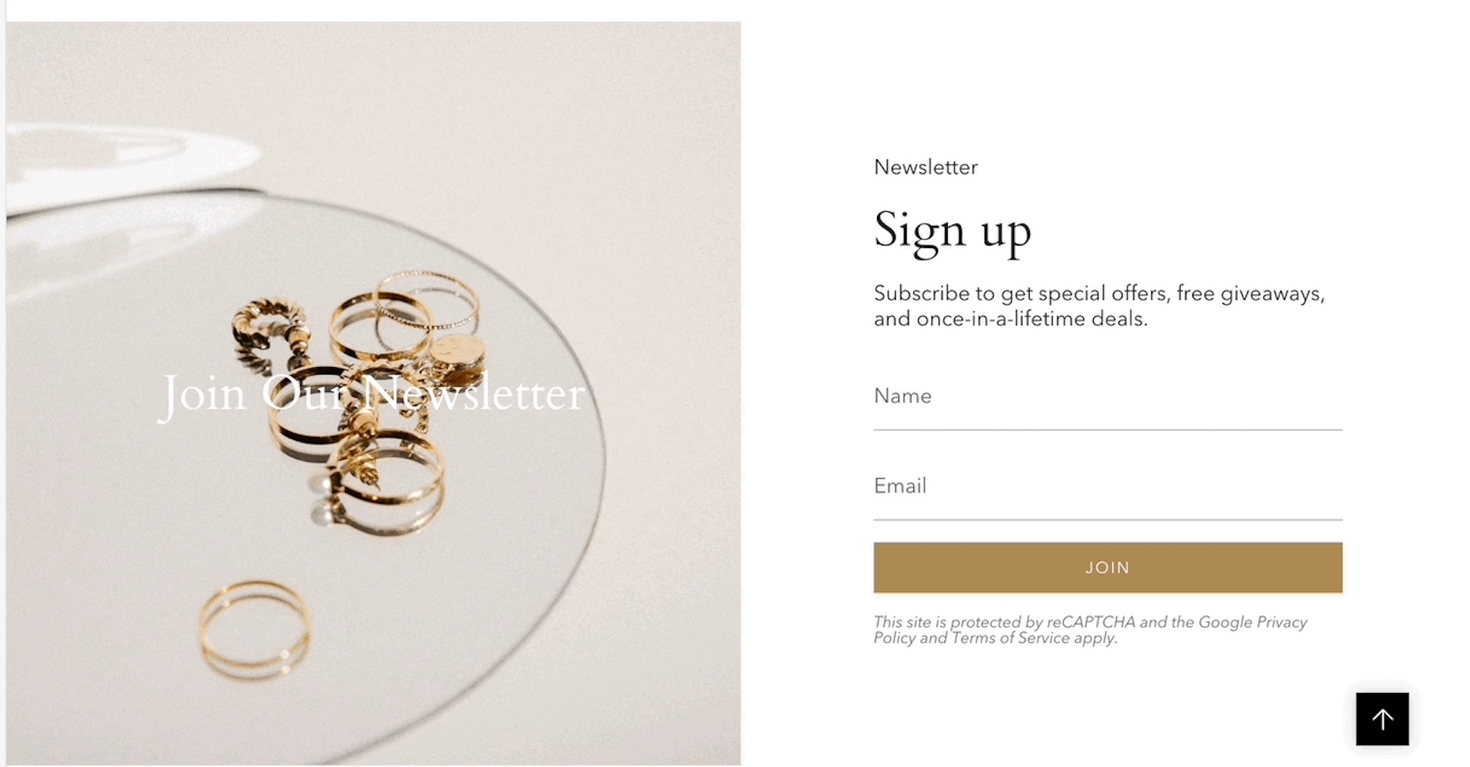
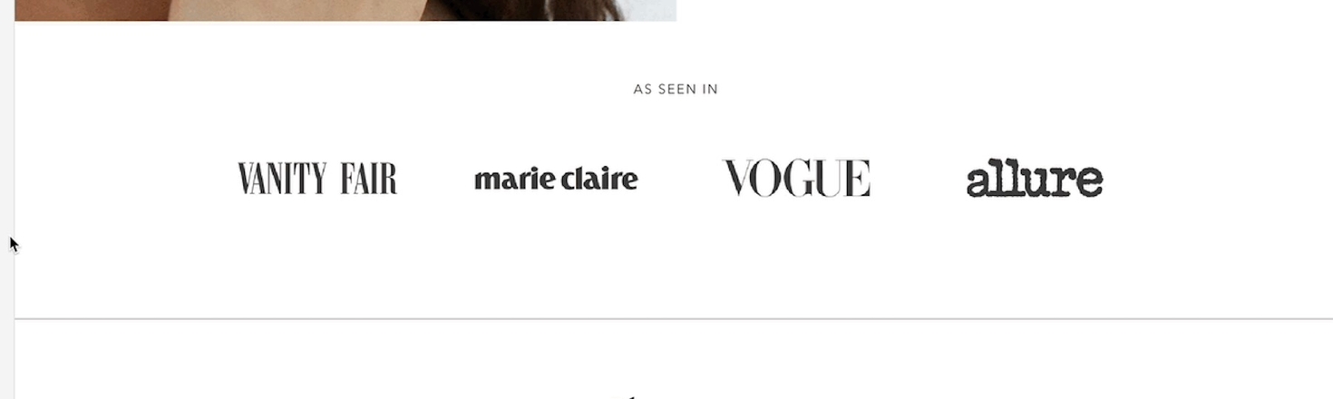

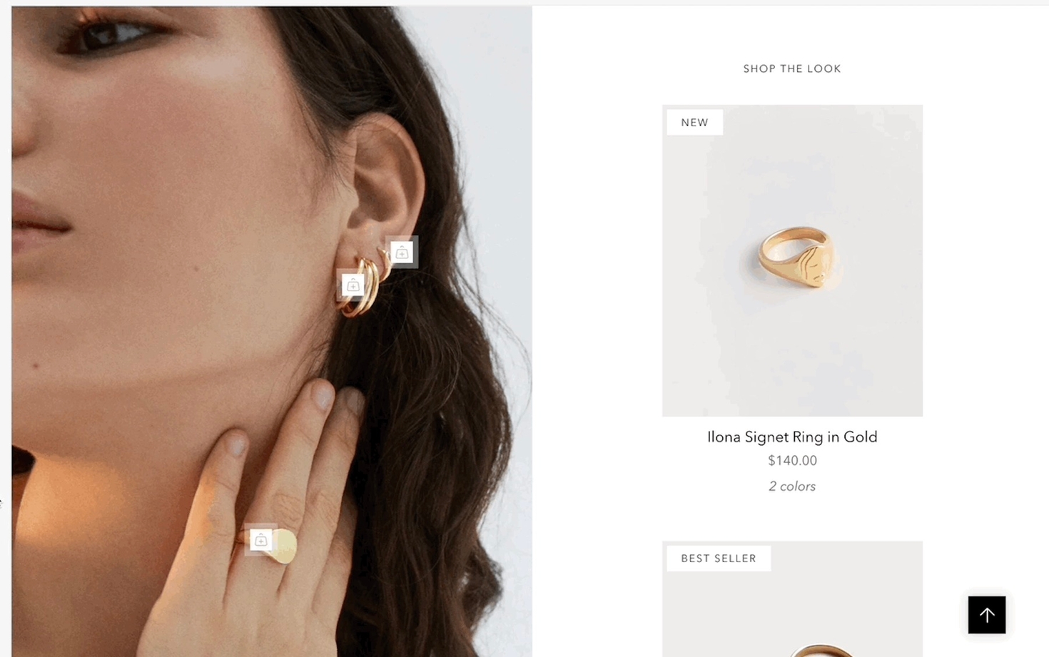
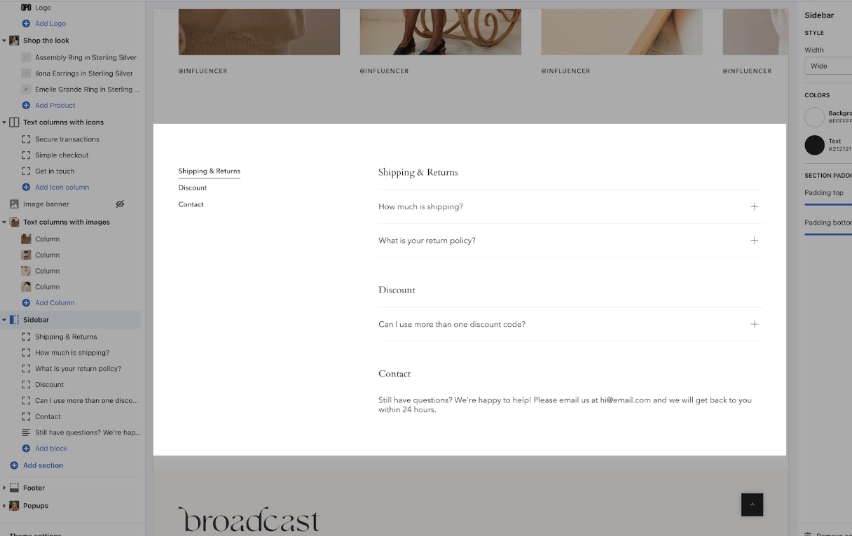
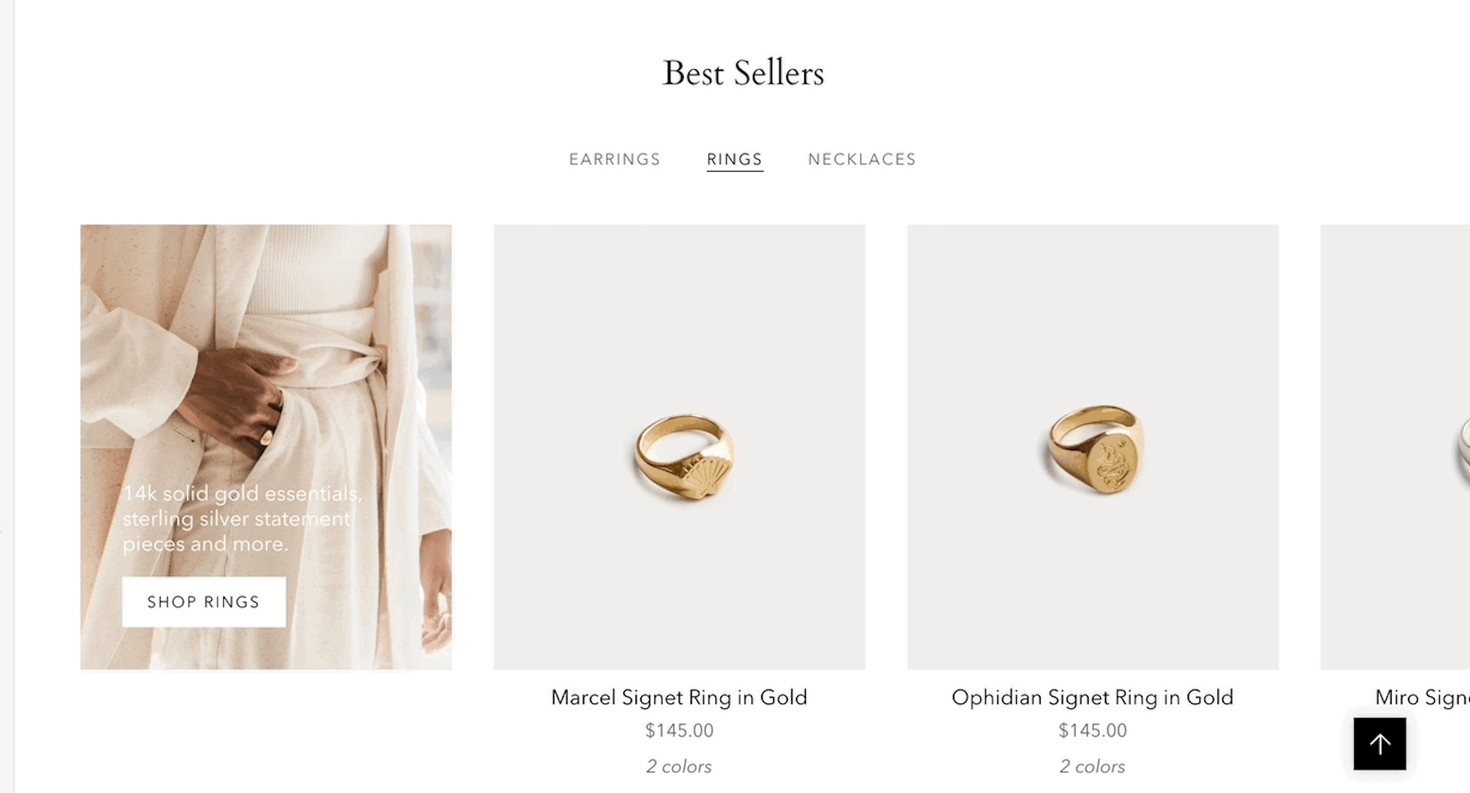
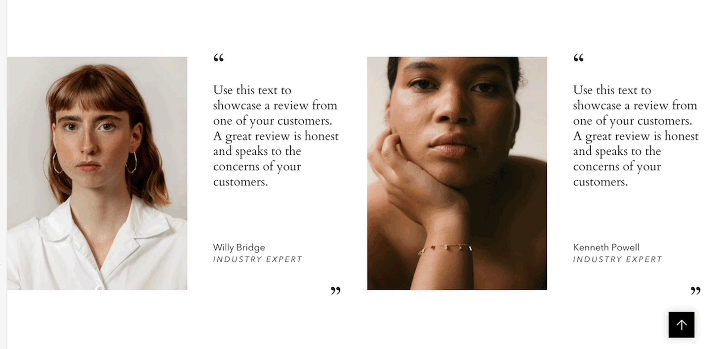
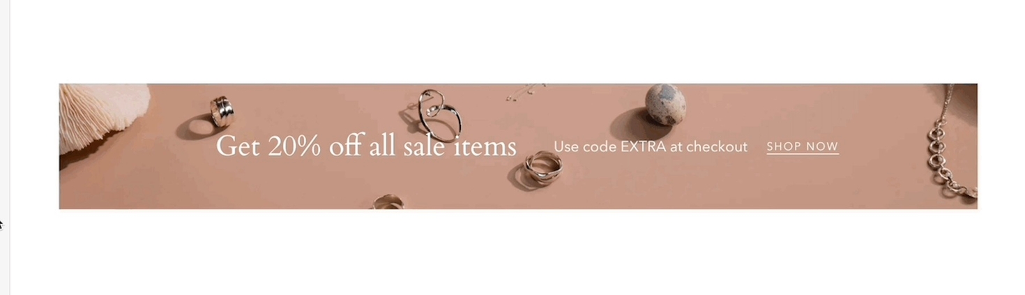
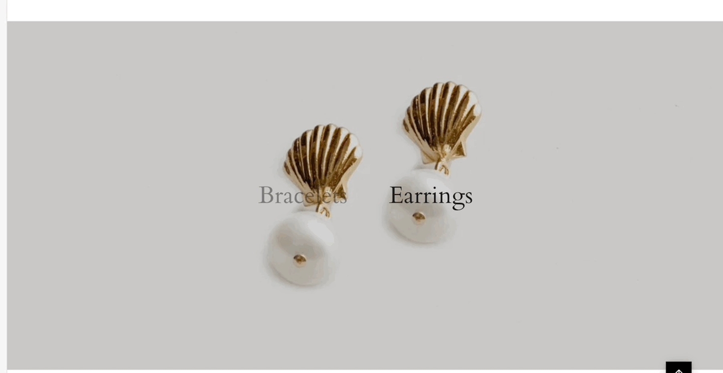


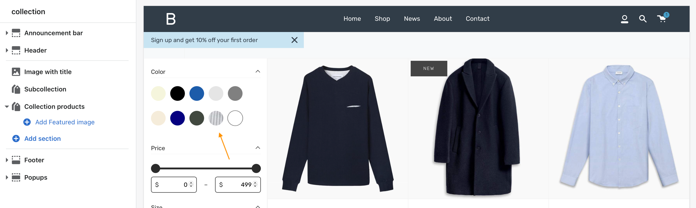
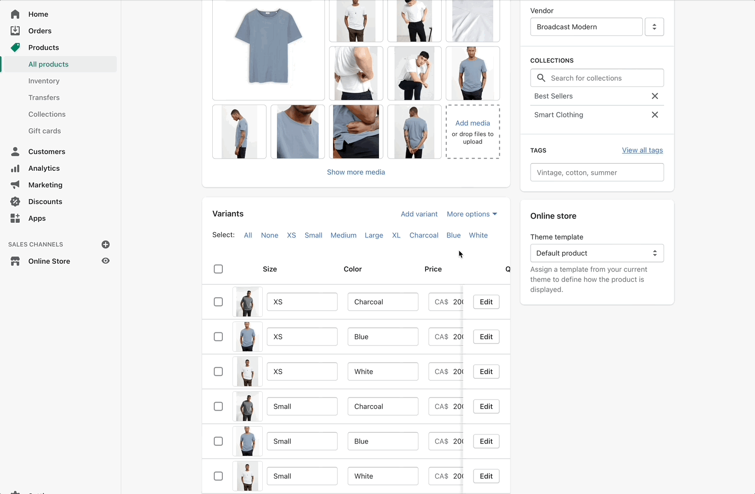

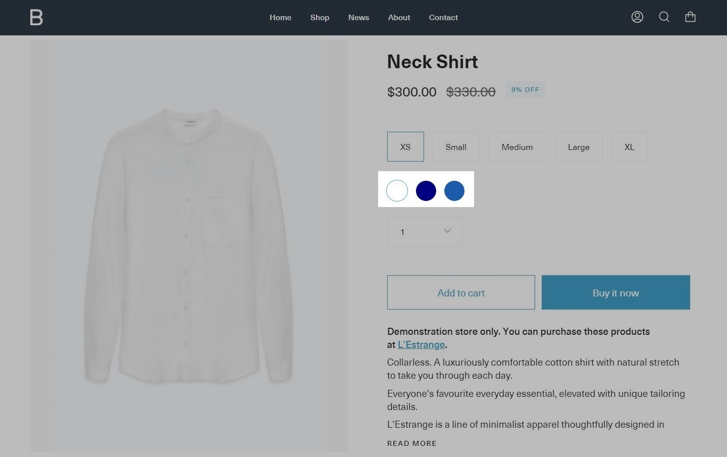
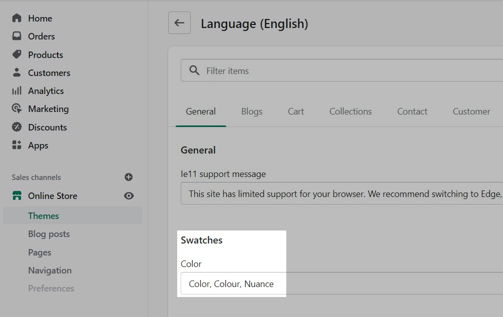
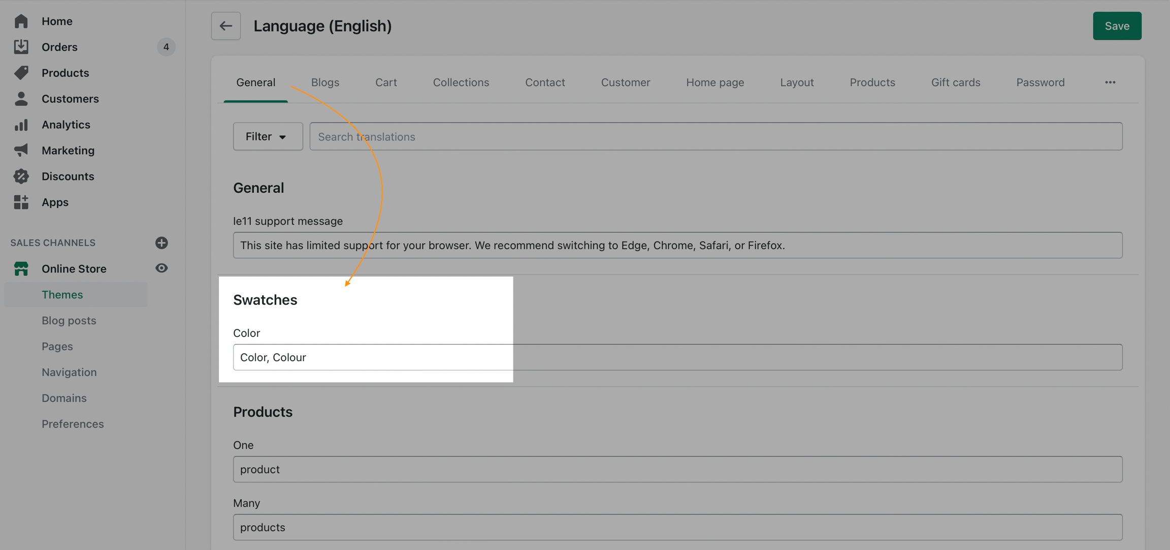
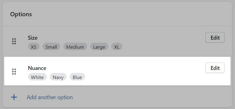
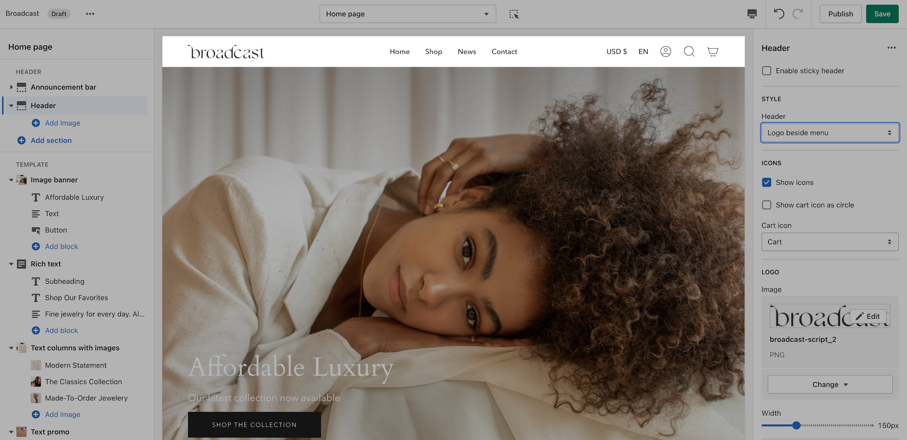
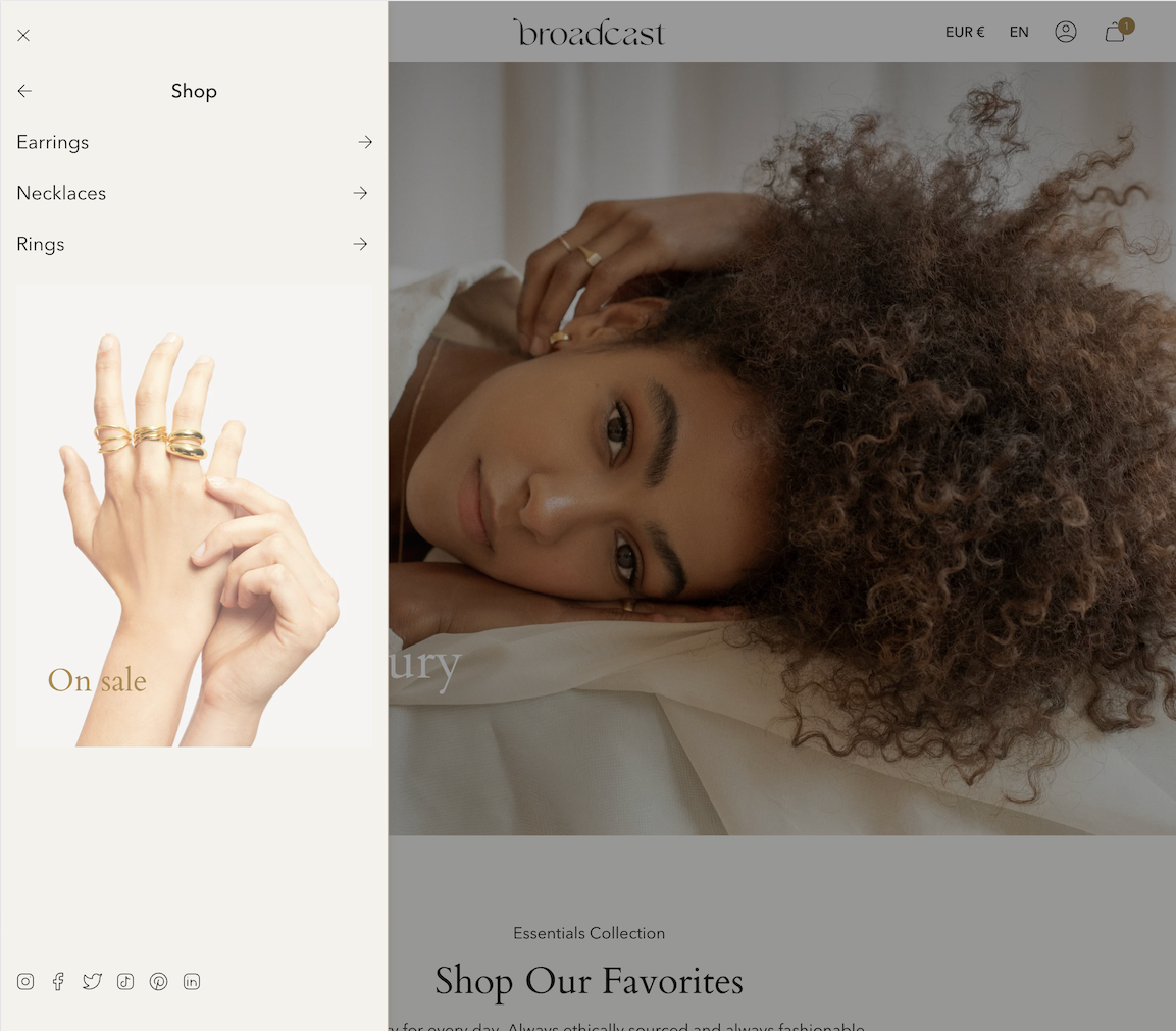
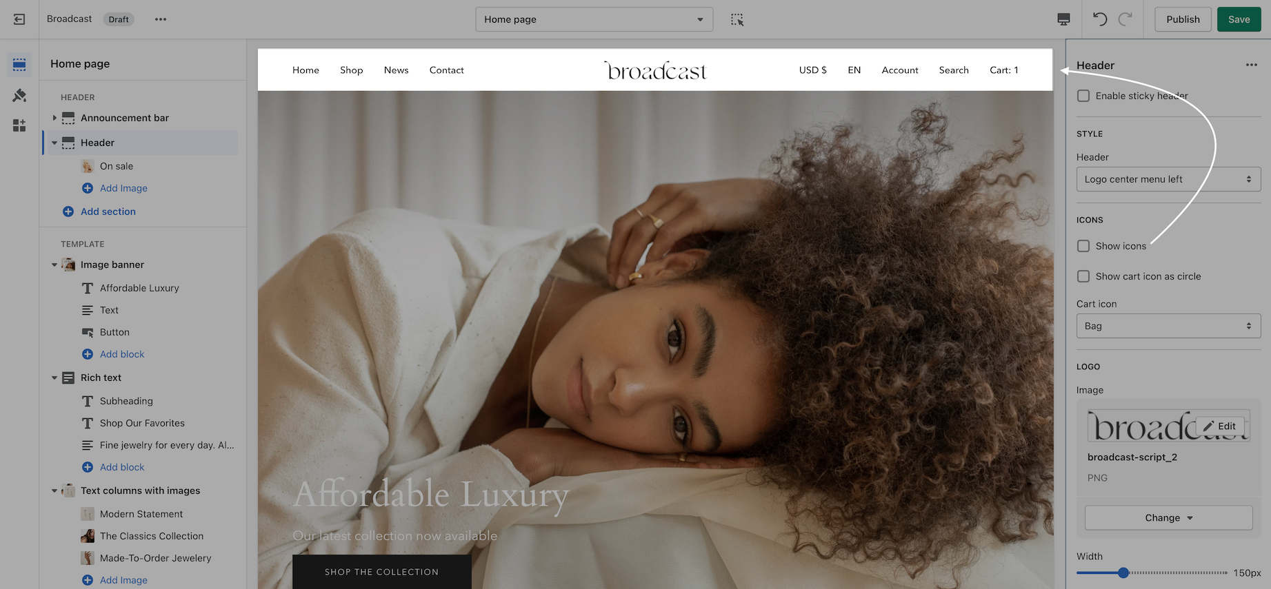
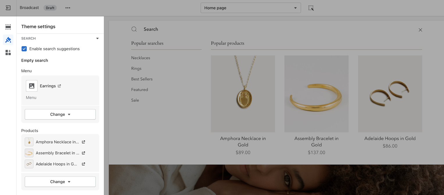
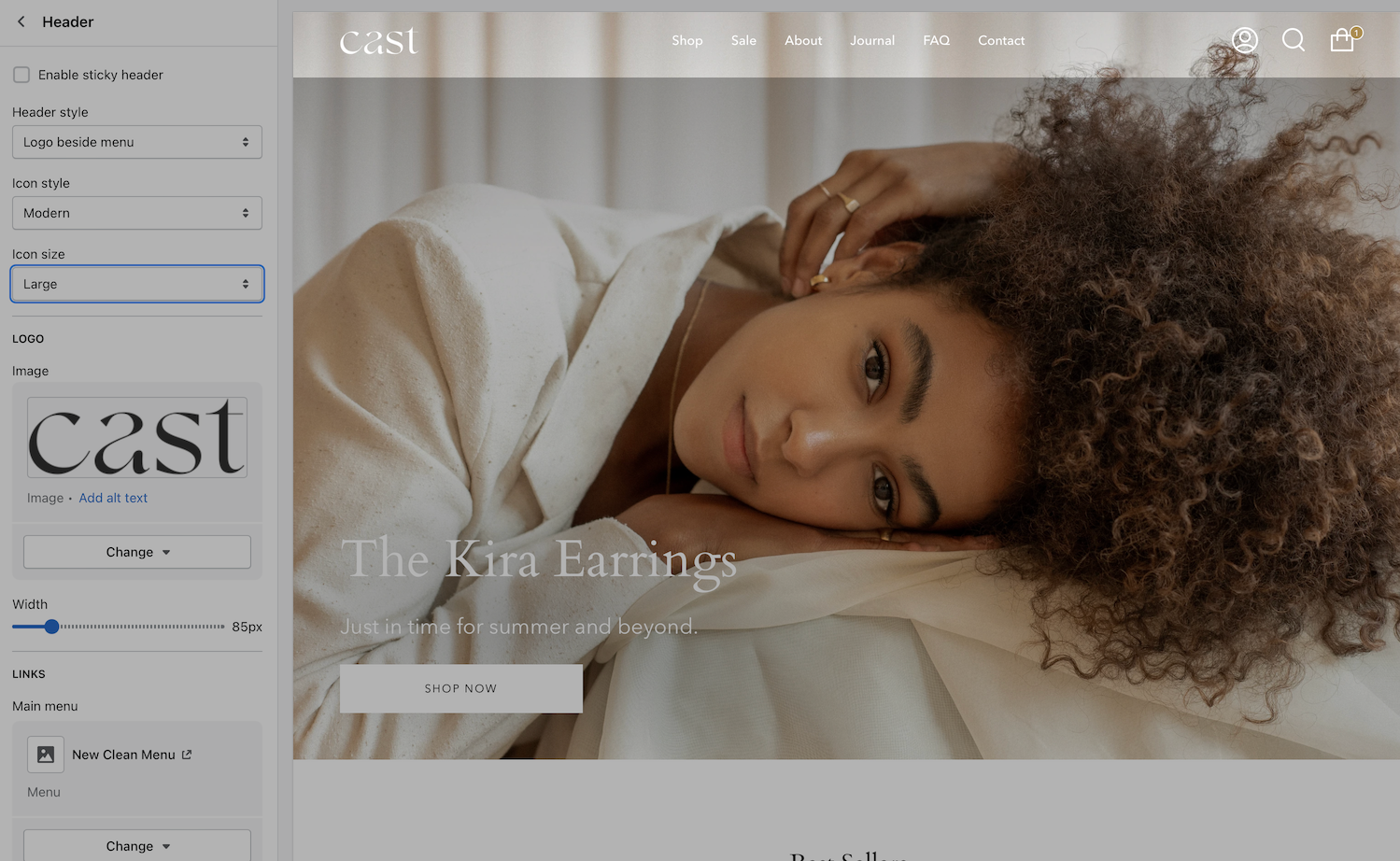